
The Best Design Inspiration Sites for Your Next Print Project


Sofia is our design and templates voice, built from the knowledge of our production team, with over 20 years in printing.
For a print project, the graphics sites worth your time are Behance, Fonts In Use, The Dieline, Designspiration and the D&AD annual, because each one shows the specification behind the work instead of only the thumbnail. Pinterest and Dribbble are faster to browse and much weaker to work from: attribution is usually lost, and most of what you are looking at is an RGB mockup that was never actually printed.
Design inspiration sites at a glance
| Site | Best for | The catch | Print it as |
|---|---|---|---|
| Behance | Full case studies with process, grids and the reasoning behind a layout | Most images are photographic mockups, so you cannot judge ink coverage or stock weight | Brochures |
| Fonts In Use | Naming the exact typeface, filed by industry and by format | Editorial pace is slow and coverage is uneven outside the well known studios | Business cards |
| The Dieline | Packaging structure, dielines and how a shape is folded | Heavy on consumer goods, close to useless for flat print | Die-cut stickers |
| Designspiration | Searching by color, so you can chase a palette rather than a keyword | Attribution on older posts is thin, and the same images recirculate | Posters |
| D&AD annual | Work judged by people who commission and approve print for a living | Winners only, one year at a time, so it is a narrow slice of the field | Posters |
| Brand New | Critique that says out loud why an identity fails, not just that it exists | Most posts move behind a paid membership after a short open window | Business cards |
| Dribbble | A fast read on whether a layout still works at thumbnail size | The small shot format flatters small work and hides everything a poster gets wrong | Postcards |
Work from the first six when you need a specification. Use the last one to loosen up, then close the tab. Whichever route you take, the reference has to be rebuilt at final size before it can be printed, and a free design template gives you the correct trim and 0.125 inch of bleed on every side to build inside.
Why the browsing matters more than the bookmarking
Most people open a graphics site after the layout is already half built, looking for something to justify a decision they made an hour ago. That is the wrong order. Inspiration is worth the time when it happens before the first artboard, because what you are actually shopping for is a structure: how much air a layout leaves, where the eye lands first, how many typefaces are doing the work.
Give it twenty minutes and a rule. Save ten things, then write one sentence under each explaining what makes it work. Half of them will collapse the moment you have to name the reason, and the five that survive are worth more than a board of two hundred images you will never open again.
The other reason to look early is cost. A poster layout that fails is a wasted afternoon. A poster layout that fails after you have printed 250 of them is a wasted afternoon plus the print bill. Our guide to commercial print-ready files covers the checks that catch the second kind.
The board is not the work. If you cannot say in one line why a piece is good, you have collected a mood, not a reference.
A rule worth stealing from every art director who has run a studio
What a graphics site can and cannot teach you
A screen shows you composition, hierarchy and type pairing accurately enough to learn from. It shows you almost nothing true about color, because a monitor emits light and a press lays down ink, and it shows you nothing at all about stock, weight or finish. A card that looks luxurious on Behance is a photograph of a card, lit by someone who wanted it to look luxurious.
So take structure from the screen and take material decisions from a printed sample. That split is the whole discipline. If you want to know what a soft-touch laminate feels like against a matte uncoated, no gallery will settle it, and a sample pack will settle it in ten seconds.
Borrowing well, and where the line sits
Copying a grid, a color relationship or an idea about hierarchy is how design has always worked. Copying artwork, an illustration, a photograph or a logo is not borrowing, it is a rights problem you inherit at the moment you send the file to press. Typefaces carry their own licenses, and a desktop license usually does not cover handing a font file to a printer.
The safe habit: rebuild what you admire from scratch in your own file. If you cannot rebuild it, you did not understand it well enough to use it, and outlining the type before you send the file removes the font question entirely.
The graphics sites worth a bookmark, and what each one hides
Seven sites cover almost everything a print project needs. They are listed with the thing each one is genuinely good at and the thing it quietly gets wrong, because a graphics site that you trust for the wrong reason costs you a reprint.
The pattern in the table below is simple. The sites that show process and specification are the ones you work from. The sites that show only a finished thumbnail are the ones you browse when you need to loosen up, and then close.
Sites for typography and color
Fonts In Use is the one that changes how you work. It catalogs real printed and published work and names the typeface, which turns "I like that lettering" into a font you can license and set today. Filter by format and you can see how a face behaves at business card size versus poster size, which is the question that actually matters.
Typewolf is the fastest way to find a pairing that already works, with the caveat that it is built around web typography, so line lengths and sizes need rethinking for paper. For palettes, Coolors and Adobe Color generate combinations quickly, and both hand you hex values that are sRGB. Convert before you commit, and read the right color profile for printing first so the conversion is deliberate rather than automatic.
The failure mode is always the same. A palette that looks balanced on a backlit screen can lose its separation in CMYK because two of the colors sit at nearly the same luminance, and ink does not have the screen glow that was holding them apart. If a brand color falls outside the gamut, a named spot ink is the fix, which is what two-color printing with Pantone or spot inks exists for.
Sites for layout and packaging
The Dieline and Packaging of the World are where structure lives. Both show the folded shape and often the flat die, so you can see how a panel sequence carries a story rather than guessing from a hero photo. If you are printing anything folded, half an hour there beats a day of sketching, and our list of notable packaging design trends maps the same ideas onto what we can actually print.
For flat layout, Behance case studies are the most useful thing on the open web because designers post the grid, the alternates and the rejected routes. AIGA Eye on Design and It is Nice That add the editorial context that explains why a piece landed when it did.
Two more worth naming for specific jobs. Poster ideas and postcard layouts you can copy are our own boards, built around formats we print, so the sizes and margins in them are real rather than aspirational.
How to adapt inspiration into a print-ready file

Four things always have to be rebuilt: color mode, resolution, bleed and fonts. Everything else in a reference can travel more or less intact.
Start with size, because it silently decides the rest. A 1200 pixel wide image is 4 inches at 300 dpi. That is a postcard. Scale it to a 24 by 36 inch poster and you are printing at roughly 33 dpi, which is a soft, blocky mess that no sharpening filter recovers. If the reference image is all you have, rebuild the artwork at final size rather than enlarging the reference. The numbers behind that are in the print resolution guide.
Then color. Convert to CMYK in your layout application while you can still see and correct what shifts, not silently at export. Set the black properly too: a rich black for large solid areas, and plain 100 percent K for small type, because four-color small type shows every fraction of misregistration. Converting files from RGB to CMYK walks through it step by step.
Bleed, safety and the edges nobody checks
Anything that touches the edge of the finished piece needs 0.125 inches of extra artwork past the trim, and anything you need to keep needs to sit inside a safety margin away from it. Screen references have no bleed because a screen has no knife, so this is always something you add rather than something you inherit. Bleed and trim explained covers the measurements, and a print-ready blank template has the lines drawn for you already.
The other edge case is the fold. A panel on a folded piece is not the same width as its neighbor, because the inner panel has to tuck. Take that from the template, never from a reference photograph.
When to hand it over instead
If the reference is strong and the file is not, two services close the gap. File check and proofing puts a human on your artwork before the run and flags the resolution, bleed and black build problems that a preflight script reports without explaining. Design services takes it further and builds the piece with you when the deadline is tighter than the learning curve.
And if what you admired was a finish rather than a layout, say so out loud. That glint in the photograph is usually spot UV or foil stamping, and both are ordered as options rather than drawn into the artwork.
What a test print costs at 4OVER4.COM
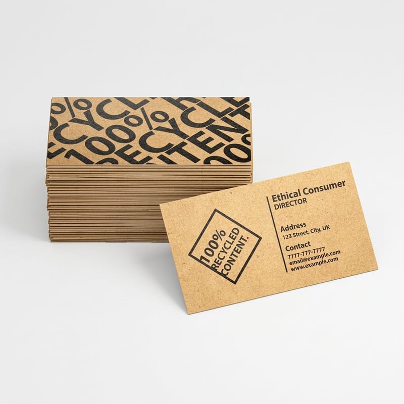
The point of a proof is to answer the questions a screen cannot: how the color sits on the stock, whether the type holds at the size you set it, and whether the finish you admired in a photograph is the finish you actually want. Business cards are the cheapest useful test because they carry type, color and finish in one small piece: 100 premium business cards start at $17.57 and print in 3 business days, which answers all three questions for under twenty dollars.
Quantity and price
Business card pricing and specs
Live configurator numbers, where the per unit cost drops as the run grows.
| Quantity | Price Per Unit | Total |
|---|---|---|
| 100 | 17.6¢ | $17.57 |
| 200 | 11.5¢ | $23.07 |
| 300 | 9.15¢ | $27.46 |
| 400 | 7.96¢ | $31.86 |
| 500 | 7.25¢ | $36.26 |
| 600 | 6.77¢ | $40.64 |
You can also earn coins on every order and redeem them against later printing, which makes a habit of proofing cheaper over a year than it looks on a single invoice.
From inspiration to ordered print
The gap between a saved image and a delivered box is four decisions: the format, the stock, the finish, and the quantity. Format comes from the job, and the reference only tells you whether a layout survives at that size. Stock and finish are where a design either gains the quality you admired in the photograph or loses it, and neither can be judged on a screen. Quantity is the cost lever, since unit price steps down as the run grows, so keep the first run small: 50 brochures on 100# gloss text for $57.11 or 50 postcards for $16.48, and scale once the design has proved itself.
Print it
Postcards, the cheap real-size test
Short runs at real trim size, so you can hold the layout before you commit to the campaign.

A practical sequence: rebuild the layout at final size, order the smallest run the format allows, look at it in the light the piece will live in, then fix what the paper showed you and order the campaign. It adds a few days and it removes the reprint. If the piece is a card or a folded item, our stylish business card examples and creative folded brochure designs are boards built around formats we print, so the sizes in them are real. For identity work in particular, the principles of logo design are worth a read before you borrow a mark you like.
Where to look, by project type
Different jobs reward different sites, so here is the shortlist by what you are making.
- Identity and stationery. Brand New for critique, Fonts In Use for the typeface, Behance for the full system. Test the result on real stock before the range is signed off.
- Posters and campaigns. The D&AD annual and Designspiration. Judge at final size on a wall, not at thumbnail size in a browser tab.
- Brochures and folded work. Behance case studies plus The Dieline for the folding logic. Pull the panel widths from a template, never from a reference photo.
- Packaging and labels. The Dieline and Packaging of the World, because both show the flat die as well as the finished shape.
- Stickers and merchandise. Dribbble and Designspiration are genuinely useful here, since the format really does live at thumbnail size.
From a reference to a file that prints
Once a reference has earned its place, a template is the fastest route from idea to file. The blank for a 4" x 6" postcard, for example, is a 4.25" x 6.25" file with the trim, the 0.125 inch bleed and the safety line already drawn, so your borrowed structure lands inside them. Start from a print-ready blank, or pick a full design from the template library and change what you need.
Start fast
From a reference to a file that prints
Blanks at the exact product size, so a layout you admired on screen lands inside the cut.









Wally turns a saved screenshot into a press-ready file
Keep the structure, rebuild the surface
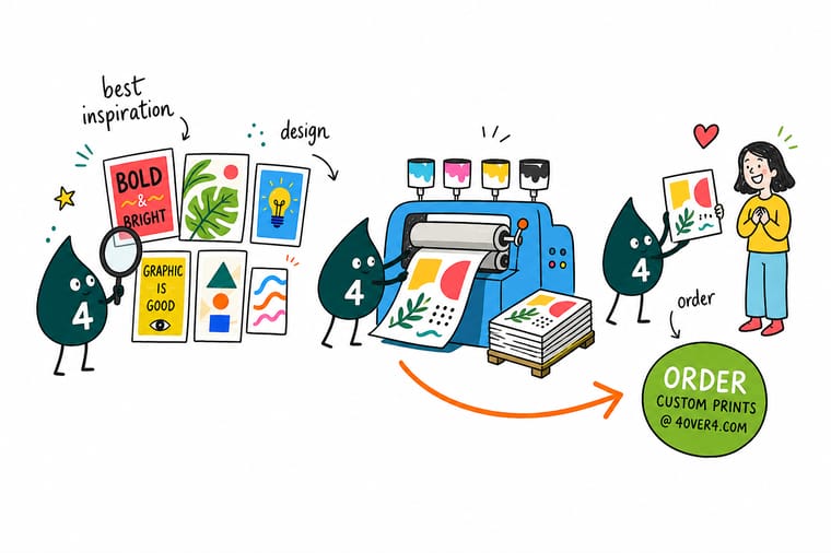
Take the grid, the hierarchy and the type pairing from your reference, then rebuild everything else. Set the document at final trim size, add 0.125 inch bleed on every side, convert to CMYK inside the layout file so you can see the shift, use rich black for large solids and 100 percent K for small type, and outline the fonts before you export. Then print one and look at it.
Order a test print →What to take from a feed and what to leave
Rules for borrowing well
- One sentence per save. Write why it works under every image you keep. The pieces that survive that test are references. The rest are a mood board.
- Steal structure, rebuild surface. Grids, hierarchy and type relationships travel. Artwork, photography and licensed fonts do not, and rebuilding forces you to understand the thing.
- Check the size before the color. Work out the final trim size first. It decides the resolution you need and whether a reference is usable at all.
- Convert color while you can still look at it. CMYK conversion inside the layout file lets you see the shift and correct it. A silent conversion at export gives you a surprise on paper.
- Print one before you print many. A single proof answers questions about stock, finish and scale that no gallery on the internet can settle.
Explore more
More ways to print and promote
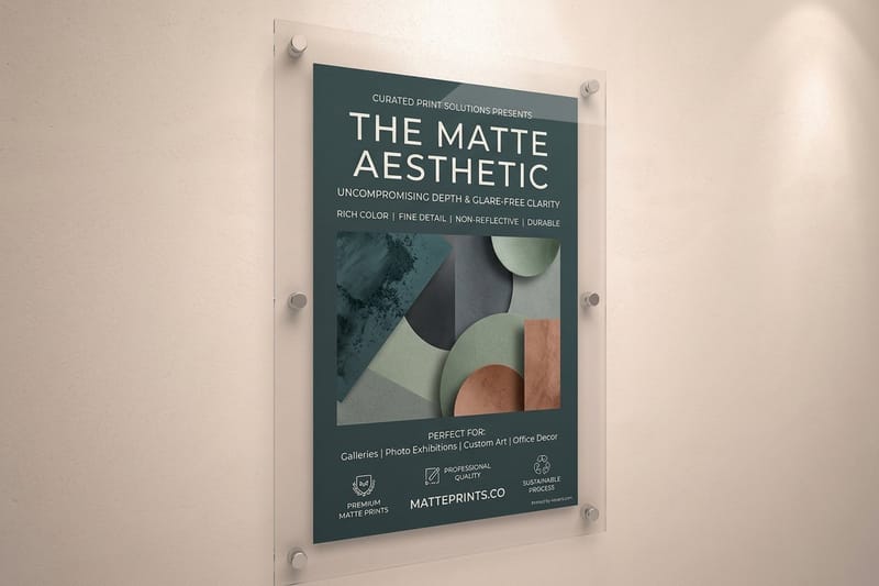
Die-cut stickers run 25 for $93.37 and matte posters print in 2 business days.
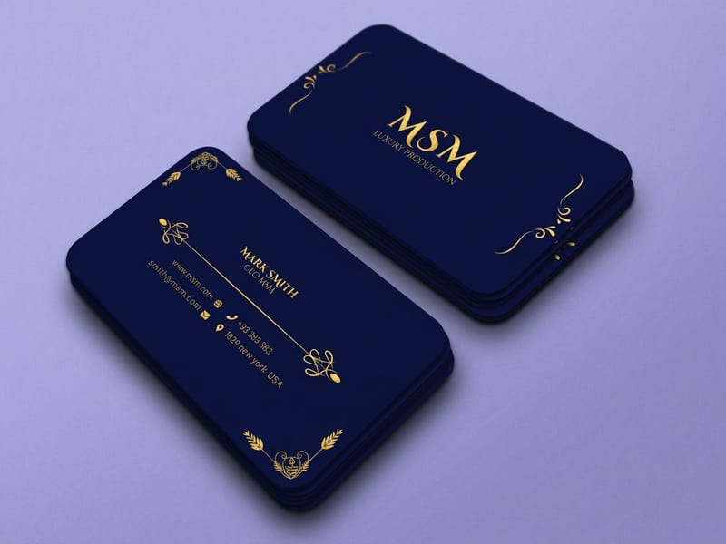 Product Premium Business Cards Test a borrowed layout on stock you can hand someone.
  Product Standard Postcards The cheapest way to see a design printed at real size. Product Standard Brochures Multi-panel layout where the fold carries the story. Product Matte Posters Large format without the glare that hides fine type.
  Guide Best Color Profile for Printing Which profile to convert into, and when to do it.
  Article 15 Creative Poster Ideas Poster directions built around sizes we actually print.
 Ready to print what you found?
Pick your format, drop in your file or start from a free template, and 4OVER4.COM prints it sharp on premium stock, as fast as your deadline needs.
Common questions about design inspiration sites
What is the best design inspiration site for a print project?
Fonts In Use, because it is the only large catalog that names the typeface in real printed work and files it by industry and format. That single fact turns a vague reference into something you can license and set the same afternoon. Behance is the best second stop for full case studies with grids and rejected routes, and The Dieline is the one to open for anything folded or wrapped. Pinterest is fine for loosening up and poor for working from, because attribution is usually gone by the time an image reaches you.
Why does a color I found online print differently?
A screen emits light and mixes red, green and blue, while a press lays down cyan, magenta, yellow and black ink onto paper that reflects light. The two ranges are not the same shape, and the colors that fall outside the CMYK gamut are almost always the ones designers save: electric blue, neon green, hot orange. Those get pulled back to the closest printable value, which usually reads duller and slightly gray next to the original. Convert to CMYK in your layout file so you can see the shift and correct it, and use a named spot ink when a brand color has to be exact.
Can I print an image I downloaded from a graphics site?
Almost never, for two separate reasons. The rights sit with the designer or photographer, and a gallery post is not a license, so reproducing the artwork is a legal exposure you carry rather than the printer. The second reason is practical: images published for the web are usually 72 dpi and around 1000 to 1600 pixels wide, which is about 4 to 5 inches at print resolution. Use the reference to understand a layout, then build your own artwork at final size with your own or properly licensed assets.
How do I find out which typeface a design uses?
Search Fonts In Use first, since the work may already be catalogued with the face named. If it is not, an image identifier such as WhatTheFont will get you close on a clean sample of lettering. Two cautions. Identifiers struggle with custom lettering and with heavily kerned logotypes, and a match is only the start, because you still need a license that covers the way you intend to use it. A standard desktop license generally does not allow sending the font file itself to a printer, which is one reason outlining type before you export is common practice.
How long should I spend looking for inspiration?
Set a limit before you start, because a graphics site has no natural end. Twenty to thirty minutes, ten saves, one written sentence per save is enough for most jobs, and the writing is the part that does the work. If you are still scrolling after an hour you are not researching, you are avoiding the first artboard. The useful next step is almost always to print something small and look at it, since a single proof answers more questions about scale, stock and finish than another hundred images will.
