
Postcard Design Ideas That Get Noticed, by Occasion and Industry


Nadia is our customer education voice, built from the knowledge of our production team, with over 20 years in printing.
Postcard design that gets noticed puts one message, one image and one action on a layout sized to a postage rate you chose on purpose: image and headline on the front, the offer on the left of the back, the address on the right. Every postcard design idea below is that formula applied by occasion and by industry, with the layouts, the image choices and the call to action placement that hold up once the card is printed rather than viewed on a screen. For a measured postcard example of each side, see the layout and anatomy guide.
Postcard design basics
- One message. The card asks for one thing; a second offer halves the response to the first.
- One image. A single photograph or illustration with a clear subject, never a collage.
- One call to action. A phone number, a code or a QR code, on the left of the back.
- A size tied to the postage rate. The postcard rate runs from 3.5 x 5 up to 4.25 x 6 inches; anything bigger mails at the letter price.
- A coating that takes a pen. Gloss on the front, uncoated on the back, so addresses and handwritten notes do not smear. Standard postcards start at $16.48 on 14pt card, with 16pt for sizes above 4.25 x 6.
Postcard design ideas you can use for any business
- 1. One strong image. Let the product, the storefront or one face fill the front edge to edge.
- 2. One offer. Make the number the biggest thing on the card and attach a deadline.
- 3. A large call to action. The phone number or code set big enough to read at arm's length.
- 4. A QR code. At least three quarters of an inch, pointed at a page that matches the card.
- 5. A back that works. Use the message area for the offer terms or a handwritten line, never a repeat of the front.
- 6. An oversized card. A 6 x 9 or 6 x 11 owns the stack when the offer is worth the letter postage.
Postcards come in both 4 x 6 and 5 x 7: 4 x 6 fits inside the postcard rate, while 5 x 7 mails at the letter price. Standard postcards start at $16.48 and soft touch at $29.44, so you can print both sizes and let the response decide.
Postcard design ideas by occasion
| Occasion | What goes on the front | What the headline does | The call to action | Product at 4OVER4 |
|---|---|---|---|---|
| Holiday and seasonal | One warm photo or one flat illustration, no collage | A greeting plus one reason to visit | A dated offer that expires in January | Christmas postcards, from $16.48 |
| Grand opening | The storefront itself, shot in daylight | The neighborhood name and the open date | Bring this card for the opening-week offer | Standard postcards, from $16.48 |
| Just listed and just sold | One exterior shot, no logo bigger than the house | Street name and the number that matters | Text for the sale figure on your street | Real estate postcards, from $16.48 |
| Restaurant and retail offer | One dish or one product, filling the frame | The offer in plain words, not a slogan | A code, a deadline, and the address | Soft touch postcards, from $29.44 |
| Appointment reminder | Nothing. Type and white space read faster | The patient action, not the practice name | Call or scan to book, with the window stated | Uncoated or matte standard postcards |
| Fundraiser and campaign | One face, one caption, high contrast | The single ask, with the amount | A QR to the donation page, nothing else | Direct mail postcards, from $89.68 |
Every row assumes the same discipline: one subject on the front, one action on the back, and a deadline attached to the offer. For the offer rows, a 4.25 x 6 card on 14pt stock keeps the postcard rate; step up to 16pt when you go to 6 x 9. You can order standard postcards in any of these sizes straight from the configurator, or browse the full range at postcard printing.
What makes a postcard get read

A postcard that gets noticed says one thing, shows one image, and asks for one action. That is the whole formula, and the reason most cards fail is that they carry three offers, a logo, a mission statement and a QR code fighting for the same three seconds at the mailbox.
Start by deciding what the card is for. A reminder, an invitation, an offer and an announcement are four different pieces, and each one wants a different front. A reminder wants type and air. An invitation wants a date the size of a headline. An offer wants the number to be the biggest thing on the card. An announcement wants a photograph that explains itself without a caption.
Then design the front and the back as a pair, not as two separate jobs. The front earns the flip, and the back closes. If the back repeats the front, you have wasted half the card. Our breakdown of postcard anatomy covers what belongs on each face before you start moving boxes around.
The size decision is really a postage decision
The USPS postcard price applies to a card between 3.5 x 5 inches and 4.25 x 6 inches, rectangular, and within the thickness range for the rate. Cross that ceiling by a quarter inch and the piece mails at the letter price instead. Larger still, and it becomes a flat.
This is not a reason to always print small. A 6 x 9 or 6 x 11 card owns the stack in a way a 4.25 x 6 never will, and for a high-value offer the extra postage per piece is cheap against the response. The mistake is choosing 5 x 7 because it looked good on screen and discovering the postage difference after the run is printed. Decide the rate first, then design to the size that rate allows. Postcard mailing dimensions and USPS requirements lays out the tiers.
Coating decides whether anyone can write on it
A gloss aqueous or UV coating makes photos snap and protects the card through the mail stream, and it also repels ballpoint ink and inkjet addressing. If you plan to hand-write a note, stamp a date, or address the cards on an office printer, choose uncoated or matte. This catches people out more than any other print decision on postcards.
The safe middle ground is a gloss front and an uncoated back, which most postcard runs support. Photos stay rich on the face, and the address side takes pen and inkjet without beading. Ask for it explicitly when you order, because a full-gloss both sides card cannot be undone after printing.
Design ideas that work by occasion

Below are directions that consistently pull, grouped by the occasion that triggers the mailing. None of them need a big budget: standard postcards start at $16.48, which makes it cheap to print two versions and let the response tell you which front works.
The pattern across all of them is the same. One image with a clear subject, a headline that names the reader’s situation rather than your company, and a call to action with a deadline attached.
Holiday, seasonal and celebration cards
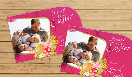
One warm image, no collage. A single photograph or one flat illustration reads at arm’s length. Four small images arranged in a grid read as a brochure and get treated like one. Christmas postcards start at $16.48, so a two-version test costs almost nothing.
Put the date where the eye lands first. For an event card, the date is the headline. Everything else is a subhead, including the name of the event.
Give the season an expiry. A holiday card with no deadline gets filed. A holiday card with an offer that ends on 15 January gets kept on the fridge until then, which is four weeks of free exposure.
Use a texture the eye cannot get on screen. A soft touch postcard at $29.44 is the cheapest way to feel expensive in a stack of gloss. Just know the trade-off: soft touch shows fingerprints and scuffs on large dark solids, so keep heavy black coverage off the front.
Real estate, home services and trades
Let the property be the whole front. A full-bleed exterior shot in daylight, with the agent photo small on the back, outperforms the reverse arrangement almost every time. Real estate postcards start at $16.48.
Name the street. "Just sold on Marchmont Road" beats "Just sold in your area" because the reader can check it. Specificity is what makes a farming card credible.
For trades, lead with the season. A furnace tune-up card mailed in September and a drain card mailed after the first heavy rain both work because they arrive when the problem is on the reader’s mind, not when your calendar said to mail.
Leave a writable strip. An uncoated back with room for a handwritten line converts far better on a farming route than a fully designed back. See these realtor postcard angles for wording that avoids sounding like a form letter.
Restaurants, retail and local services
One dish, filling the frame. Food photography loses impact the moment it competes with a menu list. Show one thing well, and put the menu on the back if it must appear at all.
Make the offer the largest element. If the card exists to move a two-for-one, then "two for one" is the headline and the restaurant name is the signature. Brands resist this and it costs them response.
Cut a shape when the shelf is crowded. A die-cut postcard at $34.05 costs roughly twice a rectangle and is the single most reliable way to stop looking like everything else in the stack. Check the mailing rules first, because non-rectangular pieces can lose the postcard rate.
Print a code you can actually count. A unique code or a QR to a landing page tells you which mailing worked. A generic "mention this ad" tells you nothing.
Nonprofit, political and community mail
One face and one caption. Faces stop the flip. A caption under a face gets read at a far higher rate than a paragraph in the middle of the card.
State the ask with a number. "$40 feeds a family for a week" is an ask. "Support our mission" is not.
Keep the back clean for the barcode zone. Political and nonprofit mail often runs in volume, and the fastest way to delay a drop is artwork sitting in the clear zone. The address side layout rules cover exactly what has to stay empty.
Mail it as a managed drop. Direct mail postcards from $89.68 include the mailing, which removes the sorting, the postage forms and the trip to the post office from your week.
Images, type and the call to action
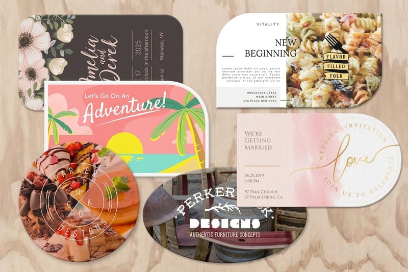
Once the idea is chosen, three craft decisions decide whether it lands: the image, the type, and where the call to action sits. Everything else is preference.
Images first. Postcards print in CMYK, and a photograph that glows on a backlit screen will sit a little darker and a little flatter on paper. Bright saturated blues and vivid greens shift the most. Pick images with a clear subject and honest contrast, avoid anything that relies on a neon accent, and never scale a small web image up to fill a 6 x 9 front.
Type second. On a coated stock, reversed white type under about 8 points starts to fill in where the ink spreads slightly. Keep small reversed text out of the design, or set it on an uncoated stock where the effect is gentler. Bigger and fewer beats smaller and more on a piece read at arm’s length.
Where the call to action belongs
Put the primary action on the message side of the back, in the upper left area, because the address block and the barcode clear zone own the right and the bottom. That leaves a defined block of usable space, and designing into it deliberately is easier than discovering it during preflight.
Repeat the action on the front only if it can be short. A phone number or a single line works. A full offer repeated twice makes the card feel like a leaflet.
If you use a QR code, give it a light quiet zone around all four sides, keep it around three quarters of an inch or larger, and point it at a page that matches the card. A code that lands on a generic homepage teaches people not to scan your codes again. Adding a QR code to a postcard walks through the placement.
When a finish earns its price and when it does not
Spot UV puts gloss on selected areas of a matte card, and the effect is genuinely striking on a logo or a single word. It also starts at $190.02 on spot UV postcards against $16.48 for a standard card, so it belongs on a high-value mailing to a short list, not on a 5,000 piece route drop.
Folded postcards from $84.36 give you four panels instead of two, which suits a menu, a schedule or a multi-property sheet. They need a tab or wafer seal to travel through the mail, so budget for that before you commit. Folded versus flat postcards compares the two honestly.
How to lay out the front and back of a postcard
The front sells and the back closes. Put the image, the headline and the offer on the front, and split the back into two areas: your message on the left, the delivery address and postage on the right. The USPS rules that shape this layout are simple: a rectangular card from 3.5 x 5 up to 4.25 x 6 inches mails at the postcard rate, and the address side keeps its clear zones free of artwork.
- Front. One image to the edge with 0.125 inch bleed, a headline that names the reader's situation, and the offer as the largest type.
- Back, left side. The message, the call to action in the upper left, and the offer terms.
- Back, right side. The postage area at the top right, the address block below it, and the barcode clear zone along the bottom right.
- Stock. 14pt card for a 4 x 6 or 4.25 x 6, 16pt above that so the card stays flat in the stack; standard postcards start at $16.48.
Postcard pricing and specs at 4OVER4.COM
A two-front test on this page costs little: standard postcards start at $16.48 on 14pt card, soft touch at $29.44, and spot UV at $190.02, which is why the finish belongs on a short list of warm prospects rather than a route drop. The numbers below come straight from the live configurator for standard postcards.
Quantity and price
Postcard pricing and specs
Real configurator numbers on standard postcards, where a larger run drops the per unit cost.
| Quantity | Price Per Unit | Total |
|---|---|---|
| 50 | 33.0¢ | $16.48 |
| 100 | 24.2¢ | $24.16 |
| 200 | 15.9¢ | $31.86 |
| 300 | 12.8¢ | $38.45 |
| 400 | 11.3¢ | $45.04 |
| 500 | 10.3¢ | $51.62 |
You can also earn coins on every order and redeem them against future printing, which stretches a mailing budget across one more drop.
Stock and finish, and how they change the design
Stock changes what the artwork can do. A 14pt card is the standard weight for postcards and feels substantial in the hand; 16pt is noticeably more rigid and is worth the step up on anything above 4.25 x 6 inches, where a thinner card bends in the stack. Uncoated stock absorbs a little more ink, so photographs sit softer and type stays crisp, which is exactly the trade you want on a reminder card. Read the full breakdown in our postcard paper and cardstock guide.
Print it
Standard postcards, ready to mail
Preset sizes on 14pt and 16pt stock, the fastest route from artwork to mailbox.

Finish changes both the look and what the card can survive. Gloss lifts color and photography and shrugs off handling in the mail stream. Matte cuts glare and reads easier under bright light. Soft touch adds a velvet surface that gets noticed before the card is read, at the cost of showing fingerprints on large dark solids. Uncoated stays writable, which matters more than most designers expect. If the card is going out as part of a managed drop rather than from your own office, direct mail postcards from $89.68 include the mailing itself.
What to put on the card, by industry
The formula holds across industries, but what fills each slot changes by business type.
- Real estate agents. Full-bleed property photo on the front, street named in the headline, uncoated back so a handwritten line is possible. Farm the same route on a schedule rather than mailing once.
- Restaurants and cafes. One dish filling the frame, the offer as the headline, and a trackable code. A soft touch finish separates you from the gloss stack without changing the artwork.
- Dental, medical and veterinary. Reminder cards want type and white space, not imagery. Uncoated or matte so the front desk can write the appointment on the card by hand.
- Home services and trades. Mail to the season, not the calendar. One service per card, a before and after image if you have a real one, and a phone number large enough to read from a driveway.
- Nonprofits and campaigns. One face, one caption, one ask with a number attached. Keep the address side clear for the barcode zone so a volume drop does not get held.
- Retail and e-commerce. A die-cut shape or an oversized format to win the stack, plus a code that ties the response back to the mailing so you can measure it.
Blanks that remove the two costly mistakes
If you are not starting from a blank artboard, a template removes the two mistakes that cost the most time: artwork that misses the 0.125 inch bleed on all four sides, and copy that sits inside the barcode clear zone at the bottom right of the back. Build on it at 300 DPI in CMYK. 4OVER4.COM sizes its blanks to exact product specs, so grab a print-ready blank from the blank template library with bleed, trim and the address zones already marked.
Start fast
Postcard templates and print-ready blanks
Blanks that keep the bottom right of the address side clear for the barcode.

Wally lays out a postcard that actually gets read
One message on the front, the fixed zones planned on the back
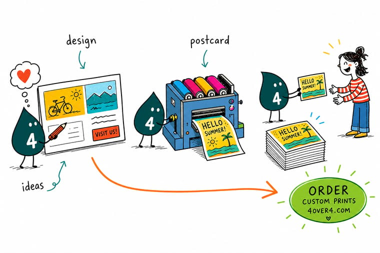
Design the front around a single subject and a headline that names the reader’s situation. On the back, place the address block and the barcode clear zone first, then write into the space that is left. Add 0.125 inch bleed on all four sides, build at 300 DPI in CMYK, and keep reversed white type above 8 points so it does not fill in on a coated stock.
Order postcards →What wins the three seconds you get
Design rules that hold at every size
- One message per card. If you can name two things the card is asking for, cut one. A second offer does not double the response, it halves the first one.
- Design the back first. The address block and the barcode clear zone are fixed. Lay them in before the copy, and the back stops needing a redesign at preflight.
- Check the postage before the size. The postcard rate stops at 4.25 x 6 inches. Pick the rate you want to pay, then design to a size that qualifies for it.
- Keep reversed type large. White text under about 8 points fills in on a coated stock. Set small type dark on light, or move to an uncoated sheet.
- Test two fronts, one list. Split the same mailing list across two front designs with different codes. One mailing tells you more than a year of opinions.
Explore more
More ways to print and mail
Christmas and real estate postcards both run 50 for $16.48 in 3 business days.
Product Standard Postcards The workhorse format, from $16.48 with gloss or uncoated backs. Product Die-Cut Postcards Cut to your shape when a rectangle disappears in the stack. 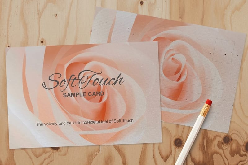 Product Soft Touch Postcards A velvet surface that feels expensive before it is read.
 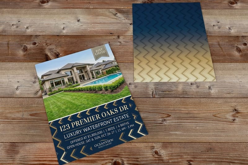 Product Real Estate Postcards Just listed and just sold cards sized for route mailing.
 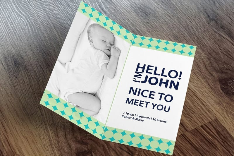 Product Folded Postcards Four panels for a menu, a schedule or a property sheet. Category Postcard Printing Every size, stock and finish we print, in one place.
  Guide How to Design a Postcard The step by step version of everything on this page.
  Article 10 Postcard Examples for Small Businesses Real cards worth stealing structure from.
 Ready to print your postcards?
Pick your size, drop in your design or start from a free template, and 4OVER4.COM prints it sharp on 14pt or 16pt stock, as fast as your drop date needs.
Common questions about postcard design
What size postcard should I print?
Choose the postage rate first, then the size. The USPS postcard price applies to a rectangular card from 3.5 x 5 inches up to 4.25 x 6 inches within the thickness range for that rate, so 4.25 x 6 is the largest card that still mails at the cheapest price. Above that the piece mails at the letter price, and 6 x 9 and 6 x 11 formats sit there. Bigger cards do get noticed more in a stack, so the honest way to decide is to weigh the extra postage per piece against the offer value. For a high-ticket service, an oversized card usually pays for itself. For a monthly reminder to a large list, stay inside 4.25 x 6. Before you pick a postcard format, check where the message, address and stamp sit on the back.
Should the postcard front carry the offer or the image?
It depends on what the card is for. If the card exists to move a specific offer, make the offer the largest element on the front and let the brand sign the bottom. If the card exists to announce something visual, a property, a dish, a new store, let the image own the whole front and put the offer on the back. What does not work is splitting the front between a medium sized photo and a medium sized headline, because neither one wins and the card reads as busy at arm’s length. Pick which job the front is doing and commit to it.
Can I write on a printed postcard by hand?
Only on an uncoated or matte surface. A gloss aqueous or UV coating repels ballpoint and inkjet ink, so a handwritten note smears and an office printer running the address side produces streaks. If you are addressing in-house, hand-signing, or stamping a date, order the card with an uncoated back. A gloss front with an uncoated back is the usual compromise: photographs stay rich on the face, and the address side takes pen and inkjet cleanly. Say it at order time, because a coating cannot be removed after printing.
What is postcard style?
Postcard style is the layout a mailed card follows: an image or headline side on the front, and a back split into a message area on the left and the address, postage and barcode zone on the right. Most postcard style cards run 4 x 6 inches on 14pt card, inside the postcard rate that ends at 4.25 x 6, and standard postcards start at $16.48 at 4OVER4.COM.
How much of the postcard back has to stay empty?
The address side has to keep space for the delivery address block and a clear zone at the bottom right for the USPS barcode, plus the postage area at the top right. In practice that leaves the left portion of the back as your usable message area, which is why laying the fixed zones in before you write the copy saves a redesign. Our postcard address side layout guide sets out the areas in detail, and every 4OVER4.COM postcard blank template already has them marked so your artwork lands in the right place.
Is a die-cut or specialty finish worth the extra cost?
It depends entirely on the list size and what a response is worth to you. Die-cut postcards at $34.05 run roughly twice a standard card at $16.48, and spot UV starts at $190.02. On a 250 piece mailing to warm prospects where one job is worth thousands, the extra spend is trivial and the card gets kept. On a 5,000 piece route drop with a low-value offer, the same money is better spent mailing more people twice. One caution on shape: a non-rectangular piece can lose the postcard rate, so confirm the mailing class before you commit to an unusual cut. Flip through the custom shaped postcards story, or watch the die-cut postcards video overview, before you pick a shape.
How do I know which postcard design actually worked?
Put a different tracking code or a different QR destination on each version and split one mailing list between them. Same list, same drop date, same offer, two fronts. Two weeks later the codes tell you which design pulled, and that answer is worth more than any opinion in the room. Keep everything else identical or you will not know what caused the difference. Most brands skip this because it feels like extra work, and then keep guessing for years.
