Event Program Design Examples to Inspire Your 2026 Events
Event Program Design Examples That Actually Drive Results
Event program design examples show you how to turn a basic schedule into a strategic brand tool that guides attendees, builds anticipation, and leaves a lasting impression. With 150,000+ businesses trusting 4OVER4 for their print needs and 10 billion+ cards printed across 25+ years, the team knows what makes printed collateral work. 4OVER4 offers 1,000+ products - including booklets, catalogs, and event materials - so your program can match the scale and style of any occasion.
An event program isn't just a sheet of paper with times on it. It's the first physical thing your attendees hold. That moment matters. A flimsy, poorly designed program tells people you didn't care enough to get the details right. A sharp, well-structured one says the opposite. It says: this event was planned with intention, and you're in good hands.
"We printed tri-fold programs for our annual fundraiser gala, and the response was incredible. Guests kept them as keepsakes. The paper quality made all the difference." - Rachel K., Event Director
This guide breaks down real event program design examples across different event types. You'll see what works, why it works, and how to apply those strategies to your own projects. Whether you're planning a product launch, a wedding, a corporate conference, or a community festival, these examples give you a concrete starting point - not vague advice.
For each example, we'll dig into the specific design choices, content strategies, and layout decisions that make them effective. You'll walk away knowing how to:
- Match your program's design to your event's goals and audience expectations.
- Structure information so attendees actually read it - not just glance and toss it.
- Use branding elements that reinforce your message without overwhelming the layout.
- Turn a passive handout into something that drives action, like scanning a QR code or visiting a booth.
Ready to see what strong event program design looks like in practice? Let's get into it. And if you want to bring any of these ideas to life, you can explore these program booklets on 4over4.com for a range of formats and paper options.
Product Launch Programs: Building Hype on Paper
A product launch event program is a sales tool disguised as a schedule. Its job isn't just to tell people when things happen. It needs to build anticipation, frame the product as the solution to a real problem, and push attendees toward a specific action - whether that's pre-ordering, signing up, or sharing on social media.
The best product launch programs mirror a narrative arc. They open with a problem or market gap. They build tension. They deliver the reveal. And they close with a clear, urgent call-to-action. Every design choice - from typography to paper weight - supports that arc.
What Makes a Product Launch Program Work
Think about the classic Apple keynote approach. The program is intentionally minimal. High-quality imagery. Short, benefit-driven copy. A schedule that builds to a crescendo. The design feels premium because every element earns its place on the page.
- Content focus: The language sells outcomes, not specs. It tells attendees what the product lets them do, not just what it is.
- Design and layout: Clean, uncluttered pages with generous white space. Bold, modern typography. The program itself feels like a product - something you want to hold onto.
- Pacing: The schedule alternates between major announcements, live demos, and partner showcases. This prevents fatigue and keeps energy high throughout.
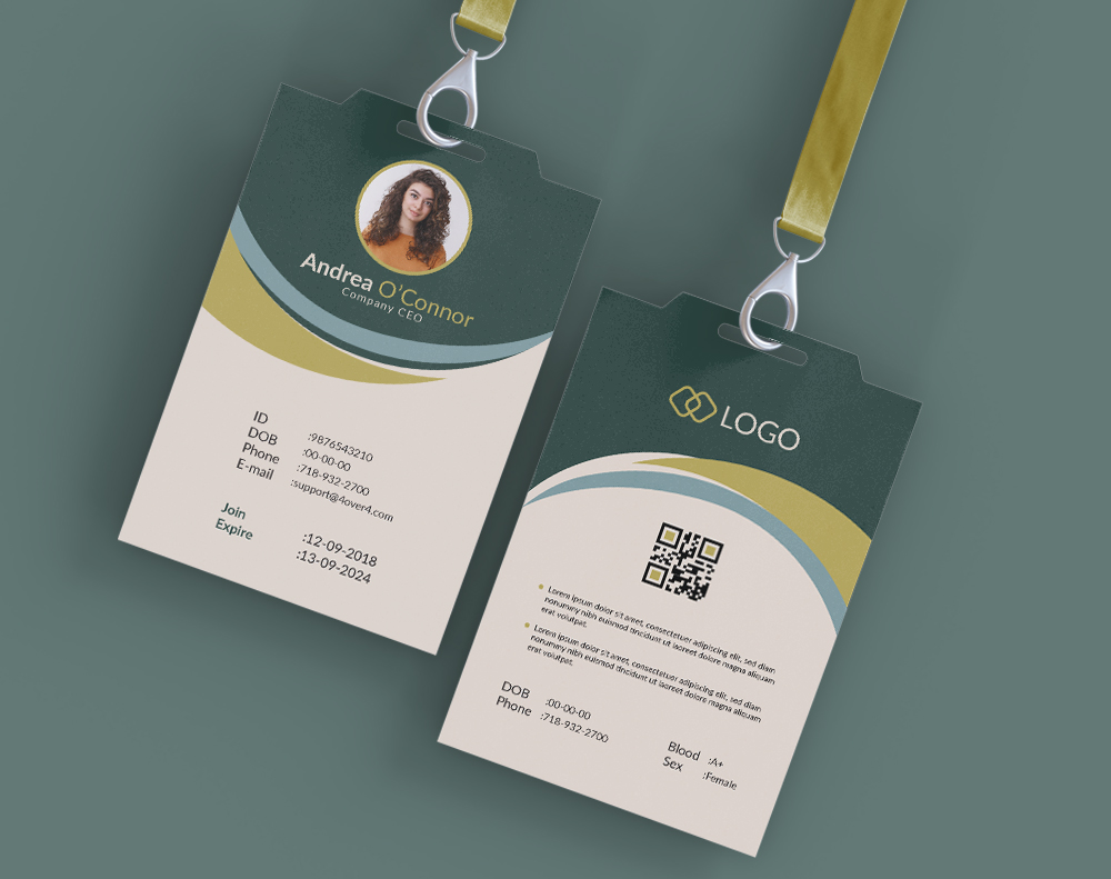
If you're designing printed materials for a launch, consider pairing your program with Printed Event Badges to create a cohesive brand experience from the moment attendees check in.
Tactics You Can Steal
To create a product launch program that generates real buzz, focus on these moves:
- Create information gaps: Use teaser headlines like "Unveiling the Future of X" or "A Feature That Changes Everything." Curiosity keeps people in their seats.
- Embed a clear CTA: Include a QR code for pre-orders, a link to an event-exclusive landing page, or instructions for a hands-on demo. Tell people exactly what to do next.
- Use lifestyle visuals: Don't just show the product on a white background. Show it in context - in someone's hands, on a desk, solving a real problem.
Conference and Summit Programs: Guiding Hundreds of Decisions
Conference programs face a unique challenge. Your attendees aren't sitting in one room watching one presentation. They're choosing between multiple tracks, sessions, workshops, and networking events - sometimes happening simultaneously. Your program needs to be a wayfinding tool, a decision-making aid, and a brand statement all at once.
The best conference event program design examples use clear visual hierarchy, color-coding, and intuitive layouts to help attendees handle complex schedules without frustration. They reduce cognitive load. When someone glances at the program between sessions, they should find what they need in seconds.
Design Strategies for Multi-Track Events
Color-coding is your best friend here. Assign a distinct color to each track or theme. Use that color consistently across the program - in headers, sidebar tabs, and session blocks. This creates an instant visual shorthand that attendees learn within minutes.
Typography matters too. Use a clear hierarchy: event name in the largest type, track names in medium weight, session titles in bold, and speaker names and descriptions in regular weight. Don't make attendees work to figure out what's important.
- Maps and floor plans: Include a simple venue map with room numbers that match the schedule. This single addition can cut "Where is Room 204?" questions by half.
- Speaker bios: Keep them short - two to three sentences max. Include a headshot and their session title. People want to know who's speaking and why they should care, not read a full CV.
- Sponsor integration: Place sponsor logos strategically, not in a cluttered grid at the back. Weave them into relevant sections - a tech sponsor next to the tech track, for example.
For design inspiration beyond event programs, check out these Graphic Design Portfolio Examples to see how professionals handle complex visual layouts.
Wedding and Ceremony Programs: Elegance Meets Function
Wedding programs sit at the intersection of personal expression and practical communication. They tell guests the order of the ceremony, introduce the wedding party, and often share the couple's story. But they also set an emotional tone. The paper, the typography, the colors - every detail contributes to the atmosphere before the first note of music plays.
Strong wedding event program design examples balance beauty with clarity. A gorgeous program that nobody can actually read defeats the purpose. The best ones use elegant fonts that remain legible, layouts that guide the eye naturally, and paper stocks that feel special in the hand.
What Sets Great Wedding Programs Apart
Paper choice is everything. A textured, heavyweight stock - like a linen or cotton finish - instantly communicates quality. Guests notice the difference between a program printed on standard copy paper and one printed on a sturdy, rich-feeling stock. That tactile moment sets expectations for the rest of the event.
Layout-wise, simplicity wins. A single fold or tri-fold format works for most ceremonies. Put the order of events on the inside panels, the wedding party on one side, and a personal note or thank-you on the back. Don't overcrowd. White space isn't wasted space - it's breathing room.
If you're working on wedding stationery and want to explore other printed pieces, you might find useful ideas in these Diy Greeting Card Design Ideas for matching your aesthetic across all your printed materials.
Fundraising Gala Programs: Driving Donations Through Design
A fundraising gala program has a dual mission. It needs to inform attendees about the evening's schedule - the dinner, the speakers, the auction - while simultaneously inspiring them to give generously. Every page should reinforce the cause, build emotional connection, and make donating as easy as possible.
The most effective gala event program design examples weave storytelling throughout the entire booklet. They don't just list auction items. They tell the stories of the people or communities that donations will help. They use photography, pull quotes, and impact statistics to create an emotional through-line from cover to cover.
Turning a Program Into a Fundraising Tool
Include a QR code on every spread that links directly to your online donation page. Don't make people search for it. Place it where eyes naturally land - near the bottom of a page, next to an impact story, or alongside the auction catalog.
- Impact numbers: Use bold, large-format statistics. "Last year, your donations provided 12,000 meals." Numbers are concrete. They make the cause feel real and achievable.
- Testimonials: A short quote from someone who benefited from the organization's work is worth more than a paragraph of mission-statement language.
- Auction catalog: If you're running a silent or live auction, dedicate clean, well-organized pages to the items. Include photos, descriptions, starting bids, and clear instructions for how to bid.
Organizations focused on sustainability should consider 4OVER4's Green Printing options. Eco-friendly paper stocks and processes let you align your printed materials with your mission.
Music Festival and Concert Programs: Bold, Visual, Unforgettable
Music festival programs need to match the energy of the event itself. These aren't quiet, refined booklets. They're bold, colorful, and designed to be carried around in back pockets and tote bags all day. Durability matters as much as design.
The best festival event program design examples use striking graphics, oversized typography, and bright color palettes. They're part schedule, part art piece. Many attendees keep them as souvenirs long after the last encore.
Design Priorities for Festival Programs
Readability in outdoor conditions is a real concern. Use high-contrast color combinations - dark text on light backgrounds or bold white text on dark backgrounds. Avoid subtle gradients or low-contrast pairings that wash out in sunlight.
Format matters too. A compact, pocket-sized program works better than a full-size booklet when your audience is standing in a field. Consider a fold-out map on one side and the schedule on the other. Practical and visually engaging.
For outdoor events, pair your programs with Custom Event Tents to create a branded experience that extends well beyond the printed page.
Corporate Training and Workshop Programs: Clarity Above All
Training and workshop programs serve a fundamentally different purpose than event programs for galas or festivals. Here, the program is a working document. Attendees will write on it, flip back to it during sessions, and reference it after the event. Design needs to prioritize usability over flash.
Effective workshop event program design examples include space for notes, clearly delineated session blocks, and practical information like Wi-Fi passwords and lunch options. They're tools, not decorations.
Functional Design Choices
- Note-taking space: Leave ruled or dotted lines next to each session description. Attendees will use them - and they'll associate that usefulness with your brand.
- Session objectives: Under each session title, include two to three bullet points explaining what attendees will learn. This helps people prioritize which sessions to attend.
- Resource links: Include QR codes or short URLs linking to presentation slides, supplementary materials, or post-event surveys.
For more ideas on how printed materials can support professional branding, take a look at these Classy Business Card Design Inspiration examples.
Community and Cultural Festival Programs: Celebrating Identity
Community festival programs celebrate local culture, heritage, and identity. They're often the most personal type of event program because they reflect a specific community's character. The design should feel authentic - not corporate, not generic, but rooted in the traditions and aesthetics of the community it represents.
These event program design examples often incorporate local artwork, cultural motifs, and bilingual or multilingual content. They serve as both a practical guide and a celebration of the community itself.
Designing for Community Connection
Work with local artists for illustrations or cover art. This adds authenticity and gives the program a unique visual identity that stock photography can't match. It also supports the community you're celebrating.
If your event serves a multilingual audience, plan your layout accordingly from the start. Don't treat translation as an afterthought. Give each language equal visual weight and ensure the layout works in both directions if you're including right-to-left scripts.
Stickers and branded materials can extend the community feel beyond the program itself. Check out these Logo Sticker Design Ideas for creative ways to build brand recognition at your event.
Charity Run and Sporting Event Programs: Action-Oriented Design
Sporting event programs need to be quick to scan, durable enough to survive being stuffed in a gym bag, and packed with practical information. Route maps, start times, safety information, sponsor acknowledgments - it all needs to fit without feeling cramped.
The strongest sporting event program design examples use bold numbering, clear section dividers, and high-contrast layouts. They're designed for people who are on the move - literally.
Practical Design Tips for Active Events
- Route maps: Make them large, clear, and color-coded. Include distance markers, water stations, and medical aid points.
- Emergency information: Put it on the back cover where it's easy to find fast. Include phone numbers, first aid locations, and weather contingency plans.
- Participant lists: If applicable, include bib numbers and names. For charity runs, consider listing fundraising milestones to inspire friendly competition.
Award Ceremony Programs: Prestige on Every Page
Award ceremony programs carry a sense of occasion. They honor achievement, and the program itself should feel like part of that honor. Recipients often keep these programs for years. The design needs to reflect the prestige of the event and the significance of the recognition being given.
Premium paper stocks, foil accents, and refined typography are hallmarks of strong award ceremony event program design examples. These aren't the place for playful fonts or casual layouts. They demand a polished, sophisticated approach.
Elevating the Award Experience Through Print
Use a heavier paper stock - something with real weight in the hand. A velvety, smooth finish or a subtle texture communicates quality before anyone reads a single word. Metallic foil on the cover, even just for the event logo or year, adds a layer of prestige that digital printing alone can't replicate.
Inside, give each award category its own spread. Include the nominees, a brief description of the award's criteria, and space for the winner's name (if announced during the event, some programs leave this as a reveal). High-quality headshots of nominees add a personal touch.
For unique or complex program designs that go beyond standard formats, 4OVER4's Custom Projects team can help bring your vision to life with specialty finishes and custom sizes.
What Ties All Great Event Programs Together
Across every example we've covered - from product launches to award ceremonies - a few principles hold constant. Great event program design examples share these traits regardless of event type:
Clear visual hierarchy. The most important information is always the easiest to find. Headlines are larger than body text. Key times and locations stand out. Nothing competes for attention.
Intentional paper and finish choices. The physical feel of the program matches the tone of the event. A gala demands thick, textured stock. A festival can get away with something lighter and more playful. The paper is part of the message.
A reason to keep it. The best programs become keepsakes. Whether it's through beautiful design, personal storytelling, or practical post-event value (like resource links or discount codes), give attendees a reason not to throw it away.
A clear next step. Every program should tell the reader what to do - visit a booth, scan a code, make a donation, share a photo with a hashtag. Don't leave the next action to chance.
For more creative print inspiration, browse these Funny Print Ad Examples to see how bold design choices grab attention and stick in memory.
Here are some ready-to-use templates to help you get started with your own event program design:
If you prefer to start from scratch with a clean layout, these blank templates give you full creative control:
Blank Templates


Don't just take our word for it. Here's what customers have said about printing their event programs with 4OVER4:
"Ordered event program design examples from 4OVER4 and the quality blew me away. Sharp colors, premium feel, arrived 2 days early."
"Been using 4OVER4 for event program design examples for a year. Consistent quality every time. The online designer made it easy."
"Switched to 4OVER4 and saved 40% on event program design examples. Better quality than my old printer. 60+ paper options."
"4OVER4's event program design examples helped us look more professional. Clients notice the difference."
What to Remember About Event Program Design
- Design for function first. Every event program design example that works well prioritizes usability. Attendees need to find information fast - clear hierarchy, color-coding, and intuitive layouts make that happen.
- Match paper to purpose. A thick, textured stock suits galas and award ceremonies. A compact, durable format works for festivals and sporting events. The physical feel sets expectations before anyone reads a word.
- Include a clear call-to-action. QR codes, donation links, pre-order pages, social media hashtags - every program should guide attendees toward a specific next step.
- Tell a story. The most memorable programs weave narrative throughout. Impact statistics, testimonials, and personal stories turn a schedule into something people keep.
- Print quality matters. With 10,000+ reviews and a 4.8/5 star rating, 4OVER4 delivers the kind of print quality that makes your event program a keepsake, not trash. Pair your programs with Custom Event Tickets for a fully branded attendee experience.
| Program Type | Implementation Complexity 🔄 | Resource Requirements ⚡ | Expected Outcomes 📊 | Ideal Use Cases 💡 | Key Advantages ⭐ |
|---|---|---|---|---|---|
| Product Launch Event Program | High - requires detailed planning and live execution | High - venue, tech, production, and logistics costs | Immediate media attention, brand credibility, direct feedback | Introducing new products with high impact and exclusivity | Generates buzz, exclusivity, direct audience feedback |
| Conference and Summit Program | Very High - complex logistics with many sessions | Very High - multiple speakers, venue, digital platforms | Industry leadership, networking, revenue generation | Professional development, industry knowledge sharing | Thought leadership, strong networking, content repurposing |
| Awards and Recognition Ceremony | High - nomination process and formal event setup | High - venue, production, staging costs | Prestige building, media coverage, stakeholder relations | Celebrating achievements and industry recognition | Builds credibility, aspirational goals, media exposure |
| Fundraising Gala Program | High - event coordination and donor engagement | High - catering, entertainment, auction management costs | Significant fundraising, donor relationship strengthening | Charitable fundraising and awareness campaigns | Raises funds, emotional donor connection, recurring revenue |
| Trade Show and Exhibition Program | High - booth setup, demonstrations, staffing | High - booth costs, staff travel and accommodation | Direct customer interaction, competitive insights | Industry showcasing, lead generation | Face-to-face prospecting, industry concentration |
| Workshop and Training Program | Moderate to High - content and facilitator dependent | Moderate - expert facilitators, materials, venue | Skill development, participant engagement, reputational gain | Professional or personal skill enhancement | High engagement, premium pricing, expertise building |
| Networking Event Program | Low to Moderate - structured but flexible format | Low to Moderate - venue, facilitation tools | Relationship building, business development | Professional connection events, community building | Cost-effective, flexible, creates sustained connections |
- Align your program's design with specific event goals.
- Structure information for maximum clarity and impact.
- Incorporate branding elements that resonate with your audience.
- Use your program to guide attendees and encourage specific actions.
- Content Focus: The language avoids technical jargon, instead emphasizing what the new product allows the user to do. It sells a lifestyle or a solution, not just a set of features.
- Design & Layout: The layout is clean and uncluttered, using negative space to make key information pop. The typography is bold and modern, reflecting the brand's innovative identity. The program feels premium and exclusive.
- Pacing & Flow: The schedule is meticulously planned to hold attention. It intersperses major announcements with live demos, expert testimonials, and partner showcases, preventing attendee fatigue and maintaining momentum.
- Create an "Information Gap": Tease features or announcements within the program with intriguing titles like "Unveiling the Future of X" or "A Revolutionary New Feature." This sparks curiosity and ensures attendees stay for the big reveal.
- Embed a Clear Call-to-Action (CTA): Your program must tell people what to do next. Include a QR code for pre-orders, a link to a special landing page with an event-exclusive discount, or details on how to get a hands-on demo at the venue.
- Use High-Impact Visuals: Don't just show the product; show it in action. Use lifestyle photos and sleek product renderings. This helps attendees visualize the product in their own lives.
- Content Focus: The emphasis is on clarity and expertise. Session descriptions are concise, highlighting the speaker's credentials, the key topic, and the intended audience or knowledge level. The program sells knowledge and connection, not a product.
- Design & Layout: Functionality trumps minimalism. These programs use grids, clear typography, and color-coding to make complex schedules scannable. A map of the venue is non-negotiable, and space for sponsors is strategically integrated without overwhelming the core schedule. Well-designed printed booklets and catalogs are still a staple for many major conferences. For high-quality printing options, explore these program booklets on 4over4.com.
- Pacing & Flow: The schedule is intentionally built with variety. High-energy keynotes kick off the day, followed by specialized breakout sessions. Crucially, ample time is allocated for breaks, lunch, and dedicated networking events, acknowledging that informal connections are as valuable as formal learning.
- Create Thematic Tracks: Group sessions by topic, skill level, or industry. Use color-coding and icons to create a visual language that helps attendees instantly recognize sessions relevant to them.
- Integrate a Digital Counterpart: Ensure your physical program heavily promotes a mobile app. Use QR codes throughout the printed guide that link directly to session pages in the app, where attendees can build a personal schedule, receive updates, and network.
- Highlight Networking Opportunities: Don't just list breaks; frame them as "Networking Coffee Breaks" or "Industry Mixers." Dedicate a specific section of your program to these events, listing who might be there or what topics will be discussed to encourage participation.
- Content Focus: The language is formal, celebratory, and respectful. It focuses on the accomplishments and contributions of the nominees. Biographies are concise but impactful, highlighting the "why" behind their nomination.
- Design & Layout: The layout is classic and sophisticated, often using elegant typography, high-quality paper stock, and brand colors in a refined way. Gold or silver foil accents and embossed logos are common to convey a sense of premium quality.
- Pacing & Flow: The program meticulously orders the awards, often interspersing them with dinner courses, entertainment segments, or keynote speeches. This flow is crucial to maintain audience engagement and prevent the ceremony from feeling like a monotonous list.
- Include "Behind the Award" Content: Don't just list categories. Add a short paragraph explaining the history or significance of key awards, or detail the rigorous selection criteria. This adds a layer of prestige and shows the value placed on the honor.
- Acknowledge Everyone Involved: Dedicate space to thank sponsors, the organizing committee, the judging panel, and event staff. This fosters a sense of community and acknowledges the collective effort required to produce the event.
- Design for Posterity: Use high-quality materials and a timeless design. People keep these programs as mementos, especially winners and nominees. Ensure it’s something they would be proud to display alongside their award.
- Content Focus: The language is centered on impact and human stories. Instead of dry statistics, the program features testimonials from beneficiaries, profiles of key community projects, and a clear explanation of how specific donation amounts translate into real-world outcomes (e.g., "$100 provides 50 meals").
- Design & Layout: The design is typically formal and polished, using high-quality paper stock, elegant typography, and professional photography. A clear hierarchy guides the reader from the schedule to donor recognition lists and, most importantly, the giving opportunities.
- Pacing & Flow: The program’s schedule strategically places the most emotional content, like a beneficiary's video or speech, just before the main fundraising appeal. This ensures guests are emotionally primed to give generously when the auctioneer or host makes the ask.
- Show, Don't Just Tell, the Impact: Dedicate full pages to powerful, high-resolution photos of your work in action. Pair a compelling image with a short, poignant caption or a quote from someone who has benefited from your services.
- Create Clear Giving Tiers: Include a dedicated "Fund-A-Need" or "Pledge" page that breaks down exactly what different donation levels can accomplish. This helps donors visualize their impact and choose a giving level that feels meaningful to them. For example: $500 for student scholarships, $1,000 for new lab equipment.
- Integrate Multiple Ways to Give: Don't rely solely on the live auction. Your program must clearly display a text-to-donate number, a QR code for a mobile-friendly donation page, and information on other ways to contribute throughout the evening.
- Content Focus: The content is directory-driven. It features alphabetical exhibitor listings, categorical indexes (e.g., "AI," "Smart Home"), detailed floor maps, and a grid-based schedule of keynotes and educational sessions. Every entry is concise and factual, prioritizing clarity over narrative.
- Design & Layout: The layout is dense but highly organized. It uses color-coding for different halls or zones, clear typography, and a grid system to keep information orderly. Icons are used heavily to denote amenities like restrooms, food courts, and first-aid stations, making the map scannable.
- Pacing & Flow: Attendee flow is self-directed, so the program facilitates this by being a reference tool, not a storyteller. Key sections are tabbed or clearly marked in a table of contents, allowing users to quickly flip to the information they need, whether it's finding a specific booth or checking the time of the next panel.
- Implement Smart Categorization: Don't just list exhibitors alphabetically. Create multiple ways to find them, such as by product category, "new exhibitor" status, or country pavilion. This helps attendees discover relevant companies they didn't know about.
- Make the Map the Hero: The floor plan is the most critical element. Ensure it’s large, legible, and uses a "You Are Here" marker. Numbered booths should correspond clearly with the exhibitor directory. Highlighting major sponsors or keynote stages on the map adds value. Beyond the show floor layout and exhibitor engagement, a critical aspect for trade show success is robust temporary security measures to protect valuable assets and ensure attendee safety. Learn more about how temporary security cameras can be deployed for such events.
- Integrate a "My Schedule" Section: Include a blank grid or lined pages where attendees can write down the booths they want to visit and the sessions they plan to attend. This simple addition transforms the program from a passive guide into an active planning tool.
- Content Focus: The language is direct, action-oriented, and focused on outcomes. Session titles are specific, like "Module 1: Mastering Pivot Tables" or "Interactive Session: Difficult Conversations Role-Play," immediately telling participants what they will learn and do.
- Design & Layout: The layout prioritizes readability and function over flash. It uses clear headings, bullet points, and ample white space for note-taking. Timings are precise, and breaks are strategically scheduled to prevent cognitive overload and encourage networking.
- Pacing & Flow: The schedule is built around the principles of adult learning theory. It alternates between lectures (information delivery), practical exercises (application), group discussions (reinforcement), and Q&A sessions (clarification). This varied pacing keeps participants engaged and facilitates deeper understanding.
- Structure by Learning Objective: Organize your program not just chronologically, but by the skills or knowledge blocks being taught. Use headers like "Part 1: Foundational Principles" and "Part 2: Practical Application" to give attendees a clear mental framework.
- Integrate Interactive Cues: Explicitly label parts of the schedule that require active participation. Use icons or bold text for "Hands-On Lab," "Group Breakout," or "Peer Review Session" to set expectations and encourage engagement.
- Provide Tangible Resources: The program is the perfect vehicle for supplementary materials. Include a QR code linking to a digital resource hub with slides, templates, and further reading. Consider packaging it within high-quality folders that attendees can use to organize their handouts and notes. You can explore options for custom full-color presentation folders on 4over4.com to elevate the professional feel.
- Content Focus: The program prioritizes activities over passive listening. It includes dedicated time slots for "Structured Introductions," "One-to-One Meetings," or "Table Talks." It often includes prompts or specific questions to get conversations started, removing the initial awkwardness.
- Design & Layout: The design is typically clean, functional, and easy to scan. The key is usability. A schedule of activities is front and center, often with space for attendees to jot down notes or names. It may include a directory of attendees or designated zones on a map to help people find specific industries or individuals.
- Pacing & Flow: The program strategically alternates between high-energy, large-group activities and more focused, intimate conversations. This prevents burnout and caters to different personality types. Brief presentations are sprinkled in to provide value and a shared focal point, but the primary emphasis remains on participant interaction. To facilitate deeper interactions and foster a collaborative spirit, exploring inspiring teambuilding activities can significantly enhance the networking experience.
- Structure the Icebreakers: Don't just hope people will talk. Dedicate the first 15-20 minutes to a specific, guided activity. This could be "Speed Networking" or grouping people by the color of their name tag to discuss a pre-defined topic.
- Provide "Conversation Fuel": Include a list of thought-provoking questions or industry-specific challenges in the program itself. This gives attendees an immediate, relevant topic to discuss, bypassing generic small talk.
- Incorporate "Connection Capture" Tools: The program should help attendees remember who they met. Include a section for notes next to the attendee list or add a QR code that links to a digital directory or a LinkedIn group for post-event follow-up. Some events even use custom printed door hangers on breakout room doors to list discussion topics or group assignments.
- Clarity is King: Your primary goal is to guide, not confuse. A well-organized program uses clear typography, logical hierarchies, and intuitive layouts (like timelines or grids) to make information easily digestible. Attendees should be able to find what they need in seconds.
- Brand Cohesion is Crucial: Your event program is a direct extension of your brand's identity. It must visually and tonally align with your event's theme, your company’s branding, and the expectations of your audience. This consistency builds trust and reinforces your message.
- Value is the Objective: A great program offers more than just a schedule. It provides value through sponsor visibility, speaker bios that build authority, a map that saves time, or QR codes that unlock exclusive content. Each element should have a purpose that benefits the attendee.
- Prioritize the User Experience (UX): Before a single design element is chosen, map out the attendee's journey. What information is most critical to them at each stage of the event? For a conference, it might be the session schedule. For a trade show, the exhibitor map. Design your layout around these priorities.
- Integrate, Don't Just Inform: Look for opportunities to make your program interactive. Use QR codes to link to speaker presentations, polling software, or digital feedback forms. Include a dedicated section for notes or networking contacts. This transforms the program from a passive document into an active tool.
- Don't Underestimate the Power of Touch: In our digital-first world, a high-quality printed program has a significant impact. The weight of the paper, the vibrancy of the colors, and the finish of the cover all contribute to the perceived value of your event. A premium physical program signals a premium experience.
Free Event Programs Templates
Common Questions About Event Program Design
What are the best practices for event program design examples?
Start with a clear visual hierarchy so attendees find key information - times, locations, speakers - in seconds. Use consistent color-coding for multi-track events. Choose paper stock that matches your event's tone. Always include a call-to-action like a QR code or donation link. Keep paragraphs short and fonts legible. For more design and print tips, browse our Printing Articles library.
How do I choose the right event program design examples for my event?
Match the format to your audience and venue. Galas and award ceremonies call for booklet-style programs on heavyweight stock. Outdoor festivals need compact, durable formats that survive a full day. Corporate workshops benefit from programs with built-in note-taking space. Consider pairing your program with Custom Counter Cards for signage at registration desks.
What makes event program design examples effective for marketing?
Effective event program design examples double as brand collateral. They reinforce your visual identity through consistent logos, colors, and typography. Including QR codes - easily created with 4OVER4's QR Code Generator - drives attendees to landing pages, social profiles, or donation portals. A well-designed program extends your marketing reach beyond the event itself when attendees keep it.
How much should I budget for event program design examples?
Budget depends on format, paper stock, quantity, and finishing options. A simple bi-fold on standard stock costs less than a multi-page booklet with foil accents. For most events, allocating 3-5% of your total event budget to printed programs delivers strong ROI. 4OVER4 offers a range of booklet and catalog options across different price points, so you can scale quality to match your budget without sacrificing professionalism.