
12 Graphic Designers to Follow for Print Design Inspiration


Why Most Design Feeds Make You Worse Instead of Better
There is a quiet problem with following designers for inspiration, and it is worth naming before the list. A feed shows you outcomes. It almost never shows you the decisions, the constraints, the client who rejected the good version, or the six directions that came first. You end up with a very refined sense of what good work looks like and no additional ability to produce it, which is a frustrating place to be.
There is a second, subtler problem specific to print. Most design shared online is optimized for the screen it is shared on, which rewards drop shadows, glowing gradients, ultra thin type, and mockups photographed in flattering light. Absorb enough of that and you start designing for a monitor even when the job is paper, where shadows read as smudges and hairlines fill in. A feed teaches habits, and you should choose which habits.
So the list below is chosen on a specific basis. These are designers whose work is largely physical, whose thinking is publicly documented through writing, teaching, talks, or books, and who are worth studying rather than merely admiring. What matters is not that you follow all twelve, it is that you follow people who show their reasoning.
Six Designers Who Set the Standard for Print
These are established figures with long, well documented bodies of work. The value in following them is calibration. They show you what the top of the craft looks like, and most have written or lectured extensively, so the reasoning behind the work is available rather than hidden.
- 1. Paula Scher. A partner at Pentagram, known for large scale environmental graphics and for identity work including her long running posters for The Public Theater. Her typographic maps and building scale lettering are a masterclass in type as architecture rather than as labelling.
- 2. Michael Bierut. Also a Pentagram partner, with identity work spanning many well known institutions. He is unusual in how much he writes and speaks about the reasoning behind design decisions, which makes his output far more instructive than images alone.
- 3. Louise Fili. A designer whose work draws deeply on European, and especially Italian, lettering traditions. Her food packaging and restaurant identities are the reference point for anyone wanting elegant hand drawn lettering that still functions commercially.
- 4. Erik Spiekermann. A type designer and information designer responsible for widely used typefaces, and a vocal advocate for letterpress and physical printing. Follow him for the perspective of someone who thinks about type as something manufactured rather than displayed.
- 5. Stefan Sagmeister. Known for conceptual, often provocative work that treats a design brief as a question worth arguing with. Useful as a corrective when your own work has become tidy and safe.
- 6. Gail Anderson. A designer and educator with a long history in editorial art direction and expressive typography, and a substantial teaching practice. Her work is a reminder that type can be illustrative without becoming decorative.
The common thread is that all six treat typography as the primary tool rather than as the last step. If you take one habit from this group, take that one.
Print picks
Four formats where studying good work pays off fastest
Live starting prices from the configurator, for the pieces designers judge each other on.
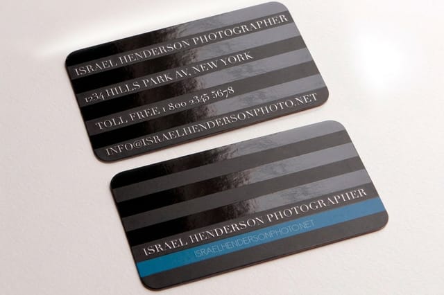 Classic Business Cards From $17.57 The smallest canvas in the trade, and the one that exposes weak typography immediately. Spot UV Business Cards From $76.88 Where a finish becomes part of the design rather than a coating applied afterwards.
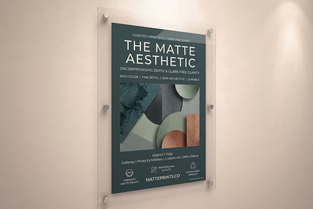
 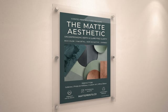 Matte Posters From $25 The format where composition, contrast, and scale are tested in public.
  Standard Brochures From $57.11 Sequence, pacing, and a fold that changes what the reader sees and when.
 Six More Worth Following for Process and Craft

This second group skews toward designers who actively share how the work gets made, which is the more directly useful thing to watch when you are trying to improve rather than admire.
- 7. Aaron Draplin. Runs Draplin Design Co and co-founded Field Notes, the pocket notebook brand. His logo work favors thick lines and blunt shapes that reproduce at any size, and he is unusually open about showing dozens of rejected marks alongside the chosen one.
- 8. Jessica Hische. A lettering artist known for custom lettering, drop caps, and book work. She has written and spoken extensively about the business of a lettering practice, including pricing and client management, which is the part most designers never see.
- 9. Marian Bantjes. Known for intricate, ornamental lettering and pattern work that sits between graphic design and illustration. Worth following as an argument that decoration can be rigorous rather than merely applied.
- 10. James Victore. A poster designer whose brush lettered, blunt work is deliberately rough and deliberately opinionated. Useful precisely because it argues against over refinement, which is the direction most self taught designers drift.
- 11. Jessica Walsh. Runs the studio &Walsh, having previously partnered with Sagmeister. The studio's output is color led, bold, and frequently experimental, and it is a good window into how a contemporary studio pitches and produces work.
- 12. Debbie Millman. A designer, educator, and the host of the long running Design Matters interview podcast. The interviews are arguably more valuable than any portfolio here, because they are hours of working designers explaining how they actually think.
Notice that several of these are worth following for what they say rather than what they post. That is not a compromise, it is the point, since the reasoning is the transferable part.
How to Follow Someone Without Accidentally Copying Them
There is a real failure mode where a designer follows a small number of people closely and slowly turns into a lower resolution version of them. It happens without any intent to copy, simply because whatever you look at most becomes your default sense of what design looks like.
The way out is to change what you extract. When a piece stops you, do not save it to a folder and move on. Ask what problem it was solving, what the alternatives would have been, and why this solution beat them. Ask what the constraint was, since almost every distinctive piece of design is distinctive because of a limitation. That analysis is transferable to your own briefs. The aesthetic is not.
A practical routine
- Write one sentence. For anything you save, note the single decision that makes it work. If you cannot name one, you were responding to polish rather than design.
- Rebuild it with different content. Apply the structure to a brief of your own. If it survives the swap, you understood the principle. If it collapses, you were copying the surface.
- Follow across disciplines. Architecture, bookbinding, signage, and packaging all solve problems graphic designers face, and borrowing across fields is far less traceable than borrowing within one.
- Keep some space empty. Constant input crowds out the thinking. The ideas tend to arrive when you stop scrolling.
If you want a structured version of the same idea applied to marks specifically, our guide to logo design principles covers what to look for, and where to look for logo inspiration covers the sources beyond the obvious ones.
From feed to finished piece
The fastest way to learn is to print something
A design judged only on a screen never has to survive a fold, an ink limit, or a stock that soaks up hairlines. Printing is where the lesson lands.
Why Print Work Teaches Faster Than Screen Work
The single biggest gap between admiring design and understanding it closes the moment you print something. A design that only ever exists on a screen never has to survive anything. Nothing pushes back.
Paper pushes back constantly. Ink spreads into uncoated fiber and thickens your careful hairlines. A fold lands somewhere and either respects your layout or cuts it in half. The trim moves fractionally, which is why bleed exists, and anything you placed too close to the edge disappears. A color that looked electric on a monitor arrives flatter, because emitted light and reflected ink are different things. Every one of those is a lesson that cannot be delivered by looking.
This is also why the designers above are worth following specifically. Their work has been through that process, so the decisions embedded in it are decisions that survived contact with manufacturing. Studying work that has only ever been rendered teaches you rendering. Our guides to DPI versus PPI and exporting a print ready PDF cover the mechanics of getting your own work through it.
Quantity and price
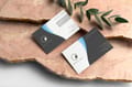
Business card pricing and specs, straight from the configurator
Real numbers on the format designers use to test ideas, with the stocks and finishes that make a small piece feel considered.
| Quantity | Price Per Unit | Total |
|---|---|---|
| 100 | 17.6¢ | $17.57 |
| 200 | 11.5¢ | $23.07 |
| 300 | 9.15¢ | $27.46 |
| 400 | 7.96¢ | $31.86 |
| 500 | 7.25¢ | $36.26 |
| 600 | 6.77¢ | $40.64 |
Building a Feed That Actually Improves Your Work
Follow lists tend to be either all famous names or all peers, and both have a blind spot. The famous names show you an achievable standard only in the sense that a mountain summit is achievable, and peers show you the current conventions of your own corner without much perspective on them.
A useful mix has three parts. A handful of established figures for calibration, which is what most of this list provides. A larger number of working designers at roughly your level or slightly ahead, because their constraints resemble yours and their solutions are directly borrowable. And a few people from outside graphic design entirely, since that is where the ideas nobody else in your field is using come from.
Then add one thing that has nothing to do with feeds. Print your own work regularly, even when there is no client and no deadline. A card, a poster, a short run of something. The gap between what you intended and what arrived in the box is the most reliable teacher available, and it is the reason a physical portfolio still carries weight, as our roundup of print portfolios shows. Start from a print ready layout in the blank templates library or build it in the online designer.
Wally on following designers usefully
Inspiration is cheap, understanding is the point
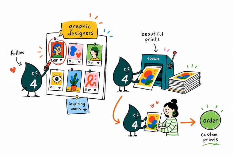
A feed full of beautiful work can leave you no better at designing, because you are seeing outcomes without the decisions behind them. Follow the people who show process, rejected routes, and printed results. Then copy the thinking rather than the look, and print something, because a fold, an ink limit, and an absorbent stock will teach you things no screenshot ever will. 4OVER4 prints on 60+ stocks with the finishes designers actually specify.
Print your own work →Turning a feed into an actual education
Explore more
More on design craft and getting hired
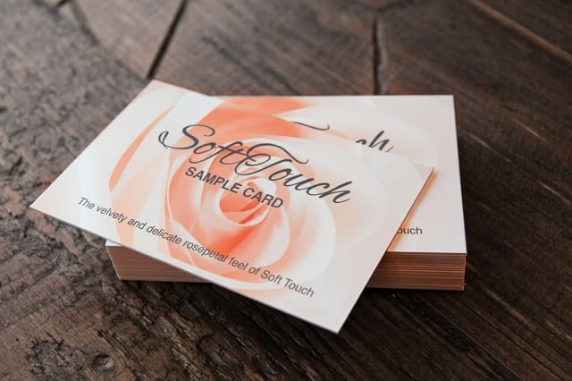
Print is where a feed stops helping: soft touch at 50 for $40.28, spot UV at 500 for $76.88.
 Article 8 Travel Photographers to Follow for Print Worthy Inspiration Eight travel photographers worth following for composition, color, and storytelling ideas you can borrow for y
  Article Graphic Design Blogs Worth Following for Print and Branding Ideas Graphic design blogs worth following for print and branding ideas, with what each one covers, how often it pos
  Article Design Portfolio Examples Portfolios that win the work, and why they do. Article Print Portfolios What a physical portfolio proves that a link cannot.
  Article The Designer Profile How to present yourself so clients take you seriously.
  Article Latino Designers to Know Designers shaping contemporary print and identity work.
  Article Logo Design Inspiration Where to look when the feed stops helping.
  Guide Instagram Post Templates Designing for the feed where the work gets seen.
 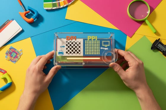 Guide DPI vs PPI The resolution question every designer gets wrong once.
  Guide Logo Design Principles The fundamentals behind marks that last.
  Guide Print Finishing Techniques Foil, spot UV, embossing, and when each earns its cost.
 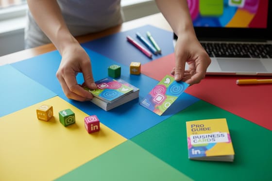 Guide Social Icons on Cards Putting your handles on paper without clutter.
 Ready to stop scrolling and print something?
Take one idea you admired this week, work out why it holds together, rebuild it in your own way, and 4OVER4.COM prints it on stock worth showing.
Following designers questions
Which graphic designers should I follow for print work?
Look for designers whose work is physical and whose reasoning is publicly documented. Established figures such as Paula Scher, Michael Bierut, Louise Fili, Erik Spiekermann, Stefan Sagmeister, and Gail Anderson give you calibration on what the top of the craft looks like, and most of them write, teach, or lecture, so the thinking behind the work is available. For process specifically, designers such as Aaron Draplin, Jessica Hische, Marian Bantjes, James Victore, and Jessica Walsh share how the work gets made, and Debbie Millman's long running interview podcast is hours of designers explaining how they think.
Does following designers on social media actually improve your work?
Only if you change what you take from it. A feed shows you outcomes without the decisions, the constraints, or the rejected directions, so it is easy to develop a refined sense of what good work looks like without gaining any ability to produce it. The fix is to interrogate anything that stops you: what problem was it solving, what were the alternatives, and what constraint shaped it? That analysis transfers to your own briefs. The aesthetic does not, and copying it just makes you a slower version of someone else.
Why is a feed of design work bad for print designers specifically?
Because most design shared online is optimized for the screen it is shared on. Feeds reward drop shadows, glowing gradients, very thin type, and mockups photographed in flattering light. Absorb enough of that and you begin designing for a monitor even when the job is paper, where soft shadows print as gray smudges, hairlines fill in on uncoated stock, and vivid screen mid tones flatten in conversion to ink. Deliberately follow designers whose work is manufactured rather than rendered, so the decisions you are absorbing are ones that survived contact with a press.
How do I get inspiration without copying someone's style?
Extract the reasoning rather than the look. For anything you save, write one sentence naming the single decision that makes it work, and if you cannot name one, you were responding to polish rather than design. Then rebuild the structure with completely different content. If it still holds together, you understood the principle. If it collapses, you were copying the surface. Following across disciplines helps too, since ideas borrowed from architecture, signage, bookbinding, or packaging are far less traceable and far more useful than ideas borrowed from other graphic designers.
What is the fastest way to improve as a print designer?
Print your own work regularly, even with no client and no deadline. A design that lives only on a screen never has to survive anything, while paper pushes back constantly. Ink spreads into uncoated fiber and thickens hairlines, a fold either respects your layout or cuts through it, the trim moves fractionally so anything near the edge disappears, and screen color arrives flatter in ink. The gap between what you intended and what arrives in the box teaches things no amount of looking at other people's finished work can.
