
10 Memorable Movie Poster Designs and the Print Lessons Behind Them


Why Movie Posters Are the Best Design Lesson You Can Get Free
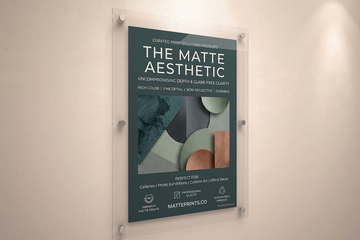
A movie poster has a brutal brief. It has to work on a wall you are walking past, at a distance you did not choose, in about three seconds, against a dozen competitors doing the same job. It has to say what kind of film this is without giving away why you should watch it, and it has to survive being reproduced at everything from a bus shelter to a thumbnail.
Those constraints make posters unusually honest teachers. There is nowhere to hide. A layout that depends on the viewer leaning in and reading carefully simply fails, and it fails visibly. Everything that survives in this form survives because it works at speed, which is exactly the same test faced by a shop window, an event flyer, a trade show banner, or a poster advertising your own business.
What follows is ten posters worth studying, each chosen because it solves the problem differently, and each with a lesson that transfers directly to anything you might print. If you want the practical sequence rather than the history, our guide to designing a poster in 8 steps covers the workflow, and standard movie poster sizes covers the dimensions.
Five Posters That Built the Modern Visual Language
The first five are the ones that changed what a poster was allowed to be. Before them, film advertising largely meant painted portraits of the cast arranged around a title. After them, a poster could be a symbol.
- 1. The Man with the Golden Arm, 1955. Saul Bass reduced the film to a jagged cut paper arm, distorted and reaching. No cast, no scene, no painted faces. It proved a poster could be a graphic symbol rather than an illustration, and it is effectively the founding document of everything below.
- 2. Vertigo, 1958. Bass again, with a spiral swallowing two tiny falling figures. The lesson is that an abstract shape can carry an emotional state more efficiently than any literal image. You feel the vertigo before you read the title.
- 3. Rosemary's Baby, 1968. A green tinted profile with a pram on a hill, and almost nothing else. It works because of what it withholds. The composition tells you something is wrong without ever showing you what, which is the single hardest trick in the form.
- 4. A Clockwork Orange, 1971. A hard triangular composition built around a single staring eye and a blade, in a palette so limited it reads instantly. The type is not applied to the artwork, it is part of the geometry holding the whole thing together.
- 5. Jaws, 1975. One of the most copied compositions ever made. A swimmer above, a shark rising below, a strict vertical split. The power comes from the viewer knowing something the swimmer does not, and it demonstrates that a poster can stage a moment of dramatic irony in a single frame.
Notice what these five have in common. Not one of them shows the cast. Every one commits to a single image, and every one asks a question rather than answering it.
Print picks
Four ways to print a poster that holds up
Live starting prices from the configurator, for artwork you want on a wall rather than in a drawer.
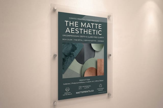 Matte Posters From $25 A non reflective surface that keeps a dark, high contrast image readable under room lighting.
 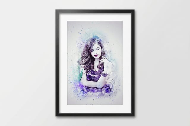 Framed Posters From $87.86 Finished and ready to hang when the print is meant to be treated as artwork.
  Mounted Posters From $39.99 Rigid backing that keeps large formats flat instead of curling off the wall.
 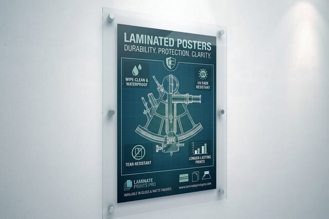 Laminated Posters From $25 A protective layer for posters that live in public places and get touched, bumped, and cleaned.
 Five More Layouts Worth Stealing From
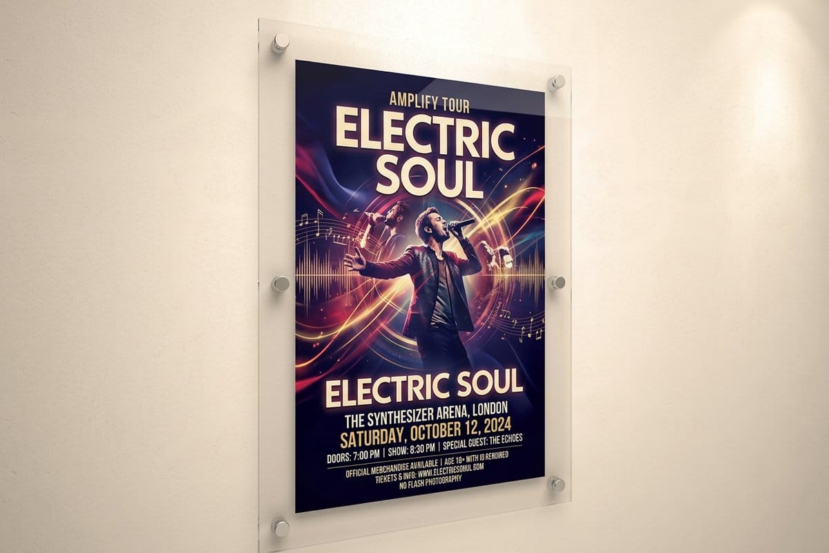
The second five are later, and they show the same principles applied to different problems, including the problem of standing out once minimalism itself had become the convention.
- 6. The Godfather, 1972. A marionette control bar and strings above the title, on black. The mark does all the work, communicating control and manipulation without a single image from the film. It is the purest argument on this list for the power of a well drawn symbol.
- 7. Alien, 1979. A cracked, glowing egg on a black field with a line of copy that promises dread rather than describing it. The composition is almost empty, and the emptiness is the point. It shows how much negative space is worth when the subject is isolation.
- 8. The Silence of the Lambs, 1991. A face, calm and pale, with a moth placed over the mouth. One small, precisely positioned element transforms an ordinary portrait into something deeply wrong. The lesson is that a single deliberate detail beats a busy composition.
- 9. Pulp Fiction, 1994. A pastiche of a battered pulp paperback, complete with creases, price corner, and worn edges. It succeeds by borrowing an existing visual language the viewer already understands, which instantly sets the tone without explaining anything.
- 10. Trainspotting, 1996. A hard orange field, high contrast cutout figures, and numbered cast portraits in a strict grid. It shows how a rigid system plus one loud color can produce something that is impossible to mistake for anyone else's work.
Six through ten are all solving the same practical problem you face. How do you look different on a wall where everyone has already learned the same rules? The answer in every case is commitment to one idea, executed further than feels comfortable.
The Floating Heads Problem, and Why It Keeps Happening
For every poster above there are a hundred built from a collage of cast faces arranged in a blue and orange sky. It is worth understanding why, because the same force operates on your own projects.
Floating head posters are rarely a design decision. They are a negotiation outcome. Everyone with a stake wants to be represented, nobody is willing to be the one left out, and the result is a composition that includes everything and therefore emphasises nothing. The poster stops being an argument and becomes a receipt.
The same thing happens to a business poster when the brief accumulates a logo, a tagline, three services, a phone number, an address, a website, a QR code, and a social handle. Each addition is individually defensible and collectively fatal, because a viewer walking past has time to absorb roughly one thing. The discipline is not learning to add well, it is learning to decide what the one thing is and defend it. Our guide to hierarchy in graphic design is the practical version of that argument.
Designing for Distance, Contrast, and the Squint Test
Every poster on this list passes a test you can run in about five seconds. Convert the design to grayscale, shrink it to the size of a stamp, and squint. If the composition still reads as a distinct shape, it will work on a wall. If it dissolves into gray mush, no amount of color, texture, or clever type will save it once a viewer is ten paces away.
This is why silhouette matters more than detail in poster work. The eye resolves large shapes and strong tonal contrast long before it resolves edges or fine type. The Jaws composition survives the squint test perfectly, because it is fundamentally two large tonal masses split by a horizontal line. A collage of similarly toned faces does not survive it at all.
A short checklist before you send the file
- Grayscale it. If the hierarchy disappears without color, the hierarchy was made of color, which is fragile.
- Shrink it. View it at thumbnail size, since that is how most people will first encounter it anyway.
- Read it at distance. Print a proof, put it on a wall, and look from where a real viewer stands rather than from your chair.
- Count the messages. If you cannot name the single thing the poster says, neither can a passerby.
Resolution deserves a word too. A poster viewed from several feet away tolerates a lower effective resolution than a business card held at reading distance, but the file still has to be built at the right scale rather than enlarged after the fact. Our guides to printing large posters and DPI versus PPI cover the numbers.
For gigs and events
The same rules run the music poster tradition
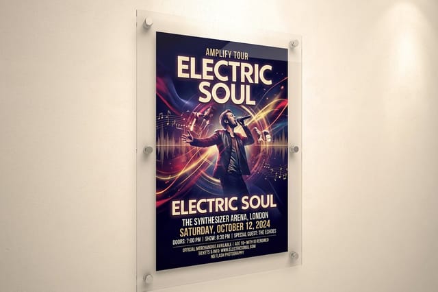
Concert posters have always been where designers push contrast, type, and limited palettes hardest, because they compete on a crowded wall.
Type as Part of the Picture, Not a Label on Top of It
One quiet thing separates the posters above from competent imitations. In each of them the lettering is composed into the image rather than placed on it afterwards. The Clockwork Orange title is structural. The Alien copy line sits in the void because the void was built to hold it. The Trainspotting numbers are part of the grid, not an annotation of it.
The common failure is the opposite sequence: finish the artwork, then find somewhere for the text. That produces a title fighting for a patch of background that was never intended to carry it, usually solved by dropping a translucent panel behind the type, which is a visible admission that the layout did not plan for words.
Practically, this means blocking out where type will live before the image is final, and choosing a typeface that belongs to the same world as the image. A poster does not need many typefaces. Most of the best use one, at two or three sizes, with the hierarchy carried by scale and position. If you are choosing, our comparison of serif versus sans serif is a sensible start.
Color That Survives the Trip to Ink
Limited palettes are an aesthetic preference in poster work and a practical one. Two or three committed colors read faster at distance, and they also convert to print far more predictably than a full spectrum photographic image.
The reason is that screen color is emitted light and printed color is reflected light made from ink on paper. The vivid mid tones that look electric on a monitor are exactly the ones that flatten in conversion, and two adjacent tones that felt clearly distinct on screen can collapse into the same printed value. A poster built on a small number of well separated colors is far less exposed to that risk than one relying on subtle gradations.
Convert deliberately rather than accepting whatever an automatic conversion produces, and adjust the palette after seeing it rather than before. Our walkthroughs of converting RGB to CMYK and the best color profile for printing cover the mechanics, and if an exact brand color has to hold, Pantone spot color printing is how you lock it.
Quantity and price
Poster pricing and specs, straight from the configurator
Real numbers on a standard poster run, with the sizes and stocks that keep a large image sharp.
| Quantity | Price Per Unit | Total |
|---|---|---|
| 50 | $2.18 | $108.75 |
| 100 | $1.64 | $163.67 |
| 200 | $1.01 | $202.11 |
| 300 | 80.2¢ | $240.55 |
| 400 | 69.7¢ | $278.99 |
| 500 | 63.5¢ | $317.44 |
Choosing a Stock and a Format for Where It Will Hang
The last decision is physical, and it is the one most often made by default. The same image behaves very differently depending on the surface it is printed on and where that surface ends up.
Matte is the safe choice for most dark, high contrast images, because it does not throw reflections back at a viewer standing under a ceiling light. Gloss deepens color and adds snap, which suits saturated artwork, but it turns a poster into a mirror in the wrong room. Laminated posters add a protective layer for anywhere the print will be touched, bumped, or wiped down, which is most public spaces.
Size and rigidity are the other half of it. Large unsupported prints curl away from a wall over time, so mounted posters keep the surface flat, and framed posters finish the job when the print is meant to read as artwork rather than advertising. Pick the size from the viewing distance rather than the budget, using our large format poster size guide, and start from a print ready layout in the blank templates library or build it in the online designer.
Wally reads a movie poster the way a passerby does
One image, three seconds, from across a lobby
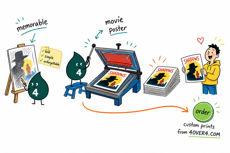
The posters that stayed famous did one thing. They picked a single image, made it read as a silhouette, and left the explaining to the film. Crowds of floating faces and six lines of type are what happens when nobody will choose. Pick your one image, push the contrast until it survives a glance from across a room, then print it on a stock that suits where it will hang. 4OVER4 prints matte, laminated, mounted, and framed.
Print your poster →What these posters teach anyone printing one
Explore more
More on posters, from design to the wall
Matte and laminated posters print in 2 business days, framed and mounted in 4.
 Guide Standard Movie Poster Sizes The one sheet and every other size, explained.
  Guide How to Design a Poster A working sequence from idea to print ready file.
  Guide Large Format Poster Sizes Picking a size that suits the room and the viewing distance. Guide Print Large Posters Sharp Resolution and file prep for prints that scale up.
  Guide Hang a Poster Damage Free Getting it on the wall without wrecking either one.
  Guide Free Poster Templates Start from a layout that already prints sharp.
  Article Creative Poster Ideas Fifteen directions when the brief is wide open.
  Article Large Format Ad Examples What works when the canvas gets very big.
  Article Design Portfolio Examples How designers present work that wins clients.
  Guide Canvas vs Posters When to stretch it and when to print flat.
  Benefit Online Designer Build the layout in the browser with live checks.
  Product Concert Posters The format where bold type and limited palettes rule.
 Ready to print a poster worth hanging?
Pick one image, push the contrast, choose the stock that suits the wall, and 4OVER4.COM prints it sharp on matte, laminated, mounted, or framed.
Movie poster design questions
What makes a movie poster memorable?
Commitment to a single image, and the discipline to withhold. Every poster people still talk about decades later picks one visual idea and executes it further than feels comfortable, whether that is a cut paper arm, a spiral, a rising shark, or a moth over a mouth. Just as important is what they leave out. They raise a question rather than summarising a plot, which is why they survive being seen repeatedly. The forgettable ones are usually collages of cast faces, which happen not because a designer chose them but because nobody involved was willing to be left out of the frame.
Who was Saul Bass and why does he matter to poster design?
Saul Bass was the designer who moved film advertising away from painted portraits of the cast and toward flat graphic symbols. His poster for The Man with the Golden Arm in 1955 reduced an entire film to a jagged cut paper arm, with no faces and no scene, and his Vertigo poster in 1958 used a spiral swallowing two tiny figures to communicate a psychological state rather than a story beat. That shift established that a poster could be a symbol instead of an illustration, and nearly every strong poster since works within the language he opened up.
How do I design a poster that works from a distance?
Design the silhouette before the detail, then run the squint test. Convert the layout to grayscale, shrink it to thumbnail size, and squint at it. If the composition still reads as a clear shape, it will hold up on a wall. If it turns into gray mush, no amount of color or fine type will rescue it, because the eye resolves large shapes and tonal contrast long before it resolves edges. Push contrast further than feels right on screen, keep the palette to two or three well separated colors, and make sure you can name the single thing the poster says.
What size should I print a movie poster?
The standard theatrical one sheet is the familiar format, but the right size for your print depends on viewing distance rather than tradition. A poster read from across a lobby needs to be considerably larger than one hung in a hallway where people pass within a few feet. Decide where it will hang and how far back the viewer stands, then choose the size that keeps the main image comfortably legible from that point. Our guides to standard movie poster sizes and large format poster sizes list the common dimensions and what each one suits.
Which poster finish should I choose for printing?
Match the finish to the lighting and the location. Matte is the safest choice for dark, high contrast images because it does not bounce ceiling lights back at the viewer. Gloss deepens saturated color and adds snap, but behaves like a mirror in a brightly lit room. Laminated posters add a protective layer for public spaces where the print gets touched, bumped, or cleaned. For large formats, mounting keeps the surface flat instead of curling off the wall over time, and framing finishes the piece when it should read as artwork rather than advertising.
