Outdoor Banner Design Guide: Layout & Color Tips
An outdoor banner design guide helps you plan, design, and print banners that grab attention in real-world conditions like wind, rain, and direct sunlight. 4OVER4.COM has printed 10 billion+ cards and print products since 1999, serving 150,000+ businesses that rely on bold outdoor signage to drive foot traffic. Whether you're setting up at a trade show, promoting a grand opening, or branding a storefront, the right banner design makes the difference between getting noticed and getting ignored.
Outdoor Banners
Premium Outdoor Banners Ready to Print
Free Design Templates:
Here's the thing most people get wrong about outdoor banners. They design for a screen, not for the street. A banner that looks great on your laptop can turn into an unreadable mess at 20 feet. This outdoor banner design guide breaks down everything you need to know - from choosing the right images to picking fonts that stay legible from across a parking lot. Let's get into it.
Why Your Image Selection Can Make or Break an Outdoor Banner
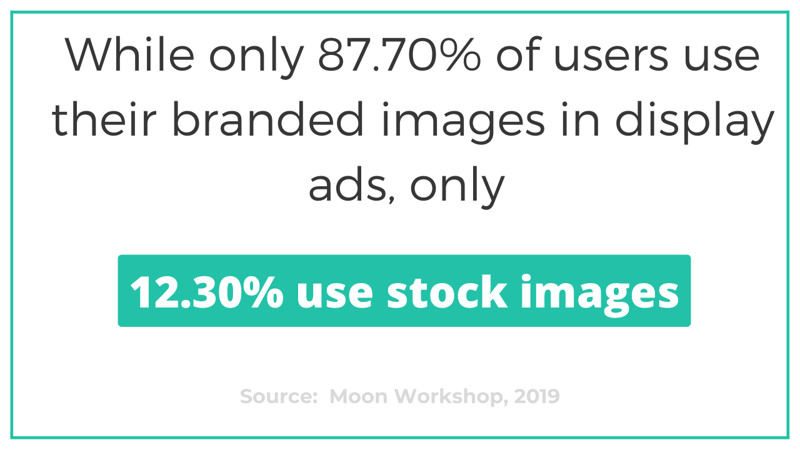
The images on your outdoor banner are the first thing people notice. Not the text. Not your logo. The visuals. That's why choosing the right imagery is the single most important decision in your outdoor banner design guide process. According to marketing research, branded custom images outperform generic stock photography in display advertising by a wide margin - roughly 87% of successful display ads use original branded imagery rather than stock photos.
What does that mean for your banner? Use real photos of your products, your team, or your location. If you're promoting a restaurant, show your actual food - not a stock photo of a generic pasta dish. If you're advertising a fitness studio, feature your real trainers in your real space. Authenticity reads differently at street level. People can spot a stock photo from 30 feet away, and it signals "generic" before they even read your headline.
"We switched from stock images to photos of our actual storefront on our outdoor banners, and foot traffic from the banner location increased noticeably within the first week."
- Derek L., retail store owner
When sourcing images for large custom outdoor banners, always use files that are at least 150 DPI at the final print size. For banners viewed from a distance of 10 feet or more, 100 DPI can work - but don't go lower. Blurry images on a large-format banner look cheap, and cheap-looking banners hurt your brand more than having no banner at all.
Keep your image composition simple. One hero image works better than a collage of five small photos. You want instant recognition, not a visual puzzle. If you need design inspiration beyond banners, check out Graphic Design Portfolio Examples for ideas on how professionals handle visual hierarchy.
Fixed Banners vs. Scrolling Banners - Which Setup Works for Your Event?
Before you finalize your outdoor banner design, you need to decide how that banner will be displayed. The two main options are fixed banner stands and scrolling banner stands, and each one changes how you should approach your design.
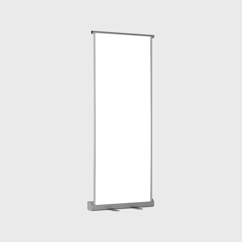
Fixed banners sit in X-frame or retractable stands. They're always visible. One message, one image, displayed continuously. These are your workhorses - reliable, simple, and effective when you need a single strong statement. Think of them as your billboard in miniature.
Scrolling banners use a motorized stand that rotates two or more banners in a vertical loop. Each banner gets several seconds of display time before the next one rolls into view. This is great when you have multiple products or services to showcase but limited floor space. One stand, multiple messages.
So which do you pick? It depends on two things: expected foot traffic and the number of messages you need to communicate. If you're at a busy trade show with heavy foot traffic flowing past your booth, scrolling banners work well because every banner in the rotation will get seen by different groups of people. But if traffic is light - say, a smaller community event - a scrolling banner might cycle past your best message right when someone walks by. They'd see your least important banner instead.
Fixed banners don't have that problem. Your message is always there. Always visible. No timing luck involved. They also work from both approach directions, while scrolling banners only display properly from one side - the back shows the previous banner rolling upside down.
If you're working with limited booth space but need to promote specific banners for different product lines, scrolling stands let you fit more messaging into a smaller footprint. For most single-message needs - grand openings, directional signage, brand awareness - fixed banners are the smarter choice.
Color Strategy That Works Outdoors (Not Just on Screen)

Color is where most DIY outdoor banner designs fall apart. What looks vivid on your monitor can wash out under direct sunlight. And colors that pop indoors might clash or become invisible against the backdrop of a busy street.
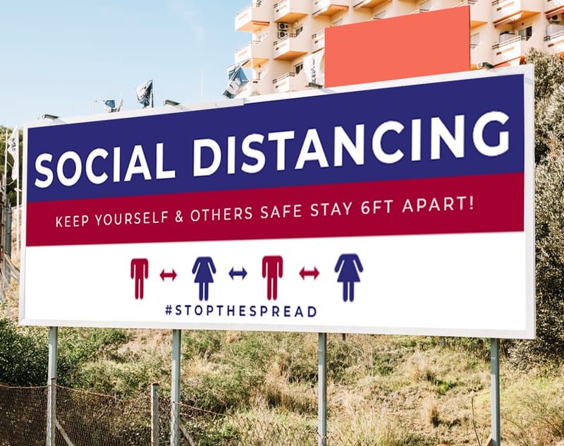
Here's a practical rule for your outdoor banner design guide: use high-contrast color combinations. Dark text on a light background, or white text on a bold, saturated background. Avoid light-on-light or dark-on-dark. Your banner needs to be readable from 15 to 50 feet away, and contrast is what makes that happen.
Stick to your brand colors when possible. This reinforces recognition. If someone has seen your website, your business card, or your social media, they should instantly connect the banner to your brand. Consistency across touchpoints builds trust. If you want to see how brand consistency works across different print formats, take a look at Classy Business Card Design Inspiration for examples of cohesive brand design.
A common mistake? Using too many colors. Three to four colors maximum. One dominant background color, one accent color, and one or two text colors. That's it. More than that and your banner starts looking like a yard sale flyer. Simplicity reads fast, and fast is what you need when someone is walking or driving past your banner.
All outdoor banner files should be saved in CMYK color mode, not RGB. CMYK is the standard for print production, and designing in RGB will cause color shifts when your file goes to press. What looked like a rich blue on screen might print as a dull purple. Convert to CMYK early in your design process to avoid surprises.
Typography That Stays Legible at a Distance

Your outdoor banner's text needs to do one job: communicate your message in under three seconds. That's roughly how long a passerby will glance at your banner. If they can't read it instantly, you've lost them.
Use a maximum of two font families on any single banner. One for headlines, one for supporting text. Sans-serif fonts like Helvetica, Arial, Futura, or Montserrat work best for outdoor readability. Serif fonts can work for headlines if they're bold enough, but avoid thin or decorative fonts for any text that needs to be read from more than five feet away.
Font size matters more than you think. For a standard 3x6 foot banner, your headline should be at least 3 to 4 inches tall. Subtext or contact information should be at least 1.5 inches. If people need to squint, your font is too small. Period.
Keep your word count low. The best outdoor banners have fewer than 10 words of primary text. A headline, a call to action, and maybe a phone number or website. That's it. If you're trying to fit a paragraph onto a banner, you're designing a flyer - not a banner. Save the details for your Business Banners product page or your website.
Letter spacing matters too. Tight kerning that looks elegant on a business card becomes a smudged mess on a large-format outdoor banner. Give your letters room to breathe. Slightly increased letter spacing improves readability at distance without making your text look awkward.
Logo Placement and Brand Identity on Outdoor Banners

Your logo should appear in the top third of your outdoor banner. Why? Because the top of a banner is the first area the eye scans, and it's the section least likely to be obstructed by tables, people, or other booth elements at ground level. If your logo is at the bottom, it might get hidden behind a display table or lost in the visual noise of a crowded event floor.
Make your logo large enough to be recognized from the same distance as your headline text. If someone can read your headline from 30 feet away but can't identify your logo, you've got a sizing problem. Your logo should be at least 10% of the total banner area for proper visibility.
Include your full brand identity on every banner: logo, brand colors, tagline if you have one, and contact information. Think of each banner as a standalone brand ambassador. Someone seeing it should get the full picture of who you are without needing to visit your website first.
For double-sided applications - like banners displayed between two walkways or on median poles - consider 2 Sided Blockout Banners. These use an opaque layer between the two print sides so images don't bleed through. Your logo and design look crisp from both directions.
Image Resolution and File Prep for Large-Format Outdoor Printing

This is where many outdoor banner designs fail before they even get to the printer. Low-resolution images, wrong color modes, and incorrect file dimensions account for the majority of reprint requests in large-format printing.
Here's your file prep checklist for outdoor banners:
- Resolution: 150 DPI at full print size for close-viewing banners. 100 DPI minimum for banners viewed from 10+ feet.
- Color mode: CMYK, not RGB. Convert before you start designing, not after.
- Bleed: Add 0.25 inches of bleed on all sides. This prevents white edges after trimming.
- Safe zone: Keep all critical text and logos at least 0.5 inches from any edge.
- File format: PDF is preferred. High-quality JPEG or TIFF also work. Avoid PNG for large-format print.
If you're not sure your file is set up correctly, 4OVER4.COM offers Blank Templates that are pre-configured with the correct dimensions, bleed, and safe zones for every banner size. Download the template for your chosen size and design directly inside it. No guesswork.
Blank Templates

One more thing: always flatten your layers before exporting. Transparent layers, live text, and linked images can cause unexpected rendering issues during print production. Flatten everything, outline your fonts, and embed all images. Your printer will thank you.
High-Resolution Graphics That Hold Up in Weather
Outdoor banners face sun, wind, rain, and temperature swings. Your design needs to account for this. Use images with strong, saturated colors because UV exposure will fade lighter tones over time. If your banner will be displayed for more than a few weeks, ask about UV-resistant inks and lamination options that extend the life of your print.
Vinyl banners printed with solvent or UV-cured inks hold up best outdoors. They resist water, resist fading, and maintain color vibrancy for months. If you're designing for a one-day event, standard printing is fine. For long-term outdoor display, invest in weather-resistant materials and finishes.
Paper Types
Grommets
Hems
Pole Pockets
Proof Options
Practical Layout Tips for Different Outdoor Banner Sizes
Not all outdoor banners are the same size, and your design approach should change based on dimensions. A narrow vertical retractable banner needs a completely different layout than a wide horizontal street banner.
Vertical Banners (Retractable and X-Frame)
These are typically 33" x 80" or similar tall, narrow formats. Stack your content vertically: logo at top, headline in the upper third, hero image in the middle, call to action and contact info at the bottom. Don't try to place elements side by side - there isn't enough width for horizontal layouts on a vertical banner.
Horizontal Banners (Fence, Building, and Event Banners)
Common sizes include 3x6 feet, 4x8 feet, and larger. These give you room for a left-to-right reading flow. Place your logo on the left (where the eye starts), your headline and main message in the center, and your call to action on the right. This follows natural reading patterns and makes your banner scannable in a single glance.
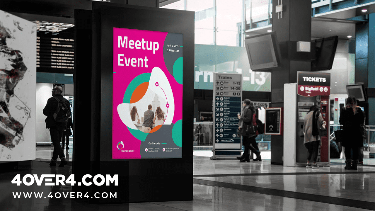
Pole Banners and Street Banners
These are narrow and tall, typically 24" x 60" or similar. They're viewed from a distance and often from moving vehicles. Use the absolute minimum text - your brand name, one short phrase, and maybe a date or location. Large images work better than text on pole banners because they're readable at speed. For creative promotional ideas beyond banners, explore Logo Sticker Design Ideas to complement your outdoor campaign.
Common Outdoor Banner Design Mistakes (and How to Avoid Them)
After 25+ years in the printing industry, 4OVER4.COM has seen every banner design mistake in the book. Here are the ones that come up most often:
- Too much text. Your banner isn't a brochure. Cut your word count in half, then cut it in half again.
- Low-resolution images. If it looks pixelated on your screen at 100%, it'll look worse printed at 6 feet wide.
- No clear call to action. Every banner needs to tell people what to do next: visit, call, scan, or show up.
- Ignoring viewing distance. Design for how far away your audience will be, not for how it looks on your desk.
- Wrong file format. RGB files, low-res JPEGs, and PowerPoint exports are not print-ready. Use CMYK PDFs.
If you're new to print design and want to learn more about creating effective marketing materials, browse the full library of Printing Articles on the 4OVER4.COM blog. You'll find guides on everything from layout principles to color theory.
"I ordered outdoor banners for our annual charity run. The colors were bold, the vinyl held up through two days of rain, and we got compliments from sponsors about how professional everything looked."
- Maria S., event coordinator, ★★★★★
Designing for Double-Sided and Specialty Outdoor Banners
Some outdoor banner placements require visibility from multiple directions. Median-mounted banners, hanging banners between buildings, and banners on freestanding frames all benefit from double-sided printing.
When designing for double-sided outdoor banners, keep in mind that the design on each side can be different - but your brand identity should remain consistent. Same logo placement, same color palette, same overall feel. The two sides can feature different messages (one side for an upcoming event, the other for your website URL), but they should clearly belong to the same campaign.
4OVER4.COM's blockout banner material includes an opaque black layer between the two print surfaces. This prevents any show-through, so each side displays crisp, independent artwork. It's the right choice for any banner that will be backlit or viewed from both sides.
Here's a look at available banner options and pricing to help you plan your outdoor banner design project:
Paper Types
Grommets
Hems
Pole Pockets
Proof Options
For seasonal promotions, holiday sales, or recurring events, you might also appreciate ideas from Diy Greeting Card Design Ideas to create a cohesive brand presence across all your print materials.
Earn Rewards on Your Outdoor Banner Orders
Every outdoor banner order with 4OVER4.COM earns you loyalty points that you can redeem on future purchases. It's a straightforward rewards program - order banners, earn points, use those points toward your next print run. If you're printing outdoor banners regularly for events, seasonal promotions, or retail displays, those points add up fast. Learn more about how to Earn Coins and start saving on your outdoor banner printing.
"We order outdoor banners from 4OVER4.COM for every trade show season. The vinyl is sturdy, the colors stay vivid even after sitting in our warehouse between events, and the loyalty coins are a nice bonus."
- James T., marketing manager, ★★★★★
What to Remember From This Outdoor Banner Design Guide
- Use branded images, not stock photos. Original photography connects with your audience faster and builds brand trust on outdoor banners.
- Limit your text to under 10 words. Outdoor banners get about three seconds of attention. Make every word count.
- Design in CMYK at 150 DPI minimum. RGB files and low-resolution images are the top causes of disappointing banner prints.
- Use two fonts maximum and high-contrast colors. Readability from a distance is the single most important factor in outdoor banner effectiveness.
- Place your logo in the top third. It's the least obstructed area and the first place the eye scans on a vertical banner.
- Choose fixed vs. scrolling stands based on foot traffic. Heavy traffic favors scrolling. Light traffic favors fixed banners that display your best message continuously.
4OVER4.COM has been printing outdoor banners for 25+ years, with 10,000+ reviews from businesses that trust the quality. For more creative print marketing ideas, check out Funny Print Ad Examples to see how brands use humor in their advertising campaigns.
Paper Types
Grommets
Pole Pockets
Proof Options
Free Design Templates
2Sided Blockout Banners Pricing
| Quantity | Price Per Unit |
|---|---|
| 1 | $108.75 |
| 5 | $97.76 |
| 10 | $86.66 |
| 15 | $86.77 |
| 20 | $86.72 |
Outdoor Banner Design - Your Questions Answered
What are the best practices for outdoor banner design?
The best practices for outdoor banner design include using high-contrast colors, limiting text to under 10 words, placing your logo in the top third of the banner, and designing in CMYK at 150 DPI or higher. Always use branded photography instead of stock images. For durable outdoor options, consider Aluminum Sign Panels for permanent installations.
How do I choose the right outdoor banner design?
Start by identifying your viewing distance and display location. Vertical retractable banners work for trade shows and lobbies. Horizontal vinyl banners suit fences, buildings, and event spaces. Match your banner format to your environment. This outdoor banner design guide recommends fixed stands for low-traffic events and scrolling stands when space is limited but you have multiple messages.
What makes outdoor banner design effective for marketing?
Effective outdoor banners combine bold visuals, minimal text, and a clear call to action. They communicate one message in three seconds or less. 4OVER4.COM has served 150,000+ businesses with outdoor signage that drives foot traffic. Pair your banners with Aluminum A Frames for directional signage that guides customers straight to your door.
How much should I budget for outdoor banner design?
Outdoor banner printing costs vary by size, material, and quantity. A standard 3x6 foot vinyl banner is affordable for most small businesses. Double-sided blockout banners cost more due to the specialty material. Budget extra for grommets, pole pockets, or hemming based on your mounting method. 4OVER4.COM offers quantity discounts, so ordering multiple banners for a campaign brings your per-unit cost down.