
10 Print Design Trends That Will Shape the Year Ahead


How to Tell a Real Trend From a Passing Fashion
Trend articles have a credibility problem, and it is worth addressing before making any predictions. Most of them are lists of things that currently look popular, presented as though popularity were evidence of direction. That produces advice with a shelf life of about a year, and work that visibly dates the moment the fashion moves on.
There is a more reliable filter. Ask what problem a trend solves. Durable shifts in design almost always answer a real constraint, whether that is a change in what customers expect, a change in what production can do affordably, or a change in what competing media cannot offer. Fashions answer a different question, which is that everyone got bored of the last thing, and they age at exactly the speed they arrived.
The ten shifts below are grouped by the pressure driving them rather than by how they look, because the pressure is what tells you whether to invest. Where something is genuinely just a style, this article says so. If you want the underlying numbers on where the trade is heading, our graphic design industry data page is the sober version.
The Tactile Shift, Print Leaning Into What Screens Cannot Do
The strongest current in print design is not visual at all. It is physical, and it is driven by a simple structural fact. Anything print can do visually, a screen can do too, usually cheaper and with motion. Texture, weight, and resistance under a thumb are the one category a screen cannot touch, and print has been steadily moving toward that advantage.
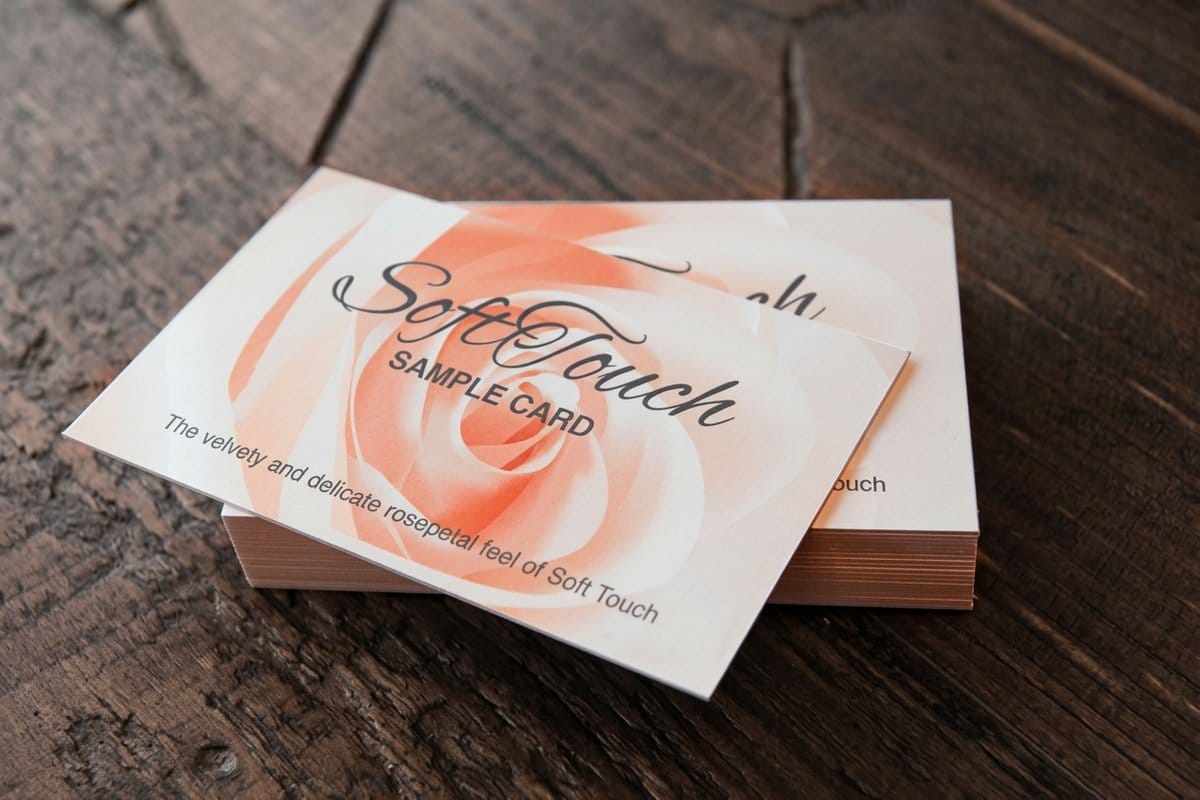
- 1. Soft touch and velvet laminates. A coating that changes how a piece feels rather than how it looks. It is spreading fast because the effect registers before the design does, at the moment of pickup, which is exactly when a first impression forms.
- 2. Selective raised finishes. Spot UV, raised varnish, and foil used on one element against a plain field. This is the print equivalent of elevation on screen, expressing hierarchy physically rather than through contrast alone.
- 3. Deep impression and debossing. Pressure driven effects, including letterpress style impression, where the surface itself carries the mark. Costly, and increasingly used precisely because the cost is legible to the recipient.
- 4. Heavier stocks and unusual thicknesses. Weight is read instantly and unconsciously as an indication of seriousness, which is why so many brands are moving up in stock weight rather than adding visual detail.
These four are worth investing in, because the pressure behind them is structural rather than cyclical. The discipline is spending once. One raised element on an otherwise plain card signals importance, while three raised elements compete and the hierarchy collapses. Our guide to print finishing techniques covers what each treatment costs and suits.
Print picks
Four finishes at the center of current print work
Live starting prices from the configurator, for the treatments designers are specifying most.
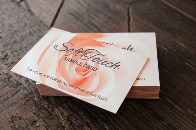 Soft Touch Business Cards From $40.28 A velvety coating that changes the piece the moment it is picked up rather than when it is looked at.
 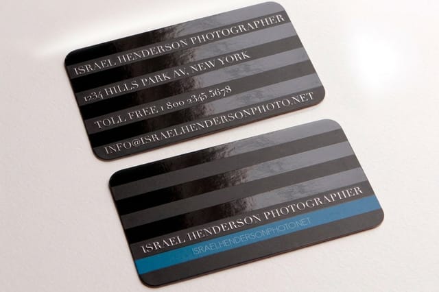 Spot UV Business Cards From $76.88 Selective gloss that raises one element above a matte field, doing the job elevation does on screen.
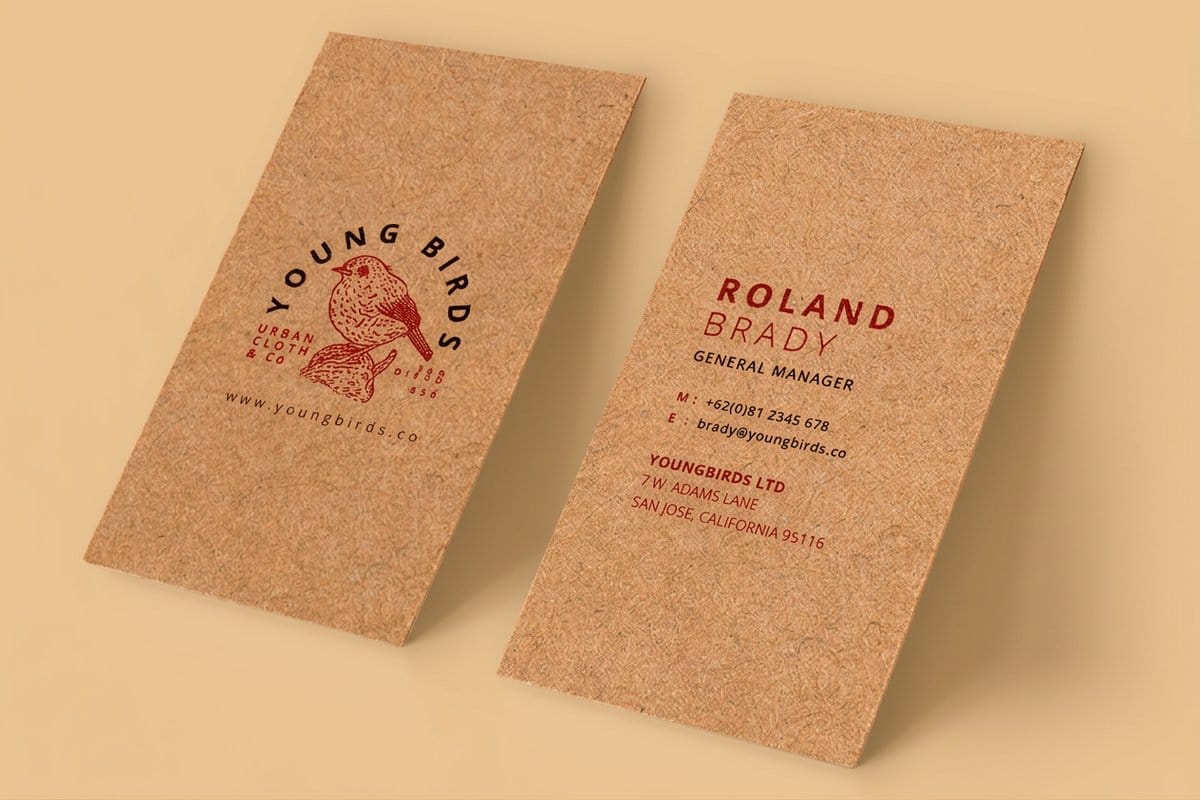
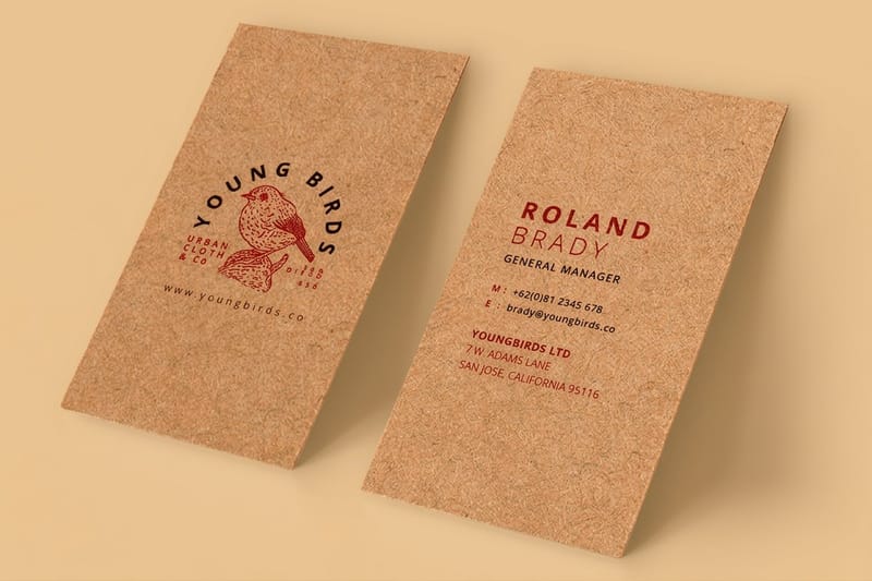
 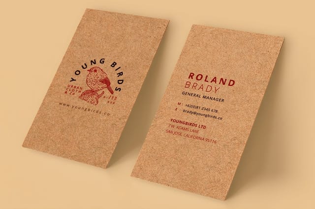 Kraft Business Cards From $24.75 Unbleached stock that makes the material itself part of the message.
 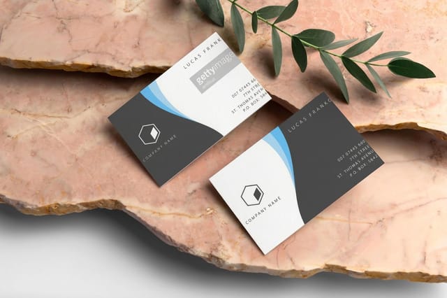 Classic Business Cards From $17.57 The control sample. Every trend below is worth judging against a well made plain card.
 Material as Message, and the Move Away From Coated Everything
The second real current is about substrate. For a long time the default assumption was that better printing meant smoother, whiter, glossier stock. That assumption has broken down, and the reasons are commercial rather than aesthetic.
- 5. Recycled and unbleached stocks as a default. Kraft, recycled, and visibly fibrous papers are moving out of the eco niche and into general use, because a growing share of customers reads material choice as a statement about the business. The important caveat is that it invites scrutiny, since a recycled card from a company that ignores the subject elsewhere reads as decoration.
- 6. Uncoated as a considered choice. Uncoated stock absorbs ink, softening fine detail and flattening color, which was once treated as a limitation. It is now frequently chosen for exactly that quality, because the warmth and the tactile surface communicate honesty in a way a glossy sheet cannot.
- 7. Visible production character. Deliberate use of texture, deckled edges, exposed board, and finishes that show the piece was made rather than manufactured invisibly. It is an argument against the flat digital surface people spend all day looking at.
All three are durable, but they carry a real design cost that is often overlooked. Uncoated and recycled stocks reproduce color and fine detail differently, so a palette tuned on a coated proof can arrive noticeably duller and a hairline typeface can thicken unevenly. Choose the stock early and design for it, rather than choosing it at the end. Ordering free paper samples before committing is the cheapest insurance available, and Green Printing covers the production side.
Layout and Type, Where Restraint Is Winning
The third current is compositional, and it is the one most visible to a casual observer. Print layouts are getting quieter, larger, and emptier, and this is a response to a genuine credibility problem rather than a swing of taste.
- 8. Larger type and fewer messages. A steady move toward one dominant message set at a size that reads at distance, with the supporting information genuinely subordinate. It reflects the reality that a printed piece gets a couple of seconds, not a careful read.
- 9. Structural whitespace. Empty space treated as part of the composition rather than as waste to be filled. It signals confidence, since only a business unsure of its message crowds every millimetre, and it makes the one thing that matters unmissable.
- 10. Expressive type as the whole design. Layouts where the typography is the image, with no photography or illustration at all. It is partly practical, since good type costs less than good photography, and partly a reaction against the interchangeable stock imagery that saturates every channel.
Restraint is not the same as blandness, and this is where the trend is most often misapplied. A minimal layout with nothing interesting in it is not minimal, it is empty, and it fails more visibly than a busy one because there is nowhere for a weak idea to hide. Our guide to minimal brand identity covers doing it deliberately, and hierarchy in graphic design covers the mechanics of making one thing dominate.
Where trends get tested
Longer formats show whether a trend has substance
A style that works on a single card can collapse across a multi page piece, where pacing, hierarchy, and sequence all have to hold.

What Is Probably Just a Fashion
Honesty requires naming the things on current trend lists that do not pass the problem test, because adopting these is how work gets dated.
Anything that recreates a specific past decade wholesale tends to have a short life. Period pastiche can be excellent when it is chosen for a reason, such as a heritage brand or a piece genuinely about that era, but adopting it because it is currently popular means committing to look exactly as old as the trend once it passes. The same applies to highly specific color combinations that become briefly ubiquitous. They work precisely because they are recognizable, and recognizable dates fast.
Deliberately distressed and imperfect effects sit in a similar category. There is a real idea underneath, which is a reaction against digital perfection, and the tactile and material trends above express that idea far more durably because they are physically true rather than simulated. A printed texture imitating wear is a picture of authenticity. An uncoated stock simply is the thing.
The test to apply is straightforward. If you cannot explain what a treatment does for the reader, it is decoration, and decoration is the first thing that looks dated.
Quantity and price
Soft touch pricing and specs, straight from the configurator
Real numbers on the finish driving most of the current interest in tactile print, with the stocks it runs on.
| Quantity | Price Per Unit | Total |
|---|---|---|
| 50 | 80.6¢ | $40.28 |
| 100 | 76.7¢ | $76.65 |
| 200 | 59.9¢ | $119.74 |
| 300 | 53.9¢ | $161.67 |
| 400 | 44.9¢ | $179.65 |
| 500 | 38.3¢ | $191.60 |

Adopting a Trend Without Regretting It in Two Years
The practical question is not which trends are real but how much of your work should follow them at all. A useful way to think about it is by how long the piece has to last.
Anything with a long life, a logo, a stationery system, a permanent sign, should be almost entirely trend free, because those pieces are expensive to change and their job is to look consistent rather than current. Anything short lived, a campaign, an event piece, a seasonal promotion, can lean into a trend heavily, because it will be retired before the trend ages. The mistake most businesses make is exactly backwards, applying a fashionable treatment to the permanent identity and printing the disposable campaign material conservatively.
Then run a control. Produce the trendy version and a well made plain version of the same piece, and compare them honestly at actual size, in hand. If the plain one holds its own, the treatment was decoration and the budget is better spent on stock weight. If the treated one clearly wins, you have evidence rather than a hunch. Start from a print ready layout in the blank templates library or build both in the online designer, and if the deadline is tight, Same Day Printing covers late approvals.
Wally separates a trend from a fashion
Ask what problem it solves before you pay for it
A trend worth adopting solves something. Tactile finishes solve the fact that a screen cannot be touched. Recycled stock solves a real expectation from customers. Bigger, plainer type solves legibility. The ones that fade are the ones that only solve boredom, and you can usually spot them because nobody can explain what they are for. Judge every trend below against a well made plain card, and only pay for the ones that win.
Try a tactile finish →How to use a trend without dating your work
Explore more
More on finishes, stocks, and current design
Kraft cards run 100 for $24.75 on 18pt kraft uncoated, soft touch 50 for $40.28.
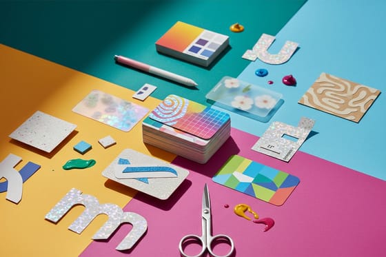 Article Business Card Design Trends Where the smallest format is heading.
 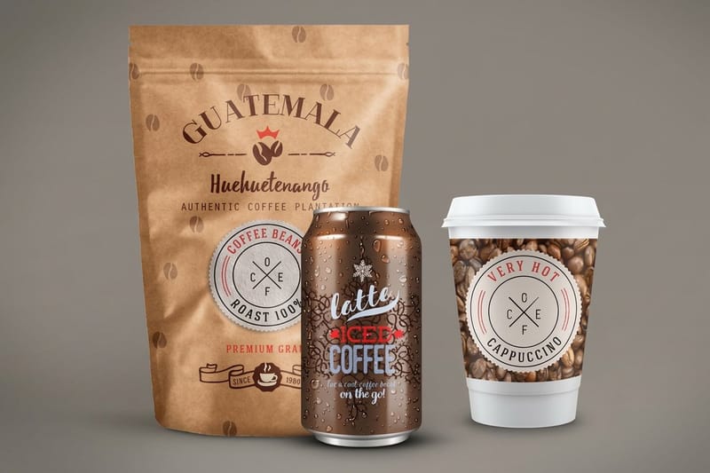 Article Packaging Design Trends How the same shifts play out on the shelf.
  Article Amazing Business Cards Executions worth studying rather than copying.
  Guide Print Finishing Techniques Foil, spot UV, embossing, and what each costs.
 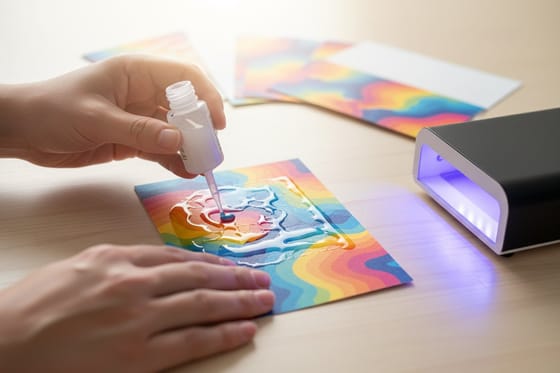 Guide What Is Spot UV How selective gloss is applied and when to use it.
 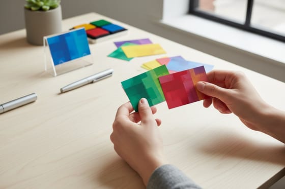 Guide Soft Touch Cards The finish behind the current tactile push.
 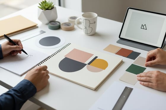 Guide Minimal Brand Identity Restraint as a strategy rather than a look.
  Guide Serif vs Sans Serif The type decision underneath most trend talk.
  Guide Brand Color Palette Building a palette that survives CMYK.
  Benefit Green Printing The production side of the sustainability shift.
  Statistics Design Industry Data The numbers behind where the trade is going.
  Product Kraft Business Cards Unbleached stock that makes material the message.
 Ready to put one of these into production?
Pick the single trend that solves an actual problem for your piece, spend the finish budget once, and 4OVER4.COM prints it on the stock that suits it.
Print design trend questions
What are the biggest print design trends right now?
Three currents account for most of what is happening. The first is tactile, with soft touch laminates, selective raised finishes such as spot UV and foil, deep impression, and heavier stocks all gaining ground because touch is the one thing a screen cannot reproduce. The second is material, with recycled, kraft, and uncoated stocks moving from a niche choice toward a default because customers read material as a statement. The third is compositional, with larger type, fewer messages, and structural whitespace spreading because crowded layouts stopped reading as credible.
How do you tell a lasting design trend from a passing fashion?
Ask what problem it solves. Durable shifts answer a real constraint, such as a change in customer expectations, a change in what production can do affordably, or a capability competing media lack. Tactile finishes last because screens cannot be touched. Recycled stock lasts because the expectation behind it is real. Fashions answer a different question, which is that everyone got bored of the last thing, and they age at exactly the speed they arrived. If you cannot explain what a treatment does for the reader, it is decoration, and decoration dates first.
Should my logo or stationery follow print design trends?
Mostly no, and this is where businesses most often get it backwards. Match the amount of trend to how long the piece has to last. A logo, a stationery system, or a permanent sign should be close to trend free, because those are expensive to change and their job is to look consistent rather than current. Short lived pieces such as campaigns, event material, and seasonal promotions can lean into a trend heavily, since they will be retired before it ages. The common mistake is a fashionable permanent identity paired with conservative disposable material.
Are recycled and uncoated papers worth using?
Increasingly yes, with one design cost to plan for. Recycled, kraft, and uncoated stocks now read as a deliberate statement rather than a compromise, and a growing share of customers interprets material choice as information about the business. The caveat is that it invites scrutiny, so a recycled card from a company that ignores the subject everywhere else reads as decoration. Practically, these stocks absorb ink, which softens fine detail and flattens color, so choose the stock early and design for it rather than tuning a palette on a coated proof and switching at the end.
How many print finishes should I use on one piece?
Usually one. Selective finishes such as spot UV, foil, and raised varnish work by creating a physical hierarchy, so a single treated element against an otherwise plain field reads instantly as the important thing. Add a second and a third and they compete, the hierarchy collapses, and the piece reads as expensive rather than considered. The reliable test is to print the treated version alongside a well made plain version and compare them in hand at actual size. If the plain one holds its own, the budget is better spent on a heavier stock.
