
The Biggest Graphic Design Trends for 2026


Sofia is our design and templates voice, built from the knowledge of our production team, with over 20 years in printing.
What Is Actually Driving Graphic Design in 2026

The biggest graphic design trends for 2026, and the current graphic design trends you see on finished print, are expressive typography, tactile finishes such as soft touch and spot UV, bold two color contrast, custom die cut shapes, visible texture, a human signature on AI-assisted work, and honest materials. Every year the trend lists arrive full of moodboards and very few decisions, so the useful question is which style still works once it leaves the screen and lands in somebody's hand. That is where 2026 gets interesting, because most of this year's movement is happening in the physical layer: the weight of the type, the feel of the stock, the way light moves across a finish.
Screens flattened design for a decade. Every brand ended up with the same geometric sans, the same soft gradient, the same rounded card. The reaction is now visible everywhere, and it is tactile, loud, and deliberately handmade. Designers are reaching for print again because print is the one place a competitor cannot copy your look with a screenshot.
The trends below are ordered the way we see them show up in real files at 4OVER4.COM, from the ones that change a layout to the ones that change a production spec. Every product listed starts from a small run, 100 business cards for $17.57 or one wall graphic for $25, so you can test a trend before you commit to it. Each section ends with the product and finish that carries it best, so you can move from inspiration to a print-ready decision in one pass. If you are building a book around this work, the most impressive graphic design print portfolios show what that looks like assembled.
Screen fatigue is pushing budgets back to print
When every channel is saturated, the rare thing wins. A card with a real finish gets kept on a desk in a way a PDF never does, and that is why studios are quietly rebuilding their physical collateral first.
Brand systems beat one-off layouts
The strongest 2026 work is systematic. One type family used at extreme sizes, one accent color, one finish, repeated across every piece until it reads as a signature rather than a coincidence.
Texture is the new differentiator
Color and layout can be imitated in an afternoon. Soft touch laminate under raised spot gloss cannot, because it is a production decision, not a design file. Texture has become a moat.
Craft signals are back on purpose
Hand-drawn marks, visible grain, slightly imperfect lettering. Audiences read those signals as human effort, and in a year of machine-fast output that reads as trust.
Shop the look
Business card printing
Every stock, shape, and finish the 2026 trends ask for, in one catalog.

2026 Graphic Design in Print, Trend by Trend
Each 2026 trend lands on a specific piece and finish. In print it looks like a graphic designer business card from $17.57 with soft touch and spot UV, a die cut interior design business card, or a wall graphic from $25.
- Expressive type. One word at the largest size a 2 x 3.5 inch card allows.
- Tactile finish. Soft touch laminate with spot UV on the logo only.
- Bold contrast. Two colors across a wall graphic, proofed at full size.
- Custom shape. A 2 x 2 inch square or a die cut silhouette in place of the standard rectangle.
- Honest materials. Uncoated 13pt cover made from 100% post-consumer waste.
Trend 1: Expressive Typography Carries the Whole Layout
Expressive typography means the type is the design rather than a label sitting on top of it. Instead of a neutral headline over an image, the letterforms are stretched, stacked, cropped, or set at a size that fills the frame, and the message and the artwork become the same object. It is the single most visible graphic design trend going into 2026, and it is the easiest one to get wrong.
It works because it forces a hierarchy decision. You cannot set a headline at 90 points and still hedge about what the piece is saying. On a business card that means one word or one name owning the front, with contact details demoted to the reverse. On a wall it means a phrase readable from across the room with nothing competing for attention.
The practical limits are printing limits. Very heavy type traps ink at small sizes, ultra-thin type disappears on uncoated stock, and tight letterspacing closes up when the ink spreads. Test the extremes before you commit a run. For a wider look at how type behaves on the smallest canvas, the roundup of most amazing business card designs is a good reference.
- Set one word, not one sentence. Expressive type needs a single anchor to be legible at speed.
- Let the type crop. Letters that run off the trim edge feel intentional and confident when the bleed is set correctly.
- Pair one voice with one neutral. A dramatic display face works only when the supporting text stays quiet.
- Check the weight against the stock. Uncoated paper softens hairlines, coated stock holds them.
Print picks
Three formats built for the 2026 look
Live prices, ready to customize with your type and palette.
 Graphic Designer Business Cards 100 for $17.57 A designer calling card built to show off type, texture, and finish choices.
 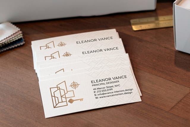 Interior Design Business Cards 100 for $17.57 Material-forward cards for studios that sell texture and palette in person.
 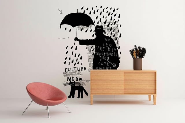 Wall Graphic $25 each Take a bold 2026 palette off the screen and onto a full wall at scale.
 Trend 2: Tactile Finishes That Reward a Second Look
The finish is where 2026 separates itself from 2023. Soft touch laminate gives paper a suede feel that makes a matte black look almost velvet. Spot UV lays glossy varnish over selected artwork so a logo or a single letterform catches the light while everything around it stays flat. Raised finishes add height you can feel with a thumb.
The reason these are trending is behavioral, not visual. A tactile card gets handled twice: once on receipt, once again when the recipient notices the texture and turns it over. That second handling is the entire point, and no digital format has an equivalent.
Use finishes as punctuation rather than decoration. One spot UV element on a soft touch card reads as expensive restraint, while five reads as a sampler. If you want to see the finish logic applied to a full range of formats, the current business card design trends and ideas cover which combinations are actually being ordered. Graphic designer business cards carry soft touch, spot UV and foil from $17.57, in 2 x 3.5, 2 x 2, 1.5 x 3.5 and 2.125 x 3.375 inch sizes.
Trend 3: Bold Color and Unapologetic Contrast
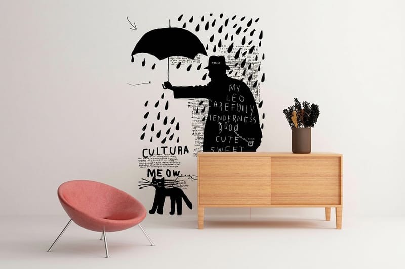
Muted, safe palettes are giving way to saturated color used at full strength. Not rainbow maximalism, but two colors pushed to their limit against each other, usually one deep neutral and one electric accent. The look reads instantly at distance, which is exactly why it is showing up on large format work first.
Scale changes the math. A palette that feels bold on a phone screen can feel timid across six feet of wall, and a color that sings in RGB can sit flat once it is converted for print. Build your palette in the destination color space and proof it at the size it will actually be viewed.
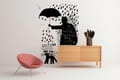
Environmental graphics are the natural home for this trend. A Wall Graphic starting at $25 turns an office corridor or a retail wall into the largest brand asset you own, and it makes a high-contrast palette do work that a small piece never could. For color psychology behind the choices, the facts about logos most people do not know are a useful detour.
Quantity and price
Graphic designer business card pricing and specs
Real configurator numbers. The more you print, the lower the unit price falls.
| Quantity | Price Per Unit | Total |
|---|---|---|
| 100 | 17.6¢ | $17.57 |
| 200 | 11.5¢ | $23.07 |
| 300 | 9.15¢ | $27.46 |
| 400 | 7.96¢ | $31.86 |
| 500 | 7.25¢ | $36.26 |
| 600 | 6.77¢ | $40.64 |
Trend 4: Custom Shapes and Die Cut Silhouettes
The rectangle is being questioned. Rounded corners, half circles, arch tops, and full custom die cuts are moving from novelty to standard practice, because a shape is recognized before a single word is read. In a stack of cards or a wall of flyers, the outline is the first brand signal that registers.
Shape is also a structural decision. A die cut removes material, which means the layout has to survive the loss. Keep critical text well inside the safe zone, avoid placing thin strokes near the cut line, and remember that a complex outline needs a clean vector path rather than a traced bitmap.
Interior and spatial designers have led this one, because their work is already about form. Cards for those studios often echo a material sample or a floor plan detail, which is why Interior Design Business Cards from $17.57 are frequently ordered with a custom silhouette rather than a standard cut. Our Interior Design Business Cards story shows a finished set.
- Keep the outline simple. Two or three curves read better than a filigree that fights the trim.
- Mind the safe zone. Pull text at least an eighth of an inch away from any cut edge.
- Supply vectors. A die line has to be a path, not a picture of a path.
- Prototype at real size. Print one, cut it, hold it. Shapes lie on screen.
Large format
Wall graphic specs
The size, material, and install detail behind a full wall of brand color.
Trend 5: Maximalism, Retro Revival, and Visible Texture
Minimalism never disappears, but it has company again. Layered compositions, halftone grain, risograph-style overprints, and unapologetic seventies and nineties references are everywhere, and they are being executed with far more control than the first wave of retro revival.
The discipline inside maximalism is that one element still leads. Underneath the layers there is a single focal point and a readable path, otherwise the piece becomes wallpaper. Think of the texture as atmosphere and the type as the message, never the reverse.
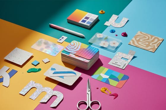
Stickers are where this trend earns its keep, because a maximalist mark works at small scale and travels on laptops, packaging, and windows. There are more distribution ideas in ten fun ways to use logo stickers for promotion.
Texture in hand
Interior design business cards
Material-led cards for studios whose whole pitch is texture and palette.
Trend 6: AI-Assisted Work and the Human Signature
Generative tools have collapsed the cost of a competent-looking layout, which means competent is no longer a differentiator. The response from serious studios has been to add signals that are obviously human: hand lettering, custom illustration, photography of real objects, and production choices that cannot be prompted, such as raised spot UV over a hand-drawn mark on a 2 x 2 inch soft touch card.
This is why the finish decisions in this article matter more than they did two years ago. Anyone can generate a nice composition. Choosing a specific stock weight, a specific varnish, and a specific trim is an act of judgment with a cost attached, and the audience feels the difference even when they cannot name it.
Portfolios are adjusting accordingly, leading with process and physical work rather than flat mockups. The examples in ten graphic design portfolio examples show how designers are presenting that shift.
Compare finishes
Popular business cards, side by side
Metallic foil cards take 7 business days and lenticular 22, so a trend has a lead time attached.
 free business cards |  Standard Business Cards |  3D Lenticular Business Cards |  Metallic Foil Business Cards | |
|---|---|---|---|---|
| Min price | Free | $17.57 | $690.88 | $222.13 |
| Paper / stock | 14pt Gloss Cover | 14pt Gloss Cover | 31pt Lenticular Lens | 16 Point Silk Laminated |
| Finish | - | Standard Finish | - | - |
| Size | 2" x 3.5" | 2" x 3.5" | 2" x 3.5" - Vertical | 2" x 3.5" |
| Default qty | 200 | 100 | 500 | 500 |
| Turnaround | 5 business days | 3 business days | 22 business days | 7 business days |
| Rating | ||||
| View & customize | View & customize | View & customize | View & customize |
Trend 7: Honest Materials and Sustainable Print Choices
Recycled and uncoated stocks are being chosen for how they look, not just for how they read on a sustainability page. Visible fiber, softer color, and a matte surface signal something the glossiest card cannot, and the aesthetic pairs naturally with the craft and texture trends above.
Design for the stock instead of fighting it. Uncoated paper absorbs ink, so deep blacks sit slightly lighter and fine detail softens. Increase type weight a step, open the letterspacing, and choose colors with a little more saturation than the screen suggests.
Packaging is where material choice is most visible to customers, and the moves there tend to reach print collateral a season later. The current shifts are covered in ten notable packaging design trends.
How to Apply the 2026 Trends Without Redesigning Everything
You do not need to adopt seven trends. Pick one structural change and one production change, apply both across your smallest and most frequently handed-out piece, and see how it performs before you touch anything else. For most brands that piece is a business card.
A practical sequence: set the type first at the size it will print, choose a single accent color and prove it in the print color space, decide the stock, then add exactly one finish. Start from a print-ready layout rather than an empty canvas, drop your artwork in, and check the trim and safe zones before you order. Graphic Designer Business Cards from $17.57 are the cheapest honest test of a new direction you can run.
Match the finish to the trend
- Expressive typography. Heavier stock with a matte or soft touch surface so the letterforms stay crisp.
- Bold color. Coated stock, which holds saturation far better than uncoated.
- Custom shapes. A rigid card weight so the silhouette does not curl at the cut.
- Texture and retro layers. Uncoated or recycled stock that lets the grain read as part of the artwork.
Formats with built-in novelty are worth a look too when a launch needs to be remembered rather than filed. The case for one of them is made in 3D lenticular postcards.
Start fast
Card templates and print-ready blanks
Free layouts plus exact-size blanks so your trim and safe zones are right the first time.






Wally sorts the trends worth printing
Seven trends, one decision at a time
Wally has seen a lot of trend lists come through the press room, and the ones that hold up share a habit: they change something physical. Pick the trend that fits what your audience already believes about you, set the type at real size, choose the stock before the finish, then add exactly one effect. Print a small run, hand it out, and let the reaction tell you whether to scale it.
Design your business cards →Turning a Trend Into a Print Decision
Explore more
More design and print thinking
Designer and interior design business cards from $17.57, wall graphics from $25, business card and packaging design trends, and print portfolios that show the work on paper.
Product Graphic Designer Business Cards The cheapest honest test of a new visual direction. 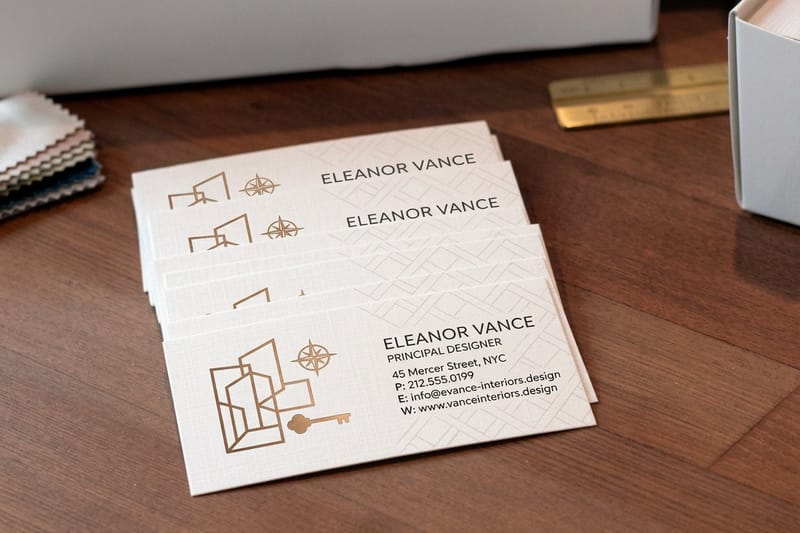 Product Interior Design Business Cards Material-forward cards for studios that sell texture. Product Wall Graphic Bold palettes at the scale a whole room can read.
  Shop Business Card Printing Every stock, shape, and finish in one place.
  Article Business Card Design Trends The trends translated to a two by three inch canvas.
  Article Graphic Design Portfolio Examples How designers are presenting physical work again.
  Article Packaging Design Trends Material and structure moves that reach print next.
  Article 30 Amazing Business Card Designs A reference stack for type, shape, and finish ideas. Article Impressive Print Portfolios What a printed portfolio does that a link cannot.
  Article Ways to Use Logo Stickers Where a maximalist mark travels best at small scale.
  Article Cool Facts About Logos The color and mark decisions behind famous identities.
  Article 3D Lenticular Postcards A format built to be remembered rather than filed.
 Test one 2026 trend on 100 cards for $17.57
Set your type, pick a stock, add one finish, and print a short run first. The reaction you get in person will tell you far more than another moodboard will.
Graphic Design Trend FAQs
What are the biggest graphic design trends right now?
The current cycle is led by expressive typography, tactile print finishes such as soft touch and spot UV, custom die cut shapes, high contrast color used at large scale, a maximalist and retro-influenced return of texture, visibly human craft in a year of generated output, and honest recycled or uncoated materials. The through line is physical: the trends that matter in 2026 are the ones that change how a piece feels in the hand, not just how it looks on a screen.
What is expressive typography and how do I use it?
Expressive typography treats the letterforms as the artwork rather than as a caption sitting on top of it. Type is set very large, cropped at the trim, stacked, or distorted so the message and the image are the same thing. To use it well, choose one word or name to carry the piece, keep every supporting element quiet and small, and test the weight against your chosen stock, because heavy type can trap ink at small sizes and thin type can vanish on uncoated paper.
How do I choose which design trends are right for my brand?
Start from what your audience already believes about you and pick the trend that reinforces it rather than the one you like most. A law practice gains from restraint and a premium finish, a creative studio gains from shape and texture, a retail brand gains from color at scale. Then adopt one structural change and one production change at a time on a single piece, and judge it by whether people keep it, mention it, or ask who printed it.
What does it cost to print a trend-forward design and how are prices set?
Price is set by four things: the product, the quantity, the stock and finish, and the turnaround. Graphic Designer Business Cards start at $17.57 and Interior Design Business Cards start at $17.57, while a Wall Graphic starts at $25. Quantity is the biggest lever because setup is spread across the run, so the unit price drops sharply as volume rises. Premium finishes and faster turnarounds add to the base, and every combination prices live in the configurator on the product page.
What sizes, stocks, and finishes can I choose?
Cards run from the standard two by three and a half inch format through square and custom die cut shapes, and large format work scales up to full wall coverage. There are 60+ paper stocks available across the catalog, from lightweight uncoated and recycled sheets to heavy premium boards. Finishes include matte, gloss, soft touch laminate, spot UV, and raised effects, and every product page lists the exact sizes, stock weights, coatings, and turnaround options available for that item.
