
Timeless Brand Design and Why Anti-Trend Branding Wins


Marcus is our print marketing voice, built from the knowledge of our production team, with over 20 years in printing.
Anti-trend branding wins because a mark you do not replace every two years keeps compounding recognition instead of resetting it. The saving is not the printing. It is the design fee, the proof rounds and the boxes of retired collateral you pay for again at every identity change, on every asset, at the same time. Hold the mark still and you reorder one approved file on your business cards and your 8.5 by 11 in letterheads for years, with nothing to redraw and nothing to throw away.
Trend-led and timeless, choice by choice
| Decision | The trend-led choice | The timeless choice | What dates it |
|---|---|---|---|
| Wordmark type | Whatever grotesk shipped last year, tracked tight | A family with decades of releases and a full weight range | Letterforms. A dated typeface dates everything set in it. |
| Color | A gradient sampled from a screenshot | One flat ink that converts cleanly to CMYK and to one color | Gradients. They shift between screen, press and embroidery. |
| Layout system | A hero composition copied from one campaign | A grid and a spacing rule that survive new formats | Slowly. Layout is the most durable part of an identity. |
| Stock and finish | 14pt gloss, cheapest option, reordered on impulse | 16pt with soft touch, deboss or foil on the mark alone | Barely. Texture reads as considered in any decade. |
| Photography | The filter of the moment across every asset | A consistent light direction and a fixed crop ratio | Fast. Filters are the clearest timestamp on a brand. |
Read the last column first. It is the one that decides how long you keep the artwork, and it is the one nobody presents. You can test any of these on a real card before you commit the identity by ordering a short run of premium business cards and living with it for a month. A run of 100 costs $17.57 and prints in 3 business days, on any stock from 14pt gloss to 24pt ultra thick gloss or 16pt uncoated with soft touch, which lets you test the stock row of the table on a card you can hold.
Why trend fatigue is real
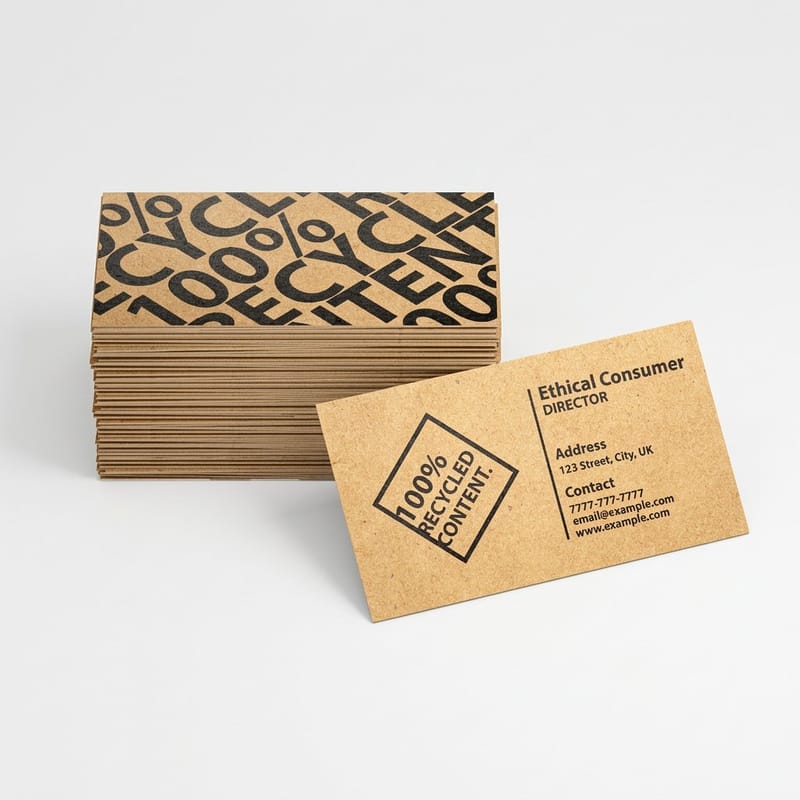
Identity trends move in visible cohorts, and that is the problem. The geometric sans wave, the wide tight-tracked grotesk that banks and breweries adopted in the same eighteen months, the flat redraw of every heritage mark, the current swing back toward serifs and drawn letterforms: none of them were bad ideas. They stopped working because everyone arrived at once.
A trend does not make a brand look bad. It makes a brand look like the year it was made in, and it makes it look like its competitors. When four firms in the same category all tighten their tracking and drop their serifs in the same season, the treatment stops doing the one job a wordmark has, which is telling people who they are looking at.
The fatigue shows up on the buyer side too. People who see the same visual language across an entire category stop reading it as a signal and start reading it as wallpaper. Our brand refresh checklist is worth running before you assume a redesign is the fix, because it separates the parts that genuinely stopped working from the parts that simply look unfamiliar to you after five years of staring at them.
We redrew our mark twice in six years and both times the sales team kept handing out the old cards because there were four boxes left. The identity was never the bottleneck.
A 4OVER4.COM customer, professional services firm
What actually dates first
Type and color age fastest. Layout ages slowest. If you look at an identity that feels ten years old, the tell is almost always the letterforms or the gradient, not the grid it sits on. That ordering matters when you plan a refresh, because redrawing a wordmark is a small job and rebuilding a layout system is a large one.
Finish is the exception. A soft touch laminate or a blind deboss carries no date at all. Texture is not fashion, which is why identities that lean on finish rather than styling hold up longer than identities that lean on a treatment.
The reprint is the real invoice
Nobody rebrands a logo. You rebrand a set: business cards for every person, letterhead, envelopes, packaging inserts, window vinyl, exhibition graphics, the truck. Each of those is a separate setup, a separate proof round, and a separate pile of old stock nobody will ever hand out.
That is where the money goes, and it is why the per-card price you compare on a product page is close to irrelevant to the decision. A box of premium business cards at $17.57 is not what a rebrand costs you. The eleven other things you reprint at the same time are.
The business case for design that endures
Recognition compounds. Every time somebody sees your mark on a card, an invoice, a box and a van, the association gets a little cheaper to retrieve. An unchanged card goes back to press from the file you already approved, while a redrawn mark needs a fresh proof on every asset from the 2 by 3.5 in card to the 8.5 by 11 in letterhead. A redesign does not add to that stack, it resets part of it, and the reset is invisible on a balance sheet because nothing appears in a column labeled recognition you gave away.
The measurable half is easier. Setup and proofing repeat on every asset in a rebrand, while the print run itself is roughly the same money whether the artwork is new or eight years old. Hold the identity still and you buy the same cards; move it, and you buy the same cards plus the design fee plus the write-off.
There is a second saving that firms usually miss. A stable identity lets you order deeper runs, and deeper runs are where print pricing actually drops. If you expect the artwork to change next spring, you order 500 cards. If you know it will not, you order 2,500 and pay less per card for the confidence.
Where the money actually goes
Split any rebrand into three buckets and the picture gets honest. Bucket one is creative, paid once. Bucket two is production setup, paid once per asset type, and it is the one that multiplies quietly. Bucket three is the print itself, which you were going to pay anyway.
Bucket two is the argument for anti-trend design. Cutting the number of times you pay it, from five in eight years to one, is a bigger saving than any per-unit negotiation on bucket three will ever produce.
When a rebrand is genuinely the right call
Anti-trend is not never-change. Four situations earn the cost outright: the legal name changed, the company sells something the mark no longer describes, the mark fails at small sizes or in single color, or there is a genuine trademark conflict. A fifth, weaker case is a merger where two marks cannot coexist on the same document.
"The founder is bored of it" is not on that list, and neither is "our competitor refreshed theirs". If you cannot name which of the four applies, what you want is probably a print upgrade rather than a redesign, and that is a much cheaper conversation.
Timeless versus trendy, decision by decision
Timeless is not a style. It is a set of five choices, each made for durability rather than for the way it looks in a portfolio shot this year. The table above sets them side by side; the diagram below shows what the difference costs across eight years of printing.
The one that surprises people is the last row. Photography is the fastest-dating element in most identities, faster than the logo, because a filter is a timestamp and everybody can read it. Fix the light direction and the crop ratio instead of the treatment and the same library stays usable for years.
The trade-off nobody puts in the deck
Restraint is harder to sell internally. A timeless identity looks quiet in a presentation, gets less applause, and gives a design team almost nothing to show off with. A trend-led one presents beautifully and then needs replacing. If you want the restrained route to survive a boardroom, bring the reprint arithmetic, not the mood board.
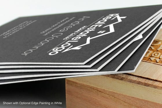
The honest limit is that a genuinely conservative identity in a category full of them can leave you invisible. In that case the differentiation belongs in the material rather than the styling: a heavier stock, a painted edge, a blind deboss. Distinct in the hand, unremarkable in a screenshot.
Design lessons from marks that outlasted their trends
The famous survivors did not stand still. They edited. The Shell pecten has been simplified repeatedly across the twentieth century and is still recognisably the same shell. Coca-Cola has kept its Spencerian script through every packaging change around it. The National Park Service arrowhead, Penguin’s horizontal band grid, Paul Rand’s striped IBM: each one changed in small increments while the recognisable core stayed put.
That is the pattern worth copying. Evolution keeps the equity and fixes the problem; revolution throws both away and buys a fresh reprint of everything you own.
Four things those marks have in common
They work in one color. Every one of them survives a fax, an embossing die, a stamped crate and a one-color newspaper ad. If a mark needs a gradient to read, it is not finished.
They are ownable rather than fashionable. A shell, an arrowhead, a script signature. None of them could be swapped for a competitor’s mark without anyone noticing, which is the actual test.
They are drawn, not assembled. Custom letterforms and drawn shapes cannot be dated to a font release, and a mark set in a typeface everybody licensed in the same year can.
They change in small steps. Weight, spacing, one detail at a time. Look at the versions side by side and the change is obvious; look at any two consecutive ones and it is nearly invisible. That is deliberate. Our logo design best practices guide covers how to test a mark before you commit it to print.
How to build a timeless brand identity in 2026
Six steps, in order. The first three are decisions about the mark itself, the last three are the ones that stop it drifting once other people start ordering the reprints.
- Test the mark at 10 mm, in black, first. Print it at the size it will appear on a pen and a swing tag, in one color, before you look at it big on a screen. Most marks that fail in ten years fail this test on day one and get approved anyway because nobody printed them.
- Pick a typeface with a long history and a full range. A family with decades of releases, real italics and weights from light to black will carry a brand through every format it meets. A display face with three weights and one good year will not.
- Choose one flat ink and check it in CMYK. A color that shifts when it converts will haunt every print job you order. Check the conversion before you approve it, and read our note on the right color profile for printing so the file behaves the same at every supplier.
- Set the spacing rule, not the layout. Define clear space around the mark as a fraction of its own height and lock a type scale. New formats then solve themselves, which is what stops a redesign becoming necessary the first time you need a format nobody planned for.
- Write it down in two pages. Not a fifty-page bible nobody opens. Two pages: the mark and its clear space, the type scale, the ink values, the stock and finish for each printed item. The second page is what keeps the brand consistent when a new person orders the next reprint.
- Decide the reprint stock once. Fix the stock and finish for cards, letterhead and packaging so every reorder matches the last one. Color and texture drift between suppliers and between substrates, and a matched reorder is a brand decision as much as a print one.
The gap between an identity that lasts and one that does not is almost never talent. It is whether anybody wrote down the ink values and the stock. If your brand voice needs the same treatment, brand messaging explained covers the written half of the same discipline.
Apply timeless design to your print collateral
This is where anti-trend design turns into a purchase order. Stock weight, finish and edge treatment are the levers that make a restrained identity feel deliberate rather than cheap, and none of them can be dated to a year the way a color treatment can. In numbers: premium cards run from 14pt gloss to 24pt ultra thick, raised foil sits on 16pt velvet laminated cover in gold, silver or holographic, and letterpress cards on 32pt or 48pt stock can add a painted edge.
Quantity and price
Premium business card pricing and specs
Real configurator numbers, where the per unit cost drops as the run grows. A stable identity is what makes the deeper run worth buying.
| Quantity | Price Per Unit | Total |
|---|---|---|
| 100 | 17.6¢ | $17.57 |
| 200 | 11.5¢ | $23.07 |
| 300 | 9.15¢ | $27.46 |
| 400 | 7.96¢ | $31.86 |
| 500 | 7.25¢ | $36.26 |
| 600 | 6.77¢ | $40.64 |

You can also earn coins on every order and put them against the next reprint, which suits a brand that intends to reorder the same file for years.
The finishes that read as permanence, and their limits
Each of these adds perceived value without adding a date, and each has a failure mode worth knowing before you commit an identity to it.
Print it
Soft touch, the quiet upgrade
A velvet laminate that changes how the card feels without changing how it looks.
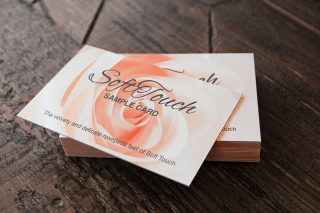
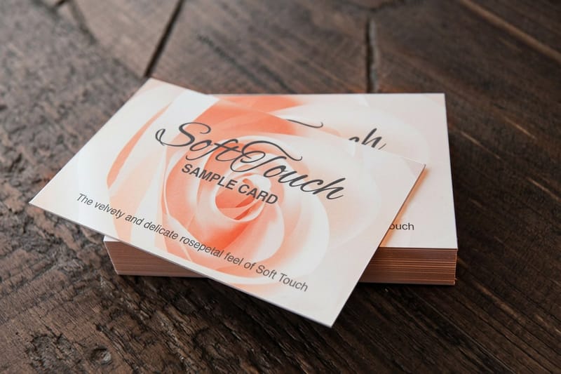
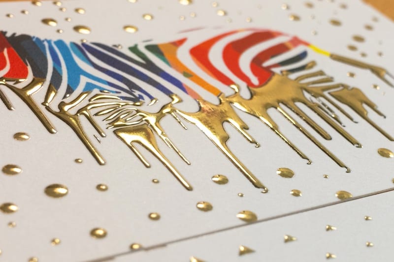
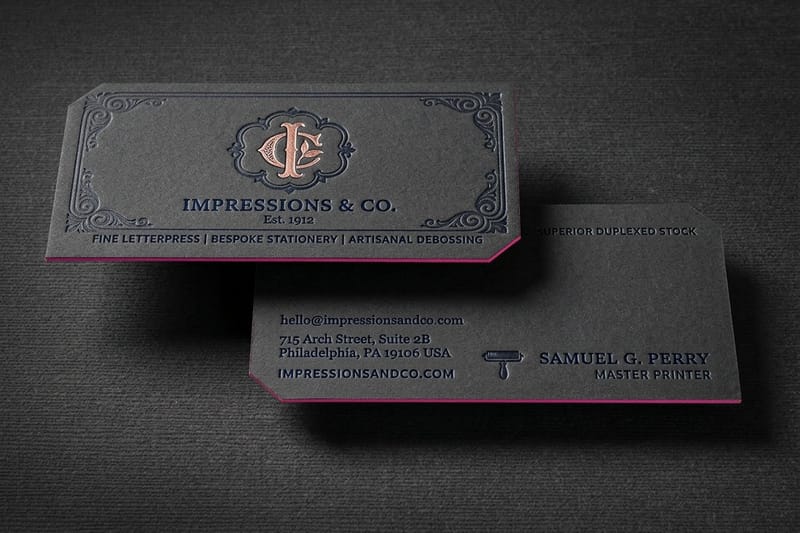
Soft touch laminate at $40.28 is the least risky upgrade: it changes the hand feel, not the artwork. Its limit is abrasion, since the velvet surface buffs to a shine at the corners of a card that lives in a wallet. Raised foil at $86.78 puts metal on the mark alone, which is the right amount of metal; keep foil coverage clear of any scored fold, because it can crack along the crease. Spot UV at $76.88 gives you gloss on one element against a matte field, and it shows fingerprints on dark solids. Letterpress at $251.36 buys a physical impression into heavy cotton stock, and it is the wrong choice for a five thousand card sales team and the right one for fifty cards a partner hands over across a desk.
Whichever you pick, fix it in the spec and reorder it. The reason a timeless identity looks expensive is not the finish itself, it is that every piece matches the last one. Compare the surfaces properly in our matte, gloss and soft touch comparison before you lock the choice, then browse the full range at business card printing.
What this looks like by industry
The principle is the same everywhere. Where you spend the differentiation budget is not.
- Professional services. Restraint is already the category norm, so put the difference in the material. 16pt uncoated with a blind deboss reads as permanent in a way another sans-serif refresh never will.
- Restaurants and hospitality. Menus reprint constantly and identities here get pushed to follow food trends. Keep the wordmark still, let the seasonal work happen in the photography and the paper.
- Construction and trades. The mark ends up on hard hats, vehicle vinyl and site boards. If it needs a gradient or fine hairlines it will not survive any of those, so test it in one color early.
- Law and finance. Longevity is the product. Letterpress or a painted edge on the card signals a firm that expects to still be here, and it costs less than the redesign it replaces.
- Retail and product brands. The packaging carries the identity, not the website. Fix the layout grid and the ink, then let the range grow into it instead of restyling every launch.
Blanks that behave the same on every reprint
If the identity is settled and you just need the file to behave, start from a blank sized to the exact product spec. Premium cards come in four sizes, 2 by 3.5 in, 2 by 2 in, 1.5 by 3.5 in and 2.125 by 3.375 in, so pick the blank that matches the size in your spec and reuse that same file for every reorder. 4OVER4.COM builds them with bleed and trim already marked, and the free online designer lets you set the artwork in the browser and send it straight to press. Grab one from the blank template library or start in the free online designer.
Start fast
Blanks that behave the same on every reprint
Business card templates and exact size blanks so your artwork lands inside the cut line every reprint.














Wally on the card he never had to redraw
Fix the mark, then spend the difference on the stock
Test your mark at 10 mm in one color, pick a typeface with a full weight range, lock one flat ink that converts cleanly to CMYK, and write the whole thing down in two pages. Then put the money into the material instead of the styling. Soft touch at $40.28 or raised foil at $86.78 on 16pt stock reads as permanence, and 4OVER4.COM prints the same file to the same spec every reorder.
Order premium business cards →What keeps an identity from dating
Habits that keep an identity alive
- Edit, never restart. Change one variable at a time and keep the recognisable core. Every mark that survived a century got there by editing, and every mark nobody remembers got replaced.
- Buy texture before styling. A soft touch laminate or a deboss adds perceived value without adding a date. A trend treatment adds a date and nothing else.
- One accent, held for years. A single accent color used the same way on every piece reads as a brand. Three that rotate by campaign read as an agency change.
- Design for the smallest use. If it works on a swing tag it works on a billboard. The reverse is not true, and the swing tag is where most identities quietly fail.
- Order deeper runs once it is stable. Print pricing drops as the run grows. A stable identity is what makes the deeper run a safe purchase rather than a gamble on your own patience.
Explore more
Print the identity you plan to keep
Letterpress cards run 250 for $251.36 in 15 business days and soft touch 50 for $40.28 in 5.
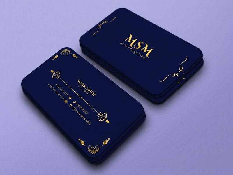 Product Premium Business Cards Heavier stock and clean flat ink, from $17.57. Product Soft Touch Business Cards A velvet laminate that carries no date at all. Product Raised Foil Business Cards Metallic on the mark alone, not across the card. Product Letterpress Business Cards A deep impression into heavy cotton stock.
 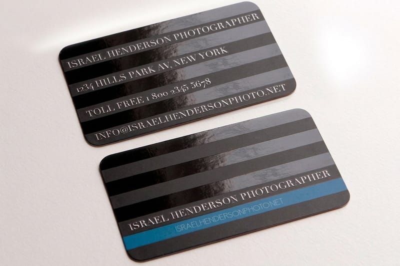 Product Spot UV Business Cards Gloss on one element against a matte field.
  Category Business Card Printing Every stock, finish and size in one place.
 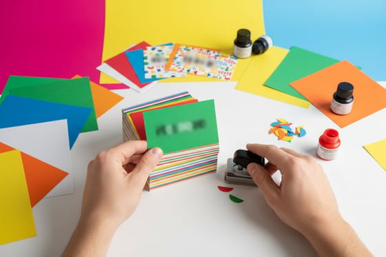 Guide Business Card Stock Explained What 14pt, 16pt and cotton actually feel like.
  Article Black and White Logos Marks that prove one color is not a limitation.
 Ready to print the version you keep?
Pick the stock, drop in your artwork or a free template, and 4OVER4.COM prints it to the same spec on every reorder for as long as the identity stands.
Common questions about timeless branding
How often should a brand actually redesign its identity?
Only when one of four things is true: the legal name changed, the business now sells something the mark no longer describes, the mark fails at small sizes or in single color, or there is a trademark conflict. On a schedule, never. A calendar-driven refresh every three to five years is an agency retainer habit rather than a business need, and it resets recognition you already paid to build. If the identity still passes the 10 mm single-color test and still tells people who they are looking at, the money is better spent on a stock and finish upgrade to the pieces you already print.
Does a timeless brand mean a boring brand?
No, but it does mean the interest moves from the styling into the material and the craft. A restrained wordmark on 16pt uncoated with a blind deboss is not boring in the hand, it is expensive-feeling in a way a gradient cannot be. The mistake is judging an identity in a screenshot, where texture is invisible and only styling registers. Print the options and hand them round the room instead. Soft touch business cards at $40.28 and raised foil at $86.78 both cost more than a plain card, and both are still cheaper than the redesign they save you from.
What print finishes signal permanence rather than fashion?
Soft touch laminate, blind or foil deboss, letterpress impression, painted edges and spot UV on a single element. None of them can be dated to a particular year the way a color treatment or a typeface release can, because they are properties of the material rather than the styling. Each has a limit worth knowing: soft touch buffs to a shine where it rubs in a wallet, foil can crack on a scored fold if the coverage crosses the crease, and letterpress needs a soft heavy stock and loses hairlines under about half a point. Pick the one your artwork can actually survive.
We already rebranded. How do we stop doing it again in three years?
Write the two-page spec and fix the reprint stock. Most repeat rebrands happen because nothing was documented, so each new marketing hire inherits an identity they cannot reproduce and quietly redesigns it rather than admit that. Two pages fixes it: the mark with its clear space rule, the type scale, the ink values in CMYK and single color, and the stock plus finish for every printed item. Then order the next run deep. A firm sitting on 2,500 matched cards is a firm that will argue against a redesign on its own.
Is it cheaper to keep the same artwork and just reorder?
Yes, and the gap is bigger than the product page suggests. Reordering an approved file skips the design fee, the proof rounds and the write-off of unused stock, and it lets you buy a deeper run at a lower unit price because you are not hedging against your own artwork changing. The print itself costs roughly the same either way. That is the whole argument for anti-trend branding in one line: the cards are not what a rebrand charges you for.
