
Top 10 Best Postcard Fonts for Print That Get Read


Nadia is our customer education voice, built from the knowledge of our production team, with over 20 years in printing.
How to Choose a Postcard Font That Reads From the Mailbox

Between the mailbox and the kitchen counter, a reader gives each card about two seconds, and the typeface decides whether anything registers in that time. Postcard fonts have to survive a small trim size, four color printing, a coated or uncoated surface, and a reader holding the card at arm's length in bad hallway light. Looking good on a monitor is not the test.
Most font choices go wrong the same way. A designer picks a face in a 200 point headline on a bright screen, then sets the body copy in that same family at 8 points and wonders why the offer disappeared. Type behaves differently at postcard scale, so choose for the smallest line on the card rather than the biggest.
Across the whole company, 4OVER4.COM has printed 10 billion+ cards since 1999 for 150,000+ businesses, and the same handful of typefaces keeps showing up in files that press cleanly while another handful keeps causing press calls. The picks below come from that pattern: faces with generous x-heights, open counters, a real bold rather than a fattened regular, and numerals that hold together at 8 points on coated, uncoated and plastic cards alike, out of the 60+ paper stocks the company carries.
Check 1: the x-height, not the point size
Two fonts set at 9 points can differ by a third in apparent size. Your eye judges size by the lowercase letters with no ascender, such as a, e and o, and the height of those letters is the x-height. Tall x-heights read larger and survive small settings, so compare printed samples instead of numbers in a menu.
Check 2: stroke contrast against your stock
High contrast faces with hairline strokes look refined on screen and then sink into uncoated paper where ink spreads. Save the hairlines for coated or plastic stock, and reach for a low contrast face whenever the card prints on uncoated, recycled, or kraft.
Check 3: the numerals and the address block
A postcard carries phone numbers, dates, discount codes, and a mailing address. Check the figures before you commit to the family. Oldstyle numerals look handsome inside body copy but slow a scanning reader, and postal automation wants an upright, unadorned sans in the address panel.
Check 4: the license before the layout
A font that is free for personal use can quietly become a legal problem on a 5,000 piece mailing. Confirm the license covers commercial print at your run size, then keep the receipt filed with the artwork so the next person inherits the answer.
Start here
The companion postcard font guide
The same shortlist, worked through as a decision instead of a ranking.

The Ten Best Postcard Fonts, Ranked for Print
This list is ordered for postcard work specifically, which is not the same as a general best fonts list. Every pick earns its place on three grounds: it stays legible below 9 points, it carries enough weight range to build a hierarchy inside one small panel, and it does not fall apart when a card is printed and trimmed at speed.
Type behaves differently on every surface it lands on, so test your shortlist on the formats you actually print. Set a headline on 2 Sided Blockout Banners and the same face at caption size on 30mil Clear Plastic Cards, and the weak links in a family show themselves immediately.
- 1. Neue Haas Grotesk. The original Helvetica drawings retuned with separate display and text cuts, so a tight headline and an open 8 point disclaimer come from one family.
- 2. Proxima Nova. A wide humanist geometric with a tall x-height that stays readable on a cluttered promotional front and neutral enough for any industry.
- 3. Futura PT. Perfect circles and long ascenders for a confident headline, as long as you letterspace the caps and keep it away from body copy.
- 4. Montserrat. The strongest free option, open source, with a wide lowercase that survives small sizes and heavy ink coverage.
- 5. Adobe Garamond Pro. The pick when a card should feel considered rather than promotional, and the best small size body text on this list.
- 6. Freight Text Pro. Sturdy serifs and low contrast, which is exactly why it holds up on uncoated and kraft cards where finer serifs break down.
- 7. Playfair Display. High contrast elegance for headlines on coated stock. Keep it above 24 points and never let it near the address panel.
- 8. Lora. A free serif with brushed curves that still reads warm at 9 points, useful on the message side of an announcement or thank you card.
- 9. Brandon Grotesque. Small caps, tight geometry, and a soft finish that suits event and boutique retail cards without shouting.
- 10. Sofia Pro. A friendly rounded geometric with a full weight range, so one family can carry the headline, the offer, and the fine print.
Notice how many of these are families rather than single fonts. On a four by six card you rarely have room for two typefaces plus a script, so the practical move is one family with a real weight range: a black for the offer, a medium for the subhead, a regular for the body, and an italic for the caveat. The hierarchy comes from size and weight, not from collecting faces.
Print picks
Three formats that stress test your type
Live prices, ready to configure with your own headline and body face.
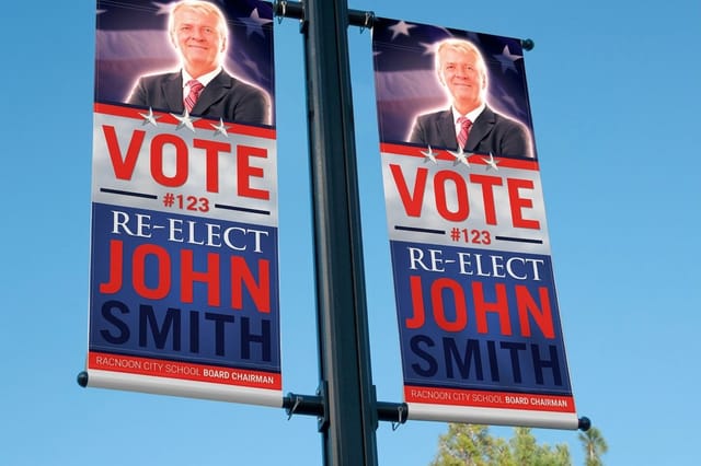 2 Sided Blockout Banners $108.75 each Blow your headline face up to full size and see its real personality.
 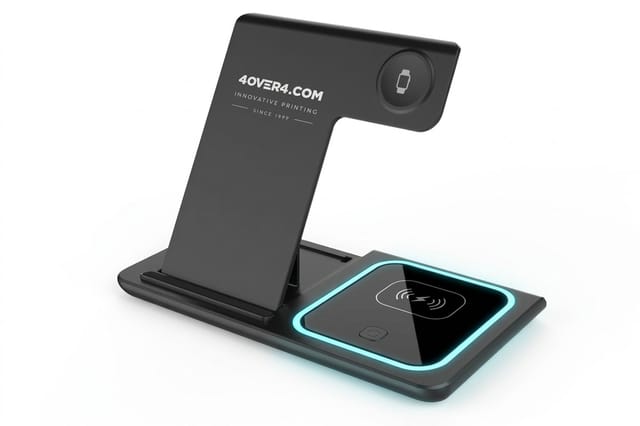 3 in 1 Foldable Wireless Charger $15.00 each A ready-made desk gift to send beside your postcards.
 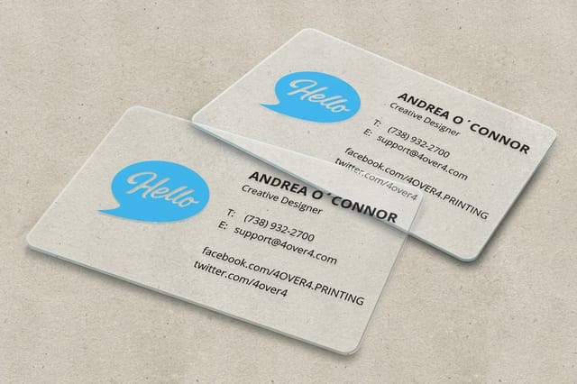 30mil Clear Plastic Cards 500 for $529.26 The hardest test for thin strokes, since the background shows through.
 Serif Fonts That Give a Postcard Weight and Warmth
Serifs do something a sans cannot on a card. They signal age, care, and permanence, which is exactly what a law firm, a winery, a wedding, or a real estate mailer wants to borrow in the half second before anyone reads a word. The catch is that serif is a huge category and only part of it prints well small.
Old style serifs, the ones drawn from sixteenth century punches, are the safest small type on a postcard because their stroke contrast is low and their serifs are chunky enough to hold ink. For the layout those serifs sit inside, the key parts of a postcard map where the message block, the address panel, and the safe zones actually fall.
- Adobe Garamond Pro. Set it at 9 or 10 points with an extra point of leading and it stays quiet, warm, and completely readable.
- Freight Text Pro. Chunky serifs and open counters make it the pick for uncoated and recycled stock where ink spreads.
- Lora. Free, well drawn, and slightly contemporary, good when a serif should feel current rather than traditional.
- Playfair Display. Display only. Beautiful in a 36 point headline and fragile anywhere under 18.
- Bodoni and Didot. Fashion level elegance with hairlines that need coated stock and tight registration on press.
Sans Serif Fonts Built for Small Type and Address Blocks
Sans serif is where most postcard type belongs: the offer, the date, the call to action, the address block, and every line meant to be understood rather than admired. What separates a good postcard sans from a poor one is x-height, counter size, and whether the bold weight is genuinely bolder or simply fatter.
The same rules carry across small format print, which is why the faces that work on a card front usually work on a business card too. If you are building a matching set on a budget, the free business card font picks overlap heavily with this shortlist.
- Neue Haas Grotesk. Separate display and text cuts, so the headline stays tight while the small print stays open.
- Proxima Nova. The most forgiving choice for a promotional card, readable small and neutral across industries.
- Montserrat. Free, wide, and confident. Tighten the tracking slightly in headlines or it drifts apart.
- Futura PT. Headlines and short lines only, since its small x-height makes body copy hard work.
- Sofia Pro. Rounded terminals that soften a hard sell, with enough weights to build a full hierarchy from one family.
A few settings matter more than the font choice itself once the type is placed:
- Track headlines tighter, body copy looser. Large type needs less letterspacing and small type needs more, and a postcard carries both within an inch of each other.
- Use sentence case for the offer. All caps costs a reader roughly a beat per word because word shapes disappear.
- Keep the address panel plain. Upright, unstyled, left aligned, 8 points or larger, with no color reversed behind it.
Script and Display Fonts for Greeting Cards and Invitations
Script is where greeting cards and invitations part ways with promotional postcards. A wedding invitation can carry a full calligraphic face because the reader is willing to slow down for it. A retail mailer cannot, because the reader is not. Match the effort a typeface demands to the effort your reader is prepared to spend.
When you do reach for script, give it one line only: the name, the greeting, or the two words carrying the sentiment. Everything else stays in a plain companion face. Check the letter connections at print size too, because plenty of scripts show a visible gap between joined letters once the ink is on paper.
- Bickham Script Pro. The reference formal script, with alternates and swashes so you can fix an awkward join by hand.
- Sacramento. A free single weight casual script, best at 24 points and up on a card cover.
- Great Vibes. Free, dramatic, and heavy on flourishes, so give it room and never set more than a few words.
- Adobe Caslon Italic. Not a script at all, and often the smarter choice when you want warmth that still reads small.
- Brandon Grotesque small caps. The modern alternative to script for save the dates and event cards that should feel current.
Quantity and price
Clear plastic card pricing and specs
Real configurator numbers, plus the stock details that decide how fine your type can go.
| Quantity | Price Per Unit | Total |
|---|---|---|
| 500 | $1.06 | $529.26 |
| 1,000 | 63.0¢ | $630.31 |
| 2,000 | 56.8¢ | $1,135.55 |
| 2,500 | 53.0¢ | $1,325.02 |
| 3,000 | 50.5¢ | $1,514.49 |
| 3,500 | 48.7¢ | $1,703.96 |
Pairing Two Fonts So the Headline and the Offer Agree
Two typefaces on a postcard is the ceiling, and one family with several weights is often better. If you do pair, make the two faces obviously different rather than slightly different. A geometric sans beside an old style serif reads as a deliberate decision. Two similar humanist sans faces just look like a mistake nobody caught.
Scale matters as much as the pairing. Display type on a large piece follows different rules than a card, and seeing a headline face blown up reveals its real personality fast. Set your shortlist across 2 Sided Blockout Banners and the flaws in a weak headline face become impossible to ignore.
- Futura PT with Adobe Garamond Pro. Geometric headline over a classical body, the safest high contrast pairing on the list.
- Neue Haas Grotesk with Freight Text Pro. Neutral headline, warm body, good for professional services that should not read cold.
- Playfair Display with Montserrat. Elegant headline and a plain modern body, both easy to license.
- Brandon Grotesque with Lora. Event and hospitality cards that want personality without resorting to script.
- Proxima Nova on its own. Black for the offer, regular for the body, italic for the caveat. One family, three jobs, no clashes.
Type at full size
2 sided blockout banners
The fastest way to see whether a headline face still holds together when it is measured in feet.

Type Size, Leading, and the Safe Zones That Protect Your Words
Type size on a mailed card is a deliverability decision as much as a style decision. Postal automation reads the address panel, and a card a machine cannot read gets handled by hand or sent back. Everything on the address side follows the postal rules first and your brand guidelines second.
Give every line room and keep live text clear of the trim. For the full layout picture, including where the message block, the stamp area, and the scanning zone sit on a standard card, the postcard anatomy guide lays it out panel by panel.
- Body copy at 8 to 10 points. Below 8 points most readers give up, and fine serifs start filling in on coated stock.
- Headlines at 24 points and up. A card competes with everything else in the stack, so commit to the size.
- Leading around 120 percent of the type size. Tighter than that and small lines lock into a gray block.
- Line length of 45 to 60 characters. Wider lines force the eye to hunt for the start of the next one.
- Type at least 0.125 inches inside the trim. Cutting tolerance moves, and a clipped descender reads as a printing error even when the file was perfect.
Small surface, small type
Charger, one logotype
When the print area shrinks to a few inches, only the cleanest letterforms survive the reduction.
Font Mistakes That Fall Apart at Press
Most postcard type problems are visible in the file long before a press sees them. They survive because everything looks fine at 200 percent zoom on a bright monitor. Print the card at actual size on your office printer, tape it to a wall, and step back six feet. Most of the following will announce themselves.
The rest come from the file rather than the design. Fonts that were never embedded, live text left editable, a script that reflowed when the document opened on another machine, or a reversed hairline serif that closed up under ink. Every one of them is preventable in the last ten minutes before you upload. If you are still choosing the family, start from the top fonts for print design and run these file checks on whichever one you pick.
- Reversed small type. White text on a dark field gains weight as ink spreads, so go up one weight and one point size or choose a heavier face.
- Script in the address panel. Scanners cannot follow connected letterforms, and a rescanned card loses days.
- Too many faces. Three or more typefaces on a four by six card reads as noise instead of design.
- Unconverted text. Outline the type or embed the fonts in the PDF, otherwise a substituted font shifts your whole layout.
- Hairlines under 0.25 points. Thin rules and fine serifs at that weight break up on press, especially on uncoated stock.
Compare finishes
Popular card stocks, side by side
Stock, finish, size, quantity, and turnaround, so you can match the surface to your typeface.
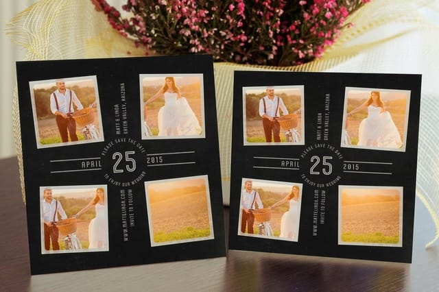 Save the Date Cards | 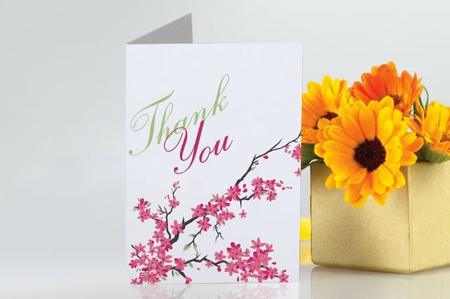 Greeting Cards | 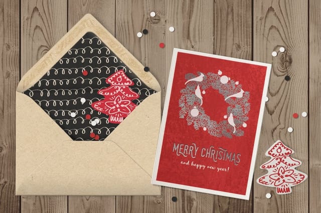 Velvet Greeting Cards | 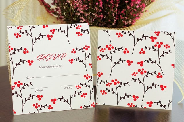 Response Cards | |
|---|---|---|---|---|
| Min price | $19.77 | $56.02 | $617.67 | $19.77 |
| Paper / stock | 14pt Gloss Cover | 14pt Gloss Cover | 16 Point Soft Velvet Laminated | 14pt Gloss Cover |
| Finish | Standard Finish | Standard Finish | - | Standard Finish |
| Size | 4.25" x 5.5" | 8.5" x 5.5" fold to 4.25" x 5.5" | 10" x 7" scored to 5" x 7" | 4.25" x 5.5" |
| Default qty | 25 | 50 | 500 | 25 |
| Turnaround | 5 business days | 5 business days | 7 business days | 3 business days |
| Rating | ||||
| View & customize | View & customize | View & customize | View & customize |
Prepping Your Fonts So the Type Prints Sharp
The last step is unglamorous and it saves more jobs than any font choice. Save the card as a press ready PDF in CMYK, with 300 dpi images, the bleed your printer asks for, and every font either embedded in the file or converted to outlines. Then open your own PDF, zoom to the smallest type on the card, and read it out loud.
Starting from a correct layout removes half the risk, because a print ready template already carries the trim, the bleed, and the safe zone. For a second pass on the shortlist itself, the companion guide to choosing postcard fonts works the same decision from a different angle, and the postcard examples for small businesses show these faces inside finished layouts.
Match the font to the finish
- Gloss and coated stock. Handles high contrast serifs and hairlines because ink sits on the surface instead of spreading into it.
- Uncoated and kraft. Choose low contrast faces with sturdy serifs and add a quarter point of weight to small type.
- Plastic and clear cards. Type wants a solid backing or a heavier weight, since whatever shows through competes with thin strokes.
- Large format and banners. Geometric display faces shine here, but letterspace the caps once the type is measured in inches.
Start fast
Card templates and print ready blanks
Free layouts plus exact size blanks, with trim, bleed, and safe zones already drawn for your type.

Wally reads your postcard from six feet away
Pick the font for the smallest line, then print it on the right stock
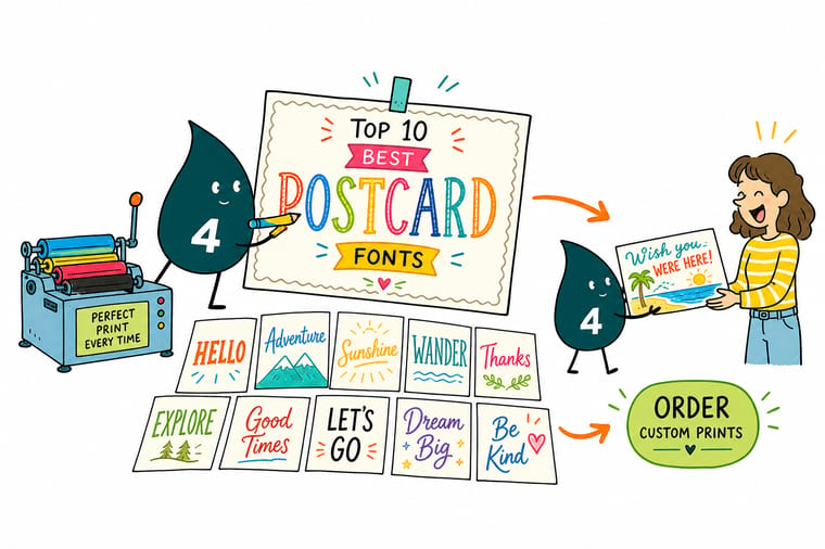
Type is the part of a postcard people judge before they realize they are reading. Set your shortlist at the exact size the card will print, place the offer, the date, and the address panel, then step back and see what survives. If a face is still clear from across the room, it will hold up in a mailbox. If it is not, keep looking before you send the file.
Print your card design →The Short Version on Postcard Typography
Read next
Guides and articles on card typography
Where the address panel and safe zones sit on a card, 20 free fonts that hold up on business cards, and 30 script and display picks for Mother’s Day cards.
 Guide Best Postcard Fonts and How to Choose Them The full decision process behind every pick on this list.
  Guide Anatomy of a Postcard Where the message, address panel, and safe zones actually sit.
  Article 20 Free Fonts for Business Cards Free faces that survive small format print, no license worries.
 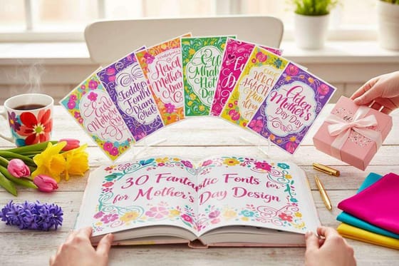 Article 30 Fonts for Mother’s Day Design Script and display picks for seasonal card projects.
 Explore more
More postcard projects where type does the work
Clear plastic cards run 500 for $529.26 in 15 business days, where type sits on a translucent ground.
 Article 10 Postcard Examples for Small Businesses Finished layouts where these typefaces are doing real work.
  Article 3D Lenticular Postcards How motion printing changes what type can safely do.
 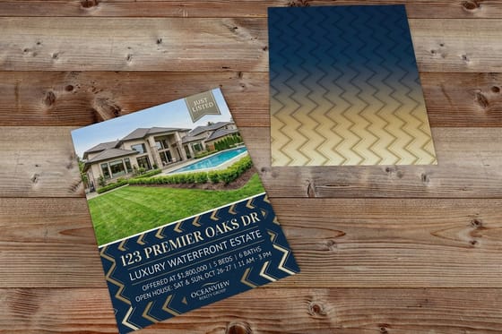 Article Memorial Day Real Estate Postcards Seasonal mailer ideas where headline type carries the offer.
 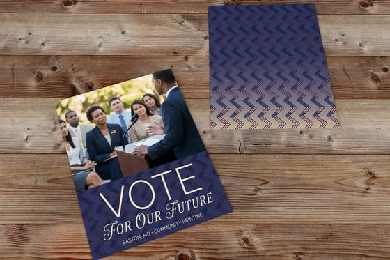 Article Political Direct Mail Postcards High volume mailers where legibility decides the result.
 Ready to see your type on a real printed card?
Choose the face for the smallest line first, set the rest around it, then upload the file and let the press show you how the type holds at actual size.
Postcard Font Questions, Answered
What makes a font a good postcard font?
A good postcard font stays legible at the smallest size on the card, usually 8 points, and still carries a headline at 30 points or more. In practice that means a tall x-height, open counters, a genuine range of weights, and stroke contrast suited to the stock you are printing on. Faces with hairline strokes look refined on coated paper and disappear into uncoated. For pairings beyond the postcard, read the best designer fonts for print and how to pair them. The companion guide to choosing postcard fonts runs the same test with worked examples.
How do I choose the right postcard font for my brand?
Start from the job the card is doing. Promotional mailers need a wide, neutral sans such as Proxima Nova or Montserrat so the offer reads instantly. Announcements, invitations, and professional services can carry an old style serif like Adobe Garamond Pro. Then check three things before you commit: does the family include a usable bold, do the numerals read cleanly at 8 points, and does the license cover commercial print at your run size.
What does postcard printing cost and how are prices set?
Price is set by product, quantity, size, stock, finish, and turnaround rather than by the fonts you pick, since type costs nothing extra to print. On 4OVER4.COM, 30mil Clear Plastic Cards start at $529.26, 2 Sided Blockout Banners start at $108.75, and the 3 in 1 Foldable Wireless Charger starts at $15.00. Unit cost falls as quantity climbs, so the per piece number in the configurator is the figure worth comparing across options.
What sizes, stocks, and finishes can I print my type on?
Cards print across 60+ paper stocks plus plastic, and every surface changes how type behaves. Coated and gloss stocks hold fine serifs and hairline rules. Uncoated, recycled, and kraft absorb ink, so low contrast faces with sturdy serifs hold up far better. Plastic and clear cards need heavier weights because whatever sits behind the card competes with thin strokes. Sizes, finishes, and quantities are all selected in the configurator on each product page.
How long does printing and shipping take for a postcard run?
Turnaround depends on the product, the quantity, and the finish you select, and each option is priced and dated in the configurator before you check out. Faster production is available on many products, including 1 business day options, with shipping time added on top based on your delivery address. If a mailing has a fixed drop date, work backwards from it and choose a production speed that leaves room for proofing.
