
The Best Designer Fonts for Print and How to Pair Them


Sofia is our design and templates voice, built from the knowledge of our production team, with over 20 years in printing.
Ten licensed families that behave on paper, four open licensed ones that cost nothing, the pairing rules that hold up at final size, and the stroke weights that survive ink.
The designer fonts that print well are the ones with a generous x-height, real optical sizes, and strokes no thinner than a quarter point: Tiempos Text, Publico Text, Sabon Next and Williams Caslon Text for serif work, Neue Haas Grotesk, Söhne, GT America and Founders Grotesk for sans, Canela and Mrs Eaves for display only. Free equivalents that hold up are Source Serif 4, EB Garamond, IBM Plex and Libre Franklin. Pair two families at most, match them on x-height rather than point size, and set anything under 10 point in 100K black. The same rules decide how your business cards, restaurant menus, postcards and letterpress cards come off the press, and the guide takes each piece in turn.
Quick answer
Pick for x-height and stroke weight, then pair on structure
A typeface prints well when its lowercase is tall relative to the em and its thinnest stroke clears about a quarter of a point. Those two measurements predict more than any style label. Tiempos Text, Publico Text, Neue Haas Grotesk, Söhne and GT America pass at text size. Canela and Mrs Eaves are display designs and fail as body copy. Pair a text face with a display face, match the pair on x-height rather than point size, and print the pair at 100 percent before you commit the run.
The Designer Fonts Worth Licensing for Print

A font earns a place on this list by doing something specific: shipping real optical sizes, holding its counters at 8 point, and carrying a weight range wide enough that you never have to fake a bold. Trend has nothing to do with it. Every family below is a licensed release you can buy once and use for years.
| Family | Foundry | Where it earns its keep | The limit |
|---|---|---|---|
| Tiempos Text | Klim Type Foundry | Body copy on uncoated stock, menus, long descriptions. | Drawn for newspaper sizes. Set it at 40 point and it looks plain, so buy Tiempos Headline for the covers. |
| Publico Text | Commercial Type | Editorial layouts, brochures, anything with real paragraphs. | Sturdy rather than pretty. It gives a page authority, not charm. |
| Sabon Next | Linotype | Invitations, programs, formal stationery. | Small x-height. Set it a point larger than you think, or it reads as fine print. |
| Williams Caslon Text | Font Bureau | Books and stationery that want a classic voice at text size. | Caslon revivals drawn from display sizes print thin. This one was redrawn for text, so use it and not a generic Caslon. |
| Neue Haas Grotesk | Commercial Type | Neutral sans work where nothing should draw attention. | Two cuts for a reason. The Display cut spaces too tightly under about 14 point. |
| Söhne | Klim Type Foundry | Brand systems that run in print and on screen at once. | Deliberately unremarkable. It will not carry a personality you have not built elsewhere. |
| GT America | Grilli Type | Packaging and signage that need condensed and extended widths from one voice. | The full family is a large license. Buy the four or five styles you will actually set. |
| Founders Grotesk | Klim Type Foundry | Confident headlines, box panels, card names. | Tight apertures. On uncoated stock the small sizes close up, so keep it above 10 point. |
| Canela | Commercial Type | Menu covers, packaging faces, anything set large. | A display design. The wedge serifs thin out badly under roughly 18 point. |
| Mrs Eaves | Emigre | Invitations and title pages set large with generous leading. | The smallest x-height in common use. It fails as 8 point body copy, and no amount of tracking rescues it. |
If the budget is zero or the files will be handed to someone else later, the open licensed families are genuinely usable in print. Source Serif 4 was drawn by Adobe for text and has proper italics. EB Garamond is a careful Granjon revival with old-style figures. IBM Plex Serif and Sans pair out of the box and cover Mono for spec tables. Libre Franklin gives you a full weight range of a plain American gothic. All four are released under the SIL Open Font License, which allows commercial use and embedding in a print PDF without a purchase.
What none of the free families give you is a full set of optical sizes and a properly drawn small-caps set, which is exactly what shows on a card or an invitation. That is where a licensed family pays for itself. If you are choosing a face for a logo rather than a layout, our guide to choosing the right logo fonts covers the different constraints a mark has to meet.
Five Pairing Rules That Survive Contact With a Press
Pairing goes wrong in a predictable way. Two faces that looked good side by side in a specimen sit at different apparent sizes once they are in a layout, and the page reads as sloppy without anyone being able to say why.
- Pair on structure, not on mood. A humanist serif against a grotesque sans works because the skeletons differ. Two humanist sans faces fight, because they are almost the same and the eye reads the gap as a mistake.
- Match x-height before you match anything else. Set both faces at the same point size, print the line, and adjust one until the lowercase heights agree. This is usually a half point to a full point of change, and it is the single adjustment that makes a pair look intentional.
- Two families is the working limit. One for display, one for text. When you need more range, take it from the widths and weights inside a superfamily such as IBM Plex or GT America rather than adding a third name.
- Give the display face something to do. If the headline face never appears above 14 point, it is not a display face, it is a second body face and you should delete it.
- Judge the pair at final size, on the real stock. Type on a backlit screen at 200 percent is not the same object as type in ink at 9 point on uncoated card. Order a free sample pack, print the pair at 100 percent, and hold it.
That last rule is where most of the value sits. A pairing that reads beautifully on a monitor can come back with the light weight looking like a regular and the fine serifs half filled in. Once you know how a family behaves on 16pt card versus 100lb text, you stop guessing. Our online designer lets you set the type at final size and see it in position before you commit, and the blank template library gives you a correctly sized artboard with the bleed and safety already drawn.
What Ink and Paper Actually Do to a Typeface
Every typeface is drawn as clean vector outlines. Nothing on a press is clean. Ink spreads at the edge of every mark, the amount depends on the stock, and the difference between a font that works and one that disappoints is almost always this and not the design.
| Situation | What happens on press | What to do in the file |
|---|---|---|
| Uncoated text stock | Fibers wick ink sideways. Light weights gain, counters in e and a start to close. | Set one weight lighter than the result you want, and keep body copy at 9 point or above. |
| Coated gloss | Ink sits on the surface, so fine detail holds, but high contrast serifs can look brittle. | Fine serifs and hairline rules are safe here. This is where a Didone actually works. |
| Reversed out of a solid | Ink creeps inward, so white letterforms get thinner, not thicker. | Medium weight minimum, 7 point minimum, no fine serifs, and add a little letterspacing. |
| Foil, letterpress or raised finishes | Foil will not hold a thin stroke, and a deep impression pushes fine serifs sideways. | Half a point minimum on every stroke, and simplify the mark rather than shrinking it. |
| Small type built from four plates | A hair of misregistration shows as colored fringing on the letter edges. | Set anything under 10 point in 100K black only. Never rich black. |
The 100K rule is worth repeating because it is cheap and it fixes a problem people blame on the font. A 6 point legal line built from cyan, magenta, yellow and black needs all four plates to land perfectly on top of each other. Pure black needs one. Our guide to rich black and the CMYK recipe explains where rich black does belong, which is large solid areas, not type. For the foil case, setting up files for foil covers the minimum stroke weights the foil die can actually hold.
The other limit worth naming: there is a floor, and it is around a quarter of a point. A rule or a serif thinner than that is a hairline in the design app and a broken dotted line on paper. Illustrator still offers a stroke setting called Hairline that means zero width, which is how the same failure keeps reaching press year after year.
Choosing Type by the Piece You Are Printing
The piece decides the typeface more than the brand does. A card is read at arm length for two seconds, a menu is read in low light while someone is talking, and a box is read from a shelf. Those are three different jobs.
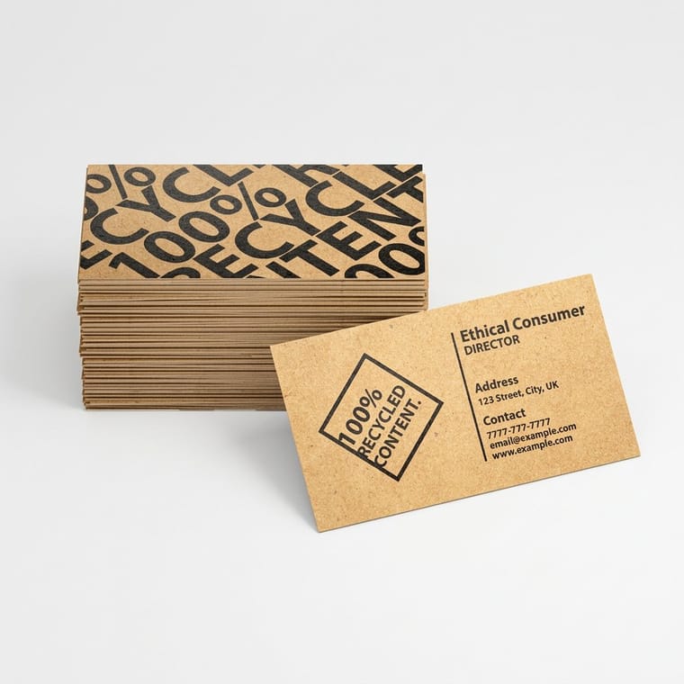
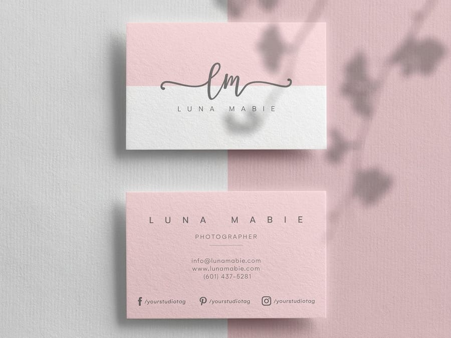
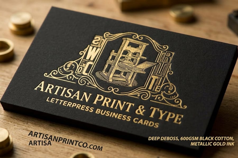
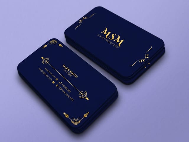
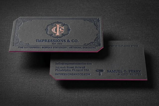
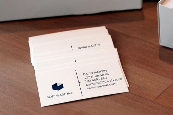
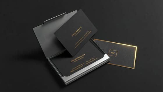
Business cards. Fifteen words, one job: the name has to be found instantly. A display cut or a heavier weight for the name, the text cut for the title and contact block, three type sizes maximum. Keep the address block at 7 point or above and set it in 100K. Standard business cards start at $17.57 and print on 14pt or 16pt stock, and premium business cards start at the same $17.57 with the heavier finishes that suit a high contrast serif. If the design leans on an impression rather than ink, letterpress business cards start at $251.36 and want a face with generous counters, because the plate pushes the paper into every enclosed shape.
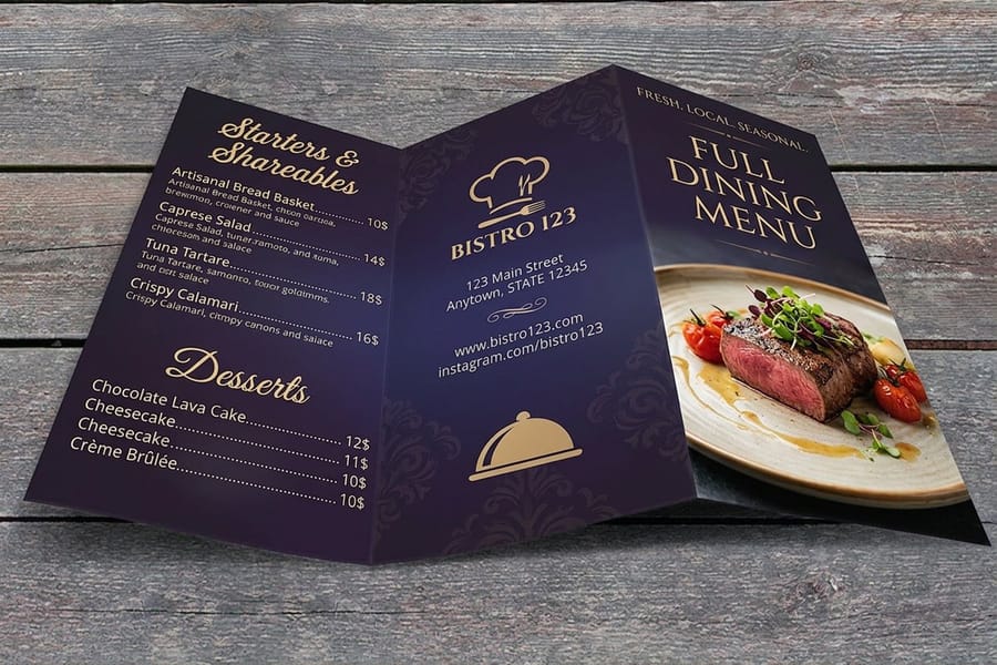
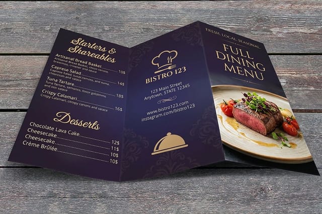
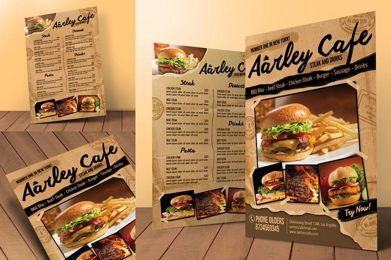
Menus. Low light and a diner who will not put their glasses on. This is where x-height beats elegance every time: 10 point in a face with a tall lowercase reads where 10 point in Garamond does not. Keep item names and prices in the same family and separate them by weight rather than by a second font. Restaurant menus start at $57.11, and the menu layout guide covers where the eye actually lands on the page.
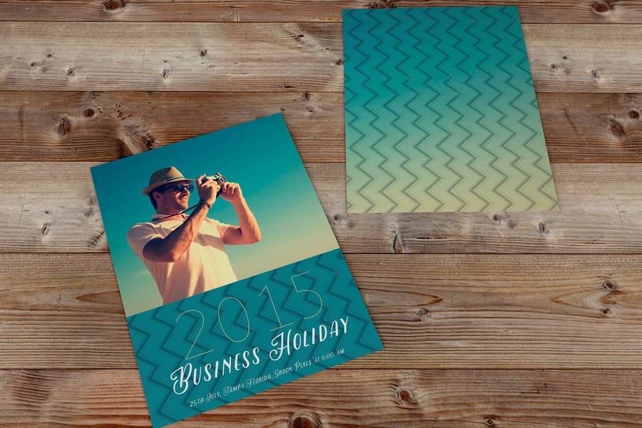
Postcards and mailers. The headline gets one second at arm length, so it needs weight and a short line. Everything else can be small as long as it is not fine. Standard postcards start at $16.48, and our notes on postcard fonts go further into sizes that still read from a mailbox. For a ranked shortlist, see the top 10 best postcard fonts for print that get read.
Packaging and stationery. Boxes are read from a distance and then held, so a superfamily with a condensed width pays off on narrow panels. Letterhead has the opposite problem: a lot of white space and a small amount of type, which exposes every spacing decision. The letterhead type guide covers the sizes that suit a printed sheet, and the whole business card printing range shows which stocks pair with which finishes.
Licensing, Embedding, and Sending the File Without Surprises
Two things go wrong between the design app and the press, and both are avoidable. The font is not licensed for what you are doing with it, or it did not travel with the file.
The license you need for print is the desktop license, and it normally covers embedding a subset of the font in a PDF sent to a printer. A webfont license does not cover print, an app license does not cover print, and a font that arrived with a piece of software is often licensed for use inside that software only. Foundries state this plainly in the EULA, usually in a paragraph headed embedding. Open licensed families under the SIL Open Font License sidestep the question entirely, which is why they are the right default for anything a client will hand to a third party later.
For the handoff itself, export a PDF/X-1a with fonts embedded and subset. That is the format our presses expect, it flattens transparency, and it converts to CMYK on the way out. Convert to outlines only the logo and any type you have distorted, warped or given an effect. Outlining the whole document is the safe answer for a one-off flyer and a bad habit on anything you will reprint, because the file can no longer be corrected, searched or read aloud. The full sequence is in our guide to exporting a print ready PDF.
Two smaller traps. A face that lacks a true italic will let the app slant the roman instead, and that fake italic is obvious in print at any size above 12 point. And a family without old-style figures will set a phone number or a price in lining figures that stand as tall as the capitals, which is why some cards look shouty for no clear reason. Both are worth checking before you license, not after. If a term in a foundry spec sheet is unfamiliar, our graphic design terms glossary defines the ones printers use, and serif versus sans serif covers the structural choice underneath all of it.
Wally explains font choice for print
Measure the lowercase, then check the thinnest stroke
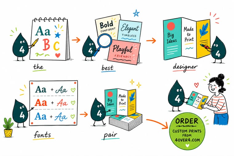
Wally sets the same line in two families at 9 point and holds them side by side. One reads, one looks like fine print, and the point size was identical in both. That is x-height doing the work. Then he checks the thinnest stroke in the file: anything under a quarter of a point comes back broken, and on uncoated stock the ink spreads sideways and fills the counters in light weights. Two families, matched on lowercase height, printed at final size before the run goes on press.
Order premium business cards →
Specs and pricing
Stocks, sizes, and starting prices for the pieces type lives on
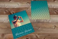
The stock decides how much ink spread your type has to survive. Business cards run from 13pt uncoated to 24pt ultra thick gloss cover, with 110# Strathmore wove and 14pt white linen for a textured sheet, and menus print on 100# gloss text or 70# uncoated text, where light weights gain the most. Configure each piece below and the starting price updates from the 4OVER4.COM configurator.

Print it
Put the typography on something people keep
Letterpress cards print on 32pt or 48pt silk or velvet laminated stock with foil, embossing and debossing options, the build where every stroke needs the half point minimum. Premium cards come in four sizes including a 2 x 2 square, and menus run from 4.25 x 11 to 11 x 25.5 inches, flat, half folded or trifolded.
Explore more
Where to go next
Read the smallest printable font size guide before you set a legal line, and serif versus sans serif if the structural choice is still open. The menu layout guide follows the type onto a real page.


By the numbers
Typography printed right at 4OVER4
Common Questions
Your font questions, answered
What are the best designer fonts for print?
For body copy that has to stay readable on paper, the reliable licensed families are Tiempos Text, Publico Text, Sabon Next and Williams Caslon Text on the serif side, and Neue Haas Grotesk, Söhne, GT America and Founders Grotesk on the sans side. For headlines and covers, Canela and Mrs Eaves carry personality that neutral text faces do not. The common thread is not fashion: each one ships real optical sizes or a weight range broad enough that you never have to fake a light or a bold, and each has been drawn with enough stroke weight to survive ink spread.
Do I have to buy a font to print with it?
You need a license that covers the use, and the desktop license most foundries sell is the one that covers artwork you send to a printer. It normally allows the font to be embedded in a PDF for print production. Web fonts and app licenses do not cover print. Open licensed families released under the SIL Open Font License, such as Source Serif 4, EB Garamond, IBM Plex and Libre Franklin, can be used commercially and embedded without a purchase, which makes them the safe choice when a client will hand the files to someone else later.
Should I convert fonts to outlines before sending a print file?
Outlining removes every font question at once, so it is the safest way to send a one-off card or flyer. The cost is that the text is no longer text: nobody can fix a typo, the PDF cannot be searched, and screen readers get nothing. Our preferred handoff is a PDF/X-1a with all fonts embedded and subset, which prints identically and stays editable in an emergency. Outline only the logo and any type that has been distorted, warped or given effects.
What is the smallest font size that prints cleanly?
Six point is the practical floor for a legal line on a card or a menu, and only in a face with an open lowercase and a sturdy stroke. Below that, the counters in letters like e and a begin to fill in, especially on uncoated stock. Reversed type needs more room than positive type, so nothing under 7 point should ever be knocked out of a solid, and it should never be a light weight or a fine serif.
Can I use Google Fonts on a printed business card?
Yes. Google Fonts ships under the SIL Open Font License, which permits commercial use and embedding in a print PDF. The catch is quality rather than legality: many of the free families were drawn for screens first and have a single mediocre italic, no true small caps and no old-style figures, which shows up on stationery. Source Serif 4, EB Garamond, Libre Franklin and the IBM Plex family are the ones that hold up in print.
Why does my type look heavier in print than on screen?
Ink spreads. A dot printed on paper is slightly larger than the dot the file asked for, and on uncoated stock the fibers wick it sideways further. A light weight that looked elegant on a monitor comes back looking like a regular, and a hairline serif comes back thick or broken. The habit that fixes it: for uncoated stock go one weight lighter in the file than the result you want, and order a free sample pack so you can judge the stock before you commit the whole run.
How many fonts should a business card use?
Two, and often one. A card holds roughly fifteen words, so a second family has very little to do. The usual layout is a display or a heavier weight for the name, the text weight for the title and contact block, and nothing else. Where a card looks busy it is almost never the font count that is wrong but the number of sizes: three type sizes on a card is plenty, four is where it starts to look like a form.
Get Started
Letterpress cards run 250 for $251.36, or $1.01 each
Set the layout in our online designer, pick the stock, and we print cards, menus and mailers where the type holds its shape at final size.
Legal Disclaimer
Gold Standard guarantees apply to all standard orders placed through 4over4.com. Price match requires verifiable proof of a competitor's published price for an equivalent product with matching specifications and turnaround time. Satisfaction guarantee covers manufacturing defects and print quality issues. Contact support with order number and documentation.
