
12 Famous Illustrators to Follow for Print Design Inspiration


Sofia is our design and templates voice, built from the knowledge of our production team, with over 20 years in printing.
The twelve illustrators to follow for print design inspiration are Malika Favre, Christoph Niemann, Noma Bar, Olimpia Zagnoli, Yuko Shimizu, Jean Jullien, Kate Moross, Geoff McFetridge, Timothy Goodman, Mike Perry, Camille Walala and Steve Simpson. All twelve build images out of flat shape, hard line or visible texture, which is the construction a four-color press reproduces well, so the work you admire on screen is work you can realistically put on a poster or a card. Their styles land on the pieces you order from a printer: posters from 11" x 17" up to 22" x 28", folded greeting cards at 4.25" x 5.5" or 5" x 7", and premium business cards with one illustrated face.
Twelve illustrators and how each style prints
| Illustrator | What the style is made of | How it behaves on press | Prints best as |
|---|---|---|---|
| Malika Favre | Flat vector, two or three colors, heavy negative space | Reproduces almost exactly. Watch the seams where two solid colors meet | Posters, covers |
| Christoph Niemann | Reduced conceptual drawing, visual puns, minimal marks | Very forgiving. Small mark count means nothing gets lost at any size | Postcards, covers |
| Noma Bar | Negative space images that read two ways at once | Needs absolute contrast. Kraft or cream stock kills the second reading | Posters, business cards |
| Olimpia Zagnoli | Rounded flat forms, saturated Italian modernist palettes | Solid coverage on coated stock. Large flats can mottle on uncoated | Posters, greeting cards |
| Yuko Shimizu | Brush and ink line, colored digitally, dense detail | Line weight is the limit. Thin brush tails fill in when reduced | Posters, book covers |
| Jean Jullien | Loose painted line, flat fills, deadpan humour | Brush edges hold well. The joke, not the resolution, carries it | Postcards, stickers |
| Kate Moross | Type-led, marker strokes, hard geometry, bright palettes | Neon and fluoro shift. Proof the palette before a long run | Posters, stickers |
| Geoff McFetridge | Reduced figures drawn with one continuous confident line | The cleanest style on this list to print. Almost nothing to go wrong | Posters, apparel art |
| Timothy Goodman | Hand lettering and loose figures, mostly black on white | One ink, high contrast. Cheap to print and hard to ruin | Postcards, greeting cards |
| Mike Perry | Hand-drawn type and pattern, visible texture everywhere | Fine texture closes up on uncoated stock as the dots gain | Posters, stickers |
| Camille Walala | Large geometric pattern, Memphis-era color blocking | Built for scale. Shrinking the pattern to card size loses the point | Large-format posters |
| Steve Simpson | Detailed character work and hand lettering for packaging | Detail-heavy. Needs a coated stock and a proof at final size | Labels, packaging, cards |
None of these artists are affiliated with 4OVER4.COM, and the press notes are ours, not theirs. If a style in this table is the direction you want, the cheapest honest test is a short run of standard postcards at the real size before you commit to a poster print. Order 50 at 6" x 9", the same proportion as a 12" x 18" poster, on 16pt gloss cover; they print in 3 business days, and the flat fields and fine lines on them show you what the poster will do.
Why illustrators are worth following if you actually print

Most inspiration lists show you screenshots. Screenshots hide the part that decides whether a style works for you, which is what happens when the file leaves the screen and hits paper. A style built from flat shapes and hard edges survives a press almost untouched. A style built from soft gradients, hairline strokes and neon sits on a monitor beautifully and arrives from the printer looking like a rough draft.
Following working illustrators teaches you which is which faster than any theory. You see the same artist solve a magazine cover, a poster and a book jacket, and the constraints that shaped each version are visible in the work. That is the useful part.
It also gives you a vocabulary for briefing. Saying flat vector, three colors, heavy negative space, like a poster gets you a usable first round. Saying make it pop does not. If you want the format side of that conversation too, our poster sizes guide covers the dimensions these styles are usually built to.
What a press does to a style
CMYK printing lays four ink screens on top of each other. Flat solid areas come out clean and consistent. Very light tints, thin reversed type and 0.25 pt hairlines are where files fail, because at that weight the difference between four screens lining up and being a fraction out is the difference between a line and a blur.
Color is the other trap. The gamut a press can hit is narrower than a backlit screen, so the brightest greens, oranges and blues come back muted. That is not a printing fault, it is physics, and the fix is to choose the palette knowing it. Our guide on which Pantone colors shift most in CMYK lists the worst offenders.
The one number that decides poster or postcard
Effective resolution is pixel width divided by printed width. A 3000 pixel illustration is 857 DPI across a 3.5 inch business card and 125 DPI across a 24 inch poster. Nothing about the file changed, only the size you asked it to cover.
This is why vector art is worth asking for. It has no pixel ceiling at all, so the same file goes on a sticker and on a wall. If a commission has to be raster, agree the final print size at the brief stage and have it built there, not scaled up later. The image resolution guide has the arithmetic in full.
How we picked these twelve

Three filters, applied in order. First, the illustrator is still working and still posting, so following actually gives you something new. Second, the style is distinct enough that you could identify a piece with the signature covered. Third, and this is the one other lists skip, the work has a printed life. Covers, posters, packaging, murals. Anything that has been on paper or on a wall has already answered the questions a screen never asks.
We deliberately kept the list to twelve. A roster of forty is a scroll, not a reference. Twelve is small enough that you can follow all of them and still notice when one of them posts something worth studying.
Nobody paid to be here, and none of these artists are affiliated with 4OVER4.COM. If you want the wider net, our companion list of graphic designers to follow on social media covers the layout and identity side, and travel photographers worth following covers photographic work.
What we left out on purpose
No AI-generated portfolios, because you cannot commission a consistent second piece from one. No estates, however good the work, because the point of the list is people you can follow and hire. No motion-first artists whose best work only exists as a loop.
We also skipped the illustrators whose entire style depends on a screen effect. Glow, blur, additive blending and animated gradients are genuinely beautiful, and every one of them is a fight on press. If that is the look you are chasing, budget for a spot color or a foil instead of trying to fake it in CMYK.
The twelve illustrators and what each one does
Read this as twelve style problems and twelve solutions, not as a ranking. Each entry says what the work is made of and where that construction helps or hurts once it is printed.
The table above pairs each name with its press behavior. The notes below go a level deeper on the ones with the sharpest lessons for print buyers.
The flat vector camp: Favre, Zagnoli, McFetridge
Malika Favre builds images from two or three flat colors and lets the paper do the rest. It is the closest thing to a printer-proof style: no gradients to band, no fine texture to fill in, no out-of-gamut neon. The one thing to check is where two solid colors butt against each other, because a fraction of a millimeter of press movement leaves a white hairline. A designer fixes that with a small trap or overlap before the file goes out.
Olimpia Zagnoli works in the same flat register but with rounder forms and much more saturated color. Those big fields of solid ink are gorgeous on a coated stock and can look uneven on a cheap uncoated one, where the sheet absorbs ink unevenly. Print her kind of palette on something coated and it holds.
Geoff McFetridge reduces figures to a single confident line. From a production point of view this is the easiest work on the list to reproduce at any size, which is exactly why it turns up on posters, apparel and walls without ever looking stretched.
The concept camp: Niemann and Noma Bar
Christoph Niemann gets an idea across with as few marks as it can survive. Fewer marks means fewer things to go wrong on press, which is why this kind of work reads perfectly on a small format like a postcard where a detailed illustration would turn to mud.
Noma Bar hides a second image in the negative space of the first. The whole effect depends on the contrast between the shape and the ground, so the stock is not a neutral decision here. On bright white it works. On kraft, cream or a tinted sheet, the second reading softens and the piece stops doing the one thing it exists to do. If you commission this style, specify a bright white stock in the brief.
The mark-making camp: Shimizu, Jullien, Goodman, Perry
Yuko Shimizu draws with a brush and colors digitally, and the brush tails taper to almost nothing. Reduced too far, those tails either vanish or fill in solid. Keep line weights at or above roughly 0.5 pt at final printed size and the character of the stroke stays intact.
Jean Jullien paints a loose line and fills flat behind it. The rough edge is the point, so it takes reduction well and works on small formats. Timothy Goodman mostly runs black on white with hand lettering, which is the cheapest possible thing to print well and one of the hardest to ruin.
Mike Perry covers the page in hand-drawn texture and pattern. That is the one to watch on uncoated stock, because dot gain closes fine texture and a lively surface turns into a gray field. Coated stock, or a slightly heavier drawing, keeps it alive.
The scale camp: Moross, Walala, Simpson
Kate Moross works bright, bold and type-led, often in colors that a monitor can show and a press cannot match. Proof the palette on the actual stock before a long run, or plan a spot color for the one hue that has to be exact.
Camille Walala designs pattern for buildings. The lesson for print buyers is about scale discipline: a pattern built for a facade loses its rhythm when you shrink it onto a business card. If you want that energy small, ask for a version drawn for the small size rather than a reduction.
Steve Simpson does dense character illustration and lettering for packaging, which is the hardest test on this list. Detail that fine needs a coated sheet and a physical proof at final size before you commit a run.
What makes a portfolio worth coming back to
A portfolio that only shows finished pieces is a gallery. A portfolio worth following shows the same idea solved three ways, or the sketch next to the final, or the piece printed and pinned to a wall rather than mocked up in a browser frame. That is the material you learn from, because it exposes the decision rather than the result.
Two other signals matter if you intend to hire. Range of format is one: an artist who has done a cover, a poster and a piece of packaging has already dealt with bleed, trim and a printer asking awkward questions. Consistency is the other. If every piece looks like a different person made it, you cannot brief a second job with any confidence about what comes back. For a longer look at how strong portfolios are put together, see our roundup of impressive graphic design print portfolios.
Print it
Posters, sized for the work
Preset poster sizes on heavy stock, the format most of these styles were built for.

Look at how each artist handles type as well. Illustration and lettering share a page more often than either discipline admits, and the artists on this list who set their own type usually deliver files that need less rescuing later. If lettering is the part you keep saving to a folder, where to look for logo design inspiration goes deeper on that.
Turning an illustration into a printed product
Pick the format before the artwork, because the format changes the drawing. A poster is read from three meters away and can carry one strong shape and nothing else. A postcard is read at arm length and can carry detail. A business card is 3.5 by 2 inches and can carry exactly one idea. Handing the same file to all three and scaling it is how good illustration ends up looking wrong on two of them.
Then set the technical floor. CMYK, 300 DPI at final printed size for anything raster, 0.125 inch bleed on all four sides, fonts outlined, and every important element pulled at least 0.125 inch inside the trim. Our CMYK versus RGB guide explains why the color mode is a decision and not a formality, and choosing the right file type for printing covers what to ask the illustrator to deliver.
Print one before you print a thousand. Ink on real stock answers questions that no monitor can: whether the black is deep enough, whether the fine lines held, whether the flat field went patchy. Premium stickers from $29.16 and standard postcards from $16.48 make that test cheap enough that skipping it is the expensive choice.
Poster pricing and specs at 4OVER4.COM
Poster pricing moves with size, stock, finish and quantity, and the per unit cost falls as the run grows. Sizes run 11" x 17", 12" x 18", 14" x 22", 16" x 20", 18" x 24" and 22" x 28", on 100# gloss or silk text, 80# gloss cover, 14pt cover or 8mil synthetic plastic, and a run starts at 50 posters in 5 business days. Saturated flat color and dense texture both want a coated sheet, such as the 100# gloss text or 80# gloss cover. The numbers below come from the live configurator, so you can size a print budget before you brief an illustrator.
Quantity and price
Poster pricing and specs
Live pricing from 50 posters at $108.75, with the per unit cost falling as the run grows.
| Quantity | Price Per Unit | Total |
|---|---|---|
| 50 | $2.18 | $108.75 |
| 100 | $1.64 | $163.67 |
| 200 | $1.01 | $202.11 |
| 300 | 80.2¢ | $240.55 |
| 400 | 69.7¢ | $278.99 |
| 500 | 63.5¢ | $317.44 |
You can also earn coins on every order and put them against the next print run, which helps when a commissioned illustration has already taken a bite out of the budget.
Working with an illustrator on your project
Start with the boring part, because it is the part that goes wrong. Following an artist gives you no rights to their work, and most of what sits in a portfolio is already licensed to whoever commissioned it. A commission is priced against the run size, the territory, how long you can use it and whether the use is exclusive, so decide those four things before you ask for a number.
Write the brief around constraints rather than adjectives. Final printed size, stock, color count, where the piece will be read from, what has to be legible, and the date the press needs the file. Two reference images from this list say more than a paragraph of description. Leave the style to the artist you chose for their style.
- Agree the deliverables. Layered vector source, a flattened press-ready CMYK PDF, and an RGB version for screen. Ask for all three at the start, not after the invoice.
- Book a proof round into the schedule. A physical proof adds days and prevents the reprint that costs weeks.
- Credit the artist. A line on the piece or in the caption costs nothing and makes the next commission easier to negotiate.
Which illustration style suits your sector
Different businesses print different things, so the style that serves you depends on the format you actually buy.
- Independent brands. One commissioned illustration, reused across a poster, a card and a sticker sheet, gives a small brand more identity than three stock images ever will.
- Music and events. Flat, bold, type-led work in the Moross register still sells a gig from a wall. Print short runs, then reprint the ones that move.
- Restaurants and food. Character illustration in the Simpson mold carries menus, packaging and window cards, and it survives being seen at arm reach.
- Publishers and studios. Concept-driven work by Niemann or Noma Bar is built for covers, where a single idea has to work at thumbnail and at full size.
- Retail and gifting. Flat saturated work prints beautifully on greeting cards and postcards, and a range in one style reads as a collection on a shelf.
Blanks for a commissioned illustration
If the illustration is commissioned but the layout is yours, start from a sized blank instead of a guessed artboard. 4OVER4.COM builds its blanks to exact product specs, so bleed, trim and safe area are already marked and the artwork lands where you intended. For an 18" x 24" poster that means an 18.25" x 24.25" artboard, 0.125 inch of bleed on every side and a safe area 0.125 inch inside the trim. Send the blank to the illustrator with the brief so the piece is drawn to it from the first sketch. Grab one from the blank template library.
Start fast
Blanks for a commissioned illustration
Poster design templates and exact size blanks so the illustration lands inside the cut line.
Wally on which illustration styles survive the press
Flat shapes print. Glow, neon and hairlines fight back.
Ask for vector when the print size is not settled, and 300 DPI at final size when it is. Convert to CMYK before you approve anything, keep line weights at or above 0.5 pt, trap the joins between two solid colors, and print one on the real stock before you order the run. 4OVER4.COM ships posters, cards and stickers on premium stock, fast.
Order posters →What to remember about illustration and print
Briefing tips that hold at every size
- Ask for vector when the size is unsettled. Vector has no resolution ceiling, so the same file goes on a sticker and a wall. Raster locks you into the size it was drawn for.
- Name the stock in the brief. Coated for detail and saturation, uncoated for a softer matte read. Negative-space work needs bright white and nothing else.
- Trap the edges between flat colors. Where two solids meet, a slight overlap absorbs press movement. Without it you get a white hairline down the join.
- Keep line weights above about 0.5 pt. Below that, fine strokes drop out or fill in. Check the thinnest line at the size it will actually print, not at 400 percent zoom.
- Proof the neon before the long run. Fluorescent greens and oranges are outside CMYK. See them on the real stock before you order thousands of anything.
Explore more
More ways to print illustrated work
Premium stickers print in 3 business days and standard posters 50 for $108.75 in 5.
Product Standard Posters Where flat, bold illustration earns its scale. Product Standard Postcards The cheapest way to see an illustration on real paper. 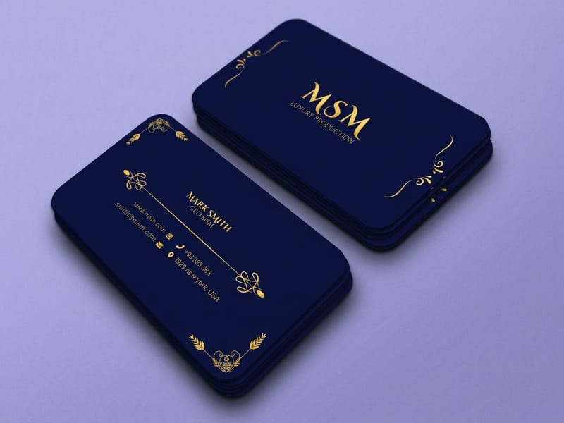 Product Premium Business Cards One illustrated face, 3.5 by 2 inches of identity.
 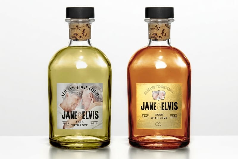 Product Premium Stickers Die-friendly formats for line-led illustration.
 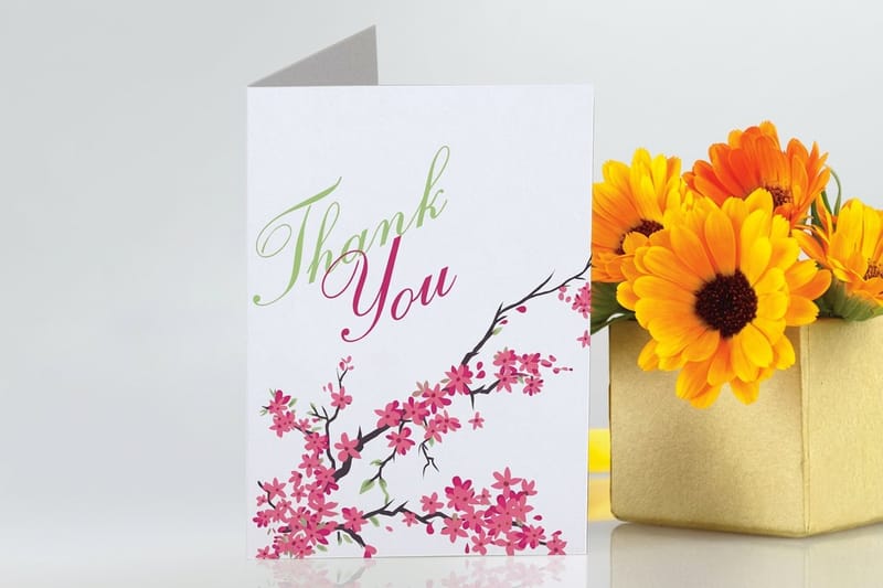 Product Greeting Cards Saturated flat color on a folded format. Category Poster Printing Every poster size, stock and finish in one place.
  Guide How to Design a Poster in 8 Steps From thumbnail to press-ready file.
  Article Vector Illustration Styles for Print Which vector looks hold up on paper.
 Ready to see the illustration on paper?
Pick the format, upload the press-ready file or start from a free blank, and 4OVER4.COM prints it sharp on premium stock, as fast as your deadline needs.
Common questions about following and hiring illustrators
Who is the most famous illustrator working right now?
There is no single answer, but the names that come up most often in professional print circles are Christoph Niemann, Malika Favre, Noma Bar and Yuko Shimizu. Niemann and Favre are both regular magazine cover artists, Noma Bar is known internationally for negative-space imagery, and Shimizu is both a working illustrator and a teacher at the School of Visual Arts in New York. Fame is a weak filter for choosing who to follow anyway. A better one is whether the artist solves the same kind of problem you have, at the same size you print at.
Can I print an illustration I found on an illustrator portfolio?
No. Portfolio work is published to show capability, not to be taken, and almost all of it is already licensed to the client who commissioned it. Following an artist gives you no rights at all. If you want a piece, either commission new work or ask about licensing an existing image, and expect the price to depend on the print run, the territory, the duration and whether the use is exclusive. Get the terms in writing before the file goes anywhere near a press.
What file should I ask an illustrator for if I plan to print?
Ask for a layered vector file, usually AI or a PDF with vectors preserved, plus a flattened press-ready PDF in CMYK with fonts outlined and 0.125 inch bleed on every side. Vector has no resolution ceiling, so the same artwork goes on a sticker and on a 24 inch poster without softening. If the style is genuinely raster, such as brush or watercolour work, agree the final printed size at the brief stage and ask for the file to be built at 300 DPI at that size. Our guide on choosing the right file type for printing covers the formats in detail.
Why does the printed version look duller than the illustration on my screen?
Your screen emits light and mixes color additively, and it can display colors that no four-ink press can reproduce. Print reflects light and mixes subtractively, so the gamut is narrower, especially at the bright end. Fluorescent greens, electric oranges and pure saturated blues are the usual casualties. The practical fixes are to convert and review the artwork in CMYK before approving it, to accept the shift on the colors that are only decorative, and to specify a spot ink for the one color that has to be exact, such as a brand color.
What does it cost to commission an illustration for print?
Rates vary enormously with the artist and the usage, so nobody can quote a number for you here. What you can control is the shape of the brief. Fees rise with the size of the print run, the territory, the length of the license and any exclusivity, so a single-run poster for one city costs far less than a national campaign in perpetuity. Decide the print formats first, get a quote against those, and print a short test run before scaling. Standard Postcards start at $16.48 at 4OVER4.COM, which makes a physical test cheap.
