
Unusual Color Names Designers Should Know


Emma is our prepress and print production voice, built from the knowledge of our production team, with over 20 years in printing.
Why So Many Color Names Sound Completely Made Up
Gamboge. Feldgrau. Coquelicot. Sarcoline. Read a color list long enough and you start to wonder whether someone is inventing words to sell paint. They are not, mostly. Almost every strange color name in circulation is a fossil of how people used to describe color before anyone could measure it, and the story behind the word usually explains the shade better than a hex code does. None of these words is an ink recipe, though. When you put gamboge on a business card, the press builds it from four process inks, cyan, magenta, yellow and black, and the paper under them, 14pt Gloss Cover or 16pt Uncoated Cover, decides how warm the yellow looks in your hand.
Before standardized inks, color was a physical object you could hold. It was a lump of resin, a crushed beetle, a mineral dug out of a specific hillside. Naming the source was the only reliable way to tell another craftsperson what you meant, so the name of the material became the name of the color and stuck around long after the material stopped being used.
That history matters more than trivia when you are designing something that will be printed. A name is a description, not a specification. 4OVER4.COM has printed 10 billion+ cards and print products since 1999, and a steady share of color complaints trace back to the same gap: a designer picked a shade by name or by monitor, approved nothing on paper, and then met a printed piece that was technically correct and emotionally wrong. The names below are fun. What they teach you about specifying color is the useful part. Two printed pieces show that lesson fastest. A run of 100 interior design business cards puts a named shade on real stock at wallet size, and a two sided blockout banner shows the same CMYK build at arm's length and across a room.
Names borrowed from places
Sienna and umber are Italian earth pigments. Magenta is named for a battle fought near an Italian town in 1859. Byzantium points at the purple dye of a single imperial court. When a color carries a place name, expect regional variation in how people picture it.
Names borrowed from plants, animals, and minerals
Gamboge is tree resin. Coquelicot is a corn poppy. Puce is French for flea. Verdigris is literally the green crust that grows on copper. These names age well because the reference object still exists and still looks the same.
Names invented by chemists
Mauveine, the first synthetic aniline dye, arrived in 1856 and gave the Victorian era its favorite purple. Zaffre came out of cobalt smelting. Laboratory colors tend to be the most precise names on any list because a formula sat behind them.
Names invented by marketers
Greige, millennial pink, and every sunset gradient with a cocktail name belong here. They are real in the sense that people agree on them for a few seasons, then drift. Use them for mood, never as a spec on a print order.
Test it on paper
Prove your color on a real printed card
A short run of cards is the cheapest way to see an unusual shade in ink.

20 Unusual Color Names Worth Knowing
These are the ones that come up most often in swatch books, novels, and fashion copy. Each entry gives you the shade and the reason the word exists, because the reason is what makes the name stick in your head and usable in a client conversation.
Read them as a vocabulary exercise. When you can say "a muted olive gray with a military history" instead of "sort of greenish," you argue for a palette better and you brief a printer better. If you want the technical half of that skill, pair this list with the best color profile for printing and the difference between CMYK and RGB color modes.
- Gamboge. A deep saffron yellow from hardened tree resin, historically used for monks' robes.
- Feldgrau. The muted gray green of early twentieth century German field uniforms, now a favorite neutral.
- Coquelicot. The hot orange red of a wild corn poppy, brighter and more urgent than scarlet.
- Glaucous. A dusty blue green with a powdery bloom, the color of a blueberry skin.
- Isabelline. A pale gray yellow, the shade of unbleached parchment left in the sun.
- Xanadu. A soft gray green named after the philodendron leaf, calm and slightly cold.
- Falu red. The iron oxide barn red of Swedish cottages, dark and slightly brown.
- Puce. A brownish purple named for the flea, far more elegant than the etymology suggests.
- Smaragdine. Emerald green with a jeweled clarity, from the Latin word for emerald.
- Zaffre. An intense cobalt blue produced by roasting cobalt ore, used for centuries in glass.
The second ten lean older and stranger. Several of them survive mainly in art conservation and heraldry, which is exactly why they feel fresh when you drop one into a brand palette.
- Caput mortuum. A dark oxide purple brown, the somber red of old iron pigment.
- Celadon. The pale gray green glaze of East Asian stoneware, quiet and expensive looking.
- Fulvous. A tawny brownish yellow used by ornithologists to describe feathers.
- Mikado yellow. A vivid, slightly orange yellow that reads as sunlight rather than lemon.
- Bistre. A warm sooty brown made from beech wood soot, common in old ink drawings.
- Verdigris. The blue green patina of aged copper, cool and faintly chalky.
- Amaranth. A saturated rose red named for a flower that fades very slowly.
- Eburnean. Ivory with a hint of warmth, the color of old piano keys.
- Sinopia. A red earth pigment used for fresco underdrawings, brick toned and matte.
- Heliotrope. A bright pinkish purple named for the flower that turns toward the sun.
Say them out loud once and you will notice something. Every single name carries a texture and a temperature along with the hue, and that extra information is the reason these words outlived thousands of forgotten swatch numbers.
Print picks
Three surfaces that show off a bold palette
Live prices, each one ready to configure with your own color build.
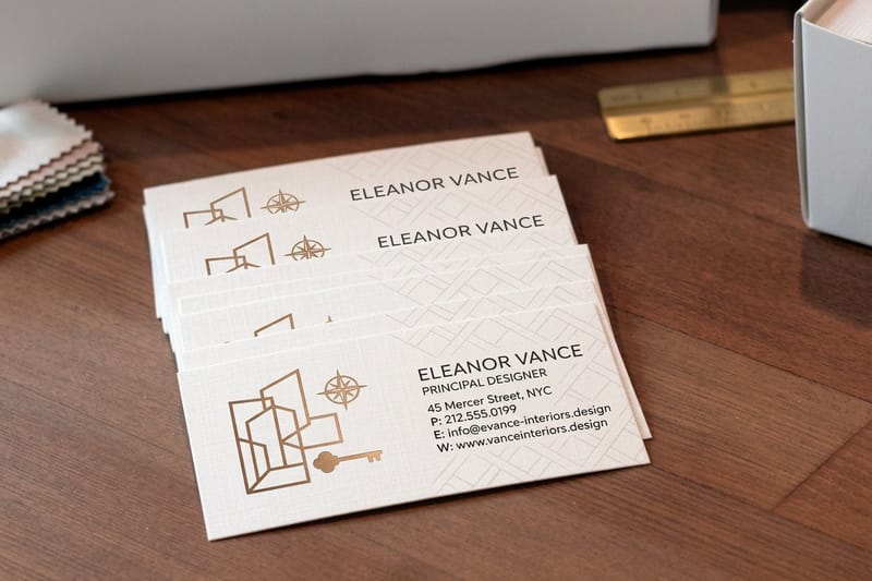
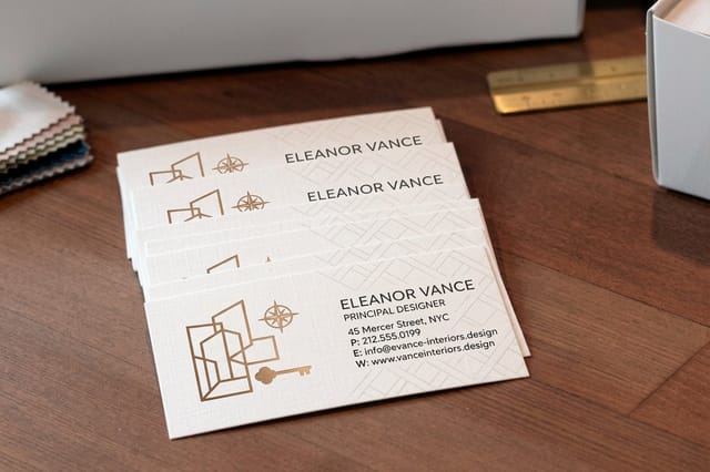 Interior Design Business Cards 100 for $17.57 A small, cheap surface to test how your favorite odd shade actually prints.
  2 Sided Blockout Banners $108.75 each Deep, saturated color on both faces with an opaque core between them.
 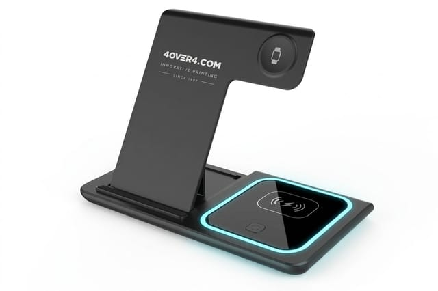 3 in 1 Foldable Wireless Charger $15.00 each A ready-made desk gift to send beside your printed palette.
 What These Names Actually Teach You About Color
Strip the romance away and the old names encode three practical ideas that modern color pickers hide from you. Hue is only one of them, and it is the least interesting. Each of the other ideas has its own box on a print order. The CMYK build carries saturation, the finish menu carries sheen (Standard Finish or High Gloss UV Coating on our business cards), and the paper menu carries the surface, from 14pt Gloss Cover to 18pt Uncoated Cover.
First, every historical name bundles saturation and lightness into the word. Nobody had to say "sixty percent saturation" because feldgrau already meant a desaturated green. Second, the names carry material context, which is another way of saying they carry finish. Verdigris is chalky, smaragdine is glassy, bistre is matte. Third, they assume a physical surface. A pigment name presumed paper, plaster, cloth, or glass, never a backlit screen.
Modern workflows dropped all three. A hex value floats free of surface, finish, and light, and that is precisely where jobs go sideways between the design file and the delivered box.
By the numbers
Color printing at 4OVER4.COM scale
Volume is why the stock you choose is a color decision as much as a texture one.
- 10B+ Cards and print products, printed since 1999
- 150,000+ Businesses served, across every industry
- 60+ Paper types, each one shifts color differently
- 99.8% On-time delivery, tracked orders
Borrowing an Unusual Color for Your Own Brand Palette
An odd color name is a great starting point and a terrible finishing point. Use it to set direction with a client, then convert it into something a press can reproduce. The workflow is short: pick the mood word, find two or three printed examples of it, choose the closest CMYK build, and prove it on the actual stock before you commit a whole run. The smallest business card order is 100 cards at 2 x 3.5 inches, and it ships in 3 business days on the standard turnaround. If the final piece runs on uncoated paper, order the test on 16pt Uncoated Cover rather than gloss, or the test lies to you.
Keep the palette honest about how it will be used. One saturated hero color, one deep neutral, and one paper white will outperform a five color rainbow on nearly every printed piece. If you want the underlying logic rather than a rule of thumb, work through the principles of design and apply contrast and repetition to your color choices the same way you would to type.
Turn a name into a usable spec
- Write the mood in words. "Falu red, dark and slightly brown, never cherry" travels better than a swatch.
- Commit to a CMYK build. Convert early so nobody approves a color the press cannot reach.
- Name the stock. The same build looks different on gloss, matte, and uncoated paper.
- Test small before you print large. A short run of cards costs a fraction of a banner reprint.
Quantity and price
Business card pricing and specs
Real configurator numbers. The more you print, the less each color test costs.
| Quantity | Price Per Unit | Total |
|---|---|---|
| 100 | 17.6¢ | $17.57 |
| 200 | 11.5¢ | $23.07 |
| 300 | 9.15¢ | $27.46 |
| 400 | 7.96¢ | $31.86 |
| 500 | 7.25¢ | $36.26 |
| 600 | 6.77¢ | $40.64 |

Using Bold, Unusual Color in Printed Work

Unusual color earns its keep in print because print holds still. A screen color competes with every other glowing rectangle nearby, while an amaranth banner or a caput mortuum business card sits in someone's hand under ordinary room light and simply looks unlike everything else they were handed that week.
Scale changes the calculation. A shade that feels sophisticated on a card can feel overwhelming across a ten foot banner, so most bold palettes work better as a dominant neutral with the strange color used as the accent that carries the logo, the headline, or a single field of solid ink. Large format is also where opacity matters, which is why a blockout core exists on 2 Sided Blockout Banners at $108.75 and up.
Light source is the other variable people forget. A color chosen under office fluorescents will read differently outdoors at noon and differently again behind a lit panel. If your piece will be illuminated from behind, read what Duratrans and backlit film are before you finalize the palette, because backlighting lifts saturation and washes out anything already pale.
Large format
2 sided blockout banners
An opaque core keeps the color on one face from ghosting through to the other.

Where Strange Color Pays Off, and Where It Should Not
Some surfaces reward an unexpected shade and some are governed by rules you do not get to break. Knowing which is which keeps a palette confident instead of reckless.
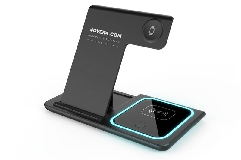
Event graphics, retail displays, and promotional objects are the playground. Your accent color belongs on the printed pieces, and a ready-made gift that lives on a desk, like a 3 in 1 Foldable Wireless Charger from $15.00, stays in use long after the event ends. Temporary window graphics let you test a bold shade at scale with no commitment, and removable window clings peel off cleanly when the season changes. For a storefront, clear window clings come in sizes from 11 x 17 to 40 x 60 inches, and a white ink layer under a pale shade keeps it from vanishing against the glass.
Safety and wayfinding are the opposite. Those colors are specified by code, not by taste, and swapping in a prettier green defeats the entire purpose of the sign. Before you touch anything in a workplace, check OSHA safety colors and ANSI color codes. Event signage sits in between, where a strong palette helps people find you across a crowded floor, as the examples in this look at custom outdoor banners for events show.
Carry the color further
Branded desk items
A promotional object keeps your accent shade in view long after the event ends, which is more mileage than any single banner buys you.
Getting the Color You Chose on the Job You Ordered
This is the part that turns a fun list into a real skill. The color you approved on a calibrated monitor is made of light, red, green and blue pixels that glow brighter than any ink can reflect. The color that arrives in the box is made of four process inks sitting on a surface that absorbs some of it, and a 14pt uncoated card soaks up more ink than a 14pt gloss one. Those two things can be close, and they are never identical, so the goal is a predictable, approved result rather than a perfect match.
Three habits get you there. Convert to CMYK yourself so you see the shift before the press does, choose the stock deliberately because uncoated paper drinks ink and mutes everything by a noticeable margin, and order a small printed piece in the final build before you commit to the big one. Business cards are the cheapest honest test you can buy.
Format matters too. A palette that sings on a retractable banner at eye level may lose its punch at a different width or viewing distance, so confirm your dimensions early with the top retractable banner sizes before you lock the artwork.
Compare options
Popular business cards, side by side
Stock, finish, size, quantity, turnaround, and price in one view before you commit.
Files, Templates, and the Handoff to Press
Color survives the handoff when the file is boring in all the right ways. Flatten transparency where it overlaps a solid field, embed the profile you actually worked in, keep rich blacks out of small text, and extend every background color into the bleed so a saturated field never ends in a white sliver after trimming. On a 2 x 3.5 inch business card that means a 2.25 x 3.75 inch document, with 0.125 inch of bleed on each side.
Starting from a correct template removes most of that risk before you draw anything. Exact size blanks give you the trim, bleed, and safe margins already in place, which means the only thing left to get right is the color itself.
A short pre-flight for bold palettes
- Convert and inspect. Look at the CMYK version at full size, not at a thumbnail.
- Check total ink coverage. Very deep colors stacked too heavily can smear or dry slowly.
- Bleed every solid field. Carry background color past the trim line on all four sides.
- Approve on the real stock. Matte, gloss, and uncoated each change the same build.
Start fast
Templates and print-ready blanks
Free layouts plus exact size blanks so trim, bleed, and safe margins are handled for you.






Wally translates a color name into a printable color
Fun to say on screen, predictable once it is ink on paper
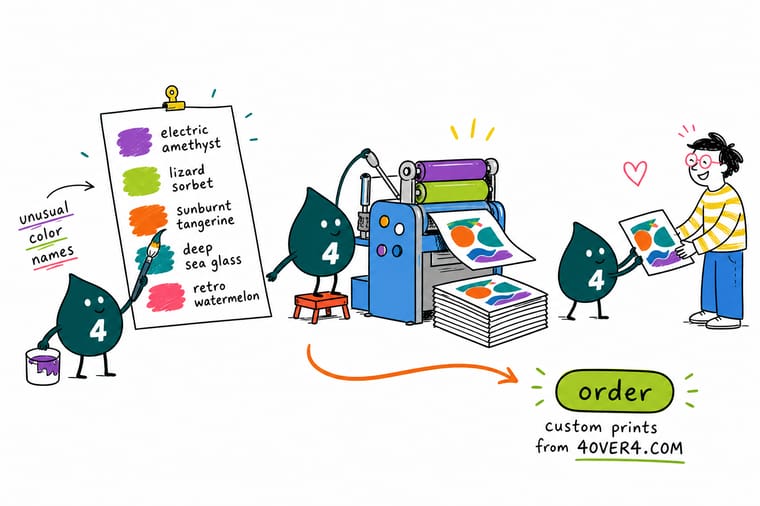
Fell in love with gamboge or feldgrau? Lovely. Now do the boring three minutes that saves the job. Convert the shade to CMYK yourself, decide on the stock, and print a small piece before you commit to a banner. Business cards cost very little and tell you the truth about how your color behaves in ink, under real light, on the exact paper you picked.
Order interior design business cards →Color Names Are Fun, Color Specs Are What Print
Go deeper
Color guides worth reading next
Read these before you convert a shade like feldgrau to CMYK: the profile to embed in the file, the reason bright RGB greens dull on paper, and the safety colors OSHA fixes by code.
 Guide Best Color Profile for Printing Pick the profile that keeps your palette predictable.
  Guide CMYK vs RGB for Printing Why screen color and ink color never fully agree.
  Guide The Principles of Design Contrast, repetition, and balance applied to color.
  Guide OSHA Safety Colors and ANSI Codes The colors you are not allowed to reinterpret.
 Explore more
More on color, design, and getting it printed
Related pages across 4OVER4.COM, one card for each place your palette has to survive.
 Article 5 Popular Photoshop Effects You Can Do Yourself Five popular Photoshop effects you can recreate yourself, with the exact settings for duotone, double exposure
  Article 7 Holiday Postcard Design Examples That Break the Mold Seven holiday postcard design examples that skip the usual clichés, with notes on layout, color, foil, and pap
  Article Corporate Poster Design Ideas for Lobbies, Events, and Recruiting Wall Corporate poster design ideas for lobbies, events, and hiring walls. See layout formulas, brand color use, sta Guide Best Color Profile for Printing Set up color management before you send the file. Guide CMYK vs RGB Color Modes The conversion that decides how your shade prints. Guide The Principles of Design The fundamentals behind a palette that works. Guide OSHA Safety Colors and ANSI Codes Where color is governed by code, not taste.
  Guide Duratrans and Backlit Film How backlighting changes a saturated color.
 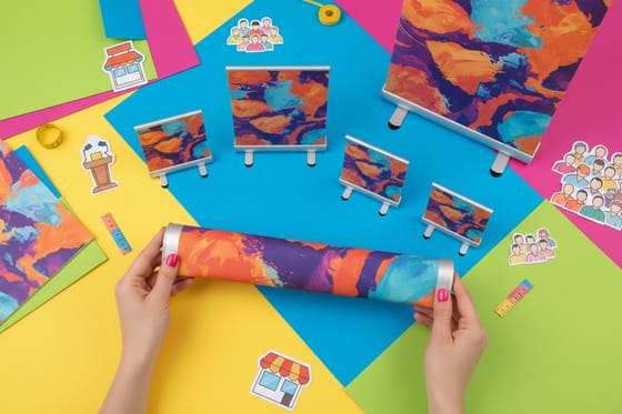 Guide Retractable Banner Sizes Match your palette to the right display size.
 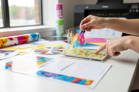 Guide Custom Window Clings Test a bold color at scale, then peel it off.
  Article Custom Outdoor Banners for Events Strong color that still reads across a crowded floor. Product Interior Design Business Cards The cheapest way to prove a color on real stock.
 Ready to see your favorite strange color in ink?
Convert the shade, pick the stock, and print a small run first. If it holds up in your hand, it will hold up across a banner or a full campaign.
Unusual Color Names, Frequently Asked Questions
Why do so many colors have weird names?
Because the names came before the measurements. For most of history a color was a physical material, so people named the shade after its source: gamboge after tree resin, verdigris after the patina on copper, sienna after the Italian earth it was dug from. Naming the material was the only dependable way to tell another craftsperson what you meant. Later, chemists named their new dyes after the compounds behind them, and marketers added a layer of seasonal names on top. The odd words survived because each one carries a texture and a temperature as well as a hue.
How do I choose an unusual color that still works for my brand?
Start with the mood word, then convert it into something a press can hit. Pick one saturated hero color, pair it with a deep neutral and paper white, and let the unusual shade carry the logo or a single solid field rather than the whole layout. Write the intent out so it survives handoff, for example dark and slightly brown, never cherry. Then build it in CMYK, choose the stock, and approve a small printed sample before the full run. The principles of design apply to color exactly as they do to type.
What does it cost to print a design with bold, unusual colors?
Color choice itself does not change the price at 4OVER4.COM, since full color CMYK printing is standard across the catalog. What moves the number is product, size, stock, finish, and quantity. Interior Design Business Cards start at $17.57, a ready-made 3 in 1 Foldable Wireless Charger starts at $15.00, and 2 Sided Blockout Banners start at $108.75. Per unit cost drops as quantity rises, so a saturated palette on a larger run often costs less per piece than a cautious one on a tiny run. Live pricing appears in the configurator on each product page.
What sizes, stocks, and finishes affect how an unusual color looks?
All of them, and stock most of all. Uncoated paper absorbs ink and mutes a saturated shade noticeably, gloss holds the most punch and depth, and matte or soft touch lands between the two with less glare. Size matters because a color that feels refined on a card can dominate across a ten foot banner, and finish matters because coatings shift how light bounces off the ink. Vinyl and film behave differently again, especially when lit from behind, which is covered in our look at Duratrans and backlit film.
How long does printing and shipping take once I approve my color?
Turnaround depends on the product, the quantity, and the finish you select, and every option shows its production time in the configurator before you check out. Business cards and other small format pieces move fastest, while large format banners, specialty coatings, and promotional items take longer because of the extra production steps. Shipping time is added on top of production, so choose your delivery method with the deadline in mind. If color accuracy matters and the date is tight, order the small test piece first so a surprise never lands on the critical path. To compare printers on deadlines before you order, read How to Choose a Promotional Printing Company That Delivers on Time.
