
7 Holiday Postcard Design Examples That Break the Mold


The seven holiday postcards worth copying are the two-color card with no red or green, the oversized 6 x 11, the year in review built from your own photographs, uncoated kraft with a white underprint, the type-only card, spot gloss on matte laminate, and the card built to be kept. Each one drops a seasonal cliché instead of adding one, and each carries a print constraint that decides whether it works in the mail.
The seven examples at a glance
| Example | Size that suits it | What is on the front | Who it works for | Print note |
|---|---|---|---|---|
| Two-color, no red or green | 5 x 7 in | Ink black field, one metallic accent | Studios, agencies, anyone with a strong brand color | Foil accent on 16pt |
| Oversized statement card | 6 x 11 in | One image, one sentence, nothing else | Retail and hospitality with a hard offer | 16pt, letter rate postage |
| Real photo, year in review | 6 x 9 in | Four to six of your own photos, dated | Contractors, salons, restaurants, interior designers | 14pt gloss for color punch |
| Uncoated kraft look | 4 x 6 in | White underprint, muted palette, handwriting | Food, craft, wellness, small-batch brands | Uncoated, writable back |
| Type only | 4.25 x 6 in | One sentence set very large | Service businesses with a clear offer | 16pt matte |
| Spot gloss on matte | 5 x 7 in | Invisible pattern that appears in raking light | Premium brands, thank-you cards | Matte laminate plus spot gloss |
| The card people keep | 4 x 6 or 6 x 9 in | Calendar, gift tag, or a dated offer | Any business that wants shelf life | 16pt, uncoated back |
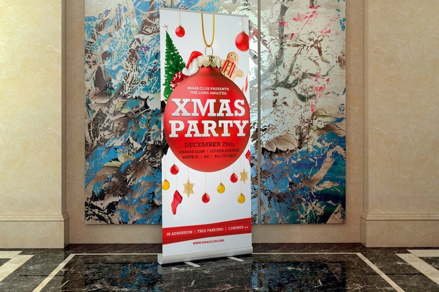
Only the 4 x 6 in and 4.25 x 6 in options above stay inside the USPS postcard rate. Everything at 5 x 7 in and larger mails at the letter rate, so size the card against the postage budget before you draw it. If your business is the kind people visit, holiday banners carry the same artwork indoors.
The seven that break the mold
Every one of these works because it drops something everyone else keeps. No snowflake border, no serif script over a photo of pine branches, no red and green fighting each other for the same square inch. What is left has to be good, which is the point.
The print note under each one matters as much as the look. A design that reads beautifully on screen can go dull on kraft, muddy in a rich black, or arrive scuffed because the wrong laminate went on a dark solid. If you want the underlying rules first, our postcard design guide covers bleed, safe zone and resolution before you start moving type around.
One to four: the cards that change the palette
1. Two colors, neither of them festive. An ink black or deep navy field, your brand color, and nothing else. It lands in a stack of red envelopes and looks like it came from a different decade. Print it on 16pt with a matte laminate, and if you want the accent to actually glint, run it as foil rather than a metallic-looking CMYK build.
2. Oversized, with almost nothing on it. A 6 x 11 in card carries one image and one sentence, and it cannot be ignored in a mail stack. The honest trade-off: anything above 4.25 x 6 in loses the USPS postcard rate and mails at the letter rate, so you are paying roughly double the postage per piece to buy that presence. Worth it for a hard offer, wasteful for a greeting.
3. Your own photographs, dated. Four to six real photos from the year, each with a one-line caption, and the year printed large. It works because stock photography is the fastest way to look like everybody else. Shoot in daylight, keep the images at 300 DPI at final size, and print on gloss so the color holds. The small business postcard examples we collected show how much difference real photography makes.
4. Uncoated kraft with a white underprint. Warm, quiet, and completely opposite to a glossy holiday card. Kraft absorbs ink, so every color shifts warm and darkens, and light type disappears entirely unless you lay a white underprint beneath it. Ask for a printed sample before you commit a run, because the shift is difficult to predict on screen.
Five to seven: the cards that change the format
5. Type only, set very large. One sentence filling the front. "Closed the 24th. Back on the 27th. Thank you for a good year." No image, no ornament. It is the cheapest card on this list to design and the hardest to get right, because there is nowhere for a weak sentence to hide.
6. Spot gloss over matte laminate. A snowflake or star pattern printed as gloss varnish on a matte black card is invisible straight on and appears when the card tilts under a light. The contrast is the effect, not the pattern, so keep the artwork simple and let the finish do the work. Read the anatomy of a postcard before you place it, because spot gloss over the address side will cause problems for the mail house.
7. A card built to be kept. A wall calendar for the coming year, a set of gift tags, or a dated offer that runs to the end of January. The card stops being mail and becomes an object, and it stays in the kitchen for weeks instead of hours. Print the back uncoated so people can write on it, and put your phone number where a hand will not cover it.
Size, postage and what going big really costs

Postage is the decision most people make last and should make first. USPS charges the postcard rate only for a rectangular card between 3.5 x 5 in and 4.25 x 6 in, with a thickness between 0.007 and 0.016 in. A 5 x 7 in card is over that limit. So is a 6 x 9 in and a 6 x 11 in. All three mail at the letter rate.
That does not make the big card wrong. It makes it a choice you should be making deliberately: fewer pieces at letter rate, or more pieces at postcard rate. For a seasonal greeting with no offer attached, a 4.25 x 6 in card at the cheaper rate lets you mail your whole list. For a "book your January project now" card with real money behind it, the 6 x 11 in earns its postage.
One more spec worth respecting. Thickness cuts both ways: 16pt is close to the top of the postcard-rate window, and a heavy laminate on top of it can push a card out of the range entirely. If postage class matters to your budget, confirm the finished caliper with your printer before the run, not after.
Rigidity, and why 14pt bends on a big card
A 4 x 6 in card is small enough that 14pt feels fine in the hand. Scale the same stock up to 6 x 9 in or 6 x 11 in and it starts to flex, and a card that arrives with a soft bend across the middle reads as cheap regardless of how good the artwork is. Above about 6 inches on the short side, go to 16pt.
The mail stream is rougher than most people expect. Cards get pushed through sorters, banded with other mail, and stuffed into boxes. A slightly heavier stock is the least glamorous upgrade on this page and the one people notice most.
The address side is not free design space
Keep the bottom 5/8 in clear across the full width for the barcode, and leave the right-hand block open for the address itself. Designers lose that space every year, the mail house asks for a revision, and the drop date slips by three days at the worst possible time of the season.
If a mail house is inkjetting addresses onto the card, the back must not carry a gloss UV coating. Inkjet ink sits on top of UV and smears. Specify uncoated or an aqueous coating on the address side and let the front carry the finish.
Finishes that photograph well and survive the mail

Three finish decisions cover almost every holiday card: whether the front is gloss or matte, whether there is a spot treatment on top, and whether any metal is involved. Each one has a failure mode people only find out about after the run.
Matte laminate looks expensive and photographs well, and on a large dark solid it shows every scuff and fingernail mark the sorter gives it. Gloss hides handling far better on dark backgrounds but flattens the quiet, editorial look people usually want from a matte card. If your design is a full-bleed black or deep green, that is the trade you are making.
Metallic is the other one. Gold and silver cannot be built from cyan, magenta, yellow and black, so a CMYK "gold" prints as a flat mustard that looks worse than no gold at all. If you want metal, it has to be foil, and foil wants simple shapes: a rule, a logo, a single word. Fine serifs and thin hairlines fill in.
Getting holiday red to actually look red
Straight 100 magenta and 100 yellow gives you a red that leans orange under most lighting. A truer holiday red usually needs the yellow pulled back and a little black added, something in the region of 0 magenta 100 yellow 90 black 5, then checked against a printed proof rather than a monitor. Deep greens have the same problem in reverse and go muddy without enough black in the build.
This is the single most common reason a holiday card disappoints in the box. Order a proof. It is a small cost against a run you have already committed the postage for, and it is the only way to see the color the way your customer will.
Matching the card to everything else you hand out
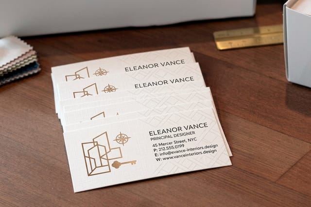
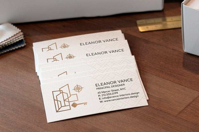
A holiday card is rarely the only piece a business puts in someone's hand in December. Studios and design practices tend to send the card and follow it with a visit, which is where a matching card in the same palette does real work. Our interior design business cards start at $17.57 and take the same foil and matte treatments as the postcard, so the pair reads as one brand.
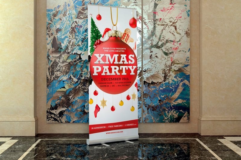
If you have a physical location, the same artwork scales up. Holiday banners from $43.92 carry the front-of-card design to the window or the wall, so the customer who got the mailer sees the same thing when they walk in. For more layout starting points, the postcard layouts worth copying are a good hour of reference.
Pricing the rest of the holiday push
The card is rarely the whole campaign. Most businesses that mail in December also want something in the window or on the wall when the customer arrives, and the artwork you have already paid a designer for should carry across. Holiday banner pricing moves with size, material and quantity, and the numbers below come straight from the live configurator.
Quantity and price
Holiday banner pricing and specs
Real configurator numbers, where the per unit cost drops as the run grows.
| Quantity | Price Per Unit | Total |
|---|---|---|
| 1 | $43.92 | $43.92 |
| 2 | $43.93 | $87.85 |
| 3 | $43.92 | $131.77 |
| 4 | $41.73 | $166.90 |
| 5 | $41.73 | $208.64 |
| 6 | $41.73 | $250.37 |

You can also earn coins on every order and redeem them against future printing, which helps when a seasonal campaign lands several jobs in the same fortnight.
Stock and finish, how they change the design
Stock is not a detail you add at checkout. A design built for gloss goes flat on uncoated, and a design built for uncoated goes plastic on gloss. Coated stock holds saturated color and photographic detail; uncoated absorbs ink, so everything shifts warm and slightly darker, which is exactly why the kraft-look card in the list above needs a white underprint under any light element.
Print it
Holiday banners, same artwork
Take the front of the card to the window, the counter or the wall.
Finish decides both look and survival. Gloss lifts photography and shrugs off handling. Matte reads calmer and shows scuffs on dark solids. Spot gloss over matte is the one finish that costs almost nothing extra in design effort and changes how the card feels in the hand, because the pattern only appears when the card tilts. Uncoated stays writable, which matters for any card meant to be filled in at a counter. For an idea of how a strong visual identity holds together across pieces, the branding design examples are a useful reference.
What different businesses should send
The right card changes with what you sell and who is on the list. Here is where each of the seven earns its place.
- Interior designers and studios. Real project photography beats any illustration you can buy. Six shots from the year, dated, on gloss, with a matching business card in the same palette.
- Restaurants and cafes. Holiday hours on a card people put on the fridge. Uncoated back, large type, and a dated offer that runs into January so the card keeps working.
- Contractors and trades. A year in review with before and after pairs. It is proof of work disguised as a greeting, and it lands with the people most likely to book a January job.
- Salons and clinics. Gift certificate cards perforated or plain, mailed early December. Keep the back writable so a client can fill in a name at the counter.
- Retail. The oversized card earns its letter-rate postage here, because the offer is specific and the window to act is short. One image, one sentence, one deadline.
Match the set
Cards that match the mailer
Same palette, same foil, handed over in person after the card arrives.
Where to look for more layouts
Steal structure, not style. The fastest way to a good holiday card is to find a layout that already balances image, headline and offer, then rebuild it in your own palette and photography. The business postcard ideas and examples collection is the closest thing to a working reference set, and the greetings-from postcard guide is worth reading if you want the retro vacation-card treatment done properly rather than as pastiche. For a small keepsake to slip in alongside a gift, our bookmark design guide covers a format that costs very little and gets kept for years.
If you are building the whole seasonal identity rather than one card, the graphic design portfolio examples show how designers present a coherent set of pieces, which is the same problem at a different scale. Print-ready blanks with bleed and trim already marked are in the blank template library.
Wally sizes the holiday card before he designs it
Postage class first, artwork second
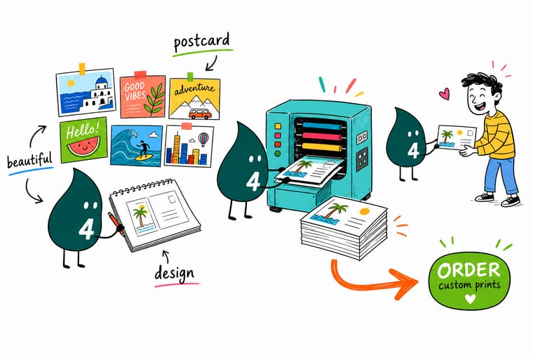
Stay between 3.5 x 5 and 4.25 x 6 inches to keep the USPS postcard rate, or accept the letter rate and go to 6 x 11 for a card nobody can ignore. Add 0.125 inch bleed on all sides, design at 300 DPI in CMYK, keep the bottom 5/8 inch of the address side clear for the barcode, and remember gold has to be foil because CMYK gold prints mustard.
Print your holiday set →What decides whether a holiday card gets kept
Design tips that hold at every size
- Drop one convention on purpose. Cut the red, the snow, or the script. Removing a single expected element is what makes a card read as considered rather than seasonal wallpaper.
- Set the postage class first. Decide between the postcard rate and the letter rate before you open the artboard. It is a size decision, and reversing it later means redrawing the layout.
- Proof the reds and greens. Screen color lies about both. A printed proof is the only honest preview, and holiday palettes are exactly the ones that shift most.
- Give the barcode its space. Bottom 5/8 in clear, right block open, no gloss UV where a mail house will inkjet. Three rules that prevent almost every late revision.
- Make it worth keeping. A date, a calendar, a tag, a code that runs into January. A card with a use stays in the house, and a card in the house is still advertising in week three.
Explore more
More postcard design and printing
Holiday banners print in 2 business days at $43.92, the fastest piece in a December push.
 Guide How to Design a Postcard Bleed, safe zone, resolution and the address-side rules.
  Guide Anatomy of a Postcard Every part of a postcard and what each one is for.
  Article 23 Postcard Layouts Worth Copying Layout references you can adapt to a holiday palette.
  Article 10 Postcard Examples for Small Businesses What real small business mailers get right.
  Product Interior Design Business Cards Matching cards in the same foil and matte finishes.
  Product Holiday Banners Take the card artwork to the window and the wall.
 Ready to print your holiday campaign?
Pick your size, drop in your design or a free template, and 4OVER4.COM prints it sharp on premium stock, as fast as your drop date needs.
Common questions about holiday postcards
What size holiday postcard gets the cheapest postage?
Anything between 3.5 x 5 in and 4.25 x 6 in, at a thickness between 0.007 and 0.016 in, qualifies for the USPS postcard rate. The most common choice is 4.25 x 6 in, because it is the largest card that still stays inside the window. Once you go to 5 x 7 in, 6 x 9 in or 6 x 11 in, the piece mails at the letter rate instead, which is roughly double per piece. Decide this before you design, since changing size afterwards means rebuilding the layout rather than scaling it.
Can I print gold or metallic on a holiday postcard?
Not from CMYK. Gold, silver and copper are reflective, and process inks are not, so a CMYK gold build prints as a flat mustard that reads worse than leaving it out. Real metallic comes from foil, which is stamped or laid onto the sheet as a separate pass. Foil likes simple shapes: a logo, a rule, a single word set in a weight that holds. Thin serifs, hairlines and fine ornament tend to fill in or break up, so simplify the artwork before you specify it.
Should the front be matte or gloss?
It depends on what your background is doing. Matte laminate photographs beautifully and gives a card that quiet, editorial feel, but on a full-bleed black or deep green it shows scuffs and fingernail marks picked up in the mail stream. Gloss hides that handling far better and lifts photographic color, at the cost of the calmer look. If your card is a dark solid and it has to arrive perfect, gloss is the safer choice. If the design is light or type-led, matte wins.
What do I have to leave clear on the address side?
Keep the bottom 5/8 in clear across the full width so the USPS barcode has somewhere to print, and leave the right-hand address block open. Also avoid a gloss UV coating on that side if a mail house is inkjetting addresses, because inkjet ink sits on top of UV and smears. Specify uncoated or an aqueous coating on the back and let the front carry the finish. Getting these three things right removes almost every late revision in a seasonal mailing.
When should holiday postcards actually drop?
Aim to land in the last week of November through around December 10. Earlier than that and the card sits before anyone is thinking about the season; later and it competes with the heaviest mail volume of the year. Work backwards from the landing date: allow for print turnaround, mail house processing, and USPS transit for your class of mail, then add a few days of margin. If you are running a dated offer, extend it into January so the card is still useful after the rush.
