
How to Design a Retro Greetings From Postcard


The classic Greetings From look spells a place name in giant letters, each one filled with a scene. The letters have to be fat enough to hold a photograph, which rules out most typefaces.
The Greetings From style spells a place name in oversized block letters, each filled with a scene from that place. Choose a short word, set it in a heavy outlined typeface, clip a high-contrast photo inside every letter, and frame it with a simple background and a subtitle. Keep the art bleeding past the trim, reserve the right half of the back for the address, and build the whole card in the 4OVER4 online designer.
Start here
A place name as a window
The look is a place name in giant letters, each one a window onto a scene. Set a short word in a heavy outlined typeface, clip a high-contrast photo inside every letter, and frame it with a simple background and a small subtitle. Keep the front art bleeding past the trim in CMYK at 300 DPI, reserve the right half of the back for the address and postage, and build the whole card in the 4OVER4 online designer before you print and mail it. The diagram maps the front and back so you can see where everything goes.
What the Greetings From style is
The Greetings From postcard is one of the most recognizable looks in print. A place name is spelled out in oversized block letters, and each letter becomes a little window onto a scene from that place: a beach inside the first letter, a skyline in the next, a mountain in the last. Read together, the word works like a miniature travel poster you can drop in the mail.
The style comes from the golden age of large-letter linen postcards, and its warmth is exactly why it still works. It is a natural fit for tourism promotions, event invites, grand openings, and local real estate outreach, because it makes a specific place feel like a destination worth remembering.
This guide shows how to build that look from scratch, how to keep it mailable, and how to design and order it in the online designer before you print postcards at 4OVER4.
Build the big letters and their scenes
The letters carry the whole design, so choose a short word and a heavy typeface. A city or region name of five to nine letters is ideal, because each letter needs enough width to hold an image. Set it in a bold slab or thick sans, then give every letter a clean outline that stays visible even where the scene inside runs light against the paper.
Next, clip a photo inside each letter. Pick scenes that are instantly readable at small size, a lighthouse, a palm-lined beach, a downtown skyline, and keep them high in contrast so they do not turn to mud once shrunk into a letterform. Vary the scenes across the word so the eye travels, and avoid busy images that fight the shape of the letter holding them.
If you want to master clipping images into type, our guide on adding scannable elements to postcards pairs well with a scenic front that also drives an online action. For a nostalgic feel, warm the color slightly and let the outline do the work of keeping the word crisp.
Frame the front like a postcard
Great letters still need a frame. Set the word against a simple background, a clear sky, a solid color field, or a classic postcard border, so the scenes inside the type stay the star. Too much competing detail behind the letters flattens the effect and makes the word hard to read from a distance.
Add a small subtitle beneath the word to complete the retro look, usually the state, a date, or a short tagline. Keep it tucked inside the safe margin and sized so it supports the headline rather than competing with it. A thin outer border in a matching color gives the whole card that souvenir feel and cleanly separates the art from the edge.
The diagram below maps a jumbo postcard so you can see where the letters, the border, and the safe margin fall before you commit any art.
Keep the back mailable
The front sells and the back mails, so treat them as two different jobs. Divide the back into a message side and an address side. USPS reads and cancels mail on the right, so reserve the right half for the recipient address and postage, and keep it clear of heavy color or art. Your written note lives on the left half.
Leave the lower right corner open for the postal barcode, and do not let a background image creep into that zone, since a busy field there can interfere with automated processing. Design the back in CMYK at 300 DPI just like the front, and keep every printed element inside the safe margin.
For the exact clearances and placement, follow our guide on how to address a postcard correctly for mailing, and our guide on how to mail postcards covers stamps and rules.
Design it with no software
You do not need a design suite to build this look. The 4OVER4 online designer opens a correctly sized postcard in your browser, where you can set the big letters, clip scenes into them, add the subtitle, and lay out the back. The bleed and safe margins stay in place while you work, so the print rules are handled for you.
If you would rather start from a layout, browse our design templates and customize one, or adapt the style for a folded piece if you want more room, in which case a greeting card gives you inside panels for a longer message. Either way, you order straight from the same screen once the design looks right.
When the card is ready, you can print it on its own or pair it with a mailing service. Ordering direct mail postcards lets you print and send to a list or a whole area in one step, which suits tourism and local campaigns built around a place.
Pick the stock, then see the real price
Stock changes how the card feels and how the color reads. A gloss stock makes the scenic art pop and gives that slick souvenir shine, while a matte or uncoated stock reads calmer and takes handwriting well if recipients will jot a note. Heavier stocks feel more like a keepsake, which fits the nostalgic style.
Cost moves on a few levers: quantity, where more pieces lower the unit price, plus size, stock, finish, and whether you add mailing. You set each option in the configurator and the total updates live, so you can weigh a jumbo gloss card against a standard matte one, or a small run against a full mailing, before you commit.
Use the live specs and pricing panel below to see the exact sizes, stocks, and finishes for postcards at 4OVER4, then order the card your campaign calls for.
Wally turns a place name into a scenic postcard
Big letters on the front, a clean mailer on the back
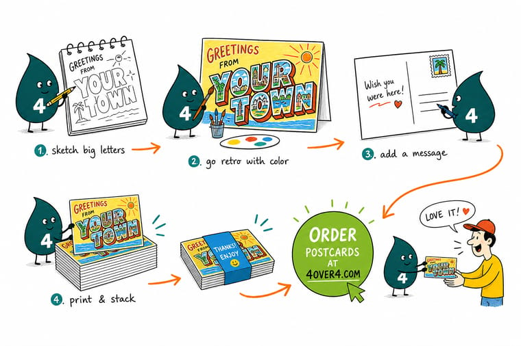
Wally builds the front like a tiny travel poster: a short word in bold outlined letters, each one holding a high-contrast scene, set against a simple background with a subtitle underneath. Then he keeps the back mailable by reserving the right half for the address and postage. Build it in CMYK at 300 DPI with bleed, design it in the online designer, and 4OVER4 prints and mails it exactly as you drew it.
Print your postcards →Quick reference
The Greetings From postcard setup, at a glance
Match these settings and your card prints exactly as designed and mails without a hitch. Sizes are for a jumbo postcard, which gives the big letters room to hold detailed scenes.
| Setting | Get it to | Why it matters |
|---|---|---|
| Jumbo trim | 6 in by 4.25 in | A larger postcard gives the big block letters room to breathe and hold detailed scenes inside them. |
| Bleed | 0.125 in every edge | The scenic front art reaches the edges, so it must run past the trim or a cut shift leaves a white sliver. |
| Safe margin | 0.125 in inside the trim | Keep the place name and any small caption clear of the blade so the letters never get clipped. |
| Color mode | CMYK | Vintage art is color-rich, so build in CMYK and re-check saturated blues and oranges after converting from RGB. |
| Resolution | 300 DPI at final size | Photos placed inside the letters need full resolution so the scenes stay sharp, not soft or blocky. |
| Back address zone | Right half reserved | USPS reads the address and postage on the right, so keep that area clear of art and heavy color. |
| File format | Flattened PDF (PDF/X-1a) | A single self-contained PDF with fonts embedded prints predictably with nothing to relink. |
Step by step
Design a Greetings From postcard in 7 steps
- Pick the place and the word Choose the destination or brand phrase that will fill the letters, usually a city or region for the classic look. Shorter words carry the style best because each letter gets more room for its scene.
- Set a big, blocky headline font Use a heavy sans or slab typeface so each letter is wide enough to hold an image. Give the letters a clean outline that stays visible even where the scene inside runs light.
- Fill each letter with a scene Clip a landmark, beach, or skyline photo inside every letter. Keep the scenes high in contrast and vary them so the word reads as a little travel poster.
- Balance the background Set the letters against a simple sky, postcard border, or solid field so the type pops. Add a small subtitle like the state or a tagline beneath the word to finish the retro frame.
- Lay out a mailable back Reserve the right half of the back for the address block and postage, keep your written message on the left, and leave the barcode zone clear at the bottom.
- Prep the file for press Confirm CMYK color, 300 DPI images, bleed on every edge, and text inside the safe margin, then outline or embed the fonts before you export.
- Export and order Export a flattened PDF with bleed included and upload it, or design the whole card in the online designer and order postcards from the same screen.
Specs and pricing
Postcard specs and live pricing
Once your design is set, size, stock and finish are what is left. Postcards run 50 for $16.48, which is $0.33 each.
| Quantity | Price Per Unit | Total |
|---|---|---|
| 50 | 33.0¢ | $16.48 |
| 100 | 24.2¢ | $24.16 |
| 200 | 15.9¢ | $31.86 |
| 300 | 12.8¢ | $38.45 |
| 400 | 11.3¢ | $45.04 |
| 500 | 10.3¢ | $51.62 |
| 600 | 9.89¢ | $59.31 |
| 700 | 9.57¢ | $67.00 |
Print it
Bring your postcard design to 4OVER4

See it in use
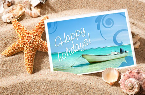
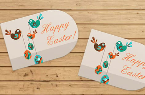
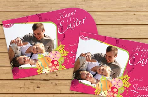
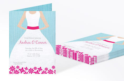
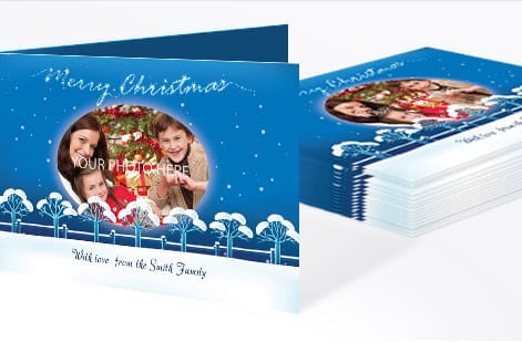
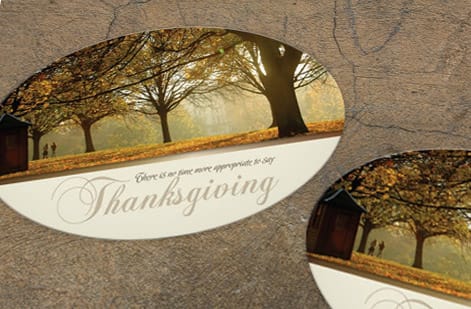
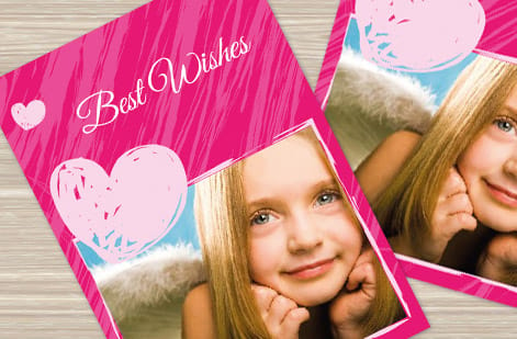
Retro cards we printed and mailed
Explore more
Where to go next



By the numbers
Retro postcards inside a 1,000+ product catalog
Common Questions
Common questions about Greetings From postcards
What is a Greetings From postcard?
A Greetings From postcard is the classic vintage souvenir style where a place name is spelled out in oversized block letters, and each letter is filled with a scene from that place: a beach, a mountain, a landmark, or a skyline. The look dates to the golden age of large-letter linen postcards and reads like a miniature travel poster. Today it works for tourism promotions, event invites, real estate farming in a specific neighborhood, and any brand that wants a warm, nostalgic hook. The design lives on the front, while the back stays a standard mailable postcard.
How do I design a Greetings From postcard?
Start with a short place name or phrase so each letter has room to hold an image. Set it in a heavy block typeface, give every letter a clean outline, then clip a high-contrast scene inside each one so the word reads as a series of little windows. Set the letters against a simple background, add a small subtitle underneath, and keep the whole composition inside the safe margin with the art bleeding past the trim. The fastest path is the 4OVER4 online designer, which opens a correctly sized postcard so you can build the letters, scenes, and message with no design software.
What size should a Greetings From postcard be?
The oversized letters and detailed scenes read best on a larger card, so a jumbo 6 in by 4.25 in postcard is a strong default, though standard sizes work for a tighter, simpler version. Whatever size you pick, match it to the product you plan to order so the file and the press agree, add 0.125 in of bleed on every edge for the full-bleed art, and keep the place name inside the safe margin. Larger cards also give you more room for a clean, mailable back.
How do I set up the back of the postcard for mailing?
Treat the front as the art and the back as the mailer. Divide the back so the right half is reserved for the recipient address and postage, since USPS reads and cancels mail on that side, and keep it clear of heavy color or art. Put your written message on the left half, and leave the lower right corner open for the postal barcode. Design the back in CMYK at 300 DPI just like the front. Our guide on how to address a postcard correctly for mailing covers the exact clearances.
What does it cost to print custom postcards?
Designing the card yourself costs nothing beyond your time, and building it in our online designer is included. Printing cost scales with quantity, where more pieces lower the unit price, plus size, paper stock, and finish. A gloss stock makes the scenic art pop, while a matte or uncoated stock takes handwriting well if people will write on the card. Set each option in the configurator and the total updates live, so you can compare sizes, stocks, and run lengths before you order.
Can I mail Greetings From postcards to a whole area?
Yes. The style is a natural fit for reaching a neighborhood or region, and you can pair the design with a mailing service so the cards go out to a list or a whole area without a trip to the post office. Direct mail postcards let you print and send in one order, which suits tourism campaigns, grand openings, and local real estate outreach. Design the card first, then choose the mailing option and quantity when you configure the order.
Get Started
Order 50 greeting cards at $1.12 each in the same style
Build the big-letter design in the 4OVER4 online designer, keep the back mailable, and print it on the size, stock, and finish your campaign calls for. Add a mailing service and send to a whole area in one order.
Legal Disclaimer
Gold Standard guarantees apply to all standard orders placed through 4over4.com. Price match requires verifiable proof of a competitor's published price for an equivalent product with matching specifications and turnaround time. Satisfaction guarantee covers manufacturing defects and print quality issues. Contact support with order number and documentation. On-time delivery rate based on tracked orders 1999 to 2026. Individual results may vary based on shipping carrier performance.
