
Branding Design Examples to Inspire Your Next Brand Identity


Marcus is our print marketing voice, built from the knowledge of our production team, with over 20 years in printing.
How to Read a Branding Design Example Instead of Just Liking It
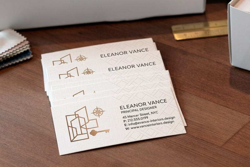
The brand pattern examples worth copying come down to five: the single-weight wordmark, the color block system, the strict grid with one break, the illustrated pattern drawn from the logo, and the texture-led identity. Test any of them where it gets printed. A run of 100 business cards at 2" x 3.5" costs $17.57 and shows the pattern at its smallest, a 2 sided blockout banner from $108.75 shows it at 2' x 3' and up, and a 3 in 1 foldable wireless charger from $15.00 shows it on an object someone keeps.
Most people scroll a gallery of brand identity design examples, save four of them, and end up with a mood board that contradicts itself. The saved work looks good because someone made a set of hard decisions, and those decisions are invisible until you go looking for them. Learning to name them is the difference between copying a look and building a system you can actually apply.
Every strong identity answers the same five questions in the same way every single time. What is the logo allowed to sit next to. Which typeface carries the message and which one supports it. Which color leads and which colors are only there to make the leader look better. How much empty space is non-negotiable. What happens when all of that has to survive a two inch card and a six foot banner.
The identities that hold up in production share one habit: they were drawn with the final substrate in mind. Ink on uncoated stock spreads differently than ink on gloss. A logo that relies on a hairline rule disappears on canvas. Reading examples with that lens changes what you save.
Look for the rule, not the result
When a layout feels calm, measure it. You will usually find the logo sitting exactly one logo height from the edge, or the type set at two sizes and nothing in between. That constraint is the reusable part.
Check how it behaves at the smallest size
Shrink any example to the width of a business card. Marks with thin strokes, tight counters, or four colors turn to mud. The identities that survive were drawn to survive that test first.
Count the colors that actually do work
Palettes that feel expensive are usually one saturated color, one deep neutral, and one paper white. Extra colors get demoted to accents used once per piece, never twice on the same page.
Ask what it costs to keep consistent
An identity that needs foil, die cutting, and a custom stock on every touchpoint will get abandoned in month three. The best systems put the expensive treatment on one item and let the rest carry the same color and type.
Start here
Put your identity on a card first
The smallest piece exposes the most problems, and it is the cheapest place to fix them.

Five Branding Design Examples and the Idea You Can Steal From Each
Each pattern below is described by what it does rather than by brand name, and each one prints cleanly, which is the part most inspiration galleries never check. Test one this week on 100 business cards for $17.57, which ship in 3 business days: 16pt uncoated with soft touch suits the texture-led identity, and 14pt gloss suits the color block system. Judge the printed card at arm's length before you roll the pattern out.
If you want a wider sweep of finished systems before you commit, work through these corporate identity and branding examples and note which of the five patterns below each one is really using.
- The single-weight wordmark. One typeface, one weight, generous letter spacing, no icon. It forces the name itself to become the mark, and it reproduces perfectly at any size on any stock.
- The color block system. The logo stays neutral and the brand color owns the background. Every piece is instantly recognizable from across a room, which is why it works so well on banners.
- The strict grid with one break. Everything aligns to a tight column grid except one deliberate element per piece. The discipline reads as premium and the single break reads as confident.
- The illustrated pattern. A repeating motif drawn from the logo fills backs of cards, packaging, and tote bags. It carries recognition without ever repeating the logo itself.
- The texture-led identity. The brand lives in the material, uncoated stock, kraft, soft-touch lamination, so the identity is something people feel before they read it.
Notice that none of these depend on a clever icon. Icons are the part of brand design people obsess over and the part audiences remember least. Type, color, spacing, and material do the recognition work, and all four are decisions you can lock in a single afternoon and apply to a print order the same day.
Print picks
Three surfaces that prove a brand system works
Live prices, ready to customize with your own colors, type, and logo.
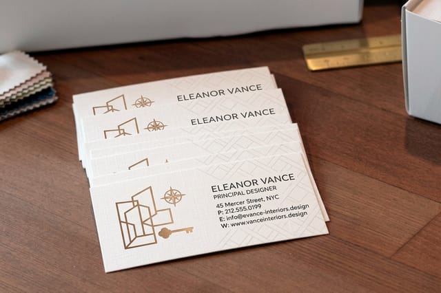 Interior Design Business Cards 100 for $17.57 The smallest surface where your typography, color, and logo have to agree.
 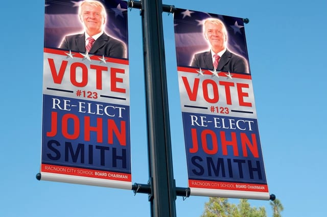 2 Sided Blockout Banners $108.75 each An opaque core keeps both printed sides clean, so the identity reads from either direction.
 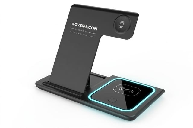 3 in 1 Foldable Wireless Charger $15.00 each An object people keep on the desk, where the mark gets seen daily.
 What Brand Design Actually Is and Why It Pays for Itself
Brand design is the set of visual and verbal rules that make your business recognizable before anyone reads a word of it. It is not the logo. The logo is one asset inside the system, alongside the typefaces, the color values, the photography direction, the tone of the copy, and the way all of it is spaced and sized on every surface you print or publish.
The payoff is compression. When someone has seen your color and your type five times, the sixth encounter costs them almost no attention to recognize. That is why consistency beats cleverness. A modest identity applied identically across a card, an invoice, a banner, and a package will outperform a brilliant identity applied differently every time.
The three documents that keep a brand consistent
- A one page rule sheet. Logo files, clear space, minimum size, hex and CMYK values, the two approved typefaces, and the three layouts you actually use. One page, not forty.
- A print spec list. Stock, coating, and finish for each item you reorder, so the fifth reprint matches the first without a new conversation.
- A working template set. Live files for the pieces you order most, sized to the printer's real dimensions with bleed already built in.
Portfolios are a fast way to see whether a system holds together, because a designer has to show the same identity across many pieces at once. Scan these graphic design portfolio examples and judge each project by whether the fifth application still looks like the first.
Turning a Brand Identity Into Printed Collateral
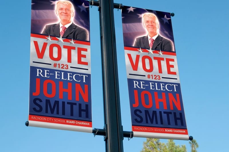
An identity becomes real the moment it exists on paper. Screens are forgiving, print is not. Color shifts against the stock, small type fills in, and anything sitting near the trim edge risks getting cut. Designing the collateral is where most brand systems get their first honest stress test, and where the rules you wrote get edited into something durable.
Start with the stack every business reorders: cards, letterhead, folders, labels, and one large format piece. Build them in that order, because the smallest item exposes the most problems. Once the card is right, the same type sizes scaled up and the same color values on a bigger surface almost always work.
Set the rules that keep every reprint identical
- Build to bleed. Extend backgrounds past the trim and keep text well inside the safety margin so a slight shift never eats a letter.
- Convert to CMYK before you approve. Bright screen blues and neon greens have no press equivalent, so choose the printable version yourself rather than letting a conversion choose for you.
- Fix one stock per item. The same design on uncoated versus gloss reads as two different brands, so lock the substrate along with the artwork.
- Keep the logo vector. One clean vector file avoids the soft, resampled mark that shows up when someone drops a web PNG into a banner.
Small format items are the easiest place to prove the system works. Stickers carry the mark onto laptops, packaging, and shipping boxes with no layout to get wrong, and there are more uses than most teams consider in these ways to use logo stickers for promotion.
Corporate Branding Examples Across Every Touchpoint
Corporate identity work is judged on coverage, not on any single artifact. The interesting question is whether the tenth touchpoint still looks like the first: the invoice, the trade show backdrop, the event program, the shipping label, the internal deck nobody outside the company will see. Consistency in the unglamorous places is what makes the glamorous places believable.
A practical audit is to list every printed item your company produced last year, lay them out on a table, and mark the ones that share the exact same logo size relationship and color values. Most teams find that two thirds of their output drifted. Fixing the drift usually costs nothing beyond a template and one afternoon.
Event collateral is the most common place drift starts, because it gets made under deadline by whoever is free. Locking a reusable layout for it early solves the problem, and these event program examples show what a well disciplined program piece looks like next to the rest of an identity.
Quantity and price
Business card pricing and specifications
Real configurator numbers. The more you order in one run, the lower the per card cost.
| Quantity | Price Per Unit | Total |
|---|---|---|
| 100 | 17.6¢ | $17.57 |
| 200 | 11.5¢ | $23.07 |
| 300 | 9.15¢ | $27.46 |
| 400 | 7.96¢ | $31.86 |
| 500 | 7.25¢ | $36.26 |
| 600 | 6.77¢ | $40.64 |

Branding Design Examples at Large Format Scale
Everything gets simpler as it gets bigger, which is the opposite of what most people expect. At six feet, detail is noise. What carries across a parking lot or a trade show hall is a single dominant color, one very short line of type, and enough empty space for both to breathe. Large format is where the color block pattern from the examples above earns its reputation.
The technical trap is show-through. A single layer banner printed on both sides lets the reverse image ghost through, which muddies the color and softens the type. A blockout construction puts an opaque layer in the middle so each face stays clean, and that is the difference between a brand color that looks deliberate and one that looks washed out.
- One message per face. A name, a category, and a call to action is already one item too many at distance.
- Type at least eight times card size. If it looks oversized on your monitor, it is probably close to right on the finished piece.
- High contrast only. Brand color on white or brand color on deep neutral, never brand color on a mid tone.
- Plan the hardware. Grommets, pole pockets, and hem placement change the safe area, so decide the hanging method before you finalize the layout.
Large format
2 sided blockout banners
An opaque middle layer stops show-through, so your brand color stays true on both faces.

Branded Merchandise That Extends the System
Merchandise is the part of an identity people carry home. It works when the object is genuinely useful and the branding is quiet, and it fails when the object is disposable and the logo is enormous. The test is simple: would someone keep this on a desk if it had no logo at all. If the answer is yes, adding a small mark turns it into daily brand exposure rather than landfill.
Desk technology is the current sweet spot because it stays in one place, in view, for years. A folding charger sits next to a laptop through every meeting. Keep the branding to a single-color mark at modest size, use the logo lockup that works without color support, and let the object do the rest.
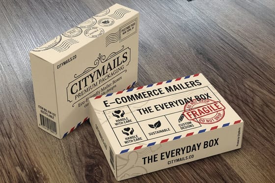
Packaging is the other half of this. The box a product arrives in is often the first physical piece of the brand a customer touches, and small businesses tend to underinvest in it. These brand packaging examples for small businesses show how far a simple color and stock decision can go.
Branded merch
Desk tech that carries the mark
A folding charger stays in view through every meeting, which is the whole point of good merchandise.
How to Choose the Right Brand Design for Your Business
Choosing is mostly elimination. Write down the three words you want a stranger to use after seeing your work, then reject every direction that does not support all three. If the words are precise, warm, and modern, an ornate script and a neon palette are out, and the decision took a minute instead of a month of moodboarding.
Then run the finalists through four practical filters before you commit, because a direction that cannot be produced consistently is not a direction, it is a poster.
- Does it survive one inch. Print the mark at business card scale on a home printer and look at it from arm's length.
- Can two people apply it identically. Hand the rule sheet to a colleague and have them lay out a simple flyer. Differences reveal missing rules.
- Does it work in one color. Stamps, engraving, embroidery, and fax-grade documents all strip color eventually.
- Is it different from the three competitors you respect most. Put all four logos side by side. If yours blends in, the direction is safe rather than right.
Typography carries more personality than any other choice, and it is where directions separate fastest. If you are leaning warm and nostalgic, these retro fonts show how far a single typeface decision moves the whole identity.
Compare finishes
Popular business cards, side by side
Stock, finish, size, quantity, turnaround, and price in one view so the choice is quick.
 free business cards |  Standard Business Cards |  3D Lenticular Business Cards |  Metallic Foil Business Cards | |
|---|---|---|---|---|
| Min price | Free | $17.57 | $690.88 | $222.13 |
| Paper / stock | 14pt Gloss Cover | 14pt Gloss Cover | 31pt Lenticular Lens | 16 Point Silk Laminated |
| Finish | - | Standard Finish | - | - |
| Size | 2" x 3.5" | 2" x 3.5" | 2" x 3.5" - Vertical | 2" x 3.5" |
| Default qty | 200 | 100 | 500 | 500 |
| Turnaround | 5 business days | 3 business days | 22 business days | 7 business days |
| Rating | ||||
| View & customize | View & customize | View & customize | View & customize |
What Brand Design Costs and How Print Prices Are Set
Design fees and print costs are two separate budgets and they behave differently. Design is a one time investment in decisions, and once the rule sheet exists you stop paying for it. Print is a recurring cost driven by four variables you control on every order: quantity, size, stock and finish, and turnaround. Understanding those four is how you keep an identity affordable to maintain.
Quantity is the biggest lever by far. Press setup is a fixed cost spread across the run, so the per unit price drops steeply as the count rises, which is why doubling a card order rarely doubles the price. Size and stock move the material cost directly, finishes such as soft-touch lamination or foil add a pass on the press, and a rush turnaround adds a scheduling premium.
A realistic starting budget for a small identity rollout
- Business cards. The first physical proof of the system, from $17.57 per order at 4OVER4.COM.
- Branded merchandise. Useful printed desk items, paired with ready-made gifts such as a 3 in 1 foldable wireless charger from $15.00 each.
- Large format presence. A 2 sided blockout banner from $108.75 covers events and storefronts for years.
- Templates instead of redesigns. Reusable layouts cost nothing per reorder and are the reason consistent brands spend less over time.
One habit saves real money: order the whole stack at once rather than piece by piece. Approving color across cards, labels, and a banner in a single review means one round of proofing instead of five, and everything comes off the press matched. For a promotional variation on the same idea, these scratch-off gift card printing examples show a low cost piece that carries the identity into a campaign.
Start fast
Brand templates and print-ready blanks
Free layouts plus exact-size blanks so your identity lands inside the trim on the first try.




Wally turns brand inspiration into a print order
Find the rule behind the example, then put it on paper
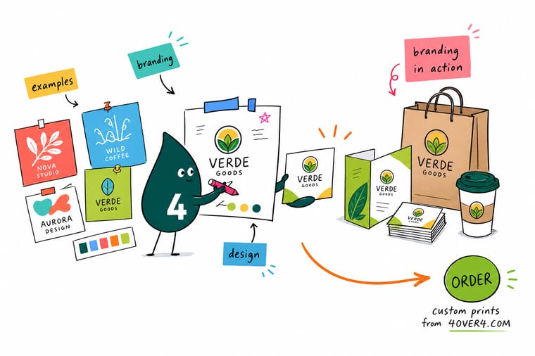
Saving pretty identities is easy. Wally's shortcut is to write down four things from any example you love: the typeface pairing, the one color that leads, the empty space around the logo, and the stock it was printed on. Those four decisions are your system. Apply them to a business card first, because the smallest piece exposes every weakness, then scale the same rules to banners and branded merch. If it survives two inches, it will survive six feet.
Print your brand identity →Brand design takeaways worth keeping
Explore more
More branding and design inspiration
Nine articles on identity, type and packaging, plus the three products priced on this page: cards from $17.57, banners from $108.75 and chargers from $15.00.
 Article 7 Holiday Postcard Design Examples That Break the Mold Seven holiday postcard design examples that skip the usual clichés, with notes on layout, color, foil, and pap
  Article Corporate Identity and Branding Examples Fifty finished identity systems worth studying closely.
  Article 15 Stylish Business Card Examples Where an identity meets its smallest, hardest surface.
  Article 10 Graphic Design Portfolio Examples Judge a system by whether the fifth piece matches the first.
  Article Brand Packaging Examples The first physical touchpoint most customers actually hold.
 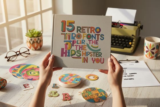 Article 15 Retro Fonts to Try One typeface decision moves the whole identity.
  Article 10 Ways to Use Logo Stickers Carry the mark onto laptops, boxes, and packaging.
 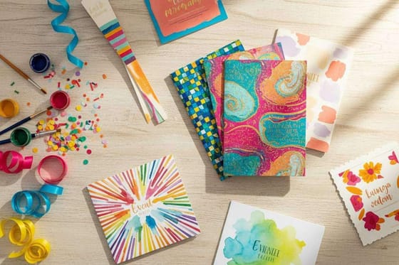 Article Event Program Examples Where identity drift usually starts, and how to stop it.
 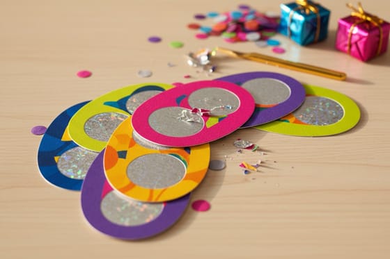 Article Scratch-Off Gift Card Examples A low cost piece that carries a brand into a campaign. Product Interior Design Business Cards Prove the system on the smallest surface first. Product 2 Sided Blockout Banners Opaque core keeps both printed faces clean and true.
 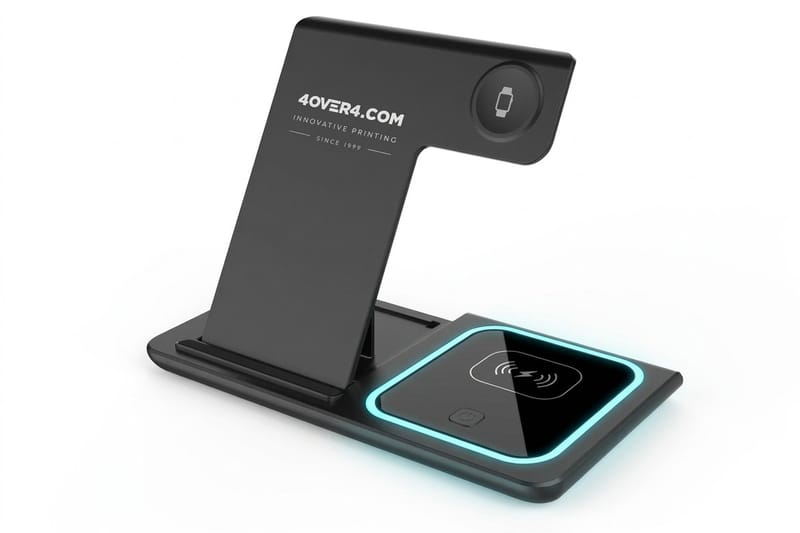 Product 3 in 1 Foldable Wireless Charger Desk tech that stays in view for years.
 Test the identity on 100 cards for $17.57
Lock your typeface, your lead color, and your logo spacing, then print the card first. Once it holds at two inches, the banner and the merch follow easily.
Branding design questions, answered
What is brand design?
Brand design is the complete set of visual and verbal rules that make a business recognizable before anyone reads a word of it. It covers the logo, the typefaces, the exact color values, the spacing and grid, the photography direction, and the tone of the writing. The logo is one asset inside that system rather than the system itself, which is why two companies with equally good logos can look wildly different in quality once you see ten pieces of their collateral side by side.
Why does branding design matter for a small business?
Because recognition is cheap once it is established and expensive every time you restart it. When a customer has seen the same color, typeface, and spacing across your card, your invoice, your packaging, and your banner, each new encounter costs them almost no attention to place. Inconsistent visuals reset that counter constantly, so the same marketing spend buys far less memory. Consistency is the whole mechanism, and it costs nothing extra once the rules exist.
What are good branding design examples to learn from?
The most useful patterns are the single-weight wordmark, the color block system where the brand color owns the background, the strict grid with one deliberate break, the illustrated pattern drawn from the logo, and the texture-led identity that lives in the paper stock itself. Each is a decision you can apply this week rather than a style you have to imitate. Study finished systems in these corporate identity and branding examples and identify which pattern each one is really using.
How do I choose the right brand design for my business?
Write the three words you want a stranger to use after seeing your work, then eliminate any direction that fails to support all three. Run the survivors through four filters: does the mark hold up at business card size, can two different people apply the rules identically, does it work in a single color for stamps and embroidery, and does it look distinct next to the three competitors you respect most. Whatever passes all four is a system you can maintain, not just a look you liked.
What does brand design cost and how are print prices set?
Design fees are a one time investment in decisions, while print is a recurring cost set by four variables: quantity, size, stock and finish, and turnaround. Quantity moves the price most because press setup is fixed and spreads across the run, so doubling an order rarely doubles the cost. At 4OVER4.COM, business cards start at $17.57 per order, merchandise such as a ready-made 3 in 1 foldable wireless charger starts at $15.00, and 2 sided blockout banners start at $108.75.
