Brochure Design Tips in MS Word for 2026
Brochure design tips in MS Word start with one truth: you don't need expensive software to create something professional. Microsoft Word ships with built-in templates, drag-and-drop image placement, and layout tools that handle bifold and trifold formats. 4OVER4.COM has printed 10 billion+ cards and marketing materials for over 150,000+ businesses, and plenty of those projects started as Word documents. If you can type a letter, you can design a brochure.
The real challenge isn't the software. It's knowing what makes a brochure worth picking up, reading, and keeping. That's what this guide covers - from choosing the right layout to preparing your file for professional printing. Whether you're promoting a local event, launching a product, or building a direct mail services campaign, these tips will help you get it right in Word.
Pick the Right Layout Before You Type a Single Word
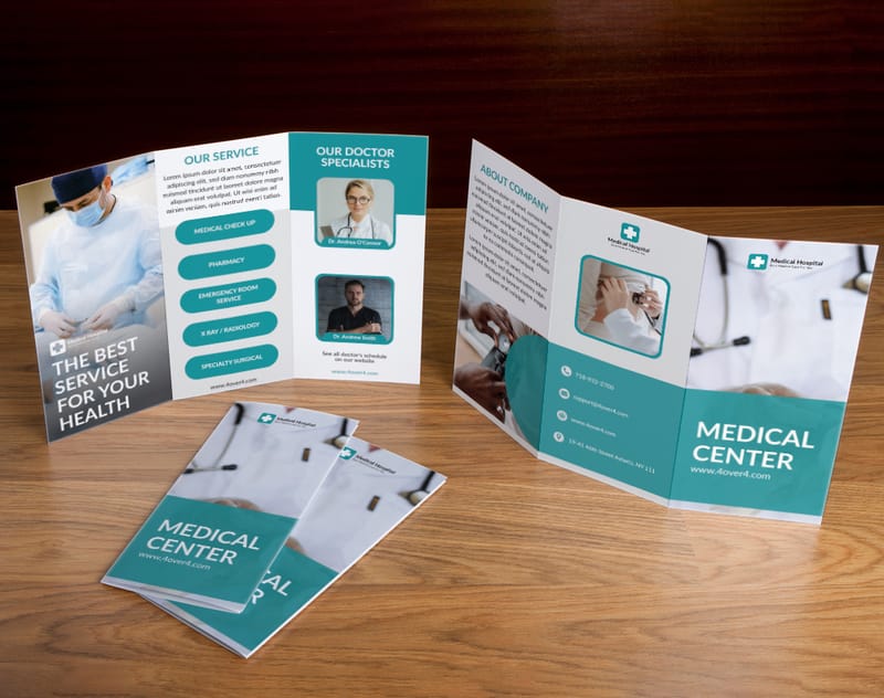
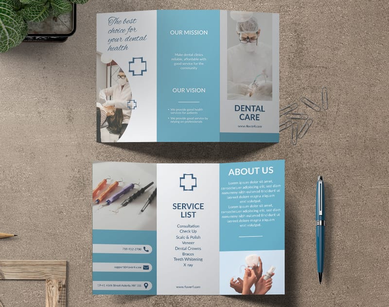
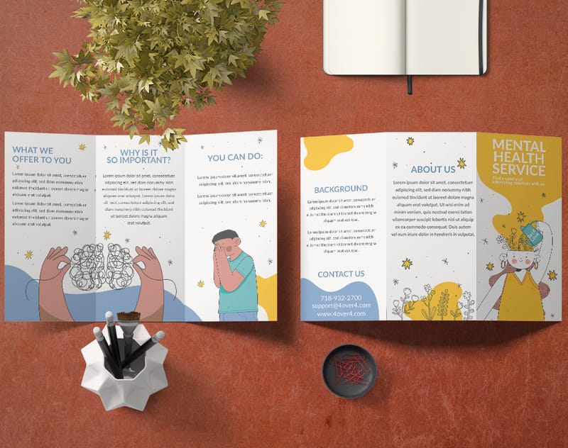
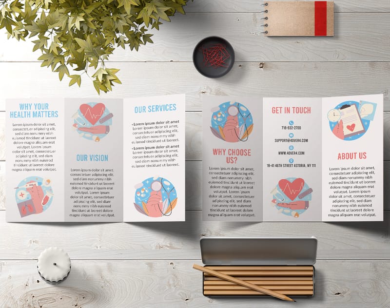
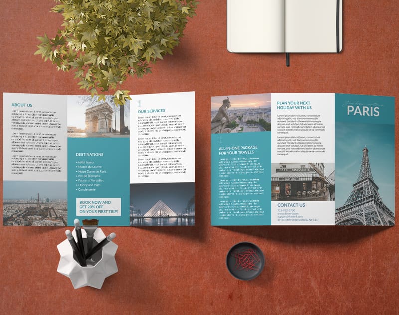
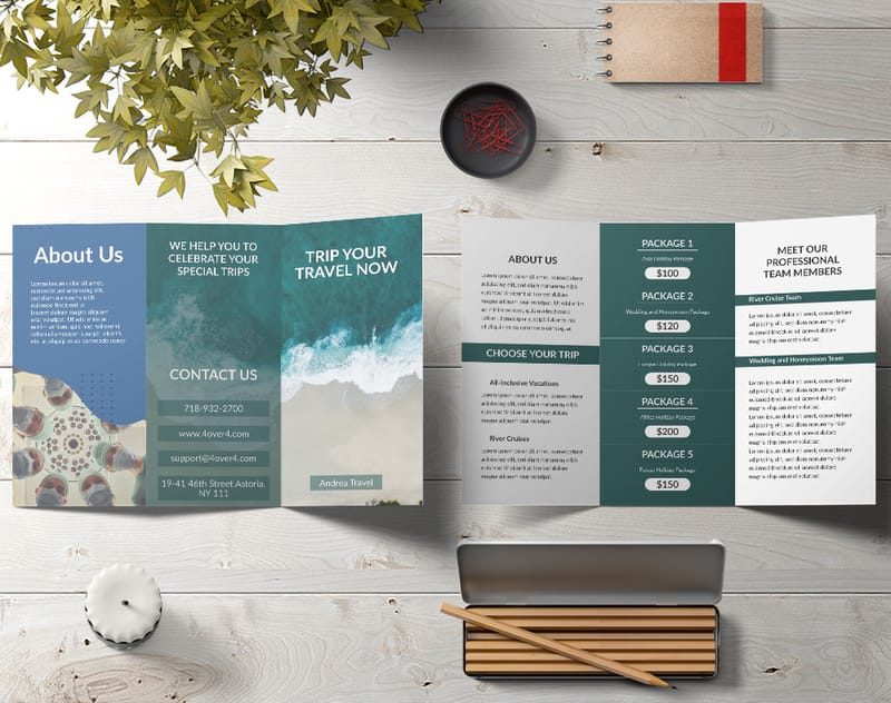
Your first decision shapes everything that follows. Bifold or trifold? A bifold brochure gives you four panels - clean, simple, great for event programs or product spotlights. A trifold brochure gives you six panels, which means more room for details, pricing, service lists, and calls to action.
Don't just default to trifold because it's popular. Think about how much content you actually have. If you're stretching three sentences across six panels, the brochure will look empty. If you're cramming a novel into four panels, nobody reads it. Match the layout to your message.
In Word, you set this up through Page Layout. For a trifold, set your page to landscape orientation, then use columns (three equal columns work best). For a bifold, stick with portrait and use two columns. Set your margins to 0.5 inches on all sides to maximize printable space.
How to Access and Customize Word's Built-In Brochure Templates
Open Microsoft Word. Click File, then New. Type "brochure" in the search bar and hit Enter. Word pulls up a collection of pre-built templates - some minimal, some colorful, some corporate. Pick one that's close to your brand's personality. You'll customize it anyway, so don't stress about finding a perfect match.
Once you've selected a template, start replacing placeholder content with your own. Swap out the stock images for your product photos or team pictures. Change the fonts to match your brand guidelines. If your logo uses a specific shade of blue, use Word's custom color picker (Format > Font Color > More Colors) to match it exactly. Consistency across your brochure and other marketing materials - like your Custom Brochures - builds recognition.
"We designed our restaurant's seasonal menu brochure entirely in Word, then had 4OVER4.COM print it on glossy stock. Customers thought we hired a designer."
- Marco R., Restaurant Owner
Typography That Works on Paper (Not Just on Screen)
Here's where most Word brochures fall apart. People pick fonts that look fine on a monitor but turn into unreadable mush when printed. Stick with these rules:
Headlines: Use a bold, sans-serif font between 18-24pt. Arial Black, Calibri Bold, or Franklin Gothic work well. These stay crisp and legible even at a distance.
Body text should sit between 10-12pt. Go smaller and people squint. Go larger and you run out of space. Serif fonts like Georgia or Cambria read well in print because the serifs guide the eye along each line. If you want ideas on how type choices affect overall design quality, check out these Graphic Design Portfolio Examples for inspiration.
One more thing - limit yourself to two fonts per brochure. One for headings, one for body text. Three fonts looks chaotic. Four fonts looks like a ransom note.
Color Choices That Print True
What you see on your screen isn't always what comes off the press. Monitors use RGB color (light-based), while printers use CMYK (ink-based). Bright neon greens and electric blues on your screen will look duller in print. That's not a flaw - it's physics.
In Word, stick with rich, saturated colors that translate well to CMYK. Deep navy, burgundy, forest green, and warm gold all print beautifully. If your brand uses a specific Pantone color, look up its closest CMYK equivalent and enter those values manually in Word's custom color dialog.
Use high contrast between text and background. Dark text on light backgrounds is always safe. White text on dark backgrounds works too, but make the font slightly bolder - thin white text can disappear on dark ink. For more creative print ideas that play with color, browse our Funny Print Ad Examples collection.
Images: Resolution Matters More Than You Think
This is the number one mistake in Word brochure design. People drag in tiny web images (72 DPI) and wonder why their printed brochure looks pixelated. For professional print quality, every image needs to be at least 300 DPI at its final printed size.
In practical terms, a photo that fills half a letter-sized panel should be at least 1500 x 2100 pixels. If you stretch a small image to fill a large space, it gets blurry. Word won't warn you about this. You have to check it yourself.
Where do you find high-resolution images? Your own camera (most smartphones shoot at 12+ megapixels now, which is plenty). Stock photo sites like Unsplash or Pexels offer free high-res options. Just make sure you have the right to use any image commercially.
When inserting images in Word, right-click the image, select "Size and Position," and make sure "Lock aspect ratio" is checked. This prevents accidental distortion. Use "Tight" or "Square" text wrapping to flow your copy around images naturally.
Writing Copy That Fits the Format
A brochure isn't a website. It's not a blog post. People scan brochures in seconds. Your copy needs to earn their attention fast and hold it.
Lead with your strongest benefit on the front panel. Not your company name. Not your founding year. The thing that makes someone think, "I need this." A restaurant brochure might lead with "Farm-to-Table Dining, Seven Nights a Week." A real estate brochure might say "Your Dream Home Starts Here."
Inside panels should follow a logical flow. Panel by panel, walk the reader through your story. Problem, solution, proof, action. Keep paragraphs short - two to three sentences max. Use bullet points for lists of services or features. Bold the most important phrase in each section so scanners catch the key points.
Every brochure needs a clear call to action. Tell readers exactly what to do next: visit your website, call a number, scan a QR code, or stop by your location. Put the CTA on the back panel (the one visible when the brochure is folded and sitting in a rack). For ideas on compelling print calls to action, explore our Printing Articles library.
Setting Up Margins, Bleeds, and Safe Zones
If you're printing at home on a standard inkjet, margins of 0.5 inches work fine. But if you're sending your Word file to a professional printer like 4OVER4.COM, you need to think about bleeds and safe zones.
A bleed is the area beyond the trim line where your design extends. It prevents white edges if the cut is slightly off. Most professional printers need 0.125 inches of bleed on each side. In Word, you can approximate this by extending background colors and images slightly beyond your intended trim area.
The safe zone is the opposite - keep all critical text and logos at least 0.25 inches inside the trim line. Anything closer to the edge risks getting cut off. This is especially true for trifold brochures where the fold panels aren't all the same width. The panel that folds inward is typically 1/16 inch narrower than the other two.
Using Word's Drawing Tools for Visual Interest
Word's shape and drawing tools are underrated for brochure design. You can create colored text boxes, rounded rectangles for callout sections, lines to separate content areas, and even simple icons using basic shapes.
Try creating a colored sidebar by inserting a rectangle shape, filling it with your brand color, and layering text on top. This breaks up the monotony of a text-heavy layout. Use Word's "Align" tools (under Format > Arrange) to make sure elements line up precisely. Misaligned elements look sloppy, even if the content is great.
For more advanced visual effects, consider using WordArt sparingly for a headline treatment, or inserting SmartArt graphics for process flows and organizational charts. Just don't overdo it. Clean and simple beats busy and cluttered every time. If you're looking for creative ways to use print materials beyond brochures, check out these Logo Sticker Design Ideas.
Paper Stock and Finish: What Happens After Word
Your Word design is only half the equation. The paper you print on transforms the experience. A brochure on flimsy 20lb copy paper feels disposable. The same design on 100lb gloss text stock feels like something worth keeping.
4OVER4.COM offers 60+ paper types for brochure printing. Glossy finishes make colors pop and photos look vivid. Matte finishes feel smooth and sophisticated, reducing glare under overhead lighting. Uncoated stocks have a natural, textured feel that works well for eco-conscious brands or artisanal businesses.
When you're ready to move from Word to print, save your file as a high-quality PDF. In Word, go to File > Save As > PDF, then click "Options" and select "High quality printing" or "Standard (publishing online and printing)." This preserves your fonts, images, and layout for the printer. Learn more about unique brochures and flyers materials to see what's possible beyond standard paper.
"I used to think you needed Photoshop for decent brochures. Turns out Word handles 90% of what small businesses need. The trick is knowing the design basics."
- Lisa K., Marketing Consultant
Common MS Word Brochure Mistakes (and How to Fix Them)
After years of printing brochures for businesses across every industry, 4OVER4.COM sees the same mistakes repeatedly. Here's what to watch for:
Too many fonts and colors. Stick to two fonts and three to four colors. Your brochure should look cohesive, not like a collage of different design ideas fighting for attention.
Ignoring the fold. Always print a test copy and fold it before sending to the printer. Text that looks centered on screen might land right on a fold line, making it unreadable. In a trifold, the inner panel is slightly narrower - adjust your column widths accordingly.
Low-resolution images. We covered this above, but it bears repeating. Check every image at 300 DPI before you finalize. Zoom in to 200% on screen. If it looks fuzzy there, it'll look worse in print.
No white space. Beginners try to fill every square inch. Resist that urge. White space gives the eye a place to rest. It makes your content feel organized and approachable. A brochure with breathing room gets read. A crammed one gets tossed.
Forgetting the back panel. The back panel of a trifold is prime real estate. It's often the first thing someone sees in a brochure rack. Put your logo, tagline, and contact info there. Make it count. For more design inspiration, explore Classy Business Card Design Inspiration - the same principles of clean, bold design apply to brochures too.
Brochure Design Tips in MS Word for Specific Industries
Real estate agents: Use the front panel for a stunning property photo with the listing price. Inside panels can feature a floor plan, neighborhood highlights, and agent contact info. Trifold works best here because you need room for property details.
Restaurants and cafes: A bifold menu brochure keeps things simple. Front panel: your best dish photo and restaurant name. Inside panels: menu categories with prices. Back panel: hours, location, and a QR code linking to your online ordering page.
Event planners: Brochures for weddings, conferences, or festivals should lead with the event date and a compelling image. Use inside panels for the schedule, speaker lineup, or venue map. Consider pairing your brochure with invitation cards for a complete event marketing package.
Nonprofits: Lead with your mission and impact stats. "Last year, we provided 10,000 meals to families in need." Inside panels tell the story with photos and testimonials. The back panel should include donation instructions and your website.
Startups and small businesses: Focus on the problem you solve, not the features you offer. "Tired of losing receipts? Our app tracks them automatically." Keep the design modern and minimal. For greeting card and print design ideas that carry similar principles, browse our Diy Greeting Card Design Ideas.
Exporting Your Word Brochure for Professional Printing
You've designed your brochure. It looks great on screen. Now what?
First, do a final proofread. Print a draft on your home printer and fold it. Check that all text is readable, images are sharp, and nothing important falls on a fold line. Have someone else read it too - fresh eyes catch typos that yours skip right over.
Blank Templates

Save as PDF using Word's built-in export. Go to File > Export > Create PDF/XPS Document. Choose "Standard" quality for the best balance of file size and print quality. If your printer requests specific settings, follow their guidelines.
When uploading to 4OVER4.COM for professional printing, you'll choose your paper stock, finish, quantity, and folding style. 4OVER4.COM delivers with a 99.8% on-time delivery rate, and most orders ship ahead of schedule. Your Word-designed brochure gets the same premium treatment as files from Adobe InDesign or Illustrator.
The bottom line? MS Word is a legitimate brochure design tool when you understand its strengths and limitations. Master the layout, respect the print requirements, and pair your design with quality printing. That's how a simple Word document becomes a marketing piece that works.
What to Remember About Designing Brochures in Word
- Choose your layout first. Bifold (4 panels) suits simple messages. Trifold (6 panels) works for detailed content. Match the format to your content volume before you start designing.
- Stick to two fonts and three to four colors. Consistency makes your brochure look professional. Use your brand colors and check how they translate from screen (RGB) to print (CMYK).
- Every image must be 300 DPI or higher. Low-resolution photos are the fastest way to make a Word brochure look amateur. Check resolution before finalizing.
- Brochure design tips in MS Word apply to print-ready output too. Save as high-quality PDF and account for bleeds (0.125 inches) and safe zones (0.25 inches from trim). 4OVER4.COM offers 60+ paper types to bring your Word design to life.
- Always print a test fold. What looks perfect flat on screen can break at the fold lines. Test before you commit to a full print run.
- Pair brochures with other print marketing. Combine your brochure campaign with eye-catching formats like 3D Postcards for a multi-touchpoint strategy that stands out.
- Select a Layout
- Access Built-In Templates
Free Brochure Design Templates
- Customize Design Elements
- Add Content
- Fine-Tune Layout
- Save and Print
- Explore Additional Resources
- Trifold Brochure: This classic format allows for concise messaging and engaging visuals. Its three-panel design is ideal for showcasing essential information about products or services.
- Bifold Brochure: The bifold structure provides ample space for imagery and text. This option suits detailed presentations or event information effectively.
- Bi-fold with Inserts: This variation includes additional inserts for more comprehensive details. It offers an opportunity to dive deeper into specific topics or features.
- Event Brochure Templates: Designed specifically for events, these templates include elements for agendas, speaker bios, and logistical details, ensuring attendees stay informed.
- Consider Your Audience: Choose a template that resonates with your target demographic. Use vibrant colors for younger audiences or subdued tones for professional clients.
- Match Your Message: Ensure the template design aligns with the message. A modern layout may suit tech-focused content, while elegance fits luxury branding.
- Keep It Simple: A clean design enhances readability. Avoid excessive visuals that could distract from the main message.
- Open Microsoft Word, and navigate to the "New" document section.
- In the search bar, type "brochure" to filter the templates.
- Browse the selection, and choose the one that fits your needs.
- Use High-Quality Images: Incorporate high-resolution images that resonate with our target audience and reflect our brand. Images serve as a focal point, capturing attention and enhancing the overall appeal of the brochure.
- Select Appropriate Fonts: Choose fonts that align with our brand's identity. Experiment with two complementary typefaces for contrast, and maintain readability by adjusting size and weight, such as using bold or italic styles.
- Balance Colors Thoughtfully: Use colors to guide attention and evoke emotions. While contrasting colors can attract viewers’ eyes to key information, ensure the balance maintains a cohesive look aligned with our branding.
- Prioritize Layout and White Space: Organize content systematically with a clear hierarchy. Utilize white space to make the brochure visually appealing, allowing readers to absorb information easily.
- Include a Strong Call to Action: Clear calls to action drive engagement and guide readers toward the next steps, such as "Visit our website" or "Call now." Tailor these phrases to our brochure's specific goals.
- Review Brand Guidelines: Ensure consistency by following our brand guidelines. Check font choices, color schemes, and image usage to maintain our organization’s identity throughout the design.
- Leverage Professional Printing Solutions: Enhance our brochures with professional printing services like 4OVER4.COM. Their custom printing solutions can elevate our materials, ensuring excellent color accuracy and quality that reflects our brand's professionalism.
- Access Print Settings: Click the "File" tab at the top left corner of Microsoft Word, then select "Print" from the menu.
- Adjust Print Options: Set the desired print options, such as paper size and orientation, to optimize the outcome. Ensure the right type of paper complements the brochure's design.
- Select a Printing Method: Choose between printing in-house or using a professional printing service like 4OVER4.COM for superior quality. Professional printing ensures clean finishes and vibrant colors, crucial for impactful brochures.
- Save as PDF: Save the brochure as a PDF for seamless digital sharing. This format preserves design elements when distributing via email or social media.
- Choose Distribution Channels: Share the PDF through various channels, such as websites and social media platforms, to maximize reach.
- Open Microsoft Word. Click on the "More templates" button beneath the "New" documents section.
- Search for Brochure Templates. Go to
File>Newand type "brochures" or "brochure" in the search bar.
- Browse Available Templates. Scroll through the library of brochure templates.
- Choose Based on Purpose. Each template serves different functions such as informational pamphlets or product catalogs. Pick one that aligns with your needs.
- Double-Click the Chosen Template. This action opens the template in Microsoft Word, ready for customization.
- Modify Text and Images. Replace placeholder text and images with your content that communicates your brand effectively.
- Incorporate Design Elements. Use shapes, icons, and SmartArt graphics accessible under the Insert tab to enhance the brochure's visual appeal.
- Adjust Layout for Visual Balance. Ensure the text and imagery are well-organized to draw attention.
- Save and Review. Regularly save your progress and review the brochure for clarity and impact.
- Select Print Settings. Access print options to ensure your brochure prints as desired. We recommend checking the print quality and paper type for best results.
- Choose Printing Method. Decide between in-house printing and leveraging services from providers like 4OVER4.COM for custom solutions. 4OVER4.COM enhances brand presence through high-quality printing, making brochures stand out.
- Explore Digital Sharing. Consider saving your final brochure as a PDF for easy online distribution.
- Maximize Reach. Utilize effective channels such as direct mail services to share your brochure, creating impactful engagements with your audience.
- Select a Suitable Template
- Customize Design Elements
- Incorporate High-Quality Images
- Optimize Layout for Readability
- Craft a Compelling Call to Action
- Consider Printing Solutions
- Purpose: Identify the main goal of the brochure. For example, a travel agency brochure may center around vacation packages, while a technology firm might focus on highlighting products or services.
- Audience: Analyze the audience's preferences. A medical facility might benefit from a conservative template, while an art gallery could opt for vibrant colors and innovative layouts.
- Branding: Ensure that the chosen template aligns with our brand identity. Matching the tone and style enhances the message and fosters brand consistency.
- Replace Placeholder Text: Click on the existing text, highlight it, and enter our content. This simple step personalizes the brochure immediately.
- Insert Images: Click the image placeholder or use the Insert tab to choose an image from our computer or online. Properly resizing and positioning images enhances the overall design.
- Adjust Layout: Modify the arrangement of text boxes and images by selecting the desired element and using resizing options. These adjustments improve clarity and impact.
Your Brochure Design in MS Word Questions, Answered
What are the best practices for brochure design tips in MS Word?
Start with a built-in template, then customize fonts, colors, and images to match your brand. Limit yourself to two fonts and use images at 300 DPI or higher. Set margins to 0.5 inches, use columns for panel layouts, and always print a test fold before your final run. Save as PDF for the sharpest output when sending to a professional printer. Explore 3D Postcards for complementary print marketing pieces.
How do I choose the right layout for my Word brochure?
It depends on your content. Bifold brochures have four panels and work best for simple messages like event programs or product highlights. Trifold brochures give you six panels for detailed service lists, pricing, or step-by-step information. In Word, set landscape orientation with three equal columns for trifold, or portrait with two columns for bifold. Always match layout to your actual content volume.
What makes brochure design tips in MS Word effective for marketing?
Word is accessible - most people already have it. That means faster turnaround and lower design costs compared to hiring a graphic designer for every update. When you pair solid Word design fundamentals (clean typography, high-res images, strong calls to action) with professional printing from 4OVER4.COM on premium paper stocks, the result competes with brochures made in specialized design software. Consider adding Black Postcards to your campaign for a bold, coordinated look.
How much should I budget for brochure design in MS Word?
The design itself costs nothing beyond your time since Word is typically pre-installed. Your budget goes toward printing. Professional brochure printing varies based on paper stock, finish, quantity, and folding style. Ordering in larger quantities drops the per-piece cost a lot. 4OVER4.COM offers options across a range of price points with 60+ paper types, so you can match your budget to your quality goals without compromise.