
Classic Fonts Still Used Today and How Bembo, Garamond and Bodoni Print


Sofia is our design and templates voice, built from the knowledge of our production team, with over 20 years in printing.
Four typefaces cut between 1495 and 1798 are still set every working day. Each came from a different century, each behaves differently under ink, and each has a printed piece it belongs on: a suede business card, a letterhead, a wedding invitation or a letterpress card.
The oldest typefaces still in daily use are Bembo, drawn from a 1495 Venetian roman, Garamond from 1530s Paris, Caslon from 1720s London and Bodoni from Parma in the 1790s. They lasted because they were cut for ink soaking into paper, and each one behaves differently on press: Bembo holds long text at small sizes, Garamond sets light and needs a point of extra size, Caslon tolerates rough uncoated stock, and Bodoni looks superb large on a coated sheet but loses its hairlines below about 12pt.
Quick answer
Old letters, and what the thin stroke tells you
Stroke contrast is the fastest way to predict how one of these faces will print. Bembo has low contrast and an angled stress, so it survives small sizes and absorbent paper. Garamond sits in the middle, reads a size smaller than its point size, and suits stationery read at close range. Bodoni pushes contrast to the extreme with a vertical stress, which looks magnificent large on coated stock and disintegrates small or reversed. Caslon has no delicate parts at all, which is why it still works on rough sheets and under letterpress impression. In print terms: set Bodoni at 12pt and above on a coated or suede card, Garamond on a 70# uncoated letterhead, and Caslon under the plate of a letterpress business card.
What Actually Makes a Typeface Last 400 Years

A typeface survives because it solves a physical problem well enough that nobody needs to solve it again. Francesco Griffo cut the roman now sold as Bembo in Venice in 1495, and Bodoni finished his high contrast faces in Parma by 1798; both still set books and invitations today. Every face on this page was cut by hand, in metal, by someone who then watched it print on damp paper under real pressure.
Three qualities keep showing up in the survivors. The first is tolerance of ink spread. Metal type squashes ink outward at the edge of every stroke, so the punchcutter drew the letter slightly lighter than he wanted it to look. Those compensations are still baked into the outlines, and they are the reason a 500 year old letter shape holds together on an offset press today while some crisp modern faces close up.
The second is a legible skeleton. Old-style romans are built on the movement of a broad nib held at a consistent angle, which is also roughly how a hand writes. The eye reads that skeleton faster than it reads a geometric construction.
The third is unglamorous: somebody kept reviving them. Monotype and Linotype rebuilt these faces for machine composition in the 1920s and 1930s, the phototype houses redrew them in the 1960s, and Adobe and others redrew them again for PostScript. Each redraw was a chance to die and each one instead added another generation of use. If you want the family tree of these shapes, our guide to lettering styles and fonts lays out where each group sits.
Garamond, the Renaissance Workhorse
Claude Garamond cut type in Paris in the 1530s and 1540s, and his romans became the reference for European printing for two centuries. What you install under the name today is a revival, and which revival matters more than most designers realize.
For a long stretch, faces sold as Garamond were actually based on types cut by Jean Jannon around 1615, held by the French national printing office and misattributed. Monotype Garamond descends from that line. Adobe Garamond, drawn by Robert Slimbach in 1989, went back to Garamond's own roman and to Robert Granjon's italic, which is why its italic feels livelier than the roman it sits beside. Neither is wrong. They are different designs wearing one name, and mixing them inside a brand system produces a mismatch nobody can name but everybody notices.
The practical trait is the small x-height. Garamond puts less of its letter into the middle band and more into ascenders and descenders, so a block of it looks smaller and lighter than the same point size in almost anything modern. Set 11pt Garamond next to 11pt of a contemporary text face and the Garamond reads a full size down. On a letterhead that is a feature: it gives an airy, formal page. It is also why Garamond fails on anything read at a distance.
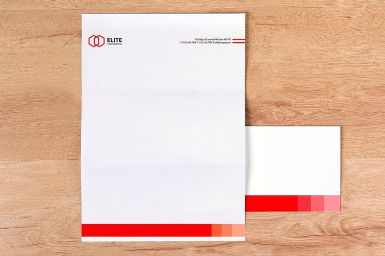
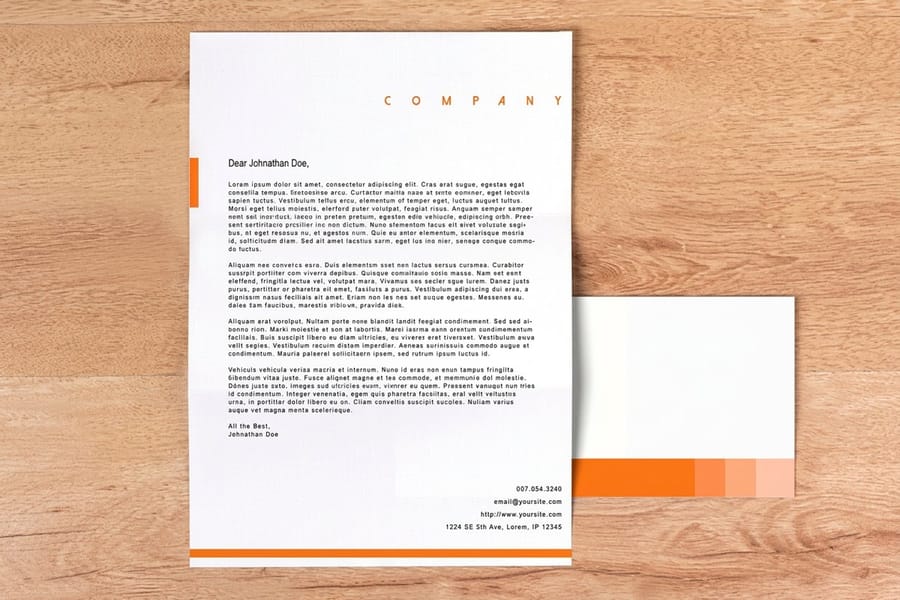
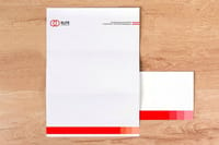
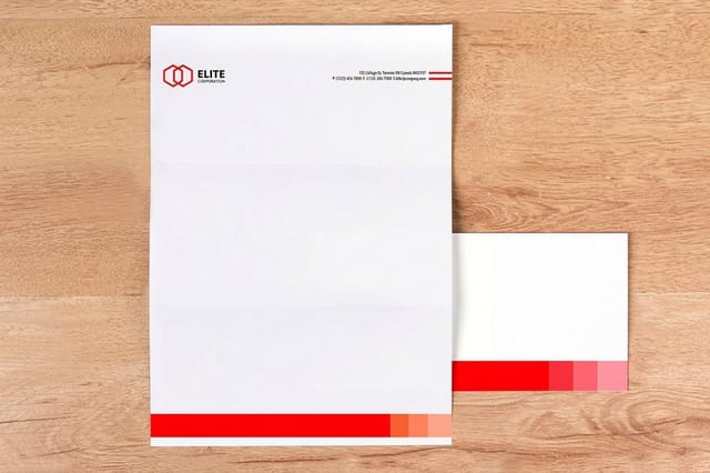
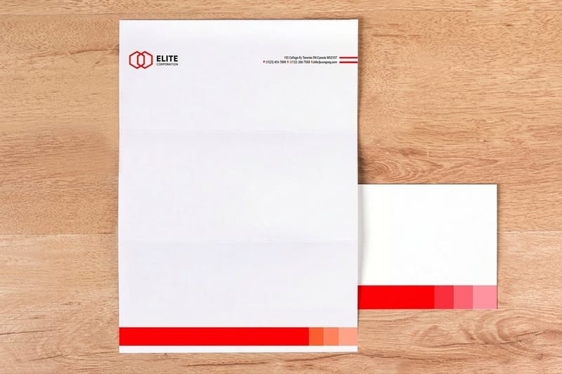
Its natural home is stationery. Standard letterheads start at $99.95 for a run, and a Garamond masthead with the body copy in the same family at 11pt or 12pt is the setting most law firms, publishers and consultancies have quietly used for decades. If you are building the sheet from scratch, our letterhead design tips on font size, style and format cover the margins and the alignment that go with it.
Bembo, the Humanist Original Behind the Others
Bembo is the oldest shape here and the easiest to work with. Its ancestor is a roman that Francesco Griffo cut in Venice in 1495 for Aldus Manutius, first used in a small book by the churchman Pietro Bembo. Monotype revived it in 1929 and named it after the book.
It is a humanist old-style, which means low stroke contrast, an angled stress and generously open counters. Those three things together give it the most forgiving behavior of the four faces on this page. The thin strokes are not that thin, so ink spread on uncoated paper thickens them without closing anything. In practice Bembo holds its color down to around 8pt where Bodoni is already falling apart at 10pt.
There is a real catch, and it is worth knowing before you spend a day setting a book in it. The 1929 Monotype drawing was made for metal, where ink spread added weight the outline did not contain. Digitised straight, it prints thin and weak on modern presses, and it is the classic complaint about the face. Monotype answered with Bembo Book in 2005, a redraw with the weight put back. If your Bembo is looking anaemic on proof, you are almost certainly using the older digitisation, not making a mistake in the layout.
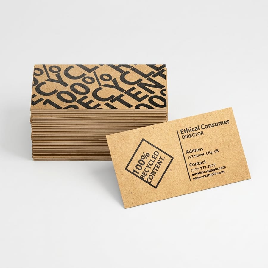
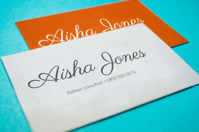
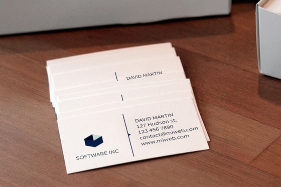
Bembo suits anything with a paragraph in it: a program, a menu, a long invitation, an annual report. It also behaves on a card where the printing is fine and the stock is dense, which is where premium business cards at $17.57 give the ink a smooth enough surface to hold small serifs cleanly. Check the smallest size you can risk in our guide to the smallest font size you can print.
Bodoni, High Contrast and the Price It Charges
Giambattista Bodoni worked in Parma at the end of the 1700s and drove stroke contrast as far as the technology allowed. Thick stems, hairline thin strokes, a dead vertical stress, and flat unbracketed serifs that meet the stem at a sharp corner. The category name is Didone, shared with Didot in France.
On a piece of print it does something no old-style can. The eye reads the alternation of thick and thin as precision and expense, which is why fashion houses, perfume packaging and luxury mastheads have leaned on it for a century. Set large, letterspaced, in a single line across a card, Bodoni still looks like money.
Then it charges you. The hairlines are the thinnest structures in common typography, and three things kill them. Small size, because a scaled-down digital outline has no optical compensation and the hairline drops below what the press can hold. Absorbent uncoated stock, because ink wicks into the fibres and the thin stroke either fattens unevenly or breaks up. And reversed type, where ink spread from the surrounding solid closes the hairline entirely and the letters turn to mush.
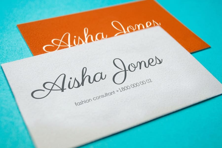
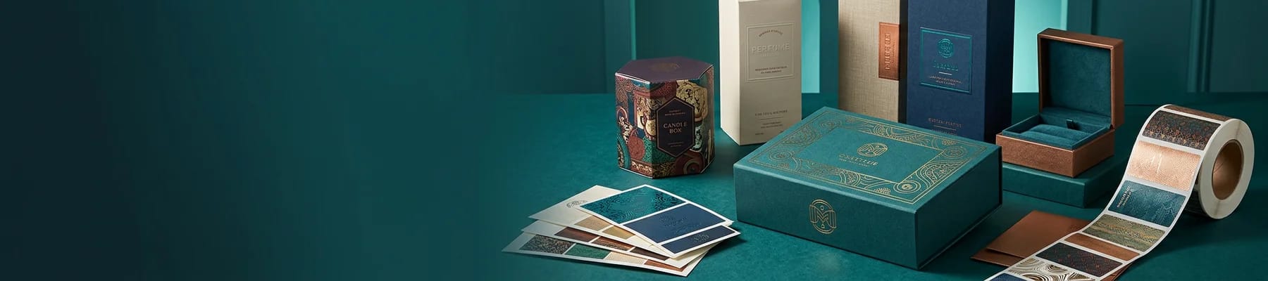
The rules that follow are simple. Keep Bodoni at 12pt and above. Print it positive rather than reversed. Give it a smooth surface: a coated card, a soft-touch laminate, or the tight nap of suede business cards at $87.15, which hold a fine line better than their velvety look suggests; see the suede business cards story. Use it for the name, not for the address block, and let a plain face carry the small text underneath.
Caslon and the Other Survivors Worth Knowing
William Caslon cut his romans in London in the 1720s, and English printing ran on them for the rest of the century. The old advice in composing rooms was that when a job would not settle, you set it in Caslon and stopped worrying.
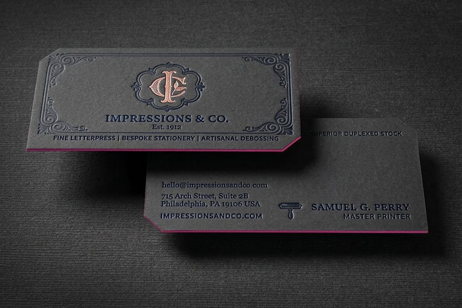
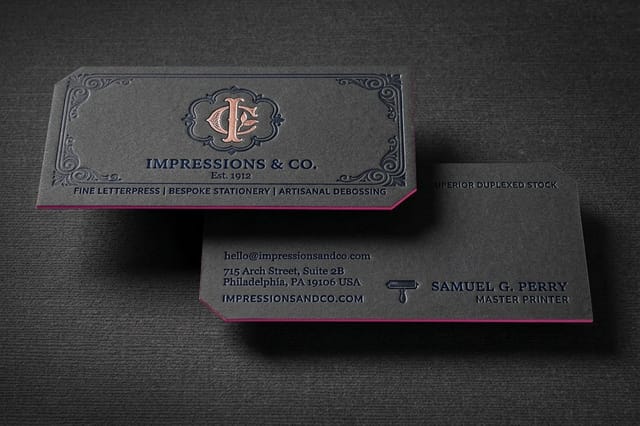
What makes it useful is a mild irregularity. The letters are not perfectly harmonised, the serifs are chunky, and nothing about it is delicate. On rough paper that irregularity reads as warmth rather than error, and there is no hairline to lose. It is the safest of these four for uncoated stock, recycled sheets, and any impression-based process. Letterpress business cards at $251.36 are the clearest case: the plate bites into thick cotton stock, the ink squeezes slightly at every edge, and a face with sturdy joints takes that far better than a Didone. Watch the letterpress business cards video before you choose a face.
| Typeface | Origin | Stroke contrast | Behaves best on | Where it fails |
|---|---|---|---|---|
| Bembo | Griffo, Venice, 1495; revived 1929 | Low | Long text, uncoated stock, small sizes | Old digitisations print thin and weak |
| Garamond | Claude Garamond, Paris, 1530s | Moderate | Letterheads, books, formal stationery | Reads a size small; poor at distance |
| Caslon | William Caslon, London, 1720s | Moderate | Rough paper, letterpress, uncoated | Too informal for cool modern brands |
| Baskerville | John Baskerville, Birmingham, 1750s | Higher | Smooth coated sheets, book work | Wants good paper; flat on newsprint |
| Bodoni | Giambattista Bodoni, Parma, 1790s | Extreme | Display sizes, coated and laminated card | Hairlines break below 12pt or reversed |
Baskerville deserves its own note. John Baskerville pushed contrast further than Caslon in the 1750s, but he also invented the conditions his type needed, milling smoother wove paper and hot-pressing sheets after printing. That is the whole lesson of this table in one story: a typeface is a bet on a paper surface. Pick the face and the stock together, or order free paper samples and set a proof line before you commit a run.
Why Four Hundred Year Old Serifs Still Print Beautifully

Modern presses are far more accurate than a wooden hand press, so it seems backwards that type drawn for the cruder machine still performs. The reason is that ink behaves the same way it always did, and you can see it on one order: the same Garamond looks crisp on 14pt gloss cover and a shade heavier on 14pt uncoated cover.
Ink spreads. On an offset press, a halftone dot prints slightly larger than it was in the file, and the same effect thickens the edge of a solid stroke. On uncoated stock the effect is much stronger, because ink soaks into open fibres and creeps sideways. Old-style faces were drawn a touch light with generous space inside the letters, which means that spread lands in space the design left for it. A face optimized for a screen, where nothing spreads, often has no such margin, and its counters fill in on cheap paper.
Two more habits help them. Bracketed serifs, the ones that curve into the stem instead of meeting it at a corner, put more material at the joint where ink pools, so the joint stays clean instead of blobbing. And old-style figures, the numerals that hop above and below the line, sit calmly in a text block instead of shouting the way lining figures do in a paragraph.
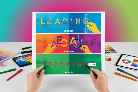
None of this rescues a bad setting. Line spacing, letter spacing and word spacing still decide whether a page is readable, and old serifs generally want a little more leading than a modern face because their ascenders and descenders are long. Our explanation of leading, kerning and tracking covers the numbers, and the serif versus sans serif comparison covers when to abandon serifs entirely.
When a Classic Typeface Is the Right Call, and When It Is Not
Choose a classic serif when the piece is meant to feel established, considered or ceremonial, and when the reader will hold it still. Choose something else when the piece has to work fast, small, or at distance.
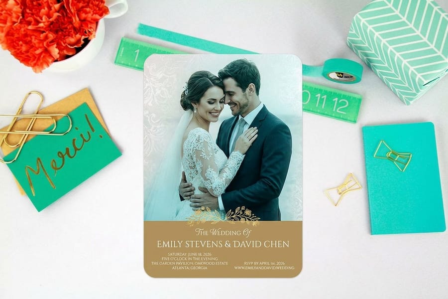
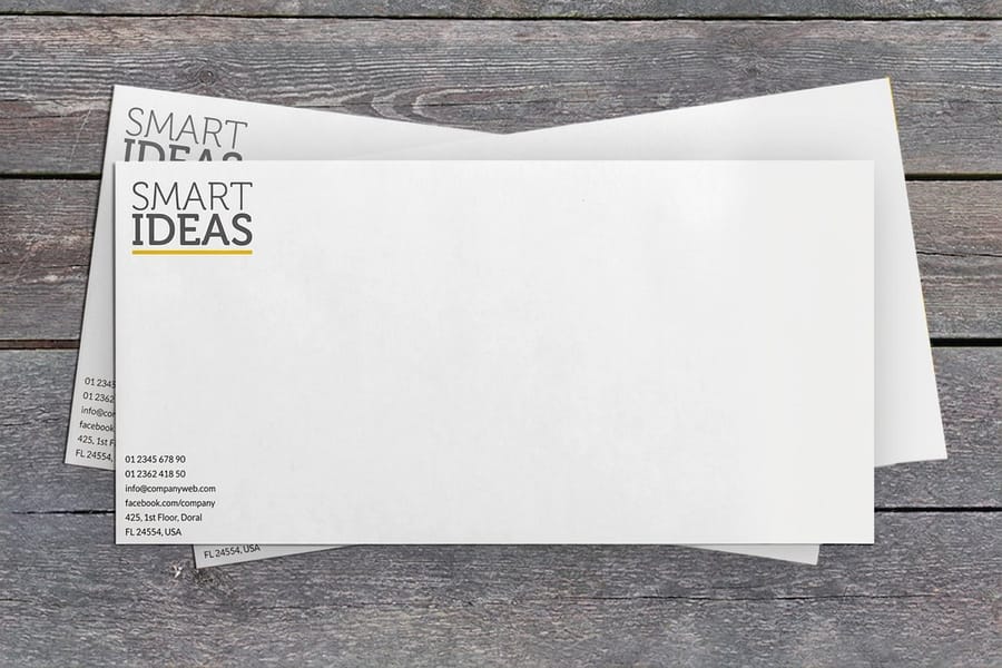
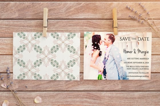
Good fits are easy to list because they share one trait: the reader is close and unhurried. Invitations and formal announcements sit at the top, and wedding invitations at $19.77 are the setting where an old-style roman with a proper italic still outperforms every modern alternative. Then professional stationery, book and report interiors, menus, certificates, and anything with an inherited or heritage story to tell. A printed envelope at $142.99 carrying a return address in the same face finishes the set, and matching the envelope to the letterhead is the single cheapest way to make a mailing look deliberate. Our guide on how to build a business stationery set that matches on every piece carries one face across the card, letterhead and envelope.
Now the honest limits. Do not put Garamond or Bembo on a banner, a yard sign or a trade show backdrop; the thin strokes and small x-height are read at three feet, not thirty. Do not set an eight page price list in Bodoni. Do not use these faces for tiny legal text, disclaimers or coupon codes, where a sturdy sans is simply more legible. And do not reach for a classic serif because it is safe: on a technology brand or a youth product, a 1530s roman reads as borrowed authority rather than earned.
If you want to test the choice cheaply, set the real copy on a real template rather than a preview line. Start from a correctly sized layout in the blank template library, or build it in the free online designer where you can set the type and order the same file.
Pairing Classic Fonts Without Muddling Them
The reliable pairings are not two classics together. They are one classic doing the reading and one neutral face doing the labelling, because the eye needs the two roles to look genuinely different rather than slightly different.
Combinations that hold up in print:
- Garamond with a humanist sans. Gill Sans, Frutiger or Source Sans handle the address block, the phone number and the small print while Garamond carries the letter.
- Bodoni with a plain grotesque. Helvetica, Univers or Inter under a Bodoni name gives the contrast that made the pairing a fashion standard, without asking the grotesque to compete.
- Bembo with itself. Roman, italic and small caps from one family cover almost any document. Small caps for the running head, italic for emphasis, and no second font at all is a legitimate answer.
- Caslon with a slab or a wood-type display face. Both come from the same press tradition, so the mix reads as period rather than accident.
Two failures repeat. The first is pairing two old-styles, say Garamond with Caslon: they are close enough that the difference looks like a mistake in the file. The second is fixing a weight problem with a bold. Bolding a delicate old-style thickens the stems while the hairlines lag behind, and the letter loses the proportion that made it worth choosing. Add size, add letterspacing, add color, or switch to the family's own semibold if it has one.
Keep the count low. Two families and three or four styles cover a full stationery set, and consistency across the standard business cards at $17.57, the letterhead and the envelope does more for a brand than any single clever pairing. Before you send the artwork, confirm the fonts are embedded or outlined using our guide to embedding fonts in Illustrator for print, and check the license with the Google fonts commercial and print use guide.
Wally explains the old serifs
Contrast decides where a classic face can go
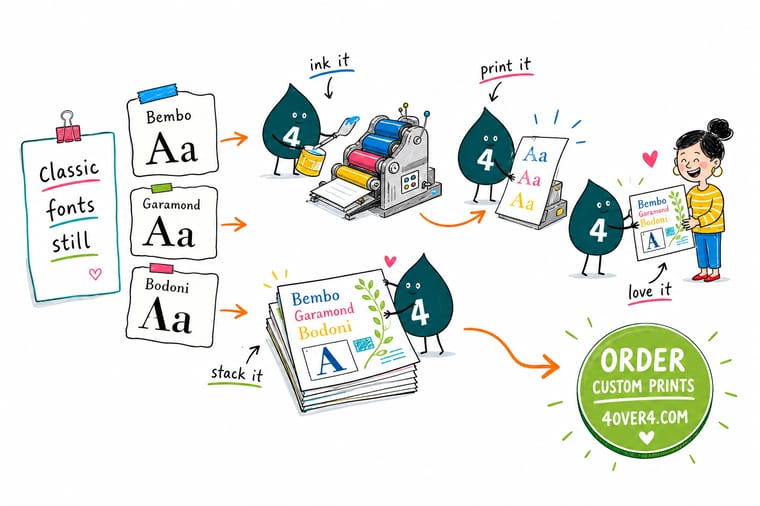
Wally sets the same word four times. Bembo stays readable when he shrinks it, because its thin strokes were never that thin. Garamond looks a size smaller than the number says, so he bumps it a point on the letterhead. Caslon does not care that the paper is rough. Then he sets Bodoni small on an uncoated sheet, watches the hairlines break up, moves it to a coated card at 14pt, and it looks like money again. Pick the face and the paper together, never one and then the other.
Print letterheads with your type →
Specs and pricing
Stocks and sizes that hold fine serif detail
The paper decides how small your serifs can go. Business cards start at 100 for $17.57 on 14pt gloss, with uncoated, cream and linen stocks in the same configurator. Letterheads print at 8.5 by 11 inches on 70# uncoated or Royal Laid and Linen, from 50 for $99.95. Wedding invitations come in 4.25 by 5.5, 5 by 7 or 6 by 6 inches on 20 stocks, from 25 for $19.77.


Print it
Put a classic typeface on something worth keeping
Set Garamond on a letterhead from 50 for $99.95, Bodoni on suede business cards from 250 for $87.15, and Caslon on letterpress business cards from 250 for $251.36, which take 15 business days on 32pt or 48pt board.
Explore more
Where to go next
Decide between serif and sans, set leading and tracking for an old serif, find the smallest size a hairline survives, pick a print friendly designer font, and embed fonts before you send the file.


By the numbers
Typography printed properly at 4OVER4
Common Questions
Your classic font questions, answered
Which of these fonts is actually the oldest?
Bembo carries the oldest drawing. Its shapes come from a roman that Francesco Griffo cut for the Venetian printer Aldus Manutius in 1495, used in a short book by Pietro Bembo, which is where the name comes from. The version you can install is much younger: Monotype revived it in 1929. Garamond follows, from Claude Garamond in 1530s Paris. Caslon dates to 1720s London and Bodoni to Parma at the end of the 1700s. So the type you set today is a modern drawing of a very old idea, and each revival made choices the original punchcutter never made.
Is Garamond free to use for commercial printing?
It depends entirely on which Garamond. Adobe Garamond, Garamond Premier and Monotype Garamond are licensed fonts, and a desktop license normally covers printing your own artwork. EB Garamond is released under the SIL Open Font License and is free for commercial work including print, and it is drawn from an original Garamond specimen rather than from a later imitation. Libre Caslon and Libre Bodoni sit in the same free category. The trap is a font found loose on a download site, which often has no license at all. Our guide to whether Google fonts are free for commercial and print use walks through the checks.
Why does my Bodoni look broken at small sizes?
Because most digital Bodonis are drawn from the display sizes of the metal originals, and metal type came in optical sizes. The 6pt cut of a metal face had thicker hairlines and looser spacing than the 36pt cut, so it survived at small sizes. A single digital outline scaled down loses that. Set Bodoni at 12pt or larger, print it on a coated sheet where ink sits on the surface, and avoid reversing it out of a dark solid. If you need the same flavour smaller, ATF Bodoni and Bodoni 72 have text-weight cuts that hold up better.
Which classic serif suits a letterhead?
Garamond for the letter itself and Caslon if the sheet is uncoated and textured. A letterhead is read slowly at close range, so the small x-height and light color that make Garamond a poor choice for a highway sign are exactly right here. Set the body around 11pt to 12pt, keep the line length under about 75 characters, and give the name in the masthead more size rather than more weight, because bolding an old-style serif thickens the stems and kills the delicacy you paid for.
Do I need to outline the fonts before sending a print file?
Embed them if the format allows it, and convert to outlines when the type is small in count and final. A press-ready PDF with fonts fully embedded is the cleanest handoff, and it keeps the text searchable. Outlining is the safety net for logos, monograms and anything with unusual glyphs. One warning specific to these faces: outlining a very light hairline in a Didone and then applying a stroke to fatten it will distort the letter shape, so fix weight by choosing a different optical cut, never by stroking the outline.
Is Times New Roman a classic font in the same sense?
It is a classic, but a young one and a different animal. Stanley Morison had it drawn for The Times of London in 1932 to squeeze more words into a narrow newspaper column, so it is compact, sturdy and slightly cramped by design. It prints perfectly well. The problem is that it was the default on every word processor for two decades, so a printed piece set in it reads as unconsidered rather than traditional. If you want the traditional signal, Garamond or Caslon costs nothing extra and does not carry the office memo association.
Get Started
250 letterpress business cards cost $251.36, or $1.01 each
Set the real copy at the real size, pick a stock that suits the face, and we print stationery where the serifs arrive exactly as you drew them.
Legal Disclaimer
Gold Standard guarantees apply to all standard orders placed through 4over4.com. Price match requires verifiable proof of a competitor's published price for an equivalent product with matching specifications and turnaround time. Satisfaction guarantee covers manufacturing defects and print quality issues. Contact support with order number and documentation.
