What You Need to Know About Leading, Kerning, and Tracking
Leading controls vertical space between lines of text. Kerning adjusts the gap between two specific characters. Tracking changes spacing uniformly across a word, sentence, or block of text. These three typography tools work together to shape readability and visual impact on every printed piece. 4OVER4.COM has printed 10 billion+ cards - and the typography on each one matters. With 60+ paper types available, getting your spacing right before you print is non-negotiable.
Why Leading Vs Kerning Vs Tracking Shapes Every Print Design
You've probably seen a business card or flyer where the text just felt off. Letters crammed together. Lines overlapping. Words floating in too much white space. That's what happens when leading vs kerning vs tracking aren't handled with care.
These three spacing adjustments sit at the core of readable, professional typography. They're different tools that solve different problems - but they all affect how your audience experiences your printed materials. Whether you're designing a brochure, poster, or business card, spacing decisions show up in the final product.
4OVER4.COM backs every print order with our 5 Gold Guarantees, but no guarantee can fix bad typography. That part's on you. If you're working on something unique, check out Custom Projects for specialized print options where type precision really counts.
Let's break down each concept so you can make confident spacing decisions on your next design.
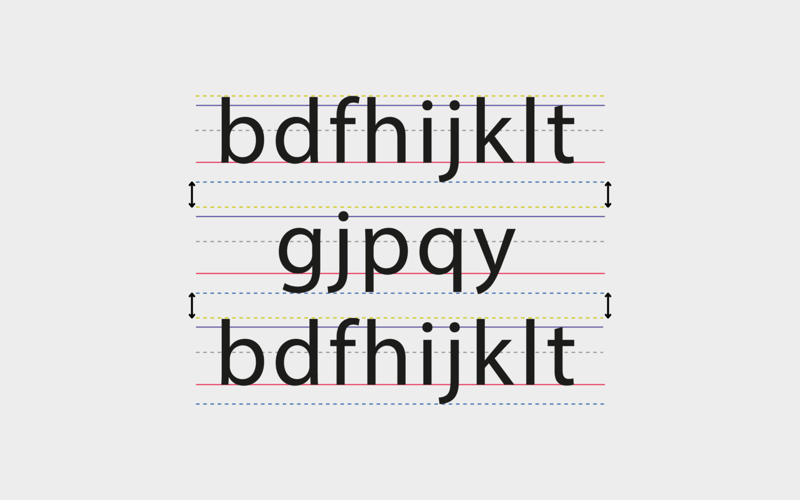
Leading: The Vertical Space Between Your Lines
Leading (pronounced "ledding") is the vertical distance between baselines of consecutive lines of text. The term comes from the days of metal typesetting, when printers literally inserted strips of lead between rows of type. Today, you control it with a slider or number field - but the principle hasn't changed.
Good leading makes text breathable. It guides the reader's eye from one line to the next without confusion. Too tight, and lines blur together. Too loose, and the text feels disconnected - like each line is its own island.
The Standard Leading Rule
The general starting point is 120% of your font size. So if you're working with 12pt type, set your leading to at least 14.4pt. Adobe InDesign and Illustrator default to this ratio automatically. It's a solid baseline, but you'll almost always need to adjust from there.
Body copy in a brochure needs different leading than a headline on a poster. Long paragraphs benefit from slightly more generous leading - around 130-150% - because readers need room to track across multiple lines without losing their place. When you're designing materials like brochures, understanding How To Fold A Brochure also helps you plan how text blocks will sit across panels.
When to Tighten or Loosen Leading
Tighten leading for short, punchy headlines. Display type at large sizes often has too much default space between lines. Pulling lines closer together creates visual impact and makes the headline read as one cohesive unit rather than stacked words.
Loosen leading for body text, especially in print. Printed materials don't have the luxury of zooming in. A business card with 8pt type and tight leading becomes unreadable. A flyer with dense paragraphs needs breathing room. Your audience won't squint - they'll just stop reading.
Sans-serif fonts with tall x-heights (like Helvetica or Futura) often need more leading than serif fonts. The letters are visually larger, so the space between lines needs to compensate.
Kerning: Fine-Tuning the Space Between Two Characters
Kerning is the adjustment of space between two specific characters. Not all characters, not a whole word - just a pair. It's the most precise of the three spacing tools, and it's where typography gets personal.
Certain letter combinations create awkward visual gaps. The classic examples: "AV," "To," "WA," and "Ty." The shapes of these letters leave uneven white space that your eye picks up immediately, even if you can't articulate why something looks wrong.
Optical vs. Metric Kerning
Most design software offers two automatic kerning options. Metric kerning uses the kern tables built into the font file. The type designer already decided how much space "AV" or "To" should have. It's reliable for well-made fonts.
Optical kerning lets the software analyze letter shapes and adjust spacing based on visual appearance. This works better for fonts with incomplete kern tables or when you're mixing typefaces. If you're building How To Make Flyers with mixed display and body fonts, optical kerning often gives cleaner results.
Manual Kerning: When You Need to Step In
Automatic kerning handles most situations. But logos, headlines, and any large display text need manual attention. At big sizes, even small spacing inconsistencies become obvious. A headline on a poster or banner that hasn't been manually kerned looks amateur - there's no way around it.
The squint test works. Zoom out or squint at your text. If you notice uneven dark and light patches between letters, those pairs need kerning adjustments. The goal is even visual density across the word.
Pro tip: kern in pairs, left to right. Adjust the first pair, then move to the next. Going back and forth creates inconsistency. And always kern after you've finalized your typeface and size - changing either one resets the game.
Tracking: Uniform Spacing Across Entire Text Blocks
Tracking adjusts the spacing between all characters in a selected range uniformly. Unlike kerning (which targets two specific characters), tracking affects every letter pair equally. Think of it as a volume knob for overall letter spacing.
Positive tracking spreads letters apart. Negative tracking pulls them closer together. Both have legitimate uses depending on the context and size of your text.
When to Use Positive Tracking
Small text benefits from slightly increased tracking. When type drops below 8pt - common on business cards, labels, and packaging - letters can merge visually. A small bump in tracking (around +20 to +50 in most software) improves legibility without changing the character of the typeface.
All-caps text almost always needs positive tracking. Capital letters were designed to appear at the start of words alongside lowercase letters. When you set an entire word or line in caps, the default spacing feels cramped. Adding tracking gives all-caps text the open, authoritative look it's supposed to have. This matters on everything from How To Make Envelopes with return addresses to large-format signage.
When to Use Negative Tracking
Large display type often needs tighter tracking. At headline sizes (36pt and above), the default spacing between letters can feel too open. Pulling tracking in slightly creates a more cohesive, impactful headline. Just don't overdo it - letters shouldn't touch or overlap unless that's an intentional stylistic choice.
Negative tracking also helps when you need to fit text into a tight space. A line that's one word too long for a text box can sometimes be saved with a small tracking reduction (-10 to -20) without visible quality loss.
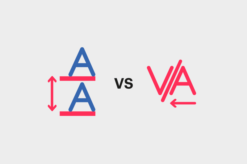
Tracking vs. Kerning: The Key Difference
Here's the simplest way to remember it. Tracking is a blanket adjustment. Kerning is a surgical one. You use tracking to set the overall tone of spacing for a block of text. Then you use kerning to fix specific pairs that still look off.
Always apply tracking first, then kern. If you kern first and then change tracking, your manual kerning adjustments get thrown off because tracking shifts everything uniformly on top of your individual adjustments.
How Leading, Kerning, and Tracking Work Together in Print
These three tools aren't competing with each other. They operate on different axes and at different scales. Leading handles the vertical. Tracking handles the horizontal at a macro level. Kerning handles the horizontal at a micro level.
A well-typeset business card uses all three. The headline might have tightened tracking and manual kerning on a tricky letter pair. The body text uses standard tracking with slightly increased leading for readability at small sizes. The tagline in all caps gets positive tracking to breathe.
For print specifically, these decisions are permanent. You can't adjust spacing after ink hits paper. That's why 4OVER4.COM provides Blank Templates for common print products - so you can set your typography within the exact dimensions of the final piece.
Typography Settings by Print Product
Business Cards: Tight real estate means every spacing decision is magnified. Use 120-130% leading for body text. Apply positive tracking (+25 to +50) on any all-caps elements. Manually kern your name or company name since it's the focal point.
Flyers and Postcards: Headlines need tighter tracking and manual kerning. Body copy needs generous leading (130-150%) because readers scan quickly. Don't let paragraphs feel dense.
Posters and Banners: Large display text demands manual kerning - no exceptions. At poster scale, a poorly kerned "AW" or "LT" pair is visible from across the room. Tracking should be slightly negative for impact.
Need help with other print-related techniques? Browse the Faq Hub for guides on everything from stamp care to magnet creation. You can also learn How To Clean Rubber Stamps or explore Custom Magnets Faq for more hands-on print tips.
Software Quick Reference
Adobe InDesign / Illustrator: Leading is in the Character panel (the number below font size). Kerning is the field labeled "AV" with an arrow between them. Tracking is labeled "VA" with arrows on both sides. Keyboard shortcuts: Option/Alt + Up/Down arrows for leading, Option/Alt + Left/Right arrows for kerning and tracking.
Canva: Letter spacing controls tracking. Line height controls leading. Canva doesn't offer manual kerning - if you need character-level precision, use a professional design tool.
Figma: Letter spacing equals tracking. Line height equals leading. Auto kerning uses the font's built-in kern table. Manual kerning requires workarounds since Figma doesn't natively support it between individual pairs.
Spacing Mistakes That Ruin Printed Typography
Understanding leading vs kerning vs tracking is one thing. Avoiding common pitfalls is another. Here are the mistakes 4OVER4.COM sees designers make most often on submitted print files.
Ignoring kerning on headlines. Auto-kerning works fine for body text. But any text above 24pt needs a manual pass. If the headline on your poster looks sloppy, no paper stock will save it.
Using default tracking on all-caps text. This is the single most common tracking error. All-caps text without added tracking looks squeezed and unprofessional. Always add positive tracking to uppercase settings.
Setting leading too tight on small body text. Anything under 10pt needs room to breathe. The 120% rule is a minimum, not a target. For small print on business cards or labels, bump it to 140-150%.
Kerning after changing font size. Resize your text first. Finalize the size. Then kern. Changing size after kerning undoes your careful adjustments.
Applying tracking when you actually need kerning. If only one pair of letters looks off, don't change tracking for the whole word. That shifts every pair and creates new problems. Target the specific pair with kerning instead.
Print Products Where Typography Spacing Matters Most
Getting leading vs kerning vs tracking right pays off most on products where text is the star. Business cards, posters, and brochures live or die by their typography. Large-format prints like 3D Lenticular Posters boost every spacing decision because the text is viewed at scale - kerning errors that hide at 12pt become glaring at 72pt.
4OVER4.COM offers 1,000+ products across 60+ paper types, and clean typography looks sharp on all of them. Here are some products and tools to consider as you put your spacing skills to work.
-
Access the Character Panel: Locate it via the "Window" menu, ensuring it's visible for easy access.
-
Select the Text Tool: Use the Text Tool and position the cursor between the two letters requiring adjustment.
-
Fine-Tune Spacing: Input precise values in the kerning field or use keyboard shortcuts, such as the Option key with directional arrows, to shift characters closer or farther apart in increments.
-
Open the Character Panel by selecting "Window" > "Character".
-
Type the text using the Text Tool.
-
Select the text to modify and locate the tracking input field in the panel, below the kerning option.
-
Use the dropdown menu or input values to increase or decrease spacing. Alternatively, hold the "Option" key (Mac) or "Alt" key (Windows) and press direction arrows to adjust tracking incrementally.
-
Use kerning for perfection: Focus kerning adjustments on critical design elements like logotypes.
-
Adjust tracking carefully: Ensure readability by testing different tracking settings, avoiding over-tightening or over-loosening.
-
Create cohesive prints: Marry kerning and tracking adjustments to maintain readability and visual flow.
Common Questions About Typography Spacing in Print Design
What's the difference between leading, kerning, and tracking?
Leading controls vertical space between lines of text. Kerning adjusts the horizontal gap between two specific characters. Tracking changes horizontal spacing uniformly across an entire word, line, or text block. All three work together to create readable, visually balanced typography on printed materials.
Should I adjust kerning on every piece of text?
No. Body text at small sizes rarely needs manual kerning - automatic metric or optical kerning handles it well. Focus manual kerning on headlines, logos, and any display text above 24pt where spacing inconsistencies are visible to the naked eye.
What's the right leading for body text on a business card?
Start at 130-150% of your font size. Business card text is typically small (7-10pt), so it needs more generous leading than standard body copy. If lines feel cramped when you print a test, increase the leading until the text breathes comfortably.
Does all-caps text always need extra tracking?
Yes, almost always. Capital letters are designed to sit next to lowercase letters. When used alone, they look too tight at default spacing. Adding positive tracking (+25 to +75 depending on the typeface) gives all-caps text the open, confident appearance it needs.
Can I fix bad spacing after sending my file to print?
Once your file is submitted and in production, spacing can't be changed. That's why proofing is so important. Check the Help Center for file preparation guidelines and always review a digital proof before approving your order. Zoom in on headlines and small text to catch spacing issues early.
Which should I adjust first - tracking or kerning?
Always set tracking first. Tracking shifts all letter pairs uniformly, establishing the overall spacing tone. Then go in and manually kern any specific character pairs that still look uneven. Kerning first and then changing tracking will undo your manual adjustments.