What You Need to Know Before Making Posters
How to make posters comes down to three things: a clear message, the right design tools, and quality printing. 4OVER4 has printed over 10 billion+ cards and print products for 150,000+ businesses, so we know what separates a poster that gets noticed from one that gets ignored. Start with your goal, pick the right size and paper, design with intention, and print with a partner that doesn't cut corners.
Your Step-by-Step Poster Making Playbook
Posters do something digital ads can't. They stop people in their tracks. A well-made poster grabs attention in a hallway, storefront, or event space - and it stays there. No scrolling past it. No skipping after five seconds.
Learning how to make posters doesn't require a design degree. You need a clear purpose, decent visuals, readable type, and a printer that won't wash out your colors. Whether you're promoting a grand opening, announcing a concert, or decorating a retail space, this guide walks you through every step.
You can even add interactive elements like a QR Code Generator link to drive traffic from your poster to a landing page. And if posters aren't your only project, check out our guide on Custom Magnets Faq for another high-impact print product.
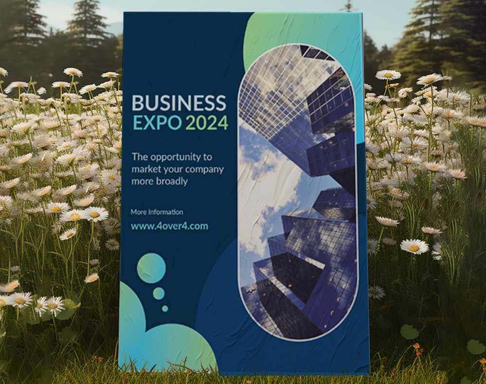
Mounted Posters
High-Quality Mounted Posters Ready to Print
Free Design Templates:
Below you'll find 4OVER4's poster products, including standard, mounted, and 3D lenticular options to fit any project.
Posters
Starting from $108.75
Order premium custom posters for printing.
Free Design Templates:
"Posters /5"
| Quantity | Price Per Unit |
|---|---|
| 50 | $2.17 |
| 800 | $0.46 |
| 7,000 | $0.14 |
| 25,000 | $0.10 |
Ink Color
Finish
Folding
Scoring
Perforation
Proof Options
"Mounted Posters /5"
Paper Types
Mounting
Lamination
Proof Options
"3D Lenticular Posters /5"
Ink Color
Effect
Number of Flips
Effect Direction
Rounded Corners
Proof Options
How to Design Posters That Actually Get Noticed
Start With a Single Clear Goal
Every great poster answers one question: what do you want the viewer to do? Visit your store. Attend your event. Call a number. Buy a product. If your poster tries to say everything, it says nothing.
Write your goal down before you open any design software. "Drive foot traffic to our Saturday sale" is a goal. "Tell people about our business" is not. The goal shapes every decision that follows - size, layout, color, copy, even paper stock.
This same principle applies to other print materials. If you're working on direct mail, our guide on How To Make Envelopes covers how to match your envelope design to your campaign goal.
Choose the Right Poster Size
Size depends on where your poster will live. Here's a quick breakdown:
- 11" x 17" - Perfect for bulletin boards, community boards, and indoor walls. Easy to distribute in stacks.
- 18" x 24" - The sweet spot for retail windows, event promotions, and trade show displays.
- 24" x 36" - Big enough for storefront signage, concert venues, and high-traffic areas where you need visibility from a distance.
- 27" x 39" and larger - Ideal for movie-style posters, gallery prints, and large-format wall displays.
Think about viewing distance. A poster on a coffee shop counter can be small. A poster in a convention hall needs to be readable from 15 feet away. Scale your text accordingly.
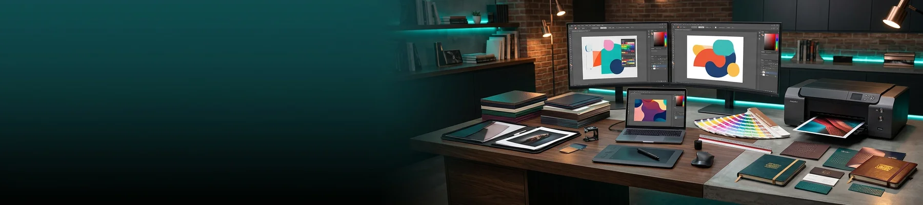
Pick Your Design Tool
You don't need Adobe Illustrator to make a poster that looks professional. Here are your options ranked by skill level:
Beginner-friendly: Canva, Adobe Express, and 4OVER4's own design tools give you drag-and-drop templates. Pick a layout, swap in your text and images, and export. If you're also creating How To Make Flyers, these same tools work for that too.
Intermediate: Affinity Designer and Figma offer more control over typography, vector graphics, and color management. Good for designers who want precision without the Adobe subscription.
Professional: Adobe Illustrator and InDesign remain the industry standard. Full CMYK control, bleed setup, and export presets for print-ready files.
Whatever tool you use, make sure it can export a high-resolution PDF at 300 DPI with proper bleed settings. This is non-negotiable for quality printing.
Layout and Composition Basics
Good poster layout follows a visual hierarchy. The viewer's eye should move from the most important element to the least important in a natural flow.
The headline goes big. This is your hook. It should be readable from several feet away. Use a bold, clean typeface. Save decorative fonts for accents, not headlines.
Supporting info goes smaller. Date, time, location, pricing - whatever details matter. Keep this to the essentials. If you need to include a lot of information, consider pairing your poster with a How To Fold A Brochure that people can take with them.
Your call-to-action needs breathing room. Don't bury "Visit us at 123 Main St" in a wall of text. Give it space, contrast, and prominence.
Use the rule of thirds. Divide your poster into a 3x3 grid and place key elements along the intersections. It creates natural visual balance without looking forced.
Color, Typography, and Image Selection
Stick to 2-3 colors maximum. A primary color for the background or headline, a secondary for accents, and a neutral for body text. Too many colors compete for attention and cheapen the look.
For typography, use no more than two typefaces. One for headlines, one for body copy. Make sure there's strong contrast between them - a bold sans-serif headline with a clean serif body works well. Avoid fonts smaller than 24pt for any text you want readable from more than a few feet.
Images should be 300 DPI minimum at the size they'll print. A photo that looks sharp on your phone screen will look pixelated and blurry blown up to 24" x 36". Stock photo sites like Unsplash and Pexels offer free high-resolution images. If you're using your own photos, shoot at the highest resolution your camera allows.
"We designed our first event poster using 4OVER4's templates and it came out looking like we hired a professional agency. The colors were vivid and the paper quality was sturdy enough to hang outdoors for two weeks."
- Marcus L., Event Coordinator, ★★★★★
Setting Up Your File for Print
This is where most DIY poster projects go sideways. Your design looks perfect on screen, then prints with cut-off text and dull colors. Here's how to avoid that.
Bleed: Add 0.125" of bleed on all sides. This means your background colors and images extend past the trim line. When the poster is cut, you won't get white edges.
Safe zone: Keep all important text and logos at least 0.25" inside the trim line. Cutting isn't perfectly precise, so give yourself a buffer.
Color mode: Design in CMYK, not RGB. Your monitor displays RGB colors that printers can't reproduce. Switching to CMYK early prevents nasty color surprises. Bright neon greens and electric blues on screen will shift to duller tones in print - plan for that.
Resolution: 300 DPI at final print size. A 24" x 36" poster at 300 DPI means your file is 7200 x 10800 pixels. Large? Yes. Worth it? Absolutely.
4OVER4 offers Blank Templates pre-configured with the correct bleed, safe zone, and dimensions for every poster size. Download one before you start designing and you'll eliminate most setup errors.
Blank Templates

For more resources on print design and file preparation, browse the Faq Hub for guides covering everything from business cards to booklets.
How to Print Posters the Right Way
Design is half the battle. Printing is where your poster becomes real. And the choices you make here - paper stock, finish, mounting - determine whether your poster looks like a cheap flyer or a professional piece.
Paper stock matters. Thicker stocks feel more big and resist curling. Glossy finishes make colors pop and work well for photo-heavy designs. Matte finishes reduce glare and give a more sophisticated, gallery-style look.
Mounted posters are rigid and self-supporting. They're great for easel displays, trade show booths, and retail point-of-purchase setups. No frame needed.
Lamination adds durability. If your poster is going outdoors or in a high-traffic area, lamination protects against moisture, UV fading, and fingerprints.
If you're creating a full marketing suite, pair your posters with Custom Booklets for events where attendees need detailed information to take home. And don't forget smaller print pieces - our guide on How To Clean Rubber Stamps is handy if you're using stamps for branding on packaging or envelopes.
Real Poster Projects for Inspiration
Seeing what other businesses have created helps spark ideas. Below you'll find showcase examples from real 4OVER4 customers, plus ready-to-customize templates and blank template downloads to get your project started fast.
Poster Mistakes That Waste Your Budget
Even experienced designers slip up when making posters. Here are the most common errors 4OVER4 sees in uploaded files - and how to dodge them.
Using RGB instead of CMYK. Your screen colors won't match print colors. Always design in CMYK from the start. Converting at the end still shifts colors.
Forgetting bleed. If your background color runs to the edge, you need 0.125" bleed. Without it, you'll get uneven white borders after cutting.
Too much text. A poster isn't a brochure. If your audience needs to squint or spend 30 seconds reading, you've lost them. Edit ruthlessly. Cut your copy in half, then cut it again.
Low-resolution images. Anything below 300 DPI at print size will look fuzzy. Phone screenshots and web-grabbed images almost never work for large-format printing.
Ignoring viewing distance. Your headline should be legible from at least 6-10 feet away. Test this by zooming out on your screen to roughly the viewing ratio.
Skipping the proof. 4OVER4 offers proofs so you can catch issues before thousands of copies roll off the press. Always review your proof.
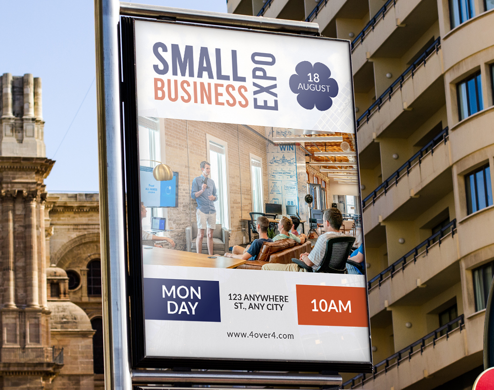
Poster Products Worth Considering at 4OVER4
Once you know how to make posters, picking the right product is the final step. 4OVER4 offers standard Posters for everyday promotions, Mounted Posters for rigid displays that stand on their own, and 3D Lenticular Posters for eye-catching motion effects.
Ink Color
Finish
Folding
Scoring
Perforation
Proof Options
Need your posters fast? 4OVER4's Same Day Printing gets rush orders out the door when deadlines are tight. Below you'll find customer reviews from businesses that have printed posters with 4OVER4.
Free Design Templates
"Ordered how to make posters from 4OVER4 and the quality blew me away. Sharp colors, premium feel, arrived 2 days early."
"Been using 4OVER4 for how to make posters for a year. Consistent quality every time. The online designer made it easy."
"Switched to 4OVER4 and saved 40% on how to make posters. Better quality than my old printer. 60+ paper options."
"4OVER4's how to make posters helped us look more professional. Clients notice the difference."
Poster Questions, Answered
What file format should I use when submitting poster artwork?
Submit a print-ready PDF in CMYK color mode at 300 DPI. This gives you the sharpest output with accurate colors. 4OVER4 also accepts AI, PSD, and EPS files, but PDF is the safest bet for preserving fonts and layout.
What's the best poster size for an indoor event?
For most indoor events, 18" x 24" hits the sweet spot. It's large enough to read from across a room but small enough to fit standard frames and easels. For hallways and lobbies, go up to 24" x 36".
Can I add a QR code to my poster?
Absolutely. Adding a QR code bridges your physical poster with a digital destination - a website, menu, registration form, or social media page. Use 4OVER4's free QR Code Generator to create one, then place it in a visible spot on your poster with at least 1" x 1" sizing so phones can scan it easily.
Should I choose glossy or matte finish for my poster?
Glossy makes colors appear more vivid and saturated - ideal for photo-heavy designs and retail displays. Matte reduces glare and gives a more refined, artistic look. If your poster will hang under bright lights or near windows, matte prevents distracting reflections.
How do I know if my image resolution is high enough?
Open your image file and check its pixel dimensions. Divide each dimension by 300 to get the maximum print size in inches at 300 DPI. A 3600 x 5400 pixel image prints cleanly at 12" x 18". Anything below 150 DPI at your target size will look noticeably soft.
What's the difference between a standard poster and a mounted poster?
Standard posters print on paper and need to be hung, taped, or framed. Mounted posters are adhered to a rigid board, making them self-supporting. Mounted versions work great on easels, countertops, and trade show displays where you can't hang anything on walls.