What You Need to Know Before Making Trading Cards
Learning how to make trading cards comes down to three things: a strong concept, smart design, and the right print materials. 4OVER4 has printed over 10 billion cards for more than 150,000+ businesses and creators. Start with a clear theme. Design front and back layouts with proper bleed and safe zones. Then pick a cardstock and finish that makes each card feel like a real collectible. That's the whole process - concept, design, print.
Your Complete Walkthrough for Custom Trading Cards
Trading cards aren't just for baseball fans and Pokémon collectors anymore. Artists, small businesses, game designers, educators, and event planners all use custom trading cards to tell stories, promote brands, and build communities. The format is compact, collectible, and surprisingly versatile.
"Gloss Laminated Trading Cards /5"
| Quantity | Price Per Unit |
|---|---|
| 250 | $0.38 |
| 1,000 | $0.15 |
| 10,000 | $0.07 |
| 25,000 | $0.07 |
Ink Color
Proof Options
If you've been wondering how to make trading cards that actually look and feel professional, you're in the right place. This guide covers every step - from brainstorming your concept to holding a finished stack in your hands. We'll talk design principles, file setup, paper choices, and finishing options so you don't waste time or money guessing.
"Kraft Trading Cards /5"
Ink Color
Proof Options
The same attention to detail applies to other print projects too. If you're exploring different formats, check out our guides on Custom Magnets Faq or How To Make Envelopes for more creative ideas. But right now, let's focus on trading cards.
"Silk Trading Cards /5Paper Type16 Point Silk LaminatedInk Color4/0 : 4 Color Front; Blank Back4/4 : 4 Color Both SidesProof OptionsStraight To ProductionFree Online Proof"
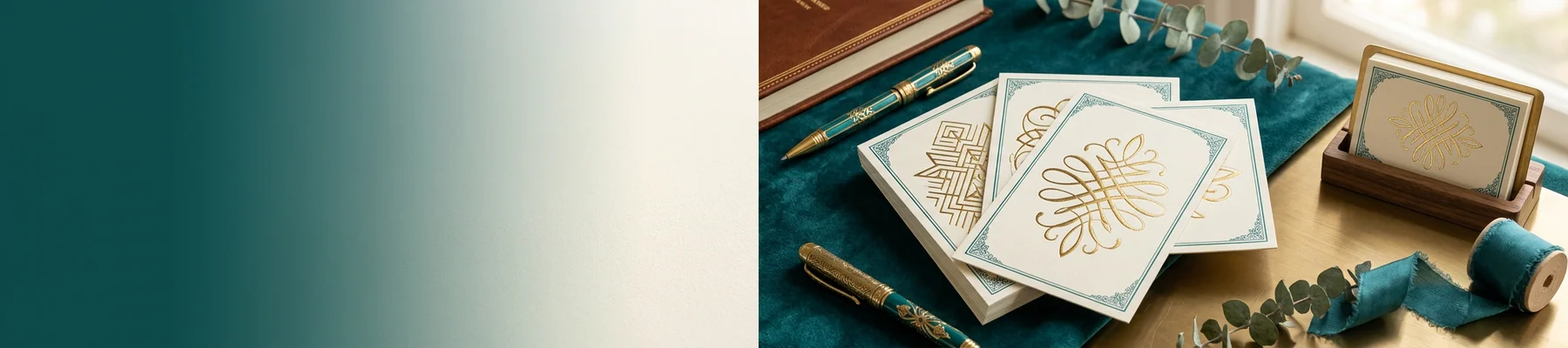
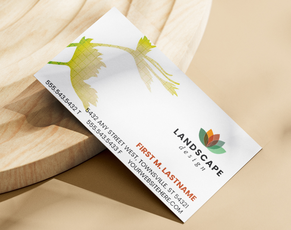
4OVER4 offers multiple trading card stocks and finishes, so you can match the feel to your vision. Here's a look at some popular options to get you started.
Step-by-Step: Designing and Printing Trading Cards That People Actually Want
Step 1 - Define Your Concept and Audience
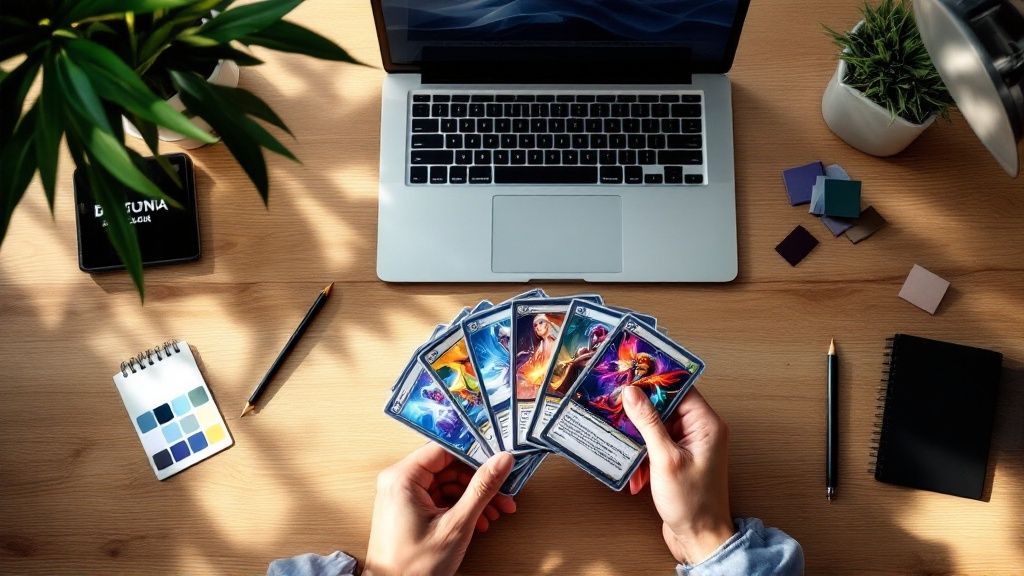
Every great trading card starts with a clear idea. Before you open any design software, answer a few questions. Who's going to hold these cards? What do they care about? Are you making a game with rules and stats, a promotional series for your brand, or an art collection?
Your concept drives every decision after this. A trading card game needs consistent stat layouts and clear typography. A promotional card for a brewery might lean heavy on photography and bold colors. An artist series might break every rule on purpose - and that's fine, as long it's intentional.
Write down your theme, the number of cards in your set, and what information goes on each card. Front typically features the main image and card name. The back holds stats, descriptions, bios, or branding. Some creators add numbering, rarity indicators, or QR codes. Get specific now so your design phase doesn't turn into a guessing game.
"I designed a 30-card set for our coffee shop's loyalty program. Each card featured a different coffee origin story. Customers started collecting and trading them - it was the best marketing move we ever made."
- Rachel K., Coffee Shop Owner
Step 2 - Choose Your Card Size and Dimensions
Standard trading card size is 2.5 x 3.5 inches. That's the same as a classic baseball card or a Magic: The Gathering card. Stick with this size if your cards need to fit in standard sleeves, binders, or deck boxes.
If you want something different - maybe a mini card or an oversized showcase card - that's possible too. Just know that non-standard sizes may limit how people store and display them. For game cards especially, standard dimensions matter. Players expect cards to fit their existing accessories.
When setting up your file, add 0.125 inches of bleed on all sides. That means your actual file dimensions should be 2.75 x 3.75 inches. Keep all important text and graphics at least 0.125 inches inside the trim line. This safe zone prevents anything critical from getting cut off during production. If you're curious about layout principles for other print formats, our guide on How To Fold A Brochure covers similar file setup concepts.
Step 3 - Design the Front of Your Trading Card
The front is your hero. It's what grabs attention and makes someone want to pick up the card. Here's what works:
- One dominant image or illustration - don't crowd the front with three competing visuals. Pick one strong focal point.
- Card name in a clear, readable font - fancy script looks cool until nobody can read it at 2.5 inches wide.
- Consistent frame or border - this ties your whole set together visually. Even a thin colored border creates cohesion across 20, 50, or 100 different cards.
- Color palette that matches your theme - dark and moody for horror games, bright and saturated for kids' collectibles, clean and minimal for business promos.
Use images at 300 DPI minimum. Anything lower and your cards will look blurry when printed. If you're using illustrations, work in CMYK color mode from the start. RGB colors look different on screen than they do on paper, and you don't want surprises.
Need design inspiration for other print projects? Browse our Faq Hub for tutorials on everything from flyers to invitations.
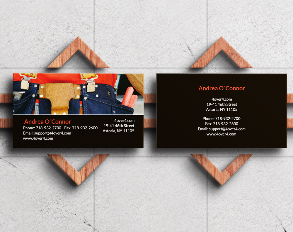
Step 4 - Design the Back of Your Trading Card
Don't treat the back as an afterthought. It's where your card delivers depth.
For game cards, the back usually has a universal design - the same across every card in the deck. This prevents players from identifying cards face-down. Think of the classic Pokémon card back. Simple, iconic, consistent.
For collectible or promotional cards, each back can be unique. Include player stats, character bios, product descriptions, fun facts, or trivia. Keep text readable at small sizes - 7pt font minimum for body text, 9pt or larger for headers. Nobody's pulling out a magnifying glass.
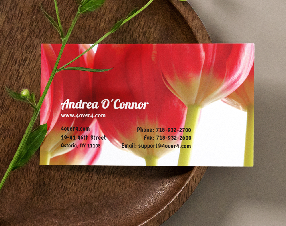
Add your logo or brand mark somewhere on the back. A small watermark, a footer logo, or a branded border all work. This is especially smart for business trading cards where brand recognition matters. If you're also creating promotional flyers alongside your cards, our How To Make Flyers guide pairs well with this project.
"We printed trading cards for our brewery's tap lineup. The fronts had custom illustrations of each beer, and the backs listed tasting notes and food pairings. People literally asked to buy full sets."
- Marcus D., Brewery Marketing Manager
Step 5 - Pick Your Paper Stock and Finish
This is where your trading cards go from "nice design on a screen" to "wow, this feels real." The paper stock and finish you choose affect how your cards look, feel, and hold up over time.
Paper stock options:
- 14pt cardstock - a solid, standard weight. Good for promotional cards and budget-friendly runs. About the thickness of a standard playing card.
- 16pt cardstock - slightly thicker, with a more big feel. Great for collectibles that need to feel premium without going ultra-thick.
- Kraft stock - uncoated, natural brown paper with a rustic, earthy vibe. Perfect for eco-conscious brands or vintage-themed sets.
Finish options:
- Gloss lamination - shiny, bright, and fingerprint-resistant. Colors pop. This is the classic trading card look.
- Silk finish - smooth and slightly matte. Feels velvety. Great for photography-heavy designs where you want rich color without glare.
- Uncoated - writable surface with a natural texture. Works well for cards that need handwritten notes or signatures.
4OVER4 carries 60+ paper types across all product lines, so you're not locked into one or two choices. Want to feel the difference before committing? Order Free Samples and compare stocks side by side.
Step 6 - Prepare Your Print Files
Getting your files right saves you time, money, and frustration. Here's the checklist:
- File format: PDF is preferred. It preserves fonts, colors, and layout integrity.
- Resolution: 300 DPI. Non-negotiable for sharp print quality.
- Color mode: CMYK. Not RGB. Your screen shows RGB, but printers use CMYK ink. Convert before exporting.
- Bleed: 0.125 inches on all sides.
- Safe zone: Keep critical content 0.125 inches inside the trim line.
- Fonts: Outline all text or embed fonts in your PDF. Missing fonts get substituted, and substitutions look terrible.
If you're working in Canva, Photoshop, Illustrator, or InDesign, all of these programs can export print-ready PDFs. Double-check your export settings. A common mistake is exporting at 72 DPI (screen resolution) instead of 300 DPI (print resolution).
For hands-on craft projects that pair nicely with card design, check out How To Clean Rubber Stamps if you're adding hand-stamped elements to your cards.
Blank Templates


Step 7 - Place Your Order and Review Your Proof
Once your files are ready, upload them and select your options: quantity, paper stock, finish, and turnaround time. Always review your digital proof. This is your last chance to catch typos, color issues, or layout problems before ink hits paper.
Look for these things in your proof:
- Text spelling and alignment
- Image placement relative to trim and bleed lines
- Color accuracy (keeping in mind screen colors are approximate)
- Correct front-to-back alignment
4OVER4 includes a free proof with every order. Take five minutes to review it carefully. It's way cheaper than reprinting 500 cards because of a typo.
Planning a bigger event around your card launch? Our Flat Bridal Shower Invites page shows how the same print-ready file principles apply to invitation projects too.
Creative Uses for Custom Trading Cards
Trading cards work for way more than games. Here are real use cases that creators and businesses love:
- Restaurant menus: A taco truck prints a 12-card set featuring each menu item with photos and descriptions. Customers collect the whole set.
- Real estate agents: Property cards with photos, specs, and contact info. Hand them out at open houses. Way more memorable than a flyer.
- Teachers: Vocabulary cards, historical figure cards, or science fact cards. Kids engage more when learning feels like collecting.
- Artists and illustrators: Mini portfolio pieces. Sell packs at conventions or include them as bonus items with online orders.
- Employee spotlights: Company trading cards featuring team members with fun facts and job titles. Great for onboarding and team building.
Here are some ready-to-use templates to kickstart your trading card design.
Mistakes That Ruin Trading Cards (and How to Dodge Them)
Even experienced designers trip up when learning how to make trading cards. Here are the most common pitfalls:
- Skipping the bleed. No bleed means white edges after cutting. It looks unfinished and cheap. Always add 0.125 inches.
- Using low-resolution images. That photo looked great on Instagram. At 300 DPI on a 2.5 x 3.5 inch card? Pixelated mess. Source high-res files from the start.
- Cramming too much text on the back. You've got limited space. Edit ruthlessly. If it doesn't add value, cut it.
- Designing in RGB instead of CMYK. Your bright neon green on screen will print as a dull olive. Convert to CMYK early and adjust colors accordingly.
- Ignoring the proof. 4OVER4 sends you a free proof for a reason. Review it. Zoom in. Read every word. Catching a mistake here costs nothing. Catching it after printing costs everything.
- Choosing the wrong finish for the use case. Gloss looks great but shows fingerprints if cards get handled constantly. Silk or matte finishes hold up better for game cards that get shuffled hundreds of times.
Best Trading Card Stocks for Your Project
Choosing the right stock is half the battle when you want to make trading cards that feel professional. 4OVER4 offers several options built specifically for this format.
| Phase | Primary Goal | Key Decisions |
|---|---|---|
| Concept | Define the purpose and theme of your card set. | Target audience, core message, overall aesthetic. |
| Design | Create a visually engaging and cohesive layout. | Color scheme, typography, image selection, layout balance. |
| Materials | Select the right physical components for quality. | Cardstock weight (e.g., 14pt vs. 16pt), finishes (gloss vs. matte). |
| Printing | Produce a professional, high-quality final product. | File preparation, proofing, order quantity. |
| Finish Type | Best For | Key Characteristics |
|---|---|---|
| Gloss UV | Colorful artwork, game cards, modern designs. | High-shine, vibrant colors, durable, moisture-resistant. |
| Matte | Elegant designs, text-heavy cards, vintage look. | Non-reflective, smooth texture, sophisticated feel. |
- The Concept: This is the "why" behind your cards. Who are they for? What's the theme? What story or information does each card need to tell? This is your foundation.
- Design & Layout: Now it's time to bring that concept to life. We're talking colors, fonts, and imagery. You’ll be arranging all the visual elements into a layout that’s balanced and eye-catching for both the front and the back.
- Printing & Finishing: The final, physical stage. This is where you pick your cardstock, decide on a protective finish, and get your files ready for a professional print run that delivers a polished, durable result.
Gloss Laminated Trading Cards deliver that classic, bright look collectors expect. Silk Trading Cards offer a smooth, velvety feel that's perfect for photography-heavy designs. Kraft Trading Cards bring a natural, eco-friendly texture for brands that value sustainability - pair them with our Green Printing options.
- To Entertain: Maybe you're building a game or a collectible series focused purely on fun and engagement.
- To Inform: Cards can be a fantastic way to share key facts, stats, or educational content in a bite-sized format.
- To Promote: You might be designing a business card that’s impossible to forget or a marketing piece that really stands out.
- To Commemorate: A great way to celebrate an event, a team's winning season, or a personal milestone.
- Purpose: To inform potential adopters and forge an emotional connection.
- Theme: "Find Your New Best Friend."
- Aesthetic: Warm, friendly, and inviting. You’d want photos with soft lighting, playful fonts, and a bright, cheerful color palette.
- Essential Info: The animal's name, age, and breed, plus a short bio and a QR code linking straight to the shelter’s adoption page.
- The Front: This is your hook. It’s all about immediate impact. This side should feature your best artwork, the card's title, and maybe a single, key stat or icon. The goal is instant recognition.
- The Back: This is where you fill in the blanks. The back is perfect for stats, lore, a short bio, or even contact details. It’s naturally more text-heavy, but it still needs a clean, organized layout to be useful.
Want to test print quality before ordering a full run? 4OVER4 also offers Free Business Cards so you can experience the paper stocks and finishes firsthand.
- Resolution (DPI): For anything printed, your design files and images need to be at least 300 Dots Per Inch (DPI). That cool image you found on the web? It's probably 72 DPI and will look pixelated and awful on a physical card. Always, always start with high-resolution assets.
- Color Mode (CMYK): Your computer screen uses RGB (Red, Green, Blue) light to display color. Printers use CMYK (Cyan, Magenta, Yellow, Black) ink. If you design in RGB, the colors will look dull and washed out when printed. Set your design file to CMYK from the beginning for accurate colors.
- Bleed and Safe Zones: This is easily the most critical—and most overlooked—step.
- Bleed is an extra margin of your design, usually 0.125 inches, that extends past the card's final trim line. It's a safety net. When the big cutting machine trims the cards, the bleed ensures you don't end up with ugly, accidental white edges.
- The Safe Zone is the opposite—it’s an inner margin where you must place all your important text and logos. This guarantees nothing critical gets chopped off during trimming.
-
14 pt. Cardstock: This is a fantastic, all-around starting point. It’s noticeably thicker and more durable than your average business card, giving it an immediate sense of quality. It feels professional without being overly stiff, making it a smart, cost-effective choice for larger print runs.
-
16 pt. Cardstock: If you want that top-tier, premium feel, 16 pt. is the only way to go. That little bit of extra thickness adds a real heft and rigidity that people instantly associate with high value. This is what you want for limited edition sets, high-end promotional cards, or any project where you need the physical card to make a statement.
- High-Quality PDF: This is usually the gold standard. It embeds your fonts and images, locking your layout in place so nothing shifts or changes.
- TIFF (.tif): This is a "lossless" format, meaning it keeps every bit of image quality without any compression. It's another fantastic choice.
- JPEG (.jpg): This can work, but only if you save it at the absolute highest quality setting. Just know that it’s a "lossy" format, so a tiny bit of data is always compressed.
Here's a closer look at the available specifications, pricing, and what other customers have to say.
- Typos & Grammar: Read every single word on the card, front and back. It's wild how a tiny typo can survive dozens of design revisions.
- Layout & Alignment: Is everything where it should be? Check that all your text and images are safely inside the "safe zone" and haven't mysteriously shifted.
- Image Quality: Zoom in. Way in. Are your logos and pictures sharp, or are they blurry and pixelated? What looks fine on your monitor might not hold up in print.
- Color Check: Remember, the colors on your screen won't perfectly match the final printed card because of differences in monitor calibration. The proof is the closest digital preview you'll get of the final output.
- Quantity: This is the biggest factor. Printing more cards dramatically lowers your price-per-card. A small batch of 50 cards for a personal project will have a much higher unit cost than a run of 5,000 for a business.
- Cardstock: The feel of the card matters. A thicker, sturdier stock like a premium 16 pt. is going to cost a bit more than a standard 14 pt.
- Finishes: This is where you can add some flair. Special touches like a high-gloss UV coating or shiny foil stamping will add to the total cost, but they also make your cards look incredible.
- Printer: Every print shop has different equipment and pricing, so it's always smart to compare.
-
Bleed: This is a little bit of your background design (usually 0.125 inches) that extends past the actual trim line of the card. Paper can shift ever so slightly when it's being cut at high speed. The bleed ensures that if the cut is a tiny fraction of a millimeter off, your background color or image still goes right to the very edge.
-
Safe Zone: This is the opposite—it's an inner margin. You need to keep all your important stuff—like names, stats, logos, and key parts of your art—inside this area. It's the "safe" space where nothing will accidentally get trimmed off.
Still not sure which stock to choose? Grab a set of Free Business Cards printed on different stocks to compare the look and feel before placing your full trading card order.
Free Design Templates


"Ordered how to make trading cards from 4OVER4 and the quality blew me away. Sharp colors, premium feel, arrived 2 days early."
"Been using 4OVER4 for how to make trading cards for a year. Consistent quality every time. The online designer made it easy."
"Switched to 4OVER4 and saved 40% on how to make trading cards. Better quality than my old printer. 60+ paper options."
"4OVER4's how to make trading cards helped us look more professional. Clients notice the difference."
Trading Card Questions - Answered
What's the standard size for custom trading cards?
The standard trading card size is 2.5 x 3.5 inches, which matches classic sports cards and most card game formats. This size fits standard card sleeves, binder pages, and deck boxes. When preparing your design file, set the document to 2.75 x 3.75 inches to include the required 0.125-inch bleed on all sides.
What paper stock works best for trading cards?
It depends on your use case. Gloss laminated stock gives you the classic shiny, colorful look most people associate with trading cards. Silk stock feels smooth and premium - great for art prints and photography. Kraft stock adds a natural, rustic texture. 4OVER4 carries 60+ paper types across product lines, so you can match the stock to your project's personality.
Can I make trading cards without design experience?
Yes. Tools like Canva, Adobe Express, and even PowerPoint let you create trading card layouts with drag-and-drop templates. Set your canvas to 2.5 x 3.5 inches at 300 DPI, work in CMYK color mode, and export as PDF. 4OVER4 also provides blank templates you can download to ensure your file dimensions and bleed are correct.
How many trading cards should I order for a first run?
Start with a smaller quantity - 50 to 250 cards - to test your design, paper choice, and finish before committing to a large print run. This lets you catch issues early and make adjustments. Per-unit cost drops as quantity increases, so once you're happy with the result, scaling up saves money.
What file format should I use for printing trading cards?
PDF is the preferred format. It locks in your fonts, colors, and layout so nothing shifts during production. Export at 300 DPI in CMYK color mode with 0.125-inch bleed. Outline all fonts or embed them in the PDF to prevent substitution errors. Always review your digital proof before approving the print run.
Do trading cards come with a protective finish?
Laminated options like gloss and silk include a built-in protective layer that resists scratches, moisture, and fingerprints. Uncoated and kraft stocks don't have lamination, which gives them a more natural feel but less durability for heavy handling. For game cards that get shuffled frequently, laminated finishes hold up much better over time.