Quick Takeaways: Matte and Glossy Brochure Finishes
Matte brochures reduce glare and feel refined in hand, making them ideal for text-heavy designs. Glossy brochures pop with vivid color and sharp image detail, perfect for photo-driven layouts. Your choice depends on what your brochure needs to accomplish. 4OVER4.COM offers both finishes across 60+ paper types, so you're never locked into one option. With 10,000+ reviews from satisfied customers, you can trust the quality either way.
Why Your Brochure Finish Matters More Than You Think
A matte vs glossy brochure comparison isn't just about aesthetics. It's about how your audience interacts with your printed piece. Does someone flip through it at a trade show? Tuck it into a bag for later? The finish affects readability, durability, and the impression your brand leaves behind.
Matte finishes absorb light instead of reflecting it, creating a smooth, sophisticated look. Glossy finishes bounce light off the surface, making colors appear richer and photos sharper. Both have a place in smart marketing. Knowing when to use each one gives you an edge. If you're also exploring layout options, check out our guide on How To Fold A Brochure to pair the right finish with the right fold.
4OVER4.COM makes it easy to experiment. Use the Online Designer to preview your artwork on different stocks before committing. And if you're working on other print projects, our guide on How To Clean Rubber Stamps covers another common printing question worth bookmarking.
Matte Brochures: When Understated Wins the Room
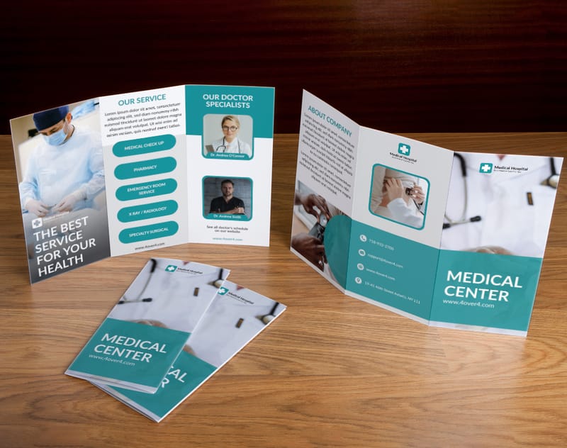
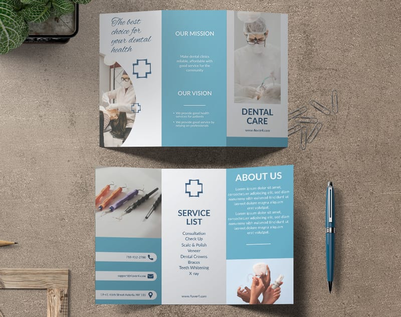
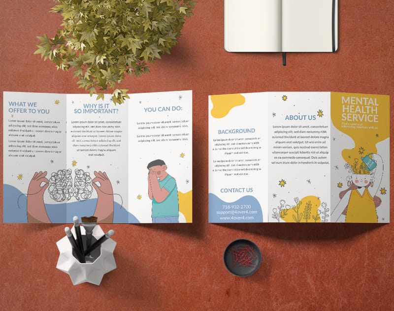
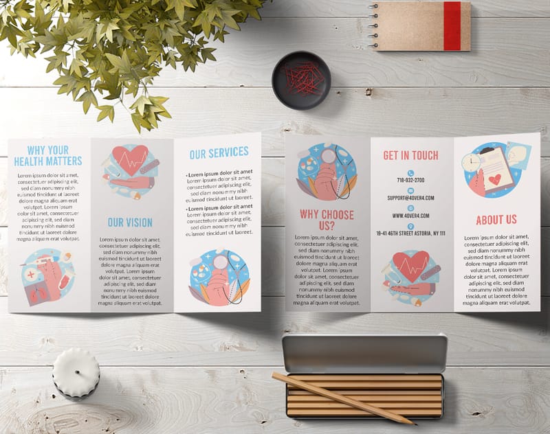
Matte Brochures work best when your content relies on words more than images. The non-reflective surface eliminates glare, so readers can scan paragraphs under fluorescent lights, outdoor sun, or dim conference rooms without squinting. That's not a small thing when you're handing out materials at a trade show or stuffing them into welcome packets.
Readability is the biggest advantage here. Body text, bullet points, and data-heavy layouts look crisp on matte stock. The ink sits on the surface without that wet-looking sheen, giving text a clean, almost letterpress-quality feel. If your brochure is a pricing guide, service menu, or educational handout, matte is usually the right call.
Matte finishes also resist fingerprints and smudges. People pick up brochures, flip through them, set them down, pick them up again. A glossy brochure shows every thumbprint after a few passes. Matte stock stays looking clean through repeated handling.
"We ordered matte brochures for our law firm's client onboarding packets. The text is sharp, the paper feels premium, and they still look perfect after sitting in folders for weeks."
- Rachel K. ★★★★★
Industries that lean matte include finance, legal, healthcare, education, and consulting. Anywhere the message says "we're serious, we're professional, we know what we're doing." The texture itself communicates trust. When someone holds a matte brochure, it feels big and intentional. Want to explore all the brochure options 4OVER4.COM offers? Browse Custom Brochures to see paper stocks and finishes side by side.
Where Matte Falls Short
Matte isn't perfect for everything. Photographs can look slightly muted compared to glossy. Colors don't pop as aggressively. If your brochure is 80% photography - think real estate listings, restaurant menus with food shots, or travel destinations - matte might flatten images you want to jump off the page.
The surface is also more susceptible to scuffing over time. While it hides fingerprints, a matte brochure tossed into a bag without a folder can pick up surface marks. It's a tradeoff worth knowing about.
Glossy Brochures: When You Need Colors That Demand Attention
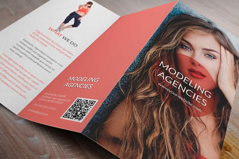
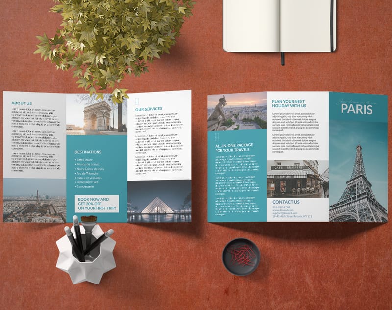
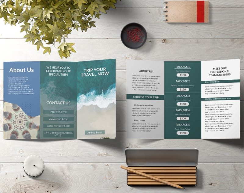
Glossy Brochures are built for visual impact. The reflective coating amplifies color saturation, making reds redder, blues deeper, and whites brighter. If your brochure features product photography, lifestyle imagery, or bold graphic design, glossy stock makes those elements sing.
The color difference is noticeable immediately. Side by side, the same image printed on matte and glossy stock looks like two different photos. Glossy gives you that magazine-quality sheen that people associate with high production value. Retail brands, restaurants, event promoters, and creative agencies tend to reach for glossy first.
Glossy coatings also add a layer of protection against moisture and light wear. For brochures distributed outdoors - think door hangers, direct mail pieces, or event handouts - that extra durability matters. Rain, humidity, and general handling won't break down a glossy brochure as quickly. If you're also creating flyers for similar campaigns, our guide on How To Make Flyers covers design tips that apply to glossy brochures too.
"Our restaurant brochures on glossy stock look incredible. The food photography pops, and customers actually keep them instead of tossing them. Worth every cent."
- Marcus D. ★★★★★
Where Glossy Falls Short
Glare is the obvious downside. Under direct lighting, glossy brochures can be hard to read. Tilt the page slightly and a paragraph disappears behind reflected light. For text-heavy designs, this is a real problem.
Fingerprints are another issue. Every touch leaves a mark on glossy stock. If your brochure gets handled frequently - passed around a meeting table, for example - it'll show wear faster than matte. Writing on glossy surfaces is also tricky. If someone needs to jot notes on your brochure (sales reps, for instance), ink smears or won't adhere properly.
Head-to-Head: Choosing the Right Finish for Your Project
The matte vs glossy brochure comparison in the end comes down to content type and distribution method. Here's how to think through it.
Text-Heavy Designs
Go matte. Service descriptions, pricing breakdowns, technical specs, company profiles. Anything where someone needs to actually read the content benefits from a non-reflective surface. Matte stock keeps the focus on your words.
Photo-Driven Designs
Go glossy. Product catalogs, portfolio pieces, travel brochures, food menus with photography. Glossy amplifies the visual elements that make people stop and look. The sheen adds perceived value to imagery.
Mixed Content
This is where it gets interesting. Many brochures combine text and imagery. For these, consider a satin or silk finish - a middle ground between matte and glossy that offers moderate sheen without heavy glare. 4OVER4.COM carries these options across multiple paper weights. Request Free Samples to feel the difference in person before ordering a full run.
Distribution Environment
Where will your brochure end up? Outdoor events and direct mail favor glossy for its moisture resistance. Indoor handouts, conference materials, and desk-reference pieces favor matte for its readability and smudge resistance.
Brand Personality
Think about what your brand communicates. Matte says refined, serious, trustworthy. Glossy says bold, energetic, eye-catching. Neither is better. They're different tools for different jobs. A luxury spa and a children's party venue shouldn't use the same finish.
Paper Weight and Thickness: The Other Half of the Equation
Finish gets the attention, but paper weight matters just as much. A glossy brochure on flimsy stock feels cheap. A matte brochure on thick, rigid paper feels like a premium document. The combination of finish and weight creates the total experience.
Thicker stocks (like 100lb cover) hold up better in both finishes. They resist bending, feel sturdy in hand, and communicate quality before anyone reads a word. Thinner stocks (like 80lb text) work well for tri-fold brochures that need to fold cleanly without cracking.
4OVER4.COM offers 60+ paper types so you can match weight, texture, and finish to your exact needs. If you're designing matching pieces like envelopes or magnets, check out How To Make Envelopes and Custom Magnets Faq for complementary print projects.
Real-World Use Cases: Five Industries, Two Finishes
Real Estate Agents
Property brochures with large listing photos shine on glossy stock. The images look professional and the brochure survives being left on kitchen counters during open houses. Pair with a heavier paper weight for a premium feel that matches the property price tag.
Law Firms and Financial Advisors
Matte, every time. These brochures are information-dense. Clients read them carefully, often under office lighting. Matte stock keeps text legible and communicates the seriousness these industries demand.
Restaurants and Cafes
Glossy menus and promotional brochures make food look appetizing. The sheen adds a freshness to food photography that matte can't match. Plus, glossy resists the occasional coffee spill better than matte.
Event Planners and Wedding Coordinators
Matte brochures with elegant typography create a romantic, refined feel. Wedding clients respond to the tactile quality of matte stock. It feels personal rather than commercial.
Startups and Tech Companies
This depends on the brand. A sleek SaaS company might go glossy for bold visuals. A B2B consulting startup might go matte for credibility. Know your audience first, then pick your finish. For more printing guides across every product type, visit the Faq Hub.
Ready to see these finishes applied to real brochure designs? Here are some templates to get you started.
Blank Templates
Common Mistakes When Picking a Brochure Finish
Choosing finish before finalizing your design. This is the biggest one. People pick glossy because it "sounds better," then realize their text-heavy layout looks worse with glare. Always design first, then match the finish to the content.
Ignoring the handling environment. A matte vs glossy brochure comparison means nothing if you don't consider where the brochure lives after printing. Outdoor distribution? Glossy handles moisture better. Conference tables? Matte resists fingerprints.
Skipping paper samples. Screen previews don't capture texture or sheen. What looks perfect on your monitor might feel wrong in your hands. 4OVER4.COM offers sample kits so you can touch the actual stock before committing to a full print run.
Using the same finish for every project. Your brand might lean matte overall, but a product launch brochure with bold photography could benefit from glossy. Stay flexible. Match the finish to the goal, not the habit.
Forgetting about writability. If your sales team needs to write on brochures - adding client names, circling services, jotting prices - glossy won't cooperate. Matte accepts pen and pencil marks cleanly.
4OVER4.COM Brochure Options for Every Finish Preference
Whether your matte vs glossy brochure comparison led you to one side or the other, 4OVER4.COM has you covered. With 60+ paper types and multiple coating options, you can dial in exactly the look and feel your project demands. Need it fast? Same Day Printing gets your brochures out the door quickly. Want to reduce your environmental footprint? Green Printing options let you choose sustainable stocks without sacrificing quality.
Here's a closer look at the available brochure specs, finishes, and what past customers have to say.
Free Matte Vs Glossy Brochure Templates
| Feature | Matte Finish | Glossy Finish |
|---|---|---|
| Surface Texture | Non-reflective, smooth | Reflective, shiny |
| Best For | Text-heavy content, refined materials | Image-heavy visuals, promotional designs |
| Durability | Resistant to smudges and fingerprints | Resists moisture more effectively |
| Target Audience | Professionals, educators | Trend-conscious, youthful consumers |
| Comparison Factors | Matte | Glossy |
|---|---|---|
| Appearance | Sophisticated and non-reflective | Vibrant and shiny |
| Retail Pricing Dynamics | May cost less for faster services | Priced higher for processing times |
| Durability | Susceptible to wear or damage | Resistant to moisture and wear |
| Preferred Applications | Text-heavy content | Visually dynamic materials |
- Text readability: The smooth, non-glossy surface enhances printed text visibility.
- Sophisticated appeal: Popular for wedding brochures (wedding brochure printing), where elegance is essential.
- Versatility in handling: Excellent for conference handouts or reports requiring quick access.
- Enhanced visuals: Images look sharp, colorful, and detailed. Popular for designing direct mail brochures that grab attention (direct mail brochure).
- Durability: Glossy brochures resist moisture more than matte, suiting outdoor use like in trade shows.
- Aesthetic appeal: Ideal for industries like travel, fashion, and entertainment requiring a visual "wow" factor.
- Purpose: Matte brochures work for internal reports or educational content, while glossy enhances promotional campaigns.
- Environment: Indoor settings like offices or weddings (linked above) favor matte. Glossy excels outdoors or in visually dynamic atmospheres like resorts or airports.
- Target Audience: Appeal to professionals with matte, while glossy attracts youthful, vibrant audiences.
Your Brochure Finish Questions, Answered
Does matte or glossy cost more for brochure printing?
Pricing is typically similar between matte and glossy finishes on the same paper weight. The cost difference is minimal at 4OVER4.COM. Your total depends more on paper thickness, quantity, and size than on the coating itself. Check current pricing on the brochure product page for exact numbers.
Can I use both matte and glossy on the same brochure?
Yes. Spot UV coating lets you apply a glossy finish to specific areas - like photos or logos - while keeping the rest of the brochure matte. This combination creates a tactile contrast that draws attention to key design elements.
Which finish is better for direct mail brochures?
Glossy tends to perform better for direct mail. The reflective surface catches attention in a stack of mail, and the coating protects against moisture during transit. If your direct mail piece is text-heavy, consider a satin finish as a compromise.
Will glossy brochures smudge if I write on them?
Yes. Ballpoint pen ink takes longer to dry on glossy surfaces and can smear. If your brochures need to be written on - for personalization or note-taking - go matte. Matte stock absorbs ink quickly and cleanly.
How do I decide between matte and glossy for my brand?
Look at your content first. Photo-heavy designs favor glossy. Text-heavy designs favor matte. Then consider your industry and audience expectations. You can also add a QR Code Generator link to your brochure design regardless of finish, driving readers from print to digital seamlessly.
Does the finish affect how long brochures last?
Glossy coatings offer slightly better protection against moisture and light fading. Matte brochures can scuff more easily over time. For long-term use, heavier paper stock matters more than finish when it comes to durability.