Quick Takeaways for Designing Your Business Card Format
Your business card format decides whether someone keeps your card or tosses it. Good design isn't about cramming in every detail - it's about clarity, hierarchy, and readability. 4OVER4.COM has printed 10 billion+ cards, and the patterns are clear: clean formatting wins. Cards with proper spacing, readable fonts, and a logical layout get held onto longer. These business card format design tips will help you nail every element, from address placement to font pairing.
Why Your Business Card Layout Deserves Real Attention
A business card is a 3.5 x 2 inch first impression. That's not much space. Every font choice, every line of text, every bit of white space either works for you or against you. Most people spend less than 10 seconds looking at a card before deciding if it's worth keeping. Your format has to do the heavy lifting in that window.
4OVER4.COM has helped 150,000+ businesses print cards that actually get results. And the difference between a card that lands a callback and one that hits the trash? It almost always comes down to format and layout, not flashy graphics. Whether you're starting from scratch or using Design Templates, understanding these principles will sharpen your design.
This guide covers everything from typography and spacing to address formatting and visual hierarchy. If you've ever wondered how to organize information on a small card without it looking cluttered, you're in the right place. You might also find it helpful to explore our Design Templates for ready-to-customize starting points. And for those who love print projects beyond cards, check out our guide on How To Clean Rubber Stamps for another hands-on resource.
The Complete Breakdown: Formatting a Business Card That Works
Business card format design tips boil down to one core idea: make it easy for someone to find what they need and remember who you are. That sounds simple. It's not. Let's break it down piece by piece.
Start With the Standard Size and Safe Zone
The standard business card size in the US is 3.5 x 2 inches. That's your trim size - the final dimensions after cutting. But your design file should be slightly larger to account for bleed (typically 0.125 inches on each side). Bleed prevents white edges from appearing if the cut is slightly off.
More important than bleed is the safe zone. Keep all critical text and logos at least 0.125 inches inside the trim line. Text that sits too close to the edge risks getting clipped. This is one of the most common mistakes people make, and it's completely avoidable.
If you want to explore non-standard formats, 4OVER4.COM offers options like square cards, rounded corners, and even 3D Lenticular Business Cards for a truly standout approach. But even with creative shapes, the safe zone rule still applies.
Visual Hierarchy: What Gets Read First
People don't read business cards top-to-bottom like a book. Their eyes jump to the largest, boldest element first. That's your visual hierarchy, and you control it.
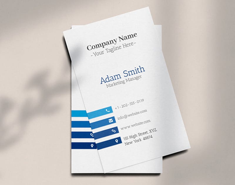
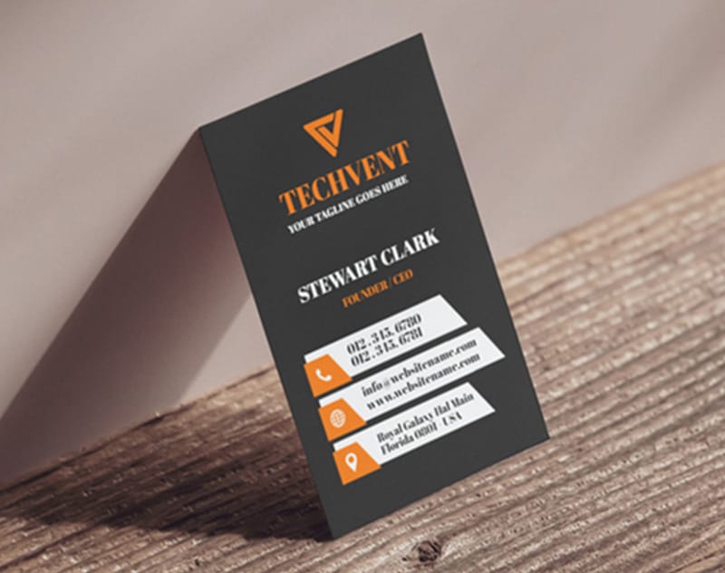
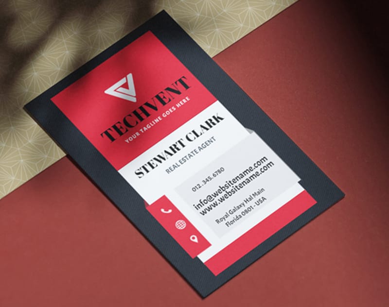
Your name or company name should be the dominant element. Make it the largest text on the card. Your title or tagline comes next, slightly smaller. Contact details - phone, email, address, website - should be the smallest readable text.
Here's a practical hierarchy to follow:
- Level 1 (largest): Company name or your name - this anchors the card's identity
- Level 2 (medium): Job title, tagline, or specialty - gives context to who you are
- Level 3 (smallest): Phone, email, website, address - the actionable contact info
Don't make everything the same size. When everything screams for attention, nothing gets it. Use size contrast to guide the eye naturally. For more design inspiration across print formats, our Faq Hub has dozens of helpful resources.
Choosing Fonts That Actually Work at Small Sizes
Font choice can make or break a business card. What looks great on a poster might be illegible at 8pt on a card. Stick to these rules:
Use no more than two typefaces. One for headings (your name, company name) and one for body text (contact details). Mixing three or more fonts creates visual chaos on a space this small.
Sans-serif fonts like Helvetica, Montserrat, or Open Sans are reliably readable at small sizes. Serif fonts like Garamond or Georgia work well for names and titles, adding a touch of elegance. Script fonts? Use them sparingly - maybe for a tagline - and never for contact details.
Minimum font size matters. Don't go below 7pt for any text on your card. For primary text like your name, 10-12pt is a solid range. For contact details, 8-9pt keeps things readable without wasting space.
"I switched from a decorative script to a clean sans-serif for my contact info, and clients actually started calling the number on my card instead of looking me up online. Readability changed everything."
- Marcus L., freelance photographer
How to Format Your Address on a Business Card
The address is where most formatting goes sideways. People either include too much or format it awkwardly. Here's how to get it right.
Keep it to two lines maximum. Line one: street address. Line two: city, state, and zip code. That's it. No need for "Suite" spelled out - use "Ste." No need for the country unless you're doing international business.
Example of a clean address format:
- 123 Main St, Ste. 400
- Austin, TX 78701
If you operate fully online and don't have a physical location, skip the street address entirely. A city and state is enough for local credibility. Or replace the address with your website URL - that's your storefront now.
For businesses with multiple locations, pick your primary one. Don't try to list three addresses on a single card. That's what your website is for. Speaking of multi-piece print projects, our guide on How To Make Envelopes can help you create matching stationery.
White Space Is Not Wasted Space
This is the hardest lesson for most people. You've got a small card and a lot of information. The instinct is to fill every inch. Resist it.
White space (or negative space) makes your card easier to read and more visually appealing. It gives each element room to breathe. Cards with generous spacing feel premium. Cards crammed with text feel desperate.
A good rule of thumb: at least 30-40% of your card's surface should be empty. That sounds like a lot. It's not. It's the difference between a card that looks professional and one that looks like a classified ad.
If you're struggling to fit everything, ask yourself what's truly necessary. Do you need both a phone number and a cell number? Do you need a fax number in 2026? Probably not. Cut the clutter.
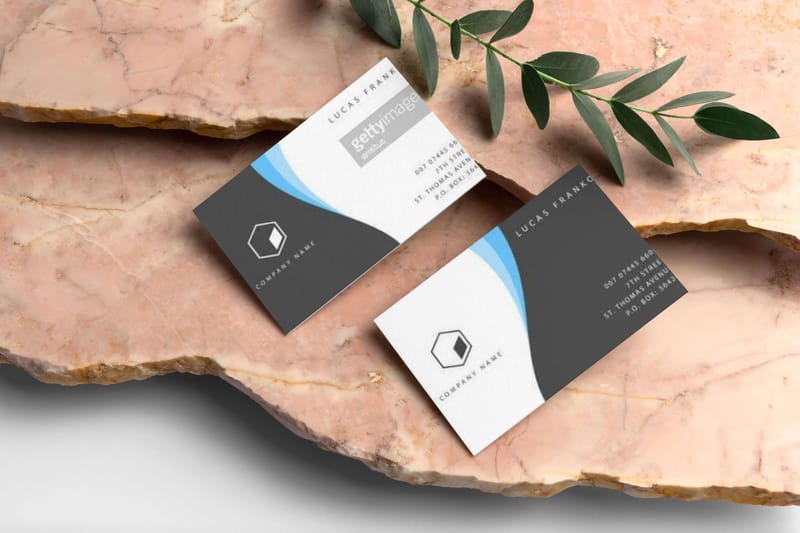
Front and Back: Using Both Sides Strategically
A two-sided card gives you double the real estate. Use it wisely.
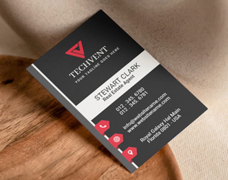
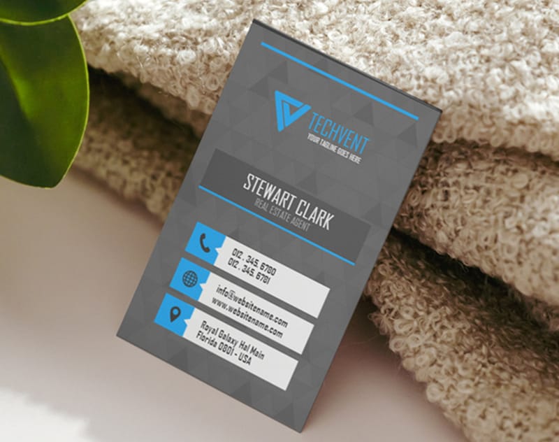
Front side: Your name, title, company name, and logo. Keep it clean and memorable. This is the side people see first.
Back side: Contact details, social media handles, a QR code linking to your portfolio or booking page, or a brief tagline. Some people use the back for a bold design element - a full-color brand pattern or a striking image.
Don't duplicate information on both sides. If your phone number is on the back, it doesn't need to be on the front too. Each side should serve a distinct purpose. For ideas on how to pair your business cards with other marketing materials, check out our guide on How To Make Flyers.
Color and Contrast: Making Text Pop
Dark text on a light background is the safest bet for readability. But "safe" doesn't mean boring. You can use color strategically:
- Accent color for your name or title - draws the eye to the most important element
- Brand colors for lines, borders, or background blocks - reinforces brand identity
- High contrast for contact details - black on white or dark gray on cream ensures legibility
Avoid light text on light backgrounds or dark text on dark backgrounds. It sounds obvious, but it happens constantly, especially with colored card stocks. Always check contrast ratios before sending your file to print.
If you want to see how different paper stocks affect your color choices, 4OVER4.COM offers Free Samples so you can test before committing to a full order.
QR Codes and Digital Elements
QR codes have made a serious comeback. A well-placed QR code on your business card can link to your website, LinkedIn profile, digital portfolio, or a vCard that auto-saves your contact info to someone's phone.
Size your QR code at minimum 0.75 x 0.75 inches for reliable scanning. Place it on the back of the card with a small label underneath ("Scan for portfolio" or "Save my contact"). Don't let it dominate the design - it's a tool, not the focal point.
Make sure the QR code has enough quiet space (white border) around it. Crowding it with other elements can prevent scanners from reading it properly.
Paper Stock and Finish Affect Perceived Format
Your format choices don't exist in a vacuum. The paper stock and finish you choose will change how your design feels in someone's hand.
A thick, textured stock like 32pt makes a bold statement. It's roughly three times the thickness of a standard card, and people notice immediately. A matte finish gives a modern, understated look. Gloss makes colors pop. Soft-touch lamination feels velvety and premium.
The point? Your format decisions should account for the physical material. A minimalist design with lots of white space works beautifully on a thick, uncoated stock. A bright, full-color design shines on gloss. For creative formats that push boundaries, explore options like How To Fold A Brochure for folded card ideas, or see how Custom Magnets Faq can inspire unique promotional pieces.
"We went with 32pt uncoated stock and a simple two-color design. The card feels big - clients comment on it every time. Format and material together made all the difference."
- Dana R., interior design studio owner
Here are some ready-to-use templates and blank layouts to help you put these business card format design tips into action:
Blank Templates


Formatting Errors That Undermine Your Business Card
Even small mistakes in your business card format can cost you credibility. Here are the ones 4OVER4.COM sees most often:
- Text too close to the edge. If your phone number gets clipped during cutting, the card is useless. Stay inside the safe zone - always.
- Too many fonts. Three or more typefaces on a 3.5 x 2 inch card looks chaotic. Stick to two, max.
- No visual hierarchy. When your name, title, phone, email, and address are all the same size, nothing stands out. Use size and weight to create order.
- Ignoring the back. A blank back is wasted opportunity. Use it for contact details, a QR code, or brand reinforcement.
- Low-resolution logos. A pixelated logo screams "amateur." Use vector files (AI, EPS, or high-res PDF) for sharp printing.
- Forgetting to proofread. A typo in your email address means zero callbacks. Triple-check every character.
These business card format design tips aren't just nice-to-haves. They're the difference between a card that works and one that doesn't. 4OVER4.COM's 10,000+ reviews consistently highlight print quality, but even the best print can't save a poorly formatted file.
"I printed 500 cards before realizing my zip code was wrong. Now I always order a proof first. Lesson learned the expensive way."
- Tanya K., real estate agent
Recommended Products to Bring Your Design to Life
Once you've nailed your business card format, picking the right product makes all the difference. 4OVER4.COM offers 60+ paper types and multiple finishes so your design looks exactly how you envisioned it. Whether you're going minimal on thick uncoated stock or bright on glossy laminate, there's a match for every style.
Looking beyond business cards? Your brand identity extends to every touchpoint. Check out Invitations for event materials that match your card's aesthetic. And if you're hosting a launch or networking event, invitation cards can help you set the right tone from the very first impression.
Here are detailed specs, options, and what real customers have to say:
Free Business Card Format Templates

| Dimension Type | Standard Measurement |
|---|---|
| Width | 3.5 inches (8.9 cm) |
| Height | 2 inches (5.1 cm) |
| Element | Description |
|---|---|
| Name & Company | Most visible; use bold text to stand out. |
| Phone Number | Clear, varied options to reach us easily. |
| Email Address | A specific address for inquiries keeps spam at bay. |
| Physical Address | Vital for brick-and-mortar locations; adds legitimacy. |
| Optional Addresses | Clarifies storefront and mailing options if applicable. |
- Phone Number: List our phone number, which could include a local number, toll-free number, direct line, or fax number. Each option provides a way for clients or partners to reach us effortlessly.
- Email Address: Include an email address for quick communication. Creating a specific email for business inquiries helps manage correspondence and reduces spam.
- Physical Address: If our business has a physical location, including the address enhances professionalism and demonstrates legitimacy. Even for virtual businesses, a mailing address can foster trust.
- Optional: If a business operates from both a physical storefront and an additional mailing address, we can include both options. This adds a layer of transparency without being unnecessary.
- Opt for Readable Fonts: Choose sans-serif fonts for modern appeal and clarity. Fonts like Arial, Helvetica, and Calibri offer a clean look. Use serif fonts, such as Times New Roman or Georgia, for a more traditional feel.
- Maintain Consistent Sizing: Keep the font size at least 8pt for all text elements. Larger sizes, like 12pt or more, work well for company names. Consistency across the card promotes better readability.
- Utilize Bold and Italics Wisely: Employ bold text for names and titles, as this draws attention to critical information. Use italics sparingly for emphasis, ensuring it doesn't compromise clarity.
- Limit Font Styles: Limit the number of font styles to two or three. Overuse can create a cluttered appearance. Stick to one style for the company name and another for contact details.
- Choose Colors That Reflect Your Brand: Selecting colors thoughtfully can resonate with recipients and convey our brand's identity clearly.
- Blue: This color signifies trustworthiness and honesty. It’s often favored by professionals in finance, law, and healthcare.
- Black: Known for its elegance, black grabs attention. This shade is popular in the tech, CEO, and fashion industries due to its bold nature.
- Name and Job Title: Clearly state your name and title for instant recognition.
- Business or Organization Name: Include your company's name prominently.
- Contact Information: Add a phone number and email address for easy communication.
- Website URL: Include your website, directing potential clients to further information.
- Address: Opt for omitting the physical address, given the space constraints.
- Additional Contact Options: Include multiple phone numbers or social media handles.
- Detailed Company Description: Allow for a brief description or tagline that encapsulates our mission.
- Branding Elements: Feature logos, colors, or images that reflect our brand's identity.
- Visual Elements: Use graphics or images that reinforce our brand message.
- QR Codes: Include QR codes that link to our website or social profiles, offering instant access to further information.
- PDF: Use PDF format for final files. PDF preserves formatting, fonts, and layout, making it ideal for professional printing services.
- JPEG: Opt for JPEG files for images. JPEGs compress image data while maintaining good resolution, suitable for photographic elements on business cards.
- TIFF: Choose TIFF files when high-quality images are essential. TIFF supports lossless compression, ensuring vibrant colors and sharp details.
- Resolution: Set a minimum resolution of 300 DPI (dots per inch) for images to guarantee clarity. This standard prevents pixelation during printing.
- Color Mode: Utilize CMYK color mode for prints. CMYK (Cyan, Magenta, Yellow, Black) aligns with commercial printing processes, producing accurate colors.
- Bleed Area: Incorporate a bleed area of at least 0.125 inches. This extra margin ensures the design extends to the edge of the card after trimming.
- File Size: Keep the file size manageable without sacrificing quality. This approach aids in easier uploading and processing with printing services.
- Incorrect Address Format: Using incorrect or incomplete addresses generates confusion. Adhere to the specific address format required for on-campus, admissions, and off-campus staff. For example, on-campus staff should use their directory address, such as 1616 Guadalupe, D2100, Austin, TX 78701. Adhering to guidelines ensures clarity in communication.
- Abbreviations Misuse: Misusing abbreviations can lead to misunderstandings. Follow the standard abbreviations according to your organization's guidelines, like using "Blvd." in place of "Boulevard," and ensure the inclusion of a nine-digit ZIP code when applicable, such as Austin, TX 78701 or Austin, TX 78713-8058.
- Overcrowded Text: Overcrowding text with excessive information reduces readability. Limit the text quantity to essential details such as name, title, and contact information, typically no more than 7 to 10 lines. Ensuring clarity in design and layout accentuates professionalism.
- Poor Font Choices: Choosing inappropriate fonts can detract from the card's professionalism. Opt for legible fonts that reflect your brand's personality, selecting clean sans-serif options for a modern look or serif choices for a classic appeal. Maintain consistent font sizing, ensuring that crucial elements like names are distinctly visible with larger text.
- Lack of Quality Materials: Neglecting to use high-quality materials can impact perceptions of your brand. Utilize a premium cardstock that conveys professionalism. A double-thick cardstock enhances durability, ensuring the card withstands handling while making a strong impression.
- Neglecting Proofreading: Skipping thorough proofreading can lead to embarrassing errors. We recommend asking a colleague or a professional copy editor to review your card before printing. A single spelling mistake can create a negative impression.
- Complicated Layout Elements: Using complex design features, like elaborate borders and intricate typography, complicates printing and could detract from the information conveyed. Simple, clean designs enhance the reader's experience. Focus on the key elements and allow ample white space.
- Inadequate Use of White Space: Failing to utilize white space correctly might result in an overcrowded appearance. Maintain margins of at least 0.125 inches. Proper use of white space not only boosts clarity but also emphasizes professionalism.
- Ignoring QR Codes: Underutilizing QR codes can limit the information provided. Including a QR code can direct customers to additional resources or promotions. Place these codes on the reverse side for easy access without cluttering the primary design.
- Choosing Incorrect Card Dimensions: Incorrect dimensions can lead to complications in printing and presentation. Standard dimensions for business cards are 3.5 inches by 2 inches. Ensure your design adheres to these specifications to maintain professionalism.
Your Business Card Format Questions, Answered
What is the standard business card size in the United States?
The standard US business card measures 3.5 x 2 inches (89 x 51 mm). Your design file should include 0.125 inches of bleed on each side, making the file size 3.75 x 2.25 inches. Keep all important text and logos within the safe zone, at least 0.125 inches from the trim edge.
How many fonts should I use on a business card?
Stick to two fonts maximum. Use one for headlines (your name or company name) and one for body text (contact details). More than two creates visual clutter on such a small format. Choose fonts that are readable at 8-9pt for the smallest text on the card.
Should I print on both sides of my business card?
Yes. A two-sided card doubles your usable space. Put your name, title, and logo on the front. Place contact details, a QR code, or social handles on the back. Don't repeat the same information on both sides - each side should serve a different purpose.
What's the minimum font size for readable business card text?
Never go below 7pt for any text. For your name, 10-12pt works well. Contact details like phone and email should be 8-9pt minimum. Sans-serif fonts tend to stay readable at smaller sizes better than decorative or script typefaces.
How much white space should a business card have?
Aim for 30-40% of the card surface to remain empty. White space improves readability and gives your card a professional, uncluttered feel. If you're struggling to fit everything, cut non-essential details rather than shrinking text or removing spacing.
What file format should I use when submitting my business card design?
Submit your file as a high-resolution PDF with fonts outlined and images at 300 DPI. This ensures sharp, accurate printing. 4OVER4.COM also accepts AI and EPS files. Avoid submitting JPEGs or PNGs for final print files - they often lack the resolution needed for crisp text.
Do I need to include a physical address on my business card?
Not necessarily. If you run an online-only business, your website URL replaces the street address. If you have a physical location, include it in a clean two-line format: street on line one, city/state/zip on line two. Skip the country unless you serve international clients.