What Your Business Card Should Actually Say
Your business card has about three seconds to make an impression. That's it. The content you include - your name, title, contact details, and brand message - determines whether someone keeps it or tosses it. 4OVER4 has printed 10 billion+ cards for 150,000+ businesses, and we've seen what works. These tips on business card content will help you nail every detail so your card does its job long after the handshake.
Why the Words on Your Card Matter More Than the Design
Business card content is the difference between a card that sits in a wallet and one that ends up in the trash. A gorgeous design with missing info or cluttered text won't get you a callback. The right content - placed strategically, formatted cleanly - turns a small rectangle into a real networking tool.
Think of your card as a tiny billboard for yourself. Every word earns its spot or gets cut. You need the right mix of identity, contact info, and brand personality without cramming the space. If you're also working on other print materials, check out guides like How To Fold A Brochure or How To Clean Rubber Stamps for related projects.


Ready to design? 4OVER4 offers Design Templates that give you a head start on layout and content placement. Below, you'll find the specific content elements that belong on your card - and exactly how to present them.

"Standard Business Cards /5"
| Quantity | Price Per Unit |
|---|---|
| 100 | $0.18 |
| 4,000 | $0.03 |
| 35,000 | $0.02 |
| 100,000 | $0.02 |
Ink Color
Finish
Variable Data (Codes, Names, Etc.)
Rounded Corners
Total Sets
Proof Options
"Free Business Cards With Free Shipping /5Paper Type14pt Gloss Cover14pt Uncoated Cover (30% PCW)Proof OptionsStraight To ProductionFree Online Proof"
"Die-Cut Any Shape Business Cards /5"
Ink Color
Finish
Die Cutting
Total Sets
Proof Options
The Complete Breakdown: What to Put on Your Business Card
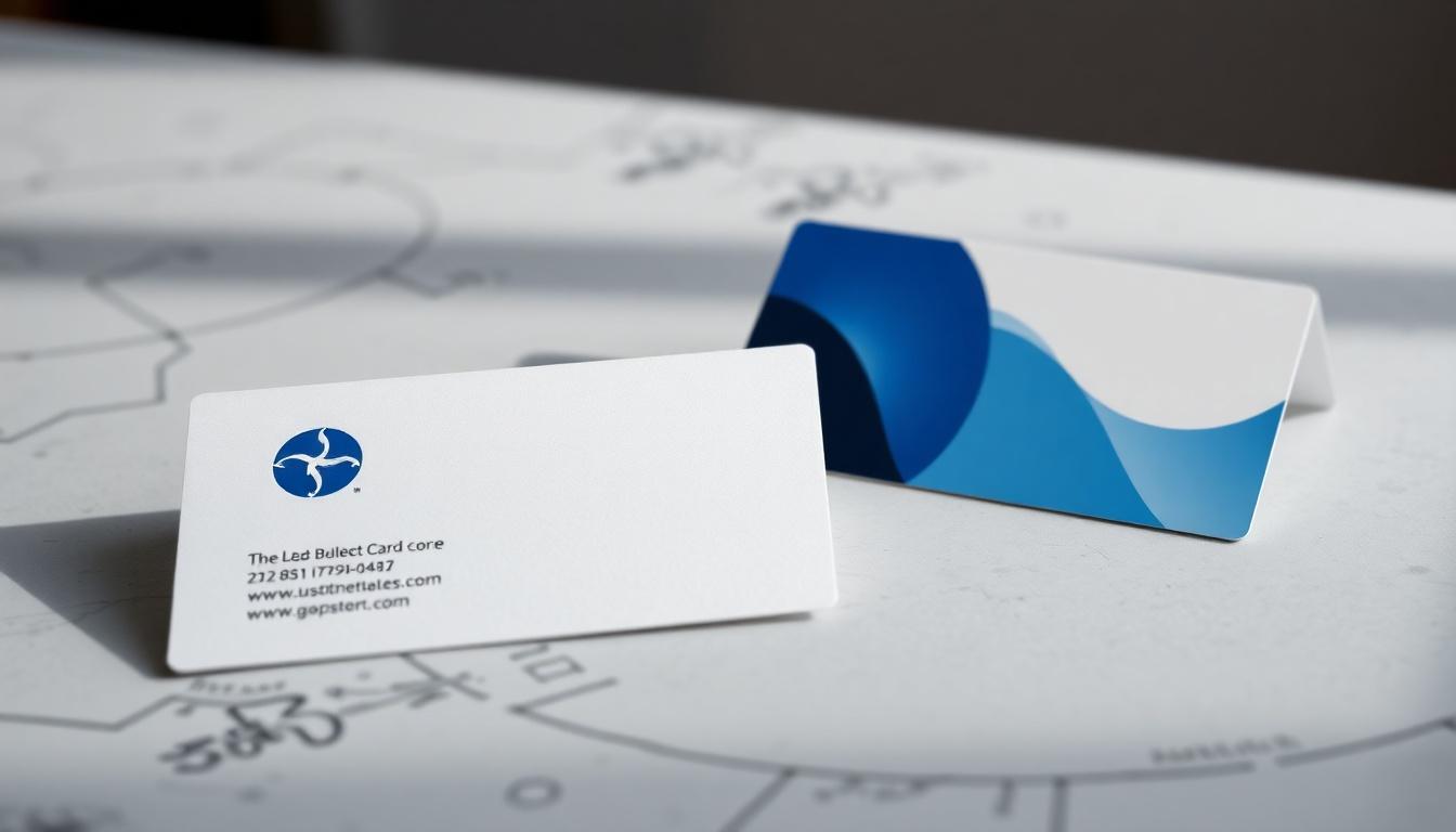
Tips on business card content start with one rule: every element must earn its place. A standard business card is 3.5 x 2 inches. That's not a lot of real estate. Here's what belongs there - and how to make each piece count.
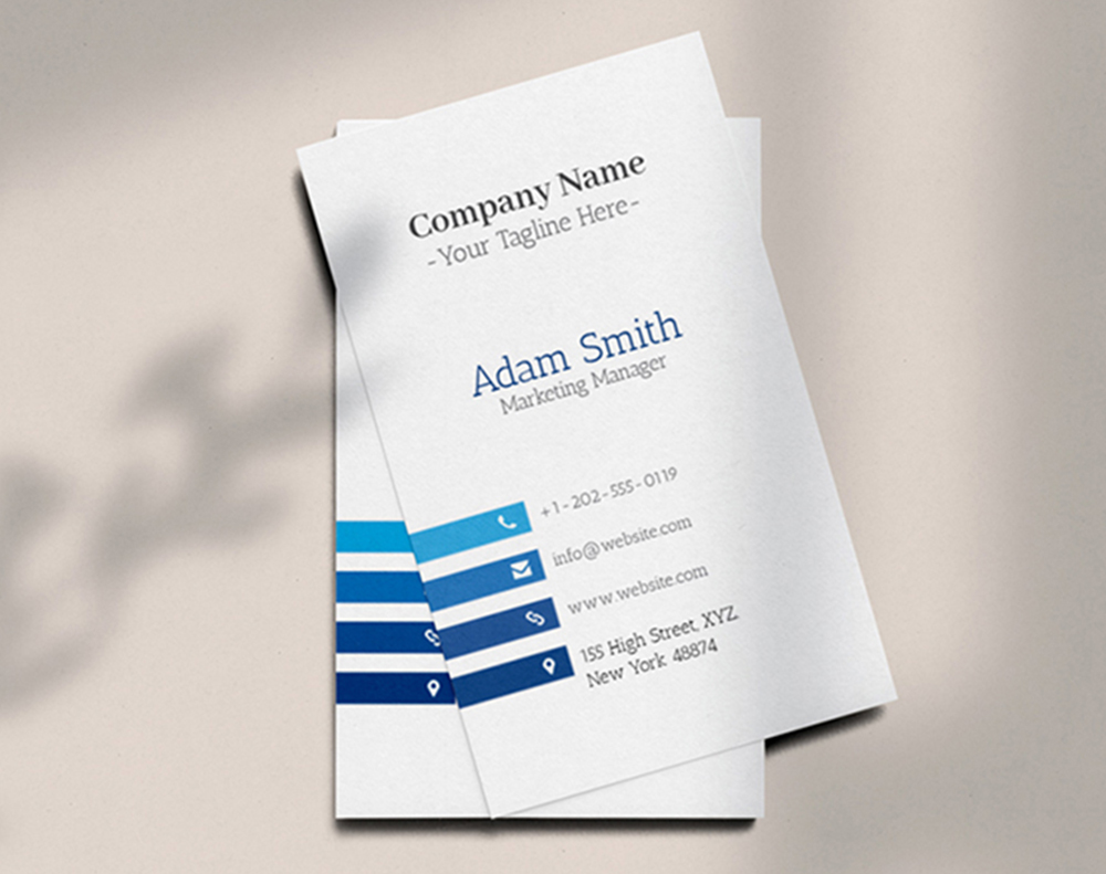
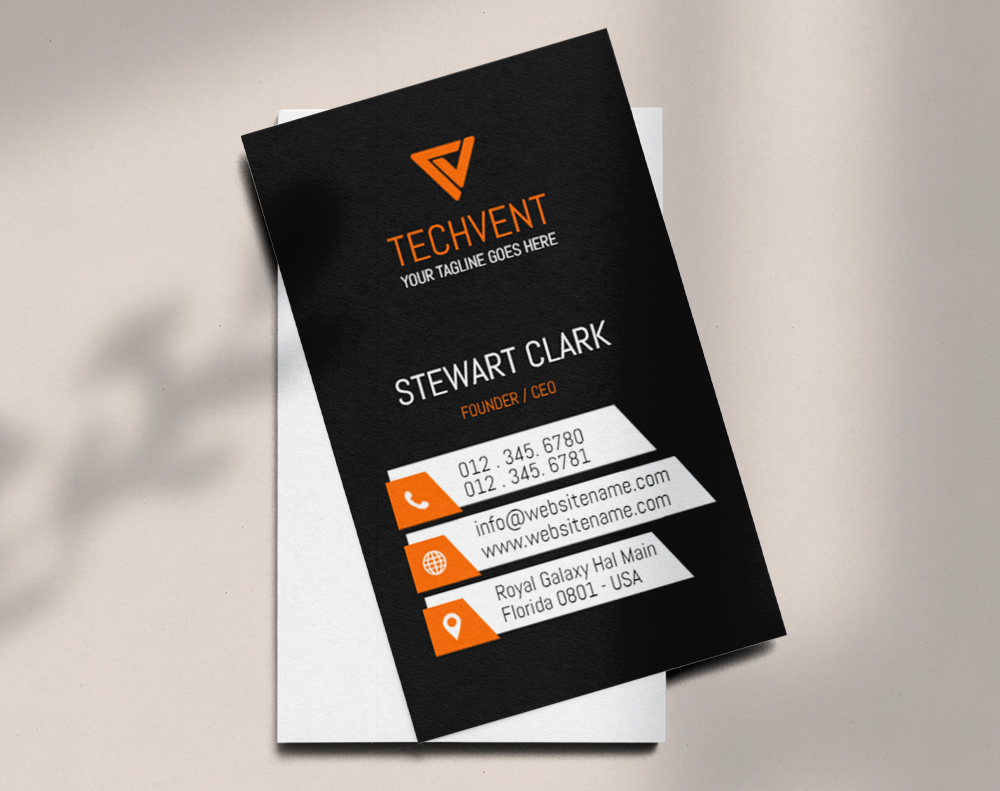
Your Name and Job Title
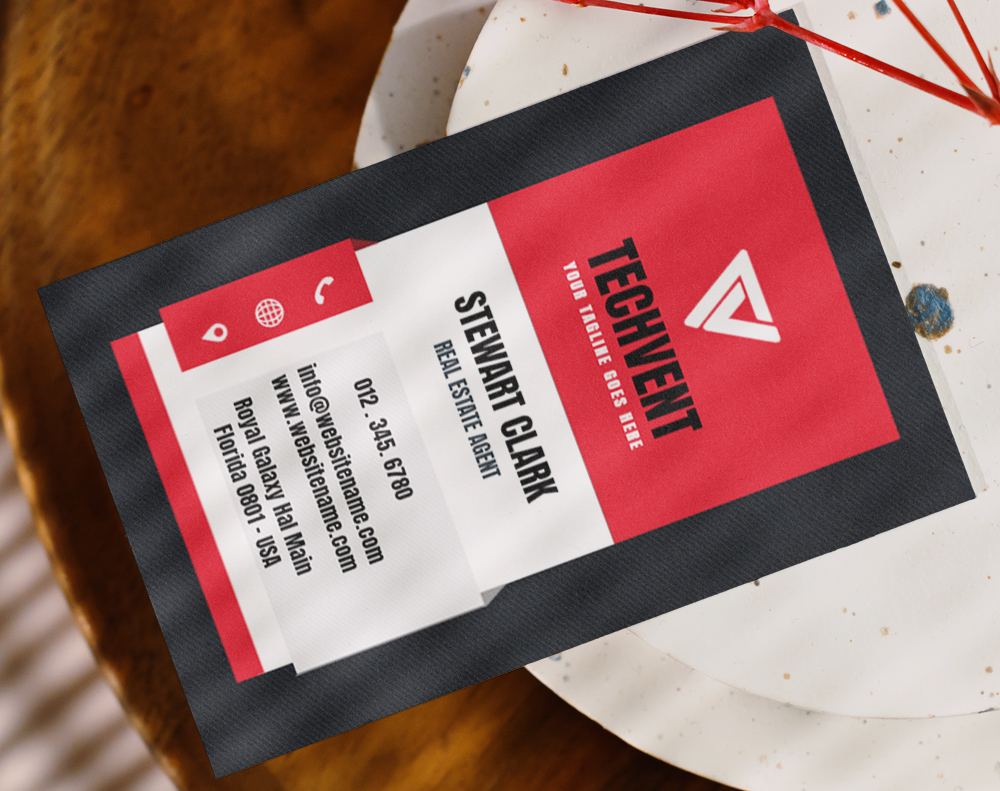
This sounds obvious. But you'd be surprised how many cards get the basics wrong. Your name should be the most prominent text element on the card after your logo. Use your professional name - the one people actually call you. If you go by "Mike" instead of "Michael," put Mike on the card.
Your job title goes right below your name. Keep it clear and specific. "Marketing Director" tells someone exactly what you do. "Brand Evangelist and Growth Hacker" tells them nothing useful. If your title is long, shorten it to the version that communicates your role fastest. People scanning your card won't puzzle over creative titles.
"I switched from 'Chief Happiness Officer' to 'Customer Success Manager' on my cards. The number of follow-up calls I got after events doubled. People finally understood what I actually did."
- Rachel K., SaaS Startup Founder
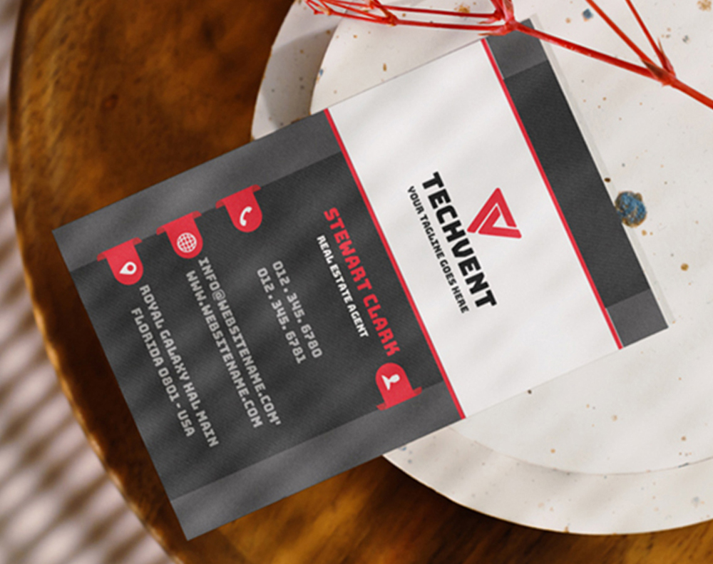
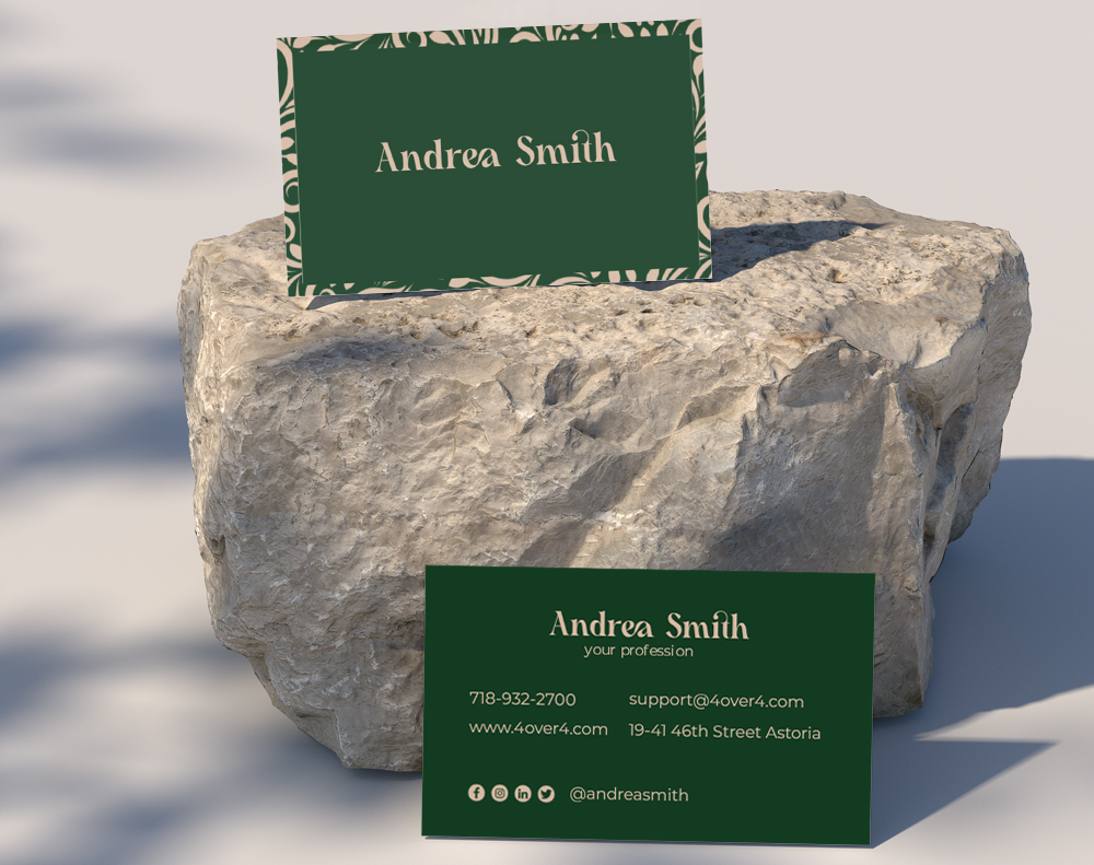
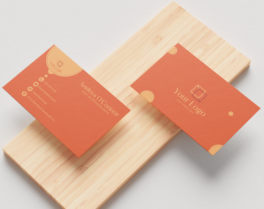
Logo and Tagline That Build Instant Recognition
Your logo is your visual anchor. It should appear on every card, positioned where the eye naturally goes first - typically the top left or center. Make sure it's high-resolution. A pixelated logo on a printed card screams amateur.
A tagline is optional but powerful. If you have one, include it. A good tagline in 3-7 words tells someone your value proposition without them reading anything else. "Fast Plumbing. Done Right." communicates more than a paragraph of text ever could. For creative card formats that really showcase your brand, explore 3D Lenticular Business Cards - they add a visual wow factor that pairs perfectly with strong content.
Phone Number - Pick the Right One
Include one phone number. Maybe two if you genuinely use both. A mobile number and an office line can work. Three numbers? That's clutter. Your prospect doesn't want to guess which one to call.
Format your number consistently. Use dashes or dots - just pick one style and stick with it. Include the area code even if you're local. Cards travel. Someone might pick yours up in another city.
Email Address That Looks Professional
Use your business email. Not your personal Gmail. Not your college email from 2009. A branded email address (you@yourcompany.com) adds credibility instantly. It tells the recipient you're established enough to have your own domain.
Keep the email readable. If your company name is long, consider a shorter alias. "j.smith@company.com" reads better than "johnathan.smitherson@superlongcompanyname.com" at 8pt font on a tiny card. For more guidance on printed materials that complement your cards, visit the Faq Hub for dozens of how-to resources.
Website URL - Clean and Simple
Drop the "https://www." prefix. Everyone knows how websites work. Just print "yourcompany.com" - it's cleaner and saves space. If you have a specific landing page for networking contacts, even better. "yourcompany.com/meet" gives people a personalized experience when they visit.
Make sure the URL actually works before you print 500 cards. Test it. Then test it again. A broken link on a business card is worse than no link at all.
Social Media Handles - Be Selective
Don't list every platform you've ever signed up for. Pick one or two that are most relevant to your business. A photographer? Instagram makes sense. A B2B consultant? LinkedIn is the move. A restaurant owner? Maybe your TikTok or Facebook page.
Use the @ handle format when possible. It's compact and universally understood. If you're exploring other print marketing that ties into your social presence, learn How To Make Flyers that drive social engagement too.
Physical Address - When It Makes Sense
If clients visit your location, include the address. A retail store, a law office, a salon - these need addresses on their cards. If you work remotely or your office isn't client-facing, skip it. Use that space for something more useful instead.
When you do include an address, keep it to two lines max. City and state might be enough if the full street address makes things too crowded.
QR Codes - The Modern Addition
A QR code on the back of your card can link to your portfolio, a scheduling page, a video introduction, or your digital vCard. It bridges the physical-digital gap. Just make sure the QR code is large enough to scan easily - at least 0.75 inches square.
Don't let the QR code dominate the design. It's a tool, not the main event. Place it on the back if the front is already full. For blank starting points to plan your layout, check out Blank Templates from 4OVER4.
Blank Templates


White Space Is Content Too
Here's a tip most people miss: what you leave off the card matters as much as what you put on it. White space (or negative space) gives your content room to breathe. A card packed edge-to-edge with text feels desperate. A card with intentional spacing feels confident.
Aim for margins of at least 0.125 inches on all sides. Group related information together - contact details in one cluster, branding elements in another. The eye should flow naturally from one group to the next without confusion.
"We redesigned our business cards to remove our fax number and secondary email. Just cleaned things up. Clients started commenting on how 'premium' our cards felt. Same paper, same finish - just better content choices."
- David L., Architecture Firm Partner
The Back of the Card - Don't Waste It
A blank back is wasted opportunity. Use it for a QR code, a brief list of services, a memorable quote, appointment lines, or a referral offer. Some professionals print a mini portfolio or a map to their office. The back gives you a second canvas to reinforce your message.
If you're making other marketing materials alongside your cards, you might also want to learn How To Make Envelopes for matching stationery sets. And for creative promotional items that complement your cards at events, see Custom Magnets Faq.
Font Size and Readability
No text on your card should be smaller than 7pt. Ideally, keep body text at 8-9pt and your name at 10-12pt. If someone needs reading glasses to see your phone number, you've already lost them.
Stick to one or two font families. A sans-serif for contact info and a serif for your name can create nice contrast. Three or more fonts looks chaotic. Consistency builds trust - even at this small scale.
Below you'll find industry data, real examples, and templates to help you put these tips into action.
Content Mistakes That Ruin an Otherwise Great Card
Even with solid tips on business card content in hand, people still make avoidable errors. Here are the most common ones 4OVER4 sees across thousands of print orders.
- Cramming too much text. If you can't read every line at arm's length, you've got too much on there. Cut the fax number. Cut the secondary address. Less is more.
- Using outdated contact info. Old phone numbers, defunct email addresses, or a website that redirects - these kill credibility instantly. Review your content before every reorder.
- Inconsistent branding. Your card's colors, fonts, and logo should match your website, social media, and other print materials. Mismatched branding confuses people.
- Forgetting a call to action. "Visit our website" or "Book a free consultation" gives the recipient a reason to act. Without direction, your card just sits there.
- Tiny or decorative fonts. That script font looks beautiful on screen. On a 3.5 x 2 inch card at 7pt? Unreadable. Always prioritize legibility over aesthetics.
4OVER4 offers free proofs on every order so you can catch these mistakes before they're printed on 500 cards.
Cards Worth Printing Once Your Content Is Dialed In
Great content deserves a great card to live on. 4OVER4 prints on 60+ paper types with options ranging from budget-friendly 14pt to ultra-thick 32pt stocks. Once your business card content is finalized, pick a format that matches your brand's personality.
Want to test your design without commitment? Start with Free Business Cards to see how your content looks in print. Need cards fast for an upcoming event? Same Day Printing gets them to you quickly. And if budget is tight, grab another round of Free Business Cards to share with your whole team.
Ink Color
Finish
Variable Data (Codes, Names, Etc.)
Rounded Corners
Total Sets
Proof Options
Here's a look at what other customers are saying about their 4OVER4 business cards.
Free Design Templates
"Ordered tips on business card content from 4OVER4 and the quality blew me away. Sharp colors, premium feel, arrived 2 days early."
"Been using 4OVER4 for tips on business card content for a year. Consistent quality every time. The online designer made it easy."
"Switched to 4OVER4 and saved 40% on tips on business card content. Better quality than my old printer. 60+ paper options."
"4OVER4's tips on business card content helped us look more professional. Clients notice the difference."
Your Business Card Content Questions, Answered
What information is absolutely required on a business card?
At minimum, include your name, job title, company name, phone number, and email address. A logo and website URL round out the essentials. Everything else - social handles, QR codes, taglines - is optional but recommended if space allows. 4OVER4's standard 3.5 x 2 inch cards give you enough room for all core content.
How many phone numbers should I put on my business card?
One is ideal. Two is the max. Listing a mobile and office line works if you actually answer both. Three or more numbers creates confusion - your prospect won't know which to call first, so they might not call at all.
Should I include a QR code on my business card?
Yes, if it links to something useful - a scheduling page, portfolio, or digital contact card. Make the QR code at least 0.75 inches square so it scans reliably. Place it on the back if your front is already full of content.
What font size works best for business card text?
Never go below 7pt for any text. Body content like phone numbers and emails reads best at 8-9pt. Your name should be 10-12pt. Test readability by printing a proof and reading it at arm's length.
Is it better to use the front and back of a business card?
Absolutely. A blank back is wasted space. Use it for a QR code, services list, appointment lines, or a brief tagline. Double-sided printing from 4OVER4 costs very little extra and doubles your content real estate.
How do I decide which social media to include on my card?
Pick one or two platforms where you're most active and where your audience actually is. A B2B professional should list LinkedIn. A visual creative should list Instagram. Don't include platforms you rarely update - it looks worse than listing none.