What You'll Learn in This Pocket Folders Branding Guide
Pocket Folders are one of the most underrated branding tools in print. This pocket folders branding guide covers how to design folders that reflect your brand identity, which paper stocks and finishes match your goals, and how to avoid common design mistakes. 4OVER4 has helped 150,000+ businesses create branded print materials - including custom Pocket Folders that make lasting impressions at meetings, conferences, and client presentations.
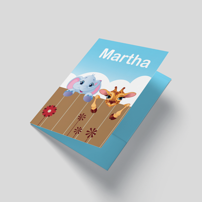
Pocket Folders
Starting from $844.54
Order Custom Pocket Folders with Quality Printing
Free Design Templates:
Why Custom Pocket Folders Still Matter for Your Brand
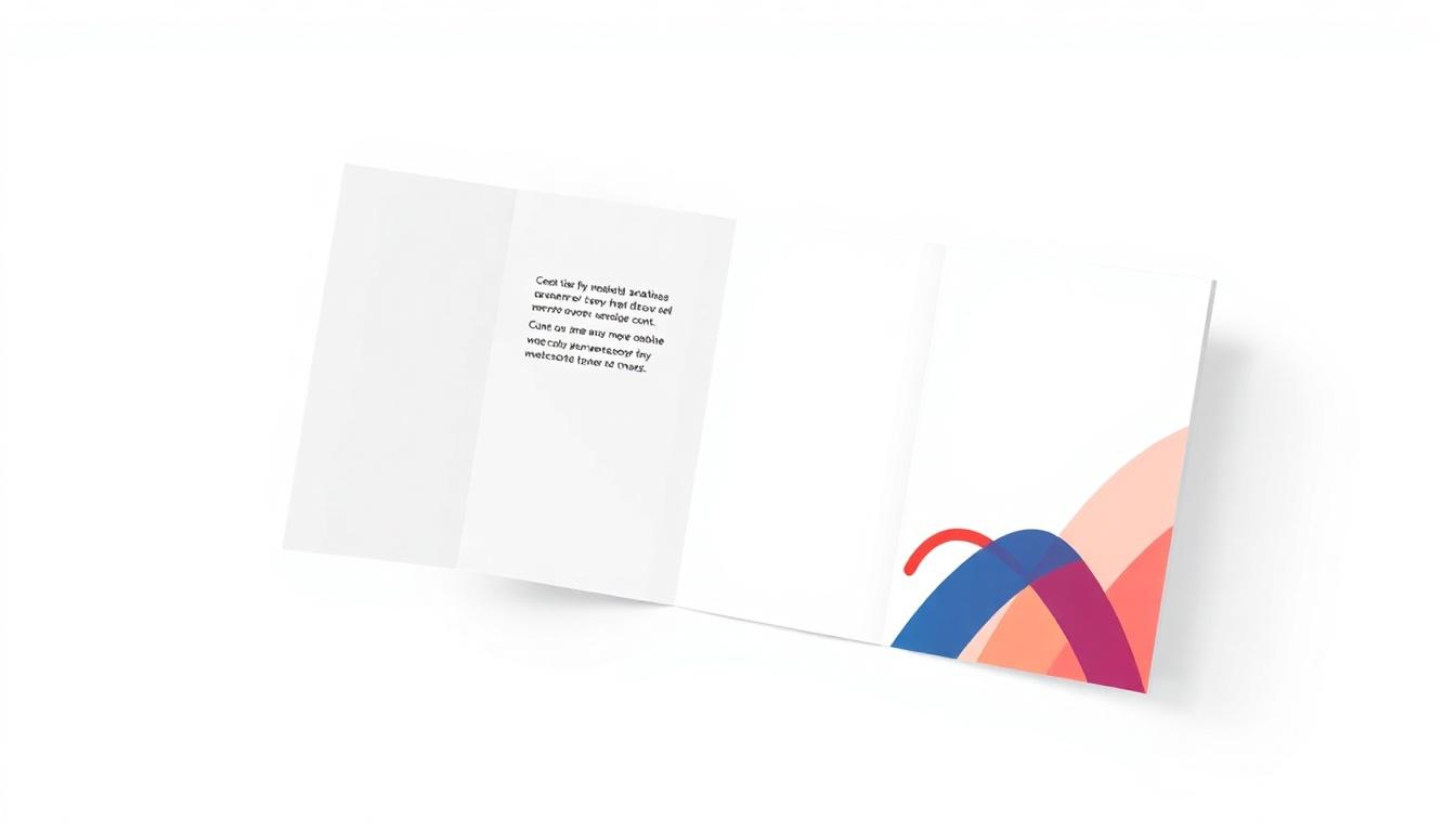

"Pocket Folders /5"
| Quantity | Price Per Unit |
|---|---|
| 250 | $3.38 |
| 800 | $1.63 |
| 3,000 | $0.93 |
| 10,000 | $0.71 |
Ink Color
Finish
Business Card Slits
Proof Options
"Raised Foil Pocket Folders /5"
Ink Color
Print Embellishment
Foil Color
Additional Embellishment
Business Card Slits
Proof Options
"Raised Spot Uv Pocket Folders /5"
Ink Color
Print Embellishment
Additional Embellishment
Business Card Slits
Proof Options
Pocket Folders aren't just document holders. They're your brand's handshake before you say a word. When you hand a prospect a well-designed folder at a meeting, you're communicating professionalism and attention to detail in a way no PDF attachment ever could. With 10,000+ reviews and a 4.8/5 star rating, 4OVER4 knows what it takes to make printed materials that actually work.
This guide walks you through every decision - from paper weight to finish, from logo placement to color strategy. Whether you're building folders for a real estate closing package or a corporate onboarding kit, you'll find actionable advice here. If you're also working on other branded materials, check out our guide on How To Fold A Brochure for companion pieces that pair well with your folders.
And if you're into hands-on print projects, our resource on How To Clean Rubber Stamps covers another classic branding tool worth exploring.
How to Brand Your Pocket Folders the Right Way
Start With Your Brand Identity, Not the Template
The biggest mistake people make? Jumping straight into a template without thinking about what their brand actually needs to say. Before you pick a color or upload a logo, get clear on three things: your brand's personality, your audience, and the context where this folder will be used.
A law firm handing folders to clients during estate planning meetings needs a completely different look than a creative agency pitching a new campaign. The folder itself sends a message. Make sure it's the right one.
Define your brand pillars first. Are you luxury? Budget-friendly? Eco-conscious? Playful? Each of these translates into specific design choices - paper thickness, finish type, color palette, and typography. Write these down before you touch any design software.
Choosing the Right Paper Stock for Your Brand Message
Paper stock is where your brand literally becomes tangible. The weight and texture of your Pocket Folder tells people something about your business before they even open it.
Thicker stock signals authority. A 14pt or 16pt card stock feels sturdy and professional - think of it as the thickness of a standard business card. If you want something that screams premium, go heavier. The physical weight of the folder in someone's hand creates an unconscious association with quality and trustworthiness.
For brands that want to stand out with transparency or a modern edge, materials like 30Mil Clear Plastic Cards show what's possible when you think beyond traditional paper. That same creative thinking applies to folder design.

"We ordered custom Pocket Folders for our annual investor meeting, and the 16pt stock with soft-touch lamination made our materials feel like they came from a Fortune 500 company. Clients commented on the quality before even reading the contents."
Logo Placement and Visual Hierarchy on Pocket Folders
Your logo goes on the front cover. Always. That's non-negotiable. But where on the front, and how big - that's where strategy comes in.
Center-placed logos work for formal, symmetrical brands. Off-center or bottom-right placement feels more modern and active. The key is consistency with your other branded materials. If your business cards use a bottom-left logo, your Pocket Folders should follow the same visual language.
Don't overcrowd the front cover. White space isn't wasted space - it's breathing room that makes your logo and tagline pop. A clean front cover with just your logo, a subtle pattern or texture, and maybe a tagline outperforms a busy design every single time.
Inside Panel Design - The Space Most Brands Waste
Here's where most people drop the ball. The inside panels of your Pocket Folder are prime real estate, and too many brands leave them blank or throw in a generic "About Us" paragraph nobody reads.
Use the inside panels strategically:
- Left inside panel: Brief company story, mission statement, or key differentiators - keep it under 50 words
- Right inside panel: Contact information, QR code linking to your website, or a call-to-action
- Pockets: Brand the pocket flaps with your color palette or a subtle pattern
- Business card slit: Always include one - it's expected and functional
If you're creating complementary print pieces to go inside the folder, our guide on How To Make Flyers covers insert design that pairs perfectly with branded folders.
Color Strategy That Reinforces Your Brand
Your Pocket Folder's color palette should match your brand guidelines exactly. This sounds obvious, but you'd be surprised how many folders come back from print with colors that are "close enough" instead of spot-on.
Use Pantone or CMYK values from your brand guide. Don't eyeball it. Don't use the hex codes from your website and hope they translate to print. Screen colors and print colors are different animals. Request a proof before your full run to make sure the blue on your folder matches the blue on your business card.
Dark backgrounds with light text create a bold, premium feel. Light backgrounds with dark text feel clean and approachable. Full-bleed color (edge to edge, no white border) looks more polished than designs with white margins.
Finish Options That Add a Tactile Brand Experience
The finish on your Pocket Folder is what people feel. And touch creates memory. Studies in sensory marketing consistently show that tactile experiences increase brand recall.
Matte finishes feel sophisticated and modern. They reduce glare, which is great for folders used in well-lit meeting rooms. Matte also pairs well with spot UV - where you add a glossy, raised element to specific areas like your logo.
Gloss finishes make colors pop and feel slick in the hand. They work well for creative industries, retail brands, and any company that wants high visual impact.
Soft-touch lamination is the premium play. It gives your folder a velvety, almost suede-like texture that people don't want to put down. It's the finish that makes someone say "wow, this feels nice" - and that reaction is pure brand equity.
Raised Foil and Raised Spot UV add dimension. Your logo literally rises off the surface. It's a conversation starter and a credibility builder in one.
Raised Foil Pocket Folders
Starting from $1037.97
Free Design Templates:
"I chose the Raised Foil Pocket Folders for our boutique hotel's welcome packages. Guests actually keep them as souvenirs. The gold foil on navy stock looks incredible and matches our lobby aesthetic perfectly."
Designing for Different Use Cases
Your Pocket Folder design should change based on how it's being used. A one-size-fits-all approach wastes the opportunity to connect with specific audiences.
Real estate agents: Include a property listing insert pocket, your headshot on the back panel, and contact info with a QR code to your listings page. Keep the design clean and aspirational.
Corporate onboarding: Use your company colors, include the company mission on the inside panel, and design pockets large enough to hold employee handbooks, benefits summaries, and welcome letters.
Event and conference handouts: Go bold with your event branding. Include the event schedule on the inside panel and make sure the folder can hold a standard letter-size program.
Sales presentations: Lead with your value proposition on the front. Inside, include a brief case study or testimonial. The folder should build confidence before the prospect even opens it.
For more printing tips across different product types, browse the Faq Hub for guides on everything from envelopes to magnets.
File Setup and Print-Ready Artwork
Getting your design file right saves time, money, and frustration. Here are the non-negotiables for print-ready Pocket Folder artwork:
- Resolution: 300 DPI minimum - anything lower will look blurry in print
- Color mode: CMYK, not RGB - RGB is for screens, CMYK is for ink on paper
- Bleed: Extend your design at least 0.125" beyond the trim line on all sides
- Safe zone: Keep text and important elements at least 0.125" inside the trim line
- File format: PDF is preferred - it preserves fonts, colors, and layout accurately
If you're also creating matching envelopes for your branded package, the guide on How To Make Envelopes walks through similar file prep steps. And for custom promotional items to include in your folder, check out Custom Magnets Faq for branded insert ideas.
Templates and Design Inspiration
Not starting from scratch is smart, not lazy. 4OVER4 offers ready-to-customize templates that already have the correct dimensions, bleed areas, and fold lines built in. You just add your branding.
Below you'll find design templates to help you get started with your Pocket Folder project. Each template is pre-configured to the correct print specifications.
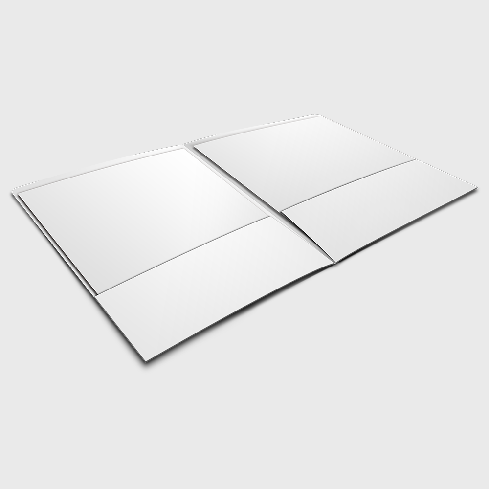
Blank Templates

Pocket Folder Branding Mistakes That Cost You Credibility
Even experienced marketers make these errors with their pocket folders branding guide execution. Here's what to watch for:
- Using low-resolution logos. A pixelated logo on a printed folder looks worse than no logo at all. Always use vector files (AI, EPS, or high-res PDF) for your logo artwork.
- Ignoring the spine. If your folder will hold thick document stacks, you need a gusseted (expandable) spine. Flat spines on stuffed folders buckle and look cheap.
- Mismatched branding. Your folder's colors, fonts, and tone should match your business cards, letterhead, and website. Inconsistency signals disorganization.
- Skipping the proof. 4OVER4 offers proofs for a reason. Colors shift between screen and print. Always review a proof before committing to a full run.
- Overloading the design. Less is more. A cluttered folder with too much text, too many images, and competing visual elements confuses instead of impresses.
With 25+ years in the printing business, 4OVER4 has seen every mistake in the book. Don't be the brand that hands out a folder with a blurry logo and mismatched Pantone colors.
Best Pocket Folder Options for Your Brand
Choosing the right Pocket Folder product depends on your brand positioning and budget. 4OVER4 offers several options that cover the full spectrum from professional to premium.
If sustainability matters to your brand, explore Green Printing options that align your materials with your values. And if you're planning an event alongside your branded folders, grab Free Invitations to complete your print package. You can also use Free Invitations as promotional inserts inside your Pocket Folders for upcoming events or open houses.
Here's a look at pricing and specifications for the Pocket Folder products available through 4OVER4:
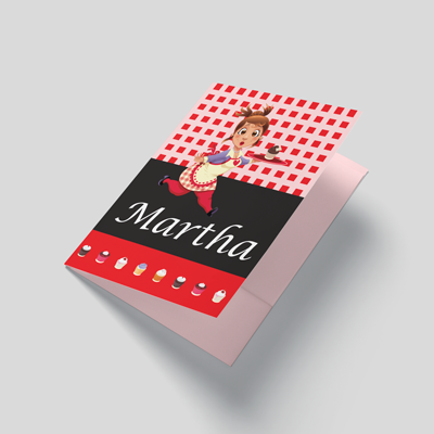
Free Design Templates
Ink Color
Finish
Business Card Slits
Proof Options
"Ordered pocket folders branding guide from 4OVER4 and the quality blew me away. Sharp colors, premium feel, arrived 2 days early."
"Been using 4OVER4 for pocket folders branding guide for a year. Consistent quality every time. The online designer made it easy."
"Switched to 4OVER4 and saved 40% on pocket folders branding guide. Better quality than my old printer. 60+ paper options."
"4OVER4's pocket folders branding guide helped us look more professional. Clients notice the difference."
Common Questions About Branding With Pocket Folders
What size are standard Pocket Folders?
Standard Pocket Folders measure 9" x 12", which holds letter-size (8.5" x 11") documents comfortably. This is the most common size for business presentations, real estate packages, and corporate onboarding kits. 4OVER4 prints to exact specifications so your inserts fit perfectly every time.
Can I print full-color designs on both sides of a Pocket Folder?
Yes. Full-color printing on both exterior and interior panels is available. Printing the inside panels reinforces your brand and makes the folder feel more complete. Most brands that follow a pocket folders branding guide choose full-color on at least the inside panels and pockets.
What's the difference between Raised Foil and Raised Spot UV Pocket Folders?
Raised Foil adds a metallic, reflective element (gold, silver, copper) that literally shines. Raised Spot UV adds a clear, glossy raised texture - same dimensional effect but without the metallic look. Foil feels more luxurious. Spot UV feels more modern and subtle.
How many Pocket Folders should I order for a branding campaign?
Order based on your distribution plan. For a single event or conference, 100-250 is typical. For ongoing sales use, 500-1,000 gives you a better per-unit price and enough stock for several months. 4OVER4's quantity tiers make it easy to find the sweet spot between cost and volume.
Do Pocket Folders come with business card slits?
Yes. Most Pocket Folder configurations include a business card slit on the right pocket. This is a standard feature that keeps your contact info attached to the folder without loose cards falling out.
What file format should I use for my Pocket Folder design?
Submit your artwork as a print-ready PDF in CMYK color mode at 300 DPI resolution. Include 0.125" bleed on all sides. 4OVER4 also provides downloadable blank templates with the correct dimensions and fold lines already set up, so your design aligns perfectly with the final printed product.