What You Need to Know About Sandwich Business Cards
A sandwich business card is a triple-layered card where two outer printed sheets bond around a colored or textured inner core. Think of it like a literal sandwich - bread, filling, bread. The result? A card that's noticeably thicker, more rigid, and impossible to ignore. 4OVER4 offers these multi-layered cards across 60+ paper types, giving you full control over color combinations and finishes that match your brand identity.
Why Sandwich Business Cards Deserve Your Attention
Most business cards get tossed within a week. Sandwich Business Cards don't. That colored edge peeking out between layers catches the eye before anyone even reads your name. It's a small detail that changes how people perceive your brand - from forgettable to premium.
With a sandwich business card explained simply, you're looking at a card built from three bonded layers. The outer layers carry your design. The inner layer adds color, contrast, and serious heft. When someone holds your card, they feel the difference immediately. That tactile moment builds trust before a single word is exchanged.
4OVER4 has printed 10 billion+ cards since 1999, and Sandwich Business Cards remain one of the most requested specialty formats. Browse our Showcase to see real client work, explore the Online Designer to start building yours, and rest easy knowing every order is backed by our 5 Gold Guarantees.
How Sandwich Business Cards Are Built - Layer by Layer
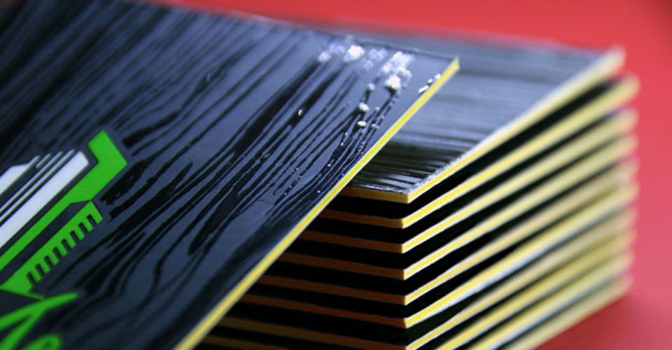
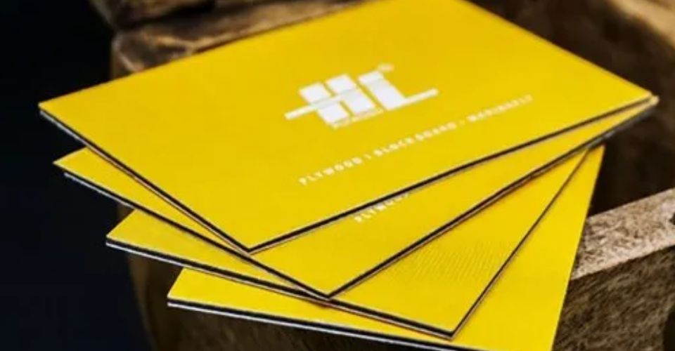
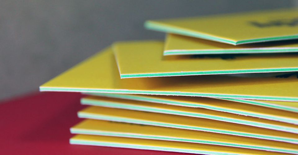
A Sandwich Business Card uses a triple-layer construction. Two printed outer sheets get laminated around a center core, which is typically a different color or material. The bonding process creates a single, rigid card that's roughly 32pt to 40pt thick - about three times the thickness of a standard business card.
The colored core is the signature element. When you look at the card from its edge, you see a vivid stripe of color running through the middle. That stripe can match your brand palette, contrast against it, or add a pop of unexpected color. It's a design detail that works on a subconscious level. People notice it, even if they can't articulate why the card feels different.
The Anatomy of Each Layer
The front layer carries your primary design - logo, name, title, contact info. This is standard business card territory, printed in full CMYK color. You can add spot UV, foil stamping, or embossing to this surface for extra dimension.
The core layer is where things get interesting. This middle sheet is usually a solid color - black, red, gold, blue, green, or any shade that fits your brand. Some printers offer textured or metallic cores. The core doesn't carry any printed design. Its job is purely structural and visual. It adds weight and that distinctive colored edge.
The back layer mirrors the front in terms of print quality. You can run a completely different design on the back, or keep it minimal with just your website and a QR code. Either way, the back sheet bonds to the core just like the front, creating a smooth, solid card.
If you're exploring other creative print projects alongside your cards, check out our guide on How To Make Flyers for complementary marketing materials.
Why the Layered Construction Matters
Thickness communicates quality. That's not opinion - it's psychology. When someone receives a card that feels hefty and rigid, they associate it with a business that invests in details. A flimsy card says "budget." A Sandwich Business Card says "we don't cut corners."
The durability factor is real, too. Standard 14pt cards bend, crease, and show wear quickly. A triple-layered card resists bending. It holds its shape in wallets, pockets, and desk drawers. Your contact info stays legible and your design stays crisp for months.
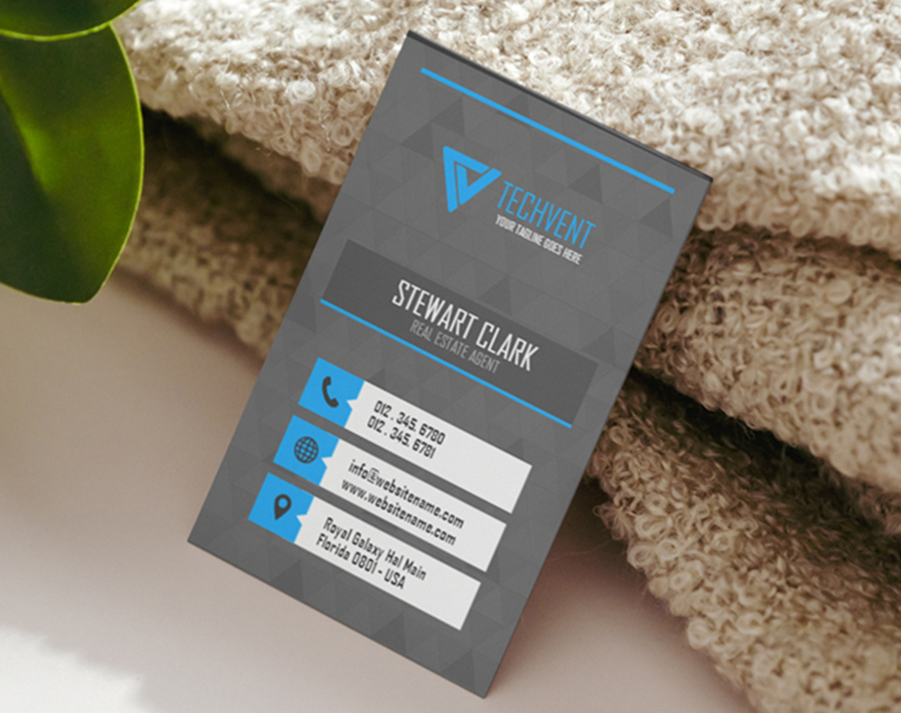
"I ordered Sandwich Business Cards with a red core for my real estate firm. Every single client comments on how thick and premium they feel. I've never had so many people actually keep my card." - Derek L., Real Estate Broker ★★★★★
Who Should Use Sandwich Business Cards?
Not every business needs a triple-layered card. But some industries and roles benefit more than others. Here's where Sandwich Business Cards make the biggest impact.
Luxury and High-End Brands
If you sell premium products or services - fine dining, luxury real estate, high-end consulting, boutique hospitality - your card needs to match that positioning. A standard card creates a disconnect. A Sandwich Business Card with a gold or black core reinforces the luxury message before you even speak.
Creative Professionals
Designers, photographers, architects, and artists live by visual impact. A layered card with a bold core color doubles as a design portfolio piece. It shows potential clients that you care about craft and presentation. For more ways to present your creative work, visit the Showcase gallery.
Networking-Heavy Roles
Sales reps, recruiters, event coordinators, and startup founders hand out dozens of cards per week. At crowded networking events, your card competes with fifty others in someone's pocket. The colored edge and extra thickness make yours the one they pull out later. It's a conversation starter - people genuinely ask about the layered construction.
Professional Services
Attorneys, financial advisors, and consultants need cards that project credibility without being flashy. A Sandwich Business Card with a subtle navy or charcoal core achieves that balance perfectly. It's understated but unmistakably premium.
Want to pair your cards with other branded materials? Our How To Make Envelopes guide walks you through creating matching stationery.
Designing Your Sandwich Business Card for Maximum Impact
Great design on a Sandwich Business Card means working with the format, not against it. The layered construction gives you design opportunities that flat cards simply don't offer.
Choosing Your Core Color
This is the single most important design decision. Your core color is visible from every edge of the card, creating a border effect that frames your entire design. Here's how to think about it:
- Match your primary brand color for a cohesive, polished look that reinforces recognition
- Use a contrasting color to create visual tension and draw the eye to the card's edge
- Go metallic (gold, silver, copper) for an unmistakable luxury feel that catches light
- Choose black for a sleek, modern, and universally sophisticated appearance
- Pick white if your outer design is dark - the white edge creates a clean, architectural frame
Layout Considerations
Keep your design clean and uncluttered. The card itself is already a statement piece because of its thickness and colored edge. Overloading the surface with too many elements fights against the card's natural elegance. Let the layered construction do some of the heavy lifting.
Leave generous margins. The edge of a Sandwich Business Card is a design element, so give it room to breathe. Text or graphics that crowd the edges compete with the core color stripe instead of complementing it.
Consider using one side for essential contact information and the other for a bold graphic or your logo at scale. The rigidity of the card means both sides get equal attention - people naturally flip a thick card over to examine it.
For general design inspiration and print tips, browse the Faq Hub where 4OVER4 covers everything from file setup to finish selection.
Finish Options That Complement the Layered Look
The outer layers of your Sandwich Business Card can receive the same finishes as any premium card. Each finish interacts differently with the layered construction:
- Soft-touch matte - Creates a velvety surface that begs to be touched. Combined with the card's thickness, it's an incredibly tactile experience.
- Spot UV gloss - Highlights specific design elements (like your logo) with a glossy, raised coating while the rest stays matte. The contrast is striking.
- Foil stamping - Metallic foil on the outer layers paired with a matching metallic core creates a cohesive luxury effect.
- Embossing or debossing - Raised or recessed elements add another layer of texture to an already dimensional card.
Not sure which combination works best? Order Free Samples from 4OVER4 to feel the difference in person before committing to a full run.
Sandwich Business Cards vs. Standard and Ultra-Thick Cards
You might be wondering how a Sandwich Business Card compares to simply ordering a thicker stock. Here's the honest breakdown.
A standard 14pt or 16pt card is the industry baseline. It's functional, affordable, and gets the job done. But it bends easily and doesn't stand out in a stack. Think of it as the economy option.
An ultra-thick 32pt card adds serious weight and rigidity. It feels premium and resists bending. But it's a single solid color throughout - no colored edge, no visual contrast from the side.
A Sandwich Business Card matches or exceeds the thickness of a 32pt card while adding the colored core. That edge stripe is the differentiator. It's a visual and tactile feature that ultra-thick cards can't replicate. You're getting thickness plus a design element that's impossible to achieve with single-layer printing.
"We switched from 32pt cards to Sandwich Business Cards with a copper core. The thickness is similar, but that copper edge gets comments every time. It's become part of our brand identity." - Monica R., Boutique Owner ★★★★★
If you're into creative print techniques, you might also enjoy learning about How To Clean Rubber Stamps or exploring How To Fold A Brochure for other hands-on projects. And for unique promotional items, our Custom Magnets Faq covers another great option for brand visibility.
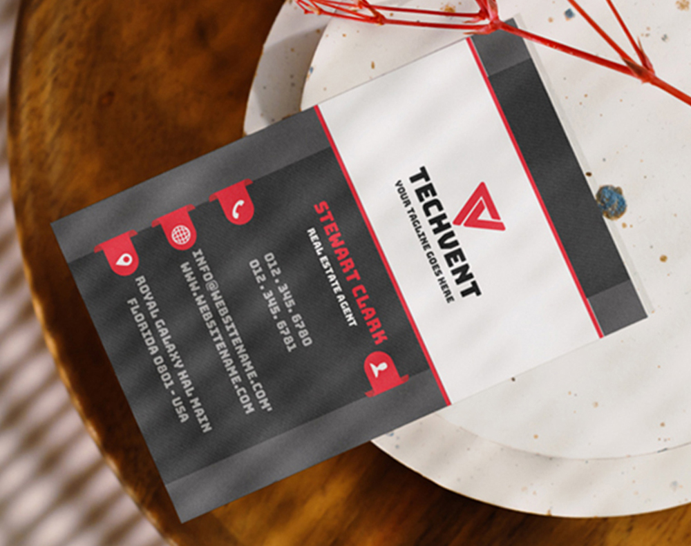
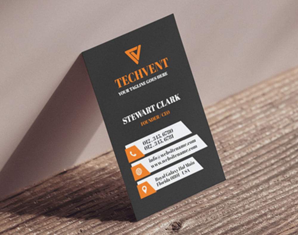
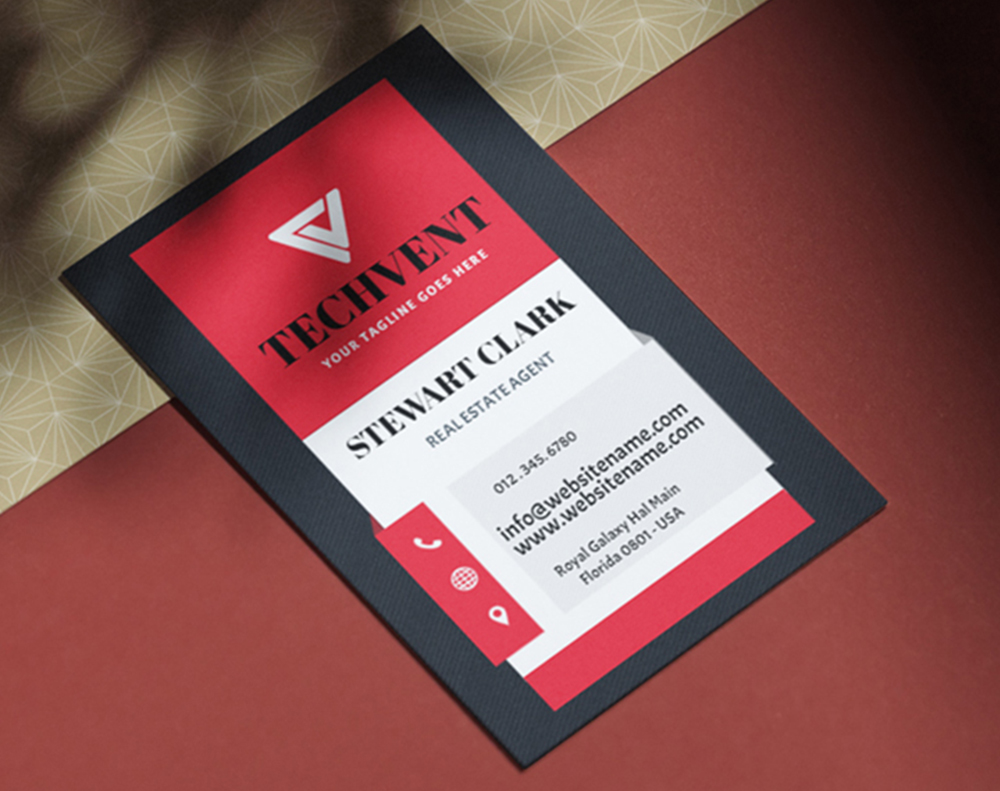
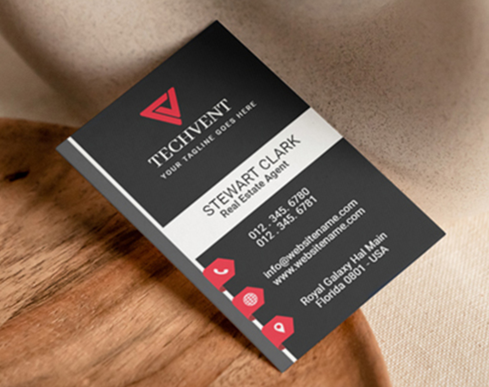
Below, you'll find design templates to help you get started with your Sandwich Business Card layout.
Blank Templates


Pitfalls to Avoid When Ordering Sandwich Business Cards
Even with a sandwich business card explained clearly, people still make avoidable mistakes. Here are the most common ones 4OVER4 sees.
Ignoring the core color. Some customers default to white and miss the entire point. The colored core is what makes this format special. Pick a color that means something for your brand.
Overdesigning the surface. The card's thickness and colored edge already command attention. Cramming both sides with text, patterns, and multiple logos creates visual noise. Simplify.
Forgetting bleed and margins. Triple-layered cards get trimmed after bonding. If your design runs too close to the edge, you risk cutting into important elements. Always set up proper bleed - typically 0.125 inches on each side.
Choosing clashing finishes. A glossy laminate over a card with a matte-textured core can feel disjointed. Make sure your surface finish complements - not competes with - the core material.
Ordering without samples. Colors look different on screen than in hand. 4OVER4's sample kits let you see and feel actual core colors before placing your full order.
"I almost went with a neon green core because it looked great on my monitor. Glad I ordered samples first - it clashed with my navy design in person. Switched to gold and it's perfect." - Tyrese W., Event Planner ★★★★
Best Card Options to Pair With Your Sandwich Business Cards
Once you've nailed your Sandwich Business Card design, consider expanding your lineup. 4OVER4 offers 1,000+ products that complement layered cards perfectly.
For a truly eye-catching alternative, try 3D Lenticular Business Cards - they use motion graphics that shift as you tilt the card. Paired with Sandwich Business Cards in your networking kit, you'll cover both tactile and visual impact.
-
Keep it concise: Avoid cluttering the card with excessive information. Instead, focus on key details and use white space for visual balance.
-
Maintain brand consistency: Does your card design align with your brand's overall aesthetics, including colors, fonts, and logo? Maintaining a cohesive identity will help your branding.
-
Use high-quality materials: Your prints is as good as the paper you print on. Using high-quality print materials will help to reflect the quality of your brand.
-
Incorporate a call-to-action (CTA): Encourage recipients to visit your website, follow you on social media, or contact you for more information.
-
Use the back of the card: Feature additional information, such as your business's unique selling points or customer testimonials, on the back.
Here's a closer look at card options and what real customers are saying about them.
Free Sandwich Business Card Templates
"Ordered sandwich business card explained from 4OVER4 and the quality blew me away. Sharp colors, premium feel, arrived 2 days early."
"Been using 4OVER4 for sandwich business card explained for a year. Consistent quality every time. The online designer made it easy."
"Switched to 4OVER4 and saved 40% on sandwich business card explained. Better quality than my old printer. 60+ paper options."
"4OVER4's sandwich business card explained helped us look more professional. Clients notice the difference."
Common Questions About Sandwich Business Cards
What exactly is a sandwich business card?
A Sandwich Business Card is a triple-layered card made by bonding two printed outer sheets around a colored inner core. The result is a thick, rigid card with a visible stripe of color along every edge. It's called "sandwich" because the construction mirrors bread-filling-bread. 4OVER4 prints these across multiple core color options to match any brand.
How thick is a sandwich business card compared to a standard card?
A typical Sandwich Business Card ranges from 32pt to 40pt, roughly three times the thickness of a standard 14pt card. For reference, a standard card is about the thickness of a cereal box panel. A sandwich card feels closer to a credit card or thicker - noticeably hefty in the hand.
Can I choose any color for the inner core layer?
4OVER4 offers a range of core colors including black, red, blue, green, gold, silver, and white. The available palette depends on current stock, so it's worth checking the latest options or ordering samples. Most brands find a close match to their primary brand color within the standard selection.
Are sandwich business cards more expensive than regular cards?
Yes, they cost more than standard single-layer cards because of the additional materials and bonding process. The price difference varies by quantity, but the per-card cost drops a lot at higher volumes. For businesses focused on premium positioning, the added cost per card is minimal compared to the impression it creates.
Do sandwich business cards work with special finishes like foil or embossing?
Absolutely. The outer layers of a Sandwich Business Card accept all the same finishes as standard premium cards - spot UV, foil stamping, embossing, debossing, and soft-touch lamination. Combining a specialty finish with the colored core creates a multi-sensory experience that flat cards simply can't match.
How should I set up my design file for a sandwich business card?
Set up your file the same way you would for any business card - CMYK color mode, 300 DPI resolution, and 0.125-inch bleed on all sides. You'll design the front and back as separate layers. The core color is selected during the ordering process, not in your design file. 4OVER4 handles the bonding and trimming.