Spot Color Printing at a Glance
Spot color printing uses pre-mixed, solid inks instead of layering tiny dots of cyan, magenta, yellow, and black. Each color gets its own ink well on press, delivering rich, consistent hues that process printing can't match. It's the go-to method for brand logos, metallic finishes, and any project where color accuracy matters. 4OVER4 offers spot color options across 1,000+ products, backed by 25+ years of printing experience.
Why Spot Color Printing Matters for Your Brand
So what is spot color printing, really? It's the difference between "close enough" and "dead-on accurate." When your brand's signature color needs to look identical on business cards, packaging, brochures, and banners, spot color is the only reliable path. Process printing (CMYK) approximates colors by mixing four inks. Spot color skips the guesswork entirely - one pre-mixed ink, one perfect result.
4OVER4 has printed 10 billion+ cards and counting, and color consistency is something our clients take seriously. Whether you're exploring Free Samples to test paper and ink combinations, browsing Design Templates for your next project, or even reading up on How To Clean Rubber Stamps for your DIY stamping setup, understanding spot color gives you a real edge in print quality.
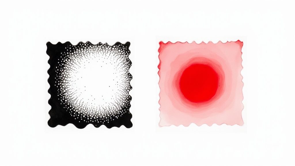
How Spot Color Printing Actually Works
Picture this. You walk into a paint store and ask for a specific shade of navy blue. The clerk doesn't hand you four cans of primary colors and say "good luck." They mix one can to your exact specification. That's spot color printing in a nutshell. A single, pre-mixed ink formulation goes onto the press for each color in your design. No blending on paper. No optical illusions. Just pure, solid color.
The press operator loads each spot color into its own ink station. If your design uses two spot colors - say, a navy blue and a gold - the press runs two stations. Each pass lays down a thick, even coat of that specific ink. The result is a density and vibrancy that CMYK process printing simply can't replicate.
The Pantone Matching System - Your Color's DNA
Spot color printing relies on the Pantone Matching System (PMS) as its universal language. Every shade in the Pantone library has a unique code - like PMS 286 C for a classic royal blue. That code is a precise ink formula. Any printer, anywhere in the world, can look up PMS 286 C and mix the exact same shade.
This removes all subjectivity. It's not "that blue looks about right." It's "this is PMS 286 C, period." Designers specify Pantone numbers in their files, and printers follow the recipe. No interpretation. No drift. If you're working on projects like brochures, our guide on How To Fold A Brochure covers the design side, but getting the color right starts with choosing the correct Pantone reference.
The Pantone system includes thousands of colors, plus specialty inks like metallics, fluorescents, and pastels that fall completely outside the CMYK gamut. That shimmery gold foil on a luxury business card? That's a spot color. The neon orange on a concert poster? Spot color again.
Spot Color vs. Process Color - What's the Real Difference?
Process color (CMYK) creates the illusion of color by printing tiny dots of cyan, magenta, yellow, and black at varying densities. Your eye blends those dots together. It works well for photographs and complex, multi-color designs. But it has limits.
CMYK can't produce every color the human eye can see. Certain bright oranges, deep purples, and vivid greens fall outside its range. Metallic and fluorescent inks? Impossible with process printing. And because CMYK relies on dot patterns, slight variations in press calibration can shift your color from print run to print run.
Spot color eliminates those variables. The ink is pre-mixed to the exact shade before it touches the press. There are no dots to misalign. No color drift between batches. For brand-critical work, this consistency is worth its weight in gold - sometimes literally, if you're using a metallic Pantone ink.
"We switched our logo printing to Pantone spot colors two years ago, and the difference is night and day. Our packaging in Chicago matches our trade show banners in Miami perfectly."
- Rachel K., Brand Manager
That said, spot color isn't always the right call. A full-color photograph needs CMYK. A design with 15 different colors would require 15 ink stations with spot color - expensive and impractical. The sweet spot (pun intended) is designs with one to three specific colors where accuracy matters most.
When Should You Use Spot Color Printing?
Spot color printing shines in specific situations. Here's when it makes the most sense:
- Brand identity materials - Business cards, letterheads, and envelopes where your logo color must be exact. Check out How To Make Envelopes for envelope design tips.
- Packaging and labels - Product boxes, bags, and tags that consumers see side by side on shelves.
- Specialty inks - Metallics, fluorescents, and opaque whites that CMYK can't produce.
- Large print runs - Spot color can actually be more cost-effective than CMYK for simple, one- or two-color jobs at high volumes.
- Legal and compliance printing - Documents where a specific color carries regulatory meaning.
If you're designing flyers for an event, our guide on How To Make Flyers walks you through the process. Creating Christmas Door Hangers with a bold, branded look? Spot color gives you that crisp, professional edge. And for promotional items like fridge magnets, our Custom Magnets Faq covers everything you need to know about getting those colors just right.
Spot Color in the Design File - Setting It Up Right
Getting spot color right starts in your design software. In Adobe Illustrator, InDesign, or Photoshop, you need to define your colors as "spot" rather than "process." This tells the printer to use a dedicated ink station instead of converting your color to CMYK dots.
Here's the basic workflow:
- Choose your Pantone color using a physical Pantone swatch book (screens lie about color).
- Define the swatch in your design software as a Pantone Spot Color, not a process color.
- Name it correctly - use the exact Pantone code (e.g., "PANTONE 485 C") so the printer's RIP software recognizes it.
- Check your separations before exporting. Each spot color should appear on its own separation plate.
- Export as PDF/X-1a or PDF/X-4 with spot colors preserved, not converted.
A common mistake? Picking a Pantone color on screen and assuming it'll look the same in print. Monitors display color using light (RGB). Ink on paper reflects light. They're fundamentally different. Always reference a physical Pantone swatch book printed on the paper stock you plan to use - coated (C) or uncoated (U) - because the same Pantone number looks different on each surface.
Cost Considerations for Spot Color Printing
Spot color pricing depends on how many colors you're using and your print quantity. For a simple one-color or two-color job, spot color can actually cost less than full CMYK because you're running fewer ink stations.
But add a third or fourth spot color, and costs climb. Each additional color means another plate, another ink station, and another pass through the press. Once you hit four or more colors, CMYK process printing usually becomes the more economical choice - unless those specific colors can't be achieved any other way.
The real value calculation isn't just about ink costs. It's about what color inconsistency costs your brand. A logo that shifts from royal blue to purplish-blue across different print runs? That erodes trust. For brand-critical work, the precision of spot color pays for itself. Visit the Faq Hub for more printing guidance.
Combining Spot and Process Color
You don't have to choose one or the other. Many professional print jobs combine CMYK process color with one or two spot colors. A brochure might use CMYK for photographs and a Pantone spot color for the company logo. This hybrid approach gives you the best of both worlds - photographic reproduction plus brand-accurate color.
When combining methods, your file will have the four CMYK separations plus additional separations for each spot color. A CMYK-plus-one-spot job runs five ink stations. It costs more than straight CMYK, but less than converting everything to spot colors.
"We print our catalogs in CMYK for the product photos, but our brand's green is always a Pantone spot. Customers notice when the green is off - it's our most recognizable element."
- David L., Marketing Director
4OVER4 can help you determine the right approach for your project. Request Free Samples to see how different ink methods look on various paper stocks before committing to a full run.
Below you'll find blank templates to help you get started with spot color printing projects:
Blank Templates


Pitfalls That Ruin Spot Color Print Jobs
Even experienced designers trip up with spot color printing. Here are the mistakes 4OVER4 sees most often - and how to avoid them.
Defining spot colors as process in your file. If your Pantone swatch is set to "process" instead of "spot" in your design software, the printer converts it to CMYK. You'll get an approximation, not the real thing. Always double-check your color mode before exporting.
Using screen colors as your reference. Your monitor can't display Pantone colors accurately. Period. Use a physical swatch book. The difference between what you see on screen and what prints on paper can be dramatic.
Forgetting coated vs. uncoated designations. PMS 186 C (coated) and PMS 186 U (uncoated) look noticeably different. Specify the correct suffix for your paper stock.
Overcomplicating the design. Spot color works best with clean, bold graphics. Trying to create photographic gradients with spot inks leads to banding and uneven coverage. Keep it simple, keep it sharp.
Not requesting a press proof. For high-stakes jobs, a digital proof isn't enough. Ask for a physical proof on the actual paper stock to confirm your spot color looks right.
Products That Benefit from Spot Color Printing
Spot color printing pairs naturally with products where brand consistency drives results. Business cards, letterheads, envelopes, and packaging all benefit from Pantone-matched inks. If you're also looking at sustainable options, 4OVER4's Green Printing program lets you maintain color accuracy while reducing environmental impact.
Below you'll find detailed product specifications, material options, and real customer reviews to help you choose the right products for your spot color projects:
| Attribute | Spot Color Printing | CMYK (Process Color) Printing |
|---|---|---|
| Method | Uses pre-mixed, solid inks applied one at a time. | Mixes tiny dots of Cyan, Magenta, Yellow, and Black to simulate colors. |
| Color Accuracy | Extremely high and consistent; perfect for brand colors. | Can vary slightly between print runs and different printers. |
| Vibrancy | Colors are cleaner, brighter, and more opaque. | Colors can appear less saturated as they are made of dot patterns. |
| Color Range | Can produce colors outside the CMYK gamut, like metallics and neons. | Limited to the colors that can be created by mixing C, M, Y, and K inks. |
| Best For | Logos, brand identity, designs with 1-3 specific colors, special effects. | Full-color photographs, complex images, designs with many colors. |
| Cost | More cost-effective for simple jobs; can be expensive for many colors. | Cost-effective for full-color designs, regardless of the number of colors. |
- Unmatched Accuracy: It delivers the most precise color match possible. Your brand colors will never be a shade off.
- Vibrancy and Purity: Colors look solid and incredibly clean because they’re laid down as a single, opaque layer of ink, not a pattern of tiny dots.
- Expanded Color Gamut: It opens the door to colors that are simply impossible to create with CMYK, including brilliant neons, rich metallics, and soft pastels. Check out our specialty printing collection to see how these unique inks can make a design pop.
- Consistency Across Materials: Spot colors hold their integrity beautifully across different paper stocks and finishes, from glossy business cards to uncoated cardboard packaging.
- Press Calibration: Minor differences in how a printing press is calibrated from one day to the next can alter the color.
- Paper Stock: The way ink dots soak into coated versus uncoated paper can dramatically change how a color looks.
- Ink Density: Tiny fluctuations in the amount of each ink laid down during a press run can lead to color variations from the first print to the last.
- Metallic Inks: Gold, silver, and bronze inks contain real metal particles, creating a genuine shimmer and a premium feel.
- Fluorescent (Neon) Inks: These inks absorb and reflect more light, resulting in colors that practically glow and demand attention.
- Varnishes: A clear spot varnish can be applied to specific areas to create a glossy or matte contrast, adding subtle texture and sophistication.
- Tiffany & Co. (PANTONE 1837 Blue): The famous blue box is so tied to the brand that the color itself is trademarked. The number "1837" is a nod to the year the company was founded, and this exact shade is meticulously reproduced on every single thing they make.
- T-Mobile (PANTONE Rhodamine Red U): This electric, energetic magenta is simply impossible to miss. T-Mobile uses this spot color to project a bold, modern, and disruptive personality that cuts through the noise in a crowded market.
- UPS (PANTONE 072 C): The deep "Pullman Brown" was chosen to represent stability, reliability, and professionalism. For over a century, this specific spot color has been a constant, reassuring symbol of the company's promise to deliver.
- Logos and Brand Elements: Your logo is your company’s handshake. Using a specific Pantone color ensures it looks exactly the same on your premium business cards, your letterhead, and your envelopes. It all works together to create a polished, cohesive brand experience.
- Color-Critical Packaging: Picture your product on a crowded store shelf. The color of its packaging is what makes it pop. A specific spot color guarantees your brand gets noticed and is instantly recognizable, print run after print run.
- Official Corporate Materials: For things like annual reports, formal documents, or company stationery, sticking to the official corporate color isn't just about looks—it's about projecting professionalism and authority.
- Metallic Inks: Add a touch of luxury with gold, silver, or bronze. These inks contain actual metallic particles, giving you a genuine, eye-catching shimmer.
- Neon and Fluorescent Inks: Want to grab attention immediately? These intensely bright colors almost seem to glow, making them perfect for event flyers, posters, or safety warnings.
- Pastel Inks: Achieve soft, delicate shades with a beautiful, creamy opacity that CMYK often struggles with, which can sometimes look washed out in comparison.
- All your photographic and multi-tonal elements are printed using the standard four CMYK plates.
- A fifth (or even sixth) plate is added, dedicated solely to printing your specific Pantone color for logos, text, or other key brand assets.
- Open the Swatches Panel: In Adobe Illustrator, you'll find this under
Window > Swatches. - Create a New Swatch: Look for the "New Swatch" icon at the bottom of the panel and give it a click.
- Set Up the Spot Color: The "New Swatch" dialog box is where the magic happens. Here’s what to do:
- Swatch Name: Be precise. Enter the exact Pantone name, like "PANTONE 286 C". This name is critical because it's what the printer uses to find the right can of ink.
- Color Type: This is the big one. Change the dropdown menu from "Process Color" to "Spot Color".
- Color Mode: You can pull your color from a library (like Pantone's) or just plug in CMYK/RGB values that look good on your screen. The on-screen look is just for you; the Swatch Name is what really matters for printing.
"Ordered what is spot color from 4OVER4 and the quality blew me away. Sharp colors, premium feel, arrived 2 days early."
"Been using 4OVER4 for what is spot color for a year. Consistent quality every time. The online designer made it easy."
"Switched to 4OVER4 and saved 40% on what is spot color. Better quality than my old printer. 60+ paper options."
"4OVER4's what is spot color helped us look more professional. Clients notice the difference."
Your Spot Color Printing Questions, Answered
What is spot color printing and how does it differ from CMYK?
Spot color printing uses a single pre-mixed ink for each color, applied directly to paper. CMYK process printing layers tiny dots of four inks to simulate colors. Spot color delivers exact, consistent hues - especially for brand logos and specialty inks like metallics that CMYK can't reproduce.
Is spot color printing more expensive than process printing?
Not always. One- or two-color spot jobs can cost less than full CMYK because fewer ink stations run on press. Costs increase with each additional spot color. At four or more colors, CMYK typically becomes cheaper unless you need inks outside the CMYK gamut.
Can I combine spot colors with CMYK in one print job?
Yes. Many projects use CMYK for photographs and add one or two Pantone spot colors for logos or brand elements. This hybrid approach balances photographic quality with brand-accurate color. Your file will need separate plates for each method.
What is the Pantone Matching System?
The Pantone Matching System (PMS) is a standardized color library used worldwide. Each color has a unique code and ink formula. Any printer can look up the code and mix the identical shade, removing guesswork from color reproduction across different print runs and locations.
Do I need a physical Pantone swatch book?
Yes. Computer monitors display color using light (RGB), which doesn't match how ink looks on paper. A physical swatch book - printed on coated and uncoated paper - is the only reliable way to choose and approve your spot color before printing.
When should I choose spot color over process color?
Choose spot color when your project has one to three specific colors that must be exact - brand logos, corporate stationery, packaging. Also choose spot color when you need metallic, fluorescent, or opaque white inks. For full-color photographs or designs with many colors, CMYK process is the better fit.