
What Is White Space in Design and How to Use It in Print


Sofia is our design and templates voice, built from the knowledge of our production team, with over 20 years in printing.
White space is the most powerful thing you can add to a layout by taking things away. This guide defines it without jargon, shows the same card before and after, and turns it into rules you can apply to the file you send to print today, from a 2 by 3.5 inch business card to a 30 by 40 inch vinyl wall graphic.
White space, also called negative space, is any area of a design left empty on purpose. It covers outer margins, gutters between columns, the clear zone around a logo and the spacing between lines and letters. It does not have to be white. Its job is to group related items, separate unrelated ones and give the reader a single obvious place to look first, which is why space-forward layouts read as calmer and more premium.
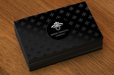
Start here
The short answer before the long one
White space is the empty area you leave in a layout on purpose. It is measured in margins, gutters, leading and clear zones rather than in inches of unused paper: on a 2 by 3.5 inch business card, a quarter inch of quiet edge inside the trim and leading around one and a half times the type size. It is what tells a reader which items belong together and which do not. Add space and a design gets easier to read and more expensive looking at the same time. Remove it and even good type, good photography and good stock will not save the piece.
Why empty space decides whether your print looks cheap or expensive

Hand two 2 by 3.5 inch cards to someone. One fills every square inch with a name, a title, two phone numbers, an address, a website, a tagline and a social handle. The other carries a name, one line of contact and a great deal of nothing. People reliably describe the second one as the more professional card, even when they cannot say why.
That reaction is white space doing its job. Emptiness signals confidence, because a design that does not need to fight for attention looks like it belongs to someone who has already earned it. It also signals care, since leaving room means someone decided what mattered and cut the rest.
The practical payoff is comprehension. A reader who can find the one important line in half a second walks away remembering it. A reader who has to hunt walks away remembering nothing at all. On a printed piece there is no scrolling and no search box, so the layout has one chance to make its structure obvious, and space is the tool that does it.
White space definition in plain English

White space is any area of a layout that carries no content on purpose. That includes the margin around the outside edge, the gutter between two columns, the gap under a headline, the space inside a letter such as the bowl of a lowercase a, and the room left around a logo so it is not crowded by type. On a business card, the outer margin is the quarter inch band inside the trim that the printer's safety line already asks for.
The name is a leftover from print history, when layouts were assembled on white paper and everything unprinted was literally white. The term stuck even though the space is often teal, black, kraft brown or a soft photograph. What defines it is absence of competing content, not the color of the surface underneath.
Designers usually split it two ways. Macro space is the large stuff: outer margins, the gap between the headline block and the footer, the empty half of a poster. Micro space is the small stuff: leading between lines, tracking between letters, the few millimeters between an icon and its label. Both matter, and beginners almost always underuse the first while accidentally destroying the second.
It is not wasted space, it is the structure holding everything up

The most common objection is that empty area is money left on the table. If you paid for 100 cards at $17.57, why not use every square inch of each one? The price of the run stays the same whether ink covers a tenth of the card or all of it. The answer is that a reader does not buy square inches, they buy clarity, and every extra element you add divides attention among everything already there.
Space is also what creates grouping. Human vision reads things that sit close together as belonging together, which means the size of each gap is a silent instruction. Put a phone number tight under a name and they read as one unit. Put the same phone number an equal distance from the name and the logo and it floats, belonging to neither.
This is why a layout can be fixed without deleting a single word. Tighten the gaps inside each group, widen the gaps between groups, and the same content suddenly has a visible skeleton. Nothing was removed. The information simply arrived in an order the eye could follow. You can see the same principle running through these graphic design portfolio examples, where each project gets room to be looked at on its own.
Before and after: the same card, two very different results
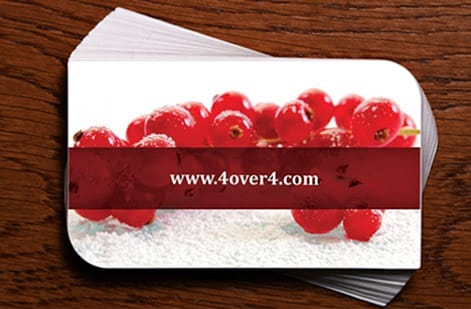
Before. The name sits 2mm from the trim edge. The logo is set at the same size as the job title. Six lines of contact detail run edge to edge in 7pt type with tight leading. A tagline fills the last free strip. Every element is technically legible and the card as a whole reads as noise, because nothing is bigger, nothing is quieter and nothing has room.
After. The outer margin grows to a comfortable quiet band on all four sides. The name goes up two sizes, the title drops to a small caps line directly under it so the two read as one unit, and the contact block moves to the lower left with a real gap above it. Two contact lines survive, the rest move to the back or come off entirely. The logo shrinks and takes a clear field around it.
Nothing about the print process changed. The stock, the ink, the finish and the price are identical. The second card simply gives the eye a path: name first, role second, how to reach you third. That is the whole trick, and it is why Interior Design Business Cards in a restrained layout look like a considered brand rather than a printout.
Margins, safety and the space the printer needs

Print adds a constraint that screens do not have. Sheets are cut in stacks and every cut carries a small tolerance, so anything sitting close to the edge risks being clipped on some pieces and not others. That is why every template shows a safety area inside the trim line, and the blank templates for a 2 by 3.5 inch card mark the trim, bleed and safety lines for you, and why designs pushed to the very edge look inconsistent across a run.
Treat that safety area as the minimum, not the target. A card whose type stops exactly at the safety line is technically correct and still looks cramped, because the eye reads the whole trimmed edge as part of the composition. Giving type a wider quiet band than the machine requires is what makes the finished piece feel deliberate.
Folds and mounting add their own demands. Content that lands in a fold gutter gets creased, and a sign fixed to a wall loses its outer band to hardware or to the frame of the mounting surface. The wall signs and graphics guide covers how much of a large format piece disappears into installation, which is space you have to plan for before you design.
Micro space: leading, tracking and the gaps inside your type
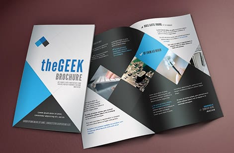
Most layouts that feel hard to read do not have a font problem, they have a spacing problem. Leading, the vertical distance between lines, is the single biggest factor. Set body text with leading around one and a half times the type size and a paragraph reads easily. Set it solid and the lines start to blur into one gray mass, especially in small print sizes on coated stock.
Tracking, the space between letters, works the other way at large sizes. Headlines and logotypes usually need tracking pulled slightly tighter, because the gaps that look correct at 10pt look like holes at 60pt. Small caps and all caps settings need the opposite treatment, since capitals were never drawn to sit shoulder to shoulder.
Display faces are the most sensitive of all. Heavy slabs, scripts and the kind of faces in this roundup of retro fonts carry so much personality that they need a clear field around them to be read as a shape rather than a texture. Give a display headline room and it becomes the focal point. Crowd it and it becomes wallpaper.
Clear space around a logo is a brand rule, not a preference

Serious brand guidelines all define a clear space zone: a minimum exclusion area around the mark where no type, no rule and no image may enter, usually expressed as a fraction of the logo itself, such as the height of one letter. On a 2 by 3.5 inch card, that zone is often the only empty area left once the name and contact lines are in. The rule exists because a logo is recognized by its silhouette, and anything touching that silhouette changes the shape the brain is matching.
The same discipline applies to stickers, labels and any small format where the mark is doing all the work. On a small circle there is very little room to begin with, so the temptation is to scale the logo until it nearly touches the die line. That is exactly when it stops reading. These ways to use logo stickers all depend on a mark that survives being seen small and fast.
If you want proof that the space is part of the mark, look at how carefully famous identities protect theirs. This collection of facts about famous logos is full of marks whose power comes from subtraction. The empty area is not around the logo, it is part of it.
Why premium packaging and signage lean hard on emptiness

Walk any shelf and the pattern shows on every panel, from a 1 by 1 inch circle sticker to a box front. Value brands fill the panel with claims, badges and bursts, because they are competing on information. Premium brands leave most of the panel empty and let one name sit in the middle, because they are competing on confidence. The layout itself is a price signal before you read a word.
The same logic drives current label and box design, as this look at packaging design trends shows. Uncoated stocks, single ink colors and wide quiet fields have become shorthand for craft, because they say the product does not need convincing. On a die cut label the empty area also protects the shape, so the die reads as intentional rather than as a crop. Our roundup of the biggest graphic design trends for 2026 tracks the same quiet look on cards and posters.
Signage takes it further because the viewing distance is longer. A wall graphic printed on White Adhesive Vinyl from $25 is read as a whole shape well before any text resolves, so the ratio of ink to empty surface is what registers first. Crowd it and the sign becomes a gray rectangle from ten feet away.
Space under pressure: when the brief says everything must fit

The hardest layouts are the ones with a genuine information load. An event flyer with a date, a venue, a lineup, ticket prices, three sponsor logos and a QR code cannot simply be emptied out. Here white space becomes a ranking exercise rather than a deletion exercise.
The method is to build a clear hierarchy of levels and to give each level a different amount of room. The single most important line gets the largest space around it. Secondary information sits in a tight group with its own smaller internal gaps. Everything else compresses into a dense footer band, which is fine, because the reader reaches it only after they have decided they care.
Seasonal and promotional work shows this well. The layouts in these poster and flyer design ideas carry a lot of detail and still read cleanly, because the designer decided in advance which single element wins the top third of the page and protected it. Crowding is only a problem when everything is crowded equally.
How to apply this to the file you are about to send to print
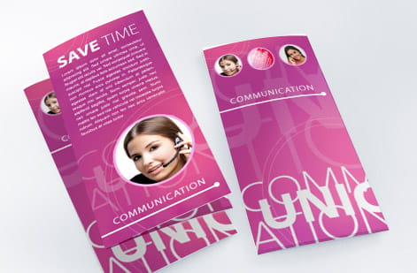
Work in a fixed order. First, cut the content list to what a reader actually needs on this piece. Second, set an outer margin wider than the safety line and refuse to break it. Third, group related items tightly and separate unrelated groups clearly, using a small set of consistent gap sizes rather than eyeballing each one. Fourth, choose one element to be the largest thing on the page and give it the most room.
Then run two checks. Print the file at actual size on plain paper, put it at the real viewing distance and see what you read first. Then blur your eyes until the type is unreadable, which strips away the words and leaves only the pattern of ink and space. If the pattern already tells you where the important part is, the layout works.
When it is ready, you can set the whole thing up in the browser without design software or a design fee, which is what makes this free online designer alternative worth a look. If you want the space to feel physical as well as visual, order free paper samples first, then compare a thick uncoated card against 30mil White Plastic Cards at $226.11 before you commit the run.
The same rules carry across the pieces you print. Interior Design Business Cards come in 4 sizes from 100 cards on 14pt to 24pt gloss or uncoated stock, flyers in 9 sizes from 4.25 by 5.5 to 11 by 25.5 inches from 50, and White Adhesive Vinyl from 11 by 17 to 30 by 40 inches or any size, permanent or removable.
Wally explains white space
The part you leave empty is doing the most work
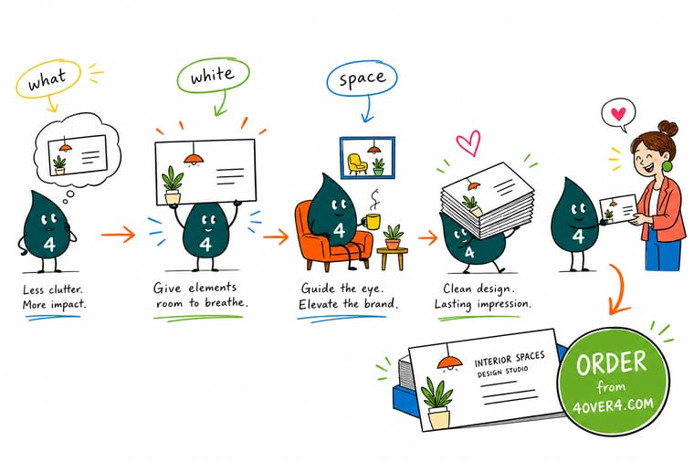
Wally likes to say that a layout is a room and white space is the floor. Fill the room with furniture and nobody can move, no matter how nice each piece is. Leave a clear path and the eye walks straight to the thing that matters. So before you shrink the type to fit one more line, try the opposite: take a line out, widen the margin, and see how much better the same card reads.
Design and print business cards →
Infographic
The 7 kinds of white space at a glance
One frame, seven kinds of empty: margins, gutters, leading, tracking, the logo clear zone, grouping gaps and active space. Save it, or keep it open in a second window while you tidy up the layout you are about to send to print.
These seven work together. Fixing the outer margin without fixing the leading, or protecting the logo while every group sits an equal distance apart, only solves half the problem on the finished print.
Specs and pricing
Business card specs and live pricing
When the spacing is settled, the practical questions are stock, size and quantity. Here are the live specs and price breaks for the card format most often used for minimal, space-forward designs.

| Quantity | Price Per Unit | Total |
|---|---|---|
| 100 | 17.6¢ | $17.57 |
| 200 | 11.5¢ | $23.07 |
| 300 | 9.15¢ | $27.46 |
| 400 | 7.96¢ | $31.86 |
| 500 | 7.25¢ | $36.26 |
| 600 | 6.77¢ | $40.64 |
| 700 | 6.43¢ | $45.04 |
| 800 | 6.18¢ | $49.43 |
Print it
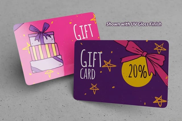
Three formats where white space pays off fastest

See it in use
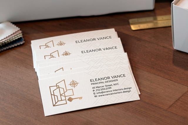
Card designs that leave the paper room to show









Explore more
Where to go next








By the numbers
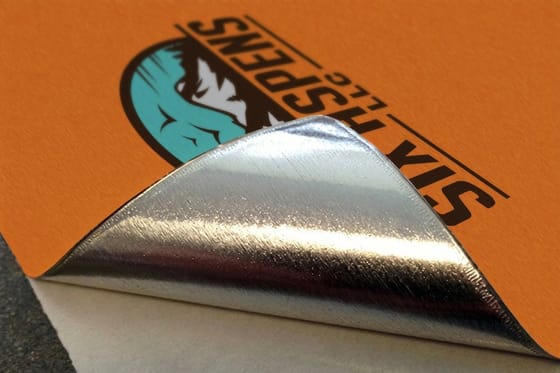
Paper types behind a card built on open space
Common Questions
Common questions about white space in design
What is white space in design?
White space, also called negative space, is any part of a layout left empty on purpose. It includes outer margins, the gutters between columns, the gap around a logo, the leading between lines of text and the small space between letters. It is an active design element rather than leftover room, because it controls how quickly a reader can separate one piece of information from another and decide where to look first.
Does white space have to be white?
No. White space is defined by emptiness, not by color. A deep teal business card with a small logo floating in the middle has plenty of white space, and so does a kraft label, a black poster or a layout that rests on a soft photographic background. Designers use the term because early print work sat on white paper. What matters is that the area carries no competing content.
How much margin does a card need against a wall sign?
Start from the reading distance and the amount of information. A business card read at arm length needs a clear margin of about a quarter inch of quiet edge plus real breathing room around the name. A wall sign read from across a room needs far more, because the eye takes in the whole shape before any detail. When in doubt, remove one element rather than shrinking the space.
What does it cost to print a design with generous white space?
Nothing extra. Price is driven by quantity, size, stock and finish, never by how much of the sheet carries ink. Interior Design Business Cards start at $17.57, White Adhesive Vinyl starts at $25 and 30mil White Plastic Cards start at $226.11. A restrained layout costs the same as a crowded one and usually reads better.
What sizes, stocks and finishes work best for space-forward layouts?
Uncoated and matte stocks suit minimal work because they scatter light and keep large empty areas looking soft rather than blotchy. Heavier weights hold a flat field without showing waves. Thick plastic and premium card stocks give an empty surface real presence in the hand. Soft touch finishes are popular for the same reason, since the eye has less to do and the fingers pick up the difference.
How long does printing take once the file is set?
Most business cards, labels and plastic cards move into production the same business day when the file passes preflight, with common turnaround options running from one business day to several days before shipping. Files that respect safety margins clear preflight faster, which is one more practical argument for keeping type away from the trim edge.
Can too much white space be a problem?
Yes. Space that is not organized reads as unfinished rather than refined. If the gaps between unrelated items are the same size as the gaps between related ones, the eye cannot group anything and the layout feels scattered. The fix is not less space overall, it is uneven space: tight inside a group, wide between groups.
Get Started
Business cards run 100 for $17.57, margins included
Set up a clean, spacious layout in the browser, check it against the safety margins, and send it to press on the stock that suits it best.
Legal Disclaimer
Gold Standard guarantees apply to all standard orders placed through 4over4.com. Price match requires verifiable proof of a competitor's published price for an equivalent product with matching specifications and turnaround time. Satisfaction guarantee covers manufacturing defects and print quality issues. Contact support with order number and documentation.
