
What Makes a Good Logo, and How It Holds Up in Print


A good logo identifies you in a half second and holds up everywhere it prints. A handful of elements and qualities make one work, and business cards and letterhead are where you find out.
A good logo identifies your business instantly and works everywhere, from a favicon to a billboard. Its function is recognition. Its design rests on typography, shape, color, and tone. Its qualities are simple, memorable, scalable, versatile, and timeless. The real proof is print: a strong mark stays crisp on a business card, a letterhead, and a folder.
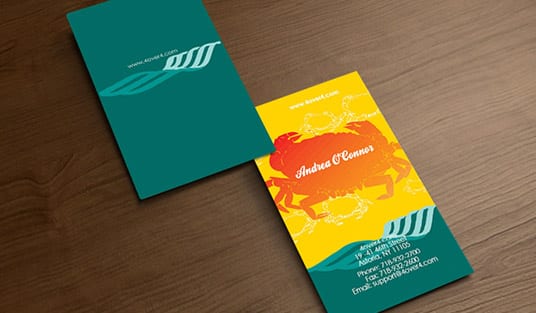
Start here
Recognized in half a second
A good logo identifies your business in a half second and holds up everywhere it appears. Its four elements are typography, shape, color, and tone. Its qualities are simple, memorable, scalable, versatile, and timeless. The final test is practical: the mark still looks sharp printed small on a card. The blueprint below turns those qualities into five quick tests.
The function of a good logo

Before a logo is beautiful, it has to be useful. Its function is identification: it is the fastest signal a person has to recognize your business and separate it from every competitor around it. That recognition happens in a fraction of a second, long before anyone reads your name spelled out or a line of copy. A logo that looks striking but fails to identify you has missed its only real job.
Think about how you actually encounter logos. You spot one on a shelf, a storefront, or a business card and you know instantly whose it is, because the mark is doing the recognizing for you. That is why the best logos feel almost invisible in use: they work so quickly you never notice the work. Everything else in the design, the typeface, the color, the shape, exists to make that instant recognition more reliable.
Hold onto that idea as we get into the visual elements, because it is the test for every decision. A choice is good if it helps someone recognize and remember you faster, and questionable if it just looks clever. For the wider process of building one, our guide on how to design a logo takes it from brief to finished mark.
The visual elements: type, shape, color, and tone
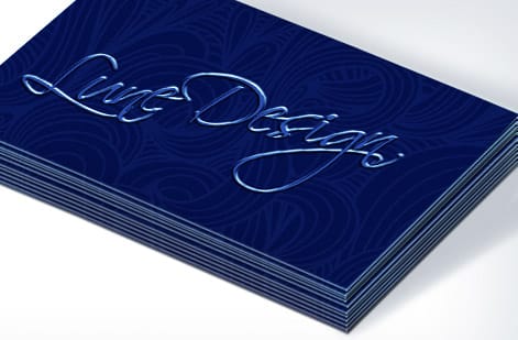
Four elements do the heavy lifting in any logo, and a strong mark aligns all of them. Typography sets the voice, whether that is a refined serif, a confident sans, or custom letterforms drawn just for you. It should sound like the brand talks. Shape and graphics give the mark a silhouette worth remembering, from a plain wordmark to a symbol to a lockup of both.
Color is emotional shorthand and a recognition aid at once, so it should be chosen on purpose and then defined in both screen and print values so it stays consistent. This is exactly where print discipline matters: a color that glows on a monitor can shift on paper unless it is set in CMYK, which our guide on why printing uses CMYK explains. Tone is the personality tying it together, playful or serious, modern or classic, and it should match how the business actually behaves.
When type, shape, color, and tone pull in one direction, the logo communicates before it decorates. If you are laying yours out for real pieces, our online design tool lets you drop the mark onto a card or letterhead with the safe margins already in place, so you can see it working in context.
The qualities of successful logo design
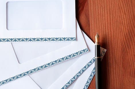
Across nearly every great logo, the same handful of qualities show up. It is simple, so it is recognized and reproduced cleanly at any size. It is memorable, built on one clear idea rather than five competing ones. It is scalable, holding its shape from a 16 pixel favicon to a billboard. It is versatile, working in solid one-color, knocked out to white, and on top of a photo. And it is reasonably timeless, restrained enough that it will not date the moment a trend fades.
Notice how many of those qualities are really print tests in disguise. Scalability matters because the mark has to survive being printed tiny on a card and large on a banner. Versatility matters because your brand appears in one ink on an envelope and full color on a folder. A logo that only works in one perfect digital rendering is not finished.
The blueprint above turns these into five quick tests. Run your mark through them, and if it fails one, that is usually the place it will let you down on the print job that matters most. The table further down spells out what each quality protects.
See your logo on print, and order a starter stationery set
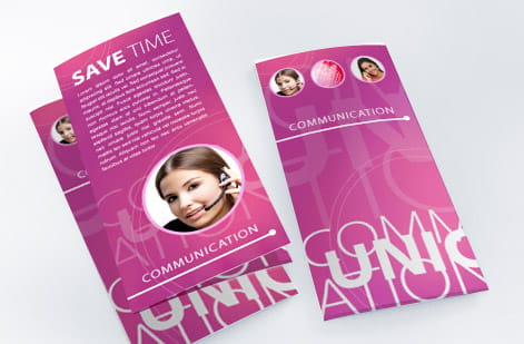
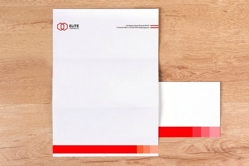
All of this stays abstract until the mark is on paper. The truest test of a logo is the moment a client holds your business card, reads your letterhead, or opens a proposal in your pocket folder. Print is unforgiving in a useful way: it shows you instantly whether the mark is crisp, whether the color is right, and whether it reads at real size.
That is why the natural next step after finishing a logo is a starter stationery set. Business cards put the mark in a hand, letterhead carries it onto every letter and invoice, and a branded folder wraps a pitch in your identity. Ordered together, they make a new brand look established from day one, and they give you three surfaces to confirm your logo holds up in the real world.
Build the set piece by piece below. Each product is priced live in its configurator, so you can choose stocks and finishes and watch the total as you go, then order free paper samples if you want to feel the paper before your logo goes to press.
Wally puts your logo through the print test
Simple, memorable, and sharp at every size
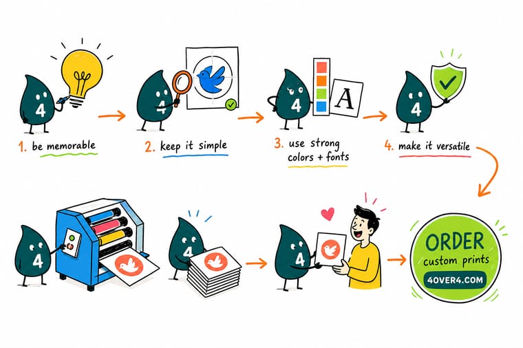
Wally checks a mark the way a press does: does it read in a half second, does one idea stick, does it hold from a favicon to a billboard, does it survive one-color and reversed? If it passes, it will look great on a card, a letterhead, and a folder. Build it in vector, set your color in CMYK, and 4OVER4 prints it crisp on the pieces a client actually holds.
Print your logo on business cards →Quick reference
The five qualities of a good logo, and what each protects
Run your mark through these five tests. Each one is really a promise about how the logo behaves out in the world, especially in print.
| Quality | The test | What it protects |
|---|---|---|
| Simple | Reads in a half second | Uncluttered marks are recognized and remembered faster, and they reproduce cleanly at every size and on every stock. |
| Memorable | One idea that sticks | A single strong concept, not five, is what a customer recalls later when they reach for your card or search your name. |
| Scalable | 16px favicon to billboard | Built in vector, the mark stays razor-sharp whether it prints tiny on a card or huge on a banner. |
| Versatile | One-color and reversed | A logo that works in solid black, knocked out white, and on a photo survives every place your brand appears. |
| Timeless | Outlasts trends | A mark tied to a fad dates fast. Restraint keeps it usable across years of printed material. |
Specs and pricing
Business card specs and live pricing
The best place to test a logo is a business card. Here are the live specs and price-per-unit for standard business cards at 4OVER4, straight from the configurator.

| Quantity | Price Per Unit | Total |
|---|---|---|
| 100 | 17.6¢ | $17.57 |
| 200 | 11.5¢ | $23.07 |
| 300 | 9.15¢ | $27.46 |
| 400 | 7.96¢ | $31.86 |
| 500 | 7.25¢ | $36.26 |
| 600 | 6.77¢ | $40.64 |
| 700 | 6.43¢ | $45.04 |
| 800 | 6.18¢ | $49.43 |
Print it
Order a starter stationery set at 4OVER4

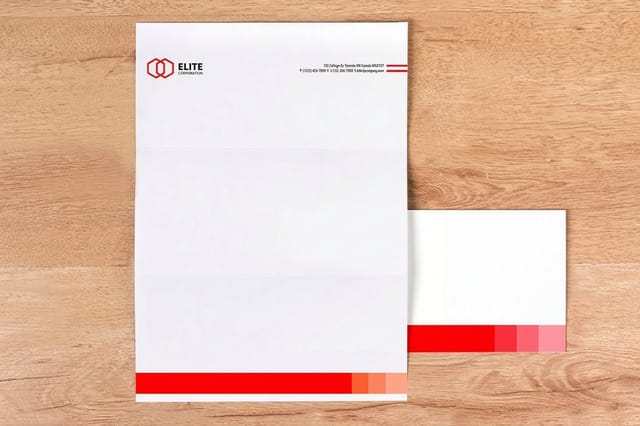
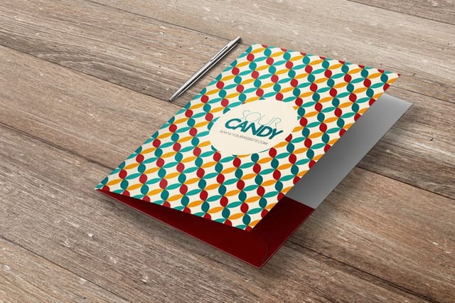
See it in use
Logos as they land on a printed card








Explore more
Where to go next
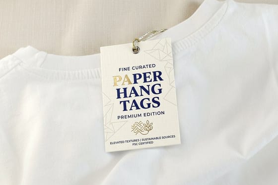




By the numbers
Sixty paper stocks your logo has to hold up on
Common Questions
Common questions about good logo design
What is the function of a good logo?
The function of a logo is identification, not decoration. It is the fastest way for someone to recognize your business, distinguish it from competitors, and connect what they see to what they already feel about your brand. A good logo does that work in a fraction of a second, before anyone reads a single word of copy. Everything else, the typography, the color, the shape, exists to serve that one job: instant, reliable recognition wherever the mark appears.
What makes a good logo, in terms of the visual elements?
Four elements carry a logo. Typography sets the voice: a typeface or custom letterforms that feel like the brand. Shape and graphics give it a memorable silhouette, whether that is a wordmark, a symbol, or a combination. Color triggers emotion and aids recognition, so it should be chosen deliberately and defined in both screen and print values. Tone ties it together, the overall personality, playful or serious, modern or classic, that should match how the business actually behaves. When those four pull in the same direction, the mark communicates before it decorates.
What makes a logo successful?
A successful logo is simple, memorable, scalable, versatile, and reasonably timeless. Simple so it is recognized and reproduced cleanly; memorable so it sticks with one clear idea; scalable so it holds up from a tiny favicon to a billboard; versatile so it works in one color, reversed, and on any background; and timeless enough that it does not date the moment a trend passes. The final test is practical: a strong mark still looks sharp printed small on a business card, which is where most people meet it first.
How do I get my logo print-ready?
Keep the master logo as a vector file so it scales without losing sharpness, and define your brand colors in CMYK for print rather than relying on the RGB values a screen uses. Provide one-color and reversed versions so the mark works on dark backgrounds and single-ink jobs. When you place it in artwork, keep it inside the safe margin and at full resolution. For a step-by-step walk-through of prepping a mark specifically for a card, see our guide on preparing a business card logo for printing.
What does it cost to print a logo on stationery, and how are prices set?
Designing the logo is separate from printing it. Once you have the mark, printing cost is set by the product and the options you choose: quantity, where more pieces lower the unit price, plus size, paper stock, and finish. A starter stationery set of business cards, letterhead, and a folder can be ordered piece by piece, with each item priced live in its configurator so you can see the total as you build the set. Order free paper samples first if you want to feel the stock before your logo goes to press.
Get Started
Print 250 envelopes for $142.99 in 7 business days
Bring your finished mark to 4OVER4 and put it on business cards, letterhead, and a folder. Choose your stock and finish and watch every price update live as you build the set.
Legal Disclaimer
Gold Standard guarantees apply to all standard orders placed through 4over4.com. Price match requires verifiable proof of a competitor's published price for an equivalent product with matching specifications and turnaround time. Satisfaction guarantee covers manufacturing defects and print quality issues. Contact support with order number and documentation. On-time delivery rate based on tracked orders 1999 to 2026. Individual results may vary based on shipping carrier performance.
