What You Need to Know About Certificate Paper
Certificate Paper is the heavyweight, textured stock that turns a simple document into something worth framing. Whether you're printing diplomas, awards, or professional certifications, the right paper makes the difference between "meh" and memorable. 4OVER4 offers premium paper options trusted by 150,000+ businesses with a 4.8/5 star rating across 10,000+ reviews. Here's what matters most when choosing yours.
Why Certificate Paper Deserves More Thought Than You'd Expect
Certificate paper carries weight - literally and figuratively. Hand someone a flimsy certificate and watch their face. Now hand them a thick, textured sheet with crisp printing. Completely different reaction. The paper stock you choose communicates how much you value the achievement it represents.
This guide covers everything from paper weight and finish to design layout and printing methods. You'll learn how to pick the right stock, avoid common formatting mistakes, and create certificates that people actually hang on their walls. If you're working on other printed materials alongside your certificates, you might find our guides on How To Clean Rubber Stamps and How To Fold A Brochure helpful for your broader print projects. 4OVER4 has been printing premium materials since 1999, and we've learned a thing or two about what works.
Choosing the Right Certificate Paper for Every Occasion
Certificate paper isn't one-size-fits-all. A kindergarten graduation certificate has different needs than a corporate leadership award or a professional license. The stock, finish, size, and design all shift depending on the context. Let's break it down piece by piece.
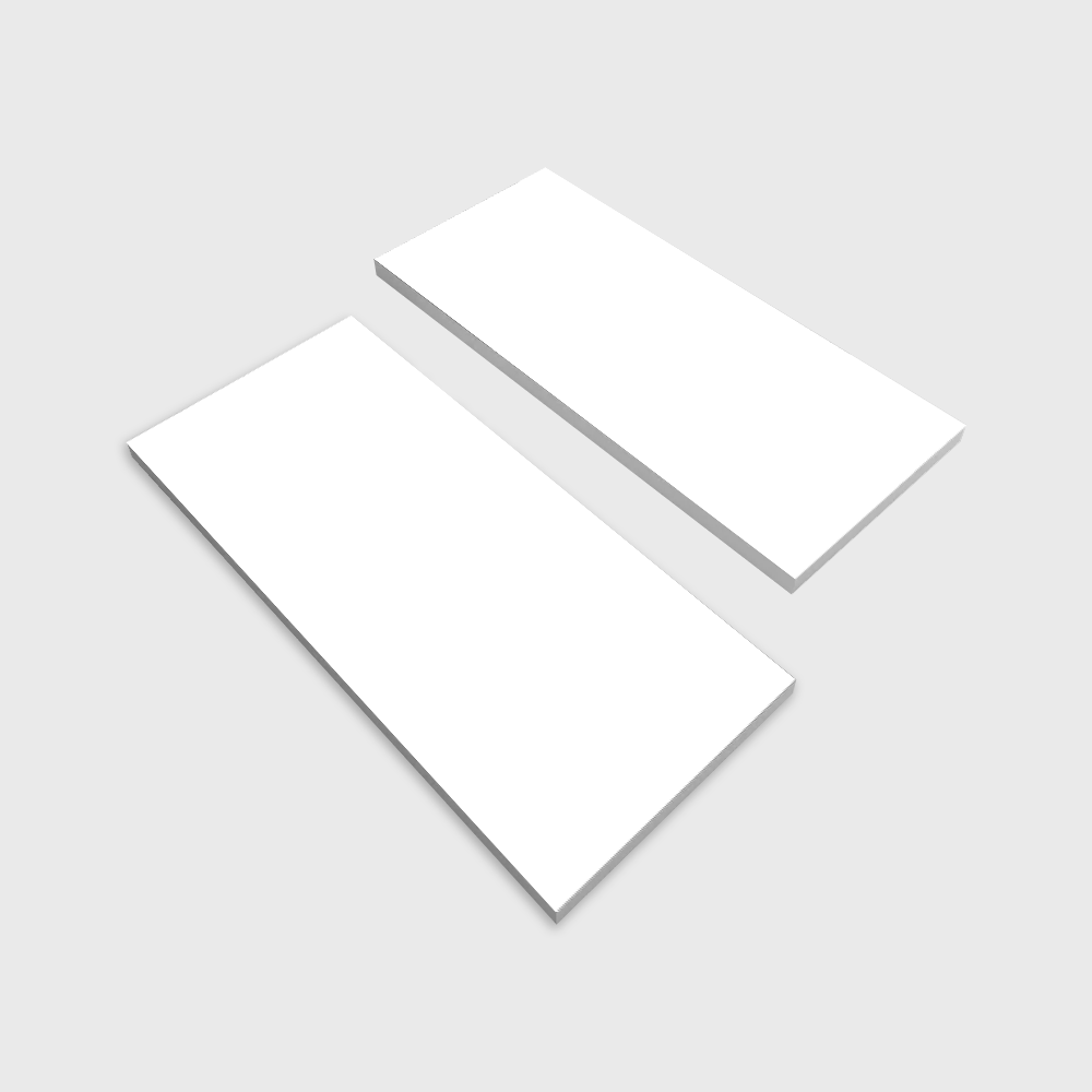
Paper Weight and Thickness: The Foundation of a Great Certificate
Paper weight is the single biggest factor in how your certificate feels in someone's hands. Standard copy paper sits around 20 lb (75 gsm). That's fine for internal memos. It's not fine for something celebrating an achievement.
For certificate paper, you want to start at 28 lb bond (105 gsm) at minimum. Most professional certificates land between 32 lb bond (120 gsm) and 80 lb cover stock (216 gsm). The heavier you go, the more big and "official" the certificate feels. Think about it this way - 32 lb bond has a nice heft without being stiff. It folds cleanly if you need to mail it in a standard envelope. An 80 lb cover stock? That's rigid. It doesn't bend easily. It demands a frame or a flat mailer.
Card stock in the 65-110 lb range works well for certificates meant to be displayed. These won't flop over when propped against a wall. They hold up to handling without creasing. If your certificates will be mailed flat in rigid mailers, heavier stock is the way to go. For a broader look at printed materials and how different stocks perform, check out our Marketing Materials Printing hub.
Finish Options That Change the Look and Feel
The finish on your certificate paper affects readability, ink adhesion, and perceived quality. Here are the main options you'll encounter:
- Linen finish - A subtle crosshatch texture that mimics woven fabric. This is the classic "official document" feel. Diplomas, government certificates, and formal awards almost always use linen.
- Laid finish - Features parallel lines pressed into the paper. Slightly less textured than linen but still distinctly premium. Works well for corporate awards and professional certifications.
- Smooth/uncoated - Clean and modern. No texture. Great for certificates with full-color designs, photos, or detailed graphics because ink sits evenly on the surface.
- Parchment finish - Has a mottled, aged appearance. Popular for academic certificates and historical-themed awards. Adds an old-world gravitas.
- Matte coated - Smooth with a slight sheen. Colors pop more than on uncoated stock, but you don't get the glare of a glossy finish. Good for certificates with bright designs.
One thing to keep in mind: textured finishes like linen and laid can affect how fine details print. If your certificate design has very small text or detailed borders, test a proof first. The texture can break up thin lines. Browse the Showcase to see how different finishes look on actual printed pieces.
Standard Sizes and When to Go Custom
Most certificate paper comes in standard letter size - 8.5 x 11 inches. That's the default for a reason. It fits standard frames, works with most printers, and stores easily in file folders.
But standard isn't always the answer. Here are some common certificate paper sizes and their best uses:
- 8.5 x 11 inches - The workhorse. Academic diplomas, training certificates, employee awards. Fits everywhere.
- 11 x 8.5 inches (landscape) - Same sheet, turned sideways. Landscape orientation feels more "award-like" and less "document-like." Most formal certificates use landscape.
- A4 (8.27 x 11.69 inches) - International standard. If your organization operates globally, A4 keeps things consistent across regions.
- 5 x 7 inches - Mini certificates for participation awards, workshop completions, or kids' programs. Less formal, more fun.
- Custom sizes - Oversized certificates (like 11 x 14 or 13 x 19) make a statement. They're harder to ignore and feel more important. 4OVER4 can handle custom dimensions when standard sizes don't cut it.
Color Choices: Beyond White and Cream
White and cream dominate the certificate paper world. And honestly? They dominate for good reason. White offers maximum contrast for black text and colorful borders. Cream (or natural/ivory) adds warmth and a traditional feel.
That said, you're not limited to those two. Blue-tinted certificate paper works for corporate settings. Gold-toned stock screams "achievement." Some organizations use branded colors - a university might use paper tinted to match their school color.
The key is contrast. Whatever color you choose, make sure your text and design elements are clearly readable. Dark text on light paper. Light text on dark paper. Sounds obvious, but you'd be surprised how many certificates end up with gray text on cream paper that nobody can read from more than two feet away. If you're designing other printed pieces alongside certificates, our guide on How To Make Flyers covers color contrast principles that apply here too.
Designing Your Certificate: Layout Principles That Work
Good certificate design follows a clear visual hierarchy. The recipient's name should be the largest text element. The awarding organization's name comes second. Everything else - date, description, signatures - supports those two focal points.
Keep your margins generous. At least 0.75 inches on all sides, ideally a full inch. Certificates that crowd the edges look rushed and unprofessional. White space isn't wasted space on a certificate. It's breathing room that makes the content feel important.
Borders matter. A simple gold or black border frames the content and signals "this is a formal document." Ornate borders with scrollwork and filigree can look elegant or tacky depending on execution. When in doubt, go simpler. A thin double-line border in a dark color works for almost any context.
Fonts? Stick to two maximum. One serif font for the main body text (think Times New Roman, Garamond, or Baskerville). One script or display font for the recipient's name. Script fonts add a personal, handwritten quality. Just make sure they're actually legible. If you can't read the name at arm's length, pick a different font. You can find ready-to-customize layouts in our Blank Templates library.
Printing Methods: Desktop vs. Professional
You've got two main paths for printing certificate paper: do it yourself on a desktop printer, or send it to a professional printer like 4OVER4.
Desktop printing works for small batches (under 50 certificates). Inkjet printers handle textured paper better than lasers in most cases. Laser printers can struggle with linen and laid finishes because the toner doesn't bond as evenly to textured surfaces. If you're using a laser, stick with smooth or matte certificate paper.
Professional printing is the move for larger runs, consistent color, and premium finishes. Offset and digital presses produce sharper results than desktop printers. Colors are more accurate. Text is crisper. And you get access to specialty options like foil stamping, embossing, and spot UV that desktop printers simply can't do. Visit our Faq Hub for more printing tips across all product types.
For a hybrid approach, some organizations print the static elements (borders, logos, organization name) professionally in bulk, then run individual sheets through a desktop printer to add recipient names and dates. This gives you professional quality where it counts while keeping personalization flexible.
Adding Security and Authenticity Features
If your certificates carry legal or professional weight, security features matter. Watermarks, holographic foils, microprinting, and serial numbers all help prevent counterfeiting.
Even for less formal certificates, a raised seal or foil stamp adds a layer of authenticity that recipients notice. It's the difference between "here's a printout" and "here's an official document." You can pair certificates with custom packaging too - learn how to create coordinating materials in our How To Make Envelopes guide, or explore Custom Magnets Faq for creative ways to extend your recognition program beyond paper.
"We switched from standard copy paper to a 65 lb linen stock for our employee recognition certificates. The reaction was immediate - people started framing them and hanging them in their offices. Same words, completely different impact."
- Rachel K., HR Director
Below you'll find blank templates to help you get started with your certificate paper design:
Blank Templates
Mistakes That Ruin Otherwise Great Certificates
Even small errors on certificate paper can undermine the entire purpose of the document. Here are the most common ones 4OVER4 sees - and how to avoid them.
- Spelling the recipient's name wrong. Triple-check every name. Then check again. Nothing kills the moment like a misspelled name on a framed certificate.
- Using too-thin paper. Anything under 24 lb bond feels like a receipt, not a recognition. Go heavier.
- Ignoring bleed and margins. If your border design runs to the edge, you need at least 0.125 inches of bleed. Without it, you'll get uneven white edges after trimming.
- Overloading the design. Three fonts, clip art, gradient backgrounds, and a watermark all fighting for attention. Pick two or three design elements and let them breathe.
- Forgetting to proof in print. Colors on screen look different on paper. Always print a test certificate before running the full batch. What looks gold on your monitor might print as muddy yellow on linen stock.
- Not accounting for printer limitations. Textured certificate paper can jam in certain printers. Check your printer's paper weight specs before feeding through a stack of 80 lb cover stock.
What Our Clients Say About Certificate Paper
When you're ready to print certificate paper or related materials, 4OVER4 has options that pair well with your recognition programs. For custom packaging and presentation, explore Tissue Paper Printing to wrap certificates in branded tissue. And if you're creating eco-friendly award packages, Recycled Paper Hang Tags make a great sustainable complement.
"We ordered certificate paper for our annual awards gala and the quality blew us away. The linen texture felt expensive and the colors printed perfectly. Our team members were genuinely proud to receive them."
- Marcus D., Operations Manager - ★★★★★
"I run a small training company and needed professional-looking completion certificates. The heavy stock 4OVER4 recommended made all the difference. Clients actually display them in their offices now."
- Priya S., Training Consultant - ★★★★★
Here's what more customers have to say:
"Ordered certificate paper from 4OVER4 and the quality blew me away. Sharp colors, premium feel, arrived 2 days early."
"Been using 4OVER4 for certificate paper for a year. Consistent quality every time. The online designer made it easy."
"Switched to 4OVER4 and saved 40% on certificate paper. Better quality than my old printer. 60+ paper options."
"4OVER4's certificate paper helped us look more professional. Clients notice the difference."
Your Certificate Paper Questions, Answered
What paper weight is best for printing certificates?
For most certificates, 32 lb bond (120 gsm) to 80 lb cover stock (216 gsm) hits the sweet spot. Lighter stocks work for certificates that need to be mailed in standard envelopes. Heavier stocks are better for framing and display. If you're unsure, 65 lb cover stock offers a good balance of rigidity and flexibility for certificate paper.
Can I print certificate paper on a regular home printer?
Yes, but with limits. Most inkjet printers handle certificate paper up to about 80 lb cover stock. Laser printers work best with smooth or matte finishes - textured stocks like linen can cause toner adhesion issues. Always check your printer's maximum paper weight specification before printing.
What's the difference between linen and parchment certificate paper?
Linen has a uniform crosshatch texture that feels woven. Parchment has an irregular, mottled appearance that mimics aged paper. Linen reads as "professional and formal." Parchment reads as "traditional and academic." Both are popular for certificate paper, but they create very different impressions.
How do I prevent certificate paper from jamming in my printer?
Fan the sheets before loading to separate them. Load only 10-15 sheets at a time. Use the manual feed tray or rear paper path if your printer has one - it creates a straighter paper path with less bending. And make sure the paper weight doesn't exceed your printer's rated capacity.
Should I use foil stamping on my certificates?
Foil stamping adds a metallic shine to specific elements like borders, seals, or text. It's worth the investment for high-profile awards, diplomas, and formal recognitions. For internal team certificates or participation awards, it might be overkill. Consider your audience and the occasion. You can also add a QR Code Generator link on your certificate to direct recipients to a digital verification page.
What file format should I use for certificate paper designs?
PDF is the gold standard for certificate printing. It preserves fonts, colors, and layout across different systems. If you're working with a professional printer, submit a high-resolution PDF at 300 DPI with fonts embedded. For desktop printing, PDF also ensures your design prints exactly as you see it on screen.
"I was nervous about ordering certificate paper online without seeing it first. 4OVER4 sent a proof that matched the final product perfectly. The 80 lb linen stock we chose for our nonprofit's volunteer awards looked incredible."
- Denise W., Nonprofit Director - ★★★★★