
Best Brand Guidelines Examples to Inspire You


Tobias is our voice for cutting, binding and large format, built from the knowledge of our production team, with over 20 years in printing.
What Brand Guidelines Actually Do for a Growing Business
A brand guidelines document is the written agreement your company makes with itself about how it looks and sounds. It answers the small questions before anyone has to ask them. How much space goes around the logo. Which blue is the real blue. What the headline typeface is when the designer is on vacation and the office manager has to make a sign by Friday. In print, the guide earns its keep on three pieces: the business card at 3.5" x 2", where the logo clear space is tightest, the letterhead, where the type rules show, and the banner, where the brand color has to hold at 4 feet wide.
Most teams write guidelines only after something goes wrong. A reseller stretches the logo, a trade show banner arrives in a color nobody recognizes, three departments buy three different business card layouts. The rulebook is the cheapest fix for all of it, and it pays for itself the first time a new hire finds the answer without a meeting.
Consistency is not a vanity project either. When a customer sees the same mark, the same palette, and the same voice across a banner, a mailer, and a card, recognition compounds. 4OVER4.COM has printed 10 billion+ products since 1999 for more than 150,000 businesses, and the accounts that reorder without drama are always the ones with a written spec. They send the same files, they name the same stocks, and every batch matches the last one because the decisions were made once and recorded.
Guidelines are a decision archive, not a design showcase
The best documents read like a manual, not a portfolio. They state a rule, show a correct example, show an incorrect one, and move on. A reader who needs the hex value should find it in ten seconds without scrolling through a mood film.
They are written for the people outside the design team
Sales reps, printers, franchise owners, and freelance contractors are the real audience. If the guide only makes sense to the person who designed the brand, it has failed the exact moment it was supposed to help.
They protect the brand when the brand grows fast
A second location, a first hire in marketing, a distributor in another state. Every one of those is a moment where the brand quietly drifts. Guidelines are the anchor that keeps the twentieth application looking like the first.
Show the system
Put the brand where people stand
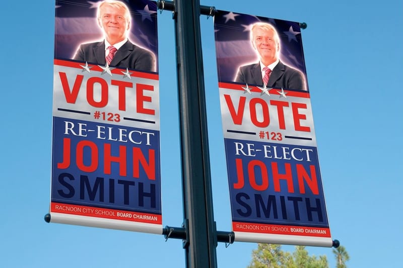
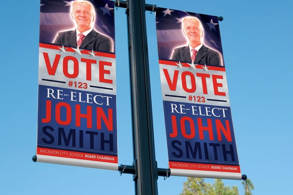
A double sided banner is the fastest test of whether your color and logo rules hold at scale.
What Belongs Inside a Brand Guidelines Document
Skip the debate about page count. A five page guide that people follow beats a ninety page book that lives unread in a shared drive. What matters is coverage: every recurring decision should have an answer, and every answer should be specific enough that two people reading it separately produce the same result.
Before you write a word, gather the raw material. Collect the logo files you actually have, pull the real color values out of your website CSS, and put your existing printed pieces on a table. If you want a visual starting point, our walkthrough of brand mood board examples and ideas is a practical way to set direction before you commit any rule to paper.
- Logo system. Primary lockup, secondary and stacked versions, the icon on its own, minimum size, and clear space expressed in a unit tied to the mark itself.
- Color. Hex and RGB for screens, CMYK and a Pantone reference for print, plus a plain rule about which colors are allowed to sit next to each other.
- Typography. Headline and body faces, weights in use, a size scale, line height, and one fallback for the day the licensed font is not installed.
- Imagery. Photo treatment, subject matter, illustration style, and a short list of what the brand never shows.
- Voice and tone. Three adjectives, a handful of before and after sentences, and the words the brand refuses to use.
- Production notes. Bleed, safe margin, resolution, file format, and the stocks and finishes the brand has standardized on.
That last section is the one most guides forget, and it is the one your printer needs. Naming the stock, the coating, and the trim size turns a design document into something a production team can execute without a phone call.
Print picks
Three formats that put brand rules to work
Live prices, ready to configure with your approved files.
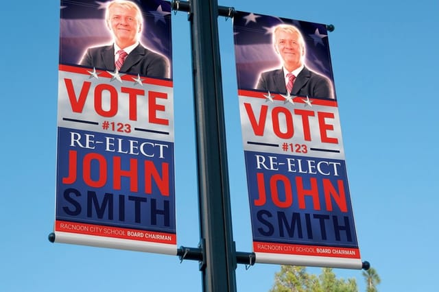 2 Sided Blockout Banners $108.75 each Two brand faces, one banner, with an opaque core that stops any bleed-through.
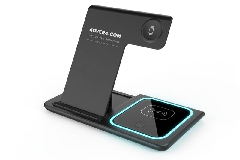
 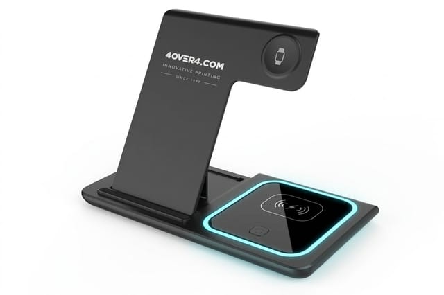 3 in 1 Foldable Wireless Charger $15.00 each A giveaway that lives on a desk instead of in a drawer.
 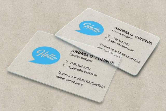 30mil Clear Plastic Cards 500 for $529.26 Transparent stock that makes a simple logo lockup look deliberate and premium.
 Standout Brand Guideline Examples Worth Studying
Some of the most useful brand books are public, and reading them is the fastest way to calibrate your own. Look past the aesthetics and watch how each one handles the boring parts, because that is where a guide earns its keep.
- The NASA Graphics Standards Manual. Published in 1975, it is still the reference point for rigor. Every application, from a vehicle decal to a letterhead, is drawn to a grid with measurements. Nothing is left to taste.
- Mailchimp's content style guide. Proof that voice deserves the same discipline as color. It gives writers rules for grammar, capitalization, and empathy, and it is published openly so contractors can follow it on day one.
- Spotify's design and branding pages. A living, web based system rather than a frozen PDF. Rules for the icon, the green, and third party usage sit next to downloadable assets, which is why partners rarely get it wrong.
- The IBM Design Language. A large system explained in small pieces, with a grid, a type scale, and a color logic that a developer and a printer can both apply without translating anything.
- City and university identity manuals. Often overlooked, and often the most practical. They have to serve dozens of departments with no design staff, so they lead with templates and hard rules instead of philosophy.
The pattern across all of them is restraint. Few colors, few typefaces, one obvious way to do each thing. If you want a broader sweep of finished identity work to react against, our roundup of corporate identity and branding examples shows how these rules look once they leave the document and land on real materials.
Quantity and price
Clear plastic card pricing and specs
Real configurator numbers. Record the tier your guidelines approve and reorder at it.
| Quantity | Price Per Unit | Total |
|---|---|---|
| 500 | $1.06 | $529.26 |
| 1,000 | 63.0¢ | $630.31 |
| 2,000 | 56.8¢ | $1,135.55 |
| 2,500 | 53.0¢ | $1,325.02 |
| 3,000 | 50.5¢ | $1,514.49 |
| 3,500 | 48.7¢ | $1,703.96 |

How the Best Brand Books Handle Logo Rules
Logo misuse is the single most common failure a guide has to prevent, and vague language is why it keeps happening. Do not write that the logo needs breathing room. Write that clear space equals the height of the letterform on all four sides, then draw it.
Minimum size deserves two numbers, one for screen in pixels and one for print in inches, because a mark that survives a web header can disintegrate on a pen or a lanyard. Add a short misuse gallery: stretched, recolored, outlined, rotated, dropped on a busy photo, given a shadow. People remember the crossed out examples longer than the approved ones.
Then think about the surfaces the logo will actually meet. A large format piece such as 2 Sided Blockout Banners is viewed from thirty feet, so the guide should name the version used at that scale and the minimum contrast behind it. Getting that rule on paper is what keeps a rushed event order from turning into a washed out mark nobody can read across a hall.
One approved file set, one location
Vector for anything printed, PNG with transparency for digital, and a single folder everyone links to. The best guides state plainly that JPEGs pulled from a website are never acceptable source files, because that is exactly how a white box ends up behind a logo on a banner.
Large format specs
2 sided blockout banners
Sizes, materials, and finishing options to write straight into your production appendix.

Color, Type, and the Details That Print Actually Cares About

Screen color and press color are two different languages, and a guide that only lists hex values will eventually produce a disappointed client. Give every brand color a full set of values, and note which ones shift when they convert to CMYK so nobody is surprised by a duller purple on a printed piece.
Also state what happens on unusual substrates. On transparent stock like 30mil Clear Plastic Cards, ink sits over whatever is behind the card, so a guide should say whether the brand allows a white underprint layer and which elements require it. That one sentence saves a reprint.
- Say which color is dominant. A palette without a hierarchy becomes a rainbow the moment three people use it.
- Set a minimum type size for print. Body copy that works at 16px on a screen can fall apart at 6pt on a card.
- Fix the contrast rules. Name the approved text and background pairings instead of hoping people check.
- Standardize a bleed and safe margin. An eighth of an inch of bleed and a quarter inch of safety inside the trim covers most formats.
- Choose a finish per material. Matte, gloss, and soft touch all change how a color reads, so the guide should pick one per piece.
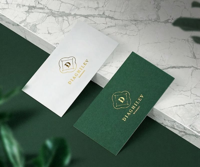
Small format is where these details show up first. If you want to see how tight typography and color discipline read at wallet size, browse our collection of stylish business card examples and note how the strongest ones use a single accent color and one typeface family. For the type side on its own, read our business card typography ideas that work in print, not just on screen.
Compare formats
Popular brand collateral, side by side
Metallic foil cards take 7 business days against 22 for lenticular, which is the question a reorder actually turns on.
 free business cards |  Standard Business Cards |  3D Lenticular Business Cards |  Metallic Foil Business Cards | |
|---|---|---|---|---|
| Min price | Free | $17.57 | $690.88 | $222.13 |
| Paper / stock | 14pt Gloss Cover | 14pt Gloss Cover | 31pt Lenticular Lens | 16 Point Silk Laminated |
| Finish | - | Standard Finish | - | - |
| Size | 2" x 3.5" | 2" x 3.5" | 2" x 3.5" - Vertical | 2" x 3.5" |
| Default qty | 200 | 100 | 500 | 500 |
| Turnaround | 5 business days | 3 business days | 22 business days | 7 business days |
| Rating | ||||
| View & customize | View & customize | View & customize | View & customize |
Turning Brand Guidelines Into Printed Materials
A guide is theory until an order goes through. The bridge between the two is a short production appendix that lists, for each recurring piece, the exact size, stock, coating, quantity, and file setup your brand has approved. Write it once and every future order becomes a copy and paste job.
Build that appendix around the pieces you actually reorder. Cards, banners, mailers, packaging, and event collateral cover most companies. Our guides to brand packaging examples for small businesses and postcard examples for small businesses are useful reference points when you are deciding what deserves a locked spec.
Lock the file setup, not just the look
Print ready means CMYK, 300 DPI at final size, fonts outlined or embedded, bleed included, and no live text inside the trim margin. Put that sentence in the guide verbatim so contractors deliver the same package every time.
Name the quantities you buy
Unit cost drops as volume rises, so a brand that knows it prints 500 cards a quarter should say so and order accordingly. Recording the tier you buy at also keeps budgets predictable when someone new takes over the ordering.
Start fast
Templates and print-ready blanks
Free layouts plus exact-size blanks so your bleed and safe margins are correct from the first file.

Brand Guidelines for Merchandise and Giveaways
Merchandise is where most brand systems quietly break, because the surfaces are odd, the print areas are tiny, and the vendor is often not the one who read your guide. The fix is a short merch section that names a simplified logo version, a one color option, and a maximum number of elements per item.
Useful objects outperform novelty ones. A useful object such as a 3 in 1 Foldable Wireless Charger earns desk space, though it ships as it comes with no logo. Whatever you brand, the guide should state the imprint color for light and dark bodies so nobody improvises.
The same logic applies to small adhesive pieces that travel further than you expect. Our list of fun ways to use logo stickers for promotion shows how far a single well drawn mark can go when the rules keep it simple.
Branded merch
A giveaway that earns desk space
Define the one color imprint version in your guide, then apply it to something people use daily.
Building Your Own Brand Guidelines Page by Page
You do not need a rebrand to start. Audit what exists, write down the rules you already follow by instinct, and fill the gaps as they appear. A first version that covers logo, color, type, and print setup is genuinely useful within a week.
- Page one. A one paragraph brand summary and the three adjectives that describe the voice.
- Pages two and three. The logo system, clear space, minimum sizes, and the misuse gallery.
- Page four. Color values for screen and press, with the dominant color called out.
- Page five. Typography, the size scale, and the fallback stack.
- Page six. Imagery direction and a few approved and rejected samples.
- Page seven. Print production specs and the reorder list, item by item.
Distribute it as a PDF and as a shared link, date every version, and keep the asset folder next to it. Then test the guide by handing it to someone who was not in the room when it was written and asking them to lay out one piece. Whatever they get wrong is your next revision.
Keeping Every Order On Brand
The final job of a brand book is repeatability. Keep an order log with the product, the exact configuration, and the file used, so the person placing the next order is copying a known good result instead of rebuilding a decision from memory.
Ask for a proof on anything new, check it against the guide rather than against your taste, and store the approved proof with the spec. Once a piece has been through that loop once, every reorder afterward is genuinely boring, which is exactly what a mature brand feels like from the inside.
Brand consistency is not about being rigid. It is about spending your creative energy on the campaign instead of relitigating the logo. For a lighter look at how far a confident brand voice can stretch, our roundup of funny print ads shows what happens when the rules are settled and the idea gets to be the interesting part.
Wally turns your brand book into a print order
From written rules to a file that presses correctly
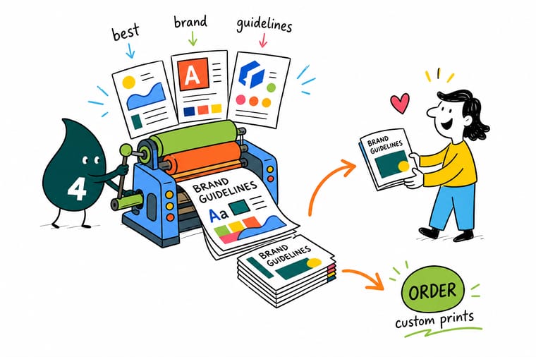
Have the rules but not the files? Pull four things out of your guidelines before you order: the CMYK values for every brand color, the vector logo at the approved size, the trim size for the piece, and the stock and finish you standardized on. Build the artwork in CMYK at 300 DPI with an eighth of an inch of bleed, keep live text a quarter inch inside the trim, then save the configuration so the next reorder matches this one exactly.
Order on-brand printing →What to Take From the Best Brand Guidelines
Keep Reading Before You Write Your Guide
Brand Mood Board Examples Set the visual direction before you write a single rule. Corporate Identity Examples Fifty identity systems and what each one gets right. Stylish Business Card Examples How brand rules read at wallet size. Brand Packaging Examples Carrying the palette onto boxes, labels, and inserts. Explore more
More branding and print ideas across 4OVER4.COM
Clear plastic cards run 500 for $529.26 and take 15 business days, the longest lead time in a brand rollout, so order them first; standard business cards take 3.
 Article Corporate Identity and Branding Fifty inspiring identity systems in one place. Product 2 Sided Blockout Banners Two branded faces with no show-through between them.
  Article Brand Mood Board Examples Direction first, rules second, print third. Product 30mil Clear Plastic Cards Transparent stock that makes a simple lockup look premium. Article Stylish Business Card Examples Fifteen cards that follow their own rules. Product 3 in 1 Foldable Wireless Charger A giveaway people keep on the desk.
  Article Brand Packaging Examples Packaging that reads as the same brand on a shelf.
  Article Postcard Examples Ten mailers that stay on brand and still convert.
  Article Logo Sticker Promotions Ten ways one mark travels further than expected.
  Article Event Program Examples Applying the type scale to a multi page piece.
  Article Funny Print Ads What a settled brand voice lets you get away with.
  Hub All Printing Articles Design, branding, and print advice in one library.
 Print something that matches your brand book
Pick the format, load your approved artwork, and lock the configuration so every future order comes back looking exactly like this one.
Brand Guidelines Frequently Asked Questions
What are brand guidelines and what do the best examples include?
Brand guidelines are the written rules for how a company looks and sounds, and the strongest examples cover six areas: the logo system with clear space and minimum sizes, color values for both screen and press, typography with a real size scale, imagery direction, voice and tone, and print production specs such as bleed, resolution, and approved stocks. The public manuals people study most, from the 1975 NASA Graphics Standards Manual to the Mailchimp content style guide, all share the same habit of stating a rule and showing a correct and incorrect example beside it. For finished identity work built on those rules, see our corporate identity and branding examples.
How do I choose the right brand guidelines example to model mine on?
Match the example to your situation rather than your ambition. If several departments or franchisees order their own materials, follow a university or city identity manual that leads with templates and hard rules. If your brand lives mostly online, a web based system like a public design language is a better model because it keeps assets next to the rules. If your challenge is writing rather than layout, start with a content style guide. Whichever you copy, keep the structure and throw away the page count that does not apply to you.
What does it cost to print materials that follow brand guidelines?
Cost depends on the format, the material, and the quantity, and unit price always drops as volume rises. At 4OVER4.COM, 2 Sided Blockout Banners start at $108.75, a ready-made 3 in 1 Foldable Wireless Charger starts at $15.00, and 30mil Clear Plastic Cards start at $529.26. Every product page shows live pricing per quantity tier, so you can record the exact configuration your guidelines approve and reorder at the same tier every time without rebuilding the quote.
What sizes, stocks, and finishes should brand guidelines specify?
Specify the ones you actually reorder, not every option available. For each recurring piece, name the trim size, the stock or material, the coating, and the quantity tier. 4OVER4.COM offers more than 60 paper and material types across collateral, from standard coated card stock to thick plastic and outdoor banner material, with matte, gloss, soft touch, and specialty finishes. Because a finish changes how color reads, pick one per piece in the guide so a matte card and a gloss card never end up looking like two different brands.
How long does printing and shipping take once the guidelines are set?
Turnaround varies by product and by the finish you choose, and the estimate appears on each product page as you configure the order. Standard collateral such as cards and postcards moves fastest, while large format banners and specialty materials need additional production time. Expedited options are available when a deadline is fixed. The practical tip is to store your approved file and configuration with the guidelines, since a repeat order that needs no new proof round is always the quickest path from decision to delivery.
