
Best Handwriting and Calligraphy Fonts for Print Design


Sofia is our design and templates voice, built from the knowledge of our production team, with over 20 years in printing.
The best calligraphy fonts for print are the ones whose thinnest stroke survives the press: Great Vibes, Allura and Pinyon Script for invitation names set at 24 pt and up, Sacramento, Caveat and Marck Script for anything smaller, and Yellowtail or Pacifico when the type has to reverse out of a dark panel. Stroke contrast, point size and file prep decide whether the font you chose on screen arrives on paper looking the same.
Script fonts and the size each one needs
| Font | Style | Stroke contrast | Smallest safe size | Where it belongs |
|---|---|---|---|---|
| Great Vibes | Formal connecting script | Very high | 24 pt | Invitation names, monograms |
| Allura | Copperplate calligraphy | Very high | 24 pt | Save the dates, place cards |
| Pinyon Script | Spencerian, engraved feel | High | 20 pt | Invitation headings |
| Petit Formal Script | Formal, sturdier strokes | Medium | 16 pt | RSVP cards, menus |
| Marck Script | Relaxed pen hand | Medium | 14 pt | Greeting card headings |
| Sacramento | Monoline single weight | Low | 12 pt | Product labels, hang tags |
| Caveat | Casual handwriting | Low | 12 pt | Packaging notes, thank you cards |
| Yellowtail | Brush, thick joins | Medium | 10 pt | Reversed type, packaging |
| Pacifico | Heavy retro brush | Low | 10 pt | Labels, tags, signage |
Sizes are the point size we would set the face at on coated or cotton stock, measured at 100 percent rather than screen zoom. Add a size on uncoated stock with heavy ink coverage. You can order wedding invitations in any of these sizes straight from the configurator.
Why a script that looks right on screen breaks on press
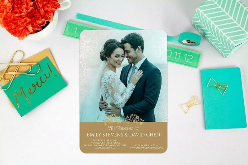
A calligraphy font is a drawing of a pen stroke, and the part that fails is the upstroke. Your screen renders that thin line at whatever weight it needs to stay visible. Paper does not negotiate: the stroke has to be laid down as ink or foil, and once it drops under about a quarter of a point it breaks into dots or vanishes at the joins.
This is why the same file looks immaculate in Illustrator at 400 percent zoom and thin on the finished card. Judge type at 100 percent, at the size it will actually print, on the stock you ordered. Our printing resolution guide covers the raster side of the same problem, and the smallest font size you can print sets the floor for body copy.
Stock changes the answer too. Uncoated and cotton papers absorb ink, so a hairline lands slightly fatter and softer than it was drawn, which forgives a thin upstroke but blurs a tight counter. Coated stock holds a fine line cleanly. Neither one saves a face whose thinnest stroke was never printable in the first place.
The hairline check that takes thirty seconds
Set the name at final size, outline a copy of it, then select the thinnest upstroke and read its width. Under 0.25 pt, size the type up or choose a lower-contrast face. Between 0.25 and 0.5 pt it will print, but it will look lighter than your screen promised. At 0.5 pt and above it behaves.
The lazy version of the same test works: print the layout at 100 percent on any office laser and hold it at arm’s length. A laser is coarser than our presses, so anything that survives that page will survive the real run.
Reversed type doubles the problem
White script knocked out of a dark panel is the single most common way a beautiful invitation goes wrong. The ink spreads a fraction into the letter from every side, so a 0.3 pt white upstroke closes up and the word arrives with gaps where the loops used to be.
When the type has to reverse, drop the copperplate and use a brush or monoline face, keep every stroke at 1 pt or thicker, and put the script on a flat solid color rather than over a photograph. A foil script on dark stock is the exception worth paying for, because the foil sits on top of the sheet instead of soaking into it.
The handwriting and calligraphy fonts worth printing
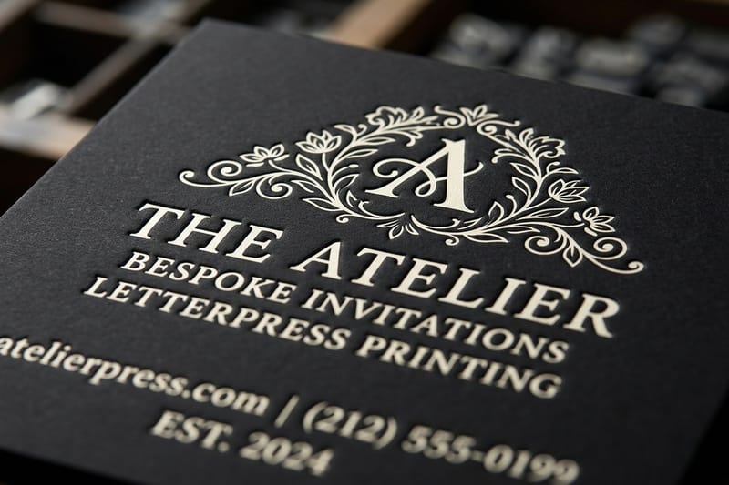
These are grouped by the job, not by looks, because the job is what decides whether the strokes hold. All of them are on Google Fonts under the Open Font License, so they are free to use on work you sell. Check the license yourself before a commercial run; the Google Fonts licensing guide explains what desktop use covers and where a web-only license stops.
Test them on real stock rather than a screen. Wedding invitations start at $19.77 and invitation cards at the same price, which makes a short proof run the cheapest design decision on this page.
Formal calligraphy, for names set large
Great Vibes is the default formal script for a reason: even stroke rhythm, generous loops, and joins that hold together as long as you leave it at 24 pt or more. Allura is lighter and more copperplate, with the thinnest hairlines in this group, so it wants a headline size and a coated or letterpress sheet.
Pinyon Script reads as engraved rather than brushed and carries slightly more weight in the upstroke, which makes it the safer choice for a two-line invitation heading. Petit Formal Script is the compromise face: formal enough for a wedding, sturdy enough to survive 16 pt on a menu or an RSVP card.
None of these should ever be set in all capitals. A connecting script draws its joins from the lowercase letterforms, so capitals leave a row of disconnected shapes with awkward gaps. Names, single lines, and short phrases only.
Monoline handwriting, for anything that has to stay small
Sacramento is a single-weight script with almost no contrast between thick and thin, which is exactly why it holds at 12 pt on a hang tag where Allura would fall apart. Caveat reads as a real pen rather than a calligrapher, and its slightly irregular baseline is what makes a packaging note look handwritten instead of typeset.
Marck Script sits between the two groups, with enough pen character for a greeting card heading and enough body to hold at 14 pt. If you only pick one script for a small brand, pick from this group. The formal faces are more beautiful and much less useful.
Brush scripts, for packaging and reversed type
Yellowtail and Pacifico are the two that survive being printed white on a dark panel, shrunk onto a small label, or foil stamped. Thick joins and low contrast do that work. The trade-off is tone: both read as friendly and retail, never as formal, so they belong on a product label or a shop sign rather than a wedding suite.
For a paid option worth the money, Bickham Script Pro carries a deep set of swashes and alternates that let one name be set several ways until the loops sit right. It is included with an Adobe Fonts subscription, and its heavy variants reverse better than most formal scripts.
Where each script belongs: invitations, cards and packaging
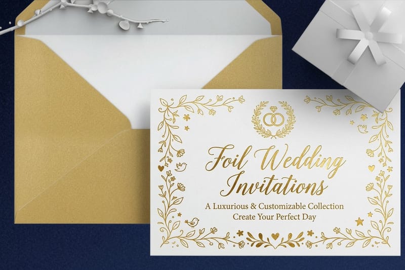
The same font behaves differently across three jobs, because each job sets the type at a different size and prints it on a different surface. Match the face to the job first, then worry about taste.
Every piece below can be ordered from the invitation printing range, and the templates further down are already sized with bleed and trim marked.
Invitations and save the dates
One script, used once. The couple’s names or the event name go in the calligraphy face at 24 pt or larger; the date, venue and details go in a plain serif or sans at 9 to 11 pt. Two scripts on one card fight each other and the card loses. If you want more detail on the whole layout, our wedding invitation design guide walks the full suite, and the wording examples cover what goes on each line.
Process matters more than font choice at this size. Letterpress invitations start at $220.20 and press the script into cotton stock, which flatters a fine hairline because the impression carries the line even where the ink is light. Foil wedding invitations start at $421.91 and do the opposite: foil sits on the surface, so it needs a slightly heavier stroke, but it reads across a room.
Greeting cards and thank you notes
Here the script has to survive being small and being read. A cover greeting can take a formal face at 30 pt or more, but the message inside is body copy and must not be a script at all. Set the inside in a serif at 10 to 12 pt and keep the handwriting for the greeting and the signature line.
A monoline face on the inside greeting is the safe compromise. It keeps the handwritten feel without asking a hairline to hold at 14 pt on an uncoated sheet.
Labels, tags and packaging
Small, curved, and often reversed, packaging is where formal calligraphy fails most reliably. A wrapped label pulls the letterforms around a curve, which stretches the thin strokes further than the flat artwork suggests. Stay with monoline or brush faces, keep the script for the brand name, and set the ingredient or care copy in a plain sans.
Hang tags are the friendlier version of the same job because they stay flat. Standard hang tags start at $25.27 and take a 12 pt monoline script comfortably, provided the type stays clear of the drill hole and the trim.
Pairing a script with a body face
The script does one job: the name, the greeting, the brand. Everything the reader has to act on belongs in a face built to be read at small size. That means a serif with a generous x-height such as EB Garamond or Cormorant Garamond for formal work, or a plain sans such as Lato or Source Sans for retail and packaging, set at 9 to 11 pt.
Pair on mood and proportion rather than era. A high-contrast copperplate script sits well beside a serif with visible thick and thin strokes, because they share the same pen logic. A monoline handwriting face sits better next to a sans, since neither one has contrast to argue about. If you want the reasoning behind the body face itself, serif versus sans serif and how to choose and set up fonts for printing both go deeper than a pairing list can.
Outlining and embedding before you send the file
A script font is the worst case for a missing font, because a substituted face does not shift the layout by a few points, it replaces the whole look of the piece. Outline the type or embed the fonts. Outlining is safer: it turns each letter into a shape that cannot be substituted, and it locks in the alternates and ligatures you switched on.
Do it on a copy, always. Outlined type cannot be edited or spellchecked, and a name misspelled in outlines is a full redraw. Keep the editable file, outline the export, and check the joins one last time at 100 percent before you upload. Converting text to shapes in Illustrator covers the steps, and embedding fonts for print is the alternative when the text has to stay live.
Invitation pricing and specs at 4OVER4.COM
A calligraphy invitation can run on three tiers of print. Flat printed wedding invitations start at $19.77 for 25, at 4.25" x 5.5", 5" x 7" or 6" x 6", in 3 business days. Foil wedding invitations put a script in gold, silver, copper or rose gold foil, from 500 in 7 business days. Letterpress invitations press the letters into 16pt silk, gloss or velvet laminated stock, from 100 in 10 business days. The table below shows the flat printed price by quantity from the live configurator, so you can size the budget before you commit the artwork.
Quantity and price
Wedding invitation pricing and specs
Invitation pricing from 25 pieces up, with the per unit cost falling as the guest list grows.
| Quantity | Price Per Unit | Total |
|---|---|---|
| 25 | 79.1¢ | $19.77 |
| 50 | 50.5¢ | $25.27 |
| 100 | 42.8¢ | $42.84 |
| 200 | 25.8¢ | $51.62 |
| 300 | 20.1¢ | $60.42 |
| 400 | 17.3¢ | $69.20 |

You can also earn coins on every order and redeem them against future printing, which takes the sting out of ordering a proof before the full run.
Stock and finish change what the script does
Stock is the second half of the type decision. Cotton and uncoated sheets absorb ink, which softens a hairline and gives the letter a slightly drawn edge that suits calligraphy. Coated stock holds the line exactly as drawn and reads sharper, which suits a monoline face on a label. A heavy ink coverage panel behind white script is the combination to avoid unless the strokes are thick.
Print it
Invitations, ready for your script
Preset sizes and stocks, the fastest way to see your type on the real sheet.
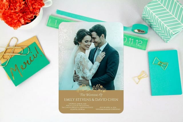
Finish decides how the script catches light. Letterpress presses the stroke into the sheet, so the line is carried by the impression as much as the ink, which is why fine calligraphy survives it. Foil sits on top and reflects, so it needs body in the stroke but reads from a distance. Flat ink on uncoated is the quietest and the most forgiving of all three, and it is the one to pick when the script is long rather than large. A matching greeting card or thank you note in the same face keeps the suite consistent after the event. Watch the Letterpress Thank You Cards video to see the pressed stroke on a small card.
Choosing a script for your industry
Different trades set type at different sizes, so the safe face changes with the job.
- Wedding and event stationers. One formal script for names at 24 pt or larger, one serif for everything else. Letterpress or foil for the script, flat ink for the detail lines.
- Small food and drink brands. A monoline or brush face for the brand name on the label, a plain sans for the legal copy. Nothing under 12 pt on a curved container.
- Boutiques and retail. Hang tags in a monoline script, printed on a stock heavy enough that the drill hole does not tear. Keep the same face on the card in the bag.
- Cafes and restaurants. Script for section headings on a menu, never for dish descriptions. Petit Formal Script at 16 pt holds where a copperplate face would not.
- Calligraphers and hand letterers. Scan real lettering at 1200 dpi, trace it to vector, and treat the traced strokes exactly like a font: nothing thinner than 0.5 pt.
Blanks that keep a swash off the trim
Starting from a sized template removes the two mistakes that cost a reprint: a loop crossing the trim, and a swash sitting outside the safety margin. On a 5" x 7" invitation the blank marks 0.125 inch of bleed and a safe area 0.125 inch inside the trim; keep every loop and swash inside that safe line, and let only a background flourish run out to the bleed. Grab one from the blank template library or start from a finished design in the design template library.
Start fast
Print-ready blanks for invitations
Exact size blank press files, so your script lands inside the cut line instead of across it.
Wally measures the hairline before he prints the name
Stroke weight decides the size, and the size decides the font
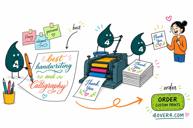
Outline a copy of the type at final size and measure the thinnest upstroke. Under 0.25 pt it drops out on press, 0.5 pt is safe, and 1 pt is the floor when the script reverses out of a dark panel. Keep tracking at zero so the joins meet, turn on contextual alternates before you outline, and 4OVER4.COM prints the proof so you can judge it on the real stock.
Order wedding invitations →What to remember about script fonts in print
Setting tips that work at every size
- Set the size before you pick the face. Decide how big the name will print, then choose a script whose hairlines survive at that size. Choosing the font first is how a design gets redrawn twice.
- Never set a connecting script in capitals. The joins live in the lowercase forms. Capitals leave disconnected shapes and uneven gaps that no amount of tracking fixes.
- Leave the tracking at zero. Adding letter spacing to a connecting script pulls the joins apart. If the word feels tight, change the size or the face, not the tracking.
- Turn on contextual alternates. Most quality scripts ship with alternates that fix the awkward pairs and the end-of-word swash. They are off by default in some apps and lost the moment you outline.
- Give the script room to breathe. A calligraphy face carries ascenders and descenders far beyond the body of the letter. Loosen the leading and keep the loops clear of the trim and the fold.
Explore more
More ways to print and design with type
Letterpress invitations run 100 for $220.20 in 10 business days and foil invitations 500 for $421.91 in 7.
Product Wedding Invitations The suite most calligraphy fonts are bought for. Product Letterpress Invitations The impression carries a fine script through cotton stock. Product Foil Wedding Invitations Metallic script that reads across a room. 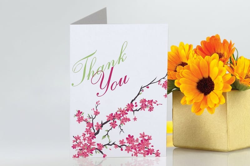 Product Greeting Cards Script on the cover, readable serif inside.
 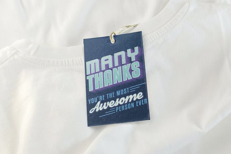 Product Custom Hang Tags Flat stock that takes a 12 pt monoline script.
 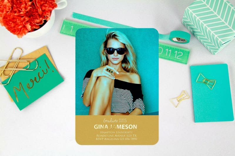 Category Invitation Printing Every size, stock and finish for invitations in one place.
  Guide Convert Text to Shapes in Illustrator Outline your script so the printer never substitutes it.
  Article Best Wedding Fonts for Invitations The wider type list for a full wedding suite.
 Ready to print your script?
Pick the size, drop in your design or a free template, and 4OVER4.COM prints it sharp on premium stock, as fast as your date needs.
Common questions about script fonts in print
What is the smallest size I can print a calligraphy font at?
It depends on the stroke contrast rather than the font name. A high-contrast copperplate face such as Allura or Great Vibes should not go below about 24 pt, because its thinnest upstroke falls under the quarter point that a press can hold cleanly. A monoline script such as Sacramento or Caveat still reads at about 12 pt, and a brush face such as Yellowtail or Pacifico holds at 10 pt. The reliable test is to outline a copy of the type at final size and measure the thinnest stroke: 0.5 pt or thicker is safe, and 1 pt is the floor when the script reverses out of a dark background.
Do I have to outline the fonts before sending the file to print?
Outlining or embedding is required, and outlining is the safer of the two for script faces. If the font is neither outlined nor embedded, the file can open on another machine with a substitute face, and a substituted script destroys the layout rather than shifting it slightly. Convert the type to outlines, keep a separate editable version of the file for corrections, and check the joins after the conversion because contextual alternates are baked in at that point. Our guide on how to convert text to shapes in Illustrator walks the exact steps, and the font embedding guide covers the alternative if you need the text to stay live. For the full pre-press check, see how to convert text to outlines before sending files to print.
Can I use a free Google Font on invitations I sell to clients?
Fonts released under the Open Font License, which covers Great Vibes, Allura, Sacramento, Caveat, Yellowtail and Pacifico, can be used on printed work you sell, including client jobs. What the license does not allow is selling the font file itself or redistributing it as part of a template package without checking the terms. A web font license bought elsewhere is a different thing and usually does not cover desktop print use at all. Read the license that came with the file before a commercial run rather than assuming free means unrestricted.
Why did the letters in my script font stop connecting in the PDF?
Two things break the joins. The first is letter spacing: adding tracking to a connecting script pulls each letter away from its neighbor and leaves visible gaps, so tracking has to stay at zero. The second is OpenType features, because most quality scripts rely on contextual alternates and standard ligatures to swap in the letterform that meets the next one, and some applications ship with those switched off. Turn both on, check the word on screen at 100 percent, then outline. Once the type is outlined the features are locked in and cannot be repaired without going back to the live text.
Is letterpress or foil better for a fine calligraphy script?
Letterpress is kinder to a fine script. The impression carries the line even where the ink lays down thin, so a hairline that would look weak in flat ink still reads as a crisp stroke on cotton stock. Foil is the opposite: it sits on the surface of the sheet and needs a slightly heavier stroke to hold, so a very high-contrast face should be sized up or swapped for something with more body before it is stamped. Letterpress invitations at 4OVER4.COM start at $220.20 and foil wedding invitations at $421.91, and both are worth a proof before the full run. Flip through the story on letterpress wedding invitations online to see the impression up close.
How many scripts should one invitation use?
One. A script is a voice, and a second one reads as indecision rather than variety. Use the calligraphy face for the names or the event line, then set every other line, including the date, the venue and the RSVP details, in a single serif or sans at 9 to 11 pt. If the piece feels flat with one script, change the size relationship between the name and the details rather than adding a second decorative face.
