
How to Choose and Set Up Fonts That Print Sharp Every Time


Sofia is our design and templates voice, built from the knowledge of our production team, with over 20 years in printing.
Fonts fail on press for reasons you cannot see on a monitor. Some faces survive ink and some do not, the size floor sits lower than you think, and outlining beats embedding in specific cases.
Choose a face with a large x-height, open counters and low stroke contrast, keep body copy at 6 point or above on coated stock and 8 point or above on uncoated, and send the artwork as a PDF/X with the fonts embedded. Outline type only when it carries a stroke, a warp, a foil layer or a logo, because outlines cannot be corrected afterwards. Set anything below roughly 18 point in 100 percent K so registration shift cannot put a colored fringe on the letters.
Quick answer
Pick for ink, size for the stock, then embed
A print font has to survive ink spread, not just look right at 100 percent zoom. Large x-height, open apertures and low stroke contrast are what keep a face readable when the stems fatten and the counters close. Hold positive text at 6 point and above on coated stock, 8 point and above on uncoated, and give reversed text one size and one weight more than positive text. Send a PDF/X with fonts embedded so a typo stays fixable, and outline only stroked, warped, foiled and logo type. The diagram below shows both handoffs and where each size floor lands.
Why Type Behaves Differently on Paper Than on Screen
Type on a screen is drawn by software that cheats on your behalf. Antialiasing paints gray pixels along every edge, hinting nudges the stems onto the pixel grid, and a hairline serif at 8 point looks perfectly crisp at 100 percent zoom. A press does none of that. It lays real ink onto a sheet that absorbs it, and the ink spreads a little as it soaks in.
That spread is dot gain, and it pushes in two directions at once. Stems get slightly fatter. Counters, meaning the enclosed holes in a, e, g and 8, get slightly smaller. On coated stock the ink sits up on the surface and the effect is mild. On uncoated paper the fiber drinks it, so a 7 point face with hairline serifs can come back with the thin strokes broken and the counters plugged. Standard letterheads start at $99.95 and are almost always uncoated, which is why body copy on a letterhead wants a sturdier face than the same copy on a coated brochure.
Registration is the second difference. Any small text built from more than one process plate has to line up within a fraction of a millimeter, and no press is perfect. Set small black text in 100 percent K. Build it as rich black and the cyan, magenta and yellow behind the K can shift a hair, which puts a colored edge on one side of every stem that the eye reads as fuzz. The rich black guide gives the recipe and the one place it belongs, which is large solid areas, never 8 point type.
Resolution is the third. Vector type is resolution independent, so it images at the full addressability of the platesetter however far you zoom. Type flattened into a picture is not. Anything pasted in as an image inherits the limits described in the print resolution guide, and small text is always the first thing to go soft.
Choosing Between a Serif and a Sans for the Job

Size, stock and reading distance decide this far more than brand personality does. A face that reads beautifully at 11 point across a booklet spread can be unusable at 6 point on the back of a card, and the brand argument does not change the physics.
Serifs help at text sizes in long reading. The serifs and the horizontal stress give the eye a rail to follow, which is why book typography has looked the way it does for four centuries. They stop helping when contrast between thick and thin strokes is high and the size drops. Garamond and Bembo are lovely and they run light, so at 8 point on uncoated they lose their thin strokes first. Transitional faces and slab serifs with low contrast, a big x-height and open counters hold together at the same size. The walkthrough of Bembo, Garamond and Bodoni explains where that contrast came from and why it varies so much between them.
Sans faces win in three specific places. Small type, because a humanist sans with open apertures keeps its counters when ink spreads into them. Reversed type, because there is no hairline left to close up. And anything read at distance, where a wide medium-weight sans is legible long before a serif is. That is the real reason standard flyers at $39.54 and signage lean on sans headlines while a 24 page booklet does not.
One test settles most arguments. Print the candidate at the actual size on the actual stock, put it on a desk, and step back to normal reading distance. If you are squinting at the small print, the face is wrong or the size is. For the longer comparison including brand voice, read the serif versus sans serif guide, and lettering styles and font categories names the families you are choosing between.
Pairing Two Typefaces Without a Clash
Two typefaces work together when they clearly differ in structure and clearly agree in proportion. Most clashes are the opposite of what people expect: not two faces that fight, but two faces that are almost the same, which reads as a substitution error rather than a decision.
Pick the text face first, because it does the most work and it has the least room to move. Then find a display face that contrasts on one obvious axis, usually serif against sans or high contrast against low. Then check proportion. Set both at the same point size and compare x-heights. If the sans has a much larger x-height it will look two sizes bigger than the serif on the page, and dropping it a point is what makes the pair feel deliberate.
| Pairing | What happens on the page |
|---|---|
| Serif headline, humanist sans body | Different structure, similar warmth. The safe pair for brochures, reports and menus. |
| Geometric sans headline, low contrast serif body | Strong contrast without noise, and the serif keeps long copy comfortable to read. |
| One superfamily, serif and sans cuts | Shared skeleton and shared x-height, so it cannot clash. The lowest risk option there is. |
| Two old-style serifs together | Fails. Garamond beside Caslon looks like a font went missing, not like a pairing. |
| Two display faces | Fails. Both are shouting and neither is a text face, so nothing on the page recedes. |
| Three or more families | Fails twice. The hierarchy blurs, and the export has one more substitution risk in it. |
Weight is the cheap lever most people skip. A single family with regular, medium, semibold and bold gives four clear levels of hierarchy without a second font, keeps the PDF smaller, and takes the substitution risk to zero. On a fold-out the pairing also has to survive panel widths that change across the piece, which the brochure font and size guide works through on real panels. A logo plays by different rules again, since the mark is set once and then outlined forever, and the logo font guide covers that case.
Minimum Sizes, Spacing, and the Reversed-Type Penalty
There is no single minimum, because the floor moves with the stock, with whether the type is positive or reversed, and with how open the face is. These are the numbers we work to in prepress, and they assume a typeface with a reasonable x-height rather than a hairline Didone.
| Piece | Positive floor | Reversed floor | What decides it |
|---|---|---|---|
| Business cards, 14pt or 16pt coated | 6 pt | 8 pt | Card backs are where legal lines get crushed. Hold everything 0.125 inch inside the trim. |
| Flyers and brochures, coated text | 7 pt | 9 pt | Folds cost a little legibility at the crease, so keep type 0.125 inch clear of every fold. |
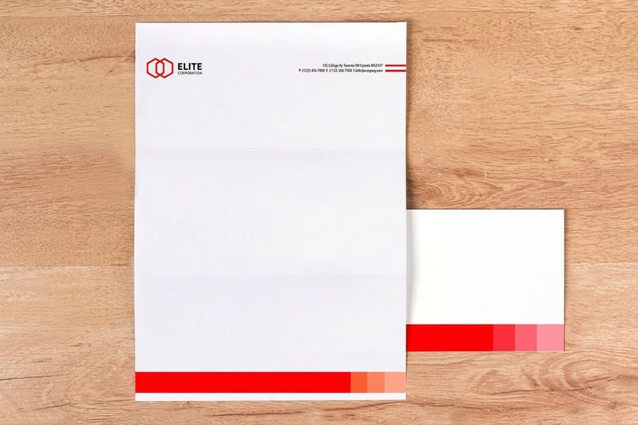
| Letterheads and envelopes, uncoated | 8 pt | 10 pt | Uncoated absorbs ink, so counters close roughly a point earlier than they do on coated. |
| Postcard address side | 10 pt | Avoid entirely | Sorting equipment reads a plain upright sans best. No script, no italic, no knockout address. |
| Banners and signs | Set by distance | Set by distance | The working rule is about one inch of cap height for every ten feet of reading distance. |
Spacing does as much work as size. Set leading somewhere between 120 and 145 percent of the type size, and move toward the top of that range as the line gets longer, because a long line needs a clearer return path. Keep the measure near 45 to 75 characters. Add a little positive tracking to anything small or reversed, since ink closing inward makes tight letterspacing worse. Take tracking out of large display type, where spacing designed for text sizes always looks loose.
Then check position. Type within 0.125 inch of the trim is at risk on every cutting job, and the bleed and trim guide shows exactly what that margin protects. If you want the deeper argument about the absolute floor, the smallest printable font size guide goes further into it, and what pt means in printing separates the point size of type from the pt thickness of paper, which trips people up constantly.
Outlining or Embedding, and Which One to Send
Embed by default and outline the exceptions. A PDF/X export with fonts embedded keeps the text live, which means a typo is still fixable and prepress can read a problem rather than guess at a shape.
Embedding fails in two situations, and both are worth checking before you export. The first is licensing. Every font file carries an embedding permission flag, and a small number are set to no embedding, in which case the export either errors or quietly substitutes. The second is the source application. A Word or PowerPoint file sent as it stands references fonts installed on your machine rather than carrying them, so export to PDF from the application with embedding switched on, which the Word to print-ready PDF guide walks through step by step.
Outlining converts every letter into vector paths. Nothing can substitute because there is no text left to substitute. That is the appeal, and it is also the whole cost.
Outline these:
- Type carrying a stroke, a warp, an envelope distortion or a gradient, since those effects can render differently in another interpreter.
- Logos, foil layers and die lines, where the letterform is a shape rather than a character. Foil setups depend on it.
- Unusual free faces, especially any with an incomplete glyph set or a license you cannot find.
Leave these live:
- Body copy in anything you may still revise, because a typo inside outlines means rebuilding the file.
- Booklets and long documents, where searchable, selectable text still has value after the job prints.
- Very small type, since outlines drop hinting and can print a shade heavier at 6 point.
Whichever route you take, save a live-text copy of the document first. Outlining is a one-way door once the file is written. The mechanics are in the outlining guide and the font embedding guide, and the print-ready PDF export guide shows the export settings that carry either choice safely.
Font Mistakes That Ruin a Print Job

Nearly every font problem that reaches our prepress desk is one of six things, and five of them are invisible on screen.
- Fake bold and fake italic. Pressing the B button on a family with no bold cut makes the application synthesise one by smearing the outline. It looks acceptable on screen and prints muddy, and small text loses its counters first. Take the real weight from the family menu instead.
- Small text built from four plates. A 7 point line in rich black, or in a dark gray mixed from CMYK, shows every registration shift as a colored edge. Move small text to 100 percent K.
- White type set to overprint. Overprint on black text is usually correct. Overprint on white text deletes it, because white carries no ink and the letters simply reveal whatever sits underneath. Check the attributes panel before export.
- Type sitting in the trim. A cutting tolerance of a sixteenth of an inch will shave a line that sits a sixteenth of an inch from the edge. Hold text 0.125 inch inside on every side.
- Legacy Type 1 PostScript fonts. Adobe ended Type 1 support in its Creative Cloud applications from January 2023, so an old file that still calls one substitutes rather than renders. Swap in the OpenType release before you send.
- A stroke applied to text, then outlined. Converting stroked type to outlines can turn a centered stroke into a shape that eats the counters. Expand the appearance, look at it at 400 percent, then outline.
The seventh is the free font from a download aggregator. It usually renders, then breaks in a specific way: missing kerning pairs, no true small caps, no proper currency or accented glyphs, an ampersand that sits at a different weight from everything around it. If it is going on standard business cards at $17.57 a box, use a properly licensed face instead. Our list of 20 free fonts that make business cards look expensive is a place to start, as long as you read each license file first. Google Fonts and commercial print use covers what those open licences actually permit, and the designer fonts that hold up in print is a shortlist worth borrowing from.
Check the File Before You Order
Seven checks, about five minutes, and they catch the font problems that get expensive once the sheets are printed.
- Open the font list. In InDesign that is Type then Find/Replace Font, in Illustrator it is Type then Find Font. Anything flagged as missing is already substituting on your own screen.
- Confirm every weight is a real cut from the family menu, not a synthesised bold or italic applied from the toolbar.
- Take small text to 100 percent K and confirm it in the separations preview, one plate at a time.
- Turn on overprint preview and hunt for white type that disappears.
- Zoom to 400 percent on the smallest line on the piece. If the counters are closing at 400 percent on screen, they will close on paper.
- Check the margins, 0.125 inch from trim and 0.125 inch from any fold or drill hole.
- Export as PDF/X with fonts embedded, then reopen the PDF and read the fonts tab in document properties. Every entry should say Embedded or Embedded Subset.
Starting from a correctly sized layout removes half the risk, so pull the file from our blank template library before you draw a text box. When the job is high value or the type is genuinely tight, run a small quantity first or ask for a proof, which the proofing guide explains. The rest of the pre-upload checks sit together in the file prep guides, and creating commercial print-ready files ties the whole handoff together.
Wally explains print fonts
Ink spreads, so the thin bits go first
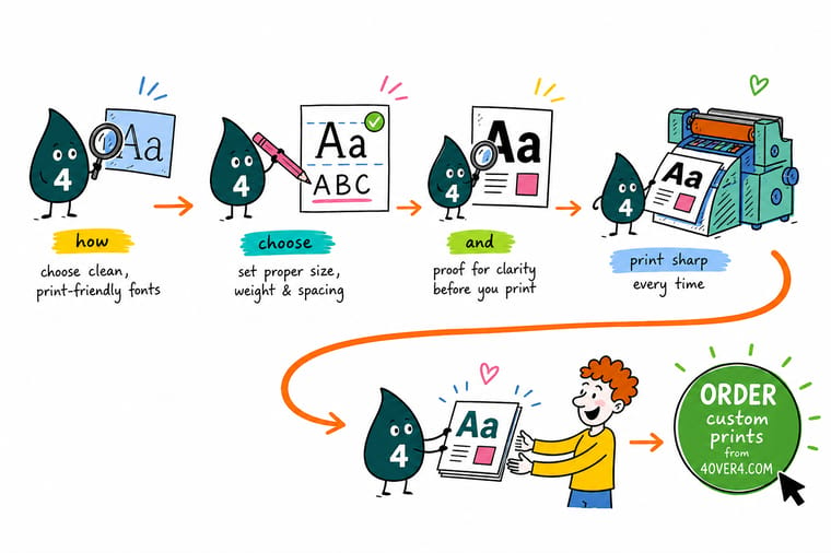
Wally puts a magnifier on the smallest line of your card. The hairline serif has already lost a stroke and the counters in the a and the e are filling with ink, because paper drinks and ink spreads. The open, low-contrast face beside it is still perfectly readable at the same 6 point. Pick that one, set small text in 100 percent black, give reversed type an extra size and weight, and send a PDF/X with the fonts embedded so a typo is still something we can fix.
Order standard business cards →%22%2F%3E%3Ccircle%20cx%3D%2241%22%20cy%3D%2249%22%20r%3D%2226%22%20fill%3D%22%2314b8a6%22%20opacity%3D%220.15%22%2F%3E%3Ccircle%20cx%3D%2278%22%20cy%3D%2258%22%20r%3D%2214%22%20fill%3D%22%2314b8a6%22%20opacity%3D%220.1%22%2F%3E%3Crect%20x%3D%2271%22%20y%3D%2228%22%20width%3D%2226%22%20height%3D%2234%22%20rx%3D%224%22%20fill%3D%22%2314b8a6%22%20opacity%3D%220.08%22%20transform%3D%22rotate(36%2080%2030)%22%2F%3E%3C%2Fsvg%3E)
Specs and pricing
The pieces where type gets smallest, with live specs
Business cards, brochures and letterheads are where the size floor actually bites. Compare stocks, sizes and starting prices straight from the 4OVER4.COM configurator. Standard business cards start at 100 for $17.57 on coated stocks such as 14pt and 16pt gloss, where 6 point is the floor. Brochures start at 50 for $57.11 on 100# gloss or silk text, 70# uncoated text or 14pt gloss cover. Letterheads start at 50 for $99.95 at 8.5 by 11 inches on 70# uncoated text or 24# Royal Laid, where body copy wants 8 point and up.

Print it
Put your type on paper
Test your smallest line at the real size on the real stock before the full run: 100 business cards cost $17.57, 50 flyers $39.54 and 50 postcards $16.48, each with 3 business days of production.




Explore more
Where to go next
Choose between a serif and a sans for your brand, find how small type can print before counters close, outline type properly in Illustrator, and check what Google Fonts licenses permit, then open business card printing and the file prep guides.


By the numbers
Type printed right at 4OVER4
Common Questions
Your print font questions, answered
Should I outline my fonts or embed them?
Embed them, and outline only the exceptions. A PDF/X export with fonts embedded keeps the text live, so a typo can still be corrected and prepress can see a problem instead of guessing at a shape. Outline type that carries a stroke, a warp, an envelope distortion or a gradient, plus logos, foil layers and die lines, where the letterform is a shape rather than a character. Keep an un-outlined copy of the document in every case, because outlining is a one-way door once the file is saved.
What is the smallest font size that prints cleanly?
On coated stock with an open face, 6 point is the practical floor for positive text and 8 point for reversed text. On uncoated stock, move both floors up about a point, because the fiber absorbs ink and the counters close earlier. Those numbers assume a typeface with a decent x-height and low stroke contrast. A high contrast Didone with hairline serifs is already in trouble at 8 point, and no press setting will save it.
Why does my small black text look fuzzy or slightly colored?
It is almost certainly built from more than one plate. If the text is rich black, or a dark gray mixed from cyan, magenta, yellow and black, then four plates have to register perfectly behind every letter. A shift of a fraction of a millimeter puts a thin colored edge on one side of each stem. Set any text below roughly 18 point to 100 percent K only and keep rich black for large solid areas.
Can I use a free font on printed material I sell?
It depends on the license, not on the price. Open licences such as the SIL Open Font License permit commercial use including print, which covers most of the Google Fonts library. Fonts pulled from a download aggregator are often unlicensed copies of commercial releases, and beyond the legal problem they usually ship broken: missing kerning pairs, no true small caps, an incomplete currency and accent set. Check the license file that came with the font before it goes on a job.
Why did the font change when the printer opened my file?
The font was never in the file. Native layout documents and Office files reference fonts installed on your machine rather than carrying them, so any machine without that font substitutes a default. Metrics change, lines reflow, and the layout you approved is not the layout that prints. Exporting to PDF/X with font embedding switched on solves it. A small number of font files carry an embedding permission flag set to no embedding, and those need replacing with a licensed alternative.
How many typefaces should one printed piece use?
Two families is the working answer, and one family with several weights is often better. Hierarchy comes from weight, size and space far more than from variety, so regular, semibold and bold inside a single family will carry a brochure comfortably. A third family rarely adds meaning and it adds substitution risk, file weight, and one more thing to check at export.
Get Started
Outline the type, then order 100 cards from $17.57
Pick the stock, set your type to the right floor, embed the fonts in a PDF/X, and we print copy that stays sharp down to the small print.
Legal Disclaimer
Gold Standard guarantees apply to all standard orders placed through 4over4.com. Price match requires verifiable proof of a competitor's published price for an equivalent product with matching specifications and turnaround time. Satisfaction guarantee covers manufacturing defects and print quality issues. Contact support with order number and documentation.
