
2026 Color Trends and the Palettes That Survive a Printing Press


Emma is our prepress and print production voice, built from the knowledge of our production team, with over 20 years in printing.
The 2026 palettes are quiet neutrals carrying one saturated accent, and the accent is usually the part your printer cannot reproduce in CMYK. Six palettes are below with hex values, the CMYK a converter returns, and the build we would actually put on plate, because a converter will hand you a navy made almost entirely of black and that prints flat every time.
The 2026 palettes at a glance
| Palette | Anchor color | Converter CMYK | What to send the press | Where it works |
|---|---|---|---|---|
| Cloud Dancer Neutrals | #F0EEE9 | C0 M1 Y3 K6 | Do not print it. Choose the paper. | Business cards, wedding stationery, packaging |
| Sun-Bleached Clay | #C46B4B | C0 M45 Y62 K23 | C8 M62 Y70 K1, safely inside CMYK | Postcards, menus, hospitality brochures |
| Abyss Marine | #16324F | C72 M37 Y0 K69 | C100 M85 Y30 K25 as a rich navy build | Posters, covers, professional services |
| Acid Pop | #C8E01C | C11 M0 Y87 K12 | Pantone 389 C spot ink, not process | Event flyers, club and festival print |
| Mushroom and Mauve | #8E6B78 | C0 M25 Y15 K44 | C42 M58 Y42 K12, watch it on uncoated | Soft touch cards, beauty and wellness |
| Soft Electric | #2A4BD7 | C80 M65 Y0 K16 | Pantone 2728 C, or accept a purple shift | Tech, retail signage, campaign flyers |
The converter column is the naive hex-to-CMYK result, shown so you can see how far it drifts from the press build beside it. Screen swatches are indicative only, so order a short postcard run, where 50 postcards start at $16.48 and print in 3 business days, or ask for a proof on your stock before you sign off a palette.
The mood behind 2026 color
The direction for 2026 is quieter and more material. Pantone put a soft white, Cloud Dancer, at the center of the year, and the palettes that have grown around it are built from paper tone, texture and one held accent rather than from full-bleed color. Our own breakdown of printing Cloud Dancer covers that single color in detail, and the companion article, Cloud Dancer, Pantone Color of the Year 2026, in Print, takes it onto real stocks.
That shift changes what a printer has to do. A loud palette hides a lot: heavy coverage buries stock differences and small registration errors. A quiet palette hides nothing. When two thirds of the sheet is bare paper, the paper is the design, and the shade, the finish and the fiber all become visible decisions rather than line items.
The other half of the trend is the accent. Almost every palette in circulation now pairs a large area of near-neutral with one saturated color used sparingly, and the saturated ones are exactly the colors four-color process struggles with. So the year asks for cheap coverage and expensive accents at the same time, which is the problem the rest of this page solves.
Why quiet palettes are harder to print
A five percent tint is the most fragile thing on a press sheet. It is where banding shows, where a slightly worn plate shows, and where the difference between two paper whites is impossible to unsee. Brands that specify a pale palette and then approve it on a bright screen are usually disappointed by the first delivery, not because the printing was wrong but because the screen was backlit and the paper is not.
The reliable move is to build the pale tones out of stock rather than out of ink. A warm uncoated sheet already sits near the neutral you want. Use it, and spend the ink on the one accent that has to carry the page.
What actually changed since the mocha and terracotta run
The browns did not leave, they lost saturation and gained gray. Mocha became mushroom, terracotta became a dusty clay, and the burgundy accent that partnered them has been replaced by a mauve or a deep marine. If you have a brand system built on the last two years of warm browns, this is a shift you can make with a tint adjustment rather than a rebrand.
The bigger break is at the bright end. Neon and gradient-heavy schemes have thinned out, and what replaced them is a single hard accent on a neutral field. That is good news for print budgets, because one spot ink on an otherwise light sheet is cheaper than heavy four-color coverage across everything.
Trending palettes for the year

Six palettes are doing most of the work in the files we set up. Each one below carries its hex values, the CMYK numbers a converter returns, and the build we would actually send to press, which is not always the same thing.
Treat the converter numbers as information, not instruction. The mathematics of hex to CMYK is fine; the trouble is that it optimizes for matching the screen value and ignores how ink behaves. It is happy to hand you a dark blue built almost entirely from black, and that is the single most common reason a brand navy prints looking washed out. Our explanation of CMYK values for print goes further into why a build with four inks in it beats a build with one.
If the palette you want has an accent outside the process gamut, you have three honest options: pay for a spot ink, move the color to where CMYK can follow, or move the accent to a finish. Metallic ink business cards from $126.32 solve that last one by putting the accent in a material rather than a color build.
How to read the numbers below
The hex value is what the design lives as on screen. The CMYK line is the naive conversion, the one a converter or a careless export gives you. The press note says what we would change before the plates are made, and why.
None of it removes the need for a proof. Color on a calibrated monitor and color on a specific stock under specific light are two different things, and the only way to settle it is to hold the printed sheet. We include a proof step so this happens before the run, not after it.
Where each palette works best
A palette that sings on a poster can fall apart on a business card, mostly because of scale. Large areas let a subtle neutral read as a considered choice; at business-card size the same tone reads as an unprinted edge. Match the palette to the piece before you match it to the brand deck.
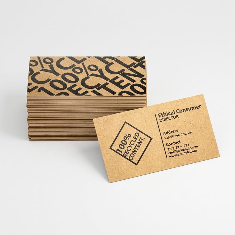
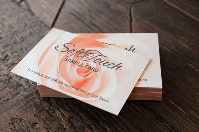
Cloud Dancer Neutrals and Mushroom and Mauve belong on small, held items where the surface is part of the experience: soft touch business cards at $40.28 give those palettes the velvety hand that makes a near-white look deliberate. Abyss Marine wants size and distance, so it earns its keep on standard posters from $108.75 and on brochure covers.
Acid Pop and Soft Electric are event palettes. They are built to be seen across a room, which means flyer printing and signage rather than stationery, and they are the two most likely to need a spot ink. Sun-Bleached Clay is the flexible one: it prints faithfully at any size on any stock, which is why hospitality keeps choosing it.
Scale changes the accent ratio
The rough rule that holds across formats is that the accent should shrink as the piece shrinks. A poster can carry an accent across a third of its area. A postcard is comfortable around a tenth. A business card usually wants the accent on one element only, a rule, a logo mark, or the edge of the card, and nowhere else.
Break that ratio and the palette stops reading as the palette. Two thirds chartreuse on a business card is not the Acid Pop palette, it is a chartreuse business card, and it loses the contrast that made the scheme work.
Coated, uncoated and the same ink
Coated stock holds ink on the surface, so colors stay saturated and dark tones stay dark. Uncoated stock absorbs it, so everything comes back a shade lighter, warmer and softer. The same file printed on both will not match, and no amount of press adjustment makes them match exactly.
Decide which stock is the master. Approve the color on that one, then accept that the other will sit slightly off it. Trying to force a match across coated and uncoated is the most expensive way to be mildly unhappy with both.
Every swatch, and the number to send
Each block below carries the three colors of the palette, the hex value, the converter CMYK, and a note on what happens when it reaches ink. Read the press note before you read the swatches, because it is the part that decides whether the palette survives.
Cloud Dancer Neutrals
The quiet end of the year. Pantone named Cloud Dancer, a soft white, its Color of the Year 2026, and the palettes built around it lean on paper texture instead of ink coverage.
On press. There is no white ink in four-color process, so the lightest tone in this palette is whatever stock you pick. A warm uncoated sheet gives you the color for free and holds the softness. Print Cloud Dancer as a tint and you get a faint gray wash that looks like a printing fault.
Sun-Bleached Clay
The terracotta run did not end, it faded. The 2026 version is dustier and lower in saturation, sitting next to a rose that has been left in the sun.
On press. This is the easiest of the six to print. Every tone sits comfortably inside CMYK on coated and uncoated alike, and the palette gains from uncoated stock because the fiber takes a little saturation out and pushes it further toward the mood it is chasing.
Abyss Marine
Deep sea navy with a sea-glass green against a cool chalk. It reads serious without going to black, which is why it keeps turning up on professional services work.
On press. The trap is the navy. A converter turns #16324F into C72 M37 Y0 K69, and that heavy black with no yellow prints as a flat, chalky, slightly purple dark gray. Send C100 M85 Y30 K25 instead. Four inks doing the work makes the navy look deep rather than dirty.
Acid Pop
One violent chartreuse against graphite and bone. It shouts from across a room, and it is the one handed over most often without anyone asking whether a press can reproduce it.
On press. It cannot, not in process. Chartreuse lives outside the CMYK gamut, and C11 M0 Y87 K12 comes back from the press as a tired olive-yellow with none of the glow on screen. Run it as Pantone 389 C spot ink, or reserve the acid for the screen and let the print use graphite and bone.
Mushroom and Mauve
The brown family that arrived with mocha has softened into mushroom, with a dusty mauve doing the accent work. Wellness and beauty brands have taken it almost entirely.
On press. Printable, with one warning. Muted mid-tones are the colors that shift most between stocks: the same mauve reads pink on gloss and gray on uncoated, because uncoated absorbs ink and takes the edge off the saturation. Pick the stock before you approve the color, not after.
Soft Electric
A pale lilac carrying most of the layout with one saturated cobalt as the signal. It is the palette that keeps the quiet year from going dull.
On press. Bright blues are the classic CMYK disappointment. Cobalt needs more cyan than the process can lay down, so the press compensates with magenta and the result leans purple. Use Pantone 2728 C for the accent, or drop the cobalt half a step toward teal where CMYK can follow you.
Using trend colors in print
Three decisions turn a palette into a printed piece: the stock, the color build, and whether any accent needs a spot ink. Stock comes first, because it moves the color more than any file adjustment will. Then set the build for the darks, since that is where converters do the most damage. Only then argue about the accent.
Export in CMYK with a working profile you can name, and keep the original RGB artwork so you can rebuild if the palette changes. Our note on the best color profile for printing covers which profile to choose and why the choice matters more on uncoated stock. If the file arrives in RGB we convert it, and the conversion is exactly the naive one shown in the table above, which is why sending a considered CMYK build gets you a better result.
Quantity and price
Premium business card pricing and specs
Live configurator numbers on premium stock, the format most brands test a new palette on first.
| Quantity | Price Per Unit | Total |
|---|---|---|
| 100 | 17.6¢ | $17.57 |
| 200 | 11.5¢ | $23.07 |
| 300 | 9.15¢ | $27.46 |
| 400 | 7.96¢ | $31.86 |
| 500 | 7.25¢ | $36.26 |
| 600 | 6.77¢ | $40.64 |

You can also earn coins on every order and redeem them against future printing, which helps when a palette test turns into a full reprint of the stationery set.
Keeping color on-brand
A trend palette is a guest in your brand, not a replacement for it. The brands that handle this well keep one fixed color they own and let the surrounding neutrals move with the year, so the work looks current in 2026 and still looks like them in 2028. Choosing your brand colors covers how to pick the one that stays.
- Fix the accent, float the neutrals. Trend palettes date at the accent, not at the base. Keep your brand color fixed and let the neutrals around it move each year and you stay current without a rebrand.
- Write the build, not the hex. A brand guide that lists only hex values guarantees a different result from every printer. Publish the CMYK build, the Pantone reference and the stock alongside it.
- Nominate a master substrate. Name the one stock the color is approved on. Everything else is measured against that sheet, which ends the argument about which delivery was right.
- Keep the accent on the reprint list. A seasonal accent belongs on short-run items you replace anyway, such as flyers and postcards, never on the sign you will keep for five years.
- Proof before the full run. A printed proof on the real stock costs a fraction of a run and settles every color question in one go. Skipping it is how a palette becomes a reprint.
The failure mode is a brand guide that specifies hex values only. Every printer converts those differently, so every supplier returns a slightly different color and nobody is wrong. Publish the CMYK build, the Pantone reference and the master stock together, and the problem disappears. There is more on how ink and substrate interact in our overview of color and ink in commercial printing.
Print it
Soft touch cards for a quiet palette
The finish that gives a near-white palette the weight the ink is deliberately not supplying.
Print on-trend materials at 4OVER4.COM
Which product you choose does as much for a palette as the color build does. Stock decides how the neutrals read, finish decides whether the accent has any presence, and format decides how much accent the design can carry. For a full-color campaign piece, standard brochures at $57.11 give a marine or clay palette room to breathe across a spread. For distance visibility, poster printing is where an acid accent finally earns the spot-ink charge.
If the accent cannot be printed, print the material instead. Metallic ink, soft touch lamination and heavier uncoated stocks all give a page a character that a flat CMYK build cannot, and none of them depend on hitting a specific hex. For the pairings that hold up year after year, the guide to color combinations for branding and print is the companion to this page, and 30 holiday color palettes covers the seasonal end.
- Beauty and wellness. Mushroom and Mauve on soft touch stock. The palette is muted enough that the finish has to supply the richness the ink is deliberately not supplying.
- Hospitality and food. Sun-Bleached Clay on uncoated. It prints faithfully, it survives a menu reprint at short notice, and uncoated absorption pushes it further toward the mood.
- Professional services. Abyss Marine with a proper four-ink navy build. Serious without going black, and it holds up on a brochure cover and a poster at the same time.
- Events and nightlife. Acid Pop with the chartreuse as a Pantone spot. Visibility at distance is the whole job, so this is the one palette worth paying spot-ink money for.
- Retail and tech. Soft Electric, with the cobalt either bought as a spot ink or nudged toward teal so the process can reach it without turning purple.
Blanks that keep the work in the color
A business card blank arrives sized at 3.75 x 2.25 in, with 0.125 in of bleed on each side and a 3.25 x 1.75 in safe zone, so the palette work stays where it belongs, in the color, rather than in fixing bleed and trim at the end. 4OVER4.COM sizes its blanks to exact product specs, so drop a print-ready blank from the blank template library under your artwork and the cut lines are already right.
Start fast
Blanks that keep the work in the color
Business card design templates and exact-size blanks so your palette lands inside the cut line.














Wally checks the palette before the plates are made
Hex is a screen value, ink is a physical one
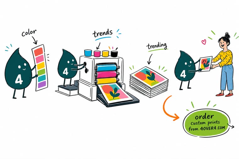
Send a CMYK build rather than a hex value, build dark blues with all four inks instead of mostly black, buy chartreuse and cobalt as Pantone spot inks, and let the paper supply Cloud Dancer because process printing has no white. Approve the color on the stock you are actually printing, and 4OVER4.COM proofs it before the run.
Order premium business cards →What to remember about 2026 color trends
Palette rules that hold at every format
- Fix the accent, float the neutrals. Trend palettes date at the accent, not at the base. Keep your brand color fixed and let the neutrals around it move each year and you stay current without a rebrand.
- Write the build, not the hex. A brand guide that lists only hex values guarantees a different result from every printer. Publish the CMYK build, the Pantone reference and the stock alongside it.
- Nominate a master substrate. Name the one stock the color is approved on. Everything else is measured against that sheet, which ends the argument about which delivery was right.
- Keep the accent on the reprint list. A seasonal accent belongs on short-run items you replace anyway, such as flyers and postcards, never on the sign you will keep for five years.
- Proof before the full run. A printed proof on the real stock costs a fraction of a run and settles every color question in one go. Skipping it is how a palette becomes a reprint.
Explore more
More ways to print a palette
Metallic ink business cards run 500 for $126.32 in 7 business days, the route for an accent CMYK cannot reach.
 Product Premium Business Cards Heavier stock that holds a pale palette without looking bare.
 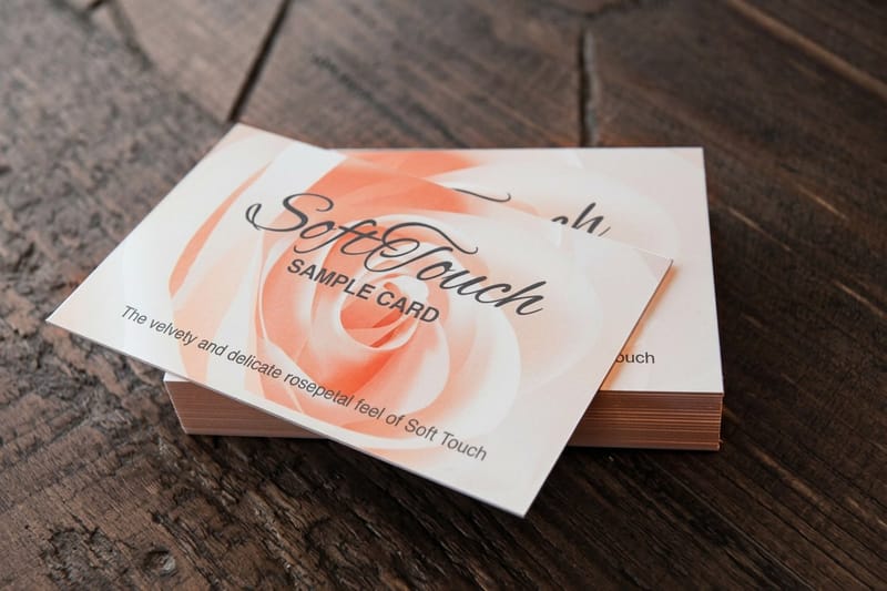 Product Soft Touch Business Cards The finish that makes a near-white read as deliberate.
  Product Metallic Ink Business Cards Put the accent in a material when CMYK cannot reach the color. Product Standard Postcards The cheapest way to test a palette on real stock.
  Guide Pantone and Spot Color Inks When a spot ink is worth the plate charge and when it is not.
  Category Business Card Printing Every stock and finish these palettes need, in one place.
 Ready to see the palette on paper?
Pick your stock, send a CMYK build or a free template, and 4OVER4.COM proofs the color before the run so the delivery matches what you approved.
Common questions about print color trends
Can CMYK print the Pantone Color of the Year 2026?
No, and it is not a limitation you can design around with a better file. Cloud Dancer is a soft white, and four-color process builds color by laying cyan, magenta, yellow and black onto a sheet, so the whitest thing it can produce is the sheet itself. Trying to print Cloud Dancer as a light tint gives you a faint gray cast that reads as a printing fault rather than as a chosen color. The right answer is to buy the color as paper: a warm uncoated stock lands very close to it, holds the soft quality the palette is after, and costs nothing extra in ink.
Why does my brand blue print purple?
Because a saturated cobalt or royal blue sits outside what cyan, magenta, yellow and black can reproduce together. To reach that brightness the build needs more cyan than the process can lay down, so magenta compensates and the eye reads the result as purple. There are two fixes. Buy the blue as a Pantone spot ink, which is a plate charge but an exact color every time. Or move the specified blue slightly toward teal, away from the magenta side, so that the process can follow it. Our guide on converting RGB files for print covers where the gamut boundary sits.
Do I need a Pantone spot ink for a trend palette, or is CMYK enough?
CMYK is enough for four of the six palettes here. Sun-Bleached Clay, Mushroom and Mauve, Abyss Marine and the neutral half of Soft Electric all sit inside the process gamut, provided the dark tones are built with all four inks rather than mostly black. A spot ink earns its cost in two situations: a fluorescent or acid accent such as chartreuse, and a brand color that must match exactly across many print runs and many suppliers. If neither applies, put the money into stock and finish instead.
Will the same palette look the same on uncoated and gloss stock?
No. Coated stock holds ink on the surface so color stays saturated and dark tones stay dark, while uncoated absorbs it and returns everything a little lighter, warmer and softer. The gap is small on solid dark colors and very visible on muted mid-tones, which is exactly where most of the 2026 palettes live. Choose one stock as the master, approve the color on that sheet, and treat the other as a close relative rather than a match. A printed proof on the real stock is the only reliable way to see the difference before the run.
How long does a color trend last, and should I reprint everything?
A trend accent has a couple of good years in it, and the neutrals around it outlast the accent by a wide margin. That is why the practical approach is to keep the brand color fixed and let the seasonal color live only on items you replace anyway. Flyers, postcards and event print are cheap to refresh, so put the trend color there. Signage, vehicle graphics and anything you will keep for years should stay on the colors your brand already owns, or you buy a rolling reprint bill in exchange for looking current for a season.
