
Great Brand Names and Why They Work


Emma is our prepress and print production voice, built from the knowledge of our production team, with over 20 years in printing.
A brand name works when it can be said once, spelled back correctly, and registered in your own class of goods. Meaning is the fourth job, not the first, and it gets attached later by what you sell and what you print. The eight strategies below are the ones behind names people actually remember, and each one carries a cost that shows up the moment the name has to sit on a card. Reuben Mattus is the textbook case: he made up Haagen-Dazs in the Bronx so an American ice cream would read as imported, and the umlaut is pure decoration. To test your own shortlist, print it on standard business cards, 100 for $17.57, then carry the winner onto hang tags from $25.27 for 50 and packaging labels from $23.88 for 25.
Eight naming strategies and what each one costs
| Strategy | Names that use it | What you gain | What it costs you | How it behaves in print |
|---|---|---|---|---|
| Invent a word | Kodak, Haagen-Dazs | Nobody owns it yet, so registration and the domain are usually clear | It means nothing on day one and you pay to teach it | Needs a strong logotype, so foil and embossing pay off |
| Fuse two roots | Verizon, Netflix | A recognisable root does part of the teaching for free | The seam can look dated if the roots go out of fashion | Reads well at small sizes on cards and labels |
| Roll off the tongue | Coca-Cola, PayPal | Repeated sounds are easier to recall and easier to repeat | Alliteration can tip into sounding like a cartoon | Repeated letterforms give a designer something to build on |
| Keep it short | Nike, Apple | Fits at a readable size on a card, a tag and an app icon | Short words are the most contested in every register | Sets large on a 3.5 by 2 inch card without crowding |
| Say what you do | City Dental Care | Understood before you spend anything on marketing | Hard to register, crowded, and it boxes you in when you expand | Often needs a mark beside it so the card is not just words |
| Sound like the product | Schweppes, Snap | The sound carries the idea with no explanation attached | Only works for products with a sound worth borrowing | Suits packaging labels where the name sits next to the product |
| Build an association | Nike, Verizon | Borrowed meaning gives the brand a direction on day one | The reference can be invisible to people outside its culture | Gives the identity a story a folder or a tag can carry |
| Buck the trend | PayPal, Yellow Tail | Contrast makes you audible in a category that all sounds alike | You are betting the category convention is a habit, not a rule | Works hardest when the print looks different too |
Every strategy in the table carries a cost, so pick the one you would rather pay: the teaching bill on an invented name, or the ownership problem on a descriptive one. Whichever you choose, a name under about 14 characters sets large on a 3.5 by 2 inch card without crowding the phone number. Once the name is chosen, you can order standard business cards, 100 on 14pt gloss cover for $17.57, and see how it behaves on paper.
What makes a brand name stick

A name works when someone can hear it in a noisy room, spell it back correctly, and find you when they type it. Meaning comes fourth, and it arrives later, carried by what you sell and what you hand people.
That order surprises founders, because naming sessions almost always start with meaning. Nike meant a Greek goddess to a handful of classicists and nothing at all to everyone else. What it had from the start was two syllables, one obvious spelling, and no competitor holding the word.
The fourth job is physical. The name has to hold up set small on a card, big on a sign, and squeezed onto the spine of a folder. A name that needs 24 characters is a design problem you will pay for on every piece you print for the life of the business. Our business card basics guide shows how little room 3.5 by 2 inches really is.
The three tests, in the order that matters
Say it down a phone line to someone who has never seen it written, and ask them to write it down. If they ask you to spell it, note that you will be spelling it for the rest of your working life. Then search the register: the USPTO trademark database is free, and a conflict in your own class of goods ends the conversation early rather than expensively.
Only after those two do you look at the domain. A name that survives the first two tests and fails the third is still workable, because you can prefix or suffix the domain. A name that fails the first two is not rescued by an available .com.
Where names actually fail
Three failures repeat. The first is proximity: a name close enough to a competitor in the same class that customers land on them by accident, which is a marketing budget spent on somebody else. The second is a spelling gimmick, the Kwik and Xpress and Fone family, which costs you a correction every time it is typed and dates the business to the decade you registered it.
The third is the one nobody checks. If you sell into another language, have a native speaker say the name out loud before you print anything. Sound, not spelling, is where the accidents happen, and a name that raises an eyebrow abroad is cheap to fix now and very expensive to fix after the packaging run. If you are still generating candidates, our list of small business name ideas is a useful place to steal patterns from.
Invent a word, or bend one you already know
An invented word is the only kind you can fully own. Kodak came out of George Eastman wanting something short that started and finished on a K and meant nothing anywhere. Haagen-Dazs came out of Reuben Mattus in the Bronx wanting an American ice cream to read as European, which is why the umlaut sits over a letter no Danish word would put it on.
The bill arrives immediately. An invented name has no meaning to borrow, so the first year of marketing is spent attaching one. If you take this route, budget for the teaching, and make sure everything you print says clearly what the company does underneath the name.
Fusing two roots splits the difference. Verizon carries veritas and horizon, Netflix carries net and flicks, and in both cases a recognisable fragment does part of the teaching before you have spent anything. That is why the fused name is the safest of the invented family for a small business. Our guide to brand messaging for small business covers what has to sit under the name once you have one.
Invent a unique word
Coining works best at two or three syllables, alternating consonants and vowels so the word can be sounded out on first sight. Avoid letter pairs that split between accents, and type the candidate on a phone keyboard before you fall in love with it. Autocorrect is a real filter now, and a name it fights every time is a name that loses traffic.
The practical check is a dictation test. Send the name as a voice note to five people and ask them to type back what they heard. Anything under four correct spellings out of five means the word is not finished.
Make it roll off the tongue
Coca-Cola was named by Frank Robinson, the bookkeeper who also drew the script, on the grounds that two Cs would look good in advertising. He was right about the advertising and accidentally right about the memory. Repeated sounds are easier to hold and easier to repeat, and repetition is how a name travels without you.
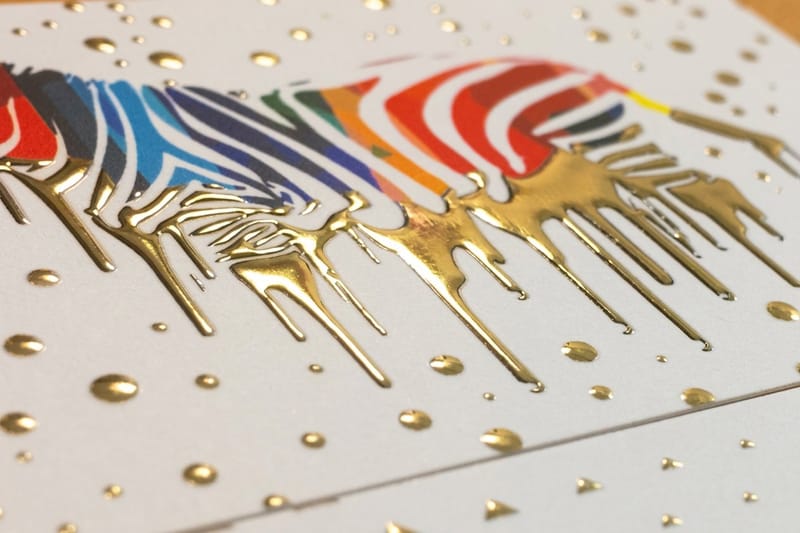
Repeated letterforms also give a designer something to work with. A doubled letter or a mirrored shape is the kind of detail that carries a raised finish well, which is why brands with rhythmic names so often end up on raised foil business cards. Foil sits on top of the stock rather than in it, so bold repeated shapes catch light in a way a thin serif never will.
Short, plain, and easy to say out loud
Short names win because they fit. Nike, Apple and Bolt set large enough on a 3.5 by 2 inch card to be the first thing read across a table. A 24-character name has to drop until it competes with the phone number, and once the name is the same size as the details, the card stops being a brand piece and becomes a contact slip.
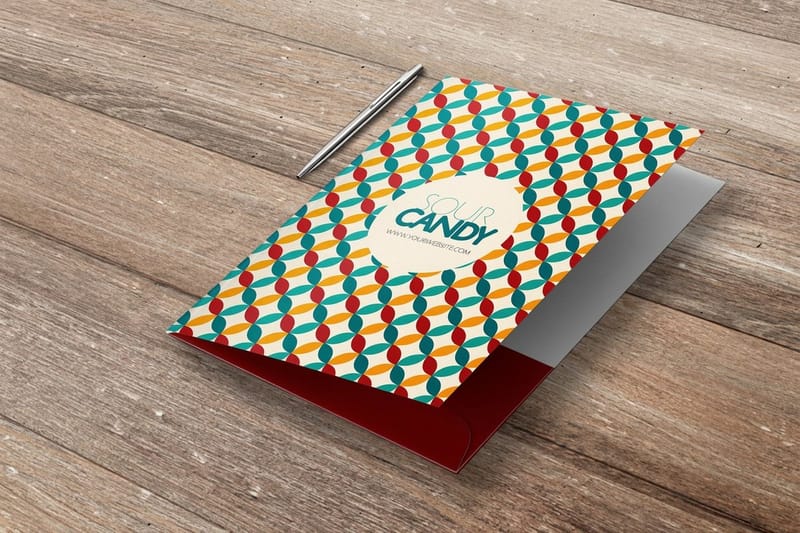
Length also decides what a folder can do. On a pocket folder, a short name can sit centered and confident on the cover, and a long one has to be stacked or shrunk. That is a permanent constraint you are choosing at the naming stage, months before anyone opens a design file.
Keep it short and powerful
Aim for one or two syllables if you can get them, and treat anything over three as a cost. Short words are also the most contested, so expect the register to be crowded and expect to pay more for the domain. The trade is real: you buy legibility and recall, and you pay for it in availability.
A useful test is the sign test. Write the name at the size it would appear on a shopfront across the street. If it is still readable and still balanced, it will handle every smaller piece you print.
Say what you do, and know the cost
Descriptive names are understood before you spend a cent. City Dental Care needs no explanation, and that is genuinely valuable for a local business that lives on search and word of mouth.
The cost is ownership. Generic and merely descriptive terms are the hardest to register and the easiest for a competitor two towns over to sit beside. They also fence you in: a name built around one service is awkward the day you add a second. If you go descriptive, put real work into the mark beside the name, because the mark is the part you can actually own. Our principles of logo design is the place to start.
Make it sound like the product
Schweppes carries the hiss of a carbonated drink opening. Snap, Kit Kat and Zap all do the same trick: the sound of the word is a small piece of the product experience, delivered before anyone reads a description.
This only works when the product has a sound worth borrowing, which rules out most service businesses. Where it does work, it works hardest on packaging, because the name sits directly beside the thing it is imitating. A sound name on a packaging label gets the joke across at arm’s length on a shelf.
Association, sound, and going against the grain
Borrowed meaning is the cheapest meaning available. Nike takes victory, Verizon takes truth and the horizon, and neither has to be decoded consciously to do its job. The association leans on something the listener already feels, so you are renting an existing emotion rather than building one.
The limit is cultural reach. A reference that lands in one market can be invisible in another, and a classical allusion is not automatically understood by the people buying from you. Test the association the same way you test the spelling, by asking people outside the room what the word makes them think of.
Build positive associations
Pick the feeling before you pick the word. Write down the three things you want a customer to assume about you before they have spoken to anyone, then look for words that already carry one of them. Working in that order stops you falling for a word that sounds good and points nowhere.
Color does the same job alongside the name, and the two should be chosen together rather than in sequence. Our roundup of color combinations that work in print covers pairings that hold up on paper as well as on screen, which is not the same list.
Buck the trend, deliberately
When a category converges on one sound, the contrarian name becomes the audible one. PayPal was friendly and alliterative when its neighbors were reaching for X and cyber. Yellow Tail was a plain animal name in a category of chateaux and vintages, and it was legible to people the category had been ignoring.
This is a bet, not a formula. You are wagering that the convention is a habit rather than a customer requirement, and you have to commit to it everywhere: the name, the type, the color, the stock. A contrarian name printed like everyone else just looks like a mistake. If you are naming a business that already exists, work through the brand refresh checklist before you change anything that customers already recognize.
Carrying your name onto your print identity
A name is a sound until it becomes an object. The first time most people meet yours, it will be on something printed: a card handed across a counter, a folder left on a desk, a label on a box, a tag on a garment. Those four surfaces have different constraints, and a name that ignores them looks compromised on all of them.
The card is the tightest. At 3.5 by 2 inches, the name, the mark, a role, a phone number and an address share a space smaller than a postcard, and the name only reads as the brand if it is clearly the largest element. The folder is the most generous, so a short name gets to sit centered on the cover with nothing else competing. A packaging label puts the name beside the product itself, which is the moment a sound name earns its money. A hang tag is the smallest of the four and the one customers physically hold, so it wants the name and almost nothing else.
Quantity and price
Business card pricing and specs
Real configurator numbers, where the per unit cost drops as the run grows, so a name test is cheap and a full rollout is planned.
| Quantity | Price Per Unit | Total |
|---|---|---|
| 100 | 17.6¢ | $17.57 |
| 200 | 11.5¢ | $23.07 |
| 300 | 9.15¢ | $27.46 |
| 400 | 7.96¢ | $31.86 |
| 500 | 7.25¢ | $36.26 |
| 600 | 6.77¢ | $40.64 |

Print the shortlist, not the winner. Two names on two short runs cost less than the meeting you would hold to decide between them, and you get an answer from people outside the business instead of inside it. You also earn coins on every order, which takes a little off the next run.
Stock, finish and how the name reads
Finish changes how a name reads more than most people expect. Gloss lifts color and makes a bold logotype snap, and it also throws glare across the card when someone tilts it under an office light. Matte kills the glare and is easier to read at small sizes, which matters if the name is long. Soft touch feels expensive in the hand and slightly softens fine detail, so a name built from hairline serifs loses a little crispness. The trade-offs are laid out in our comparison of matte, gloss and soft touch finishes.
Print it
Premium business cards
Heavier stock and a choice of finishes, for the version of the card you hand to people who matter.
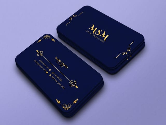
Raised and foiled finishes have a harder rule. Foil sits on top of the stock rather than soaking into it, so thin strokes fill in and lose their shape at small sizes. If you already know you want a foil identity, choose a name that can be set in a weight heavy enough to hold the foil, and pick the typeface at the same time as the name rather than months later. Our roundup of easy to read fonts for brands and print is a sensible shortlist to test a new name in.
What different kinds of business should choose
The right strategy depends on where your customers find you and what you will print most of.
- Local services. Descriptive names earn their keep here, because search and word of mouth do the work. Put the effort into the mark and the card, since the words are the part you cannot own.
- Consumer products. Sound and association carry the shelf. The name sits beside the product on the label, so a word that imitates or evokes the product is doing marketing you do not have to pay for.
- Professional firms. Founder surnames still work, and they age well. The risk is succession, so pair the name with a mark strong enough to survive a partner leaving.
- Fashion and retail. Short and ownable, because the name will be printed on hang tags, woven labels and packaging where every extra character costs space.
- Technology and software. Fused roots dominate for a reason: the domain is usually available and a recognisable fragment does the teaching. Check how the name reads spoken aloud in a demo, not just typed.
Whatever the category, the identity has to run across every piece. That is why business card printing, presentation folders, hang tags and packaging labels are worth ordering as one decision rather than four separate ones a year apart.
Blanks to drop a shortlisted name into
Open the blank for the card size you plan to test: the standard 3.5 x 2 inch card, the 2 x 2 inch square, or the 3.5 x 1.5 inch slim card, where a long name runs out of height first. 4OVER4.COM sizes its blanks to exact product specs, so your logotype lands inside the cut line and nothing important sits in the bleed. Grab a print ready blank from the blank template library, or start from a layout in the design template library and drop the name in.
Start fast
Blanks to drop a shortlisted name into
Business card templates and exact size blanks with bleed and trim already marked.














Wally tests a name on paper, not in a meeting
The card decides the argument faster than the whiteboard does
Set each shortlisted name in one neutral typeface, print a short run of standard business cards from $17.57, and hand them to ten people. Watch whether they read it back right, whether they ask what you do, and whether they ask you to spell it. The name that draws no questions is the name to register.
Order business cards →What to remember about naming a brand
Naming checks that only take ten minutes
- Set it before you sign it. Type the shortlist in one neutral typeface at card size and at sign size. Half the candidates fall out on sight, and it takes ten minutes.
- Count the characters. Anything past about 14 characters starts fighting for room on a card, a tag and an app icon. Know the cost before you choose it.
- Watch the letter shapes. Names with repeated or mirrored letters give a designer a structure to build on. Names with awkward pairs like rn or Il create small errors that repeat forever.
- Avoid thin serifs if you want foil. Foil and raised finishes sit on top of the stock, so hairlines fill in and lose definition. If you plan a foil identity, choose a name that can carry weight.
- Print it before you decide. A short run of business cards costs less than an afternoon of debate, and handing the name to ten people tells you more than any of it.
Explore more
Print the name once you have it
Standard packaging labels run 25 for $23.88 in 3 business days and pocket folders 250 for $844.54 in 7.
Product Standard Business Cards The cheapest honest test of a new name, from $17.57. Product Raised Foil Business Cards Foil that sits on the stock and catches light on bold letterforms. Product Pocket Folders Where a short name gets to sit centered and confident. Product Custom Hang Tags The name on the product, at the point of sale.  Category Business Card Printing Every stock, finish and shape in one place.
  Guide Brand Refresh Checklist What to change, in what order, when the name stays.
 Ready to see your name in print?
Pick your stock, drop in your logotype or start from a free template, and 4OVER4.COM prints it sharp, as fast as your deadline needs.
Common questions about brand names
How long should a brand name be?
One or two syllables and under about 14 characters is the range that stays comfortable everywhere you will print it. Past that, the name starts competing for space with the phone number on a business card and has to be stacked or shrunk on a folder cover and a hang tag. Length is not a rule, it is a cost, and the cost is paid on every piece you print for the life of the business. If you love a long name, test it set at card size and at sign size before you register anything.
Is a descriptive name or an invented name better?
They fail in opposite directions, so pick the failure you can live with. A descriptive name like City Dental Care is understood instantly and costs nothing to explain, but it is the hardest kind to register, the easiest for a competitor to sit beside, and it boxes you in when you add a service. An invented name like Kodak is legally clean and completely yours, but it means nothing on day one and you fund the teaching. Local businesses that live on search usually take descriptive. Businesses that plan to grow beyond one service usually take invented or fused.
How do I check a name is actually available?
Search the USPTO trademark database first, and search it in your own class of goods and services, because the same word can be registered by different businesses in different classes. Then check your state business register, then the domain, then the handles on the social platforms you will actually use. Take them in that order. A conflicting registration ends the conversation, while a taken domain is usually workable with a prefix or a suffix. For anything you intend to defend, have a trademark attorney run the search properly before you print.
Does the domain have to match the name exactly?
No, and insisting on it has killed a lot of good names. Plenty of established businesses run on a domain with a word added, and customers reach them through search rather than by typing the address. What does matter is that the domain is close enough that a person who heard the name once can find you in a single search. Where an exact match causes real trouble is when the .com belongs to a business in the same category, because then your marketing sends people to a competitor.
How do I test the name in print before committing?
Print a short run of standard business cards, which start at $17.57, and hand them out for two weeks. Watch three things: whether people read the name back correctly, whether they ask what the company does, and whether they ask you to spell it. A name that draws the spelling question from strangers will draw it forever. Doing this before you order folders, packaging labels and signage is the cheapest insurance in the whole branding process, because those are the pieces that hurt to reprint.
