
Luxury Business Card Ideas With Raised Lettering and Rich Texture


A card feels expensive when the thumb finds the lettering before the eyes read it, and only a raised finish does that. Raised foil, raised spot UV and raised holographic build the type into a cured ridge that stands off the sheet, and a matte or soft touch ground underneath is what makes that ridge register as quality rather than as decoration.
Raised finishes compared
| Finish | How it feels | What it adds | Price | Best for | Where it fails |
|---|---|---|---|---|---|
| Raised spot UV | A clear gloss ridge with a hard edge, felt more than seen | Height and shine, no extra colour | From $108.75 | Monograms, patterns and tone on tone over a matte field | Over a busy full colour image, where the ridge disappears into the artwork |
| Raised foil | A metallic ridge with weight to it, brightest at a shallow angle | Height plus a metallic colour | From $86.78 | A name, a monogram, a rule under a logotype at display size | Large solid blocks, which pick up every handling mark |
| Raised holographic | The same ridge, with a rainbow shift as the card turns | Height plus a colour that never sits still | From $86.78 | Beauty, events, music, anything that wants to be picked up twice | Conservative sectors and any brand whose colour has to stay exact |
Prices are the live starting points on the configurator and move with stock, quantity and turnaround. If you are choosing between the three, order one small run of each on the same artwork and decide with the cards in your hand. You can configure raised foil business cards in a couple of minutes.
What actually makes a card feel expensive
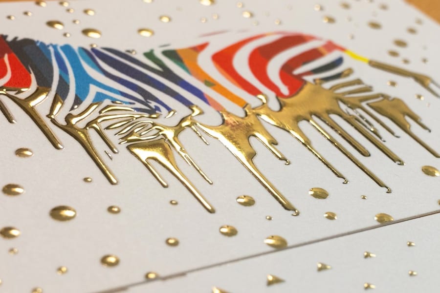
Hand someone a card and watch what they do with it. The thumb finds the surface before the eyes read the name, and that half second is the whole thing. A raised finish is the only choice on the menu that answers a thumb, which is why raised foil business cards and raised spot UV business cards keep showing up in the pockets of people who charge a lot for their work.
Raised printing works by laying a clear or metallic resin on top of the already printed sheet and curing it, so the lettering stands proud of the card. Embossing does the opposite: it pushes the stock from behind and leaves a matching dent on the reverse. If both sides of your card carry information, raised printing is the practical one, and our guide to stock and coating for embossed cards covers the case where the dent is the point.
The other half of the effect is the surface the ridge sits on. Gloss fights it, because a shiny ridge on a shiny card reads as one texture. Soft touch and matte laminates absorb light, so the raised element is the only thing catching it, and the contrast is what the hand registers as quality. If you have not settled the base finish yet, start with the matte, gloss and soft touch comparison before you pick the raised element.
Raised foil and raised spot UV, side by side
Raised spot UV adds height and shine but no colour, so whatever is underneath shows through it. That makes it the subtler of the two and the one that survives a rebrand, because the shape can be repeated in any brand colour. Raised foil adds height and a metal, which is louder and more immediate.
The cheap test is to ask what you want the person to notice. If the answer is the name, use foil on the name and nothing else. If the answer is the card itself, use spot UV across a pattern and let the type stay flat and quiet.
Why the base stock decides how the texture reads
A ridge on a limp card feels like a sticker. The stock has to be rigid enough that the card does not flex when a thumb presses the raised area, which is why luxury cards live on heavy cover weights rather than the 14pt most people order by default. The live specs on each product page list what we run, and the price table below moves with the stock you pick.
Colour of the stock matters too. A dark card makes a metallic ridge jump; a warm off white makes a clear ridge almost invisible until it moves in the light. Both are correct, they just do different jobs, and the only reliable way to choose is to hold a printed sample rather than judge from a screen.
Raised ink, embossing and letterpress are not the same thing
Raised ink, sold in some shops as thermography or raised printing, drops a clear resin powder onto still-wet ink and heats it, so the type swells into a ridge that sits on top of the sheet. Nothing is pushed through the paper, which is why the back of the card stays flat.
Embossing is the opposite operation. A metal die cut for your artwork pushes the sheet up from behind, so the raised shape on the front leaves a matching hollow on the reverse. Letterpress reverses that again, pressing inked type down into a soft cotton stock so you feel a bite rather than a ridge.
Raised foil bonds a metallic film to that resin ridge, adding colour and height together. Raised spot UV cures a clear gloss layer to the same height and adds no colour at all, which is why it leaves your brand palette untouched. Four different processes, four different feels, and only one of them costs you the back of the card.
Luxury card ideas worth printing
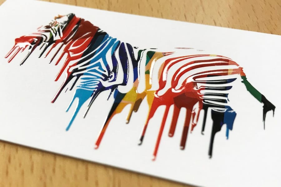
These are the directions that hold up in the hand rather than only in a mockup. Each one names the finish that suits it, so you can price it directly from our business card range instead of guessing.
Restraint is what separates most of these from a card that looks like it is trying. One raised element per side is usually the correct number.
Ideas that keep the card quiet
1. The monogram alone. Put the mark in raised foil at a generous size on the back, and leave the front to plain type. The back becomes the object people keep, and the front still does its job.
2. Tone on tone pattern. Print nothing, then run a repeating mark in raised spot UV across the whole back. From arm’s length it looks like a blank card. In the hand it is not.
3. Name raised, details flat. The name in raised foil, the phone and email set small in grey. It creates a hierarchy you can feel, and it stops the card looking like every field has equal weight.
4. A single raised rule. One short line under a logotype, raised, and nothing else. The cheapest luxury move on this list because it uses the least area.
5. Dark stock, one metal. A near black card with a single warm metallic element is the most reliably premium combination in print, and it photographs well, which matters if the card ends up on social media.
Ideas that let the card show off
6. Holographic on black. Raised holographic business cards against a dark field shift through the spectrum as the card turns. This is the one people hand to someone else to look at, which is more than most cards manage.
7. Texture as the illustration. Instead of printing an image, build it out of raised spot UV. A skyline, a set of tools, a botanical line drawing, all in clear resin on a matte ground.
8. A painted edge. Edge painting is a hand applied colour on the cut edge of a thick or duplexed card, and it gives you a third surface nobody else is using. It is a specialist step, so agree it with your printer before you commit artwork, and budget for it separately from the raised finish.
9. Shape plus texture, carefully. A rounded or cut shape and a raised finish can work together, but only if one of them is subtle. If you want to lead with shape instead, the custom shaped card ideas cover that route on its own.
10. Match the raised element across the kit. The same raised mark on the card, the folder and the thank you note reads as a system. Our thank you card ideas are the easiest second piece to add.
Where raised finishes fall down
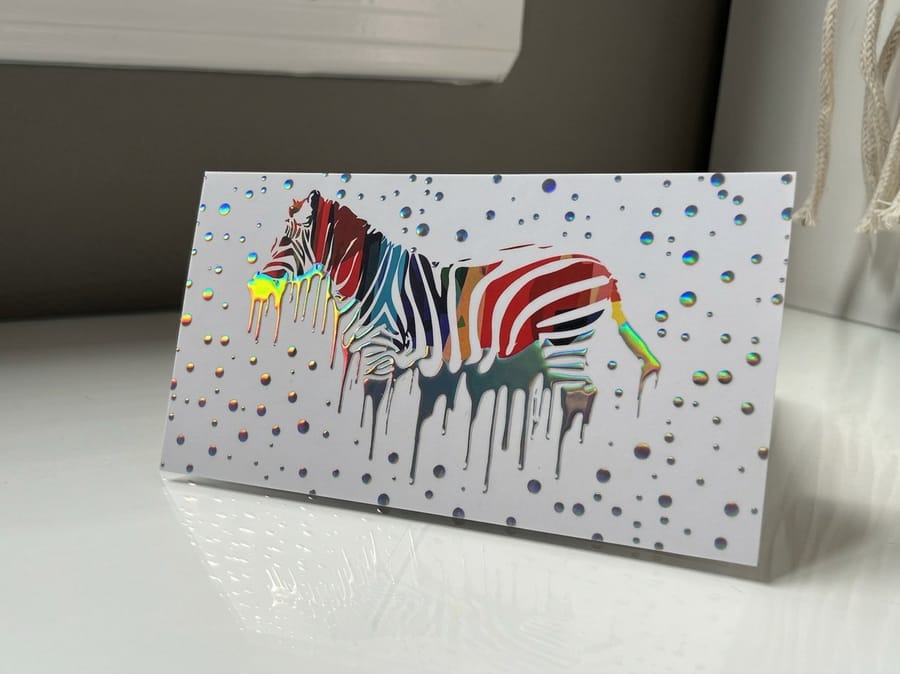
The reason most raised cards disappoint is not the print. It is a design that never gave the finish anywhere to work.
Thin strokes are the first casualty. A raised layer needs a certain amount of area to hold a clean edge, so hairline rules and small high contrast serifs tend to break up or fill in. Keep raised elements at display size, or pick a face with even stroke weights, and set the 7pt contact details flat where they belong.
The second problem is a busy background. Raised spot UV over a full bleed photograph is still there under the thumb, but the eye never finds it, and you have paid for a finish nobody sees. Give the ridge a calm field and it earns its cost.
Then there is the practical side. A stack of raised cards does not sit flush, so a box of 500 is taller than a plain one and a card case holds fewer. Soft touch laminate resists ballpoint ink, so if you write appointment times on the back, leave an uncoated panel or use a different card for that job. And a card with a cured resin ridge should not be fed through a desktop laser printer afterwards, because the fuser heat and the resin do not get along.
What the file needs before it can be raised
The raised element goes on a separate layer of its own, built as solid vector shapes in 100% K, with no gradients, no transparency and no placed images inside it. The press needs a yes or no answer for every point on the card, and a soft edged shape cannot give one.
Name that layer plainly so nobody has to guess, keep it in perfect register with the artwork underneath, and export with the same bleed and trim as the rest of the file. If you are setting the document up from scratch, the Photoshop dimensions walkthrough has the page setup, and business card basics covers bleed and safe area from the beginning.
When a plain card is the right answer
If you hand out hundreds of cards a month at trade events, most of them are going in a bin by lunchtime, and a raised finish on that volume is money spent on strangers. Order plain for the crowd and raised for the meetings that matter, printed from the same artwork so the brand stays consistent.
Same logic if your card is mostly a scanning surface for a QR code, or if it lives inside a product box rather than a pocket. The finish should follow the moment the card is used in.
How to judge a raised proof before the full run
A raised sample tells you more in thirty seconds than a screen proof tells you in an hour, but only if you know what you are looking at. Tilt it under a warm lamp rather than office fluorescent, because a ridge reads by reflection and flat overhead light hides the whole effect you paid for.
Then run a thumb along one long letter stroke and feel whether the height is even end to end. A ridge that thins in the middle of a stroke means the resin was laid short and the full run will do the same. Look closely at where the raised layer meets the printed edge underneath it, since any overhang or gap there is a register problem, not a trick of the light.
Turn the card over and check for a dent. Hold it beside a plain card from the same order, because if the ground is not matte enough, the ridge and the surface catch light the same way and the effect disappears.
Raised card pricing and specs at 4OVER4.COM
Price moves with stock, quantity and turnaround, and the per card cost drops sharply as the run grows. The numbers below come straight from the live configurator, so you can size the budget before you commit artwork.
Quantity and price
Raised foil pricing and specs
Real configurator numbers, where a larger run pulls the per card cost down and the specs list what we actually run.
| Quantity | Price Per Unit | Total |
|---|---|---|
| 100 | 86.8¢ | $86.78 |
| 250 | 47.9¢ | $119.73 |
| 500 | 37.1¢ | $185.63 |
| 1,000 | 36.1¢ | $361.37 |
You can also earn coins on every order and redeem them against future printing, which softens the step up from a plain card to a raised one.
Stock and base finish under the raised layer
The raised layer gets all the attention and the stock does half the work. A rigid cover weight keeps the card from flexing when a thumb presses the ridge, and a matte or soft touch laminate gives that ridge the dull background it needs to be seen. Put the same raised element on a gloss card and the effect collapses, because the ridge and the surface reflect light the same way.
Print it
Raised spot UV, ready to configure
Clear gloss height over a matte field, with the file requirements listed on the product page.
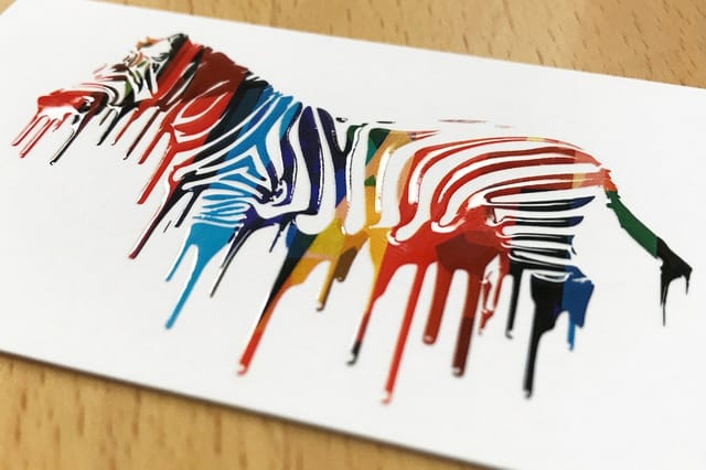
Stock colour is the other lever. A near black card makes a metallic ridge look lit from inside, while clear resin on a warm off white stays hidden until the card tilts, which is a deliberate effect rather than a weak one. If the base finish is still open, work through the matte, gloss and soft touch comparison first, then pick the raised element to sit on top of it. For sizing and bleed in metric, the card dimensions in centimetres save a conversion step.
Which raised finish suits your field
The finish that fits depends on what your card is expected to do after it leaves your hand.
- Architects and designers. Tone on tone raised spot UV on a heavy off white stock. The card says the practice cares about materials, which is the thing being sold.
- Law and finance. Raised foil on a name, everything else flat and conservative. The texture carries the signal so the layout does not have to.
- Beauty, salons and events. Raised holographic on a dark card. It gets handled, photographed and passed on, which is exactly the point in a referral business.
- Photographers and creative studios. A raised mark on the back, a clean front, and the portfolio doing the talking. Pairs with the ideas in our design trends round up.
- Independent consultants. One raised rule under a logotype. The smallest raised area on the list, so it is the cheapest way into the finish without looking cheap.
- Online sellers with a physical insert. A raised card in the box outperforms a printed slip, and the e-commerce card ideas cover what to put on it.
Everything on that list sits inside the wider business basics print collection, which is where to look if the card is the first piece of a larger kit. Cards that need a second life as a fridge magnet or a peel and stick label are a different job, handled by business card magnets at $19.68 and business card stickers at $10.76.
Templates and print-ready blanks
Starting from a correct document removes the two mistakes that cause reprints on raised jobs: artwork built to the trim instead of the bleed, and a raised layer that is a fraction out of register. Grab a print ready blank from the blank template library with bleed and trim already marked, then build the raised layer on top of it.
Start fast
Templates and print-ready blanks
Business card templates and exact size blanks, so the raised layer lands in register with the art underneath.






Wally checks the ridge with his thumb, not his eyes
How to build a luxury card that survives contact with a pocket
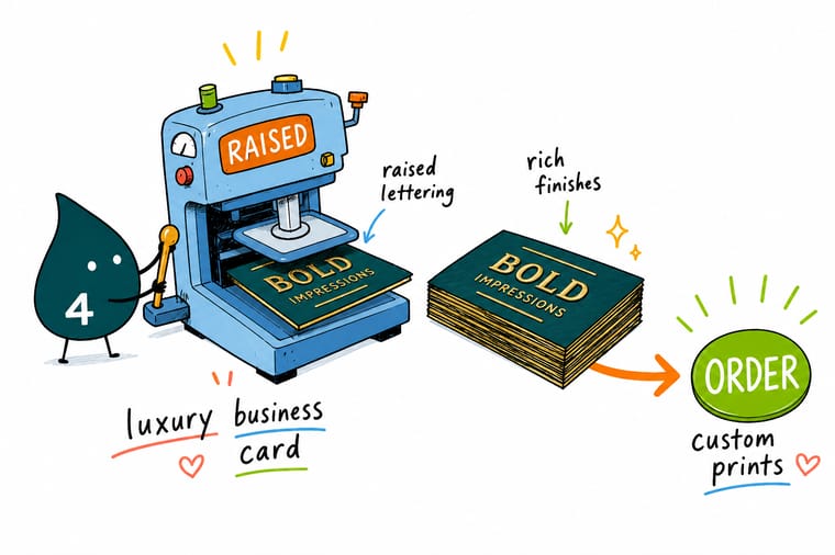
Pick a matte or soft touch base so the raised element has something dull to shine against, keep the raised layer to display sized type and solid marks, build it as 100% K vector on its own named layer in register with the artwork, and leave the 7pt contact details flat. Raised foil and raised holographic start at $86.78 and raised spot UV at $108.75, printed and shipped by 4OVER4.COM.
Order raised foil cards →What to remember about raised luxury cards
Design tips that hold at every size
- Give the ridge a quiet field. Raised finishes read by contrast. A matte or soft touch ground with one raised element beats a busy card with three.
- Set raised type large. Display sizes hold a clean raised edge. Fine serifs and hairline rules are where the finish breaks up, so leave the small print flat.
- Build the raised layer as flat vector. Solid shapes in 100% K, no gradients, no transparency, on a clearly named layer of its own and in register with the art beneath it.
- Pick the stock colour deliberately. Metal on a dark card jumps. Clear resin on a warm off white hides until it moves. Both work, for different reasons.
- Leave a writing surface if you need one. Soft touch laminate refuses ballpoint ink. If people write on your cards, plan an uncoated panel before the file goes to press.
Explore more
More ways to print a card people keep
Related products, guides and ideas on 4OVER4.COM, one card each, so you can keep building the set.
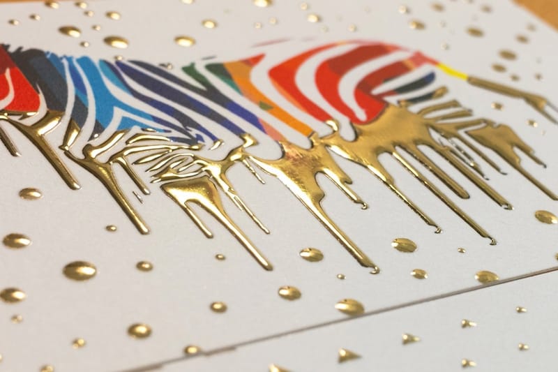 Product Raised Foil Business Cards A metallic ridge you can feel, from $86.78.
 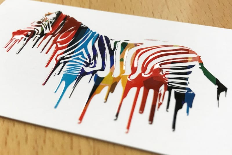 Product Raised Spot UV Business Cards Clear gloss height with no added colour, from $108.75.
 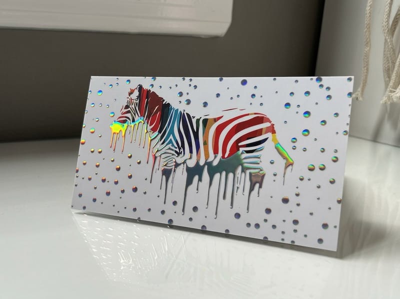 Product Raised Holographic Business Cards A rainbow shift across the raised lettering, from $86.78.
  Category Business Card Printing Every stock, shape and finish we run, in one place.
  Guide Matte, Gloss or Soft Touch Pick the base finish before you pick the raised element.
 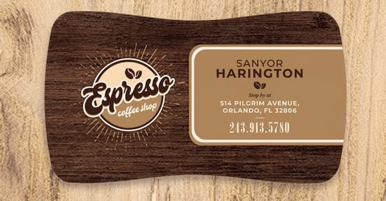 Article 20 Custom Shaped Card Ideas When shape, not texture, is the thing people remember.
 Ready to print a card people keep?
Pick the finish, drop in your artwork or a free template, and 4OVER4.COM prints the raised layer in register on premium stock, as fast as your deadline needs.
Common questions about raised business cards
Are embossed business cards worth it?
For a card going to a small number of people who matter, yes. Embossing is the costliest of the raised options because it needs a metal die cut for your artwork, and that cost lands on the first order rather than the reorder. It also dents the reverse, so it only suits a card that carries little on the back. For the same height without a die and without a dent, raised foil at $86.78 or raised spot UV at $108.75 gets you there.
Can I get a raised finish on both sides of a card?
With raised foil or raised spot UV you can, because the resin sits on top of the sheet and leaves the other face untouched. With embossing you cannot, since the die that lifts one side hollows the other. Restraint is the better answer anyway. Two raised faces compete for the same attention and the card stops having a front.
Which colours work best for raised lettering?
A metal against a dark ground is the most reliable pairing, because the ridge catches light the flat areas cannot. Warm metallics on near black read as expensive under almost any lighting. Pale foils on pale stock stay hidden until the card tilts, which is a deliberate effect rather than a weak one. Clear spot UV takes no colour at all, so it is the finish that leaves your palette exactly as designed.
Does raised lettering wear off a business card?
Not under normal handling. The raised layer is a cured resin bonded to the printed sheet, and it is harder than the laminate underneath it, so it resists scuffing better than the flat areas around it. What does show wear is a large solid raised area on a dark card, because fingerprints and handling marks sit on top of the gloss and catch the light. Keep raised elements to type, marks and rules rather than filled panels, and the card still looks new after months in a wallet.
Raised foil or raised spot UV, which one looks more expensive?
They read as expensive in different ways. Raised foil adds a metal, so it announces itself from across a table and suits a name or a monogram that you want noticed immediately. Raised spot UV adds height and shine without colour, which makes it the quieter and arguably more confident option, and it is the one designers reach for when the card should look plain until it is picked up. Foil starts at $86.78 at 4OVER4.COM and raised spot UV at $108.75, so the subtler finish is actually the pricier one.
Can I put raised printing over a photograph?
You can, but it usually wastes the finish. The ridge is still there under a thumb, yet a full bleed image gives the eye so much to look at that nobody sees the raised element, and you have paid for something invisible. If the card has to carry a photograph, put it on one side and keep the other side calm with a single raised mark. That way the image does its job and the texture does its own.
How do I set up the file for a raised finish?
Build the raised element on its own layer as solid vector shapes filled 100% K, with no gradients, no transparency and no placed images inside that layer. The press needs a hard yes or no for every point on the card, so a soft edged or semi transparent shape cannot be interpreted. Keep the layer in exact register with the artwork below it, name it plainly, and export with the same bleed and trim as the rest of the document. Our free file review catches a mis-built raised layer before the run rather than after it.
Is a raised card worth it if I hand out hundreds a month?
Usually not for all of them. Cards handed out at a busy trade event mostly get discarded, and a premium finish spent at that volume is money going to strangers. The approach that works is two versions of the same artwork: a plain card for the crowd and a raised card for the meetings where the person is likely to remember you. The brand stays consistent because the design is identical, and the cost lands where it changes an outcome.
