
What Calligraphy Is, Where It Came From, and How It Prints Today


Sofia is our design and templates voice, built from the knowledge of our production team, with over 20 years in printing.
Calligraphy styles fall into two families: broad-edge hands such as Uncial, Blackletter, Chancery Italic and Foundation, and pointed-pen hands such as Copperplate, Roundhand and Spencerian. Here is the definition, the world history from Roman capitals to Copperplate, the scripts worth knowing, the stroke weights each one needs to survive a press, and how to order a card or invitation in each.
Calligraphy is the art of forming letters by hand as deliberate drawn shapes, with a set tool, a set pen angle and a set order of strokes. The word joins the Greek kallos, beauty, and graphein, to write. Its history is really a history of two tools: the broad-edge pen, where thick and thin come from the direction of the stroke, and the pointed flexible nib, where they come from pressure. That split still decides which script prints cleanly and which one falls apart under foil, letterpress or small type.

Quick answer
Two pens, and everything else follows from them
Calligraphy is writing performed as a controlled craft rather than as a quick mark. Every historic hand is a record of the tool that made it. A broad-edge nib is a flat chisel, so its thick and thin strokes come from the direction you pull it, and its thinnest stroke can never be finer than the narrow edge of the nib. A pointed flexible nib splays under finger pressure, so its thin strokes have no floor at all. At invitation size that difference is measurable: a Copperplate upstroke can fall under 0.25 pt, while presses hold a line of about 0.5 pt. That is why Uncial, Blackletter and Chancery Italic look sturdy and print easily, and why Copperplate and Spencerian look expensive and give printers trouble.
What Calligraphy Is, and What It Is Not
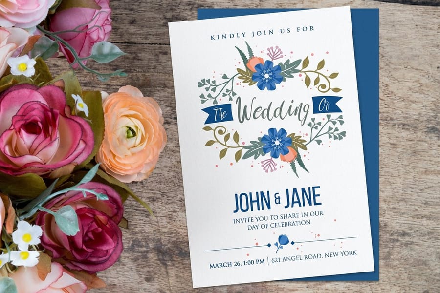
A calligraphic hand is a system, not a look. Uncial, Chancery Italic and Copperplate each specify three things: the tool, the angle at which you hold it, and the order and direction of the strokes that build every letter. Get those right and the letters come out consistent. Change the pen angle by fifteen degrees and you are writing a different hand, whether you meant to or not.
That is also the honest difference from good handwriting. Neat handwriting is fast and personal. Calligraphy is slow and impersonal on purpose, because the point is that the letters obey the same rule every time.
Two words sit next to it and get used interchangeably, which causes real trouble when a designer briefs a printer. Hand lettering draws letters as outlines and fills them, so the artist can make shapes no single pen stroke could produce. Typography sets letters somebody already drew and cut. Most printed script today is the third case: a typeface modelled on a calligraphic hand, set on screen, output to plate or toner. Our rundown of lettering styles and fonts separates those families in more detail.
Knowing which one you are dealing with decides how you prepare the file. Real hand work arrives as a scan and needs vectorising. A script typeface arrives as a font and needs its OpenType alternates switched on, then converted to outlines before it is sent.
A Short History of Calligraphy, Told Through the Pen
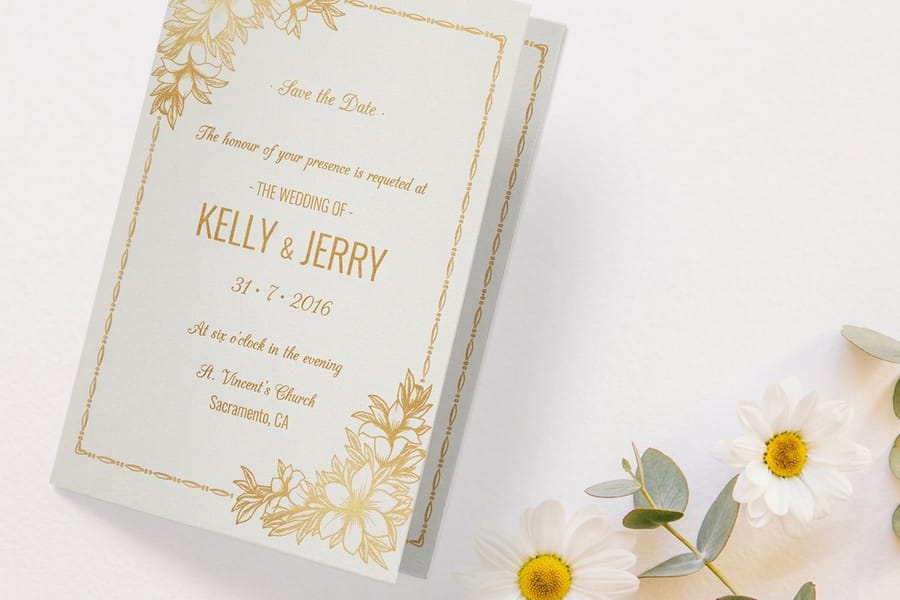
Read the history as a history of tools and it stops being a list of dates.
The brush, in China. East Asian calligraphy runs on a soft pointed brush, ink, stone and paper, and it produced a tradition where the writing was ranked with painting rather than beneath it. A brush loses width the moment you lift, so the whole aesthetic is about pressure and speed, not about a fixed nib angle.
The flat brush, in Rome. The capitals carved on Roman monuments were painted onto the stone with a flat brush before a mason cut them. That is where the serif comes from. It is the way a flat brush enters and leaves a stroke, not a decoration the carver added. Every Trajan-derived typeface in use today is a copy of a brush stroke.
The reed pen, in the Islamic world. The qalam, a cut reed, produced the angular early Kufic hands and then the rounded cursive Naskh. Because figurative imagery was largely absent from sacred contexts, calligraphy carried the decorative load, and the discipline of proportioning letters in rhombic dot units is the strictest measuring system any writing tradition produced.
The quill, in the monastery. Uncial, then Carolingian minuscule under Charlemagne, then the narrow dense Blackletter of the later Middle Ages. Blackletter was not chosen for atmosphere. It packed more words onto expensive parchment. When Gutenberg cut type in the 1450s he cut it to imitate the Blackletter the scribes around him were writing, which is why the first printed books look handwritten.
The engraver's burin. Renaissance writing masters published manuals, and by the eighteenth century those manuals were engraved into copper plates rather than cut in wood. The burin makes a line that swells and tapers naturally, and English writing masters bent the pointed flexible nib to imitate it. That is why the script is called Copperplate. The wedding hand everybody thinks of as the most handmade thing on the invitation began life as an imitation of a printing process.
The steel nib, in business. Nineteenth century America ran on Spencerian, a fast oval business hand taught to clerks. Frank Mason Robinson wrote the Coca-Cola wordmark in Spencerian in 1886, and it is still there.
The revival. Edward Johnston rediscovered the broad-edge pen and published Writing and Illuminating and Lettering in 1906, teaching Eric Gill along the way. Johnston then drew the lettering for the London Underground, which is the moment calligraphic study turned back into typeface design and stayed there.
The Major Scripts, and Which Press Each One Survives
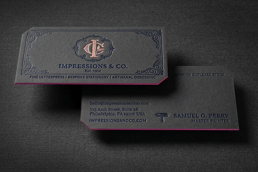
Six hands cover almost everything a print buyer will be asked to choose between. Read the last column first: it names the process each hand survives, from blind embossing for Roman capitals to flat CMYK on smooth stock for Copperplate.
| Script | Tool | What gives it thick and thin | Prints best as |
|---|---|---|---|
| Roman Square Capitals | Flat brush, then chisel | Stroke direction against a flat brush edge | Engraved-look certificates, monograms, blind embossing. Strokes are even and heavy, so it takes a die well. |
| Uncial | Broad-edge quill | Fixed nib angle, roughly flat | Display lines and headings. Rounded, wide, and legible at small sizes, but it has no lowercase to fall back on. |
| Blackletter | Broad-edge quill, steep angle | Fixed nib angle, very upright | Mastheads, labels, single words. Counters are narrow, so ink spread closes them fast on uncoated stock. |
| Chancery Italic | Broad-edge, slanted | Fixed nib angle, around 45 degrees | Body-length formal text. The most forgiving formal hand in print, still readable at 9 or 10 point. |
| Copperplate | Pointed flexible nib | Finger pressure splaying the nib | Flat CMYK or thin foil on smooth stock. Hairlines are the failure point on anything that presses or bites. |
| Spencerian | Pointed flexible nib, lighter | Pressure, applied sparingly | Logos and single names at generous size. Too fine for small print or for a deep letterpress impression. |
The split that matters is broad-edge against pointed. A broad-edge hand has a floor on its thin strokes, because the narrow dimension of the nib is a physical width. A pointed-pen hand has no floor at all, and the upstroke can go as thin as the paper allows. That is beautiful under a loupe and a genuine problem on press, which the section on modern print below covers.
Humanist Minuscule, the Hand Behind Roman Type
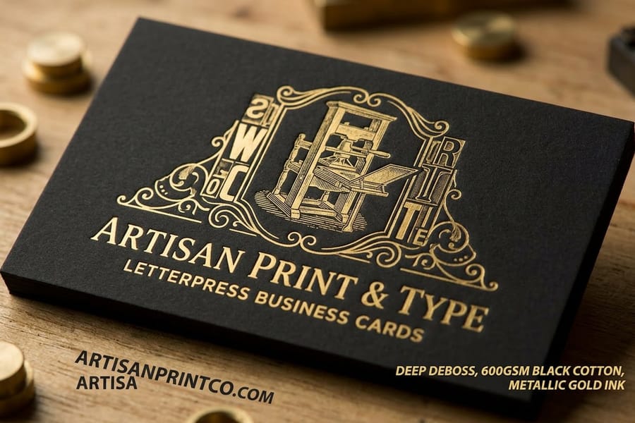
Humanist minuscule is the upright lowercase that Florentine scholars such as Poggio Bracciolini wrote in the early 1400s. They copied it from Carolingian manuscripts they took to be ancient Roman, and the result is round, open and plain: a broad-edge pen held at about 30 degrees, short ascenders, generous space inside every o and e.
Its importance to print is direct. The first roman typefaces cut in Venice in the 1460s and 1470s copied this hand, so every book face you read today descends from it. Its sloped, faster cousin became Chancery Italic.
- Thin stroke: fixed by the nib edge, so it never drops below what a press holds.
- Best use: addresses, menus and body text where a pointed script would close up.
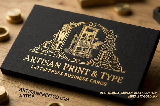
- Best process: flat print, foil or letterpress. On letterpress business cards from $251.36, the even strokes take a deep impression without filling in.
Roundhand Script, the English Commercial Hand

Roundhand is the pointed-pen business hand of eighteenth century England, the hand clerks used for ledgers and letters and the one George Bickham gathered in The Universal Penman, engraved and issued in parts from 1733. Printers and calligraphers often use Roundhand and Copperplate as two names for the same family. Roundhand leans at about 55 degrees, joins every letter and gets its swells from pressure on the downstroke.
For print, treat it like Copperplate with slightly more weight. The upstrokes are hairlines, so the same 0.5 pt floor applies, and the hand reads best at 24 point and larger.
- Stock: smooth coated or a hard smooth uncoated card, never linen or felt.
- Format: flat wedding invitations start at 25 for $19.77 in 4.25 by 5.5, 5 by 7 or 6 by 6 inches, one script front with the details in a serif.
- Envelopes: print the addresses in the same hand on invitation envelopes, 250 for $170.42, and test the longest name first.
Foundation Script, the Hand Most Students Learn First
Foundation script, also called the Foundational hand, is Edward Johnston's teaching hand. He built it in the early 1900s from the Ramsey Psalter, a tenth century English manuscript, and taught it as the first hand a student learns. The rules are strict and easy to check: a broad-edge pen at 30 degrees, an x-height of four nib widths, and an o drawn as a full circle that sets the width of every other round letter.
Those rules make it the sturdiest of the lowercase hands on press. Nothing in it goes thinner than the edge of the nib, so it survives small sizes, foil and letterpress where a pointed hand would break.
- Best use: headings, place cards, programs and quotations set as a block.
- Size: it stays legible down to about 12 point, much smaller than Copperplate.
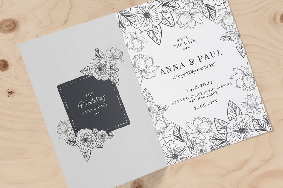
- Format: folded wedding invitations start at 25 for $38.22 and give a Foundation heading room on the front while the schedule sits inside.
Calligraphy in Modern Print and Branding
Script does one job in branding that geometric sans faces cannot: it signals that a person was involved. That is why it clusters in weddings, spirits, patisserie, salons and heritage marks, and why it is nearly absent from software and finance. The trade is legibility. A script wordmark at 8 mm on a business card is read as a shape, not as letters, so it has to be a name people already recognize or a name short enough to guess.
The practical rules are about stroke weight, not taste.
- Set a floor of 0.5 pt on the thinnest stroke. Around 0.25 pt and below, offset and digital presses both start laying the line intermittently. Zoom to 100 percent, not 400 percent, and if the hairline nearly disappears on screen it will disappear on paper. The same threshold logic applies to the smallest font size you can print.
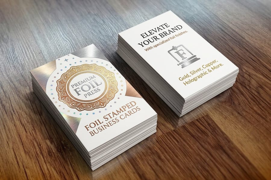
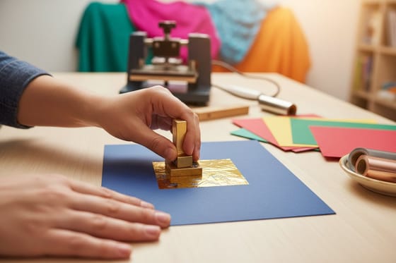
- Foil is harder than ink, not easier. A stamping die has to hold the hairline as a physical ridge, and thin ridges wear. Heavier scripts foil cleanly, fine Spencerian upstrokes break up. Set the file the way our foil file setup guide describes, as a solid spot layer with no tints, and read how foil stamping works before committing a delicate script to a die.
- Letterpress spreads what it presses. Deep impression pushes ink sideways into soft cotton stock, so a hairline gains weight and a tight counter fills. Script on letterpress business cards, which start at $251.36, wants a weighted hand rather than the finest one you can find.
- Reversed script needs extra weight. White script knocked out of a dark solid loses width from every side as ink spreads inward. Add weight to the whole hand before you reverse it, or the thin strokes close up entirely.
- Embossing wants shapes, not lines. A blind emboss reads through shadow, and a hairline casts no shadow. Embossed printing suits square capitals and monograms far better than pointed-pen script.
Stock changes the answer as much as the process does. A textured sheet interrupts a hairline mechanically, so linen stock and heavy felt finishes are the wrong place for the finest script and the right place for a broad-edge hand. Smooth coated or a hard smooth uncoated holds thin strokes best.
Put those rules in order before you send a file:
- Pick the family. Broad-edge for small type, foil or letterpress, pointed pen for a name at display size.
- Set the size. Pointed-pen names at 24 point and up, Chancery Italic body text at 9 or 10 point.
- Measure the hairline. At 100 percent, the thinnest stroke should be 0.5 pt or heavier.
- Match process and stock. Flat print on smooth card for fine script, letterpress on 32pt or 48pt laminated board for a weighted hand.
- Outline and proof. Convert the script to outlines and print the longest name on the real stock before the full run.
Putting Calligraphy on Invitations, Envelopes and Cards
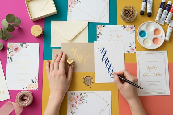
An invitation suite is the one job where calligraphy carries most of the design, so the layout decisions are small and they matter. Give the script one job per piece. The couple's names, or the event name, in the hand you paid for. Everything else, meaning dates, times, addresses and the RSVP details, sets in a companion serif or italic. A card set entirely in Copperplate is slower to read and looks cheaper, not richer, because nothing has hierarchy.
Size the script generously. A pointed-pen hand at 24 point and up keeps its swells visible and its hairlines above the press floor. The same face at 10 point becomes a gray texture. If the wording genuinely needs a formal hand at text size, use Chancery Italic instead, which was written at running size and survives it.
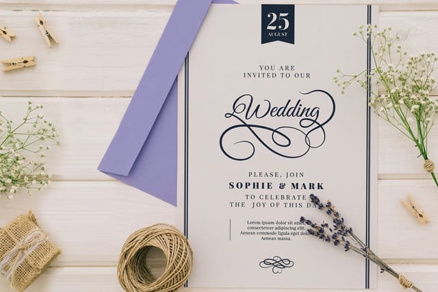
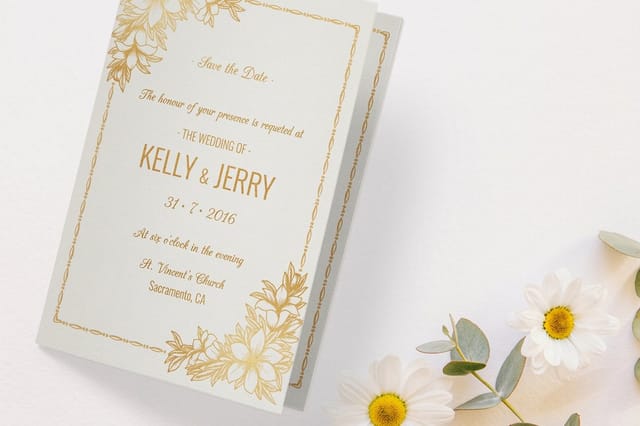
Then pick the format against the amount of information. Flat wedding invitations start at $19.77 and give you one calligraphic front, which is the cheapest way to get a script suite in the post. Folded wedding invitations start at $38.22 and buy three more panels, which is what you want when the schedule, the venue map and the dress code all have to fit without crowding the script. Sizes and matching envelope dimensions are laid out in the invitation sizes guide, and the full layout sequence sits in how to design wedding invitations.
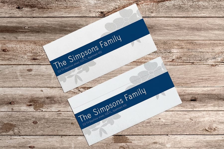
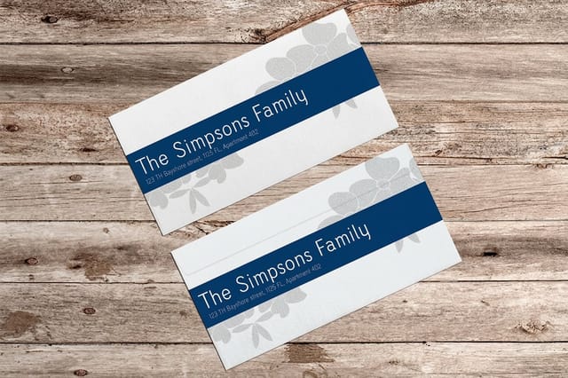
Envelopes deserve a decision of their own. Hand addressing by a working calligrapher is priced per envelope and takes days across a long guest list. Printing the addresses in the same script on invitation envelopes, which start at $170.42, is one pass and matches the suite exactly. Print a test of the longest name on the actual stock first, because the address block is where a script hits the smallest sizes on the whole job.
For thank-you notes and anything sent after the event, greeting cards start at $56.02 and hold a script comfortably at display size. If you want to lay any of this out yourself, the blank template library has correctly sized files for every card and envelope on the list, and the invitation printing range shows which stocks are available in each format.
Wally explains calligraphy
Two pens, two ways to make a thick line
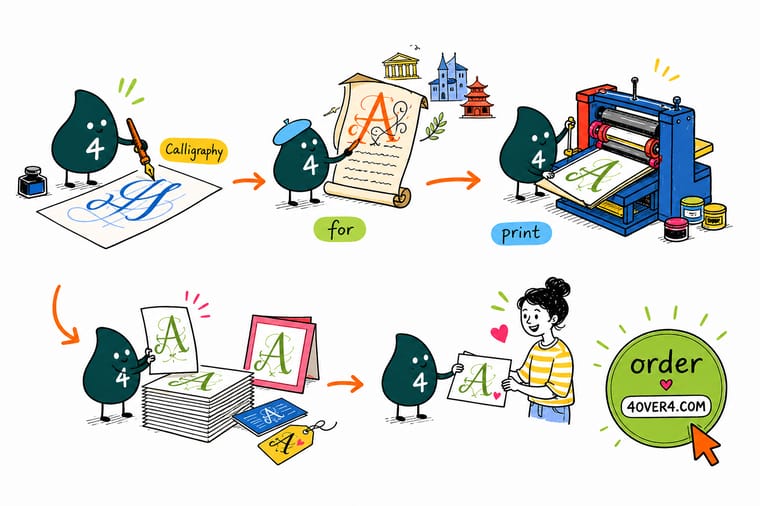
Wally holds a broad-edge pen like a tiny chisel and drags it at one fixed angle. Pull down and the line is fat, pull sideways and it goes thin, and the thin can never get thinner than the edge of the nib. Then he picks up the pointed pen, presses on the way down so the tip splays, and lets go on the way up so it closes to a hair. That hair is the pretty part and the dangerous part. Under 0.5 pt the press starts skipping it, so Wally fattens it up before the job goes on plate.
Print calligraphic wedding invitations →
Specs and pricing
Stocks, sizes and starting prices for script work
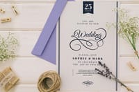
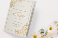
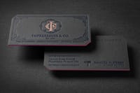
Flat wedding invitations come in 4.25 by 5.5, 5 by 7 or 6 by 6 inches on 20 stocks, 25 for $19.77 in 3 business days. Folded invitations fold to the same three sizes on 12 stocks including linen and metallic pearl, 25 for $38.22 in 5 business days. Letterpress business cards print on 32pt or 48pt silk or velvet laminated board, 250 for $251.36 in 15 business days.
Print it
Order a suite the script actually survives
Put a Copperplate or Roundhand name on a flat card at 5 by 7 inches, move a long schedule to a folded card, and send the envelopes in the same hand in A7 for a 5 by 7 invitation. Invitation envelopes start at 250 for $170.42 in 11 sizes.
Explore more
Where to go next
Sort script from serif and slab with the lettering styles guide, choose a serif to set beside the script, lay out a full wedding suite, and check how a foil die handles fine strokes before you commit a delicate hand to it.
By the numbers
The stationery side of our press, counted
Common Questions
Your calligraphy questions, answered
What is calligraphy, in plain terms?
Calligraphy is the art of forming letters by hand as deliberate drawn shapes, using a specific tool held at a specific angle, with a fixed order and direction for every stroke. The word comes from the Greek kallos, meaning beauty, and graphein, to write. What separates it from ordinary handwriting is not neatness but rule: a hand such as Uncial or Chancery Italic has a defined pen angle, a defined letter height measured in nib widths, and a defined stroke sequence, so two trained scribes writing the same hand produce nearly the same letters.
What is the difference between calligraphy, hand lettering and typography?
Calligraphy writes letters in single passes with a pen or brush, so the shape of the tool is visible in the shape of the stroke. Hand lettering draws letters as outlines and then fills them, which means the artist can build a shape no pen could make in one movement. Typography arranges letters that somebody else already designed and cut, whether as metal type or as a font file. In practice a modern invitation is usually the third: a typeface drawn from calligraphic models, set on screen and printed.
Which calligraphy style suits a wedding invitation?
Copperplate and Spencerian are the traditional choices because they read as formal and their swelled strokes look expensive at small size. Chancery Italic is the practical alternative when the guest list includes long names or the piece has to carry a lot of information, because italic stays legible at 9 or 10 point where a pointed-pen script starts to close up. If the suite is going to be foil stamped or letterpressed, pick the heavier of the two candidates. Fine hairlines are the first thing a die or an impression destroys.
Does calligraphy have to be written by hand, or can it be printed?
Both work, and they cost very differently. Hand-addressed envelopes by a working calligrapher are priced per piece and take days for a large guest list. Printed calligraphy uses a script typeface, or a scan of real hand work converted to vector, and prints in one pass at the same cost as any other artwork. The tell that gives printed script away is repetition: the same letter appearing identically every time. Script fonts with contextual alternates and swash variants fix most of that if you actually turn the OpenType features on.
Why did my script artwork print thin, broken or patchy?
The hairlines were below what the press can hold. A pointed-pen script scaled down to fit a 5 by 7 invitation can push its thinnest upstroke under 0.25 pt, and at that width offset and digital both start dropping ink in patches rather than laying a continuous line. Set the thinnest stroke at 0.5 pt or heavier, check it at 100 percent on screen rather than zoomed in, and never build a script in a single spot color at a light tint. Our note on the smallest printable font size covers the same limit for type.
Is calligraphy the same thing as cursive?
No. Cursive simply means the letters are joined and written without lifting the pen much, which is a property of how you write rather than an art form. Plenty of calligraphy is not cursive at all: Roman square capitals, Uncial and Blackletter are written letter by letter with many pen lifts per character. And plenty of cursive is not calligraphy, including the joined handwriting taught in schools, which has no controlled pen angle and no fixed stroke order.
Get Started
25 flat wedding invitations cost $19.77, or 79 cents each
Pick a flat or folded format, choose your stock, and we print the suite with the thin strokes intact and the envelopes to match.
Legal Disclaimer
Gold Standard guarantees apply to all standard orders placed through 4over4.com. Price match requires verifiable proof of a competitor's published price for an equivalent product with matching specifications and turnaround time. Satisfaction guarantee covers manufacturing defects and print quality issues. Contact support with order number and documentation.
