
The Graphic Design Websites Worth Using on a Print Project


Sofia is our design and templates voice, built from the knowledge of our production team, with over 20 years in printing.
For print work the short list is Behance for finished layouts, Fonts In Use for typefaces that have already survived a press, Adobe Color and Coolors for palettes, Unsplash and Pexels for free photography, and The Noun Project for icons. All of them publish in RGB for screens, so check three things before anything from them enters your file: the CMYK build of the color, the pixel dimensions against your finished size at 300 dpi, and whether the font license covers commercial printing. Then test the result on the piece you will order, whether that is flyers, posters or brochures.
Design resource sites by what you need
| What you need | Sites worth opening | Check before you use it | Where it ends up |
|---|---|---|---|
| Layout inspiration | Behance, AIGA Eye on Design, Creative Bloq | Whether the piece was ever actually printed or only rendered in a mockup | Brochures, posters, packaging |
| Typefaces | Fonts In Use, Google Fonts, Font Squirrel | That the license covers commercial desktop printing, not just personal use | Every job with words on it |
| Color palettes | Adobe Color, Coolors | The CMYK build of each swatch before you commit the brand to it | Identity work, packaging |
| Photography | Unsplash, Pexels | Pixel dimensions against your finished size at 300 dpi | Flyers, posters, covers |
| Icons and vectors | The Noun Project, Vecteezy, Openclipart | Attribution terms on the free tier, and that the file is real vector art | Menus, signage, infographics |
Nothing on this list is a substitute for a proof. Whatever you gather, put it on the real stock at the real size before you order a run: 100 standard business cards from $17.57 in 3 business days, or 50 flyers from $39.54. You can order standard business cards from the live configurator and see the whole thing on paper for the price of a lunch.
Inspiration sites are RGB, and a press is not

Every site in this article publishes images in RGB, because they are made to be looked at on a screen that emits light. Ink on paper reflects light instead, and the CMYK gamut it can reach is smaller. The colors that suffer most are the ones designers fall for first: electric blues, neon greens, hot oranges and anything fluorescent. They come back from a press flatter and greyer than the reference you saved, and no amount of press adjustment recovers them.
This is not a reason to stop looking at Behance. It is a reason to treat what you find there as composition reference rather than color reference. Steal the grid, the hierarchy and the crop. Rebuild the palette yourself in CMYK and judge it there.
The practical habit is to convert early, not at export. Set the document up in CMYK the day you start, so the palette you approve is the palette that prints. Our color profile guide covers which profile to work in, and the specs that decide a print job covers the rest of the setup.
What a screen palette actually costs you
A saturated RGB blue can lose a visible amount of punch when it becomes CMYK, and a bright green shifts toward olive. If that color is a logo color, the shift shows up on every printed piece the business ever orders, next to a website that still glows. Deciding the CMYK build first, then matching the screen to it, keeps the brand consistent in the direction that matters.
If the color has to be exact across suppliers and substrates, that is a Pantone conversation rather than a palette-generator conversation. Choosing a brand palette walks through where a spot color earns its cost and where it does not.
A five minute check before you commit
Build the palette in Adobe Color or Coolors, then paste the hex values into your layout application, convert the swatches to CMYK, and look at the numbers. Anything that lands above roughly 90 percent in three or four channels will print as a heavy muddy solid. Anything that converts with a single dominant channel usually holds up well.
Then print it. A single sheet on the actual stock tells you more than an hour of soft proofing on a monitor nobody calibrated.
The sites worth opening, by the job in front of you
Bookmarking twenty sites is how people end up using none of them. A short list, sorted by the job, gets used. Here is the set that earns its place on print work, and the honest limit of each one.
Where a site is strong for screen work and weak for print, that is said plainly, because that is the part most roundups leave out.
Finished work and layout reference
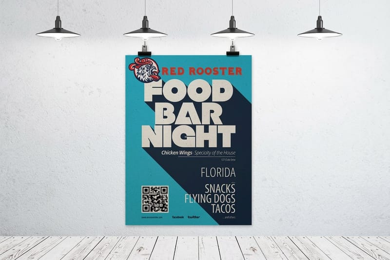
Behance is the deepest archive of finished graphic design on the web, and it filters by field, so you can sit inside packaging or editorial work rather than scrolling everything. The catch is that a large share of what you see was never printed. It is a render in a mockup, which means the type sizes, the folds and the ink coverage were never tested against a real press.
Dribbble is a screen-first community and its shots are small crops. Good for a color mood or an icon idea, poor for anything that needs a full layout at reading size. AIGA Eye on Design and Creative Bloq are editorial rather than gallery, which is what you want when you are trying to understand why something works instead of collecting another thumbnail.
Pinterest deserves a mention and a warning. It is a fast mood board and a terrible source of truth, because images get re-uploaded at low resolution and separated from the person who made them. Use it to explain a direction to a client, never as a file you build from. For portfolio-standard examples with proper attribution, our roundup of graphic design portfolio examples is a better starting point.
Type, and the license question nobody asks
Fonts In Use is the most useful type site for print work because it indexes published pieces and names the typefaces in them, filtered by format. You can look at what actually holds up on a book cover or a poster instead of guessing from a specimen page.
Google Fonts families are open source and free to use commercially, including for desktop print, which is why they carry so much small business work. Font Squirrel curates free fonts specifically for commercial licenses, which saves the reading.
Here is the trap. A font marked free on a general download site is very often free for personal use only, and a business card is commercial use. Converting the text to outlines hides the font from the file, but it does not grant you a license. Read the license, then read how to convert text to outlines before sending files to print for the production side, and easy to read fonts for brands and print for choices that survive small sizes.
Photography, vectors and mockups
Unsplash and Pexels both give away good photography, and both will happily hand you a file too small for the piece you are designing. Check the pixel dimensions on the download page every single time.
The Noun Project is the fastest route to a consistent icon set, with a free tier that requires attribution and a paid tier that does not. Vecteezy and Openclipart cover the rest, though the quality range is wide and some downloads labelled vector are traced bitmaps that fall apart when you scale them for a banner.
Mockup sites are the last category and the one to be most suspicious of. Soft studio lighting and a shallow depth of field flatter everything, including 5 point body copy nobody will be able to read on the actual card. Judge type at 100 percent in the layout, then use the mockup only to present.
Print pricing and specs at 4OVER4.COM
The gap between a design file and a printed piece is a set of numbers: size, stock, finish and quantity. For a flyer that means 8.5" x 11", 100# gloss text, a standard or high gloss UV finish, and 50 copies from $39.54 in 3 business days. The figures below come from the live configurator, so you can decide what the job costs before you spend an afternoon on the artwork.
Quantity and price
Business card pricing and specs
Real configurator numbers, where the per unit cost drops as the run grows.
| Quantity | Price Per Unit | Total |
|---|---|---|
| 100 | 17.6¢ | $17.57 |
| 200 | 11.5¢ | $23.07 |
| 300 | 9.15¢ | $27.46 |
| 400 | 7.96¢ | $31.86 |
| 500 | 7.25¢ | $36.26 |
| 600 | 6.77¢ | $40.64 |

Standard flyers start at $39.54, standard brochures at $57.11 and standard postcards at $16.48, so a designer can test three formats of the same idea for less than the cost of one stock photo subscription. You can also earn coins on every order and put them against the next run.
Resolution is the trap free stock sets
Divide the pixel width of an image by 300 and you have its printable width in inches at full print resolution. A 1920 pixel wide download is 6.4 inches, which is comfortable on a postcard and hopeless on a poster. An 18 by 24 inch poster wants roughly 5400 by 7200 pixels if you are holding 300 dpi, and free libraries rarely go there.
Print it
Business cards, ready to proof
The fastest, cheapest way to see whether your file behaves the way the screen promised.

Large format is where the rule bends in your favour. A poster is read from several feet away, so 150 dpi at final size is often perfectly acceptable, which halves the pixels you need. A business card held at arm’s length is not forgiving in the same way, and neither is any piece with fine type or a hairline rule. Our resolution guide has the numbers per format, and bleed and trim explained covers the margin the press needs around all of it.
One more thing the download page will not tell you: an image scaled up in Photoshop has not gained detail, it has gained pixels. If the original is too small, find another image. When the file is finally right, exporting a print-ready PDF is the step where most of the remaining mistakes get caught.
Choosing resources by what you print
The right shortlist depends on who you are and what leaves the printer. This is how it usually breaks down.
- Freelance designers. Fonts In Use and Behance for reference, Google Fonts for licenses that never need explaining to a client, and a printer with a live configurator so you can quote a job in the same hour you scope it.
- Small business owners. Skip the inspiration rabbit hole. A palette from Adobe Color, a Google Fonts pairing, and a print-ready blank template covers most of what a first run of cards or flyers needs.
- Marketing teams. Lock the CMYK builds and the licensed typefaces in a shared brand file, then let anyone pull imagery from an approved stock account rather than from a search result.
- Agencies and studios. The mockup is for the pitch, the outlined PDF is for the press. Keeping those two files separate stops a presentation render from ever reaching a printer.
- Students and career changers. Creative Bloq and AIGA Eye on Design explain reasoning, which is the part that transfers. Then print something small and cheap so you learn what a screen never teaches you.
Whichever group you sit in, the vocabulary is worth having straight. Our graphic design terms glossary explains the words a printer uses, and graphic design marketing covers turning the work into paying jobs.
Press blanks with bleed, trim and safe margin drawn
Inspiration sites give you a direction. A template gives you correct bleed, a trim line and a safe margin for the exact product you are ordering, which is the part that decides whether the job comes back right. An 8.5" x 11" flyer blank, for example, is an 8.75" x 11.25" file with the trim line drawn and a safe margin 0.125 inch inside it, so your artwork lands where the cutter expects it. Start from the blank template library, or browse the ready-made layouts in design templates.
Start fast
Press blanks with bleed, trim and safe margin drawn
Design templates and exact size press blanks so your artwork lands inside the cut line.














If you would rather not open a design application at all, the free online business card design tool runs in the browser and hands the finished file straight to production, which removes the export step where files most often go wrong.
Wally checks the site before he trusts the file
Three checks that keep an online find printable
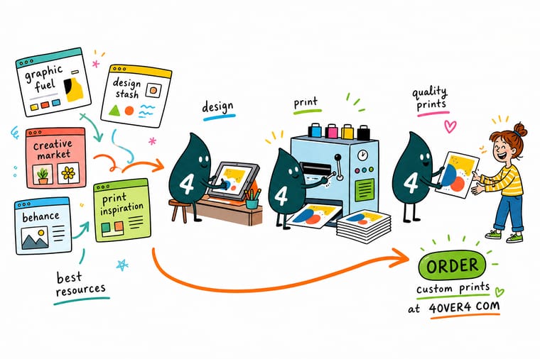
Convert the color to CMYK and look at the numbers before you approve it, divide the image pixel width by 300 to get its real printable inches, and read the font license for the words commercial use. Then set 0.125 inch bleed, keep type off the trim line, and 4OVER4.COM prints it on premium stock as fast as your deadline needs.
Order business cards →What to remember about design resource sites
Working habits that keep online finds printable
- Save reference for composition, not color. Take the grid, the crop and the hierarchy from what you find online. Rebuild the palette in CMYK yourself, because the version you saved was made to glow on a screen.
- Check pixels before you fall in love. Divide the pixel width by 300 to get the printable inches. A photo that gives you 6 inches is not going on an 18 inch poster, no matter how good it looks in the browser.
- Read the license, then keep it. Save the license file next to the artwork. A year later, when a client asks whether they can use the font on packaging, you will want the answer in the folder rather than in your memory.
- Test the type at 100 percent. Mockup lighting hides small type. Zoom the layout to actual size on screen, or print one page and hold it, before you sign off a size.
- Keep the bleed set from the first day. Add 0.125 inch of bleed on every side at document setup, not at export. Retrofitting bleed into a finished layout is where good designs get cropped badly.
For type specifically, the best designer fonts for print narrows the field, and if you are still building a portfolio, logo design tutorials and business card examples are the two rabbit holes worth falling into.
Explore more
More ways to print and promote
Standard posters run 50 for $108.75 in 5 business days and standard flyers 50 for $39.54 in 3.
Product Standard Business Cards The cheapest way to see how your design behaves on real stock.  Product Standard Flyers Full color flyers for the layouts you just finished sketching.
  Product Standard Posters Large format, where image resolution stops being optional.
  Product Standard Brochures Folded formats that reward a proper grid.
  Category Business Card Printing Every stock, finish and shape in one place. Category Poster Printing Sizes, stocks and finishes for wall work.
 Ready to print what you designed?
Pick the size, drop in your file or start from a free template, and 4OVER4.COM prints it sharp on premium stock, as fast as your deadline needs.
Common questions about design resource websites
What is the best website for graphic design inspiration for print?
Behance is the deepest archive of finished graphic design and it filters by field, so you can browse packaging or editorial work specifically rather than scrolling everything. For print in particular, Fonts In Use is the better second stop, because it indexes work that was genuinely published and names the typefaces used, filtered by format. The limitation of both is the same: much of what you see online is a render inside a mockup rather than a piece that came off a press, so the type sizes and the ink coverage were never tested. Use them for composition and hierarchy, and rebuild color yourself in CMYK.
Can I use free stock photos from Unsplash or Pexels on printed material?
Usually yes for the license, and often no for the resolution. Both sites allow commercial use under their own licenses, though it is worth checking the terms for the specific image, especially where people or trademarks appear. The bigger practical problem is size. Divide the pixel width of the download by 300 to get the printable width in inches at full print resolution. A 1920 pixel wide file gives you 6.4 inches, which covers a postcard or a business card but falls well short of an 18 by 24 inch poster, which wants roughly 5400 by 7200 pixels at 300 dpi.
Are free fonts safe to use on a commercial print job?
Only if the license says so, and plenty do not. Google Fonts families are open source and free for commercial use including desktop printing, and Font Squirrel curates specifically for commercial licenses, so both are safe defaults. General font download sites are where the trouble is: a large share of what they offer is free for personal use only, and printing a business card for a client is commercial use. Converting the text to outlines removes the font data from the file but does not grant you a license, so it solves a production problem and not a legal one.
Why does my design look different when it comes back from the printer?
Most of the time it is the color space. Your monitor emits light and works in RGB, while a press lays down ink that reflects light and works in CMYK, and the CMYK gamut is smaller. Saturated blues, neon greens and fluorescent oranges are the ones that shift most, and they are exactly the colors that look best on an inspiration site. Set the document to CMYK at the start so the palette you approve is the palette that prints, and order a small run before committing a large one. Monitor brightness and an uncalibrated screen account for the rest.
Do I need a design site at all, or can I just use a template?
For a first run of cards, flyers or postcards, a print-ready template is usually the faster and safer route, because the bleed, the trim line and the safe margin are already correct for the product you are ordering. Inspiration sites earn their time when you are building something that has to be distinctly yours, such as an identity or packaging, where the layout decisions matter more than the setup. A reasonable middle path is to gather reference online, then drop your artwork into a blank press template so the production side is never in question.
