
Brand Strategy for Startups, From Identity Decisions to Your First Print Run


Emma is our prepress and print production voice, built from the knowledge of our production team, with over 20 years in printing.
Brand strategy for a startup is four decisions made in order: who the product is for, what that person stops doing once they buy it, the one promise you will be judged on, and the identity that carries the promise. Everything printed after that is execution, and print is where the decisions stop being editable, so settle all four before you buy the first run. For the first order of startup marketing materials, print 100 standard business cards and a run of premium stickers as soon as the mark is final, add letterheads and envelopes together once you send quotes, and hold pocket folders until you have a repeatable sales handover.
Startup brand collateral, in printing order
| Piece | When to print it | What it locks in | Where it goes wrong | Starts at |
|---|---|---|---|---|
| Business cards | Week one, before the website is finished | Logo at small size, type hierarchy, the brand color on coated stock | Fine serifs and hairline rules disappear at 3.5 x 2 in | $17.57 |
| Letterheads | When you send quotes, contracts or invoices | Margin discipline and how the brand behaves behind body text | Heavy coverage at the top fights a desktop laser printer | $99.95 |
| Printed envelopes | Same day as the letterhead, never later | The return address block and the smallest usable logo lockup | A set that arrives in two waves ships mismatched whites | $142.99 |
| Premium stickers | As soon as the mark is final | Whether the logo reads with no words next to it | A mark that needs its wordmark dies as a sticker | $29.16 |
| Pocket folders | Once a repeatable sales handover exists | Large-area color and how the brand looks at arm’s length | Bulk minimums lock in a name you may still change | $844.54 |
Prices are the starting configuration on each product page, such as 100 business cards at 2 x 3.5 inches on 14pt gloss cover, and move with stock, finish and quantity. The order of the rows matters more than the numbers: each piece tests something about the identity, and testing it on the cheapest piece first is what keeps a rebrand from becoming a write-off. You can order standard business cards straight from the configurator.
The four decisions that come before any artwork
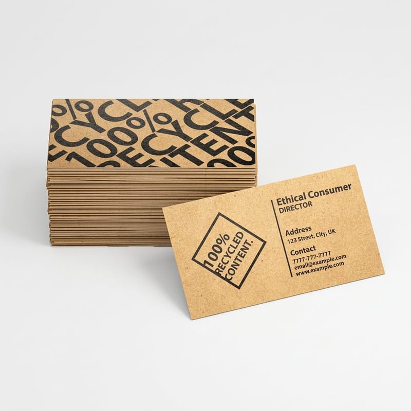
Founders usually start with the logo, and that is why the process stalls. The mark is the last of the four decisions, and a designer handed the other three finishes faster, charges less, and argues about color for a shorter time.
The four, in order: who the product is for, what that person stops doing once they buy it, the single promise you are willing to be judged on, and the identity that carries the promise. The third one is the one startups skip. A promise you cannot fail is not a promise, it is a slogan, and it gives a designer nothing to draw.
Get specific enough that the sentence would be wrong for a competitor. "We help small businesses grow" fits ten thousand companies. "We do the bookkeeping for owner-operated restaurants so the owner never opens a spreadsheet on a Sunday" fits one, and it tells you the brand should feel calm rather than energetic. Our guide to brand messaging breaks the same sentence into its parts.
Write the positioning before you brief anyone
One page is enough: the customer, the alternative they are leaving, the promise, three words for tone, and three words the brand must never be. That last line does more work than the rest combined, because it lets you reject a direction without a two-hour meeting about taste.
Hand that page to whoever draws the mark. If you are drawing it yourself, the principles of logo design are a faster read than another round of inspiration boards, and the step-by-step startup brand guide covers the sequence end to end.
Settle the name before you commit to a run
A name change after a print run is the most common waste in startup branding, and it is entirely avoidable. Check the domain, the trademark class you actually trade in, and the app store handle before anything reaches a press. Say it out loud on a phone call. If people spell it back wrong, it will cost you every time someone tries to find you.
Once the name survives that, the tone follows. Tone is not decoration, it decides typeface weight, how much white space the layout carries, and whether the brand color is a bright accent or the whole field.
Turning identity into files a press can hold
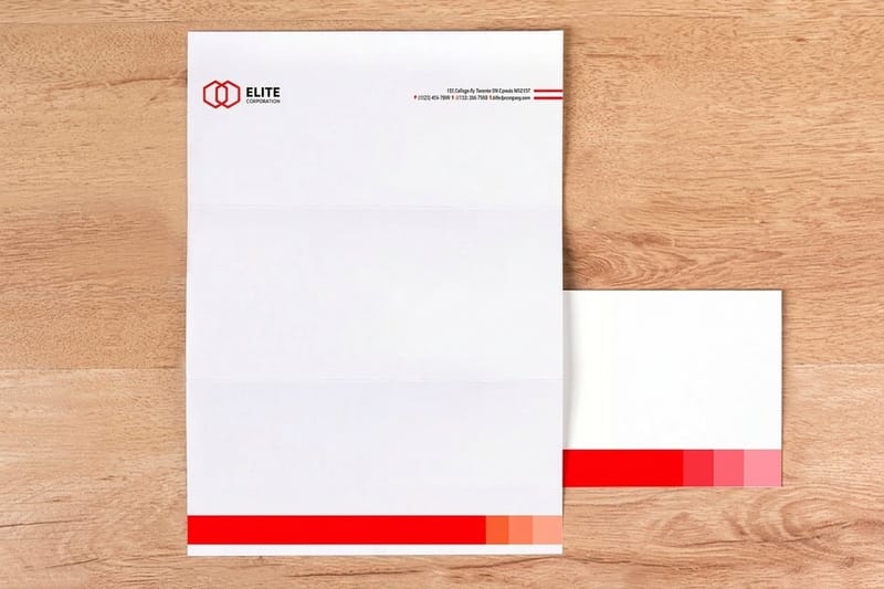
Screens emit light, paper reflects it, and the two color models do not overlap. A brand color chosen in RGB on a bright monitor, especially a vivid blue, an electric green or a neon orange, sits outside what four process inks can reach. Converted to CMYK it comes back duller and slightly shifted, and the founder who never saw that conversion is the founder who calls the printer.
Do the conversion yourself, at the start, and approve the CMYK version as the brand color. Note the CMYK build in your one-page identity sheet next to the hex value, and if the color is genuinely load-bearing for the brand, specify a Pantone spot ink and accept that it costs more on small runs. Our note on the right color profile for printing covers which profile to convert into, and the pairings that survive print is where to look if the palette is not fixed yet.
The second thing to lock is scale. Draw a simplified version of the mark at the same time as the full lockup, and set the minimum size for each. A logo with a fine outline and a tagline underneath works at three inches on a folder and turns into a gray smudge on a card corner or a sticker.
The three processes your brand will meet
Cards and short-run stationery come off a digital press. Larger stationery runs and folders go offset. A banner is large format on vinyl or fabric. The same approved file passes through three different ink systems and three different substrates, so the brand color will not be numerically identical across all of them. Decide in advance how much drift you accept, and print the pieces that will sit side by side on the same stock in the same order.
That is also why a stationery set should be ordered as a set. Standard letterheads at $99.95 and printed envelopes at $142.99 bought weeks apart can land on two slightly different paper whites, and the mismatch shows the moment the letter goes into the envelope.
Bleed, safe area, and the type that plugs
Build every piece with 0.125 inch of bleed on all four sides and keep anything that must not be trimmed at least 0.125 inch inside the cut line. Centering a logo optically rather than mathematically is a design choice, but pushing it to the edge because it looks tight on screen is how a mark comes back clipped.
Reversed type is the other trap. White text at 6 or 7 point, set in a light serif, knocked out of a heavy ink coverage, will fill in at the edges as the ink spreads. Use a heavier weight, go up a point or two, or set that block in the brand color on white instead. The card stock guide explains how coating changes the amount of spread you get.
What to print first, and what to hold
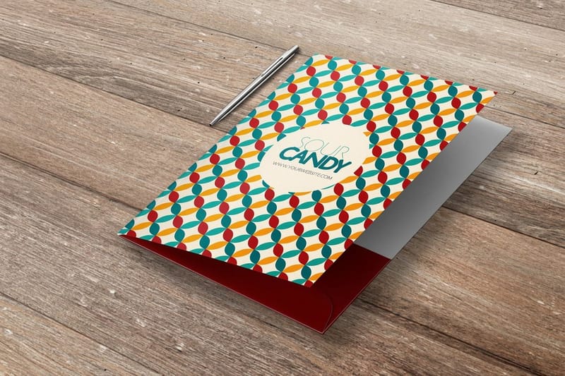
Print in the order the pieces get used, not the order they appear in a brand guidelines PDF. For most startups that means cards, then stickers, then stationery when money starts moving on paper, then a folder or a banner once there is a repeatable reason to hand something over or stand behind something.
Cards come first because they are the cheapest full test of the identity. Standard business cards start at $17.57 and premium business cards at the same $17.57 with heavier stock and finish options, which means the whole risk of finding out your logo does not work at small size costs less than lunch. Order a small quantity, carry them for two weeks, and look at how they age in a pocket before you order a thousand.
The piece to hold is the folder. Pocket folders start at $844.54 because they are die cut and glued in bulk, and bulk is exactly the wrong commitment for a company that might rename itself in month seven. Print folders when a salesperson is handing one over every week, not before.
The first ninety days
Cards for everyone who meets a customer. Premium stickers from $29.16, because a sticker is the only brand asset another person carries for you and it forces you to prove the mark reads without the wordmark. Then the stationery set, once you are invoicing on your own paper rather than sending a PDF from a template.
Keep the quantities honest. A startup identity has roughly an eighteen month half-life, and the founders who feel best about their print spend are the ones who ordered twice at small volume rather than once at a discount they never used up. If a refresh is already on the horizon, work through the brand refresh checklist before spending anything.
What earns its place later
A retractable banner stand from $139 earns its cost the first time you take a table at an event, and stays useless in a cupboard otherwise. Interior and exterior signage follows the same rule, and branded signage only makes sense once there is a door with your name on it.
Everything beyond that is a marketing decision rather than a brand one. Affordable branding strategies covers the cheap moves worth making while revenue is still thin, and branding your business in print is the wider view of how the pieces hold one look.
What the first run actually costs
A first card run starts at 100 cards, 2 x 3.5 inches on 14pt gloss cover. Moving to 16pt gloss, 16pt soft touch or 24pt ultra thick raises the price, turnaround moves it too, and the quantity steps run in hundreds from 100 to 1,000 with the per unit cost falling at each step. The numbers below come from the live configurator, so you can set the budget before you commit artwork.
Quantity and price
Business card pricing and specs
Real configurator numbers, where the more you order the lower the per unit cost drops. Weigh that discount against how long your identity will stay unchanged.
| Quantity | Price Per Unit | Total |
|---|---|---|
| 100 | 17.6¢ | $17.57 |
| 200 | 11.5¢ | $23.07 |
| 300 | 9.15¢ | $27.46 |
| 400 | 7.96¢ | $31.86 |
| 500 | 7.25¢ | $36.26 |
| 600 | 6.77¢ | $40.64 |

You can also earn coins on every order and redeem them against later printing, which matters more than it sounds when a young brand is buying in small repeat runs rather than one large one.
Stock and finish as brand decisions
Stock is part of the identity, not a checkout option. A 14pt card is the standard weight and feels correct in almost any hand. A 16pt card is noticeably more rigid and reads as deliberate. Above that you are into specialty weights that make a statement, and the statement should match the tone words on your positioning page rather than contradict them. A calm, precise brand on an ultra-thick card with foil is telling two different stories at once.
Print it
Business cards, ready to hand over
Stock weights, coatings and finishes in one configurator, with a proof before the run.
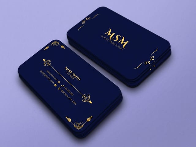
Finish changes how the brand color behaves. Gloss lifts saturation and makes photography snap, which flatters a bright palette and fights a muted one. Matte lowers contrast slightly and cuts glare, so fine type stays readable under a bright light. Soft touch adds a texture people notice before they read anything, which is why it suits brands built on craft. Uncoated takes a pen, which still matters if anyone writes on the back. The trade-off is real: a matte or soft touch surface shows fingerprints and scuffs on a solid dark field far more than gloss does, so a brand with heavy black coverage should see a sample before committing. The stationery set guide covers how to keep the same finish decision consistent across cards, letterhead and envelopes.
What different startups should print
The four decisions are the same for everyone. What they produce is not, so here is the pattern by company type.
- Software and SaaS startups. Almost everything is on screen, so the printed pieces carry more weight per unit. Cards and stickers, both in the CMYK build of your interface color, so the brand does not appear to change between the app and the table at a conference.
- Direct-to-consumer products. The packaging insert and the sticker do the branding work. Prove the mark reads at one inch before you approve anything else, because that is the size it will live at inside a box.
- Professional services. Stationery is not nostalgia here. A letterhead, an envelope and a card that match tell a client the practice has been organized for longer than it has, which is exactly what a young firm needs to communicate.
- Food and beverage. Color drift matters most in this category, because appetite colors sit near the edge of the CMYK gamut. Specify a spot ink for the one color that carries the brand and let everything else be process.
- Agencies and studios. Your own collateral is a portfolio piece. This is the one case where a heavier stock and a specialty finish pay for themselves, because the object is the argument.
Blanks that settle the geometry for you
If the identity is settled but the layout is not, templates remove the guesswork about geometry. 4OVER4.COM sizes its blanks to exact product specs, 2 x 3.5 inches for a standard card plus the 2 x 2 square, 1.5 x 3.5 slim and 2.125 x 3.375 inch sizes, so bleed, trim and safe area are already marked and your logo lands where you intended. Pull a print-ready blank from the blank template library, or start from a full layout in the design template collection.
Start fast
Blanks that settle the geometry for you
Card design templates and exact size blanks so your artwork lands inside the cut line.














Wally checks the brand before the press does
Four decisions, one CMYK build, then the first run
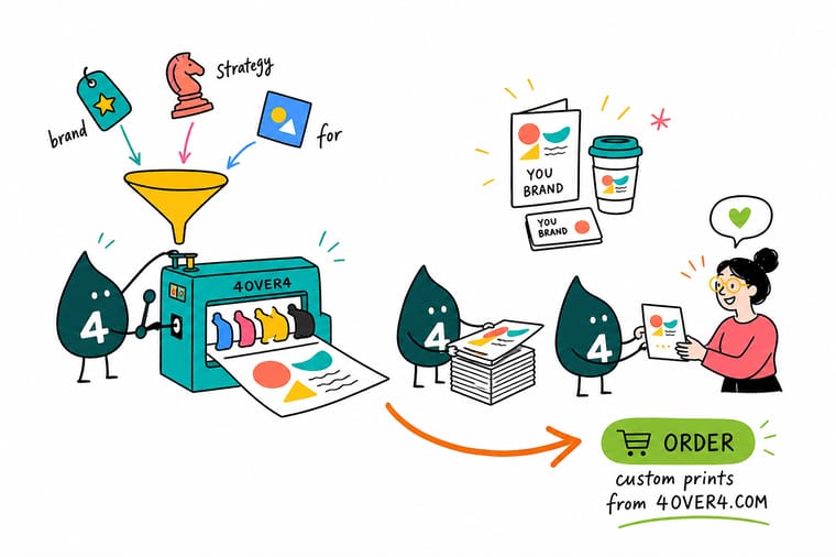
Write the positioning on one page, settle the name, convert the brand color to CMYK and approve that version, and draw a simplified mark for anything under an inch. Then print the cheap piece first: business cards at 0.125 inch bleed on 14pt or 16pt stock, so you find out what does not work while a reprint still costs almost nothing.
Order business cards →What to decide before the first print run
Rules that hold from identity to press
- Approve the CMYK version, not the hex. The screen version is a preview. Sign off the converted build and record it next to the hex value, so nobody has to guess it again on the next job.
- Draw the small mark on day one. A simplified logo for anything under an inch is not a compromise, it is part of the identity. Set a minimum size for both versions and write it down.
- Order the stationery as one job. Letterhead and envelopes bought weeks apart can land on different paper whites. Order together and the set matches.
- Buy twice at small volume. A first identity rarely survives eighteen months untouched. Two small runs cost slightly more per piece and waste far less.
- Keep a single master artwork file. One file with the CMYK values built in, exported per job. Reconverting from RGB every time is how three versions of the same blue end up in circulation.
Explore more
More ways to print and promote
Retractable banner stands print in 3 business days and printed envelopes run 250 for $142.99 in 7.
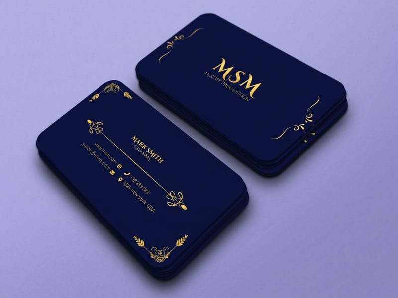 Product Premium Business Cards Heavier stock and finishes for the first piece anyone touches. Product Letterheads Your brand behind body text, on paper that feeds a laser printer. Product Pocket Folders Large-area color for a sales handover that repeats.
 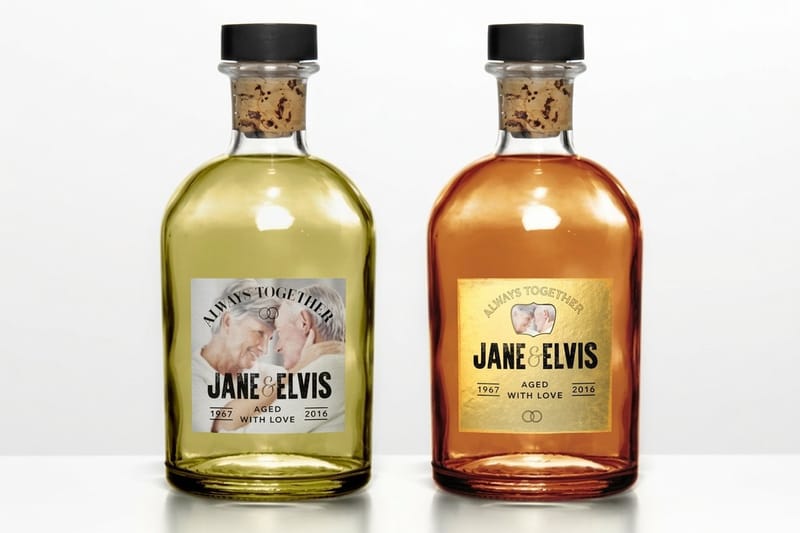 Product Premium Stickers The brand asset your customers carry for you.
 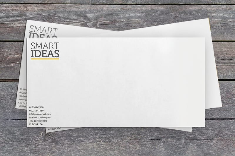 Product Printed Envelopes Order with the letterhead so the paper white matches.
  Category Business Card Printing Every stock, finish and shape in one place.
 Ready to put the brand on paper?
Start with the cheapest piece, upload your artwork or a free template, and 4OVER4.COM prints it sharp on the stock you picked, as fast as your launch date needs. Browse sticker printing and envelope printing when the set grows.
Common questions about startup branding
How much should a startup spend on branding before it prints anything?
Spend on the thinking, not the artifacts. A one-page positioning document, a name that survives a trademark and domain check, and a logo that works at both three inches and half an inch will carry a company through its first two years. Printing before those exist means paying twice, because the reprint arrives the moment the name or the promise moves. Once they are settled, the first print run is genuinely small money: standard business cards start at $17.57 and premium stickers at $29.16 at 4OVER4.COM, which is far less than most founders expect and far less than a second round of design.
Should I pick a Pantone spot color or stick with CMYK?
Stick with CMYK unless the color is doing real work for the brand. Four-process printing is on every product and adds nothing to the price, while a spot ink is a separate ink on press and costs more, particularly on short runs. A spot color earns its cost in two situations: when your color sits outside what four inks can mix, which is usually a vivid blue, a bright orange or a strong green, and when the brand is a single color used flat across large areas where a slight shift between jobs would be obvious. For everything else, build the color in CMYK, approve a printed proof of that build, and use it consistently.
How many business cards should a startup order on the first run?
Order what the team will genuinely hand out in three to six months, which for most early startups is a few hundred rather than a few thousand. The per-card price drops as quantity climbs, and that discount is the trap: a startup identity has a short half-life, and a box of two thousand cards with the old logo is a more expensive mistake than the saving. A practical pattern is a small first run, carry them for two weeks, look at how the stock ages in a pocket and whether the type reads under bad lighting, then reorder at volume once nothing about the design annoys you.
Do I need a full brand guidelines document at this stage?
No. A twenty-page guidelines PDF is for an organization with several people producing artwork independently, and a startup rarely is. What you do need is one page: logo files with a stated minimum size for each version, the brand color as both hex and CMYK build, the typefaces with the weights you actually use, and three words describing the tone. Anyone briefing a printer or a freelancer can work from that in five minutes, and it will be kept current, which a longer document will not be.
When are presentation folders worth printing?
When someone is physically handing one to a prospect on a repeating basis. Pocket folders start at $844.54 at 4OVER4.COM because they are die cut and glued in a production run, so the format only makes economic sense in quantity, and quantity is the wrong commitment while the name or the positioning could still move. If you need something to hand over before that point, a printed brochure or a well-made card with a QR to a proposal does the same job for a fraction of the outlay, and you can look at folders once the sales motion is proven.
