
Best Flyer Fonts and the Sizes That Keep Them Readable


Sofia is our design and templates voice, built from the knowledge of our production team, with over 20 years in printing.
Which faces to pair, what size to set them at for the distance the flyer gets read from, and the four things ink does to type that a screen never shows you.
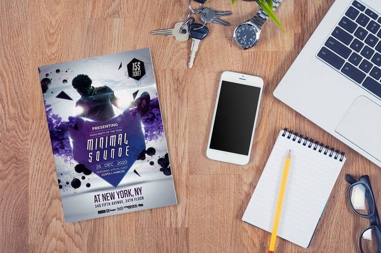
Use exactly two type families on a flyer: one display face for the headline and one plain, large x-height face for the body, and make them differ clearly on one axis, weight, width or classification. Set the headline at three to four times the body size, keep body copy at 10 or 11pt when the flyer is read in the hand and 14pt or more when it is pinned to a board, and never take body text below 9pt. Anton with Source Sans 3, Oswald with Open Sans, and Playfair Display with Lato are three pairings that hold up in print.
Quick answer
Two faces, one axis of contrast, sized for the distance
Pick the body face first, then the headline, then the sizes. The seven steps below go in that order, and the size table sets the numbers for each flyer size.
Seven Steps From Blank Page to a Flyer People Actually Read
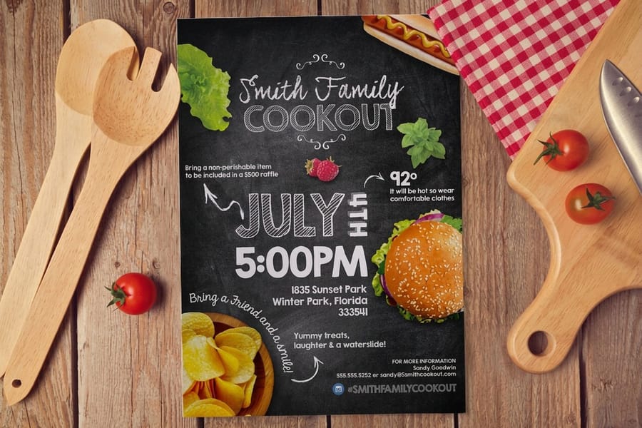
Type on a flyer has about two seconds to earn a second look. Work in this order and the decisions stop fighting each other.
One, fix the reading distance before you open the file. A 4.25 by 5.5 handbill pressed into someone's hand and an 11 by 17 taped to a coffee shop board are not the same design problem, and every size decision below depends on which one you are making.
Two, choose the body face. Pick it before the headline. Looking good at 60pt is easy. Staying clear at 10pt on paper is the hard brief, so start there and pick a face with a large x-height, open counters and a genuine range of weights. Source Sans 3, Open Sans, Lato, IBM Plex Sans and Merriweather all clear that bar.
Three, choose a headline face that differs on one clear axis. Weight, width or classification. A heavy condensed grotesque next to a regular-width humanist sans reads as a pair. Two humanist sans faces at similar weights read as a mistake, because the reader gets no signal about which line to read first.
Four, build the size ladder. Headline, subhead, body, call to action, fine print. Five levels, and nothing else. Set the headline at three to four times the body size. If two levels land within a couple of points of each other, either merge them or push them apart, because a reader cannot see a two point difference from across a room.
Five, set leading and line length. Body leading at 120 to 140 percent of the type size, and 45 to 75 characters per line. A single column of 11pt running the full width of an 8.5 inch sheet gets past 100 characters, which is why so many one-column flyers feel like homework. Split it into two columns or push the margins out to three quarters of an inch.
Six, look at it in grayscale at 25 percent. Shrink the page until words become shapes. If the headline is not the first thing your eye lands on, the hierarchy has failed and no font choice will rescue it.
Seven, print one at final size on paper before you order the box. Type that felt confident at 200 percent on a monitor is routinely two points too small in the hand. Set the file up per our bleed and trim guide, then order standard flyers, which start at $39.54 for 50.
Five Flyer Font Pairings That Hold Up in Print
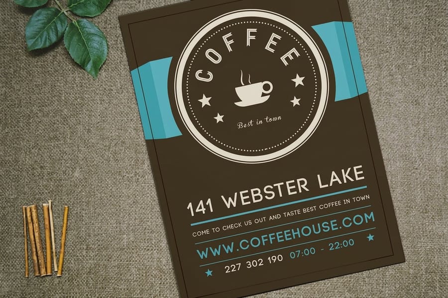
A pairing works when the two faces are obviously different in one way and quietly compatible in every other. All ten faces below carry open licenses that allow commercial print runs, so none of them cost anything to use on a paid job.
| Headline face | Body face | Why the pair works | Best flyer for it |
|---|---|---|---|
| Anton | Source Sans 3 | Anton is heavy and condensed, Source Sans 3 is regular width and evenly weighted. The gap is unmissable at any size. | Sales, events and clearance flyers on 8.5 by 11 |
| Playfair Display | Lato | A high-contrast serif against a plain humanist sans. The serif carries the occasion and the sans stays out of its way. | Open houses, fundraisers, gallery nights |
| Oswald | Open Sans | Oswald fits a long headline into a narrow measure without shrinking it, and Open Sans has the x-height to stay readable underneath. | Real estate, gyms, anything with a wordy headline |
| Montserrat Black | Merriweather | Geometric sans over a serif drawn with sturdy strokes and a large x-height, which is exactly what survives on uncoated stock. | Service businesses and text-heavy informational flyers |
| Archivo Black | IBM Plex Sans | A dense display grotesque over a lighter neo-grotesque with wider spacing. They separate by weight and by fit rather than by shape. | Product launches, menus, price lists |
If pairing makes you nervous, use one superfamily instead. Source Sans 3 Black for the headline and Source Sans 3 Regular for the body is a real pairing and a safer one than two faces picked by feel, provided the weight jump is at least four steps. Two adjacent weights, Semibold over Regular, look like a printing error rather than a decision.
The same logic carries across formats. A folded brochure needs the pair to survive across panels, which is covered in our notes on brochure paper and layout, and standard brochures start at $57.11 for 50. On a 4 by 6 mailer the body face matters more than the headline face, because there is barely room for a headline at all, which is why postcard fonts follow slightly different rules.
Type Sizes by Flyer Size and Reading Distance
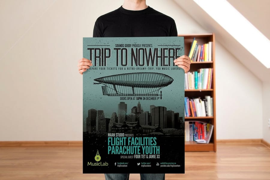
Point size is meaningless on its own. What matters is how far away the reader stands, and flyers get read at two very different distances: in the hand at roughly 18 inches, or on a wall from several feet back. These ranges hold up in print.
| Flyer size | Read from | Headline | Subhead | Body | Fine print |
|---|---|---|---|---|---|
| 4.25 x 5.5 handbill | In the hand | 24 to 30pt | 13 to 15pt | 9 to 10pt | 7pt floor |
| 5.5 x 8.5 half page | In the hand | 30 to 40pt | 15 to 18pt | 10pt | 7.5pt |
| 8.5 x 11 handed over | In the hand | 40 to 54pt | 18 to 22pt | 10 to 11pt | 8pt |
| 8.5 x 11 on a board | 4 to 6 feet | 60 to 80pt | 26 to 30pt | 12 to 14pt | 9pt |
| 11 x 17 posted | 8 to 12 feet | 100 to 140pt | 36 to 44pt | 16 to 18pt | 10pt |
The rule underneath the table is the one sign shops use: roughly one inch of cap height per ten feet of viewing distance. Type size is not cap height, though. On most sans faces the capitals measure about seventy percent of the point size, so 72pt gives you around three quarters of an inch of cap. That is why the 11 by 17 row jumps to 100pt and above rather than the 72pt people expect.
Below 9pt, body copy stops being copy and becomes texture. Nobody reads a 7pt paragraph, so use 7 and 8pt only for the disclaimer, the date and the legal line. If your copy will not fit above 9pt, the answer is less copy or a bigger sheet, not a smaller font. When the piece really has to be read across a room, move up to standard posters from $108.75 for 50, and see our sizing notes on poster sizes and resolution.
One more distance question decides everything: where the flyer ends up. Hand-to-hand distribution, counter stacks and board postings each want a different size ladder, and our field notes on flyer distribution are worth reading before you commit to a format.
What Print Does to Type That a Screen Never Shows You
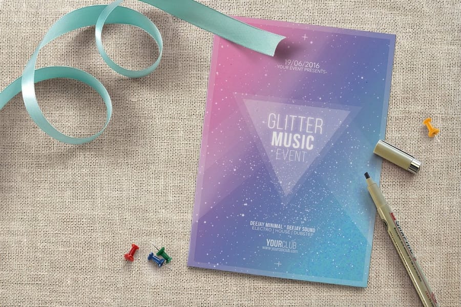
Every font choice on a flyer eventually meets ink and paper, and four things happen there that no monitor will warn you about.
Ink spreads, and uncoated stock spreads it more. Paper fiber draws ink sideways as it absorbs, so every stroke grows a fraction. High-contrast serifs like Bodoni and Didot lose their hairlines first, which is how an elegant headline turns patchy on uncoated text stock. Gloss coated stock holds the ink on the surface and keeps fine detail, so the same file genuinely looks sharper there. If your headline face has hairline strokes, either run coated or choose a face with less stroke contrast.
Reversed type is where light weights die. White type knocked out of a solid loses ground from all four sides, so a Light weight at 9pt reversed out of dark ink fills its own counters and turns into a gray smudge. Reversed body copy wants at least a Regular weight, better a Medium, one point larger than you would set it black on white, plus a touch of extra letter spacing.
Small black text is 100% K, never rich black. A black built from all four inks needs four plates to line up perfectly, and at 9pt they never quite do, so the type picks up a colored fringe around the edges. Set body copy and fine print in K only and save rich black for large solid areas. Our color profile guide covers how to check that before you export.
Fonts have to travel with the file. Export a press-ready PDF with fonts embedded, or convert the type to outlines. Embedding keeps the text editable if a typo shows up at proof, which is why we prefer it. Outlining is safe too, just final. The full handoff is written out in our print-ready file guide, and every size we run has a correctly built starting point in the blank template library.
The Mistakes That Kill a Flyer Before Anyone Reads It
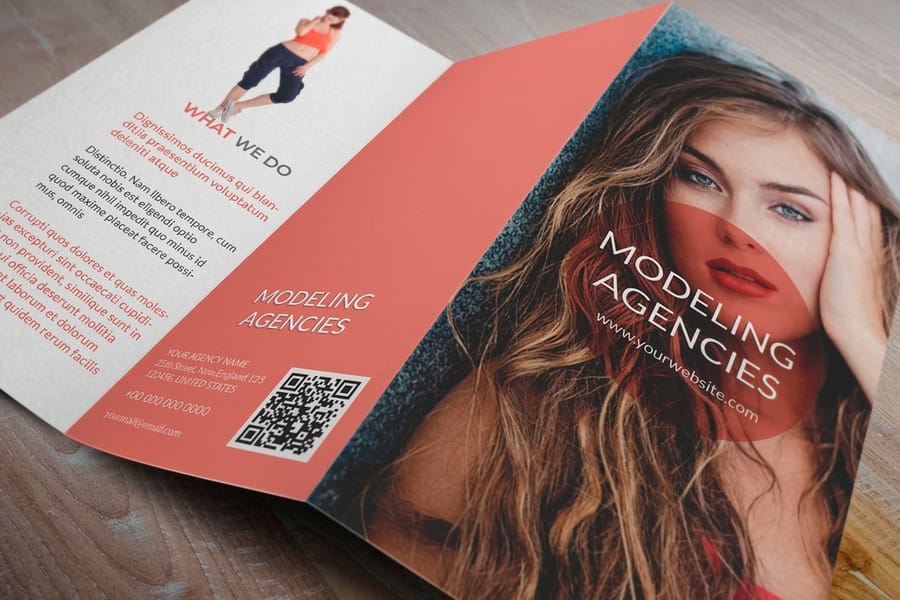
These eight do the most damage, the worst first.
- Three or more type families on one sheet. Each new face is another thing competing for attention. Two families plus their weights covers every hierarchy a flyer needs.
- Body copy set in the display face. Display faces are drawn for large sizes, with tight spacing and details that vanish small. Anton at 10pt is unreadable, and it is unreadable in a way people blame on their eyes rather than the flyer.
- Horizontal scaling to make a headline fit. Squashing a font to 85 percent width wrecks the relationship between vertical and horizontal strokes that the designer spent months on. Use a condensed cut of the same family, or cut two words from the headline.
- Everything centered. Centered text gives the eye a new starting point on every line, which slows reading and makes ragged left edges. Center a short headline if you like. Left-align the body.
- All caps past the headline. Capitals strip out the ascenders and descenders that let people recognize words by shape, so all-caps paragraphs get read letter by letter. Fine for three words, punishing for thirty.
- Type dropped straight onto a busy photo. Without a scrim, a solid panel or a dark gradient behind it, the text competes with whatever is in the image underneath. Add the panel and the same font suddenly reads.
- A phone number at body size. The call to action is the whole reason the flyer exists, so give it its own line, its own weight and some space around it.
- A free font with no commercial license. Fonts from Google Fonts are cleared for commercial print. A face grabbed from a free-download site may be personal use only, and that license file matters far more once you are selling from the flyer.
Fix those eight and the typography is done. If you would rather not build the file from scratch, our online design templates come with the type hierarchy already set for each flyer size, and you can compare stocks and quantities across the whole flyer printing range before you commit.
Wally explains flyer fonts
Two faces, one clear difference, sized for how far away the reader stands
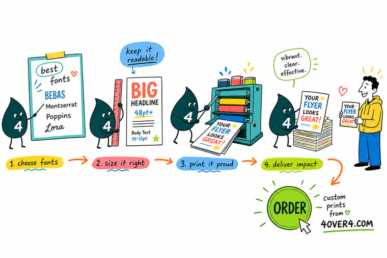
Wally picks the small font first, because that is the one that has to survive at 10pt on paper. Then he finds a headline face that is obviously different from it, heavier or narrower or from another family altogether, so the eye knows instantly which line comes first. Then he checks the distance. In the hand means a 40pt headline on letter size. On a wall four feet away means 60pt and up, with the body copy pushed to 14pt. And he keeps the small text in plain black ink only, because four inks at 9pt go fuzzy at the edges.
Order 50 flyers for $39.54 →
Specs and pricing
Flyer sizes, stocks and starting prices
Every size in the table above is a real option here. Flyers print from 4.25 by 5.5 inches up to 11 by 17 and 11 by 25.5, on stocks from 70# Uncoated Text to 14pt Gloss Cover, with 3 business days as the standard turnaround. Configure the sheet, the stock and the quantity, with starting prices straight from the 4OVER4.COM configurator.



Print it
Put the type on paper




Flyer type, paper and file setup
Where to go next
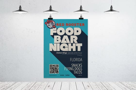


Printed in our Queens plant
What ink does to type at 8pt
Common Questions
Your flyer font questions, answered
What is the best font for a flyer?
There is no single best font, there is a best pair. The pairings table above lists five that hold up, each with an obvious difference between the two faces. What fails is two faces chosen because they both feel modern, since the reader gets no signal about which one to read first.
What is the smallest font size that prints cleanly on a flyer?
Type holds on press down to about 6pt, but that is a mechanical limit rather than a design one. Nobody reads a 6pt paragraph. Keep body copy at 10 or 11pt on a flyer held in the hand, never below 9pt, and reserve 7 to 8pt for the legal line, the date and the disclaimer. Reversed type needs one extra point over whatever you would use black on white, because ink spread eats into the letters from every side.
Can I use Google Fonts on a flyer I am selling or printing commercially?
Yes. Fonts on Google Fonts carry open licenses that permit commercial use, including print runs, and that covers Anton, Oswald, Montserrat, Open Sans, Lato, Merriweather, Source Sans 3 and Playfair Display. A free-font download site is a different situation entirely. Many of those files are personal use only, and the license text sitting unread inside the zip is the one that governs your print run. Read it before the file goes to press.
How many fonts should a flyer use?
Two families, because the extra levels of a headline, subhead, body, call to action and fine print come from weight and size rather than from new fonts
Should I outline my fonts before sending the file to the printer?
Embedding is the better default. Export a press-ready PDF with fonts embedded, which is what PDF/X-1a does, and the type stays editable if a typo turns up at proof stage. Outlining also works and removes any font substitution risk, but it is final, and converting very light weights to outlines can thicken the strokes very slightly. Whichever you choose, never send a layout file with linked fonts and hope the printer owns them.
Why does my type look thinner on screen than it does on the printed flyer?
Ink spreads. Paper fiber draws ink sideways as it absorbs, so every stroke grows a fraction, and uncoated stock does this far more than coated. That is why a Didone or any high-contrast serif loses its hairlines first on uncoated, while the same file stays crisp on gloss coated stock where the ink sits on the surface. If your headline face has hairline strokes, either run it on a coated stock or pick a face with less stroke contrast.
What size should the phone number and call to action be on a flyer?
Bigger than the body copy and smaller than the headline, which usually lands between the subhead and body sizes. On an 8.5 by 11 flyer with 11pt body copy, set the call to action around 16 to 20pt and give it its own line with space around it. A frequent flyer mistake is a phone number set at 10pt in the middle of a paragraph, where it disappears into the text it is supposed to end.
Get Started
Type sorted? Print the flyer.
Pick your size and stock, upload the press-ready PDF with the fonts embedded, and we run full color flyers that hold their small text as cleanly as their headline.
Legal Disclaimer
Gold Standard guarantees apply to all standard orders placed through 4over4.com. Price match requires verifiable proof of a competitor's published price for an equivalent product with matching specifications and turnaround time. Satisfaction guarantee covers manufacturing defects and print quality issues. Contact support with order number and documentation.
