
How to Choose Brand Colors That Work Across Every Print


Why Your Brand Colors Matter More Than Your Logo
A shopper recognizes your color before they read your name and long before they parse your logo. Color is the fastest brand signal there is, and studies put its share of a first impression as high as 85 percent. That is why the single most valuable branding decision a business makes is not the logo, it is the one color it decides to own and repeat everywhere.
Owning a color is not about picking a pretty shade. It is about consistency: the same exact value on your card, your sign, your packaging, and your online store, batch after batch, until the eye ties it to you without thinking. A color that drifts between orders quietly erases the recognition you are trying to build, so the goal is one deliberate palette, locked and repeated.
This guide covers how to choose brand colors that fit your business, what the common colors signal, and how to keep them accurate from screen to print. 4OVER4.COM prints across 60+ stocks and matches Pantone and spot colors, so your brand color reads the same on every piece. For the deeper story on why color moves people, the psychology of colors in business is the perfect companion.
See color first
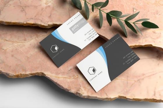
Business cards printing
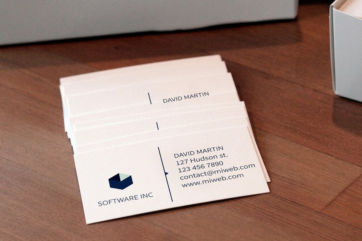
The first place your brand color meets a customer, in every stock and finish.
Start With What You Want People to Feel
Color is emotional shorthand, so the first question is not "what looks good" but "what should someone feel in the first second." A pediatric clinic and a law firm want opposite reactions, and their palettes should say so before a word is read. Decide the feeling first, then let it narrow the field of colors that can carry it.
Know the mood you are selling
Write down three words for how you want to be perceived, calm, bold, premium, friendly, whatever fits, and use them as a filter. If a color fights those words, it is out, no matter how much you like it. This keeps taste from hijacking a decision that should serve the customer. Test the shortlist on a real business card in the online design templates studio, because a color that sings on a screen can fall flat on paper.
One hero color, not five
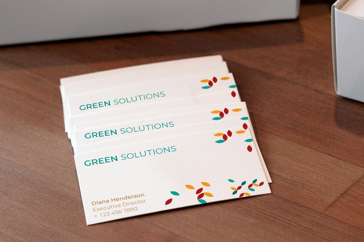
Pick one hero color you can truly own, then one or two supporting shades and a neutral. That is the whole palette. Three loud colors read as an accident, and they make every future piece harder to design. Restraint is what makes a small brand look intentional, the same lesson behind a minimal brand identity.
Print picks
Four pieces to carry your palette
Live prices, ready to customize with your exact brand color.
Standard Business Cards From $17.57 The first place your brand color meets a customer, in a color they will remember. 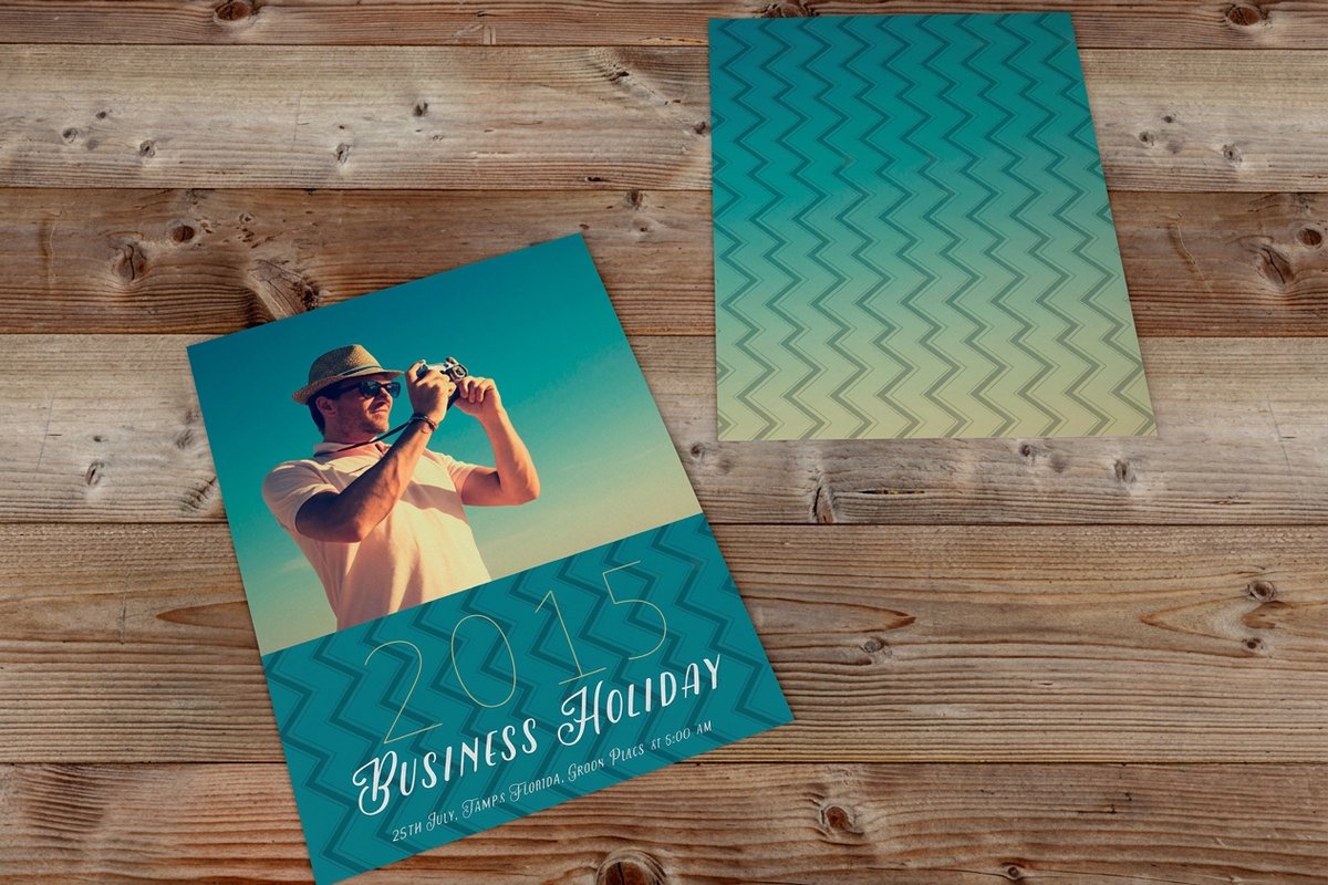 Postcards From $16.48 A cheap way to proof your palette at scale before a big run.
 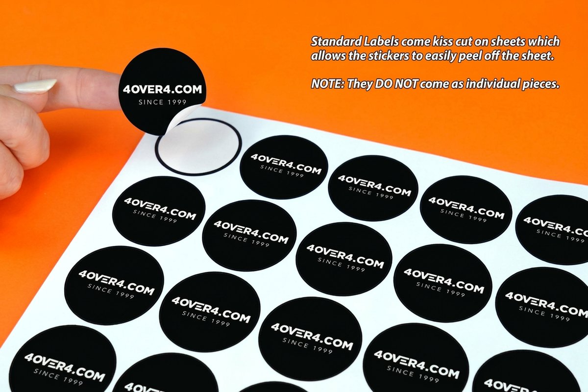 Standard Stickers From $23.88 Spread one recognizable color across every package and giveaway.
 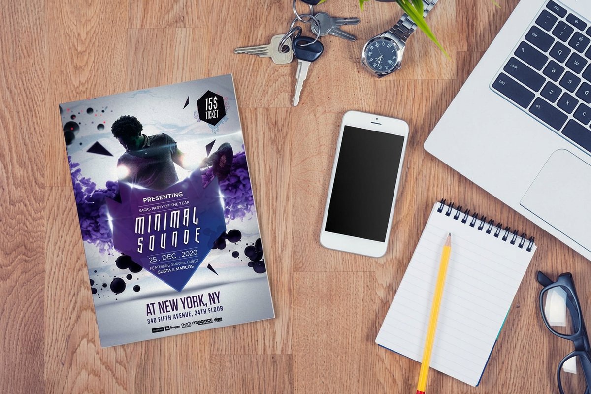 Flyers From $39.54 Show your palette to a whole neighborhood at once.
 Brand Color Meanings: A Quick Cheat Sheet
Colors carry rough, widely shared associations. They are not rules, and context bends them, but they are a useful starting map when you are narrowing a palette. Use this as a sanity check, not a straitjacket: the goal is a color that fits your business and stands apart from the shop next door.
A quick read of the map: red pushes energy and urgency, blue signals trust and calm, green leans natural and growing, yellow feels optimistic and warm, purple reads premium and creative, and black carries authority and luxury. Whatever you land on, the next job is making it print exactly the same everywhere it appears.
Why color sticks
The data behind brand recognition
See the numbers on how consistent branding builds awareness and loyalty.
Learn From Businesses That Nailed Their Brand Colors
The brands you can picture with your eyes closed all did the same thing: they picked one color and refused to stray from it for years. A single soda brand owns red, a delivery giant owns brown, a jeweler owns a specific robin's-egg blue so precisely that the shade is trademarked. None of that is magic. It is relentless repetition of one exact value across every touchpoint.
The takeaway for a small business is freeing: you do not need a famous logo to get the same effect, you need discipline. If your one color shows up on every card, flyer, sticker, and sign, customers will start to see it as yours. To watch a real brand pull ahead on color and print alone, the shelf standout case study is worth a read.
Spread one color
Standard stickers
The cheapest way to put your exact brand color on everything you hand over.
How to Apply Your Brand Colors Consistently Across Print
Consistency is where good color choices are won or lost. The rule is simple: define your color once, in exact values, and reuse those values everywhere. Write the CMYK and the Pantone number into your one-page style guide and hand it to every designer and printer after you, so nobody eyeballs it.
The catch is that screens and paper do not speak the same language. What glows on a monitor can print dull if the file is set up in the wrong color mode. Building files in the right mode from the start prevents almost all of it, and the CMYK vs RGB guide explains which to use and when. Here is what real card pricing and specs look like, so you can plan a color-critical run against actual numbers.
Quantity and price
Business card pricing and specs
Real configurator numbers for a color-critical run. More cards, lower per-card cost.
| Quantity | Price Per Unit | Total |
|---|---|---|
| 100 | 17.6¢ | $17.57 |
| 200 | 11.5¢ | $23.07 |
| 300 | 9.15¢ | $27.46 |
| 400 | 7.96¢ | $31.86 |
| 500 | 7.25¢ | $36.26 |
| 600 | 6.77¢ | $40.64 |
Keep Color Accurate From Screen to Print
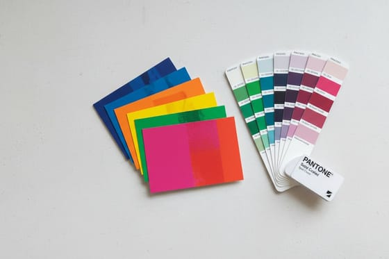
A brand color is only as strong as its consistency, and the most common place it breaks is the jump from screen to press. If matching matters, and for a brand it does, the safest path is a spot color. A Pantone or spot ink lays down one exact, repeatable value instead of mixing it from four process inks, so batch two looks like batch one.
4OVER4.COM offers Pantone and spot color printing for exactly this reason. When you are converting a screen value for process print, the Pantone to CMYK guide keeps the shift honest, and the best color profile guide covers the setup. Proofing on a cheap piece first is smart, and stickers are the easiest low-cost way to see your exact color on real stock.
Proof your color
Standard stickers
Cheap enough to test your exact brand color on real stock before a big run.
Where Your Brand Colors Show Up
Your palette is not a logo file that sits on a hard drive. It lives on every physical thing a customer touches: the business card in their hand, the flyer on the board, the sticker on the bag, the sign over the door, the postcard in the mail. Each one is a chance to repeat your color and deepen recognition, or to break it and start over.
The move is to treat every printed piece as the same brand speaking, not separate projects. Same hero color, same supporting shades, same neutral, everywhere. To see the color-carrying pieces side by side on stock, finish, and from-price, here is a quick comparison across our most ordered business cards, where color reads sharpest first.
Compare cards
Popular business cards, side by side
Stock, finish, quantity, turnaround, and from-price across our most ordered cards.
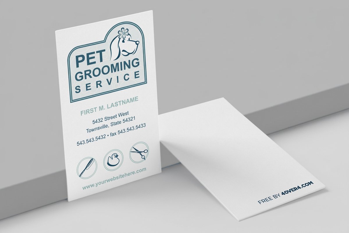 free business cards | Standard Business Cards |  3D Lenticular Business Cards | 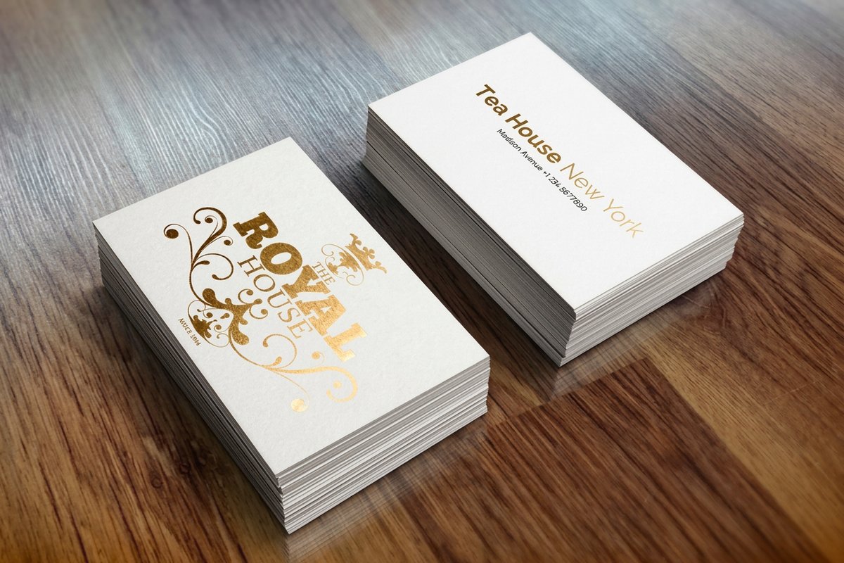 Metallic Foil Business Cards | |
|---|---|---|---|---|
| Min price | Free | $17.57 | $690.88 | $222.13 |
| Paper / stock | 14pt Gloss Cover | 14pt Gloss Cover | 31pt Lenticular Lens | 16 Point Silk Laminated |
| Finish | - | Standard Finish | - | - |
| Size | 2" x 3.5" | 2" x 3.5" | 2" x 3.5" - Vertical | 2" x 3.5" |
| Default qty | 200 | 100 | 500 | 500 |
| Turnaround | 5 business days | 3 business days | 22 business days | 7 business days |
| Rating | ||||
| View & customize | View & customize | View & customize | View & customize |
How to Choose Your Brand Colors and What It Costs
Bring it together in four steps. Decide the feeling you want to create. Filter colors against three words for how you want to be perceived. Pick one hero color, one or two supporting shades, and a neutral. Then lock the exact CMYK and Pantone values into a one-page style guide so nothing drifts. That is a complete brand palette, and none of it costs money to decide.
Printing it is the affordable part. Business cards start at $17.57, postcards at $16.48, and stickers at $23.88, so proofing your color on real stock is cheap. Price depends on the piece, the stock and finish, and the quantity, with bulk discounts lowering the per-unit cost as you scale. Spot color runs a little more for the pieces where exact matching matters most.
Match the color to the piece
- First impressions. Business cards, where your hero color meets a customer in the hand.
- Local reach. Flyers and postcards proof the palette cheaply at scale.
- Everything you ship. Stickers spread one recognizable color for pennies.
- Exact matching. Spot color on the pieces where the shade must be perfect.
Wally picks one color and owns it
Choose it, lock it, repeat it everywhere
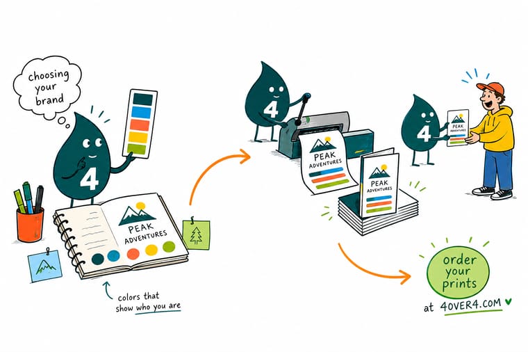
Customers see your color before your name, so choosing brand colors is the highest-value move you make. Decide the feeling first, pick one hero color plus a supporting shade and a neutral, then lock the exact CMYK and Pantone values. Repeat that palette on every card, flyer, and sticker. 4OVER4.COM matches Pantone and spot colors so your brand color prints the same on every piece, every time.
Proof your brand color on business cards →Picking a palette that survives the press
Explore more
More ways to build a brand with color and print
Related pages across 4OVER4.COM, one card each, so you can keep refining your palette.
 Article Web to Print Solutions That Simplify Business Ordering Web to print solutions compared for businesses: storefront models, template locking, approval workflows, and b
  Category Business Cards Printing Where your hero color first meets a customer, in every stock and finish.
  Shop Stickers Printing Spread one recognizable brand color across everything you ship.
  Product Postcards Proof your palette at scale for pennies a piece.
 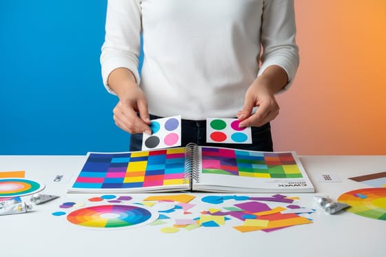 Guide CMYK vs RGB Which color mode to use so screen colors print true.
  Guides Pantone to CMYK Match your brand color when converting for process print.
  Article Psychology of Color What each color signals before a word is read.
  Case study Shelf Standout Story How color and print pushed a food brand off the shelf and into carts.
 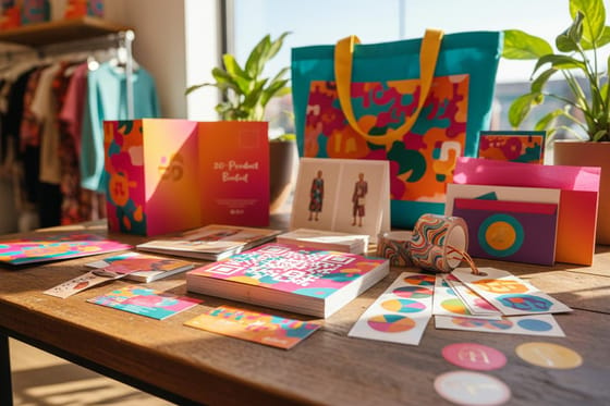 Kit Retail Lead-Gen Set On-brand print pieces that carry your palette into the shop.
  Statistics Brand Awareness Data The numbers behind why consistent color builds recognition.
  Benefit Pantone Spot Color One exact, repeatable ink so your color never drifts.
  Service Online Design Templates See your palette on a real piece inside the cut and bleed lines.
 Ready to see your brand color on real print?
Lock your palette, then proof it on a card or sticker. 4OVER4.COM matches Pantone and spot colors so your brand prints the same on every piece, as fast as same day.
The color choices people second-guess
Why do brand colors matter for a business?
Color is the fastest brand signal there is. A customer recognizes your color before they read your name or parse your logo, and research puts color as high as 85 percent of a first impression. That makes choosing and owning one deliberate color the highest-value branding decision a business can make, ahead of the logo itself. The power comes from consistency: the same exact color repeated on your card, sign, packaging, and store until the eye ties it to you. A color that drifts between orders quietly erases the recognition you are building.
How do I choose the right brand colors?
Start with feeling, not taste. Write three words for how you want to be perceived, calm, bold, premium, friendly, and use them to filter shades; if a color fights those words, it is out. Then pick one hero color you can truly own, plus one or two supporting shades and a neutral. That restraint is what makes a small brand look intentional instead of accidental. Test the shortlist on a real business card in the online design templates studio, because a color that sings on a screen can fall flat on paper. Once you land it, lock the exact values so it never drifts.
What do the main brand colors mean?
The common associations are a useful starting map, not rules: red pushes energy and urgency, blue signals trust and calm, green leans natural and growing, yellow feels optimistic and warm, purple reads premium and creative, and black carries authority and luxury. Context bends all of them, so use the meanings as a sanity check while narrowing your palette, then let fit and distinctiveness decide. The goal is a color that suits your business and stands apart from the shop next door, not one that ticks a meaning box.
How do I keep my brand color consistent across print?
Define the color once in exact values and reuse them everywhere. Write the CMYK and the Pantone number into a one-page style guide and hand it to every designer and printer so nobody eyeballs it. Build your files in the right color mode from the start, since a color set up in the wrong mode can print dull. When matching truly matters, use a spot color: a Pantone ink lays down one exact, repeatable value instead of mixing it from four process inks, so batch two matches batch one. Proof on a cheap piece like a sticker first.
What does it cost to print my brand colors, and how are prices set?
Proofing and printing your palette is affordable. At 4OVER4.COM, business cards start at $17.57, postcards at $16.48, and standard stickers at $23.88, so testing your exact color on real stock is cheap. Price depends on the piece, the stock and finish, and the quantity, and ordering more brings the per-unit cost down, with bulk discounts helping as you scale. Spot color printing runs a little more for the pieces where exact matching matters most. Check the configurator on each product page for real numbers before you commit to a color-critical run.
