
How to Make a Marketing Flyer That Converts


A flyer that converts sells one offer to one audience and makes the next step effortless. Here is how to build one from the offer up: layout, copy, call to action, and the print specs that make it worth keeping.
A marketing flyer converts when it does one job well. Lead with a single concrete offer aimed at one audience, build a layout that pulls the eye from a bold headline down to an obvious call to action, write short benefit-driven copy, and print on a stock with enough weight to feel worth keeping. One clear invitation to act beats a beautiful flyer that only shows your name.
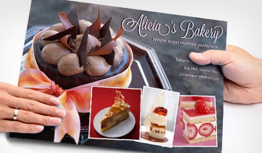
Start here
A marketing flyer that converts, in one paragraph
A flyer converts when it makes one offer to one audience and makes acting on it effortless. That means a bold headline carrying the offer, a layout that flows from headline to call to action, short benefit copy, an unmissable next step, and a stock with enough weight to feel worth keeping. Get those right and a flyer becomes one of the highest-return print promotions you can run from 4OVER4.COM. The checklist below breaks the build into seven steps.
Why most flyers get tossed and yours will not

A flyer lives or dies in about three seconds. That is how long a reader gives it before deciding to keep it, act on it, or drop it in the nearest bin. Most flyers lose that moment because they try to be a brochure: logo, mission, five services, a wall of text, and no single reason to do anything. The reader cannot find the point, so there is no point.
A marketing flyer that converts is built the opposite way. It leads with one offer aimed at one audience, guides the eye straight from the headline to the call to action, and makes the next step effortless. Everything on it earns its place by moving the reader toward that response. That discipline, not a bigger design budget, is what separates a flyer that gets kept from one that gets recycled.
This guide walks the full build in the order you would actually do it: the offer, the layout, the copy, the call to action, and finally the print specs and stock that make the piece feel worth holding. If you would rather start from a template, our online design tool bakes the print rules in, and you can print the finished piece as standard flyers in minutes.
What is a marketing flyer?
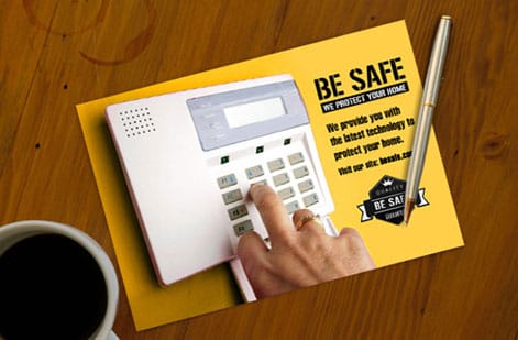
A marketing flyer is a single-page printed piece with one commercial purpose: to move a specific audience to take a specific action. Unlike a brochure, which unfolds to tell a fuller story, a flyer works in one glance. It is a poster you can hold, a coupon you can hand out, an invitation you can leave on a counter.
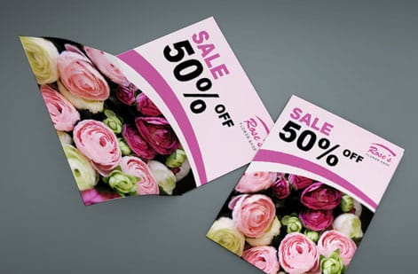
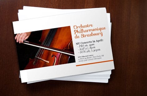
Because it works in one glance, a flyer has a strict anatomy. There is a headline that states the offer or benefit, a hero visual that carries the mood, a short middle that answers why now, and a call to action that tells the reader exactly what to do. Miss any one of those and the flyer stops converting, no matter how polished it looks.
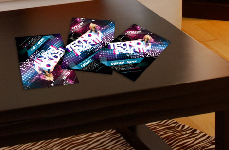
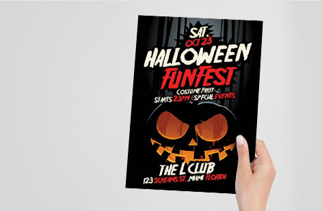
The format flexes to the job. A restaurant hands out club flyers for a weekend event, a gym drops event flyers for a class launch, and a local service mails mailing flyers to a neighborhood. The offer changes, the anatomy does not. For the pure design mechanics behind that anatomy, pair this page with our guide on how to design flyers.
Lead with one offer, not five
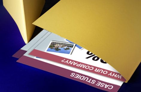
The single biggest lift you can give a flyer happens before any design: decide the one offer it makes. Not the list of everything you do, but the single reason a stranger should act right now. A percentage off, a free first visit, a limited-time bundle, an event with a date. One clear, concrete promise the reader can grasp instantly.
Specificity is what makes an offer believable. "Great prices" says nothing. "20 percent off your first order through Friday" gives the reader a number, a scope, and a deadline, which is exactly what turns interest into action. If your business truly has two offers worth promoting, run two flyers, because splitting attention on one piece halves the pull of both.
Put that offer in the headline, at the top, in the biggest type on the page. The reader should understand what they are being offered before they read a single word of body copy. Everything below the headline exists only to support and prove that one promise, then hand the reader to the call to action.
The layout that pulls the eye from headline to CTA
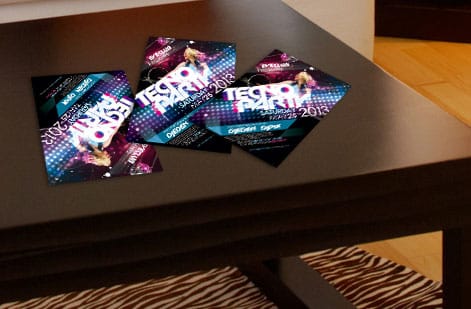
A converting flyer has a path built into it. The eye lands first on the largest, boldest element, then follows contrast and whitespace down to the response. Your job in layout is to make that path deliberate rather than accidental. Rank your elements by importance and size them in that order: headline biggest, hero image dominant, benefits medium, call to action set apart and impossible to skip.
Whitespace is the tool most people underuse. Crowding every inch with content makes the flyer feel cheap and hides the offer. Generous margins and breathing room around the headline and the call to action guide the eye and signal quality. Keep to one or two typefaces, a tight color palette drawn from your brand, and consistent alignment so nothing fights for attention.
Remember the physical edges. Any color or photo that runs to the border needs 0.125 in of bleed, and every word you cannot afford to lose stays inside a 0.125 in safe margin so the trim never clips it. Get the hierarchy and the edges right and the flyer reads itself, from the headline straight to the action.
Copy that earns the response
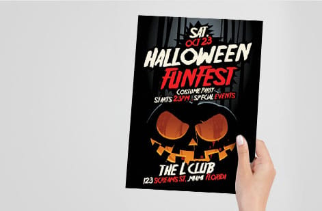
Flyer copy is not the place for paragraphs. The reader is standing, scanning, deciding. Write to that. Lead every supporting line with a benefit, not a feature, and keep sentences short enough to absorb at a glance. Three to five crisp benefit lines will out-convert a dense block of prose every time.
Answer the two questions the reader is silently asking: what do I get, and why should I act now. The offer answers the first. Urgency, whether a deadline, limited quantity, or a seasonal window, answers the second. Add one line of proof if you have it, a rating, a guarantee, or a well-known client, to make the promise credible without cluttering the page.
Then stop. Resist the urge to explain your whole company. A flyer that says one thing clearly beats one that says ten things vaguely. Save the fuller story for the landing page or the brochure the reader reaches after they respond. If you want a deeper framework for flyer messaging, our guide on how to design flyers breaks copy and layout down together.
The call to action and how to make it easy to act on
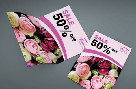
The call to action is where a flyer either converts or quietly fails. It has to do two things: tell the reader exactly what to do, and make doing it effortless. "Call today," "Scan to book," "Bring this in for 20 percent off." A verb, a clear reward, and no ambiguity about the next move.
Give the reader more than one way to respond. A phone number for the caller, a QR code for the scanner, a short URL for the typer, and a physical coupon block for the walk-in. A QR code in particular closes the gap between paper and screen, sending a reader straight to a booking page or offer and letting you measure the response. Keep it large, give it quiet space, and label what it does. Our guide on using QR codes on flyers, brochures, and postcards covers sizing and placement.
Set the call to action apart visually. A contrasting color block, extra whitespace, or a button-like shape signals "act here." It should be the second thing the eye finds after the headline, and it should never blend into the body copy. If a stranger cannot tell how to respond in one second, the flyer is not finished.
Print specs and stock that make a flyer worth keeping
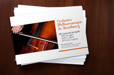
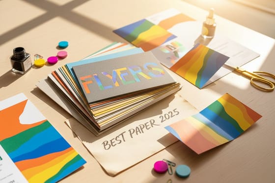
The feel of a flyer changes how the offer reads. A flimsy sheet says the promotion is disposable. A flyer with weight and sheen says it is worth a look. That is why stock and finish are conversion levers, not just cost lines. A promotion you want taken seriously earns a heavier gloss text or a premium cover weight, and a silk or matte finish that feels considered in the hand.
Match the stock to the setting. High-volume street or door handouts can run on lighter text weight to keep the unit price down, while a counter piece for a premium brand deserves a heavier, coated stock. Specialty finishes like metallic or spot options add standout for luxury and event promotions. Order free samples first so you can feel the exact stock before the full run.
Whatever stock you choose, the file rules stay constant: CMYK color, images at 300 DPI at final size, 0.125 in of bleed on every edge, text inside the safe margin, and a flattened, press-ready PDF. Nail those and the printed flyer matches your screen, with nothing clipped at the edge. Compare weights in detail with our best paper weight for flyers guide.
Getting flyers into hands, and what they cost
A great flyer only converts if the right people hold it. Match distribution to the audience you named at the start: counter and rack placement for foot traffic, direct mail for a targeted neighborhood, event handouts for a captive crowd, and community boards for local reach. For mailed campaigns, our direct mail flyers and EDDM service put your offer in mailboxes without you touching the postal side.
Cost stays friendly because flyers scale so well. Price is driven by quantity first, then size, stock, and finish, and the per-piece cost drops steeply as the run grows. That makes flyers one of the highest-return print promotions available, especially when a heavier stock lifts response enough to more than cover the small step up in price. You set every option in the configurator and watch the total update live.
From here it comes down to picking the flyer and the specs. Use the live specs and pricing panel below to see exact sizes, stocks, and finishes, browse the full flyers printing range, or order free samples before your file goes to press.
Wally builds every flyer around one offer
Say one thing, say it loud, make it easy to act on
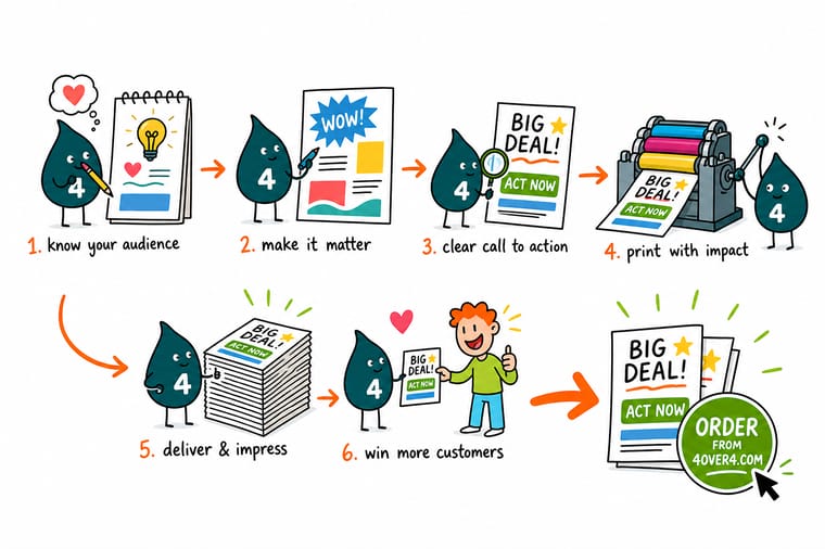
Wally treats a flyer like a single invitation: one offer up top, one clear path down the page, and one call to action the reader cannot miss. He trims the copy to the benefits, sets the response block in its own bright color, and picks a stock with enough weight to feel worth keeping. Build it that way, print it at 4OVER4, and the flyer does its one job.
Print your flyers →Quick reference
The marketing flyer setup, at a glance
Match these settings and your flyer is ready to print clean and convert. Size and stock flex to the campaign; the file rules stay constant.
| Setting | Get it to | Why it matters |
|---|---|---|
| Standard size | 8.5 x 11 in | The workhorse flyer size, roomy enough for an offer and cheap to print in volume. Half-page 5.5 x 8.5 in works for handouts. |
| Bleed | 0.125 in every edge | Any background color or photo that runs to the edge extends past the trim so the cut never leaves a white sliver. |
| Safe margin | 0.125 in inside the trim | Keeps your headline, offer, and contact details clear of the blade. |
| Color mode | CMYK | Convert from RGB before export so vivid brand colors print true instead of dulling on paper. |
| Resolution | 300 DPI at final size | Sharp photos and logos at the printed dimensions, checked at 100 percent zoom. |
| Paper stock | 100 lb gloss text or heavier | A flyer with weight and sheen reads as worth keeping. Silk and matte options change the feel in hand. |
| File format | Flattened PDF with bleed | A single press-ready PDF prints predictably every time. |
Step by step
Build a converting flyer in 7 steps
- Name one audience and one goal Decide exactly who the flyer is for and the single action you want, whether that is a call, a scan, a visit, or a coupon redemption. Everything else serves that one goal.
- Write the offer before you design Lead with the reason to act: a discount, a free trial, an event, a deadline. Make it concrete and specific so the reader knows what they get and by when.
- Build a top-to-bottom visual path Put the headline and hero image up top, the supporting benefits in the middle, and the call to action at the bottom, so the eye flows straight to the response.
- Cut the copy to what earns the click Trim every sentence that is not the offer, a benefit, or the next step. Short lines and clear subheads beat dense paragraphs on a flyer.
- Make the call to action impossible to miss One button-like block, a QR code, and a phone number in a contrasting color. Tell the reader exactly what to do next in a few plain words.
- Pick a stock and finish that fits the message A premium promotion earns a heavier gloss or silk stock. A high-volume handout can run on lighter text weight to keep the unit cost down.
- Export print-ready and proof it CMYK, 300 DPI, bleed on all sides, a flattened PDF, then run it through our free file check and order a proof before the full run.
Specs and pricing
Flyer specs and live pricing
Once the design is set, the print decisions come down to size, stock, quantity, and finish. Here are the live specs and price-per-unit for flyers at 4OVER4.COM, straight from the configurator.
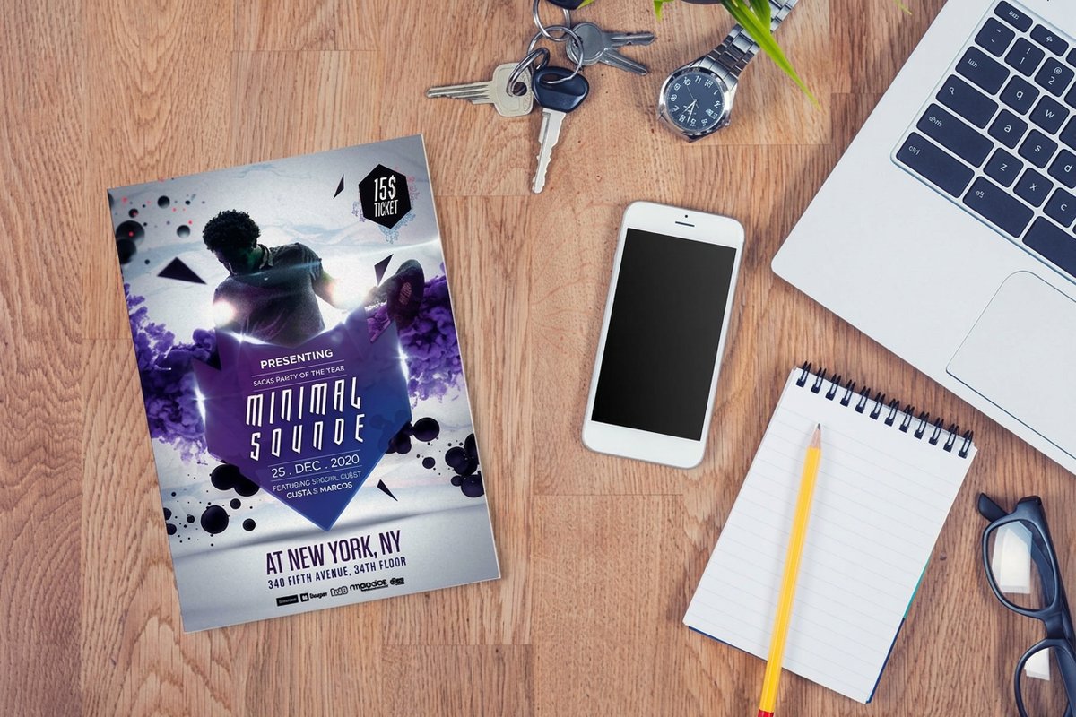
| Quantity | Price Per Unit | Total |
|---|---|---|
| 50 | 79.1¢ | $39.54 |
| 100 | 57.1¢ | $57.11 |
| 200 | 37.3¢ | $74.69 |
| 300 | 28.6¢ | $85.68 |
| 400 | 24.4¢ | $97.76 |
| 500 | 21.8¢ | $108.75 |
| 600 | 18.7¢ | $112.03 |
| 700 | 16.5¢ | $115.33 |
Print it
Print your marketing flyers with 4OVER4
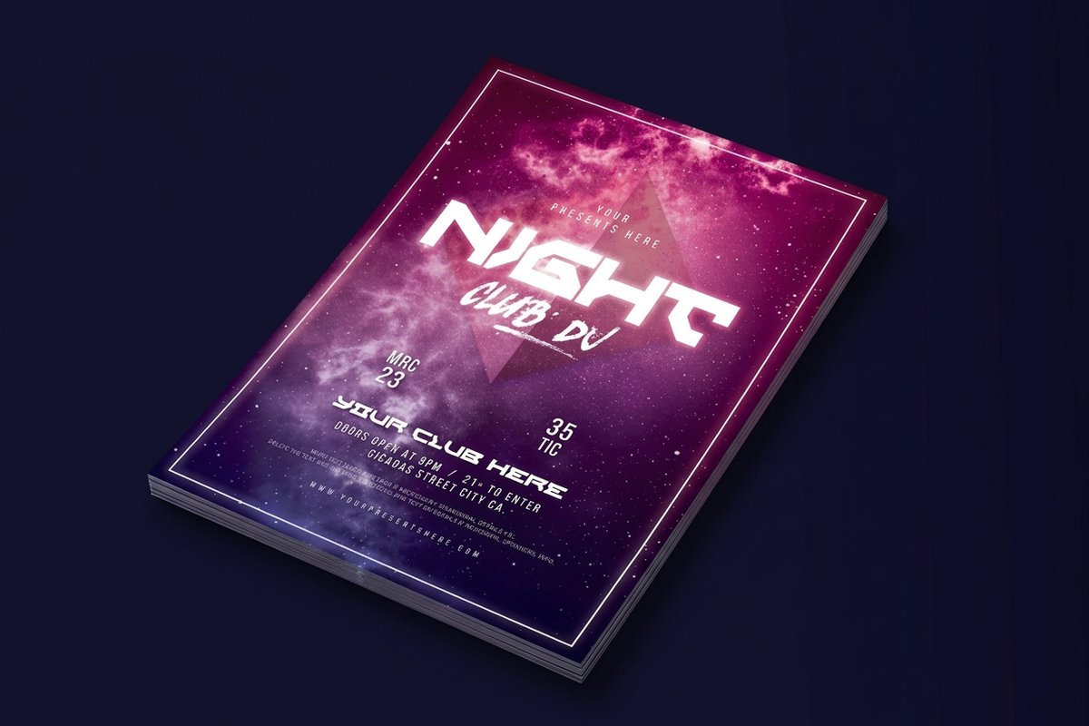
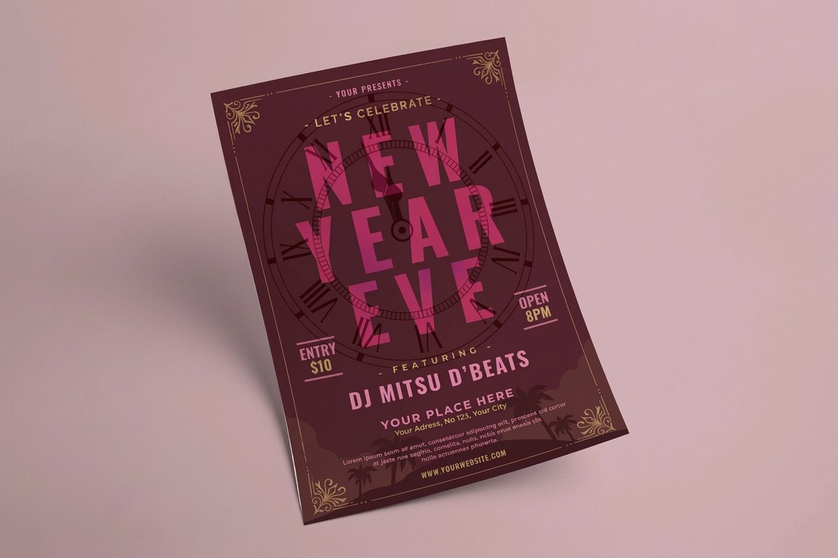
See it in use
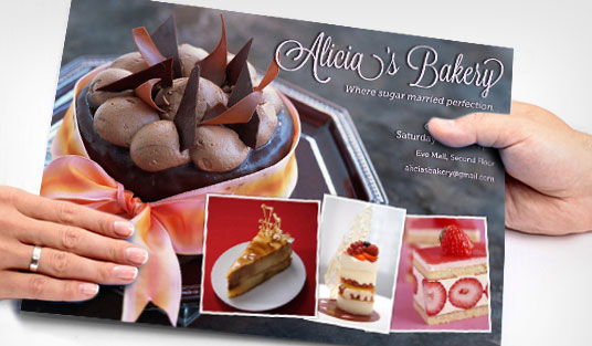
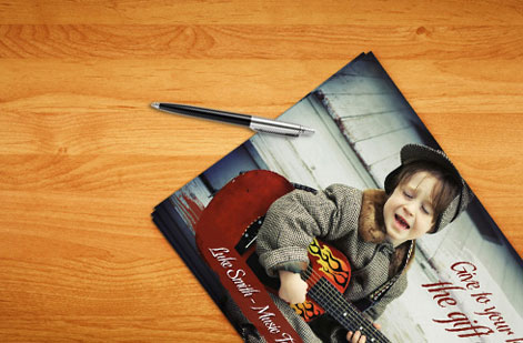
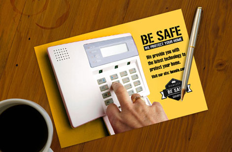
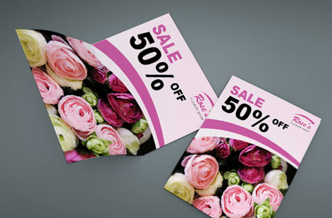
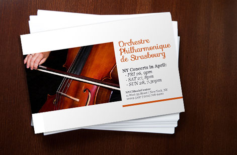
Real flyer work, printed in-house
Explore more
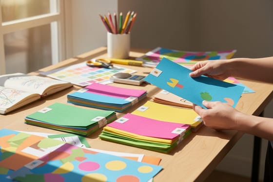
Where to go next


By the numbers
Flyer printing you can count on at 4OVER4
Common Questions
Common questions about marketing flyers
What makes a marketing flyer actually convert?
A marketing flyer converts when it does one job well: it puts a single clear offer in front of one audience and makes the next step obvious. That means a headline that names the benefit, one dominant image, a short block of copy that answers why now, and a call to action the reader cannot miss, usually a phone number, a QR code, or a coupon. Flyers fail when they try to describe the whole business. They win when they read like a single, specific invitation to act.
How do I choose the right flyer for my campaign?
Start from how the flyer will be handed out or displayed. A rack or counter handout does well at half-page or standard 8.5 x 11 in on a bright gloss stock. A mailer flyer needs to survive the postal stream, so a heavier stock and mailing-safe layout matter. A premium event or luxury promotion earns a silk or metallic finish that signals quality the moment it is touched. Match the format and stock to the setting, then let the offer drive the design. Our guides on how to design flyers and the best paper weight for flyers go deeper on each choice.
What does flyer printing cost and how are prices set?
Flyer price scales with a few levers you set in the configurator: quantity first, since a larger run drops the price per piece sharply, then size, paper stock, and finish. A standard flyer run starts low and the per-unit cost keeps falling as the quantity climbs, which is why flyers remain one of the most cost-effective print promotions. You adjust each option and the total updates live, so you can weigh a heavier stock or a bigger run against your budget before you commit.
What sizes, stocks, and finishes are available for flyers?
Common flyer sizes run from half-page 5.5 x 8.5 in up through standard 8.5 x 11 in and larger 8.5 x 14 in and 11 x 17 in formats, plus die-cut, folded, and shaped options. Stocks range from lighter text weights for high-volume handouts to heavy gloss and premium cover weights, and finishes include gloss, matte, silk, and metallic. Each combination changes how the flyer feels and how the offer reads, and every option is priced live so you can see the tradeoff instantly.
How long does flyer printing take to ship?
Turnaround depends on the product, stock, and quantity, and many flyer options qualify for fast and same-day production when you order early in the day. You will see the available turnaround and shipping options in the configurator as you set your specs, so you can plan a distribution date backward from when the flyers need to be in hand.
Should a marketing flyer include a QR code?
For most campaigns, yes. A QR code bridges the gap between a printed flyer and an online action, letting a reader scan straight to a landing page, a booking form, a menu, or a discount without typing a URL. It also makes the response measurable, since you can track scans. Keep the code large enough to scan easily, give it quiet space around it, and pair it with a short line telling the reader what they will get when they scan. Our guide on using QR codes on flyers, brochures, and postcards covers placement and sizing in detail.
Get Started
Ready to print a flyer that actually converts?
Bring your offer to 4OVER4.COM and print it on the size, stock, and finish your campaign calls for. Adjust every option and watch your price update live.
Legal Disclaimer
Gold Standard guarantees apply to all standard orders placed through 4over4.com. Price match requires verifiable proof of a competitor's published price for an equivalent product with matching specifications and turnaround time. Satisfaction guarantee covers manufacturing defects and print quality issues. Contact support with order number and documentation. On-time delivery rate based on tracked orders 1999 to 2026. Individual results may vary based on shipping carrier performance.
