
How Each Generation Uses Emojis and What It Means for Your Brand


Why the Same Emoji Lands Differently at Every Age
Emojis are not a shared language. They are four overlapping dialects that happen to use the same characters. A symbol that reads as friendly agreement to a sales director in her fifties can read as cold dismissal to the 23 year old who receives it, and neither person thinks they are being unclear. That gap is where brand messages quietly lose people, and it shows up in email subject lines, packaging, social captions and printed signage.
The split is not about intelligence or effort. It is about when each group met the keyboard. People who learned emojis after they had already spent decades writing letters and memos treat them as decoration attached to a finished sentence. People who grew up typing in group chats treat them as grammar, doing the work that voice and facial expression do in person.
4OVER4.COM has printed 10 billion+ cards and print products for more than 150,000 businesses since 1999, and the pattern repeats across industries. The brands that hold a mixed audience are the ones that let words carry the message and let symbols carry the accent. The brands that lose a segment usually copied a tone from one platform and pasted it onto everything, including the pieces that live on a wall or in a wallet for years.
Emojis arrived at a different life stage for each group
Boomers met emojis as an optional flourish on an already established writing style. Gen X met them mid career, when tone in email still mattered professionally. Millennials met them in adolescence, when a text was the main social channel. Gen Z met them before they wrote a formal sentence at all, which is why their usage feels the most inventive and the least literal.
Platforms taught different manners
Facebook rewarded warmth and completeness. Instagram rewarded aesthetics. Group chats rewarded speed. TikTok comments reward joke density. Each of those environments trained a different reflex, and people carry that reflex into every other channel, including the reply they send your support team.
Literal readers and ironic readers
The single most useful way to think about this is not by birth year but by reading mode. Literal readers take the picture at face value. Ironic readers assume the picture is commenting on the sentence. Older audiences skew literal, younger audiences skew ironic, and plenty of people move between the two depending on who they are talking to.
Where brands get caught in the middle
Your audience is rarely one generation. A local service business talks to homeowners in their sixties and renters in their twenties in the same week. Choosing a single emoji voice for all of them is a losing bet. Choosing a clear written voice and adjusting the symbols per channel is not.
Say it big
Signage that reads the same to everyone
When the audience spans four generations, legibility does the work an emoji cannot.
How Boomers Use Emojis
Boomers use emojis the way they use exclamation points: as sincere warmth added to a sentence that already says what it means. The smiley is a smile. The heart is affection. The thumbs up is genuine approval, not a shrug. There is no hidden layer, and reading one into their message is usually a mistake.
Placement is the giveaway. Boomers tend to put the emoji at the end, after the full stop, as a signature of goodwill rather than as punctuation inside the thought. They also use more of them per message when they feel affectionate, which younger readers sometimes misread as shouting when it is actually just kindness.
- Face symbols read literally. A smiley means the person is pleased, not that they are being polite about bad news.
- Hearts are warmth, not romance. They appear in messages to colleagues, clients and grandchildren alike.
- Thumbs up is real approval. Treating it as curt is a younger reader’s projection, not the sender’s intent.
- Flowers, praying hands and sunrises carry sincerity that younger audiences almost never use unironically.
- Emojis sit outside the sentence, added at the end rather than replacing words inside it.
For brand work this is the easiest group to serve. Warm, plain language with one clear symbol at the end reads as friendly and trustworthy. Sarcasm does not travel, and neither do stacked ironic symbols. If a printed piece is aimed at this audience, keep the icon count low and the words unambiguous.
Print picks
Three formats for a mixed age audience
Live pricing on pieces where plain words and clean design beat symbol shorthand.
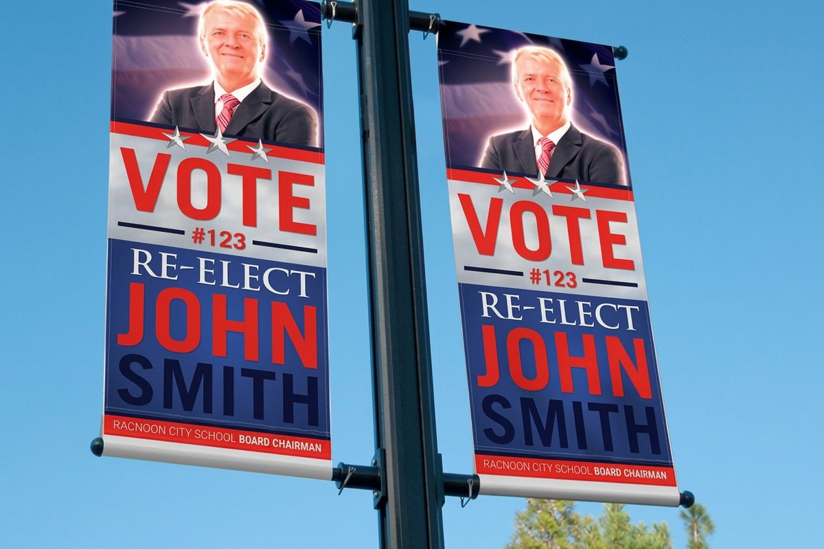
2 Sided Blockout Banners From $108.75 Two readable sides for events where every age group walks past from a different direction. 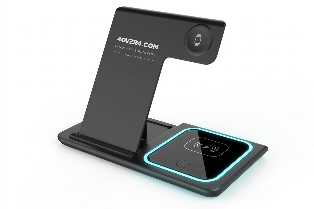 3 in 1 Foldable Wireless Charger From $15.00 Branded swag younger audiences actually keep on the desk instead of in a drawer.
 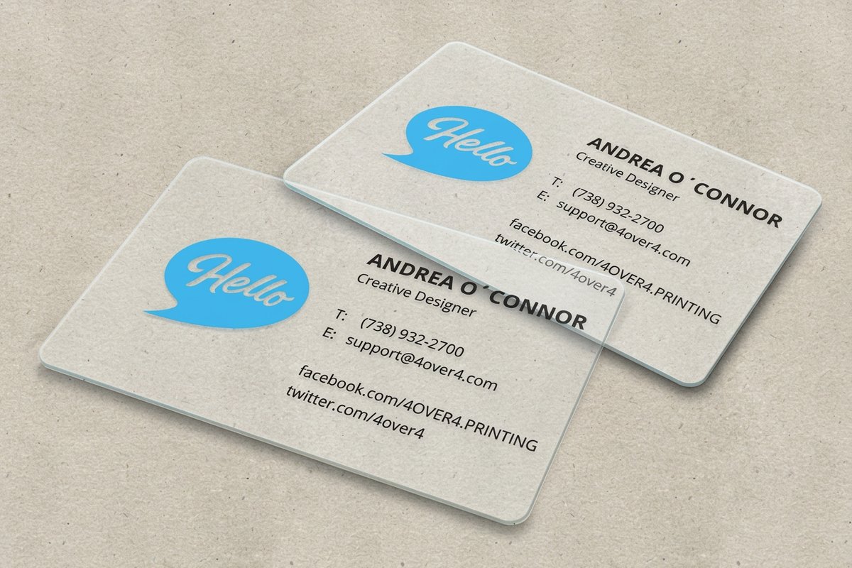 30mil Clear Plastic Cards From $529.26 A premium clear card where a single icon carries the whole personality.
 How Gen X Uses Emojis
Gen X is the bridge, and their usage shows it. They arrived at emojis by way of text smileys typed with punctuation, so they understand symbols as tone markers, but they still write complete sentences underneath. The result is restrained: one or two symbols, used to make sure a dry line does not read as hostile.
This is also the group most likely to use a wink or a sideways smile to signal that a joke is a joke. That habit reads as slightly dated to younger audiences, but it works exactly as intended with everyone over forty, and it defuses the flat tone that professional writing tends to produce.
- Sparing use. One symbol per message is normal, and a wall of icons feels like noise.
- Tone rescue. The emoji exists to stop a short reply from sounding annoyed.
- Dry humor. The eye roll and the shrug do heavy lifting, usually about work.
- Comfortable with both modes. Gen X reads literal intent from parents and ironic intent from their kids without missing a beat.
- Skeptical of trends. They will not adopt a new symbol meaning just because a platform decided it this month.
Marketing to this group works best when the emoji does not carry information. Put the offer, the date and the price in words, and let the symbol handle warmth. That discipline also makes the message portable, which matters when the same campaign has to work in an email, on a banner and on a card that someone keeps in a wallet.
How Millennials Use Emojis
Millennials treat emojis as social lubricant. The crying laughing face, the folded hands, the fire and the sparkle exist to keep a message from sounding cold, demanding or self important. A request without a softener feels rude to this group, which is why so many Millennial work messages end with a small apologetic symbol.
They are also the generation that turned emojis into formatting. Sparkles around a phrase mean the phrase is doing something clever. A pointing finger introduces a list. A single symbol repeated three times is emphasis. This is where the shift from decoration to grammar really happened, and Gen Z pushed it further from there.
- Softening. A symbol removes the perceived edge from a direct request.
- Enthusiasm signaling. Fire, hundred and sparkles mark approval without a paragraph of praise.
- Self aware humor. The skull and the crying laugh appear when the joke is on themselves.
- Brand fluency. Millennials expect companies to use emojis and notice when a brand uses them badly.
- Nostalgia sensitivity. Symbols tied to their own teenage internet carry disproportionate warmth.
This is the audience most receptive to a playful brand voice in print. A sticker sheet, a clever insert or a card with one witty icon lands well, and it gets photographed. If you want ideas for that kind of piece, the roundup of fun ways to use logo stickers shows how a small printed object turns into repeat exposure.
How Gen Z Uses Emojis
Gen Z uses emojis as irony markers, and that single fact explains most of the confusion. A symbol is rarely there to describe a feeling. It is there to comment on the sentence it follows, usually to undercut it, exaggerate it or signal that the writer knows the sentence is a bit much. Read literally, the message makes no sense at all.
They also treat the crying laughing face as dated and reach for the skull instead, meaning something is so funny it killed them. The plain smiley is not friendly to this group. Ending a serious message with it reads as cold, corporate or quietly passive aggressive, which is exactly the opposite of what a Boomer sender intended.
- Skull for laughter. The dead symbol replaced the laughing one and now signals genuine amusement.
- Plain smiley as menace. Attached to a request, it reads as forced politeness with an edge.
- Thumbs up as dismissal. To many Gen Z readers a lone thumbs up ends a conversation coldly.
- Random symbol substitution. Unrelated icons appear as absurdist punctuation and are not meant to be decoded.
- Fast turnover. Meanings shift within months, so a brand chasing them is always half a season behind.
The practical takeaway for brands is counterintuitive. Gen Z respects a brand that writes plainly far more than one that performs their dialect badly. Use their symbols only where a real person is writing in real time, such as a community reply, and keep campaign assets in clean language that will still make sense next year.
Quantity and price
Clear plastic card pricing and specs
Real configurator numbers for the card format where one icon has to carry the brand.
| Quantity | Price Per Unit | Total |
|---|---|---|
| 500 | $1.06 | $529.26 |
| 1,000 | 63.0¢ | $630.31 |
| 2,000 | 56.8¢ | $1,135.55 |
| 2,500 | 53.0¢ | $1,325.02 |
| 3,000 | 50.5¢ | $1,514.49 |
| 3,500 | 48.7¢ | $1,703.96 |

The Emojis That Mean Different Things at Different Ages
A short list of symbols does most of the damage. These are the ones where the gap between the sender’s intent and the reader’s interpretation is wide enough to change the meaning of an entire message, and they show up constantly in customer service replies, internal chats and social captions.
The safest rule is that any symbol carrying approval, agreement or amusement is contested territory. Symbols that describe a concrete object, such as a calendar, a location pin or a package, mean the same thing to everyone and are safe in every channel.
- Thumbs up. Older readers see approval. Younger readers see a conversation being shut down.
- Plain smiley. Older readers see friendliness. Younger readers see thinly veiled irritation.
- Skull. Older readers see death or danger. Younger readers see laughter.
- Crying laughing face. Warm and current for Boomers, Gen X and many Millennials, faintly dated for Gen Z.
- Folded hands. Prayer or gratitude for older readers, a request or a high five for younger ones.
- Full stop after a short reply. Not an emoji, but the same problem. It reads as neutral to older writers and angry to younger ones.
When a symbol has to appear on something permanent, such as a banner, a card or packaging, test it with someone from each group before it goes to print. A misread icon on a screen costs you one message. The same icon on a thousand printed pieces costs you the run.
Built to be read
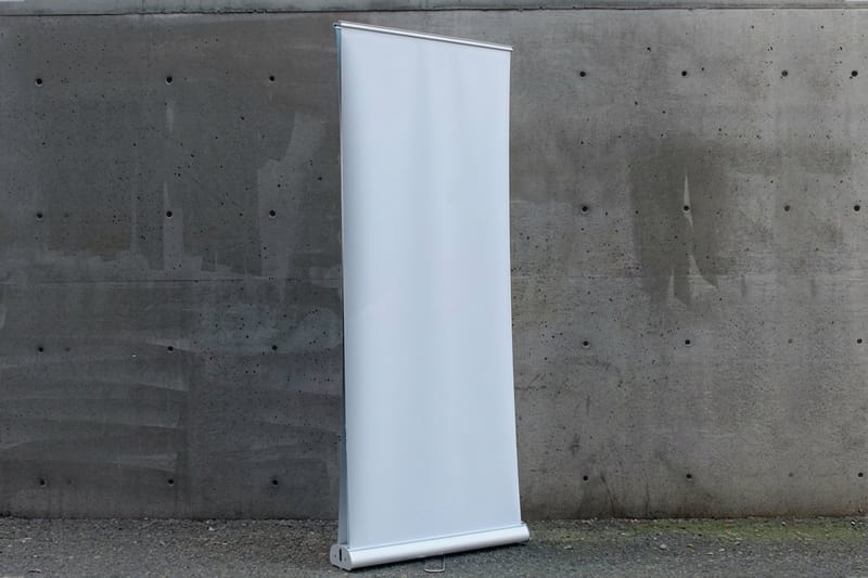
Blockout banner specifications
Sizes, finishes and hardware for the piece your audience reads from across a room.

Emoji Mistakes Brands Keep Making
Most emoji failures are not about choosing the wrong symbol. They are about a brand borrowing a voice it has not earned, using symbols to hide a weak offer, or applying one tone to every channel regardless of who is reading. These four mistakes account for nearly all of the cringe.
The fix is boring and reliable. Decide what your brand sounds like in plain sentences first, then decide how much symbol seasoning each channel gets. A voice that survives being stripped of emojis is a voice that will survive the next platform shift too.
- Speaking teen in a corporate account. Ironic symbols from an official brand handle read as a costume, and younger audiences spot it instantly.
- Emoji as information. If the discount, deadline or location lives inside a symbol, screen readers and half your audience miss it entirely.
- Chasing meaning shifts. By the time a symbol trend reaches a campaign brief, the group that started it has moved on.
- One tone everywhere. The voice that works in a community reply is wrong on a mailer to homeowners in their sixties.
- Overloading the visual. A row of symbols competes with the logo and the offer, and the eye gives up.
Physical items are the honest test of a voice. If your message still works when it is stamped on something a customer keeps, the voice is real. Promotional pieces that live on a desk get read hundreds of times, which is why a branded object should carry one clean idea rather than a joke that expires.
Swag that survives
Branded tech people keep
A useful object earns years of quiet brand exposure without needing a joke that expires next season.
Choosing an Emoji Voice for Each Audience
Instead of a brand wide emoji policy, build a small matrix. For each channel, note who actually reads it, whether they read literally or ironically, and how permanent the piece is. Ephemeral and young leans playful. Permanent and mixed leans plain. That one decision resolves most arguments in a marketing meeting.
Identity work should carry the personality that symbols only hint at. A well built mark, a set of colors and a consistent tone do the job across every generation without needing translation. If your identity is thin, start with the guide to logo variations every brand needs and get the fundamentals right before you tune the voice.
- Community replies. Real person, real time, symbols welcome and matched to the person you are replying to.
- Email campaigns. One symbol maximum in the subject line, none carrying meaning the words do not already say.
- Social captions. Match the platform dialect, not the brand deck, and rewrite per platform rather than reposting.
- Packaging and inserts. Symbols as design elements only, never as the instruction the customer needs to follow.
- Signage and banners. Legibility beats personality, since the viewer has about three seconds and no context.
Naming follows the same logic. A name that needs an ironic symbol to be funny will not survive a storefront sign. If you are still choosing one, the lists of food truck name ideas, cleaning business name ideas and art and craft business name ideas are a useful stress test for how a voice reads out loud.
Compare formats
Popular banner formats, side by side
Material, finish, size, quantity, turnaround and price in one view so the channel decision is easy.
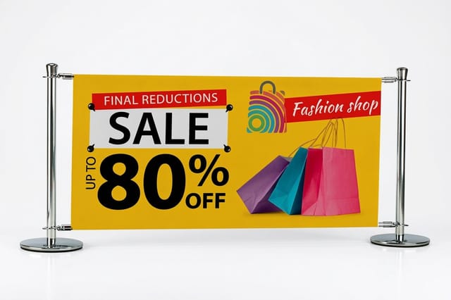 Indoor Banners | 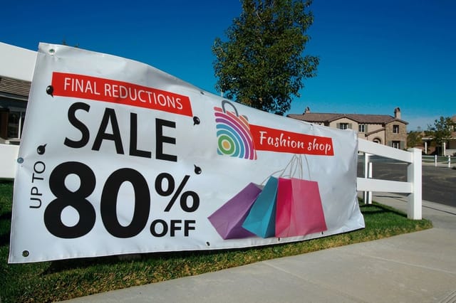 Outdoor Banners | 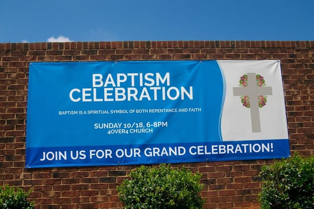 Business Banners | 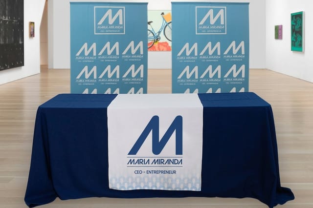 Fabric Banners | |
|---|---|---|---|---|
| Min price | $25.00 | $79.00 | $43.92 | $57.20 |
| Paper / stock | 13oz. Smooth Blockout Vinyl | 13oz. Outdoor Vinyl | 13oz. Scrim Vinyl | 5oz Economy Polyester |
| Size | 12" x 24" | 2' x 4' | 2' x 6' | 24" x 72" |
| Default qty | 1 | 1 | 1 | 1 |
| Turnaround | 2 business days | 3 business days | 2 business days | 4 business days |
| Rating | ||||
| View & customize | View & customize | View & customize | View & customize |
What This Means for Your Marketing and Print Design
Print is where generational tone decisions become expensive, because you cannot edit a caption after the run. That constraint is a gift. It forces you to write the sentence that works for the whole audience, and that sentence usually improves the digital version too.
Technically, symbols are just artwork once they hit a press, and the color you see on a backlit screen is not the color that comes off a sheet. Bright screen oranges and neon greens shift noticeably, so convert deliberately and check the guide to what CMYK means in printing before you approve a proof. Order a physical sample when the piece matters, and see how our free sample program compares in the Vistaprint free samples alternative breakdown.
Match the piece to the reader
- Mixed age signage. Plain language, high contrast, one icon at most, sized to read from across a room.
- Younger audience swag. Personality allowed, but tie it to something useful they will keep on a desk.
- Premium cards. A single symbol treated as a design mark, never as a punchline.
- Longer form print. Let layout and imagery carry tone, since a brochure has room to be warm in words.
If your next piece is a longer format, the collection of brochure ideas you have not thought of yet shows how structure and imagery can carry personality without a single symbol on the page.
Start fast
Templates and print ready blanks
Free layouts plus exact size blanks so your artwork lands inside the safe area on the first upload.

Wally translates emoji tone across generations
One symbol, four readings, and the print piece caught in between
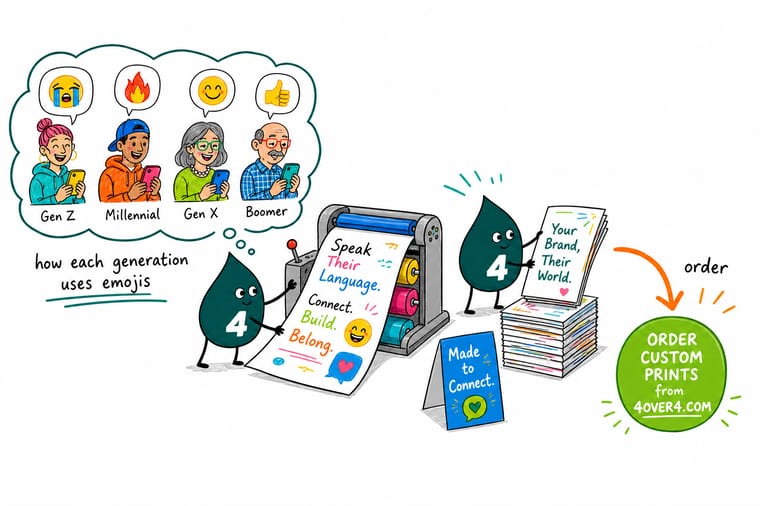
Before your next campaign goes to press, run the sentence past one reader from each generation and ask what they think you meant. If the answers differ, the symbol is doing work the words should be doing. Keep the offer and the instruction in plain language, treat any icon as a design element, and check a physical proof so the color you approved on screen is the color that arrives.
Order clear plastic cards →Emoji Rules Worth Keeping
Keep reading
Guides that make the brand voice concrete
Color, identity and format decisions that hold up across every age group you sell to.
Guide What CMYK Means in Printing Why screen bright symbols shift color on paper and how to fix it. Guide Logo Variations Every Brand Needs Build an identity that reads the same to every generation. Guide 10 Brochure Ideas You Have Not Tried Carry personality through structure instead of symbols. Guide 10 Fun Ways to Use Logo Stickers Small printed objects that younger audiences keep and share. Explore more
More on brand voice, naming and print
Related pages across 4OVER4.COM, one card each, from products to naming lists.
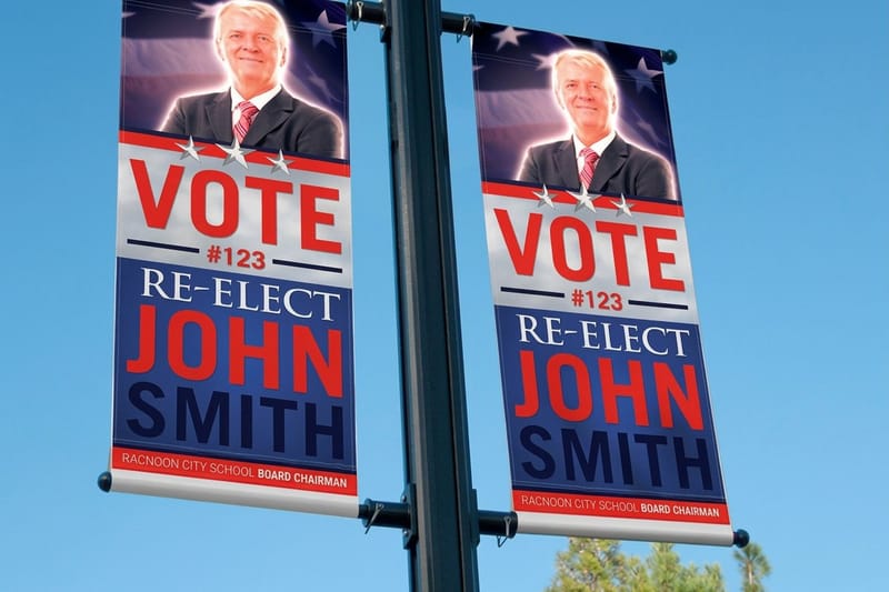 Product 2 Sided Blockout Banners Legible from both sides for mixed age foot traffic.
 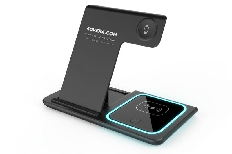 Product 3 in 1 Foldable Wireless Charger Branded tech swag that stays on a desk for years.
  Product 30mil Clear Plastic Cards A premium card where one icon carries the personality.
  Guide What CMYK Means in Printing Get screen color to survive the press.
  Guide Logo Variations Every Brand Needs One identity, every placement, no confusion.
  Alternative Free Samples Compared How our sample program stacks up before you commit.
  Article 10 Brochure Ideas You Have Not Tried Longer format print that carries tone without icons.
  Article 10 Fun Ways to Use Logo Stickers Playful print for the audience that shares it.
  Article 100 Food Truck Name Ideas Names that read well out loud and on a sign.
  Article 100 Cleaning Business Name Ideas Voice testing for a service brand, one name at a time.
  Article 100 Art and Craft Business Names Personality first names for makers and studios.
 Ready to put your brand voice on something permanent?
Write the line that works for every generation, pick a format that fits the audience, and let our team print it on stock you can hold before the full run ships.
Generational Emoji and Brand Voice FAQ
How do emoji meanings differ between generations?
Older readers treat emojis as literal decoration attached to a finished sentence, so a smiley means pleased and a thumbs up means approval. Younger readers treat them as commentary on the sentence, so the same symbols can read as forced politeness or as a conversation being shut down. Gen X sits in the middle, using one symbol to keep a dry line from sounding hostile. The practical rule is to write the meaning in words and let the symbol add warmth, never information.
Which emojis should a brand be careful with when talking to Gen Z?
The plain smiley, the thumbs up and the crying laughing face are the three to watch. To many Gen Z readers the smiley attached to a request reads as passive aggressive, a lone thumbs up reads as dismissive, and the crying laughing face reads as dated. The skull, which older audiences associate with death, is their standard marker for something being very funny. If you are unsure, use no symbol at all rather than the wrong one.
Should my brand use emojis in printed marketing at all?
Sparingly, and only as design elements. Print is permanent, so a symbol whose meaning shifts within a year becomes a dated piece sitting in someone’s hands. Use symbols where they function as icons, such as a location pin on a mailer or a small mark that reinforces the logo, and keep the offer, the date and the call to action in plain words. That approach reads correctly to every generation and survives the next platform trend.
Do emojis print accurately on banners, cards and packaging?
They print, but the color usually shifts. Emoji artwork is designed for backlit screens in RGB, and the bright oranges, neon greens and electric blues that look vivid on a phone flatten out on paper. Convert the artwork deliberately, outline it as vector art where possible so it stays crisp at large sizes, and read what CMYK means in printing before approving the proof. Always check a printed sample rather than a monitor.
How do I test emoji tone before a campaign goes out?
Show the exact wording to one reader from each generation and ask them what the sender means, not whether they like it. If two of them describe different intentions, rewrite the line. For anything going to press, add a physical proof to the same test so you catch both tone and color problems at once. Our free samples comparison explains how to get real stock in hand before committing to a full run.
