
Graphic Design for Print and the Specs That Decide Your Final Result


Four settings decide whether a layout survives the press: color mode, effective resolution, bleed and safety, and the exact trim size of the piece. Here is each one with the numbers, including the disc and case dimensions nobody writes down.
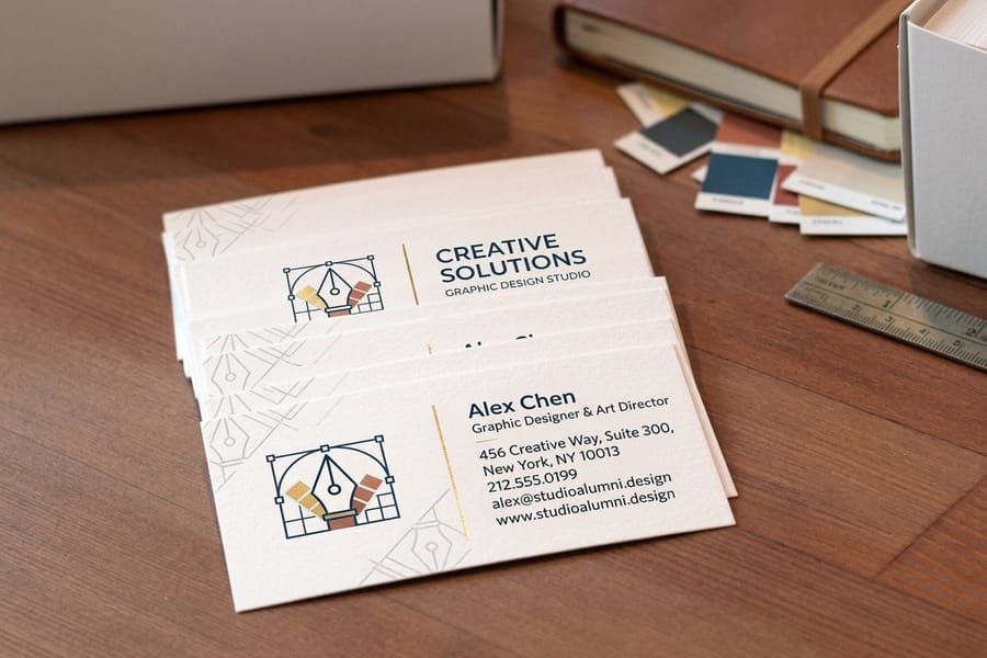
Design print files in CMYK at 300 ppi effective resolution, with 0.125 in of bleed on every edge and a 0.125 in safety margin inside trim, exported as a press ready PDF at 100 percent of final size. Standard trims: business card 3.5 x 2 in, postcard 4 x 6 in, CD or DVD face 4.724 in diameter with a 0.59 in center hole, jewel case front 4.75 x 4.75 in, and a 14 mm DVD case wrap 10.75 x 7.2 in flat. Large format is the exception, where 100 to 150 ppi at full size is enough.
Quick answer
The four settings that decide the result
Color mode, effective resolution, the bleed and safety pair, and the exact trim size. Everything else in a print file is taste. Those four are measurable, and a job fails on them long before anyone debates the typeface. Build in CMYK so you see the color shift yourself rather than letting the press choose. Check resolution after scaling, not before. Carry artwork 0.125 in past trim and keep anything you care about 0.125 in inside it. Then set the document to the real size of the piece, which for disc packaging means metric measurements that do not round to anything friendly.
Color Mode, Ink Limits, and the Blacks That Ruin a Job
Set the document to CMYK on the day you start, not the afternoon you export. Converting late is where a brand blue turns purple and a designer spends an evening arguing with a proof.
Screens build color from light and reach greens, blues and oranges that no combination of four inks can produce. When the file converts, those colors snap to the nearest printable value. Doing the conversion yourself means you watch that happen in your own layout, on your own monitor, and get to fix it. Doing it at the RIP means the press decides for you. Brand colors are the sharpest version of this problem, which is why a critical brand color is often specified as a Pantone spot ink instead of a CMYK build, and why palettes chosen with print in mind hold up better than palettes chosen on a display.
Two numbers matter after that. Total ink coverage, the sum of all four channels in the heaviest area of your file, should stay at or under roughly 300 percent on a coated sheet. Push past it and the sheet cannot dry fast enough, so ink offsets onto the back of the next sheet in the stack. The second is black. A single 100K black keeps small type razor sharp because one ink cannot misregister against itself. A large solid panel in 100K, though, sits next to a photograph looking grey and thin, and needs a rich black build such as 60C 40M 40Y 100K to read as genuinely black. Use each in the wrong place and the job looks amateur in a way most clients feel without being able to name.
Stock changes the result again. The same file prints noticeably softer on uncoated paper, because the fibers pull ink in and spread it. If a color has to match across a card, a brochure and a wall piece, expect to build slightly different values for each. Our graphic designer business cards start at $17.57 and are worth ordering once as a color test before you commit a whole campaign to a palette.
Resolution That Holds Up at the Size You Print

300 ppi at final size is the working rule for anything a person holds. The part that catches people is the phrase at final size, because resolution is not a property of the file on its own.
Scale an image up in a layout and its effective resolution falls by the same proportion. A 300 ppi photo placed at 200 percent is delivering 150 ppi to the press. A 600 ppi scan placed at 50 percent is delivering 1200 ppi, which is wasted weight and nothing else. InDesign, Illustrator and Affinity all report the effective or actual ppi in the links panel, and that figure is the one that decides whether the print looks sharp. The file properties dialog will happily tell you the image is 300 ppi while the layout is quietly starving it.
Large format works differently, and treating it like a business card wastes days. Nobody examines a wall graphic from eight inches away, so viewing distance buys back resolution. At full size, 100 to 150 ppi is normally enough, and many large pieces are built at quarter scale at 400 ppi so the application stays responsive, then output at 100 percent for the same visual result. A wall graphic starts at $25 and is one of the few places where a smaller number on the ppi field is the correct professional answer rather than a compromise.
| Piece | Typical viewing distance | Resolution at final size | Where it breaks |
|---|---|---|---|
| Business card | 10 to 16 inches | 300 ppi | Logos exported as small PNGs instead of vector. |
| Brochure or booklet | 12 to 20 inches | 300 ppi | Web images at 72 ppi scaled up to fill a panel. |
| Poster | 3 to 6 feet | 150 to 200 ppi | Type set from a rasterized comp rather than live text. |
| Wall graphic | 4 feet and beyond | 100 to 150 ppi | Files built at full size that stall the application. |
Logos and type should never be raster in the first place. Keep them as vector, and a mark stays crisp whether it prints at 0.75 in on a card or 6 feet on a wall. Most of the problems in logo files that fail at press are resolution problems wearing a different hat: a mark that only exists as a 400 pixel PNG has already decided how large it can ever print.
Bleed, Trim, and Safety: The Three Lines Every File Needs
A print file carries three lines, and describing them as one line called the edge is the single most common reason a job comes back wrong. Trim is where the blade lands. Bleed is artwork carried 0.125 in past it. Safety is a 0.125 in band inside it where nothing important goes.
Bleed exists because cutting is mechanical. Sheets are stacked and cut in lifts, the lift compresses slightly, and the blade can land up to about a sixteenth of an inch off the intended line. If your background stops exactly at trim, that drift shows as a white hairline down one edge of some cards in the box and not others, which looks worse than a consistent error. Extending the background an eighth of an inch past trim gives the blade somewhere harmless to be wrong. A 3.5 by 2 in card is therefore supplied at 3.75 by 2.25 in.
Safety is the same tolerance pointed inward. Text that sits 0.05 in from the trim line is fine in the file and clipped in real life. Keep type, logos and page numbers at least 0.125 in inside trim, and be stricter than that on anything that folds or binds. This is also why thin borders are a trap: a 2 mm keyline running around a card is the most visible object on the piece, and a sixteenth of an inch of cutting drift turns it into a border that is thin on one side and thick on the other. If the design needs a frame, either make it heavy enough that the drift is invisible or pull it well inside the safety margin. Composition decisions like these belong at the start, which is what layout principles for print deal with before any of the specs come into play.
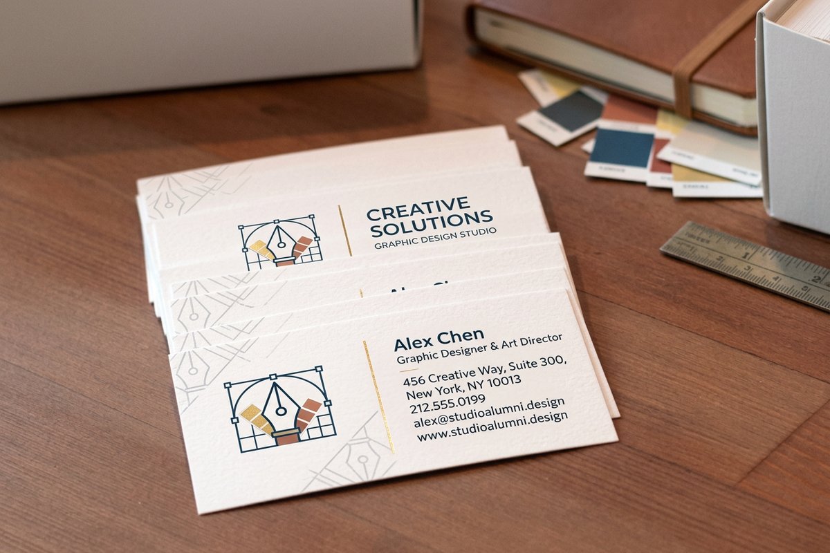
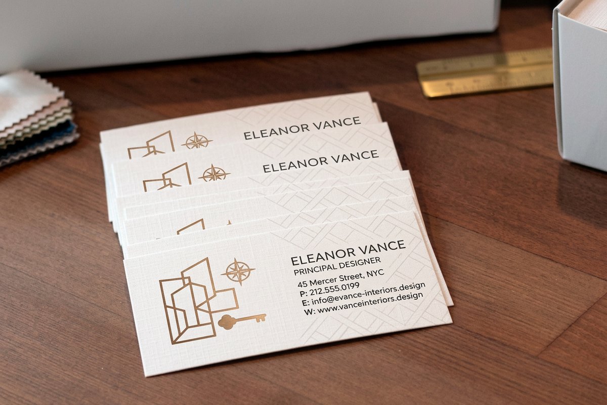
Folds and multi panel pieces add one more rule. The panel that folds inward has to be slightly narrower than the panels wrapping it, usually by about 1/16 in per fold, or the inside panel buckles. Ask the printer for the folding dimensions of the specific product rather than dividing the flat size by three. Ordering a test run is cheap insurance: interior design business cards start at $17.57 and a single box will tell you more about your bleed setup than another hour of previewing.
Exact Dimensions for Cards, Covers, and Disc Packaging
Standard sizes are standard because equipment, envelopes and cases were built around them. Disc packaging is the category designers most often get wrong, because the measurements are metric in origin, awkward in inches, and rarely written down in one place.
| Piece | Trim size | Size with bleed | The detail that catches people |
|---|---|---|---|
| Business card | 3.5 x 2 in | 3.75 x 2.25 in | Rounded corners eat into the safety margin, so pull content further in. |
| Postcard | 4 x 6 in | 4.25 x 6.25 in | Mailing leaves the lower right of the address side unusable. |
| CD or DVD face | 4.724 in diameter | Art to 4.8 in, hole 0.59 in | Printing stops at a 1.5 in inner diameter unless the disc is hub printable. |
| Jewel case front | 4.75 x 4.75 in | 5 x 5 in | The case lip covers roughly 0.1 in down the left edge. |
| Jewel case tray card | 5.9 x 4.625 in flat | 6.15 x 4.875 in | A 0.25 in fold at each end forms the two spines. |
| DVD case wrap, 14 mm | 10.75 x 7.2 in flat | 11 x 7.45 in | The 0.55 in spine sits dead center, so title text must be centered on the flat file. |
| DVD case wrap, 7 mm slim | 10.4 x 7.2 in flat | 10.65 x 7.45 in | A 14 mm layout will not fit a slim case, and the spine text lands on the front. |
Two habits keep disc work out of trouble. Build the wrap as one flat file with guides at the spine folds rather than three separate documents, and keep spine type at least 4 point clear of each fold, because a wrap that wanders by a millimetre puts a letter around the corner. For the full set of case variations and the sizes behind them, the DVD cover size and print spec guide goes deeper than a summary table can.
Everything above is the boring half of design for print, and it is the half that decides whether the work you spent a week on arrives looking like the file you approved. Get color mode, effective resolution, the three lines and the exact trim size right and almost nothing else can go badly wrong. The rest of our design process guides cover the stages either side of these specs, from early composition through handing finished files to a client. If you are producing this work for other people, winning print clients as a designer and the printed portfolios worth studying are the natural next reads.
Wally checks your file before the blade does
Four numbers, and the guillotine stops being a gamble
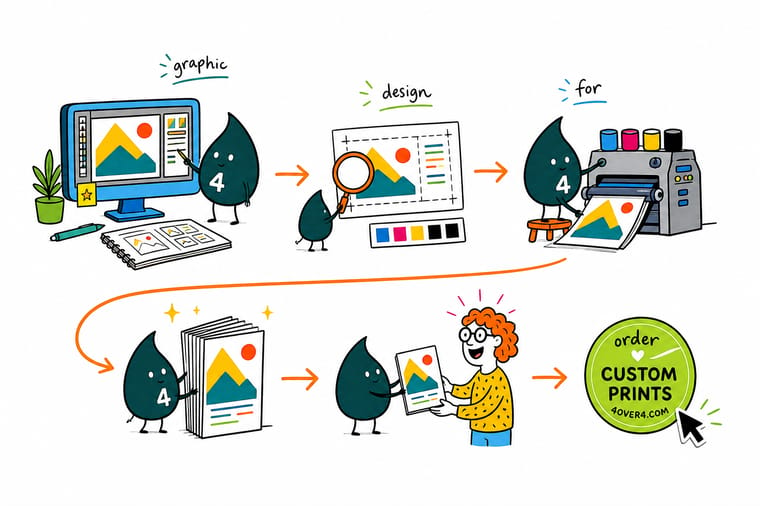
Wally opens the file and looks at four things in order. Is the document CMYK, so the blue you picked is a blue ink can actually make. Is every image 300 ppi at the size it sits on the page, not the size it was scanned. Does the background run 0.125 in past the trim line, and is the type 0.125 in inside it. Is the document set to the real trim size of the piece, which for a CD face means 4.724 inches across with a 0.59 inch hole in the middle. Four checks, about two minutes, and the box that arrives matches the screen you approved.
Order graphic designer business cards →Specs and pricing
Sizes, stocks, and starting prices
Every size below is a real trim size you can build a document to, with live configuration options and starting prices straight from the 4OVER4.COM configurator.

Print it
Put the specs to work on a real job
Explore more
Where to go next






By the numbers
Print files handled right at 4OVER4
Common Questions
Your print setup questions, answered
What resolution do I actually need for print?
For anything held in the hand, 300 ppi at the size it will print. The trap is that resolution is relative to scale: a 300 ppi image placed at 200 percent is really 150 ppi, and a 150 ppi image placed at 50 percent is really 300 ppi. Every layout application shows this as effective or actual ppi in the links panel, and that is the number to trust. Large format is different because nobody stands two feet from a wall graphic. At full size, 100 to 150 ppi is normally enough for a wall piece, and building the file at quarter scale at 400 ppi keeps the application responsive while producing the same result.
Why do my colors look different printed than on screen?
Because a screen makes color with light and a press makes it with ink on paper. RGB covers a wider range than CMYK, so saturated blues, greens and oranges have no ink equivalent and get pulled to the nearest printable value. Convert to CMYK yourself before you send the file so you see that shift in your own layout instead of discovering it in the box. Uncoated stock adds a second shift, since the fibers absorb ink and every color reads a little softer than the same file on a coated sheet.
How much bleed does a print file need?
One eighth of an inch, 0.125 in, on every edge that the artwork runs to. A 3.5 by 2 in business card is supplied at 3.75 by 2.25 in with the trim marked. Bleed exists because a stack of sheets shifts slightly under the guillotine, so the blade can land a fraction outside the intended line. Without bleed that fraction shows as a white sliver on one edge. Pair it with a 0.125 in safety margin on the inside, and keep text, logos and thin borders out of that band.
What are the exact dimensions for CD and DVD artwork?
A CD or DVD face is 4.724 in (120 mm) in diameter with a 0.59 in (15 mm) center hole. Most presses stop printing at an inner diameter of 1.5 in unless the disc is hub printable, which brings the printable area in to roughly 0.87 in. A jewel case front insert trims to 4.75 by 4.75 in. The tray card behind the disc is 5.9 by 4.625 in flat, with a 0.25 in fold at each end for the spines. A standard 14 mm DVD case wrap is 10.75 by 7.2 in flat with a 0.55 in spine, and a 7 mm slim case wrap is 10.4 by 7.2 in.
Should I use 100K black or rich black?
Both, in different places. Use 100K on its own for body text, thin rules and anything under about 12 point, because a single ink cannot misregister against itself and the edges stay sharp. Use rich black, commonly 60C 40M 40Y 100K, for large solid panels, where 100K alone looks washed and grey next to a photograph. Never set small type in rich black: four inks stacked under 8 point type fill the counters and look muddy the moment registration drifts by a hair.
What file format should I send to the printer?
A press ready PDF, exported as PDF/X-1a or PDF/X-4, with fonts embedded or converted to outlines, images at their real effective resolution, and the document built at 100 percent of final size. Include the bleed and set crop marks with an offset larger than the bleed so the marks sit outside the artwork. Send one page per side rather than reader spreads unless the job is a booklet the printer asked to receive that way. If you are unsure, send the PDF and keep the native file, since almost every fix a prepress operator asks for is faster in the original document.
Get Started
Files ready? Put them on paper.
Set the document in CMYK, carry the artwork an eighth of an inch past trim, keep the type an eighth inside, and send the PDF. We handle the rest.
Legal Disclaimer
Gold Standard guarantees apply to all standard orders placed through 4over4.com. Price match requires verifiable proof of a competitor's published price for an equivalent product with matching specifications and turnaround time. Satisfaction guarantee covers manufacturing defects and print quality issues. Contact support with order number and documentation. On-time delivery rate based on tracked orders 1999 to 2026. Individual results may vary based on shipping carrier performance.
