
How to Design a Logo in 9 Steps


A great logo is a process, not a lucky sketch. Define your brand, choose a style that scales, build it in vector, and export print-ready files. Here is the full nine-step method, start to finish.
To design a logo, work in nine steps: define your brand identity, gather inspiration, study the competition, choose your logo type and style, sketch concepts by hand, rebuild the best one in vector, set your color and typography, test it small and in one color, then export print-ready CMYK and vector files. Keep it simple, make it work in a single color, and it will look sharp everywhere from a favicon to a business card.
The short version
How to design a logo, in one paragraph
Design a logo by working from meaning to marks. Start with your brand identity, gather inspiration and study your competitors, then choose a logo type and style that fit. Sketch widely by hand, rebuild your best idea in vector, and lock a tight color palette and typeface. Before you finalize, test the mark at thumbnail size and in solid black, then export print-ready CMYK and vector files. Keep it simple and it will read on a screen, a sign, and a business card alike.
Why your logo is worth getting right

Your logo is the one piece of design people meet before they meet you. It sits on the business card you hand across a table, the sign above your door, the invoice you email, and the corner of every ad. Get it right and it quietly does a hundred small jobs at once: it signals who you are, it earns a sliver of trust, and it makes the next thing you show feel like it belongs to the same brand.
Get it wrong and the damage is just as quiet. A logo that blurs when it shrinks, splits into mud in CMYK ink, or looks like three competitors mashed together makes a business feel unsure of itself before a word is read. That is why a good mark is worth real thought, not a five-minute clip-art job. The business card statistics back this up: the physical touchpoints your logo lives on still shape first impressions and drive real returns.
The good news is that a strong logo is a process, not a lightning strike of talent. Work the nine steps below in order and you will end up with a mark that is simple, distinctive, and ready to print. If you want the short version first, our six key principles of logo design is the pocket checklist that sits underneath everything on this page.
How to design a logo in 9 steps
Here is the whole process at a glance. Each step narrows the field a little more, so by the end the final mark is a decision you can defend rather than the first shape that felt nice. Do them roughly in order, but expect to loop back. Designing a logo is closer to sculpting than to filling in a form.
- Define your brand identity. Write down your mission, your audience, and three words for how the brand should feel before you open any design tool.
- Gather inspiration. Build a mood board of marks you admire and jot a quick note on why each one works. You are collecting principles, not logos to copy.
- Study the competition. Line up the logos in your category so you can deliberately look different instead of blending into the crowd.
- Choose your type and style. Pick a wordmark, lettermark, icon, or combination mark, then settle on a visual style that matches the personality you defined.
- Sketch concepts by hand. Draw a lot of rough ideas fast on paper. Quantity kills the obvious first answers and surfaces the better ones underneath.
- Build it in vector. Redraw your strongest sketch in vector software so the mark stays razor sharp at every size, from app icon to banner.
- Set color and typography. Choose a tight color palette and a legible typeface, then test them together at real sizes before you fall in love.
- Test it small and in one color. Shrink the logo to a favicon and strip it to solid black. If it still reads, the shape is strong enough to print anywhere.
- Export print-ready files. Save vector, CMYK, and one-color versions with the right bleed so the logo prints clean on every surface you order.
The rest of this guide expands the steps that trip people up most: defining identity, studying the competition, choosing a style, and prepping files that actually print. If you would rather work inside a layout while you experiment, the 4OVER4.COM design tool lets you drop a mark onto a real card and see it at print size right away.
Step 1: Define your brand identity first
Skipping this step is the single biggest reason logos fail. A mark is not a drawing you like, it is a compressed summary of a brand, so you cannot design one until you know what you are compressing. Spend twenty focused minutes answering three questions before you touch a canvas.
- Who is this for? A logo for weekend cyclists and a logo for corporate insurance clients should not look remotely alike.
- What does the brand promise? Speed, safety, craft, playfulness, luxury. Name the one promise the mark has to whisper.
- How should it feel? Pick three adjectives. Bold, warm, precise. These become the tie-breaker every time two options look equally good.
Those three feeling words are the most useful thing you will write all week. When you are deciding between a sharp geometric icon and a soft rounded one, you stop arguing about taste and simply ask which one is more precise, or more warm, or more bold. If you are aiming for the pared-back end of the spectrum, our guide on minimal brand identity design shows how to say more with less.
Steps 2 and 3: Find inspiration, then study the competition
Inspiration and research are two different jobs, and people confuse them. Inspiration is about principles: you gather marks you admire and figure out why they work, then borrow the reasoning, never the shape. A wordmark you love might teach you about letter spacing. A sports badge might teach you about bold negative space.
Competitive research is the opposite move. You line up the logos already in your market so you can deliberately zag where they zig. If every plumber in town uses a blue droplet, a blue droplet makes you invisible. Map the category, spot the cliché, and design against it. Reading a few facts about logo design is a fast way to sharpen your eye for what separates a memorable mark from a forgettable one.
A quick warning that saves grief later: admiration is not permission. Study famous marks for principles, but keep your own mark far enough from any competitor that nobody could confuse the two. Distinctiveness is the entire point of a logo, so protect it from step one.
Step 4: Choose a style with staying power
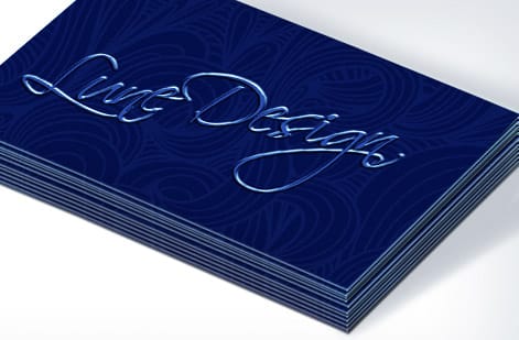
Style is where the feeling words from step one turn into pixels. A classic, restrained mark suits a law firm or a bank. A bright, rounded one suits a kids brand. A clean, geometric one suits a tech tool. There is no universally correct style, only the one that matches the promise you already defined.
Whatever direction you pick, bias toward simple. Minimal marks age slower, read faster at small sizes, and print cheaper because they hold up in one ink and one color. Trends are tempting, but a logo has to look right for a decade, not for a season, so treat this year's gradient fad with suspicion. Our full logo design best practices break down the traits, from simplicity to scalability, that keep a mark looking current long after the trend that inspired it has faded.
One practical test settles most style debates: imagine the logo carved into a single-color foil stamp, then imagine it as a tiny app icon. If the style still works in both extremes, it has staying power. If it only shines as a big, full-color, glowing screen graphic, it will let you down at the print stage.
Color and type that survive the jump from screen to print
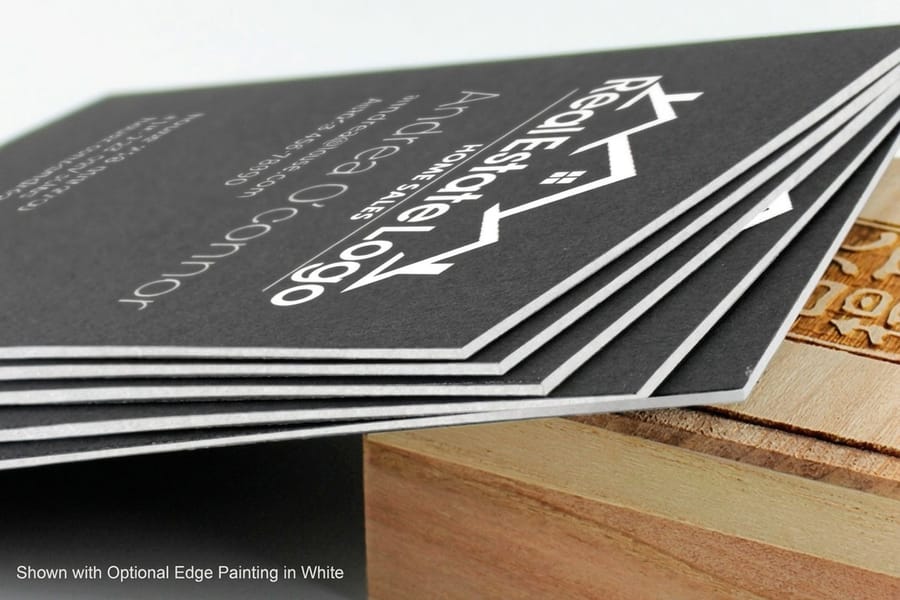
Color is emotional shorthand, so choose it on purpose. Keep the palette tight, two or three colors is plenty, and give each one a job: a primary, a secondary, and maybe an accent. More colors mean more ways for your brand to look inconsistent and more money at the print stage.
The screen-to-print gap is where beautiful logos go to die. Monitors mix light in RGB and can glow with colors that ink simply cannot reproduce. Printers mix pigment in CMYK, which has a smaller range, so a neon RGB blue can arrive on paper looking dull and grey. Choose your logo colors in CMYK from the start, and read CMYK vs RGB before you finalize anything. When a color has to be exact every single time, a spot color using a pre-mixed Pantone ink is the professional answer.
Typography deserves the same restraint. One or two typefaces, chosen for legibility rather than novelty, will carry your whole identity. Test the pairing at real sizes: a font that looks elegant on a poster can close up and blur on a business card, so proof it small before you sign off.
Run two proofs of the same mark before you commit: one on a business card, one as a rubber stamp. The card tells you whether the color holds up in CMYK on the stock you plan to order and whether the letterforms stay open at roughly three quarters of an inch wide. The stamp is the harsher test, one ink, no halftone, no gradient, no tints, so a drop shadow, a hairline outline, or a tight counter inside a letter collapses into a solid blob. A logo that survives both will also survive foil, embossing, engraving, a woven label, a pen barrel, and a van door, which is most of what you will ever print it on.
Step 9: Prep a print-ready logo file
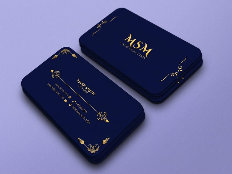
A brilliant logo that lives only as a low-resolution JPG is a liability. The final step turns your design into a set of files that print clean anywhere, and it is the difference between a mark that looks sharp on a banner and one that arrives fuzzy on a card.
- Keep the master in vector. SVG, EPS, AI, or a vector PDF store the logo as math, so it scales from favicon to billboard without a single soft edge.
- Export a CMYK version for print and hold your RGB version for screens. Mixing them up is how brand colors drift.
- Save a solid one-color version. Foil, embossing, engraving, and single-ink jobs all need a mark that works in pure black or pure white.
- Respect bleed and clear space. Leave room around the mark so trimming never clips it, and never stretch it to fit.
Once your files are ready, printing is the easy part. 4OVER4.COM shows live specs and per-unit pricing on every product, so you can put your finished logo on business cards, matching business stationery, and branded merchandise from one place. Not sure where to start? Our guide on where to print business cards weighs your options.
Print your logo: the file checklist
Before you place any order, put every version of the mark in one folder. This is the exact list to export yourself, or to ask your designer to hand over, so a print job never comes back to you asking for a better file.
- Vector master, AI or EPS. The editable original with live paths. Every other file on this list is exported from it in a couple of minutes, and without it you are paying somebody to redraw the logo later.
- Press-ready PDF with fonts outlined. Convert type to curves before you save. If the font stays live and the printer does not own it, the machine substitutes another one and your wordmark quietly changes shape.
- Transparent PNG. For email signatures, invoices, slide decks, and the web. Export it larger than you think you need, so nobody has to enlarge it and blur the edges.
- Solid one-color version. Pure black on white, no gradient, no drop shadow, no thin outline. Foil, embossing, engraving, and single-ink jobs all print one solid shape, and this is that shape.
- Reversed version. The same mark knocked out in white for dark stock, so a black card or a dark tote does not need a rushed redraw the night before the order goes in.
- CMYK and Pantone builds. CMYK values for full-color printing, plus a Pantone number for any color that has to land identical on every run. Read spot color printing to judge when that pre-mixed ink is worth the line item.
- Minimum size, written down. Shrink the mark until the thinnest line closes up, then set the minimum one step above that point. Most logos hold at about three quarters of an inch wide, the size they land on a business card, and the tagline usually gives up long before the icon does.
- Clear space, written down. A margin on all four sides equal to the height of the capital letter in your wordmark. It keeps other elements off the mark and it keeps trimming from clipping it.
Name the files plainly, something like brand-logo-master.eps, brand-logo-print.pdf, brand-logo-1c.eps, brand-logo-white.eps, and keep the folder where you can reach it in seconds. That folder is what a printer wants the day you order business cards, matching business stationery, or branded merchandise.
Logo design mistakes that cost you at the printer
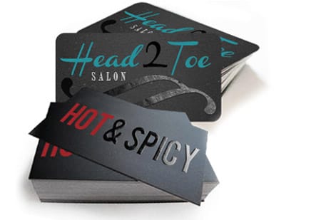
Most bad logos are not badly drawn, they are badly prepared. Sidestep these and you will clear the bar that most first-time designers trip over.
Designing only at large sizes. A mark that looks heroic at 2,000 pixels can turn to soup as a favicon. Shrink it early and often.
Ignoring the one-color test. If your logo falls apart without its gradient, it will fail on foil, embossing, and any single-ink print. Prove it in solid black first.
Using too many colors or fonts. Every extra color and typeface is another way for your brand to look inconsistent and another cost at print. Restraint reads as confidence.
Working in RGB and hoping for the best. Proof in CMYK before you order, or expect your glowing screen blue to arrive flat and grey on paper.
Skipping the vector file. A raster-only logo pixelates the moment a printer scales it. Always keep a vector master.
Copying a trend or a competitor. Trends date and lookalikes confuse. Aim for simple, distinctive, and yours. If a term on a print quote ever stumps you, the printing terms glossary translates the jargon into plain English.
Wally explains logo design
Simple marks travel; busy ones break
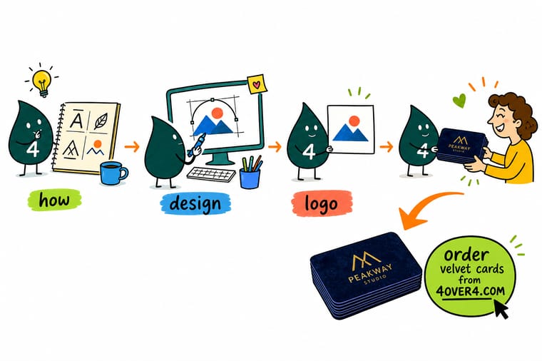
Wally will tell you the whole secret in one line: design a logo that still works shrunk to a favicon and stripped to solid black. If it survives both, it will look sharp on a screen, a sign, and a business card. Start from meaning, build it in vector, keep the palette tight, and proof it in CMYK before you print. When the mark is ready, 4OVER4.COM gives it a first home on cards, stationery, and merch.
Design it in the browser →Specs and pricing
Print your logo on velvet cards
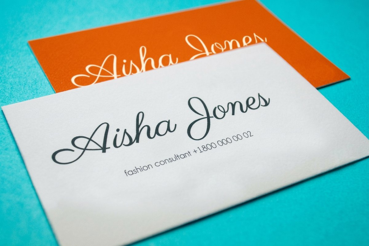
Once your mark is print-ready, here is what a set of soft-touch velvet business cards gives you at 4OVER4.COM, with live specs and per-unit pricing pulled straight from the configurator.
| Quantity | Price Per Unit | Total |
|---|---|---|
| 500 | 20.7¢ | $103.59 |
| 1,000 | 13.8¢ | $137.68 |
| 2,500 | 9.04¢ | $226.11 |
| 5,000 | 6.54¢ | $327.15 |
| 10,000 | 6.43¢ | $642.93 |
| 15,000 | 6.39¢ | $958.72 |
| 20,000 | 6.47¢ | $1,294.72 |
| 25,000 | 6.41¢ | $1,602.92 |
Print it
Give your new logo a first home
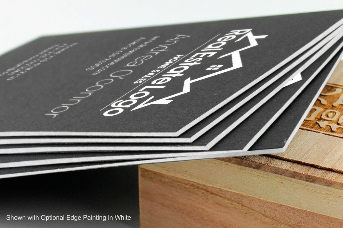
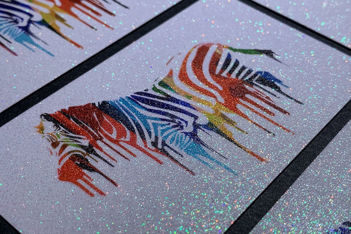
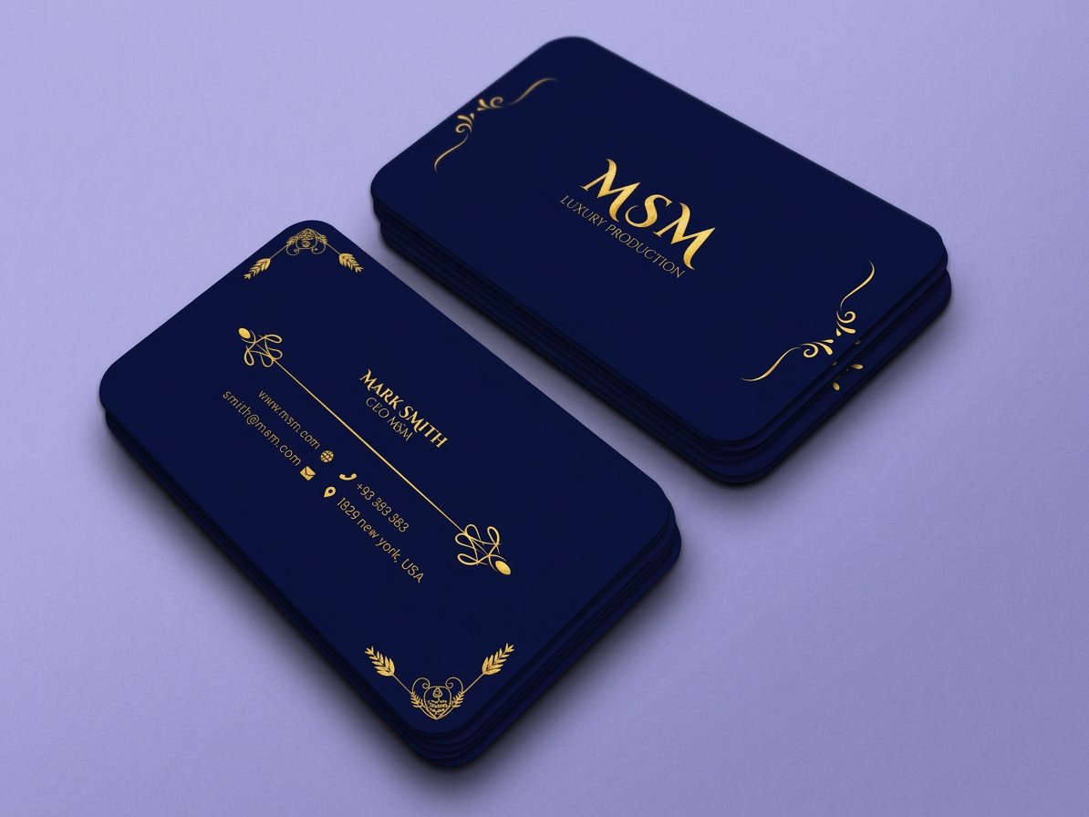
See it in use
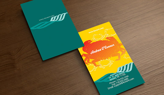
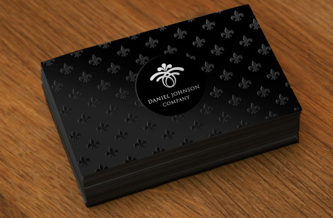
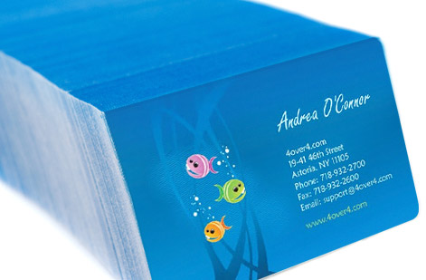
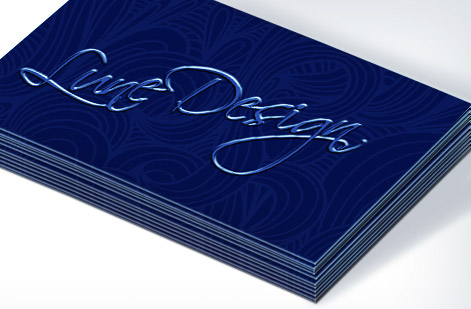
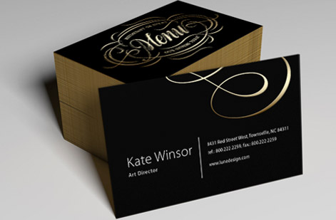
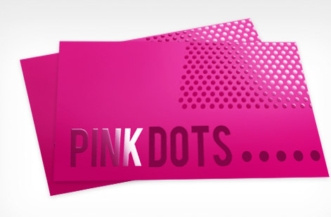
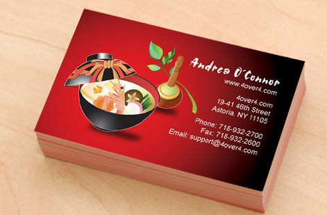
Real customer logos, printed in-house
Explore more
Where to go next





By the numbers
A place to print your logo, once it is done
Common Questions
Common questions about designing a logo
Can I design my own logo, or do I need a professional?
You can absolutely design your own, especially for a small business or side project. The nine-step process below works whether you use free vector software, an online design tool, or a designer. The real gap between amateur and pro logos is not budget, it is discipline: a clear brief, restraint with color and fonts, and testing the mark small and in one color. If you would rather start from a proven layout, 4OVER4.COM offers a free design tool and ready-made templates you can adapt. Bring in a professional when the mark has to carry foil, embossing, or engraving, or when you need the full file set and the usage rules handed over, because those jobs punish guesswork and are expensive to redo once a run is printed.
What are the nine steps to designing a logo?
Define your brand, gather inspiration, study competitors, pick a logo type, sketch by hand, rebuild in vector, set color and type, test it small and in one color, then export print-ready CMYK vector files. In full: define your brand identity, gather inspiration, study the competition, choose your logo type and style, sketch concepts by hand, rebuild the best one in vector, set your color and typography, test it small and in a single color, then export print-ready CMYK and vector files. Each step narrows the field so the final mark is a deliberate choice rather than the first idea you liked. Work them in order, and do not skip the sketching stage: a page of rough marks on paper costs you an hour, while the same decision made inside vector software takes ten times longer to undo.
What file format should my logo be for printing?
A vector file is the answer for print. Vector formats such as SVG, EPS, AI, or a vector PDF store your logo as math, so it stays crisp at any size and never pixelates. Keep a CMYK version for print alongside your RGB version for screens, plus a solid one-color version for foil, embossing, or single-ink jobs. A raster JPG or PNG is fine for the web but will blur the moment a printer scales it up. Guard the editable vector master above all the rest, because every other file you will ever need is exported from it in a couple of minutes.
What file do I need to print my logo?
Send a press-ready PDF exported from the vector master, with the fonts converted to outlines, the colors built in CMYK, and a Pantone number listed for any color that has to match exactly. Keep AI or EPS on hand in case the printer needs to edit paths, and hold three more versions ready: a solid one-color mark for foil, embossing, engraving, and single-ink jobs, a white reversed mark for dark stock, and a transparent PNG for screens and email signatures. If the only artwork you have is a JPG pulled off a website, have it redrawn in vector before you order, because raster art below print resolution softens the moment it is scaled and no press setting will bring the edges back.
How small can a logo be printed and still read?
Test it rather than guess. Print the mark at three quarters of an inch wide, the size it lands on a business card, then again at half an inch, and study the thinnest line and the tightest gap between shapes. Wherever the detail starts to close up, set your minimum one step above that size and write the number down with the files. Taglines and hairline outlines fail first, which is why many brands keep a stacked version with the tagline for large uses and an icon-only version for small ones. Uncoated and textured stocks spread ink a little more than coated, so proof on the paper you are actually ordering before you approve the run.
How do I choose the right logo style for my business?
Match the style to the promise. A law firm or bank leans classic and restrained, a kids brand leans bright and rounded, a tech startup leans clean and geometric. Start from the three feeling words in your brief, then test candidate marks against them. When in doubt, go simpler: minimal marks age better, print cheaper, and read faster at small sizes than busy ones. Look hard at what your direct competitors print, then move deliberately away from it, because the job of a logo is to be told apart at a glance on a shelf, a van door, or a card sitting in a stack of other cards.
How much does a custom logo cost, and what affects the price?
A DIY logo can cost nothing but your time, a freelance mark commonly runs a few hundred dollars, and a full brand-identity system from an agency can reach thousands. Price tracks scope: number of concepts, rounds of revisions, file formats delivered, and whether you also get brand guidelines. Whatever you spend on the design, printing it well is separate. 4OVER4.COM shows live per-unit pricing on every product so you can budget the design and the print run independently. Before you compare two quotes, ask each one the same question: how many concepts, how many revision rounds, and does the handover include the vector master, the one-color version, the reversed version, and written minimum size and clear space rules. A cheap logo delivered as a single JPG charges you a second time the first day you print it.
What is the most common logo mistake that shows up at the printer?
Designing only in RGB and only at large sizes. A logo that dazzles on a glowing screen can turn muddy in CMYK ink or lose its fine lines when it shrinks to card size. Always proof your mark in CMYK, at thumbnail scale, and in solid black before you place a print order, and start from a vector file so nothing pixelates on the way to paper.
Get Started
Logo ready? Put it on something people keep.
Upload your finished mark, pick a stock and finish, and we print business cards that make a clean logo feel unforgettable in hand.
Legal Disclaimer
Gold Standard guarantees apply to all standard orders placed through 4over4.com. Price match requires verifiable proof of a competitor's published price for an equivalent product with matching specifications and turnaround time. Satisfaction guarantee covers manufacturing defects and print quality issues. Contact support with order number and documentation. On-time delivery rate based on tracked orders 1999 to 2026. Individual results may vary based on shipping carrier performance.
