
5 Popular Photoshop Effects You Can Do Yourself


The five effects worth learning first are duotone, double exposure, glitch channel shift, halftone and light leaks, and each one is four or five steps once you know where the setting lives. What separates a good result from a disappointing one is not the technique, it is knowing how each effect changes when it stops being light on a monitor and becomes ink on paper.
The five effects at a glance
| Effect | Where it lives | The setting that matters | What print does to it | Prints best on |
|---|---|---|---|---|
| Duotone | Gradient Map adjustment layer | Two stops, dark shadow and light highlight | Vivid stop colors shift on CMYK conversion | Matte posters |
| Double exposure | Two layers plus a layer mask | Top layer on Screen or Lighten | Bright areas flatten out and lose detail | Posters |
| Glitch and channel shift | Layer Style, Blending Options, Channels | One channel off, layer nudged 6 to 12 px | Pure R, G and B fringes go muddy in ink | Die-cut stickers |
| Halftone | Filter, Pixelate, Color Halftone | Max Radius 4 to 8 px at final size | Fine dots moire against the press screen | Posters |
| Light leaks | Soft brush on an empty layer | Screen mode, 40 to 60% opacity, heavy blur | Additive glow fades badly on uncoated stock | Premium business cards |
Every one of these is built non-destructively, so convert the photo to a Smart Object before the first filter and you can revise the setting after the proof lands. You can order posters in any size straight from the configurator once the artwork is ready.
Set the file up before you touch a filter
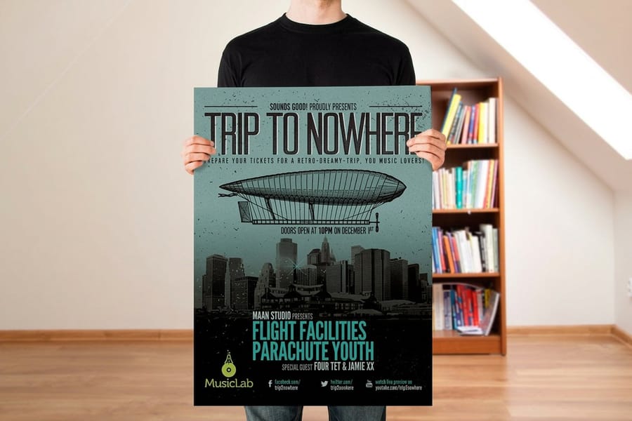
Every effect below behaves differently depending on how the document was built, so this comes first. Work at the final printed size at 300 pixels per inch, keep the document in RGB while you design, and convert to CMYK only at the end. Effects that rely on channels or on additive blend modes fall apart if you build them in CMYK from the start.
Build everything on adjustment layers, layer masks and smart objects rather than on the pixels themselves. Duotone, halftone and channel shifts all involve settings you will want to change after you see a proof, and a flattened file means starting over. Convert the photo to a Smart Object first, then every filter you apply becomes a line you can double-click and edit.
Add the bleed at the document stage, not at export. Our walkthrough on adding bleed and crop marks in Photoshop sets the canvas up correctly, and it matters more with these effects than with plain layouts, because a halftone or a light leak that stops exactly at the trim line leaves a white sliver after cutting.
The document settings that decide everything else
Set the canvas to the trim size plus 0.125 inch on each edge, the resolution to 300 ppi, the color mode to RGB and the bit depth to 8 bits per channel. Eight bits sounds like a downgrade, and for photo retouching it is, but Duotone mode and several older filters are simply unavailable in 16 bit.
Name your layers as you go. A glitch build ends up with four or five copies of the same photo, each one with a different channel switched off, and by the third round of edits an untitled stack of Layer 1 copy 4 costs more time than it saved.
Look at it on paper before you commit
Turn on View, Proof Setup, Working CMYK and then View, Proof Colors. The screen preview shifts, sometimes dramatically, and that shift is the honest preview of what ink will do. Neon greens, electric blues and pure magentas are the usual casualties.
Then print a small test. A short run of postcards costs very little and tells you more about a duotone or a halftone than any amount of screen preview, because paper absorbs ink and a monitor emits light. If the effect reads on a postcard, it will read on a poster.
Duotone, and why a gradient map usually beats it
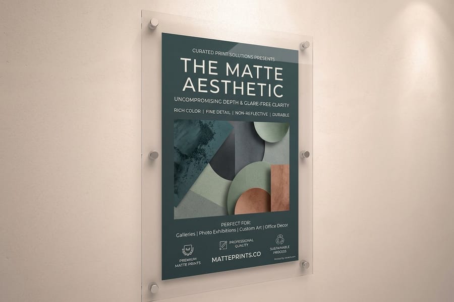
A duotone is a photograph rendered in two colors instead of a full color range, and it is the fastest way to make a mixed set of photos look like one campaign. The classic route is Image, Mode, Grayscale, then Image, Mode, Duotone, then picking two inks and shaping their curves. It works, and it also flattens the file and locks you out of the layer stack.
The route most designers use now is a Gradient Map adjustment layer. Add one above a desaturated photo, set the left stop to a deep color for the shadows and the right stop to a pale one for the highlights, then drag the midpoint diamond to control where the transition sits. The photo underneath stays untouched and you can restyle the whole piece by editing two color stops.
The trade-off is real: only true Duotone mode gives you the separations a two-ink spot job needs. If you are printing on a four-color digital press, which is what most short-run work goes on, that advantage disappears and the gradient map is better in every other way. Our guide to duotones and filling text with images covers the curve editing in more depth.
Picking two colors that hold up in ink
Keep the two stops far apart in brightness. A dark stop and a light stop give you a readable image; two colors of similar value give you mush, and it looks worse on paper than on screen because dot gain closes the gap further.
Check both stops in Proof Colors before you commit. Saturated blues and greens are the ones that shift, and a duotone built on a color that CMYK cannot reach loses the exact quality you chose it for. Pull the saturation back a little in the source file rather than letting the conversion do it for you.
Where a duotone actually earns its keep
It rescues a set of photos shot by different people in different light. Strip the color out, map both to the same two stops, and a mismatched gallery becomes a series. Event posters, band artwork and staff pages all use it for that reason.
A duotone also prints cleanly on matte posters, because the flat surface does not add its own gloss highlight to a picture that is already carrying only two colors.
Double exposure that survives the press
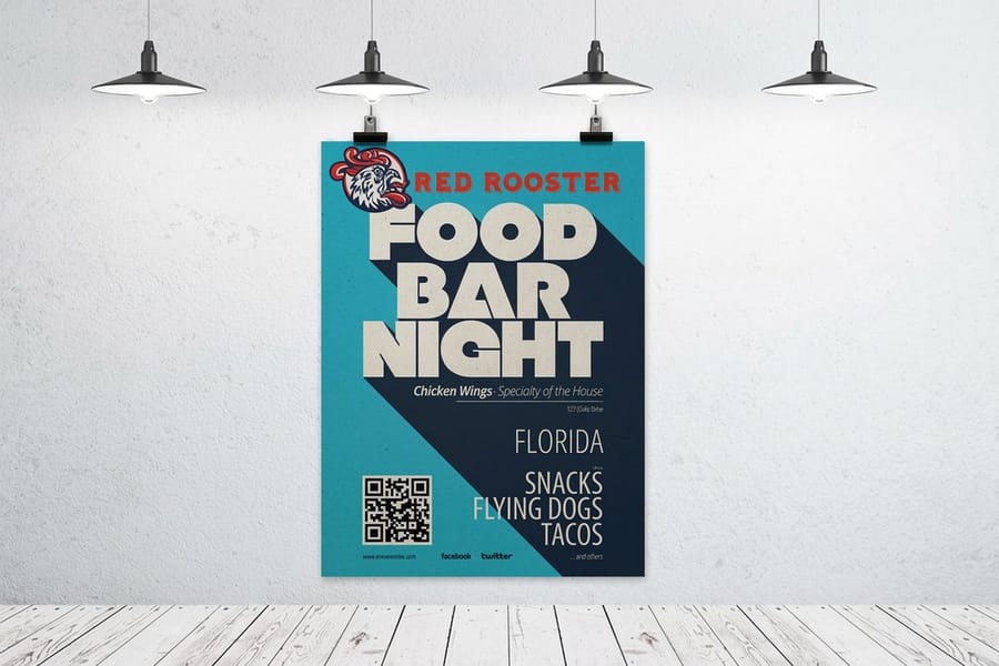
A double exposure blends a portrait with a landscape or a texture so the second image appears inside the silhouette of the first. Stack the texture above the portrait, set the top layer to Screen or Lighten, and the effect appears immediately. Both modes ignore black, which is the whole mechanism.
That mechanism dictates the shot you need. The portrait wants a bright, near-white background so the texture layer washes out around the head and gathers inside it. A portrait shot against a dark wall gives you a texture layer sitting on top of everything, and no amount of masking rescues it convincingly.
Refine it with a mask rather than the eraser. Load a selection from whichever channel has the most contrast between subject and background, usually the blue channel on a skin tone, then apply it as a layer mask on the texture and paint the edges back by hand with a soft brush at 20% flow.
What print does to the light half
Screen mode pushes everything toward white, and white on paper is just unprinted stock. The pale areas that look delicate on a backlit monitor arrive as bare paper, so the gentle gradient you spent an hour on can disappear entirely.
The fix is a Levels or Curves adjustment clipped to the blended result, pulling the white point down until the lightest tone in the artwork holds a small percentage of ink. Then the highlight still reads as a highlight but it is printed, not implied.
Glitch and RGB channel shift
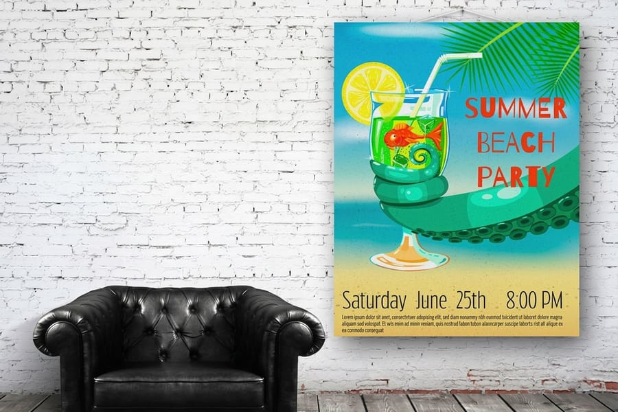
The core of a glitch look is a channel offset. Duplicate the photo layer, open Layer Style and go to Blending Options, then in Advanced Blending untick the R box on the copy and nudge that layer 6 to 12 pixels sideways with the arrow keys. You get the red and cyan fringe that reads instantly as a broken signal.
Add slice displacement on top. Draw a thin rectangular marquee across the image, press Command or Control plus J to lift it to its own layer, then move it horizontally by a few pixels. Three or four slices at different heights and different offsets is plenty; a dozen turns into noise and stops reading as a deliberate choice.
Finish with one texture pass. Filter, Noise, Add Noise at 2 to 4 percent, or Filter, Distort, Wave with a small amplitude on a duplicated layer masked to a band. Restraint is what separates a glitch that looks designed from one that looks like a corrupted upload.
The CMYK problem nobody mentions
The whole effect is built on red, green and blue channels that do not exist in CMYK. When the file converts, those clean fringes turn into duller composite colors and the shift loses roughly half its force. Compare the two side by side in Proof Colors and you will see it.
Two ways around it. Push the offsets further than looks right in RGB so there is something left after conversion, or rebuild the fringe deliberately with solid color layers set to your own values, so you control exactly what the press prints instead of inheriting whatever the conversion decides.
Where glitch artwork belongs
It suits small, high contrast pieces more than large ones. On die-cut stickers the offset reads as intentional at a glance, and the cut shape gives the broken artwork a hard edge to work against.
Keep type out of the glitched area, or duplicate the type on a clean layer above it. A shifted headline is legible on a screen at full size and unreadable on a printed piece held at arm’s length.
Halftone at a size the press can hold
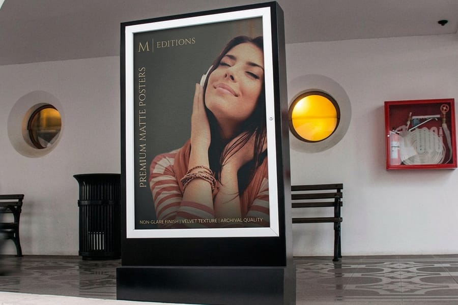
A halftone turns continuous tone into a grid of dots, the way newsprint and comic art do. Filter, Pixelate, Color Halftone is the quick route: set Max Radius somewhere between 4 and 8 pixels and leave the four screen angles at 108, 162, 90 and 45, which are the standard cyan, magenta, yellow and black angles. For a single-color halftone, convert to Grayscale first, then Image, Mode, Bitmap and choose Halftone Screen, where you set the frequency in lines per inch and the dot shape.
The mistake that ruins most halftones is resolution. Max Radius is measured in pixels, so a halftone that looks right on a 72 ppi web-sized file becomes four times coarser when the same artwork is enlarged to 300 ppi for print. Build the halftone at the final print dimensions, then judge the dot size.
The second mistake is going too fine. The press lays down its own screen, and a decorative halftone close to that frequency interferes with it and produces moire, the wavy pattern nobody wants. Keep your intentional dots obviously coarse so they read as a design decision rather than fighting the press for the same space.
Matching the dot to the viewing distance
Big dots for big pieces. A poster read from three or four feet away can carry a dot you can see individually, and that visibility is the point. The same dot size on a business card just looks like the image failed.
Print a strip at three different Max Radius settings, tape it to a wall and step back. Two minutes of that answers a question no amount of zooming on a monitor will.
Halftone plus paper texture
A coarse halftone on an uncoated stock gains a slightly soft edge as the ink spreads into the fibers, which is close to the look people are chasing when they imitate old print. You can preview it before ordering by following our method for adding paper texture in Photoshop.
On posters the effect scales up cleanly, because the dot grid is vector-like in character and does not soften the way a photograph does when it is enlarged.
Light leaks, and the Screen mode trap
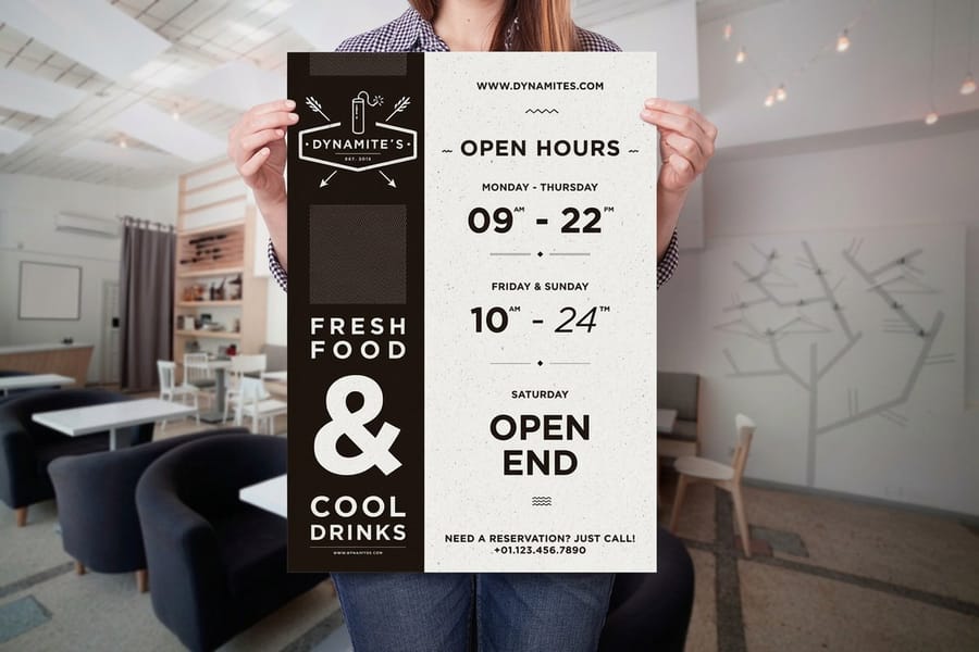
A light leak is the warm streak of flare that shows up when light reaches film it should not have. Add an empty layer above the photo, pick a soft round brush at a large size, choose a warm orange or a pink, and drag one stroke in from a corner. Set the layer to Screen, drop the opacity to somewhere between 40 and 60 percent, then apply Gaussian Blur at 80 to 150 pixels so no brush edge survives.
One leak, one direction. Light entering a camera body comes from somewhere specific, and two leaks from opposite corners immediately look like a filter rather than an accident. Mask the leak off faces and off any type; a warm haze across a headline is the fastest way to make a nice photograph unusable.
This is the effect that suffers most in print. Screen mode is additive, it works by adding light, and ink is subtractive, it works by removing it. A leak that glows on a monitor can barely register on a printed page, which is why so many pieces come back looking flatter than the file did.
Making a leak survive ink
Raise the layer opacity roughly 15 to 20 percent above what looked right on screen, or move the leak onto a darker area of the photograph where the contrast carries it. Both work; the second usually looks more natural because that is where real flare shows up anyway.
Stock matters as much as the setting. A gloss finish holds a warm gradient better than an uncoated one, because uncoated paper absorbs ink and softens the transition. If the leak is doing real work in the design, print it on a coated stock.
Where a light leak reads best
On small pieces with a photographic background it adds warmth without adding elements. A leak across the corner of premium business cards gives a photo-backed card a mood that a flat color block cannot.
Check the trim first. A gradient that ends inside the bleed area is fine; one that ends right at the trim line shows a hard edge if the cut lands a fraction off, and cuts are never perfect. Our Photoshop business card dimensions guide has the safe margins.
Poster pricing and specs at 4OVER4.COM
Once the effect is settled, the size and the stock decide the cost. The numbers below come straight from the live configurator, so you can price an idea before you finish the artwork.
Quantity and price
Poster pricing and specs
Live configurator numbers, where the per unit cost drops as the run grows.
| Quantity | Price Per Unit | Total |
|---|---|---|
| 50 | $2.18 | $108.75 |
| 100 | $1.64 | $163.67 |
| 200 | $1.01 | $202.11 |
| 300 | 80.2¢ | $240.55 |
| 400 | 69.7¢ | $278.99 |
| 500 | 63.5¢ | $317.44 |
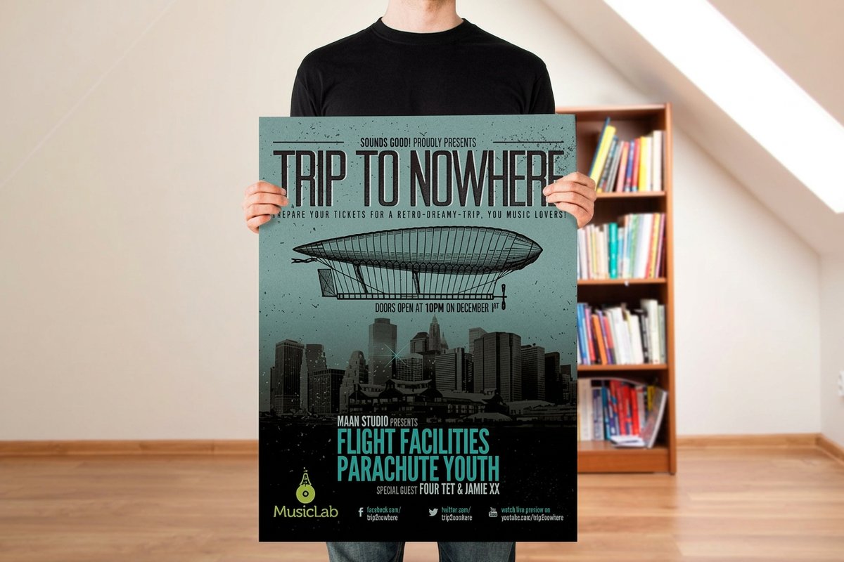
You can also earn coins on every order and redeem them against later printing, which makes testing two versions of an effect cheaper than it sounds.
Stock and finish change how an effect reads
The same file prints differently on different paper, and with these five effects the difference is large enough to change which one you should pick. Coated gloss holds saturated color and smooth gradients, which is what a light leak and a double exposure both depend on. Matte kills glare and suits duotones, because a two-color image has no highlight detail to lose and benefits from an even surface. Uncoated absorbs ink and softens edges, which ruins a fine gradient and flatters a coarse halftone.
Print it
Posters, ready for your artwork
Preset sizes and stocks, the fastest way to see an effect at full scale.
Scale matters just as much. An effect built for a poster read from several feet away can be far coarser than one on a card held at reading distance, and shrinking the same file does not translate. If the piece is large and rigid rather than paper, the foam board sizes and shapes guide covers the formats that hold artwork flat on a wall. For type choices that sit well alongside a heavily treated image, our roundup of the most popular fonts in graphic design is a useful starting point.
Where each effect earns its place
The technique is easy. Choosing which one fits the job is the part worth thinking about, so here is how these break down by the kind of work people bring us.
- Event and music promoters. Duotone across a mismatched set of artist photos, printed large. It hides differences in shooting conditions and gives a lineup one visual voice.
- Photographers and print sellers. Double exposure and light leaks on gallery pieces, printed on a coated stock so the light half of the image keeps its gradient.
- Streetwear and music labels. Glitch and channel shift on stickers and small format, where the offset reads as deliberate and the artwork is seen up close.
- Cafes, bars and small retail. Coarse halftone on posters and window pieces. It reads from across a room and it costs nothing extra to print.
- Design studios pitching work. A duotone or a halftone applied to a client photo on a card is the quickest way to show a treatment rather than describe one.
If the finished piece is going on a wall at home rather than in a shop, our article on removable photo tiles you print yourself covers a format built for exactly that, and event work often pairs a treated photo with stationery, which is where the most popular wedding theme ideas come in useful.
Templates and print-ready blanks
Starting from a correctly sized document saves the most common round of rework, because every pixel-based setting in these effects depends on the canvas being right. 4OVER4.COM sizes its blanks to exact product specs, so the bleed and the trim are already where they should be. Grab one from the blank template library before you open a photo.
Start fast
Templates and print-ready blanks
Postcard design templates for a cheap test print, plus exact size poster blanks so your artwork lands inside the cut line.
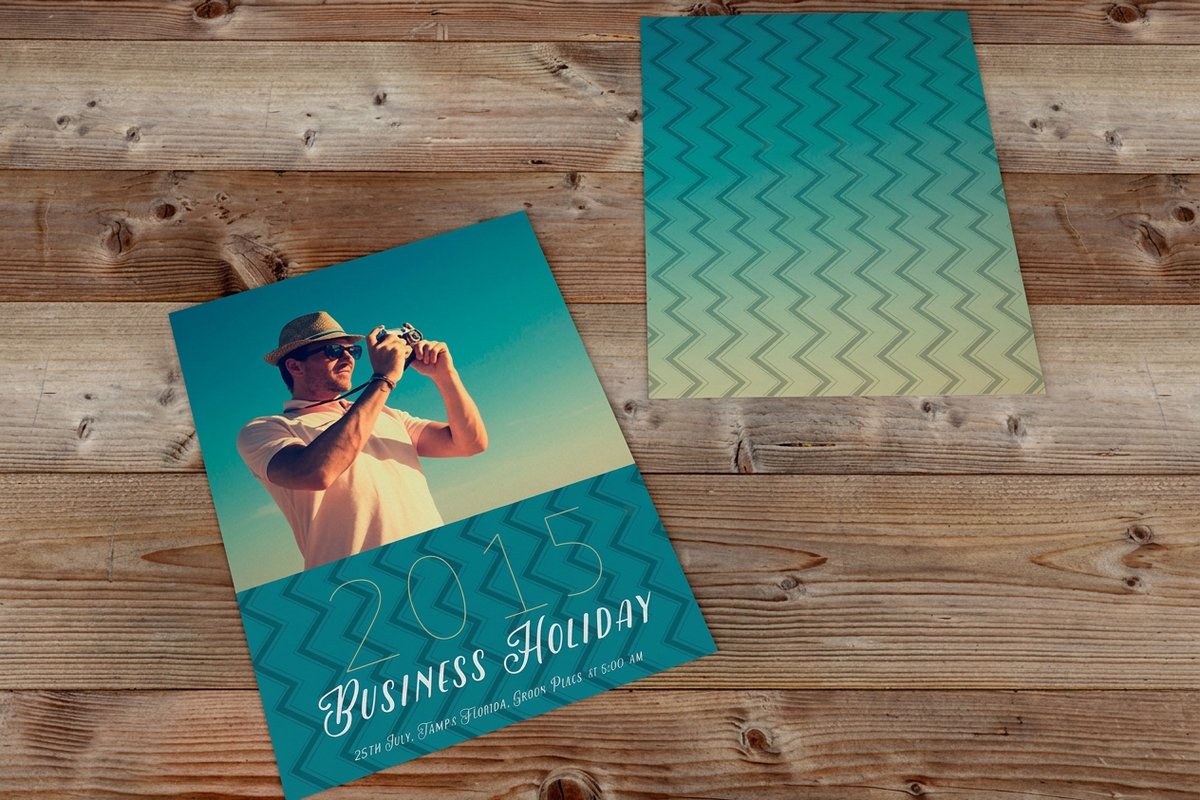

Wally checks what happens when an effect meets ink
The setting that looks right on screen is rarely the one you print
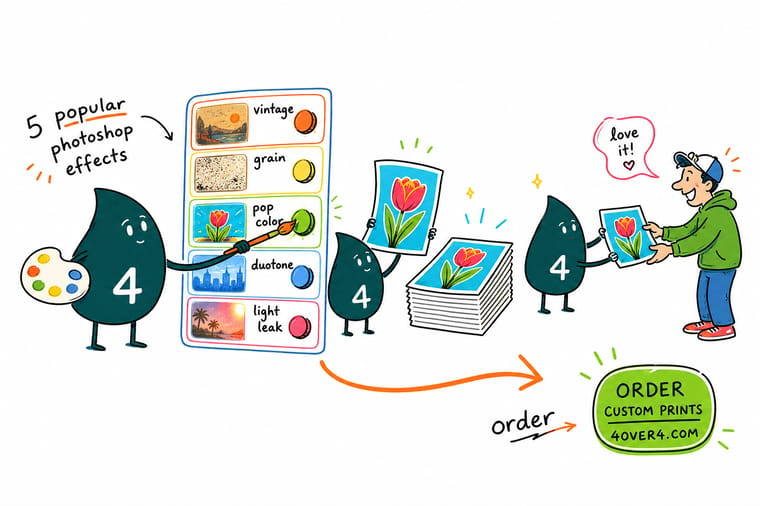
Build at final size in 300 ppi RGB, convert the photo to a Smart Object first, and turn on Proof Colors before you sign anything off. Push channel offsets further than looks right, lift a Screen mode light leak by 15 to 20 percent, and keep halftone dots obviously coarse so they do not fight the press screen. Then let 4OVER4.COM print it on a stock that suits the effect.
Order posters →What to remember about these five effects
Habits that keep an effect printable
- Build at final size. Every pixel-based setting, from Max Radius to blur radius to channel offset, is relative to the document. Set the real dimensions first and the numbers stop lying to you.
- Smart Objects over flattened pixels. Convert the photo before the first filter. Every setting stays editable after the proof arrives, which is when you actually know what needs changing.
- Proof Colors is not optional. These five effects lean on saturated color and on light. Both are exactly what shifts in a CMYK conversion, so look at the honest preview before you sign off.
- One effect per piece. A glitched, duotoned halftone with a light leak reads as indecision. Pick the one that carries the message and let the rest of the layout stay quiet.
- Keep type clear of the effect. Words survive a texture; they do not survive a channel offset or a haze. Put the headline on its own clean layer above everything.
Explore more
More ways to print your artwork
Related products and guides on 4OVER4.COM, one card each, so you can keep building.
 Product Posters Large format for halftones and duotones that read across a room.
 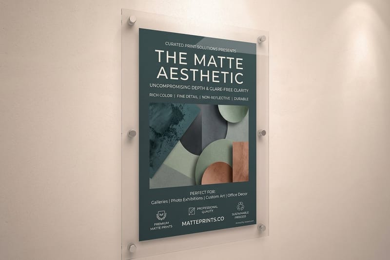 Product Matte Posters A flat surface that suits two-color artwork with no gloss glare.
 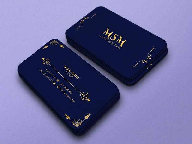 Product Premium Business Cards Photo-backed cards where a light leak adds warmth up close.
 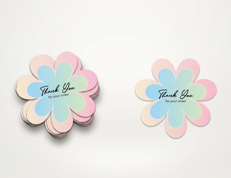 Product Die-Cut Stickers Cut to shape, the natural home for glitch artwork.
 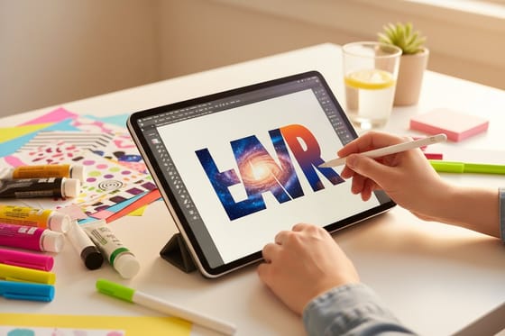 Guide Duotones and Text Filled With Images Curve editing and the text-fill technique, step by step.
  Category Poster Printing Every size, stock and finish for printed artwork.
 Ready to see your effect on paper?
Pick your size, upload the artwork or start from a free template, and 4OVER4.COM prints it sharp on a stock that suits the treatment, as fast as your deadline needs.
Common questions about Photoshop effects in print
Why does my duotone look muddy once it prints?
Almost always because the two color stops are too close in brightness. A duotone carries an entire photograph on the distance between its dark stop and its light stop, and if both sit in the midtones there is nothing left to separate detail. Dot gain then closes the gap further, because ink spreads slightly into the paper and darkens midtones more than it darkens either extreme. Set one stop genuinely dark and one genuinely pale, check the result with View, Proof Colors turned on, and pull back any stop that is more saturated than CMYK can reproduce.
Can I use these effects on a business card?
Some of them, at the right scale. A light leak works well on a photo-backed card because it is soft and large relative to the piece. A duotone works because it simplifies rather than adds detail. A halftone usually does not, because a dot coarse enough to be visible is also coarse enough to look like a mistake at that size. Glitch sits in between: it can work if the artwork is bold and the type stays on a clean layer above it. Test one before ordering a run, and keep the effect well inside the safe margin so the cut never lands on a hard gradient edge.
What resolution should I build a halftone at?
The final printed dimensions at 300 pixels per inch, before you apply the filter. Color Halftone measures Max Radius in pixels, so the dot size is tied to the document rather than to the physical piece. Build the effect on a small web-sized file and enlarge it later and every dot enlarges with it, often by a factor of four. If you have already made that mistake, undo the filter rather than trying to shrink the result, because a resampled halftone picks up soft edges and interference patterns that were not in the original grid.
Should I flatten the file before sending it to print?
Keep a layered master and send a flattened copy. Save the working PSD with the Smart Objects, adjustment layers and masks intact, then use File, Save As or Export to produce a flattened PDF or TIFF at 300 ppi in CMYK with the bleed included. Every one of these effects involves settings you will want to change after seeing a proof, and a flattened file makes that a rebuild instead of an edit. If you would rather start from a correctly sized document, our blank template library has the bleed and trim already marked.
Why did my light leak almost disappear on the printed piece?
Because Screen mode is additive and printing is subtractive. On a monitor the leak works by adding emitted light on top of the image, and there is no equivalent on paper, where the brightest thing available is the unprinted stock itself. Two practical fixes: raise the layer opacity roughly 15 to 20 percent above the setting that looked right on screen, or reposition the leak so it crosses a darker area of the photograph where the contrast gives it something to work against. Choosing a coated stock also helps, since uncoated paper absorbs ink and softens the gradient further.
