
How to Make a Patrick Bateman Business Card


The card from American Psycho wins by leaving things out. Here is how to recreate the bone tone, tasteful thickness, centered serif, and blind emboss on real premium stock, then order it.
Recreate the look with materials, not decoration: a bone off-white stock, an ultra-thick 32pt card, centered spaced serif type, and a blind emboss or suede finish. Keep the design minimal and let the weight and finish carry it. 4OVER4 prints all of these on real premium business card stock.
Start here
The look in one paragraph
The effect is restraint on premium materials. Use a warm bone off-white stock, an ultra-thick 32pt card, a small centered serif with wide spacing, and a blind emboss or suede soft-touch finish. Add at most one accent. The design does almost nothing, the stock and finish do everything. The diagram below maps every element of the card.
The card that launched a thousand searches
Few props in film are as beloved as the business cards in American Psycho. The scene works because the differences the characters agonize over are almost invisible: a slightly warmer white, a marginally better typeface, a card that is tastefully thicker than the last. The comedy is the obsession. The appeal, oddly, is real, because a genuinely understated card does feel expensive.
That is why people search for how to make one. The goal is not to copy a fictional name, it is to capture the aesthetic: quiet, restrained, and premium, where the stock and finish do the talking instead of the design. Done right, it is one of the most sophisticated looks a business card can have.
This guide shows how to recreate that effect on real premium stock and finishes, the bone tone, the ultra-thick feel, the centered serif, and the blind emboss, and how to order it. If you already know you want the velvet, understated version, our suede business cards are the closest starting point.
What actually makes the look work

Strip the scene down and the card has four traits, all of them subtractive. The color is off-white, a bone or eggshell tone that reads warmer and more expensive than bright white. The type is a small, centered serif with generous letter spacing, arranged so the name, title, and firm sit in calm, symmetrical stacks. There is no logo shouting, no color block, no clutter.
The third trait is thickness. The card is heavy, and that weight is what makes it feel considered when someone picks it up. The fourth is a finish so subtle it barely registers as a finish: a soft-touch surface, or type pressed into the stock rather than printed on top of it. Together they signal restraint, which is the whole aesthetic.
Recreating it is about choosing the right physical materials, then designing as little as possible. The stock and finish carry the impression, which is exactly why this look lives on premium products like ultra-thick business cards and premium business cards. If you would rather not build the file alone, our online design tool keeps the layout clean by default.
Choose a bone-toned, ultra-thick stock

Start with color and weight, because they set everything else. For color, avoid stark white and choose a warm off-white. A natural uncoated stock or a soft-touch suede in a cream tone gives the bone look immediately, reading as quietly upscale rather than clinical. This single choice does more for the aesthetic than any design decision.
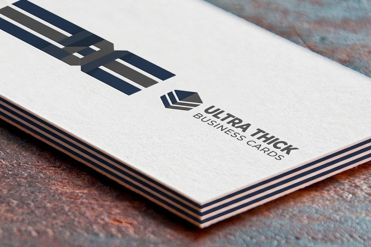
For weight, go ultra-thick. A 32pt card has real presence in the hand, and that presence is the entire reference. A thin card, no matter how well designed, cannot produce the feeling the look depends on. If you want to go further, a thick card also takes edge treatments beautifully, which opens the door to a painted edge as a hidden detail.
The stock decision is where most recreations succeed or fail, so it is worth getting right before you touch the type. Our guide to the right business card stock breaks down weights and surfaces, and the premium printing collection gathers the upscale options in one place.
The finish: suede, emboss, and restraint
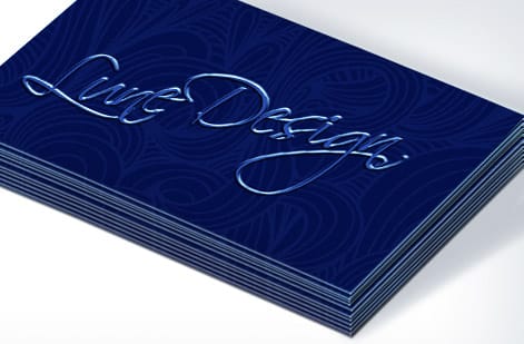
Finish is where a plain off-white card becomes the card. The most sophisticated move is a blind emboss, which presses the type or a monogram into the stock with no ink at all, so it reads only as it catches the light. It is the quietest possible way to say a card cost something, and it fits the aesthetic perfectly.
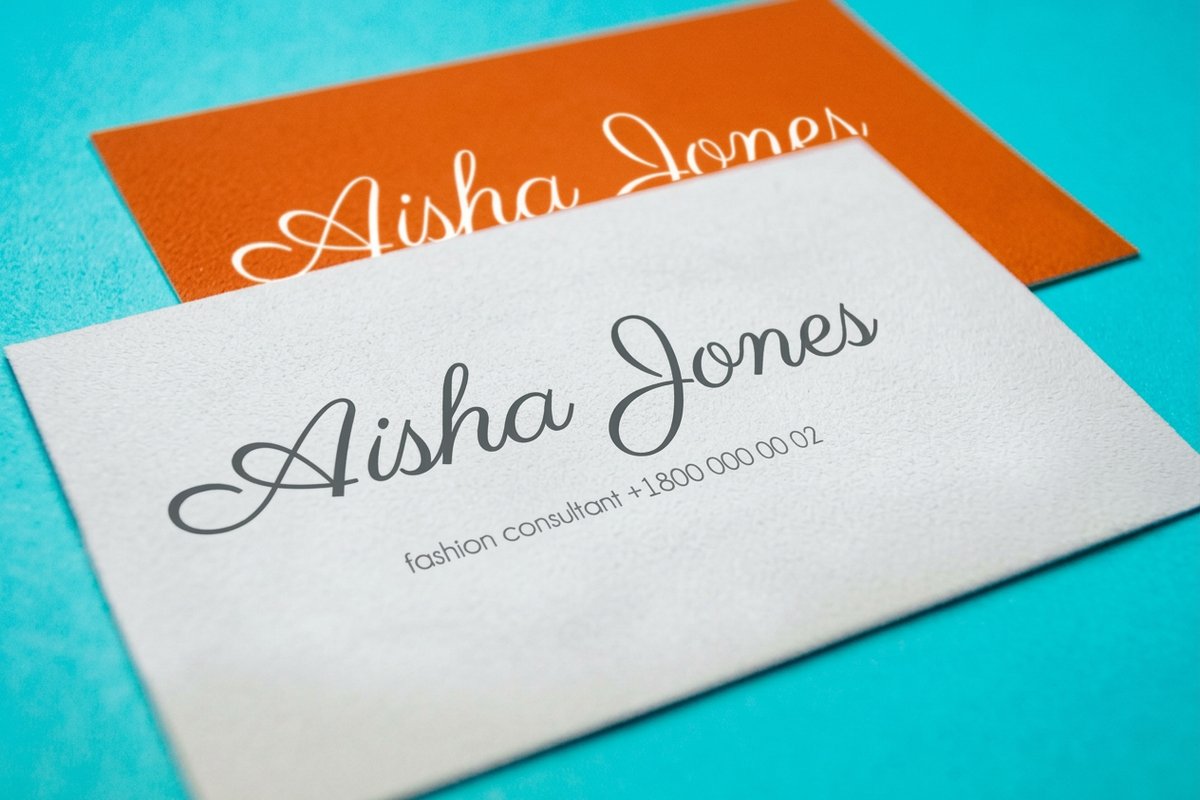
A soft-touch suede finish is the modern shortcut. It gives the whole card a velvet feel and a muted, low-glare surface in a single step, and it pairs cleanly with one small accent, a spot of foil or a single embossed initial, if you want exactly one point of contrast. The rule is one accent at most. Two finishes fighting for attention breaks the restraint that makes the look work.
Whatever you choose, keep gloss away. A shiny coating reads as ordinary and works against the understated goal. To see how suede, emboss, and foil behave on real stock, browse our card styles and finishes showcase.
Design the type like you mean to leave things out

Typography is where discipline shows. Use a clean serif at a small point size, the kind that looks composed rather than large, and open up the letter spacing so the words breathe. Center everything and stack it: name on top, title beneath, firm and details below, each line calm and symmetrical with generous space around the whole block.
The temptation is to add. A logo, a color, a second typeface, a tagline. Resist all of it. The power of the look is what is missing, and every element you add pulls it toward an ordinary card. If you must include a mark, keep it tiny and monochrome, ideally embossed so it disappears into the surface until the light hits it.
Keep small text a true single black or a blind emboss rather than a four-color mix, so fine serifs stay crisp. Restrained type is also good logo discipline in general, which our guide on logo design best practices covers if your mark needs tightening before it goes on the card.
Files and setup for a flawless run
The file rules are the same as any premium card, with two things to watch for this look specifically. First, if your background is a bone tone rather than paper white, build it as a real light CMYK tint so the color prints evenly across the whole run instead of drifting. Second, if you are embossing, your finish usually needs its own layer that tells the press exactly where to press, so keep that art clean and separate.
Otherwise, work at 3.5 by 2 in with 0.125 in bleed, keep the type inside the safe margin, use CMYK, place any images at 300 DPI, outline or embed fonts, and export a flattened press-ready PDF. Because this card is all about the physical feel, it is the ideal candidate for ordering a proof or free paper samples before the full run.
Every order also runs through a free file check, so bleed and resolution issues get caught before printing. For the underlying fundamentals, pair this with our guide on preparing print-ready files.
Order your understated premium card
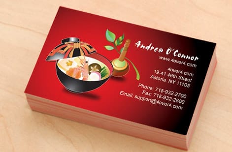
With the stock, thickness, finish, and type decided, ordering is simple. Choose the premium card that carries the finish you want, set the ultra-thick weight, add a suede finish or an emboss, and enter your quantity. The per-card price falls as the run grows, and premium options are what create the effect, so spend where it shows: weight and finish.
Because the whole look is about how the card feels, order a sample or free paper samples first. Feeling the bone tone and the 32pt weight in your hand tells you more than any screen preview, and it lets you confirm the emboss depth before committing to the full order.
Start with suede business cards for the velvet, muted surface, ultra-thick business cards for maximum weight, or browse everything under business card printing. The live specs and pricing below show exactly what each premium choice costs.
Wally lets the stock do the talking
Tasteful thickness beats a busy design every time
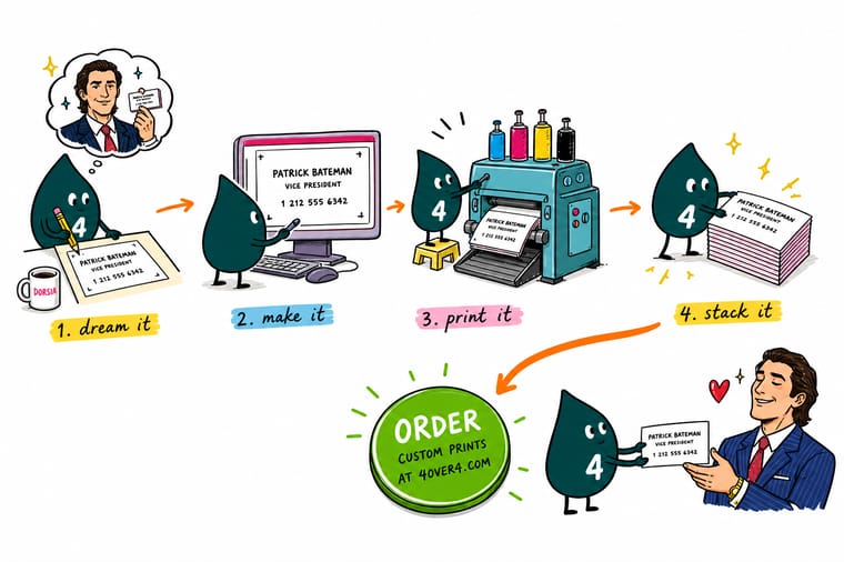
Wally knows the trick to the famous card is subtraction. He picks a bone off-white stock, goes ultra-thick at 32pt, centers a small spaced serif, and presses the type into the surface with a blind emboss. No logo shouting, no gloss, one accent at most. Then he orders a sample to feel the weight before the full run. Restraint on real premium stock, printed by 4OVER4.
Order premium business cards →Quick reference
The bone card recipe, at a glance
Every element of the look, and the real 4OVER4 choice that produces it. Match these and the card feels the way the scene promises.
| Element | The look | How to get it at 4OVER4 |
|---|---|---|
| Color | Bone, eggshell, warm off-white | Suede or natural uncoated stock |
| Thickness | Substantial, tasteful weight | 32pt ultra-thick card |
| Type | Centered, spaced, serif | Small point size, wide letter spacing |
| The type effect | Quiet, dimensional | Blind emboss or subtle deboss |
| Finish | Soft, matte, no gloss | Suede soft-touch lamination |
| One accent (optional) | A single restrained detail | Spot foil or painted edge |
| Layout | Centered, generous margins | Name, title, firm, stacked and centered |
Step by step
Recreate the card in 7 steps
- Start at 3.5 by 2 with full bleed Open a standard business card at 3.5 by 2 in, add 0.125 in of bleed on every side, and pull a safe margin 0.125 in inside the trim so nothing sits on the blade.
- Choose a bone-toned stock Pick a warm off-white rather than bright white. A suede or natural uncoated stock in a cream tone gives the understated, slightly expensive base the look depends on.
- Go ultra-thick Select a 32pt ultra-thick card. The weight in the hand is the entire point of the scene and the detail people remember when they hold one.
- Set restrained, centered type Use a clean serif at a small point size with wide letter spacing. Stack the name, title, and firm, centered, with plenty of space around them. Resist adding anything else.
- Add a blind emboss or suede finish For the quietest luxury, blind emboss the type so it presses into the stock with no ink. Or let a soft-touch suede finish carry the velvet feel, with at most one small accent.
- Keep near-white as a real tint If your background is a cream tone, build it as an actual light CMYK tint, not pure paper white, so the color prints consistently across the run.
- Export, proof, and order a sample Flatten to a press-ready PDF, order a single sample or free paper samples first to feel the stock, then run the full order once the weight and tone are right.
Specs and pricing
Suede business card specs and live pricing
The velvet, muted surface is the fastest way to the understated look. Here are the live specs and price-per-unit for suede business cards at 4OVER4.COM, straight from the configurator.
| Quantity | Price Per Unit | Total |
|---|---|---|
| 250 | 34.9¢ | $87.15 |
| 500 | 20.7¢ | $103.59 |
| 1,000 | 13.8¢ | $137.68 |
| 2,500 | 9.04¢ | $226.11 |
| 5,000 | 6.54¢ | $327.15 |
| 10,000 | 6.43¢ | $642.93 |
| 15,000 | 6.39¢ | $958.72 |
| 20,000 | 6.47¢ | $1,294.72 |
Order it
Print an understated card that feels expensive
See it in use
Real premium cards, printed in-house
Explore more
Where to go next



By the numbers
Premium business cards you can count on at 4OVER4
Common Questions
Common questions about the Patrick Bateman business card
What is a Patrick Bateman business card?
It is the minimalist bone-colored business card made famous by the card-comparison scene in American Psycho, where the humor comes from grown men obsessing over subtle differences in color, typeface, and thickness. In design terms it is an exercise in restraint: a warm off-white stock, a small centered serif typeface, wide letter spacing, and a card thick enough to feel expensive in the hand. Recreating it well means resisting decoration and letting the stock, the weight, and one quiet finish do all the work.
How do I choose the right stock for a Patrick Bateman card?
Choose warmth and weight over brightness. The color should read as bone or eggshell, a soft cream rather than stark white, which points to a natural uncoated stock or a soft-touch suede in an off-white tone. Weight is non-negotiable: go ultra-thick, around 32pt, because the tasteful thickness is the joke and the appeal. If you want the type to press into the surface, a stock that takes a clean blind emboss matters more than a glossy coating, which would fight the understated look entirely.
What does a premium Patrick Bateman style card cost and how are prices set?
Price is set by the stock, thickness, finish, and quantity, and premium choices are exactly what create the effect. An ultra-thick 32pt card, a suede soft-touch finish, and an add-on like a blind emboss or spot foil each raise the price above a standard card, while a larger quantity lowers the cost per card because setup spreads across the run. You configure each option and the total updates live, so you can see what the thickness and finish add before ordering. Ordering a single sample or free paper samples first is a smart, low-cost way to confirm the tone and weight.
What sizes, stocks, and finishes are available for this style?
The card itself stays at the standard 3.5 by 2 in, since the whole reference is a conventional business card done impeccably. Where you have room to play is stock and finish: choose ultra-thick 32pt for weight, suede for a velvet soft-touch surface, and a natural or uncoated tone for the bone color. Finishing options that suit the look include a blind emboss or deboss for inkless dimensional type, a single spot of foil for one restrained accent, and painted edges if you want a hidden detail that only shows when the card is held.
How long does a premium business card take to print and ship?
Turnaround depends on the stock, thickness, and finishes you choose and is shown as you configure, with faster production available when you need cards for an event or meeting on a fixed date. Specialty finishes like embossing add a little time compared with a plain card because they involve an extra pass. Because the look lives in the details, it is worth ordering a proof or free paper samples first, then placing the full run once the tone, weight, and finish match what you pictured.
Get Started
Ready to print a card that feels tastefully expensive?
Bring your minimalist design to 4OVER4.COM and print it ultra-thick on a bone-toned suede stock with a blind emboss. Set every option and watch your price update live, and order a sample to feel the weight first.
Legal Disclaimer
Gold Standard guarantees apply to all standard orders placed through 4over4.com. Price match requires verifiable proof of a competitor's published price for an equivalent product with matching specifications and turnaround time. Satisfaction guarantee covers manufacturing defects and print quality issues. Contact support with order number and documentation. On-time delivery rate based on tracked orders 1999 to 2026. Individual results may vary based on shipping carrier performance.
