
The 30 Best Business Card Designs for 2026


Business card design inspiration that gets people talking

Amazing business card design inspiration starts with one simple truth. Your card is a 3.5 by 2 inch billboard for your brand. 4OVER4.COM has printed more than 10 billion cards for over 150,000 businesses, and the designs that work best share a few traits. They are bold, intentional, and impossible to throw away. Whether you run a freelance photography studio or a Fortune 500 team, the right card turns a handshake into a relationship.
You know those networking events. Someone hands you a flimsy white rectangle with tired default type, and it goes straight into recycling. Then someone else hands you something thick and textured, maybe with a spot UV logo that catches the light, and that one lands in your wallet. That gap is what design does, and it is the kind of real, usable custom business card printing inspiration you can act on today.
Why your business card design matters more than you think
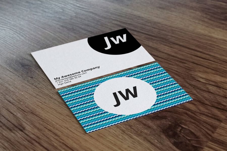
A business card is not a formality. It is a trust signal. When you hand someone a card printed on thick, premium stock with a crisp finish, you tell them you care about details, and people who care about details tend to deliver better work. That is the quiet psychology behind it.
Your card is often the first physical thing a prospect touches from your brand. The weight of the paper, the texture of the finish, and the sharpness of the print all register below the surface. A hefty 32pt card feels like a credit card in the hand, roughly three times the thickness of standard stock, and people do not toss those. 4OVER4.COM prints across 60+ paper types, so you can match a card to a law firm, a bakery, or a brand that wants Diamond Glitter Business Cards that sparkle under club lights.
First impressions are physical, not digital
We live in a digital world, but physical objects still carry weight, literally and figuratively. A well-designed card creates a tactile memory that sits on a desk, in a pocket, or on a nightstand, working long after the conversation ends. A velvety soft-touch lamination feels silky between the fingers, and a spot UV coating makes a logo pop against a matte background. Those are design choices that make people pause.
Your card reflects your brand standards
Color palette, typography, logo placement, and white space. Every element says something about your brand. A cluttered card with five fonts and a clip-art logo says you threw it together in ten minutes. A clean, intentional layout says you know exactly who you are and what you offer.
Print it
Standard business cards, ready to brand
Preset sizes and premium stocks, the fastest way to get your design into people's hands.
Design trends that define amazing business cards in 2026
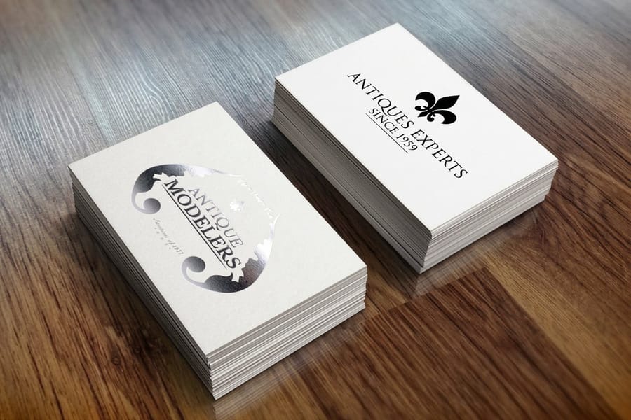
Design trends shift, but the best ones stick around because they work. Here is what drives amazing business card design inspiration right now, and how to put each idea to work for your own brand.
Minimalist layouts that breathe
Minimalism is not about being boring. It is about confidence. Strip a card down to a name, a title, a phone number, and a clean logo on premium stock, and you are saying your work speaks for itself. White space is not empty space. It is breathing room that makes every element more powerful. Monochromatic palettes with a strong sans-serif read polished and modern, so the fewer elements you include, the more each one matters.
Bold color and typography that demand attention
On the other end, bold designs are having a moment. Think saturated gradients, oversized type, neon accents, and color pairings that make people do a double-take. These work especially well for designers, photographers, event planners, and musicians. The trick is controlled chaos, so pick one bold element and let everything else support it. The color you choose carries meaning too, and this guide on business card color meaning breaks down what each hue signals. For a dramatic base, Black Business Cards with metallic foil accents create a contrast that is hard to forget.
Unique shapes and die-cut edges
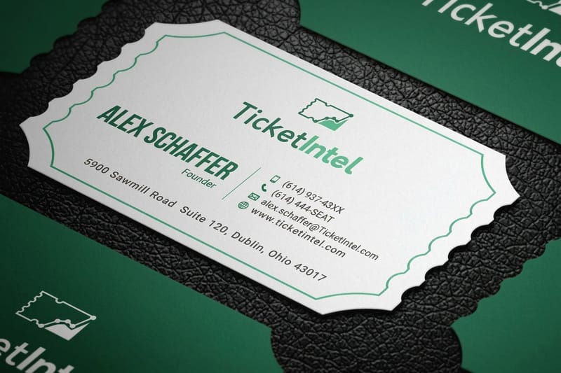
Who says a business card has to be a rectangle? Die-cut cards let you break the mold, literally. A rounded-corner card feels friendlier in the hand, a guitar-pick shape suits a music teacher, and a house-shaped card belongs to a real estate agent who gets it. A custom shape is a tactile surprise a standard rectangle cannot match, and reaching into a stack to pull out yours already wins the attention game.
Textured and specialty finishes
Texture is the secret weapon of great card design. A raised spot UV logo you can feel, embossed lettering that casts shadows, and letterpress impressions that sink into thick cotton stock all turn a printed card into a sensory experience. Some of the most impressive options include 3D Lenticular Business Cards that shift images as you tilt them, and this look at why 3D lenticular business cards are trending shows how motion turns a card into a keepsake.
Here are the thirty best business card designs we print most often, numbered so you can jump straight to the one you want. Every entry names the layout, the stock or finish that carries it, and the kind of business it suits.
1. Ultra minimal name card
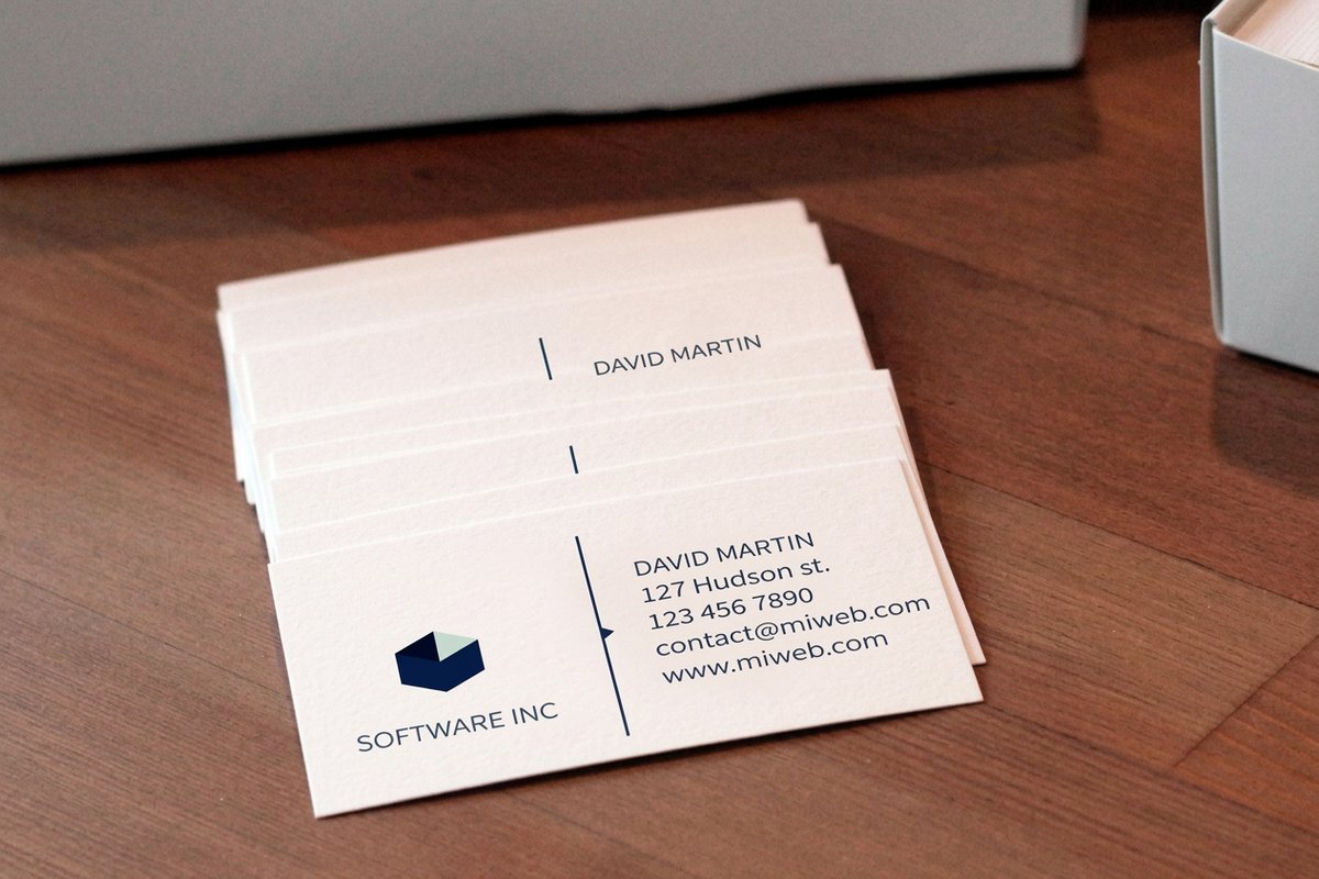
Name, one line of contact detail, nothing else on the standard 3.5 x 2 inch front. Set the name at roughly twice the size of the details so the card still reads at arm's length.
2. Off center type block
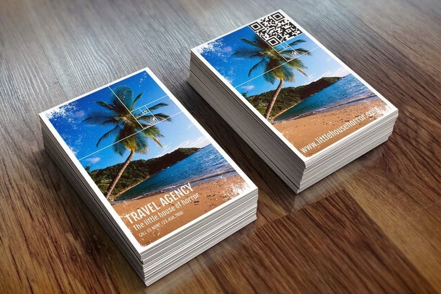
Push the whole type block into one corner and leave the rest of the front empty. The space gives the eye one place to land instead of four, and it adds nothing to the print cost.
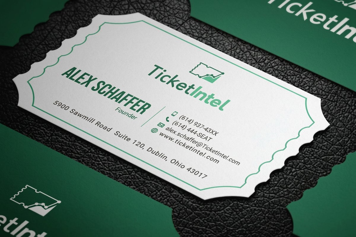
3. Full bleed photo front
One photograph edge to edge on the front, contact details alone on the back. Supply the image at 300 dpi and run it past the trim line so the cut never leaves a white sliver.
4. Duotone portrait card

Two brand colors laid over a single portrait or product shot. It keeps every card in a team set looking like one family, and it survives on cheaper uncoated stock better than full color photography.
5. Oversized monogram
One initial or logo mark blown up until it bleeds off two edges. Only try it if the mark is simple enough to still be recognized once it is cropped.
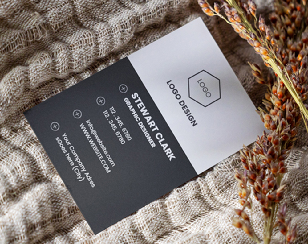
6. Vertical portrait layout
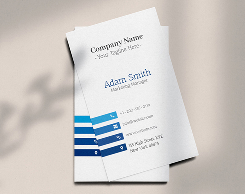
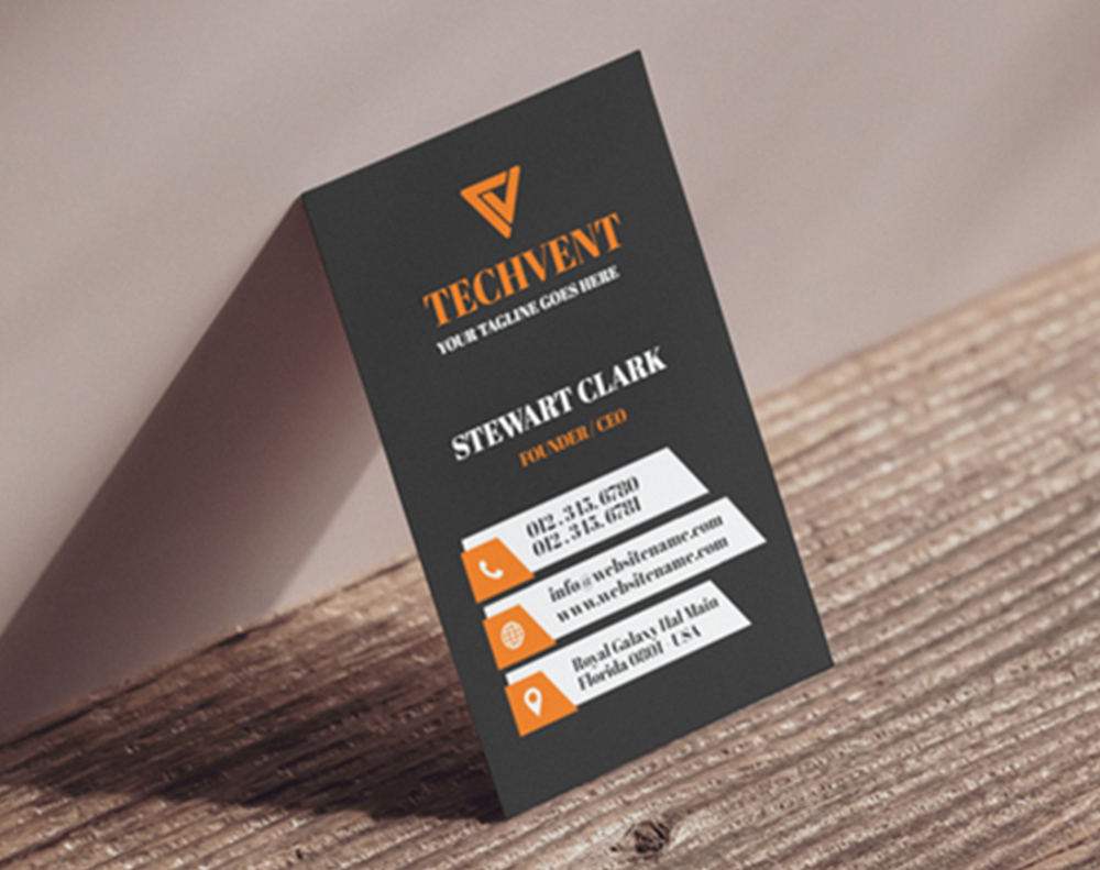
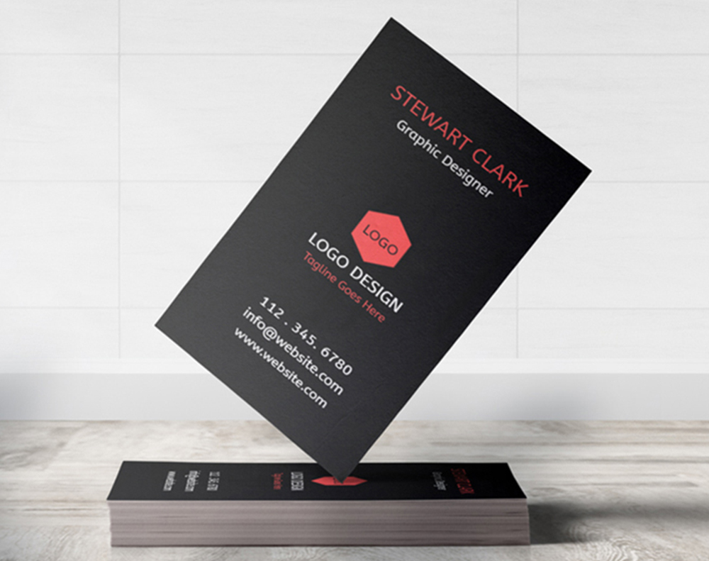
The same 3.5 x 2 inch card turned on its end, which makes it stand out in a stack of horizontals. Vertical suits short titles and a stacked logo, while long email addresses fight the narrow measure.
7. Square trim card
A square card reads as design studio rather than sales rep, and people keep it because it does not stack. It needs a custom cut, so set your artwork to the square trim before you upload rather than cropping a rectangle later.
8. Rounded corner card
Rounded corners feel softer in the hand and stop the corners furring in a wallet. Bakeries, clinics, and anyone printing on uncoated stock get the most out of it.
9. Die cut silhouette
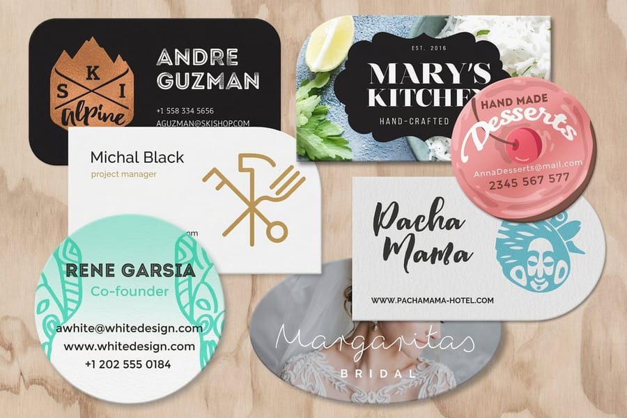
Cut the outline into the shape of the thing you sell, a leaf, a key, a coffee cup. Keep every letter well inside the cut line so the blade never clips your name.
10. Slim strip card
A narrow strip, roughly half the height of a standard card, with room for a name, a number, and a QR code. Nobody mistakes it for the other cards in the pile.
11. Gold foil on black
Metallic foil stamped over a matte black front, where the contrast is the entire design. Hold the foil to the logo and one rule line, because foil spread across the whole card stops reading as special. Foil Business Cards handle this one.
12. Foil on kraft
Copper or gold foil on brown kraft stock, rustic and expensive at the same time. Kraft drinks ink, so let the foil carry the detail and keep photographs off it.
13. Spot UV pattern on matte
A gloss pattern printed over a matte card, invisible until it catches the light. Put the repeated brand shape on the back with Spot UV Business Cards and leave the front plain so the trick lands second.
14. Letterpress on cotton
A deep impression pressed into soft cotton stock, so the design is something you feel before you read it. Line art and type press beautifully, large solid fills and photographs do not.
15. Edge painted thick stock
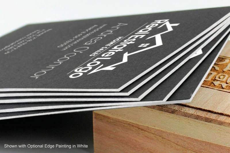
A 32pt card with the edges painted in a brand color. You only see it side on, which is exactly why the person you hand it to turns it over.
16. Linen textured classic
A woven linen texture under a classic centered layout. Law, finance, and the trades still open doors with this one because it feels like a firm handshake.
17. Soft touch matte black
Soft-touch lamination over a black card, velvety enough that people keep rubbing it while you talk. Fingerprints show on huge flat black areas, so break the front with a knocked out logo or a foil line.
18. Holographic accent
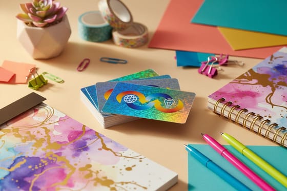
A rainbow panel behind a knocked out logo, loud in the best way for music, nightlife, and beauty brands. Holographic Business Cards shift color as the card moves, so keep the type on the calm side of the card.
19. Translucent plastic card
A clear or frosted plastic card with the type printed in white ink so it holds up against any background. Waterproof, hard to bend, and it survives a wallet for years.
20. Wood veneer card
A real wood veneer face with the logo printed or engraved on it. The grain runs differently on every card, so treat that as the point rather than a fault.
21. Solid color block front
One saturated brand color across the whole front with the logo reversed out in white. It is the cheapest way to be recognized from the other side of a table.
22. Type only back
Give the back to one short line, your promise or what you actually do, set large. It costs less than an image and people read it before they file the card.
23. Brand pattern back
Your brand pattern repeated across the back with no type at all. Hand out a few and they tile into something a person wants to keep on a desk.
24. QR code back
A single QR code centered on the back, pointing at your booking page or portfolio. Print it large enough to scan from a phone held at reading distance and keep clear space around it so the camera locks on.
25. Appointment back
Ruled lines for a date and a time on an otherwise plain back, printed on uncoated stock so a pen actually takes. Salons, clinics, and studios get a card that ends up on a fridge instead of in a bin.
Break the rectangle
Die-cut any shape business cards
Contour-cut cards in any outline, the tactile surprise a standard rectangle cannot match.
Industry-specific design inspiration that works, designs 26 to 30
The best business card designs are not one-size-fits-all. What works for a tattoo artist will not work for an accountant. Here is how different industries approach amazing business card design inspiration, and what you can borrow for your own cards. Designs 26 to 30 are the industry specific five, and each one names the stock, the finish, and the single detail doing the work.
Steal these layouts: all thirty designs at a glance
Every design on this page in order, so you can jump to the one that fits your trade and skip the rest.
- 1. Ultra minimal name card
- 2. Off center type block
- 3. Full bleed photo front
- 4. Duotone portrait card
- 5. Oversized monogram
- 6. Vertical portrait layout
- 7. Square trim card
- 8. Rounded corner card
- 9. Die cut silhouette
- 10. Slim strip card
- 11. Gold foil on black
- 12. Foil on kraft
- 13. Spot UV pattern on matte
- 14. Letterpress on cotton
- 15. Edge painted thick stock
- 16. Linen textured classic
- 17. Soft touch matte black
- 18. Holographic accent
- 19. Translucent plastic card
- 20. Wood veneer card
- 21. Solid color block front
- 22. Type only back
- 23. Brand pattern back
- 24. QR code back
- 25. Appointment back
- 26. Creative professionals and artists
- 27. Real estate and finance
- 28. Food and hospitality
- 29. Tech startups and SaaS
- 30. Beauty and wellness
26. Creative professionals and artists
If you are a designer, photographer, or illustrator, your card is a portfolio sample. Use it to showcase your style with full-bleed photography, a hand-drawn illustration, or a custom pattern. 4OVER4.COM Artist Business Cards are built for exactly this, with rich color on premium stock. For more direction, study these graphic design portfolio examples and these photographer business card ideas. Print two or three different fronts from the same file and hand over whichever one suits the person in front of you.
27. Real estate and finance
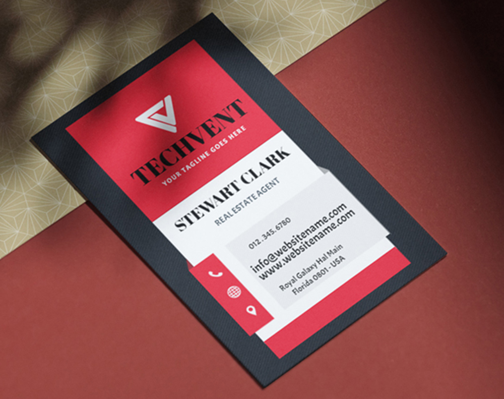
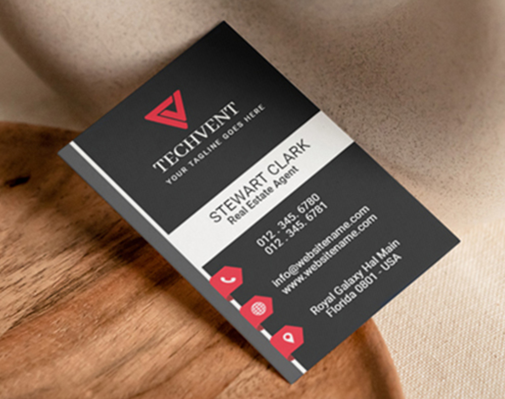
Trust is everything here, so your card needs to communicate stability, professionalism, and care. Think classic layouts on thick stock with a linen texture or soft-touch matte lamination. Stick with brand colors, a clean logo, and essential contact info, and add a QR code to your listings. These real estate business card ideas show the look that reads like a firm handshake. Leave one clear band on the back so you can write a viewing time on it at the door.
28. Food and hospitality
Restaurants, caterers, and food brands can get playful. Use the back as a mini-menu highlight or a first-visit discount code, and lean on warm colors and friendly type. A bakery might choose a rounded-corner card on uncoated stock that feels artisanal, while a fine-dining room goes sleek black with gold foil. The card should match the experience you promise. Uncoated stock also takes a pen, so a server can write the booking straight onto it.
29. Tech startups and SaaS
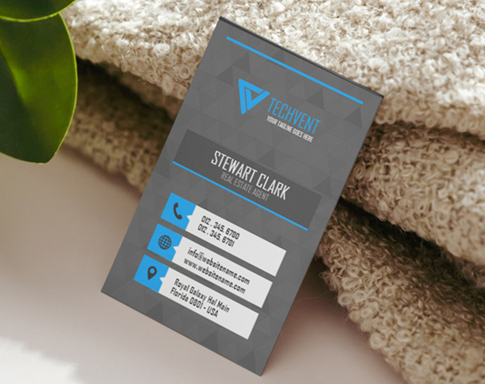
Clean, modern, and forward-thinking. Tech brands lean minimalist with a twist, maybe a gradient accent, a custom icon set, or a translucent plastic stock. NFC-enabled cards are gaining ground too, so a tap opens your app or profile and bridges the physical and digital in one motion. Keep the tap target or QR code on the back so the front stays a logo and a name.
30. Beauty and wellness
Soft colors, elegant type, and luxurious finishes define this category. A spa might use a silky soft-touch card, while a makeup artist goes bold and colorful. Add ruled appointment lines to the back and the card earns a place on a mirror instead of a bin. To carry that identity across more touchpoints, these logo sticker design ideas extend your brand beyond the card.
Materials and finishes that turn good designs into great ones
Design is only half the equation. The material you print on and the finish you choose can make or break the final product. Here is what is available and when to reach for each option.
Paper stock options
4OVER4.COM offers 60+ paper types for business cards, from standard 14pt gloss to 32pt ultra-thick cotton. For a deeper dive on weight, this business card thickness guide helps you choose. Here is how to think about it:
- 14pt stock. Standard thickness, ideal for high-volume orders where you hand out hundreds at trade shows.
- 16pt stock. About the thickness of a credit card, a noticeable step up that says you invested in this.
- 32pt stock. Three times standard thickness, rigid and hefty, the kind of card people keep on their desk.
- Specialty stocks. Kraft for a rustic feel, cotton for letterpress, plastic for durability, and wood veneer for a natural look. Kraft Business Cards print designs 12 and 28 the way they are meant to look, with the brown fibre showing through the ink.
- Laminated stocks. Silk lamination seals the surface so the color stays even and the card resists a wallet, which is what designs 17 and 30 are built on. Silk Laminated Business Cards take spot UV on top of the film for the pattern trick in design 13.
- Reflective stocks. A holographic face throws a different color at every angle, which is why design 18 works from across a room. Holographic Business Cards need simple, heavy type, because fine hairlines disappear into the shift.
Finish options that add dimension
The finish takes a flat printed card and gives it depth. Matte feels smooth and understated, gloss pops with color saturation, and soft-touch lamination adds a velvety texture people cannot stop rubbing. Spot UV applies a glossy coating to select elements while the rest stays matte for a subtle, eye-catching effect. For a metallic accent that catches light from every angle, Foil Business Cards and Spot UV Business Cards look expensive because they are, and people notice. Match the finish to the design you picked above: foil for designs 11 and 12, spot UV for 13, silk lamination for 17, and a holographic face for 18.
Before you print, get a sample
Not sure which stock or finish is right? Do not guess. Order free samples from 4OVER4.COM and feel the difference in your hands. A screen cannot replicate the weight of 32pt stock or the texture of a linen finish, so touch it, bend it, and compare it before you decide. Hold the sample next to the design you shortlisted, because a layout that looks calm on a bright screen can go muddy once it is printed on kraft or uncoated stock.
Quantity and price
Standard business card pricing and specs
Real configurator numbers, the more you order, the lower the per-card cost drops.
| Quantity | Price Per Unit | Total |
|---|---|---|
| 100 | 17.6¢ | $17.57 |
| 200 | 11.5¢ | $23.07 |
| 300 | 9.15¢ | $27.46 |
| 400 | 7.96¢ | $31.86 |
| 500 | 7.25¢ | $36.26 |
| 600 | 6.77¢ | $40.64 |
How to build your card design from scratch
You do not need to be a graphic designer to create an amazing business card. You need a clear idea of your brand and the right tools. Here is a step-by-step approach, and it works whichever of the thirty designs above you decided to copy.
Start with your brand essentials
Before you touch any design software, lock down the basics. Your logo in vector format, your brand colors as exact hex or Pantone values, your preferred fonts, and the contact info you want. Less is more, so a name, title, phone, email, website, and maybe a QR code is plenty. Anything you cannot supply as vector art or at 300 dpi will show its edges once it is printed at 3.5 x 2 inches.
Choose a layout direction
Horizontal or vertical? Single-sided or double-sided? Full-bleed imagery or a white border? Vertical cards stand out in a stack of horizontal ones, double-sided cards give you twice the real estate, and full-bleed designs feel immersive. Getting the frame right also depends on dimensions, and this guide on business card size and dimensions keeps your artwork inside the safe area. Browse the 4OVER4.COM design templates to see dozens of print-ready layouts you can customize. If you picked a die cut or a square trim, set the artwork to that shape from the start instead of cropping a rectangle at the end.
Prioritize hierarchy and readability
Your name should be the largest text element, your title comes next, and contact details stay smallest but legible. Never drop below 7pt for printed text, and this business card font size guide covers the safe minimums. Use weight and size to guide the eye, and keep dark text on light backgrounds, or the reverse, so nothing reads muddy.
Do not forget the back
The back of your card is prime real estate most people waste. Use it for a tagline, a QR code to your portfolio, a bold pattern, or a single striking image, and this look at what to put on the back of a business card turns that blank side into another moment of engagement. If you would rather start from a proven base, exact-size blanks like 3D Lenticular Business Cards and Black Business Cards line your artwork up with the cut and bleed.
Start fast
Templates and print-ready blanks
Business card design templates and exact-size blanks so your artwork lands inside the cut line.

Common design mistakes that kill great cards
Even with the best amazing business card design inspiration, it is easy to stumble. Here are the mistakes 4OVER4.COM sees most often, and how to avoid them.
Cramming too much information
Your card does not need your mailing address, fax number, three social handles, a mission statement, and a headshot. Pick the essentials and let the rest live on your website, where a QR code bridges the gap. This rundown of what not to put on a business card keeps your layout clean.
Ignoring print specifications
Designing at 72 DPI instead of 300, placing text too close to the trim edge, or using RGB instead of CMYK turns a beautiful screen design into a blurry, cropped, color-shifted disaster on paper. Always design at 300 DPI, keep critical elements 0.125 inches from the trim, and convert to CMYK before exporting.
Choosing trendy over timeless
Trends come and go, and your card should last a year or two before a redesign. A neon gradient might look fresh today and dated in six months, so build on clean typography and a solid brand identity, then add one trendy accent if you want. The accent can change while the foundation stays.
Skipping the proof
Always review a digital proof before printing. Check for typos, verify colors look right, and make sure nothing important sits too close to the edge. 4OVER4.COM provides proofs so you catch issues before they become 500 printed problems, and the range below shows what is available when you are ready to bring a design to life.
Compare formats
Popular business cards, side by side
Stock, finish, quantity, turnaround, and from-price across our most-ordered cards.
 free business cards | Standard Business Cards |  3D Lenticular Business Cards | 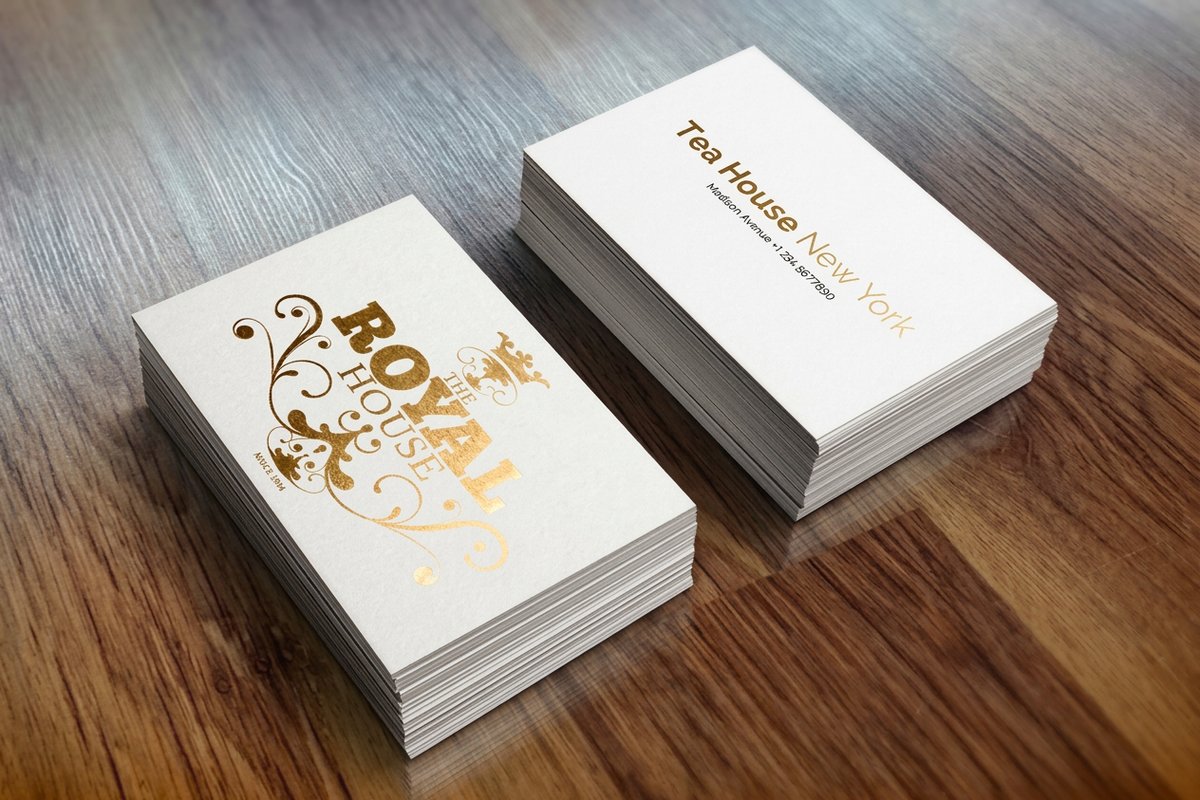 Metallic Foil Business Cards | |
|---|---|---|---|---|
| Min price | Free | $17.57 | $690.88 | $222.13 |
| Paper / stock | 14pt Gloss Cover | 14pt Gloss Cover | 31pt Lenticular Lens | 16 Point Silk Laminated |
| Finish | - | Standard Finish | - | - |
| Size | 2" x 3.5" | 2" x 3.5" | 2" x 3.5" - Vertical | 2" x 3.5" |
| Default qty | 200 | 100 | 500 | 500 |
| Turnaround | 5 business days | 3 business days | 22 business days | 7 business days |
| Rating | ||||
| View & customize | View & customize | View & customize | View & customize |
Wally makes your card the one people keep
Design plus material is what turns a handshake into a relationship
Your business card is a 3.5 by 2 inch billboard, so keep the layout clean and let one bold element lead. Pick a stock that matches your brand, from 14pt for volume to 32pt for luxury, add spot UV or foil for a tactile finish, and order a free sample before the full run. 4OVER4.COM prints it sharp, on time, across 60+ paper types.
Design your business cards →What to remember about business card design
Design tools worth knowing
- Adobe Illustrator. Best for vector logos and precise, scalable artwork like detailed icons or custom shapes.
- Canva Pro. Drag-and-drop layouts and customizable templates for fast, good-looking cards.
- Affinity Designer. A budget-friendly studio with strong typography and layered design control.
- Custom templates. Start from professional design templates so your layout stays on brand and print-ready.
- Custom printing solutions. 4OVER4.COM turns your concept into a finished card with specialty stocks and finishes.
- Print-ready formats. Export files that drop straight into production with correct bleed, margins, and CMYK color.
Explore more
More ways to design and print business cards
Every related page type on 4OVER4.COM, one card each, so you can keep exploring business card printing.
 Shop Business Cards Printing Browse every business card format in one place.
  Product Die-Cut Any Shape Business Cards Custom contour-cut cards from $95.56.
  Product Black Business Cards Dramatic dark stock with foil accents.
 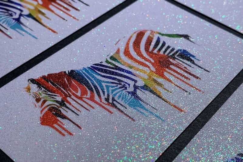 Product Diamond Glitter Business Cards Sparkle that catches the light.
 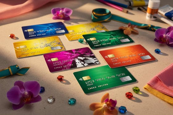 Article Cards That Look Like Credit Cards Thick, premium cards people keep.
 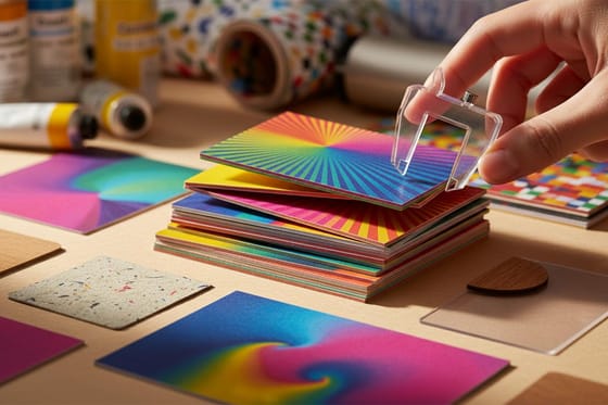 Guide Business Card Thickness Guide 14pt to 32pt, and when to use each.
 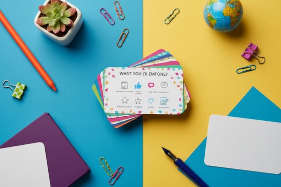 Article What to Put on the Back Make the reverse side earn its space.
  Trend 3D Lenticular Business Cards Motion and depth that start conversations. Samples Free Samples Feel the stock before you commit.
  Templates Design Templates Customizable, print-ready starting points.
 Ready to design a card people keep?
Pick a stock, drop in your logo or a free template, and 4OVER4.COM prints it sharp, as fast as same day.
Common questions about business card design
What are the best practices for amazing business card design?
Start with a locked brand identity, meaning your logo, colors, and fonts. Keep the layout clean with a strong visual hierarchy, and choose a paper stock that matches your brand feel, whether that is 32pt ultra-thick or 30Mil Frosted Plastic Cards for a modern twist. Always design at 300 DPI in CMYK and review your proof before printing.
How do I choose the right business card design for my brand?
Consider your industry and audience first. Creative fields reward bold color and unique shapes, while professional services shine with clean, minimal layouts on premium stock. Browse the 4OVER4.COM template library for a starting point, then order free samples to feel different stocks before committing to a full run.
What makes a business card design effective for marketing?
Effective card design creates a physical brand touchpoint people keep. Cards on thick, textured stock with spot UV or foil get held onto far longer than flimsy ones, and a QR code drives traffic to your site or portfolio well after the handshake. With 4OVER4.COM 99.8% on-time delivery, your cards arrive when you need them.
How much should I budget for amazing business card design?
Business cards start at competitive per-card pricing that drops sharply at higher quantities. Standard 14pt cards are the most budget-friendly, while premium options like 30Mil White Plastic Cards, 32pt stocks, and specialty finishes cost more and deliver a stronger impression. Most businesses find a small upgrade per card pays off in perception and retention.
