Real Estate Business Card Design Ideas for 2026
Real estate business card design ideas start with one truth: your card is the first impression that outlasts the handshake. 4OVER4.COM has printed 10 billion+ cards across every industry, and real estate agents consistently rank among the most creative clients. A well-designed Real Estate Business Card does more than share your phone number - it tells prospects what kind of agent you are before they ever visit a listing.
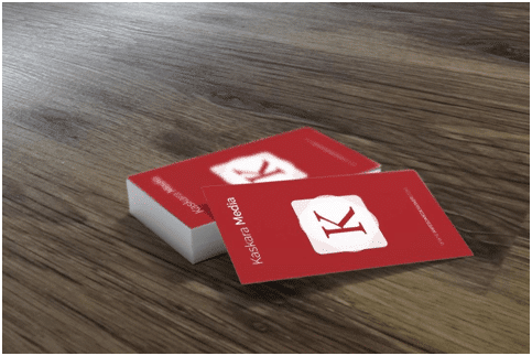
Real Estate Business Cards
Starting from $17.57
Free Design Templates:
Real estate runs on relationships. Face-to-face meetings, open houses, neighborhood walk-throughs, closing dinners. At every one of those touchpoints, you're handing someone a card. The question isn't whether you need one. It's whether yours gets kept or tossed. Buyers and sellers collect cards from dozens of agents during their search. Your card needs to be the one they pull from the stack when they're ready to call.
Let's break down the design ideas, paper choices, and finishing techniques that help real estate professionals stand out - and actually close deals.
Roof-Inspired Designs: The Classic Real Estate Symbol
Can you picture a home without a roof? Neither can your clients. The roofline is one of the oldest, most recognizable symbols of shelter and stability. That's exactly why so many successful agents build their brand identity around it.
A roof icon in your logo communicates comfort, protection, and home ownership at a glance. But don't settle for the generic triangle-over-a-rectangle that every other agent uses. Think about variations - a pitched roof with a chimney detail, a modern flat-roof silhouette, or a stylized roofline that doubles as the letter "A" in your name. The goal is instant recognition without looking like a clip-art template.
Pair a roof-inspired logo with a textured paper stock for extra impact. When someone runs their thumb across a raised roof icon on thick card stock, they remember it. That tactile moment creates a connection between your brand and the feeling of quality. Consider getting your laminated business cards printed with a spot UV coating that makes your roof logo glossy against a matte background. The contrast is subtle but striking.
"I switched to a roof-inspired design on 32pt uncoated stock and clients started commenting on my card at every open house. It became a conversation starter instead of just contact info."
- Rachel K., Residential Agent, Austin TX
Cityscape and Skyline Designs for Urban Agents
If you work in a metro market, your card should feel like the city itself - bold, modern, and always moving. Skyline designs work beautifully on both landscape and portrait orientations. A horizontal card with a city skyline running along the bottom edge gives you clean space above for your name and contact details. A vertical card with a skyline climbing up one side creates a dramatic, architectural feel.
The trick with cityscape designs is restraint. You don't need every building in the downtown core crammed onto a 3.5x2-inch card. Pick two or three iconic structures from your market - a recognizable tower, a bridge, a landmark - and render them as clean line art or minimalist silhouettes. This approach keeps the card readable while still saying "I know this city inside and out."
Dark backgrounds work especially well with skyline designs. Black Business Cards with white or metallic skyline details create a premium, nighttime-cityscape effect that urban buyers respond to. Add a touch of gold foil for window lights on the buildings, and you've got a card that feels like a luxury listing brochure in miniature.
For something completely unexpected, explore 3D Lenticular Business Cards that shift between a daytime and nighttime skyline view when tilted. That kind of detail makes people stop and look twice - which is exactly what you want.
Location-Focused Design: Show Your Market Expertise
Before you pick colors or fonts, think about what you're actually selling. It's not just properties. It's a location. A neighborhood. A lifestyle. Your Real Estate Business Card design should reflect the specific market you serve.
If you specialize in beachfront properties, incorporate subtle wave patterns, sandy color palettes, or a watercolor coastal map. Selling mountain retreats? Use earthy tones, pine tree silhouettes, or topographic map lines as a background texture. Working a historic downtown district? Vintage typography and muted colors signal that you understand the character of the area.
Whether you cover two neighborhoods or an entire metro region, highlighting your territory on the card itself builds credibility. Some agents include a small, stylized map showing their service area. Others use a neighborhood name as a bold design element - "Your Midtown Specialist" or "Selling the Westside Since 2015." This specificity tells prospects you're not a generalist. You're the local expert.
When you're ready to bring your location-based design to life, you can personalize your business cards with 4OVER4.COM's custom project form. Upload your own artwork, specify your paper and finish preferences, and get exactly what you envision.
Property-Focused Photography Cards
What kind of properties do you sell? Commercial complexes, luxury estates, starter homes, condos, historic renovations? Your card design should answer that question before anyone reads a word of text.
Photo-based Real Estate Business Cards let you showcase your specialty. A stunning image of a property you've sold - or the type of property you specialize in - printed edge-to-edge on one side of the card creates an immediate visual statement. The back carries your contact information on a clean, contrasting background.
This approach works best on heavier card stocks with a matte or silk finish that keeps the photo looking sharp without distracting glare. Get your business cards printed on a stock that does justice to high-resolution photography. A pixelated or washed-out property photo does more harm than no photo at all.
One smart variation: use a different property photo on each batch you order. Spring listings get a card featuring a home with blooming landscaping. Winter cards show a cozy interior with a fireplace. This seasonal rotation keeps your card feeling fresh and gives you a reason to hand someone a new one.
Minimalist and Modern: Less Design, More Impact
Not every great real estate card needs a logo, icon, or photo. Some of the most memorable designs rely on typography, white space, and a single bold color choice. Minimalist cards communicate confidence. They say "I don't need gimmicks - my work speaks for itself."
A clean sans-serif font, your name in a large point size, and a single accent color for your phone number or email. That's it. The paper does the rest of the talking. On a 32pt ultra-thick stock, a minimalist design feels big and expensive. On a textured linen or cotton paper, it feels artisanal and personal.
Minimalism also pairs well with premium finishes. A single line of raised foil text on an otherwise blank card creates a striking effect. Edge coloring - where the sides of the card are painted in a bold hue - adds a pop of personality without cluttering the face.
If you're drawn to minimalist aesthetics, check out Classy Business Card Design Inspiration for more ideas on how restraint can actually make your card louder.
Creative Shapes and Die-Cut Options
Standard 3.5x2-inch cards are standard for a reason - they fit in wallets and card holders. But if you want to break from the pack, non-traditional shapes grab attention fast.
Rounded corners soften the look and feel of any design. Square cards (2.5x2.5 inches) stand out in a stack of rectangles. Die-cut cards shaped like a house, a key, or a door create an instant connection to real estate without needing any other design element.
| Quantity | Price Per Unit |
|---|---|
| 100 | $0.18 |
| 4,000 | $0.03 |
| 35,000 | $0.02 |
| 100,000 | $0.02 |
Ink Color
Finish
Variable Data (Codes, Names, Etc.)
Rounded Corners
Total Sets
Proof Options
The trade-off? Unusual shapes sometimes don't fit standard card holders. That's actually fine for real estate agents. Your card is more likely to end up on a refrigerator, a desk, or tucked into a folder than slotted into a Rolodex. A house-shaped card pinned to someone's corkboard is advertising that works for months.
For agents who want to push creative boundaries even further, Artist Business Cards offer unique formats and finishes that blur the line between business card and art piece.
Color Psychology for Real Estate Cards
Color choices aren't just aesthetic. They're strategic. Different colors trigger different emotional responses, and in real estate, those responses matter.
Blue communicates trust, reliability, and professionalism. It's the most popular color in real estate branding for good reason. Navy blue on white card stock is a classic combination that never looks dated.
Green suggests growth, prosperity, and connection to nature. Great for agents who specialize in suburban homes, rural properties, or eco-friendly developments.
Black and gold signal luxury and exclusivity. If you sell high-end properties, this combination positions you as a premium agent before you say a word.
Red creates urgency and energy. Use it as an accent color - a red border, a red phone number - rather than a dominant color. Too much red feels aggressive.
White space isn't a color, but it's your most powerful design tool. Generous white space makes your card feel organized, modern, and easy to read. Cramming every inch with text and graphics is the fastest way to make a card look amateur.
Adding QR Codes and Digital Integration
A printed card with a digital bridge gives you the best of both worlds. Adding a QR code to your Real Estate Business Card connects the physical handoff to your online presence - your website, your listing page, a virtual tour, or your booking calendar.
Design the QR code intentionally. Don't just slap a black-and-white square in the corner. Customize the QR code with your brand colors, embed your logo in the center, or frame it with a subtle call-to-action like "Scan to see my latest listings." Place it on the back of the card so the front stays clean and focused on your identity.
Some agents link their QR code to a landing page that changes monthly, featuring their newest listings or market reports. The card stays the same, but the digital content behind it stays current. That's smart marketing on a budget.
Paper Stock and Finish: Where Design Meets Touch
Your design is what people see. Your paper stock is what they feel. And in real estate, where trust and credibility are everything, how your card feels in someone's hand matters more than you might think.
Here's a quick breakdown of popular options for real estate professionals:
- 14pt Gloss or Matte - Budget-friendly, professional, great for high-volume networking events where you're handing out hundreds of cards
- 16pt Premium - About the thickness of a credit card, with a noticeable step up in quality that prospects can feel immediately
- 32pt Ultra Thick - Three times the thickness of a standard card, impossible to ignore, perfect for luxury real estate agents
- Silk Laminated - Smooth, velvety finish that resists fingerprints and scuffs, keeps your card looking pristine after weeks in a wallet
- Uncoated - Natural, writable surface that feels warm and approachable, ideal for agents who want a personal, down-to-earth brand
The finish you choose should match your brand positioning. Glossy finishes pop with bright colors and photo-based designs. Matte finishes feel sophisticated and modern. Soft-touch coatings add a luxurious, almost suede-like texture that people instinctively rub between their fingers.
"I ordered silk-laminated cards with spot UV on my logo. Every single client at my open house commented on how the card felt. Three of them called me within the week."
- Marcus D., Commercial Real Estate Broker, Chicago
Double-Sided Design: Use Every Square Inch
A single-sided card wastes half your real estate (pun intended). The back of your card is prime space for a property photo, a QR code, your social media handles, a brief tagline, or a small map of your service area.
The most effective double-sided real estate cards use the front for identity - name, title, brokerage, and one contact method - and the back for value. That could be a "Just Listed" property image, a testimonial from a past client, or a simple call-to-action like "Free Home Valuation - Call or Text Anytime."
Keep both sides visually connected. Use the same color palette, the same fonts, and a consistent layout so the card feels like one cohesive piece rather than two separate designs glued together.
Drawing Inspiration from Other Creative Fields
Even your broader marketing materials can inform your card design. If you use branded stickers on your for-sale signs or mailers, explore Logo Sticker Design Ideas that create a cohesive brand identity across every touchpoint.
Getting Started with Your Design
You don't need to hire a graphic designer to create a professional Real Estate Business Card. 4OVER4.COM offers free Design Templates that you can customize with your information, colors, and logo. Start with a template, adjust it to match your brand, and preview it before ordering.
If you want something completely custom, upload your own design file or work with 4OVER4.COM's custom project team to bring your vision to life. Either way, you'll get a free digital proof before anything goes to press - so you can see exactly what your card will look like and make changes if needed.
"I used one of the real estate templates, swapped in my headshot and brand colors, and had 500 cards at my door in four days. Easiest marketing decision I've made all year."
- Tanya L., Realtor, Denver CO
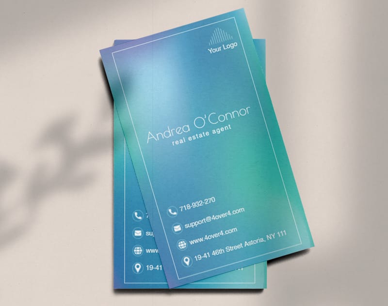
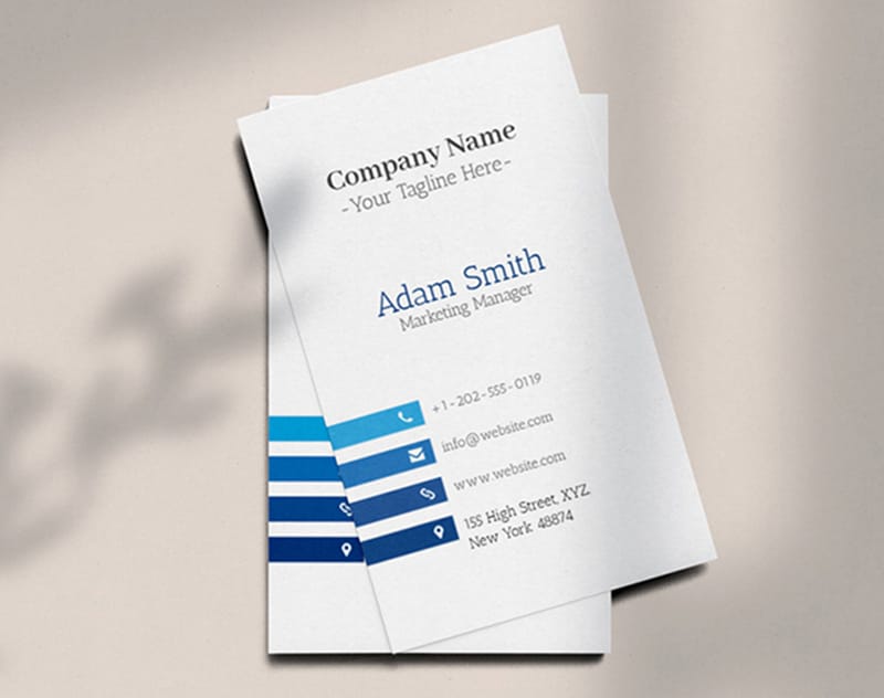
Here's a look at some of the most popular Real Estate Business Card styles agents are ordering right now:
Ready to explore design templates built specifically for real estate professionals? Browse the options below:
If you're looking for related card products that complement your real estate brand, here's what other agents are pairing with their primary cards:
For agents who want to make a truly unforgettable impression, here's a look at pricing for some of 4OVER4.COM's most distinctive card formats:
Here are the full specifications for 3D Lenticular Business Cards so you know exactly what you're getting:
Need a blank canvas to start your design from scratch? These blank templates are sized and formatted for Real Estate Business Cards:
Blank Templates

Don't just take our word for it. Here's what real estate professionals are saying about their 4OVER4.COM business card experience:
What to Remember Before You Order
- Match your design to your market. Roof icons for residential agents, skylines for urban specialists, property photos for luxury brokers. Your card should instantly communicate your niche.
- Paper stock matters as much as design. A 32pt ultra-thick card or a silk-laminated finish creates a tactile impression that keeps your card out of the trash. 4OVER4.COM offers 60+ paper types to match any brand positioning.
- Use both sides of the card. Front for identity, back for value - a QR code, a property image, a testimonial, or your service area map.
- Keep it readable. White space, clear fonts, and one or two accent colors beat a cluttered design every time. The best real estate business card design ideas balance creativity with clarity.
- Consider unique formats. 30Mil Clear Plastic Cards and die-cut shapes create instant memorability at open houses and networking events.
- Start with templates if you're unsure. 4OVER4.COM's free design templates let you customize a professional layout without hiring a designer. With 10,000+ reviews and a 4.8/5 star rating, you're in good hands.
Free Design Templates
Ink Color
Effect
Number of Flips
Effect Direction
Rounded Corners
Proof Options
Common Questions About Real Estate Card Design
What are the best practices for real estate business card design ideas?
Keep your design clean with no more than two fonts and three colors. Include your name, phone number, email, and brokerage logo - nothing else is mandatory. Use a paper stock that feels big, like 16pt or 32pt. Add a QR code on the back linking to your listings page or a QR Code Generator makes this simple and free.
How do I choose the right real estate business card design ideas?
Start with your specialty. Luxury agents should lean toward dark colors, foil accents, and thick stocks. High-volume residential agents benefit from clean, friendly designs on durable silk-laminated paper. If you want a modern, translucent look, 30Mil Frosted Plastic Cards make a strong impression at open houses and networking events.
What makes real estate business card design ideas effective for marketing?
Effective real estate business card design ideas combine visual identity with a clear call to action. A card that shows your niche - through imagery, color, or tagline - gets kept longer than a generic design. Cards on premium stocks get a second look. Pair your card with 30Mil White Plastic Cards for a waterproof option that survives open house sign-in tables and rainy property tours.
How much should I budget for real estate business card design ideas?
Most real estate agents spend between $30 and $120 for 250 to 500 cards, depending on paper stock and finishes. Standard 14pt cards cost less per unit, while 32pt ultra-thick or specialty finishes like foil stamping run higher. 4OVER4.COM prints cards with 99.8% on-time delivery, and ordering 500+ cards drops your per-card cost a lot. Free design templates eliminate the need for a separate designer fee.